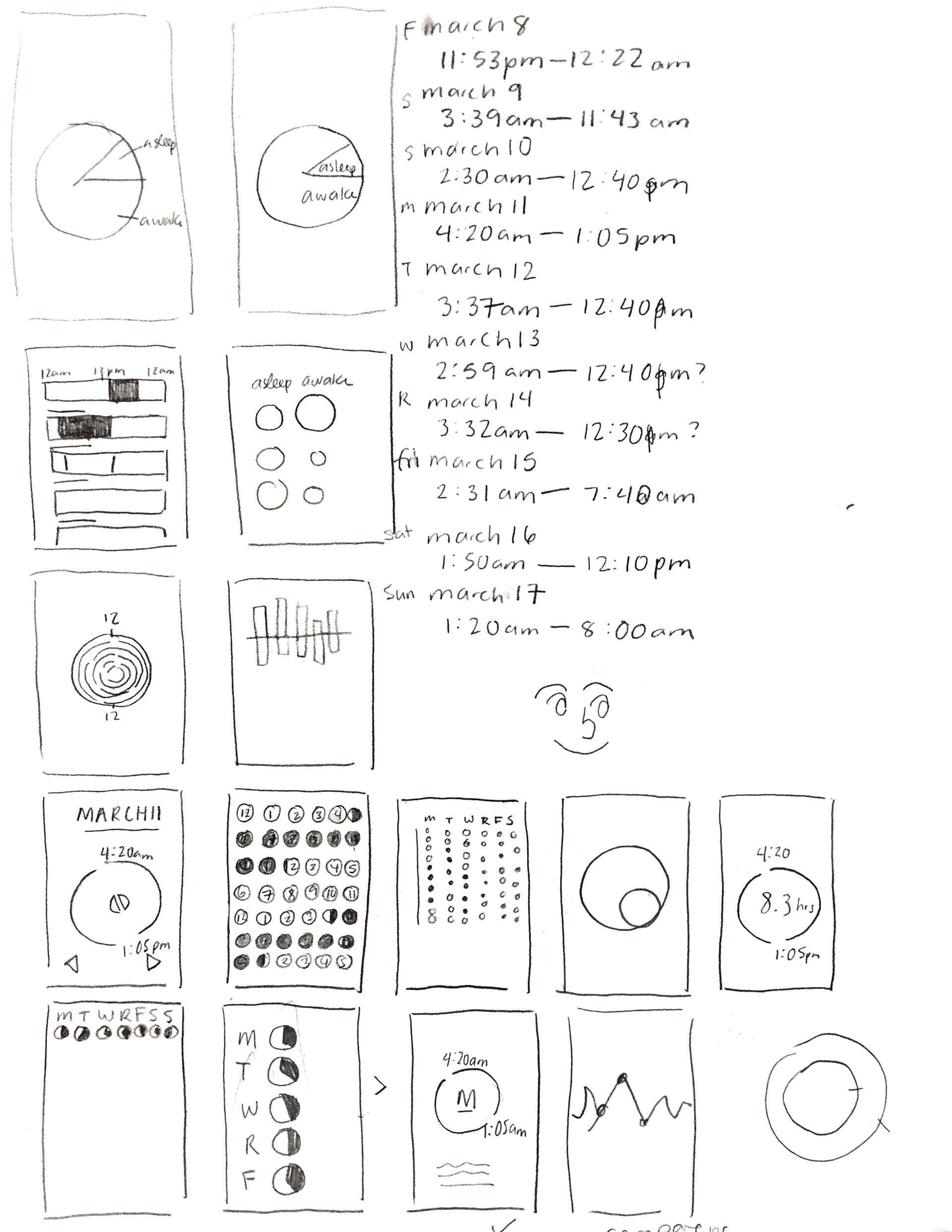
Over Spring Break, I tracked when I went to sleep and when I woke up. I represented this data through a mobile app that serves as an infographic.
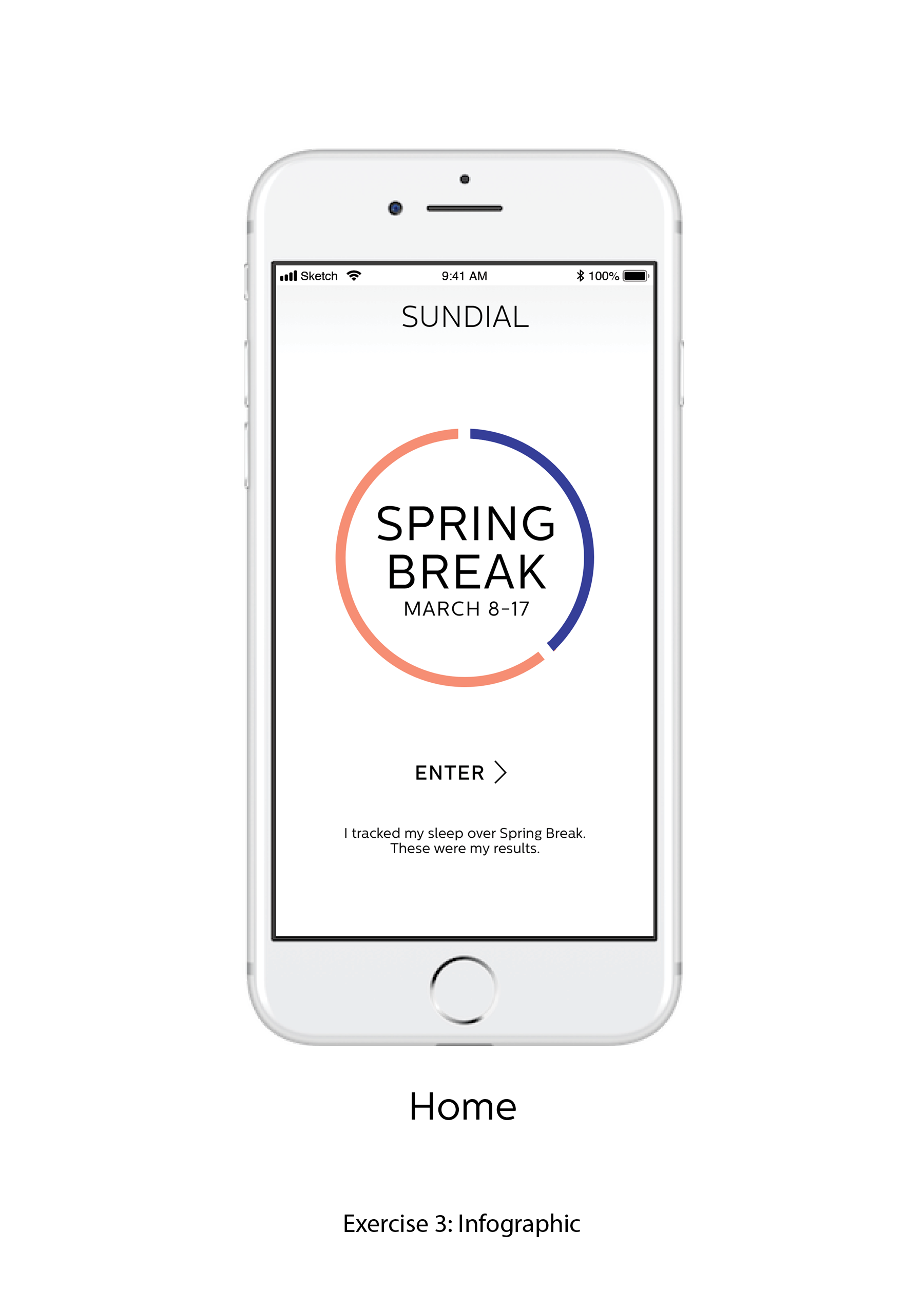
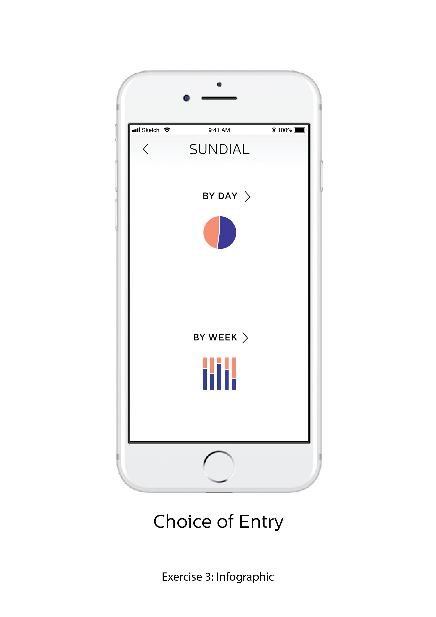
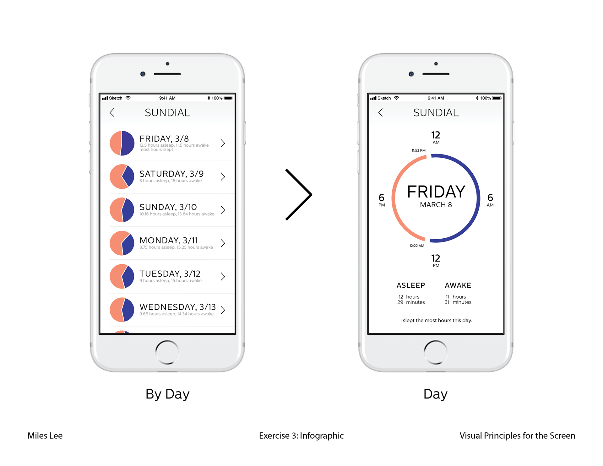
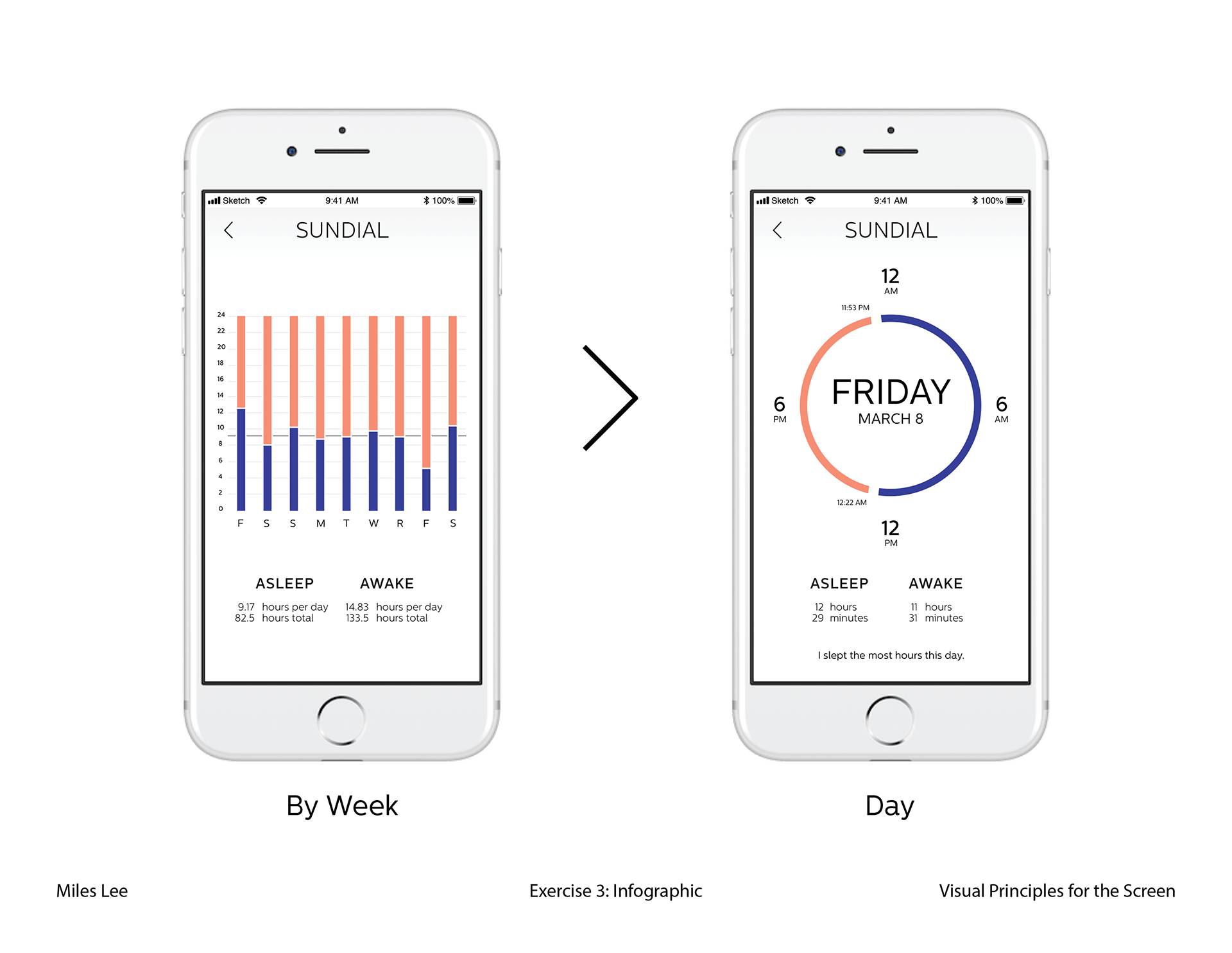
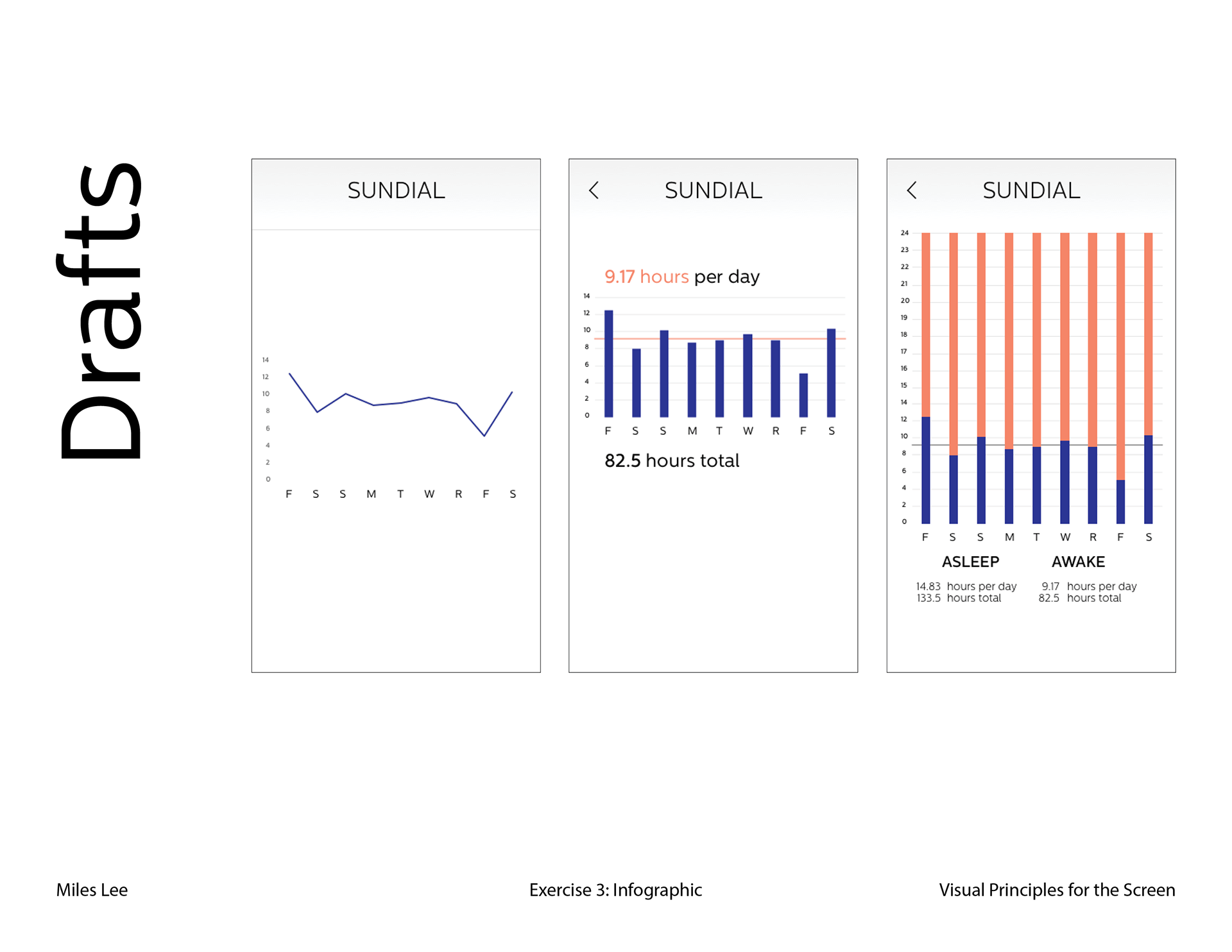
I recorded the (approximate) times I went to sleep and woke up every day from March 8 to March 17. After conducting a lot of visual research on infographics and data visualization, with a focus on themes like sleep, hours, and sunlight, I decided to visualize the information I collected as a circle. This was reminiscent of not only the sun and moon, but also a clock as well. I denoted the times I fell asleep and woke up using the four quadrants of the clock (clockwise from the top: midnight, 6:00 AM, noon, 6:00 PM). I wanted the user to be able to access this data through two different methods: by day and by week.
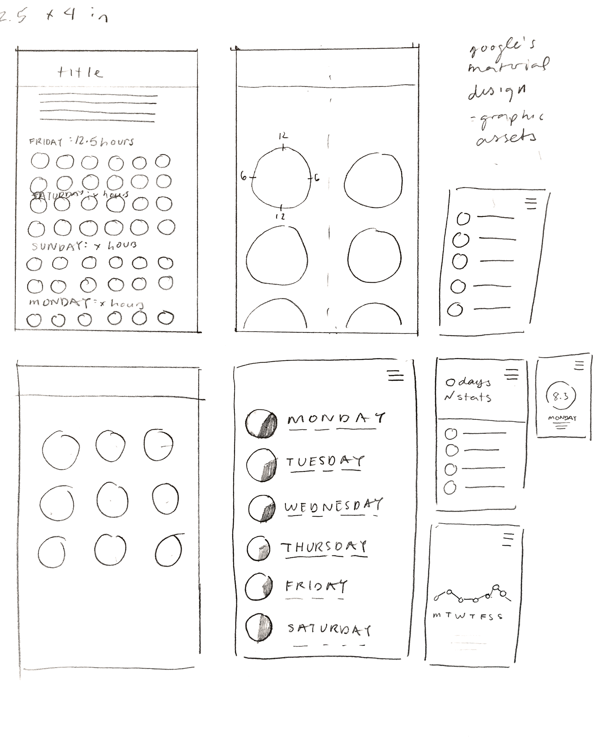
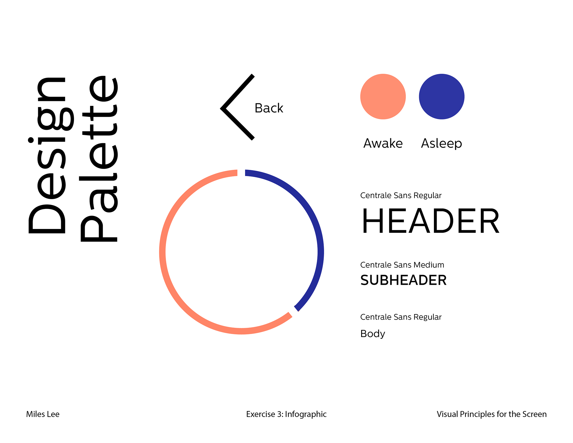
I decided to use complementary colors, orange and blue, to denote the hours in which I was awake and asleep due to their familiar connotations (orange/yellow as daytime or sunlight, and dark blue as nighttime). Typographically, I chose Centrale Sans for its clean forms. I used Sketch to create the final screens.