






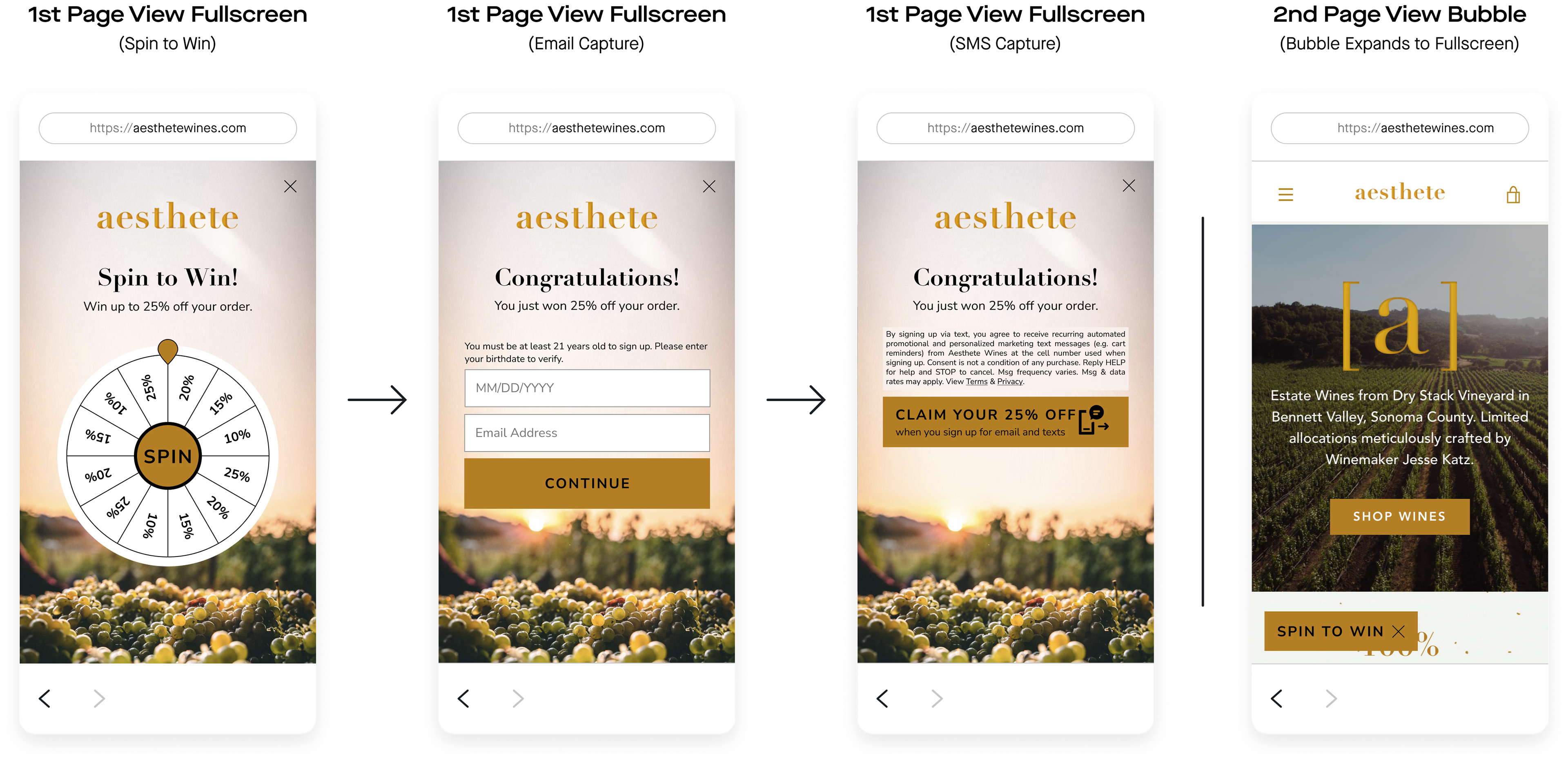
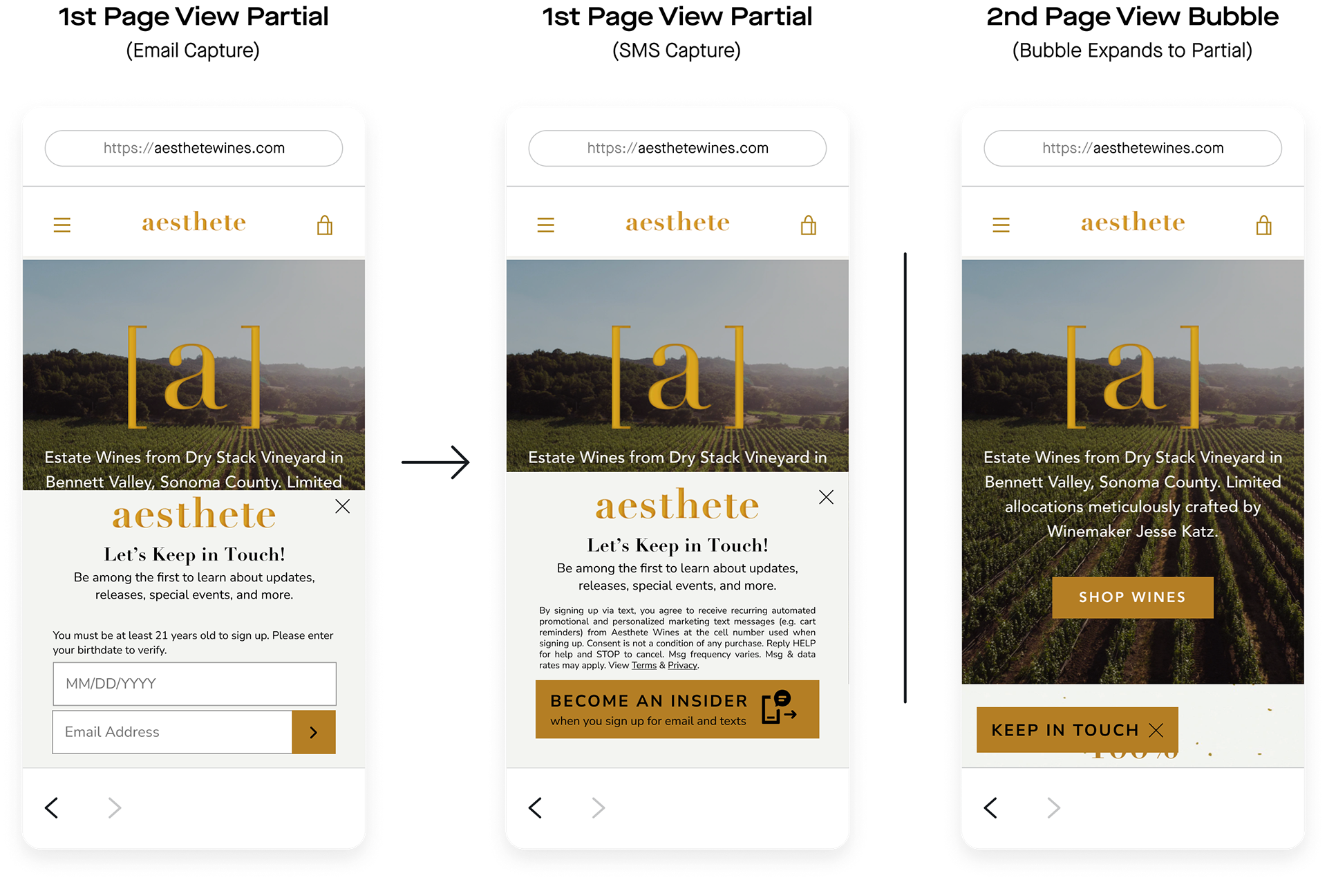

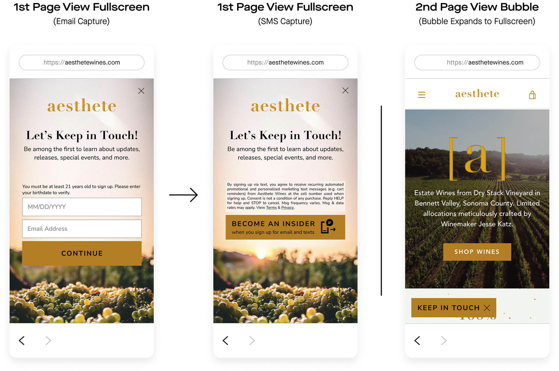
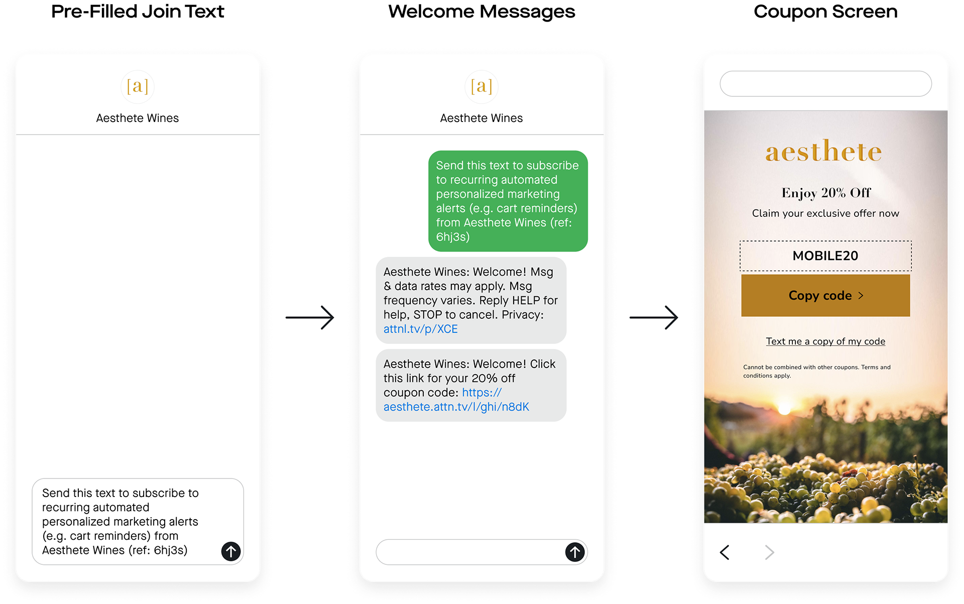



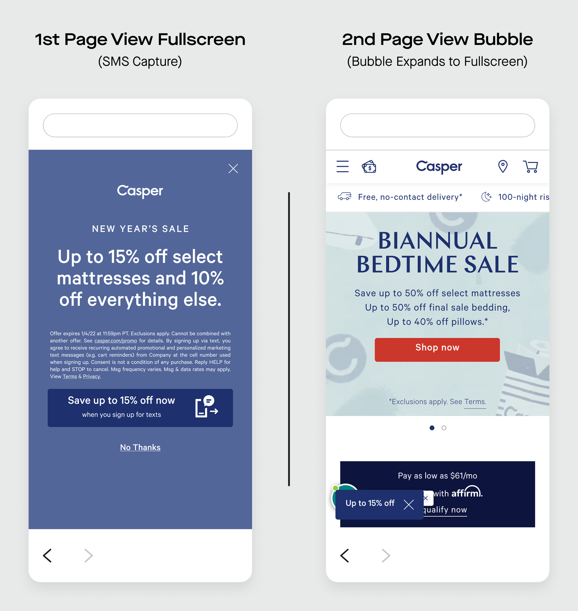
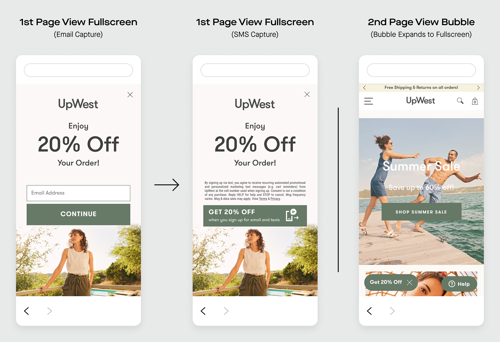
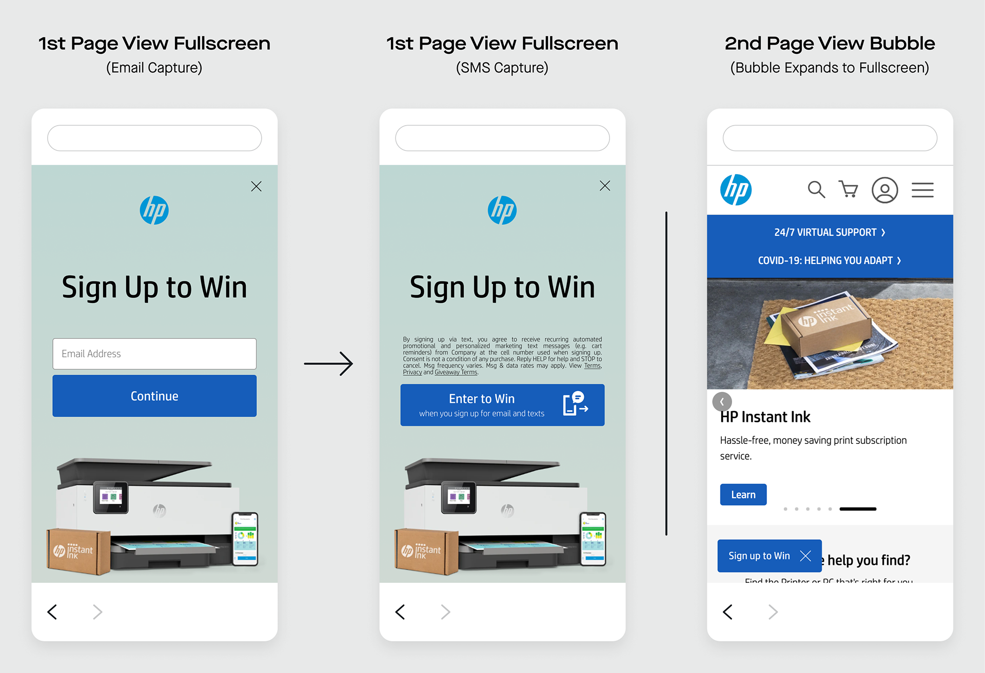
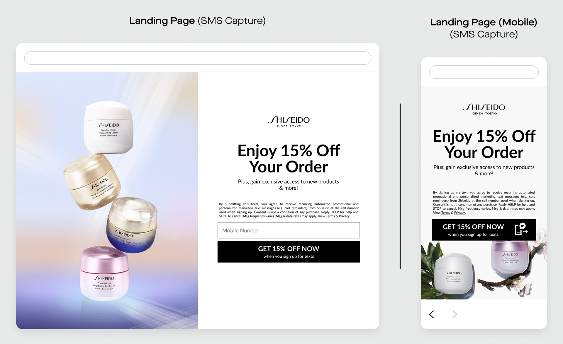

Attentive is the highest performing SMS marketing platform. It drives 20.5% of total online revenue for its 8,000+ clients, who sent over 25 billion messages through Attentive’s platform in 2022.
I joined Attentive in June 2021 as a UI Designer on the Strategic Design team within Product. There, I improved team workflows, user experience, and product strategy.
Shipping product updates, design system templates, and accessible web experiences such as sign-up flows, pop-ups, and triggered email campaigns, I collaborated with Client Strategy, Engineering, and PMs to improve our product for users. I interfaced directly with clients, delivered innovative workflows to my team, and leveraged user insights for company-wide agile initiatives such as concierge services and international expansion.
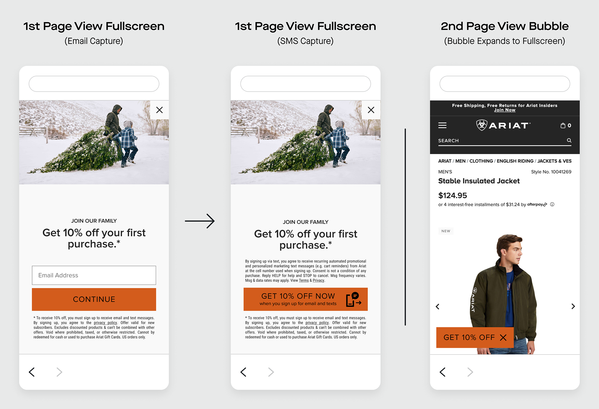
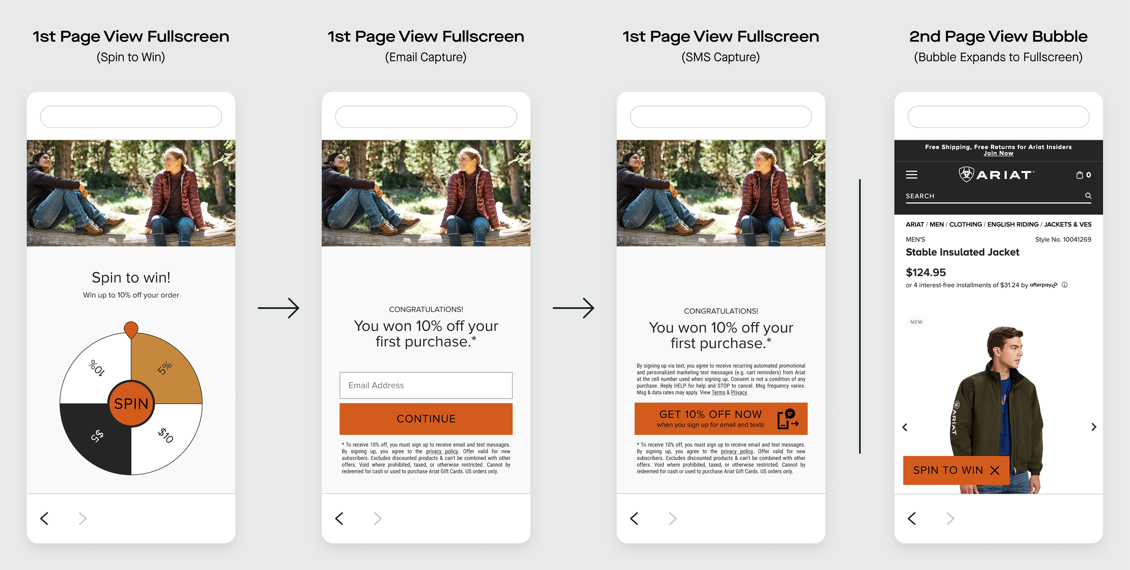
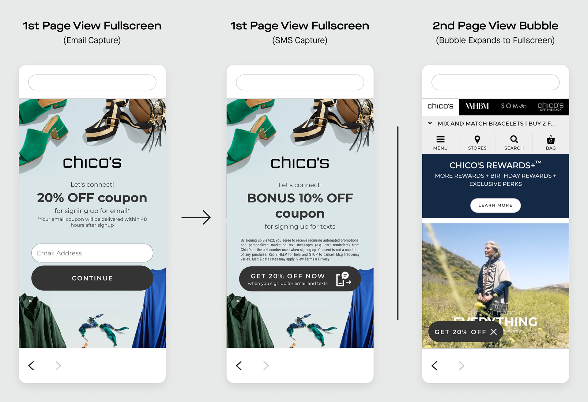
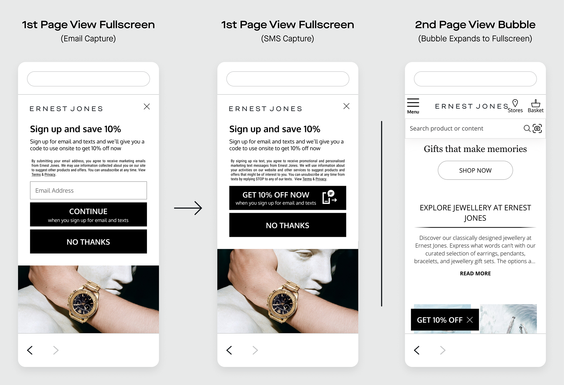
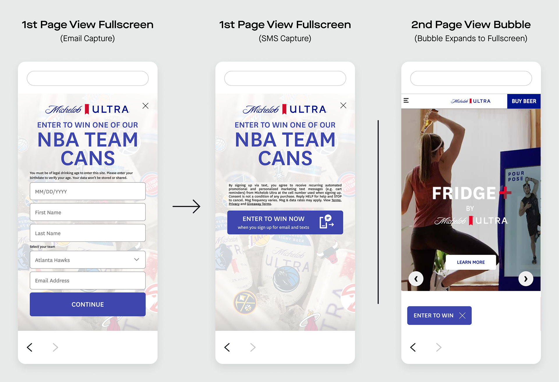
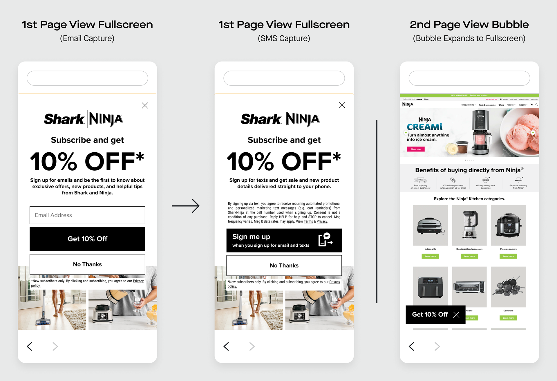
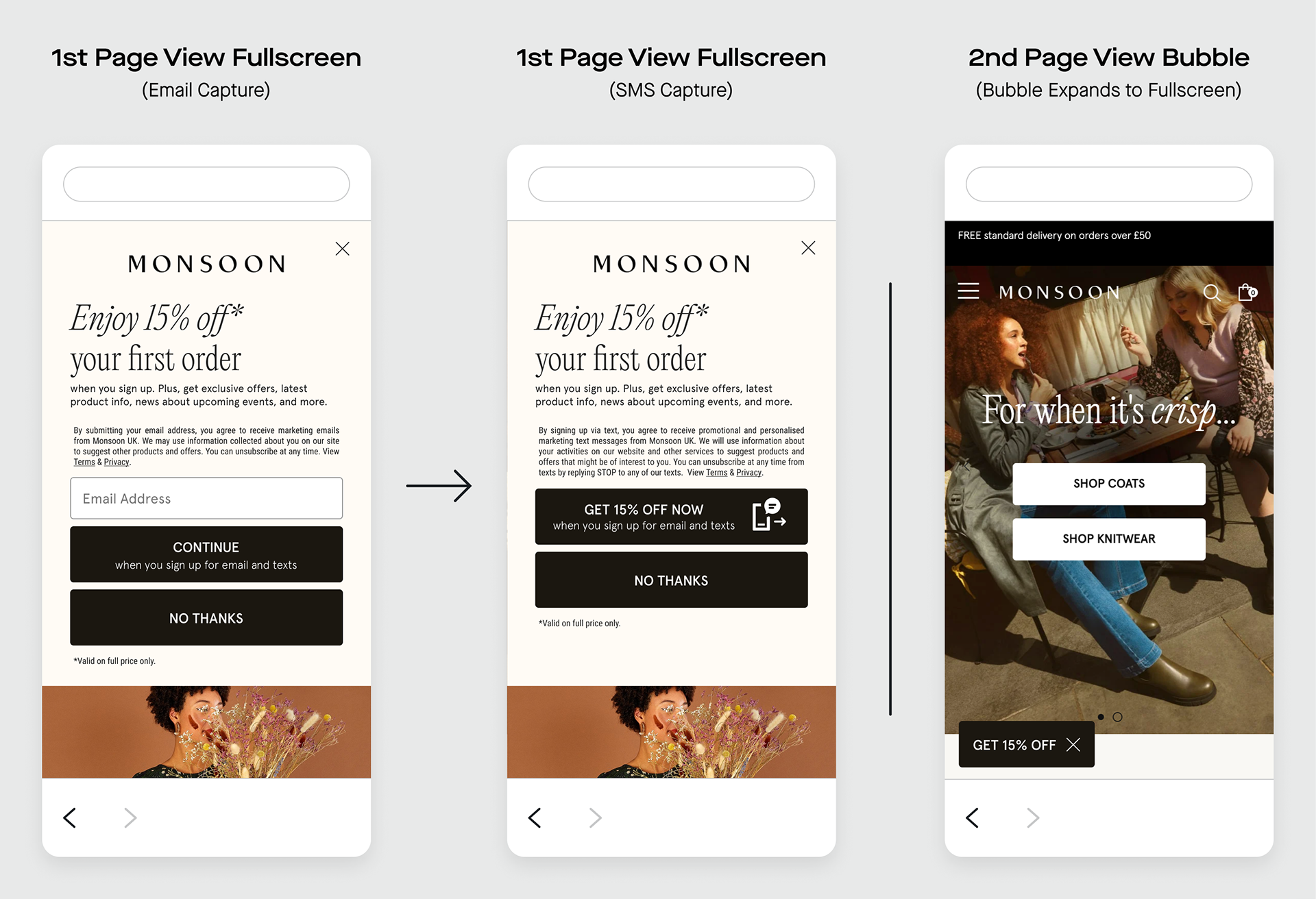
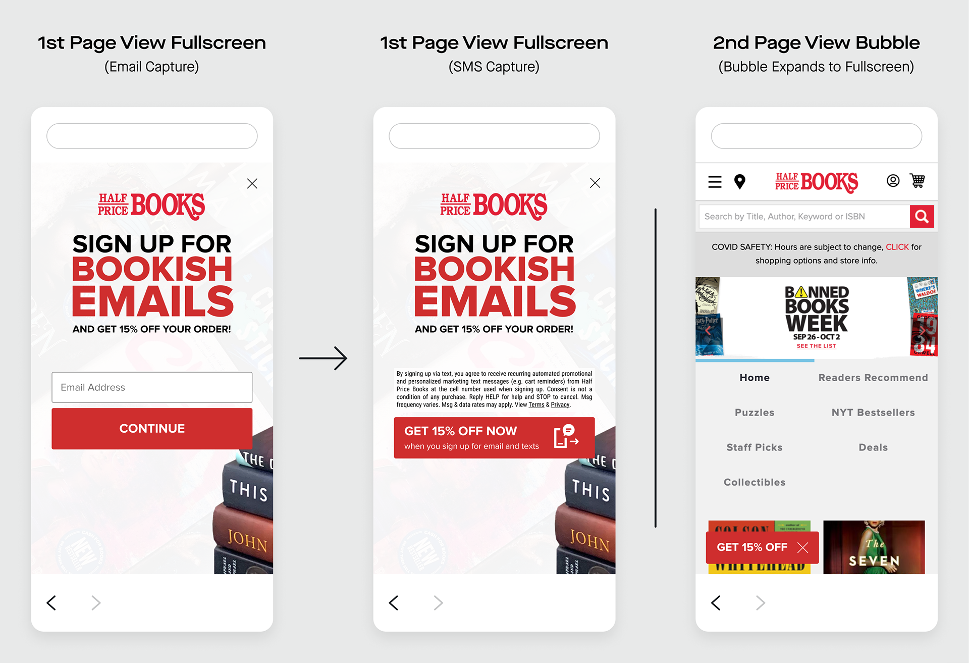
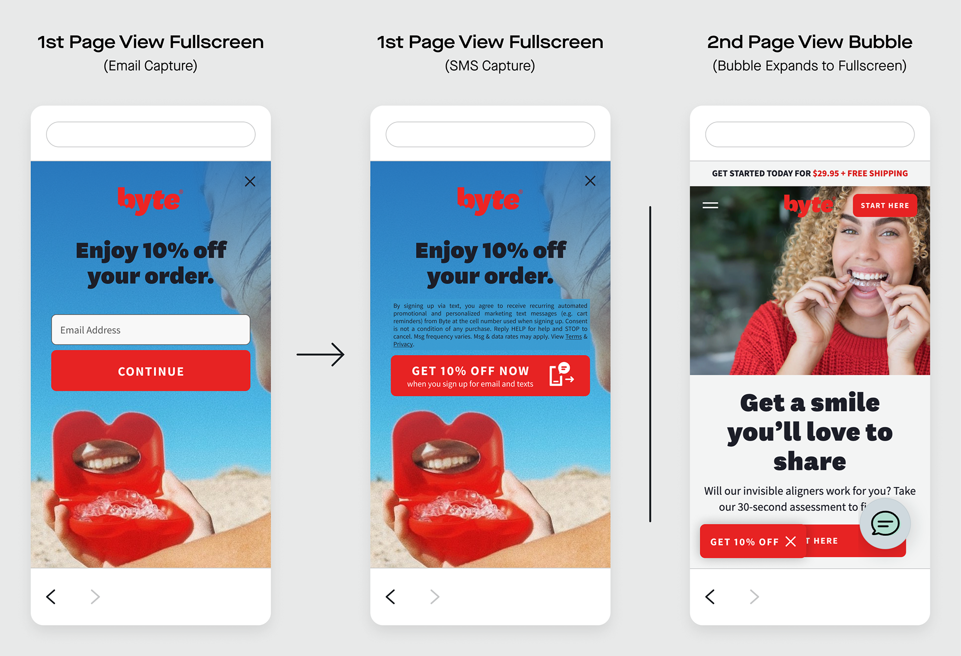
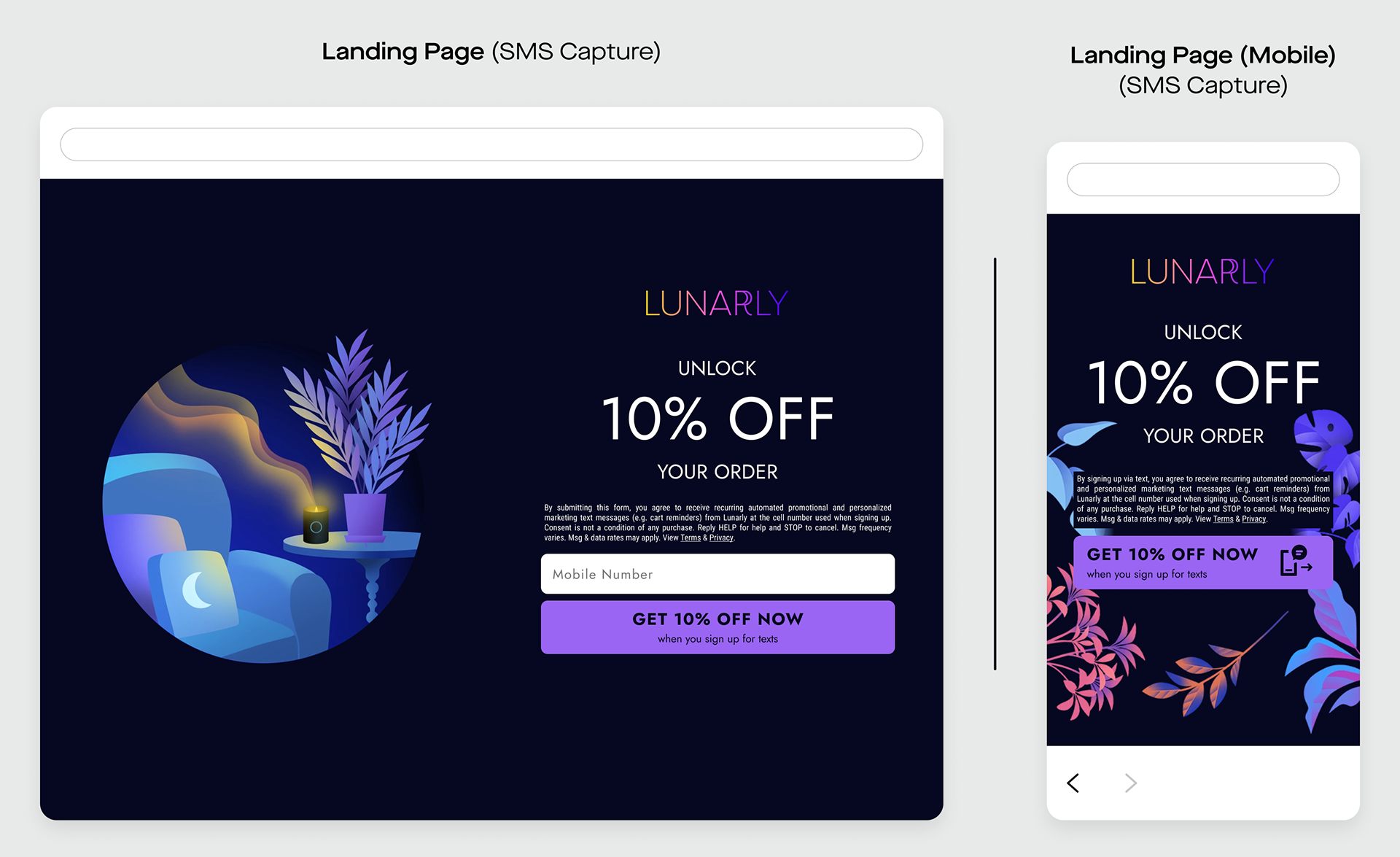
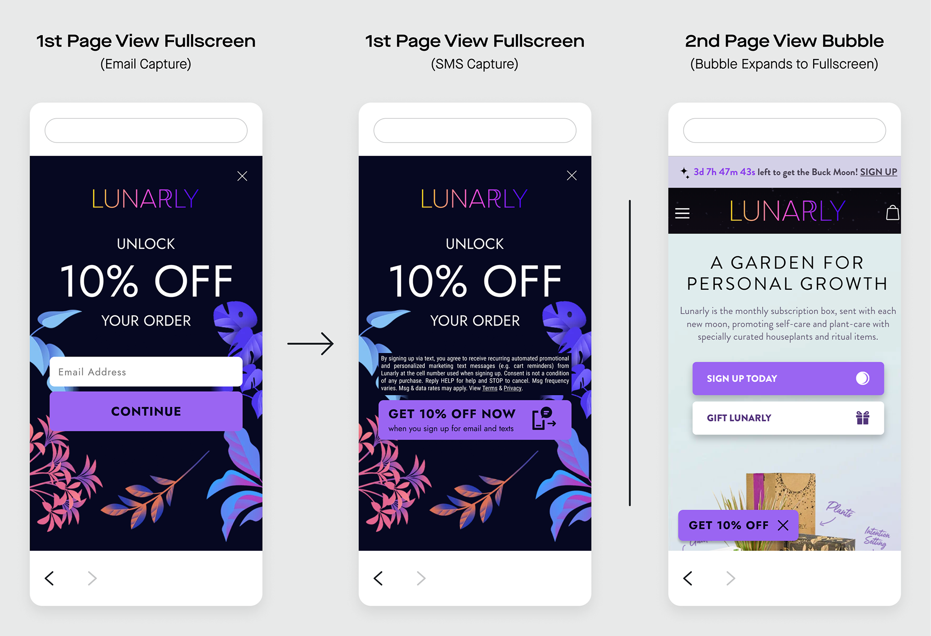
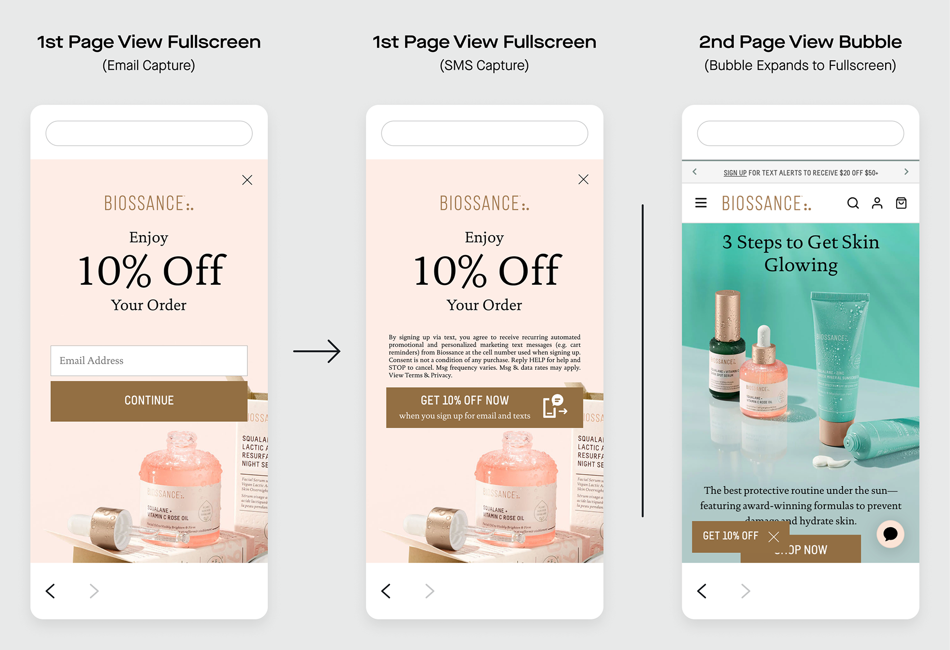
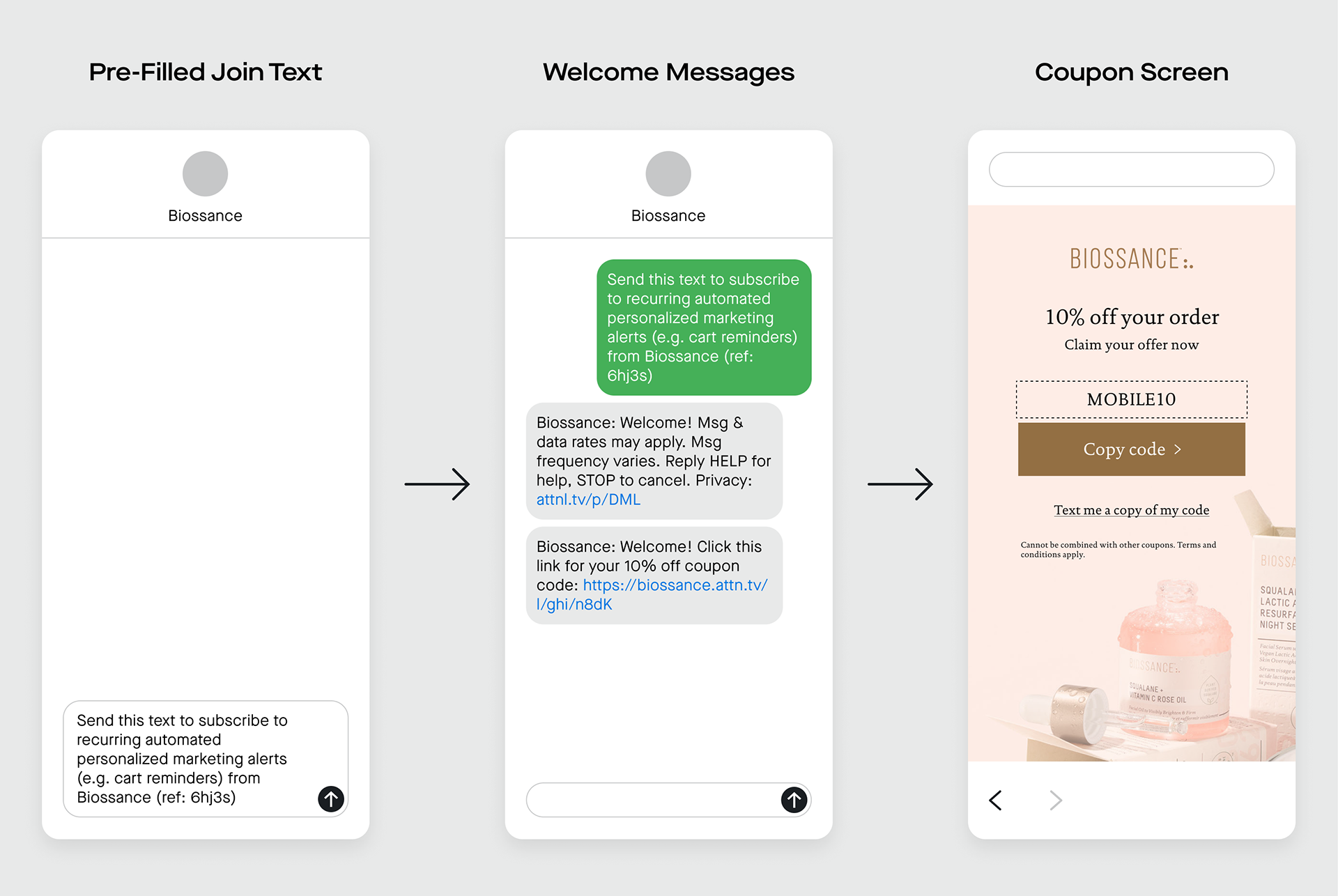
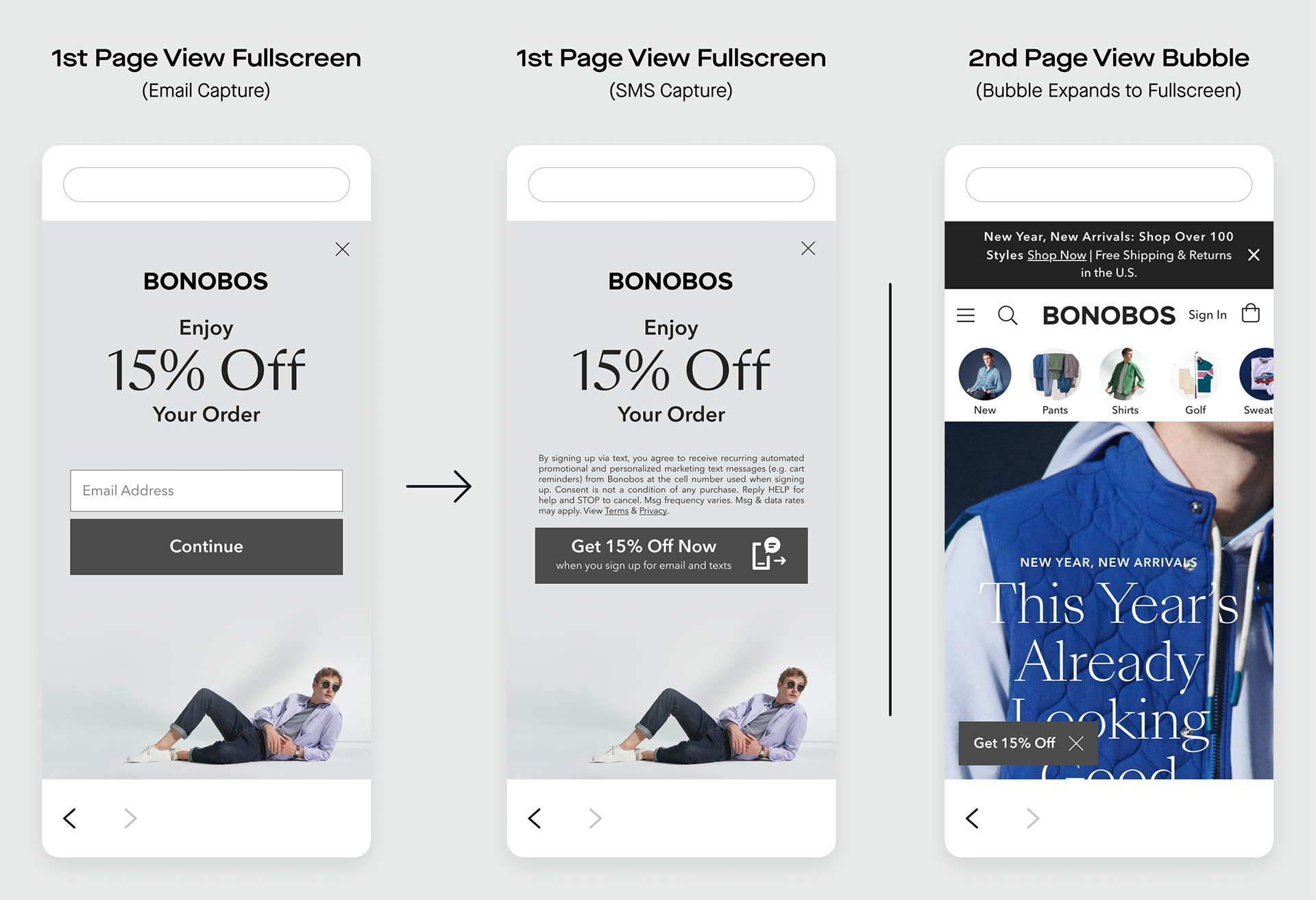
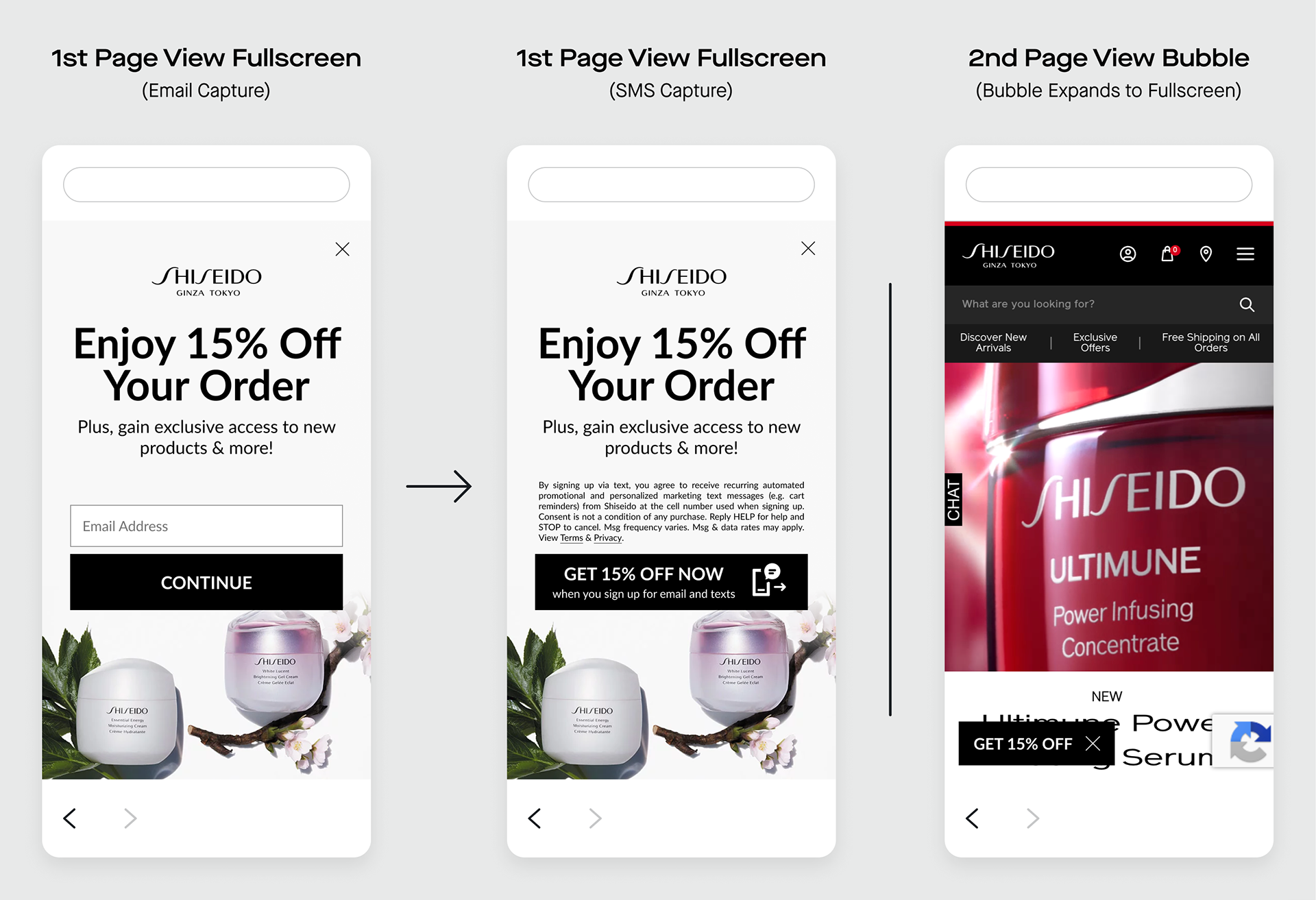
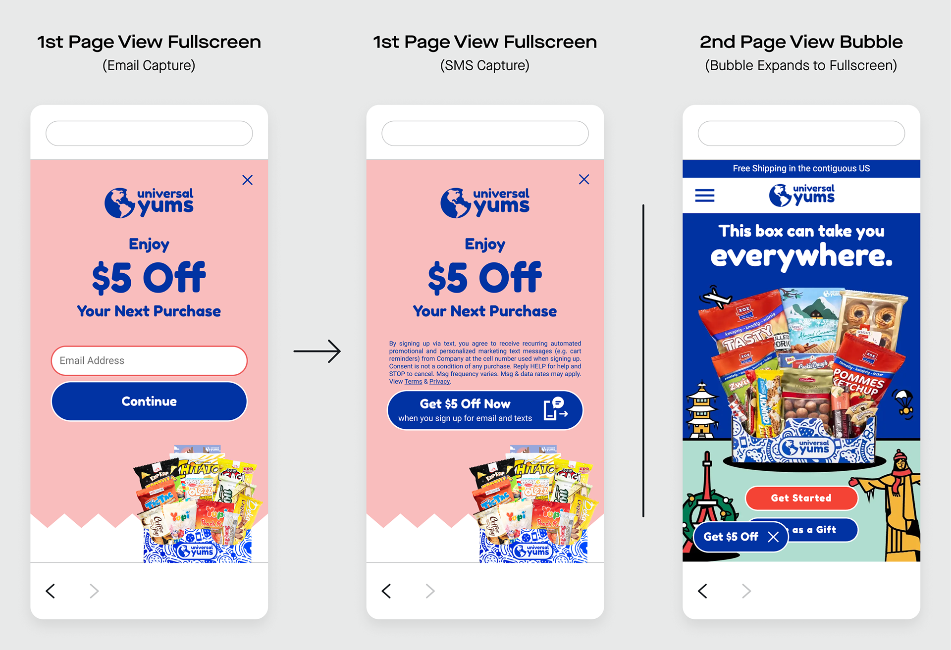
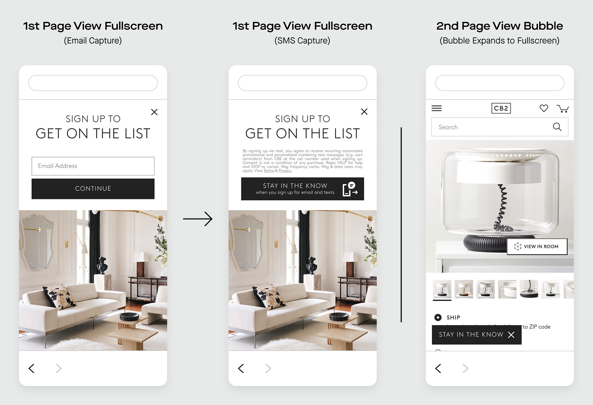
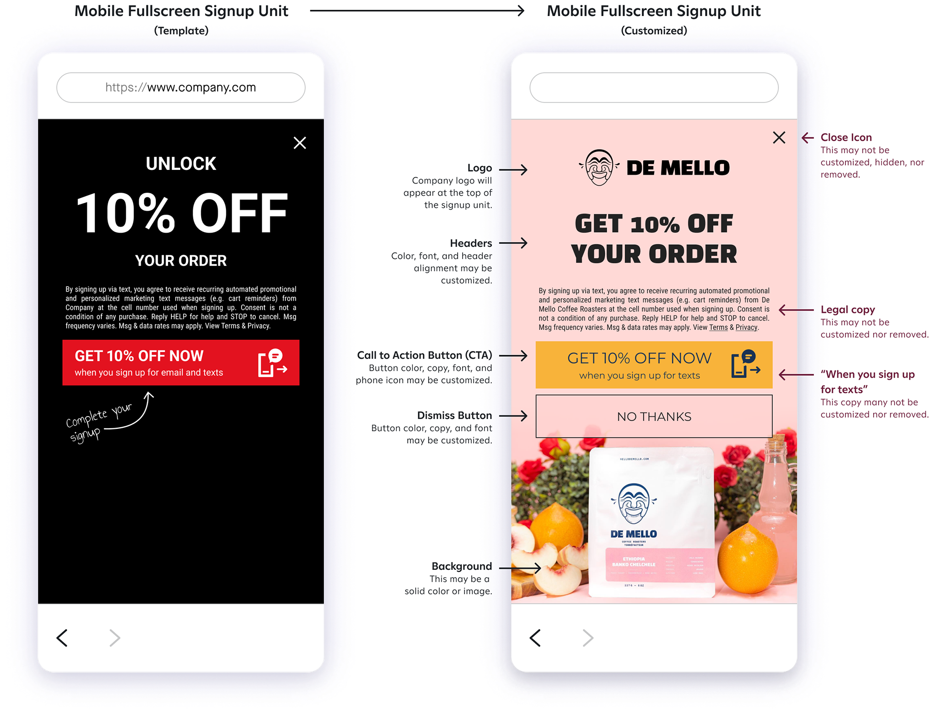
Day to day, I assisted Attentive's 8,000+ clients in the creation of their design collateral. To create a tailored, native experience, I worked with each client’s brand elements to design and build assets like sign-up units and emails that met our standard of compliance in regards to TCPA and ADA guidelines.
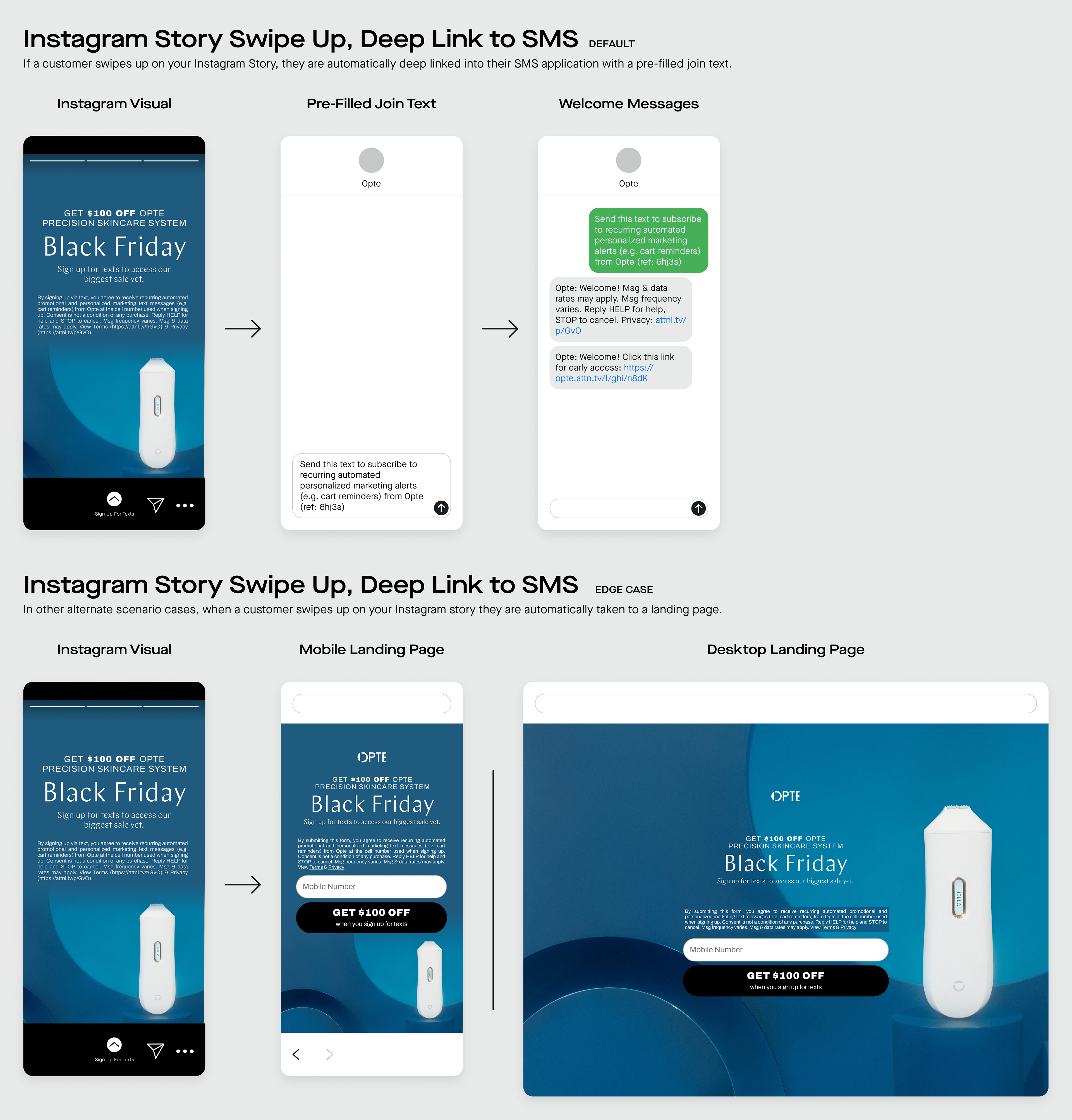
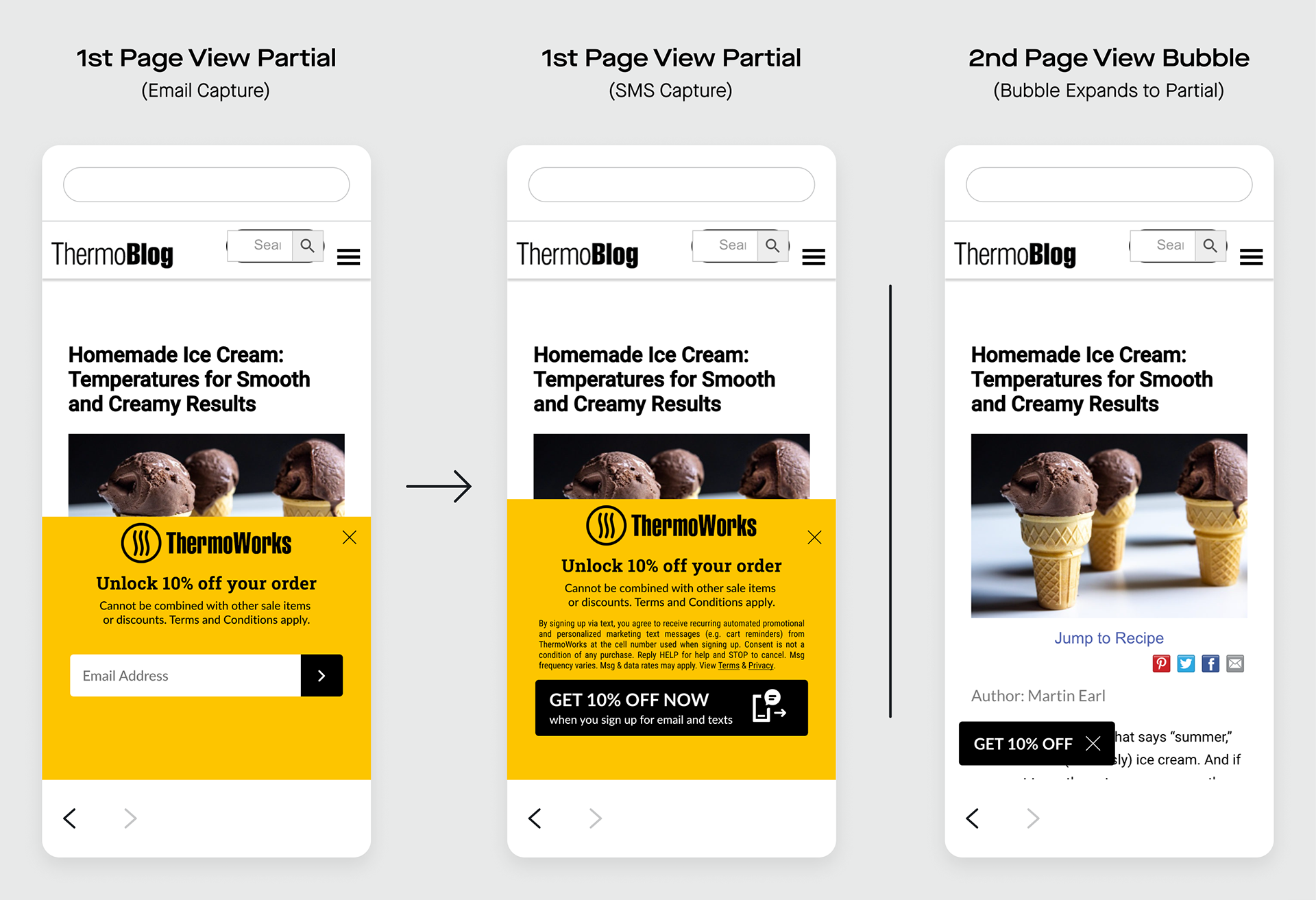
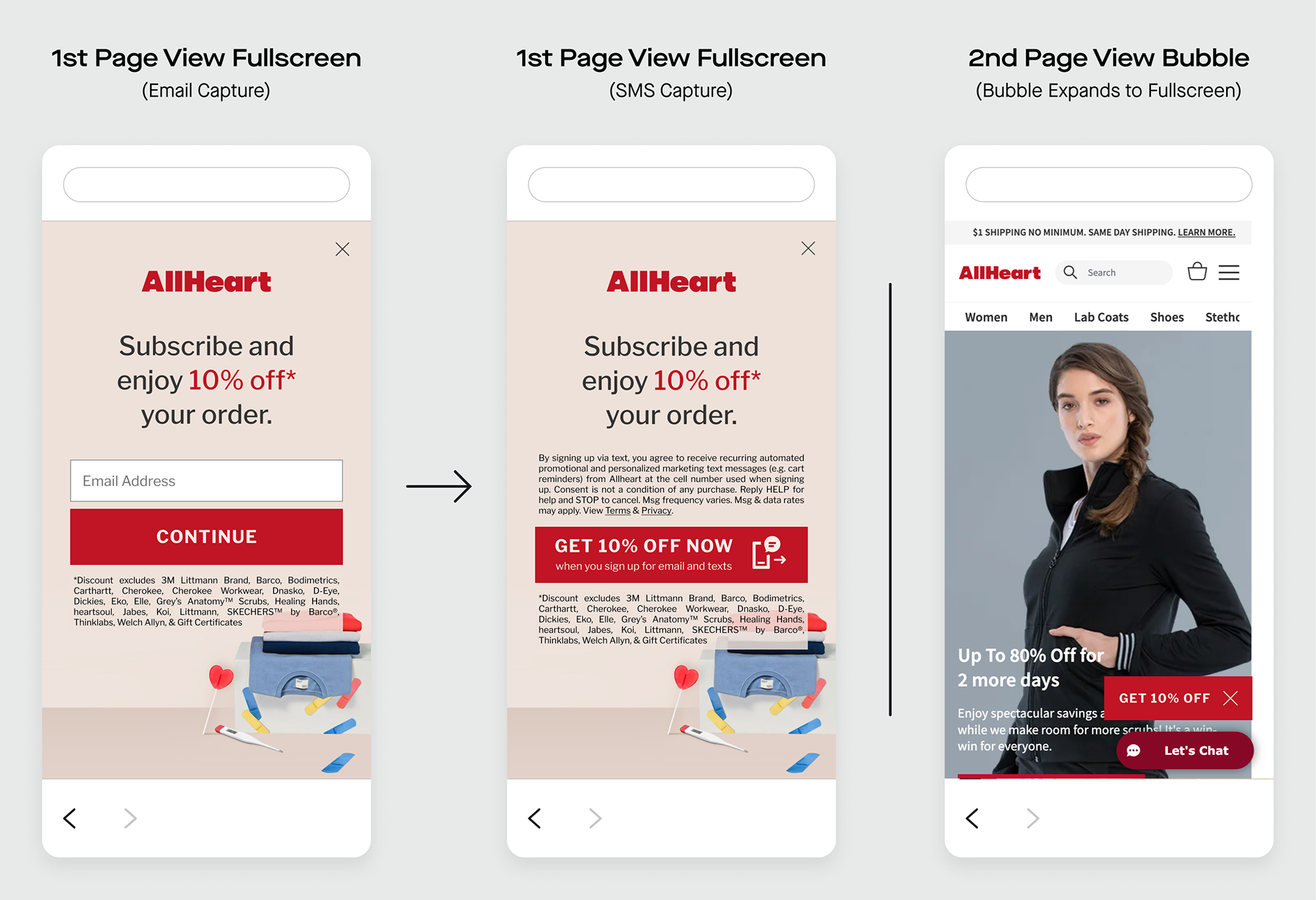
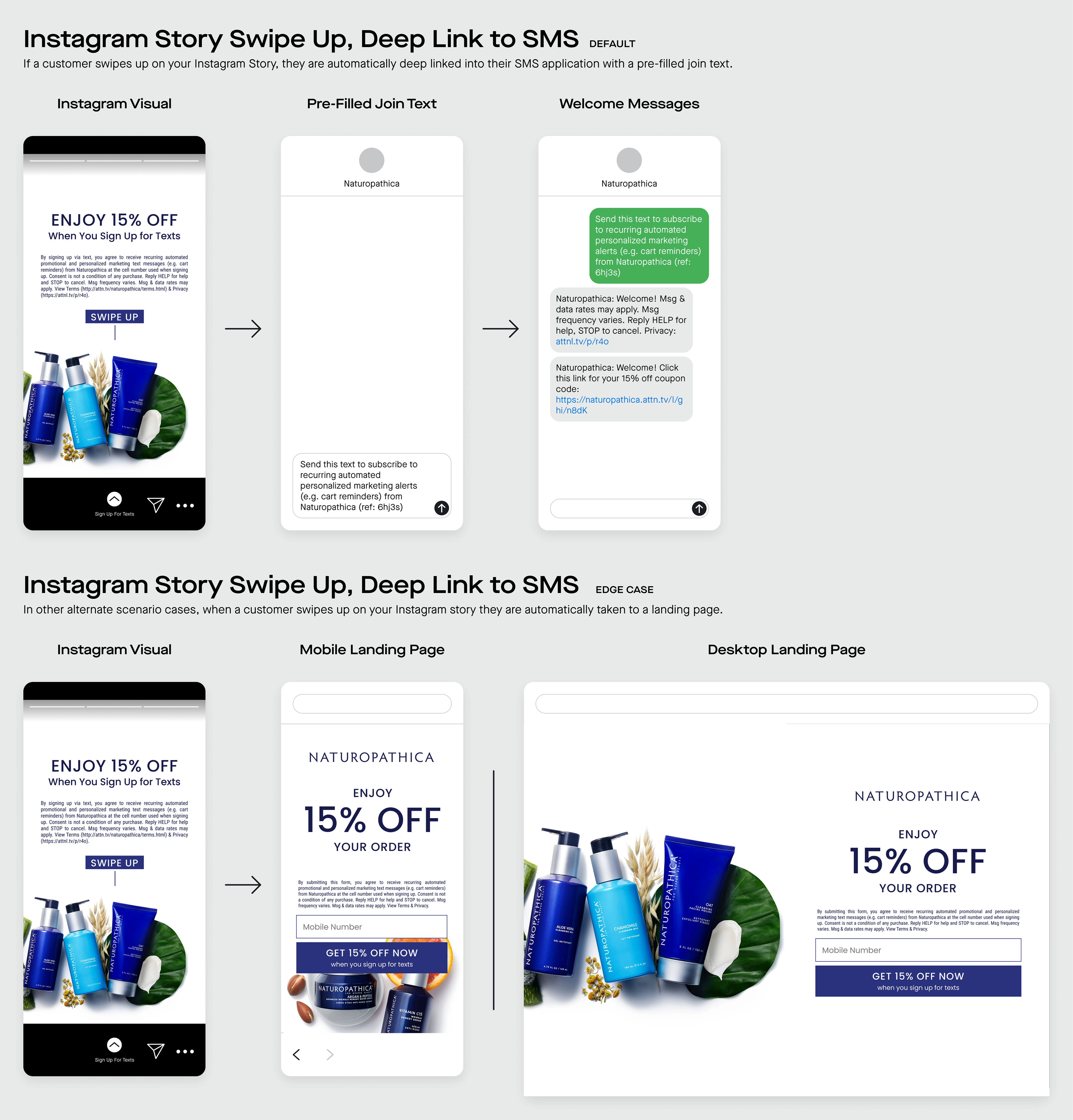
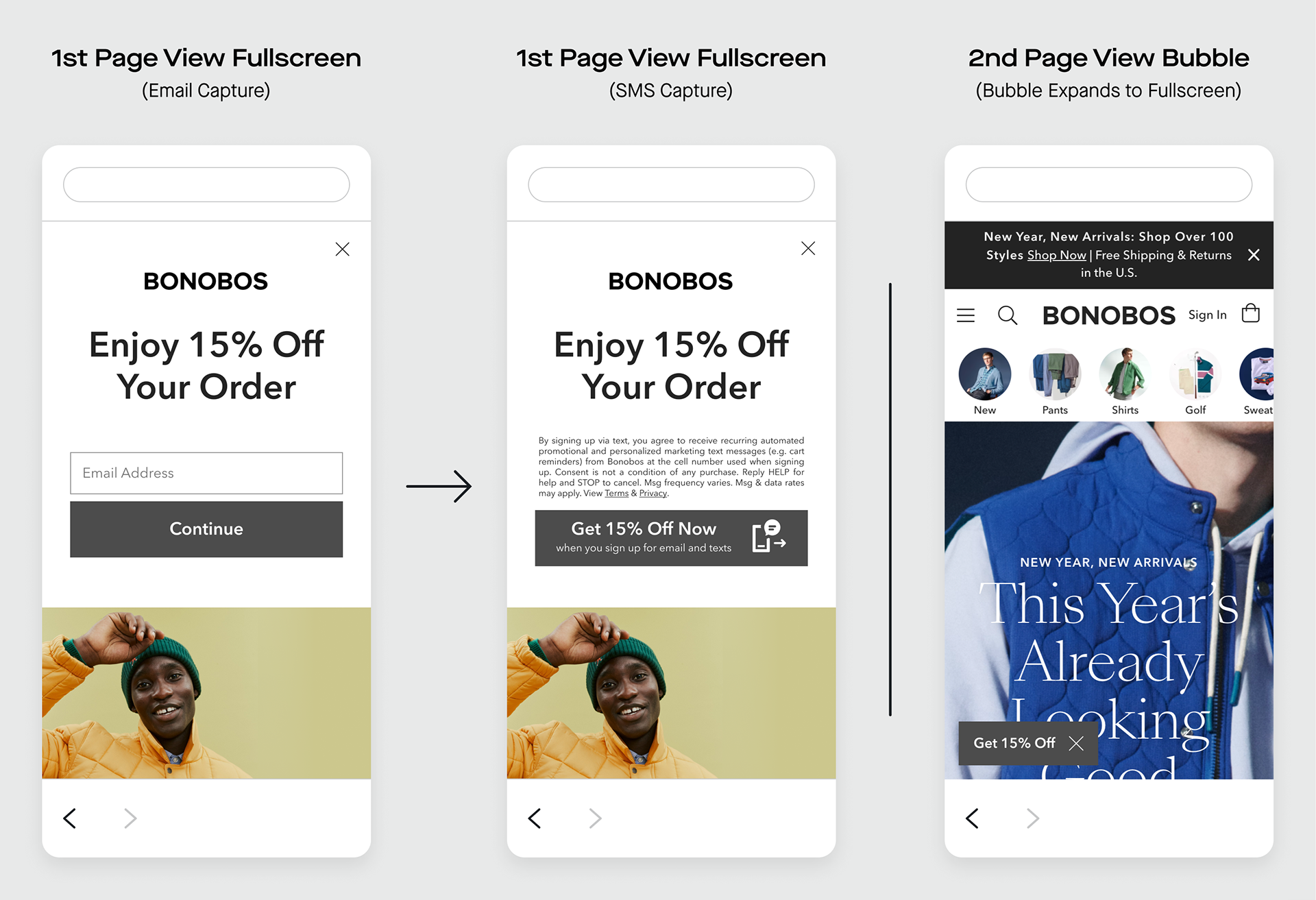
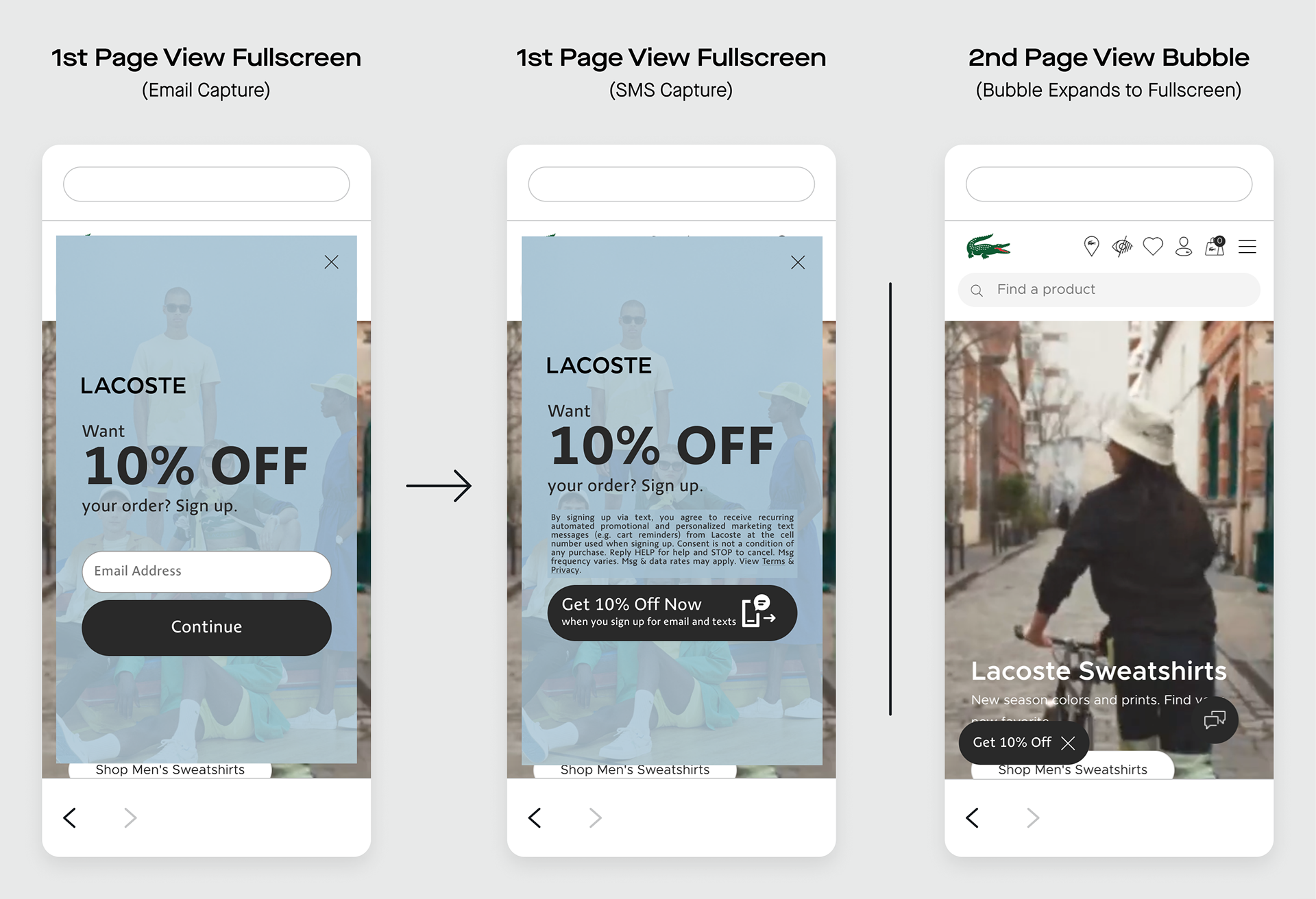
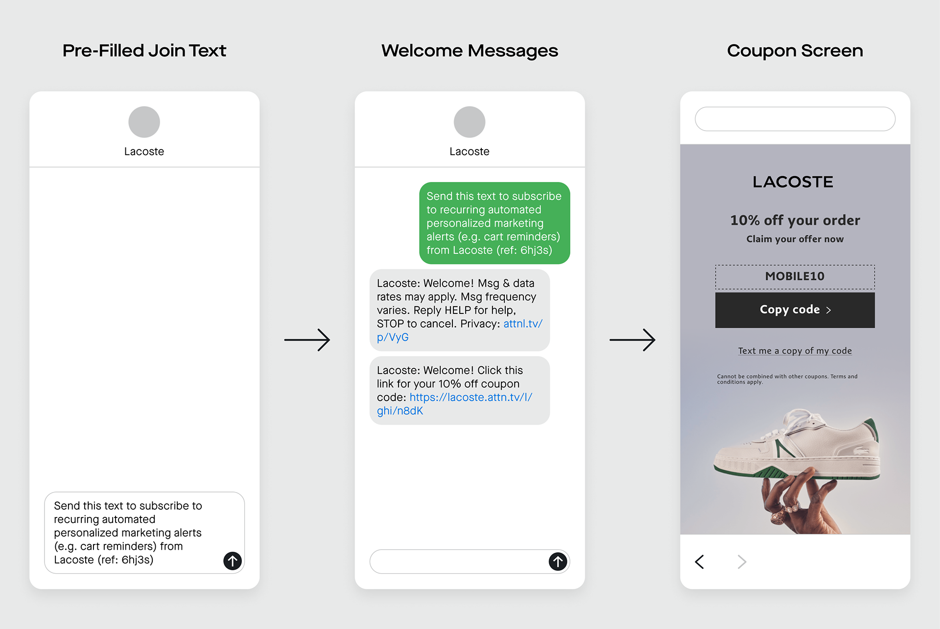
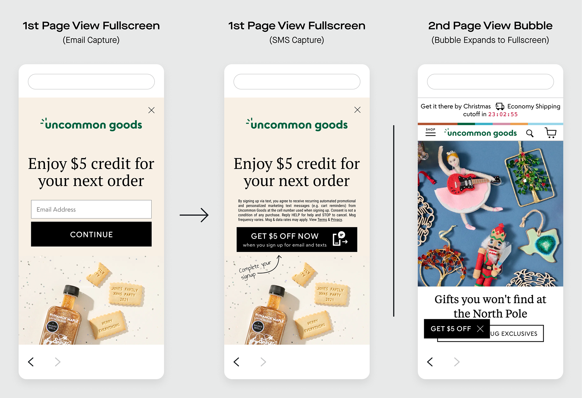
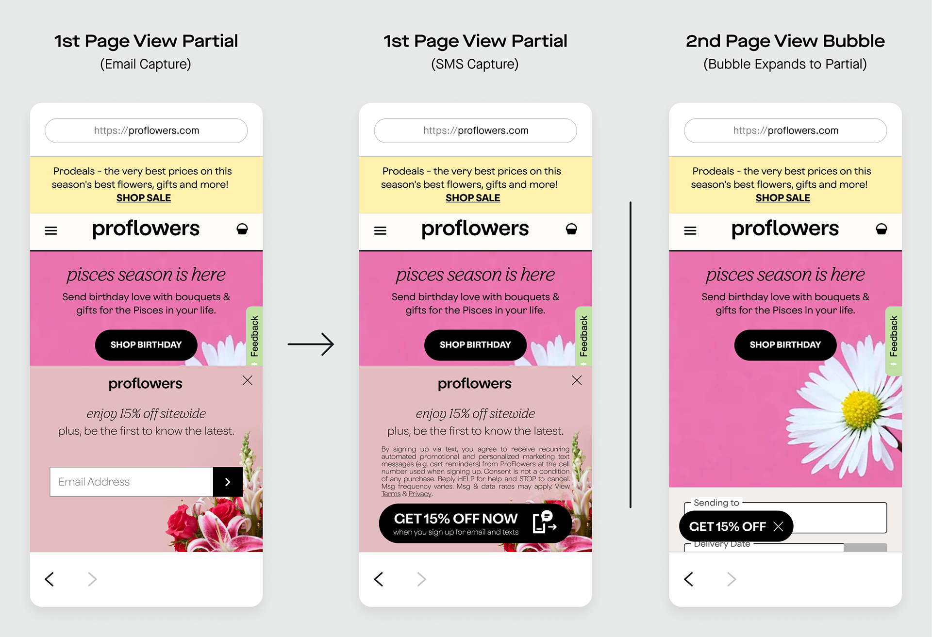
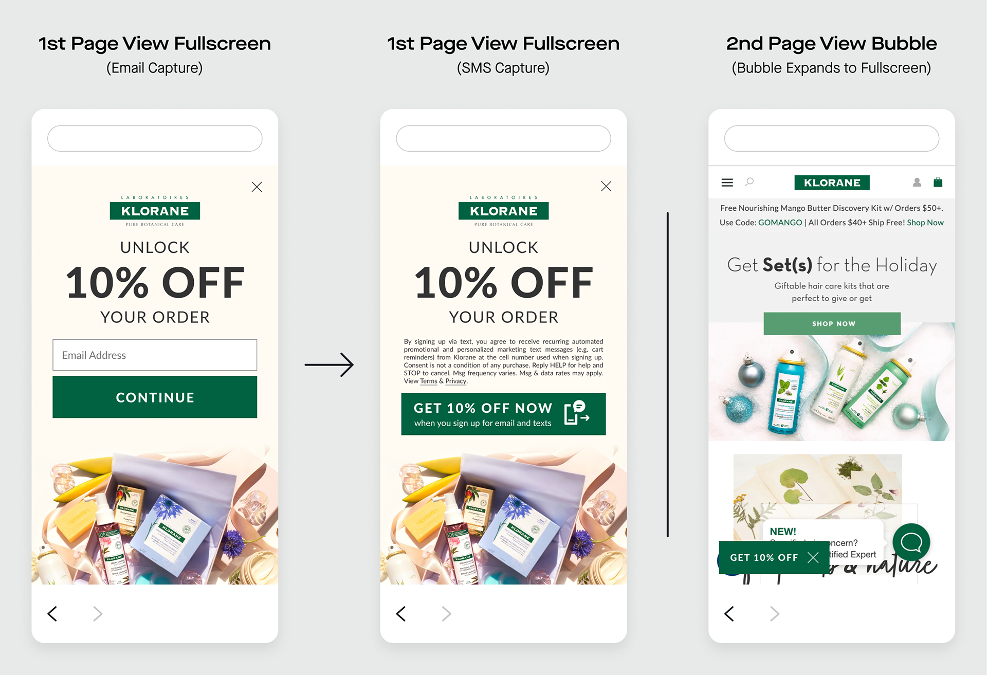
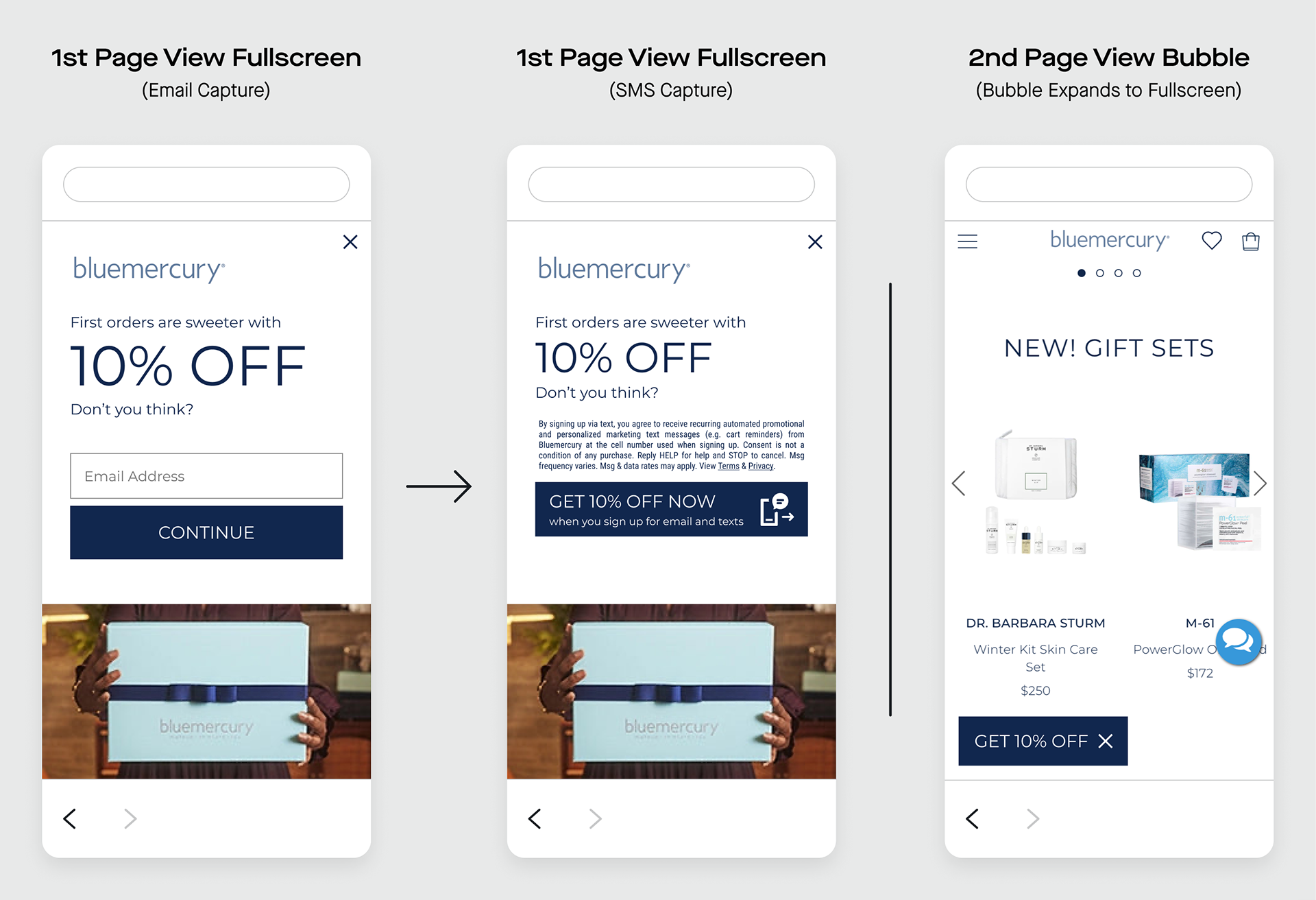
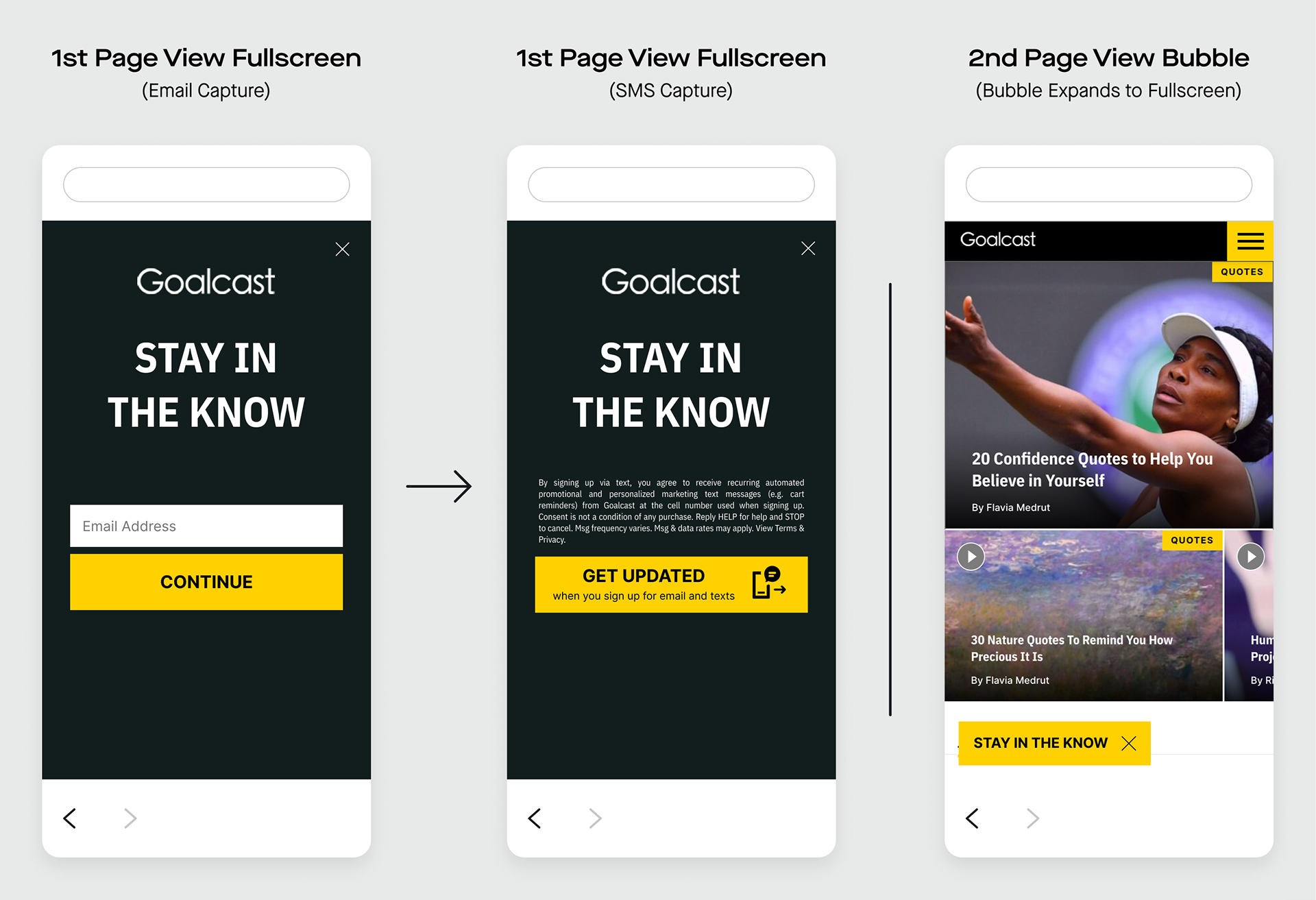
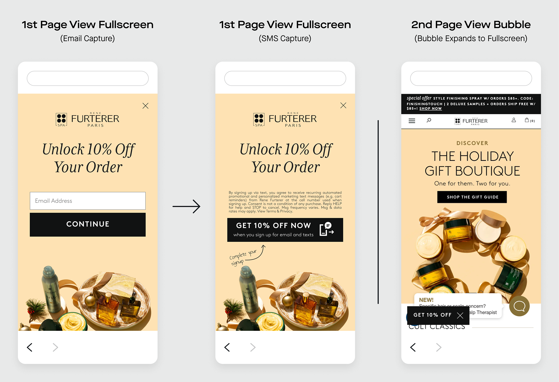
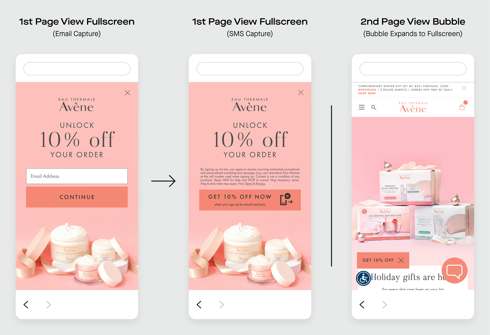
See the Texts We Love page for examples of sign-up units and the Texts We Love blog tag for examples of how our clients are leveraging Attentive.
With the Client Strategy team as my liaison, I provided first-class support to our clients. I worked with Product and Engineering to troubleshoot bugs and beta test product updates to ensure the Attentive Platform provides the best possible user experience for our clients.
Case Study: Swank
We work hard to retain clients, lest they churn. One client, Swank: A Posh Boutique, did churn, but gave Attentive a second chance. In May of 2022, a CSM described the situation:
They are a returning brand (brought back directly by BL) and their founder is very unhappy with the creatives they were using during their last trial.
“BL” refers to Attentive’s CEO, Brian Long. I didn’t design the client’s previous creatives (sign-up units), but it seemed like for this client, the design of their sign-up units was a dealbreaker. I knew I had a lot of responsibility on my shoulders. It was up to me to impress this client and show that Attentive was right for them.
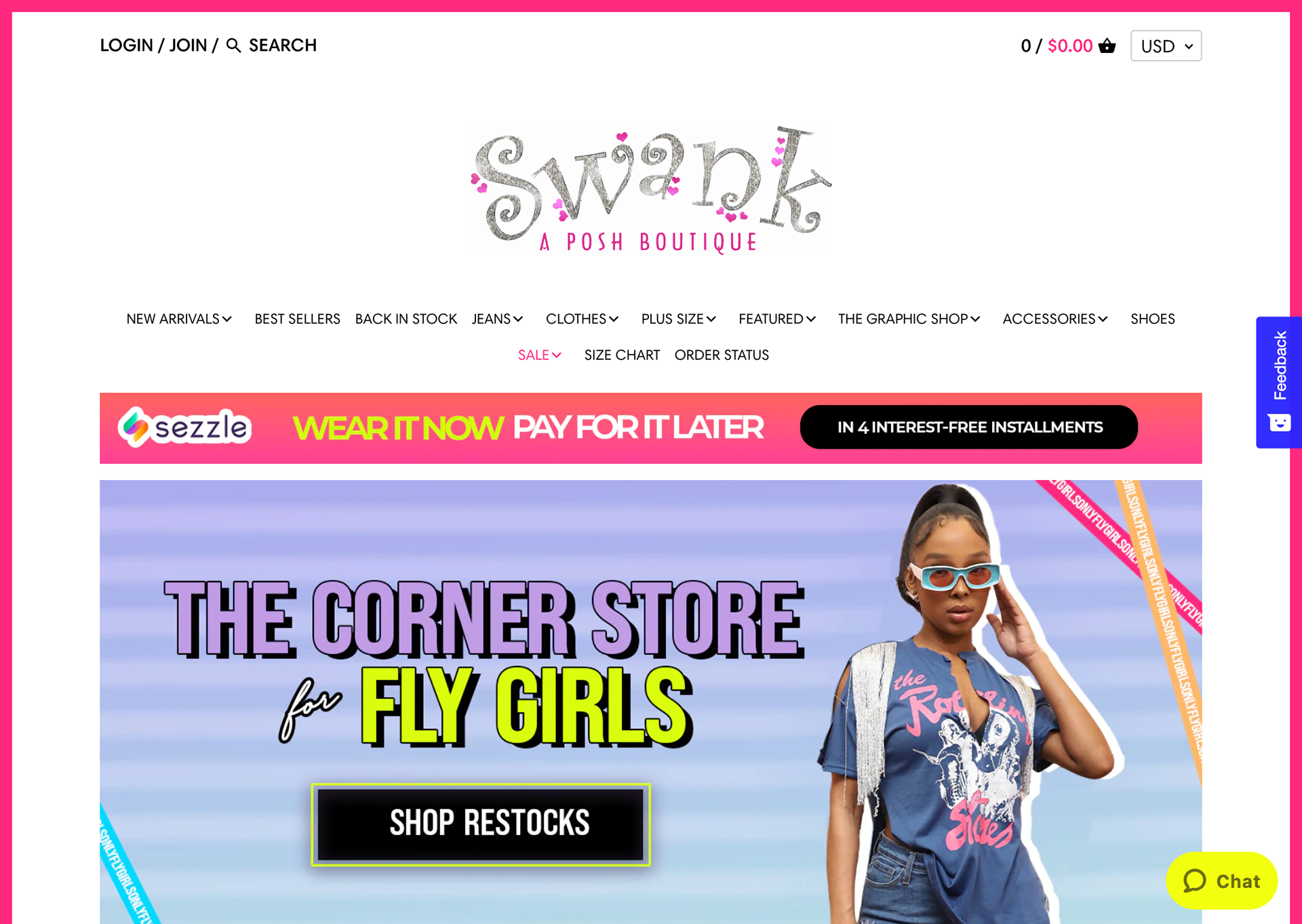
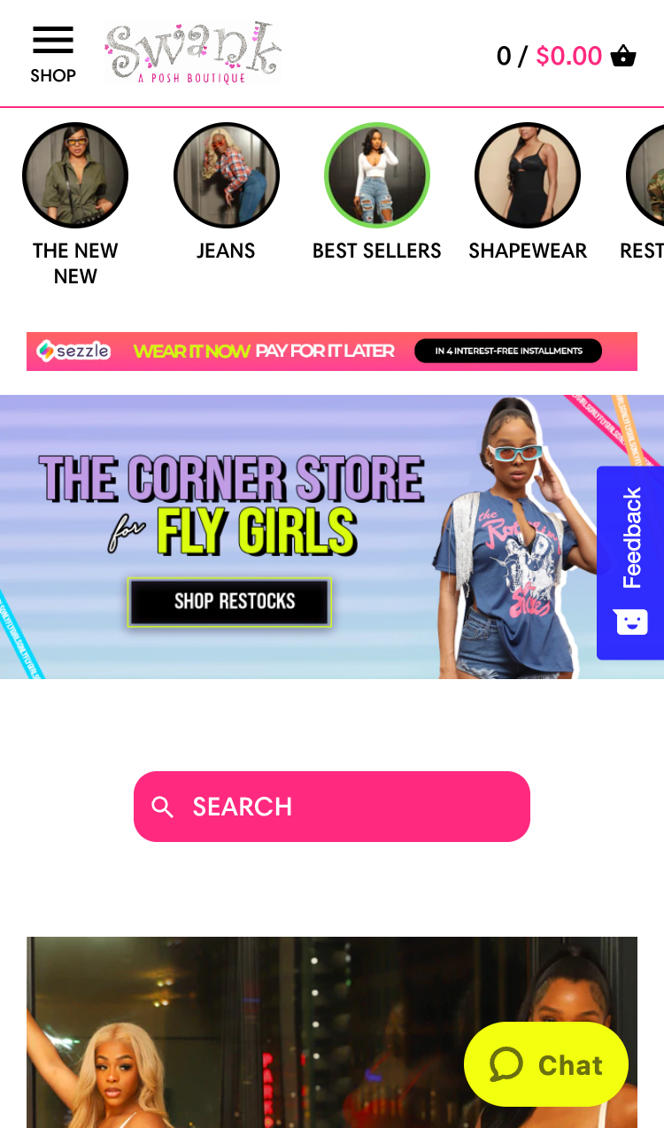
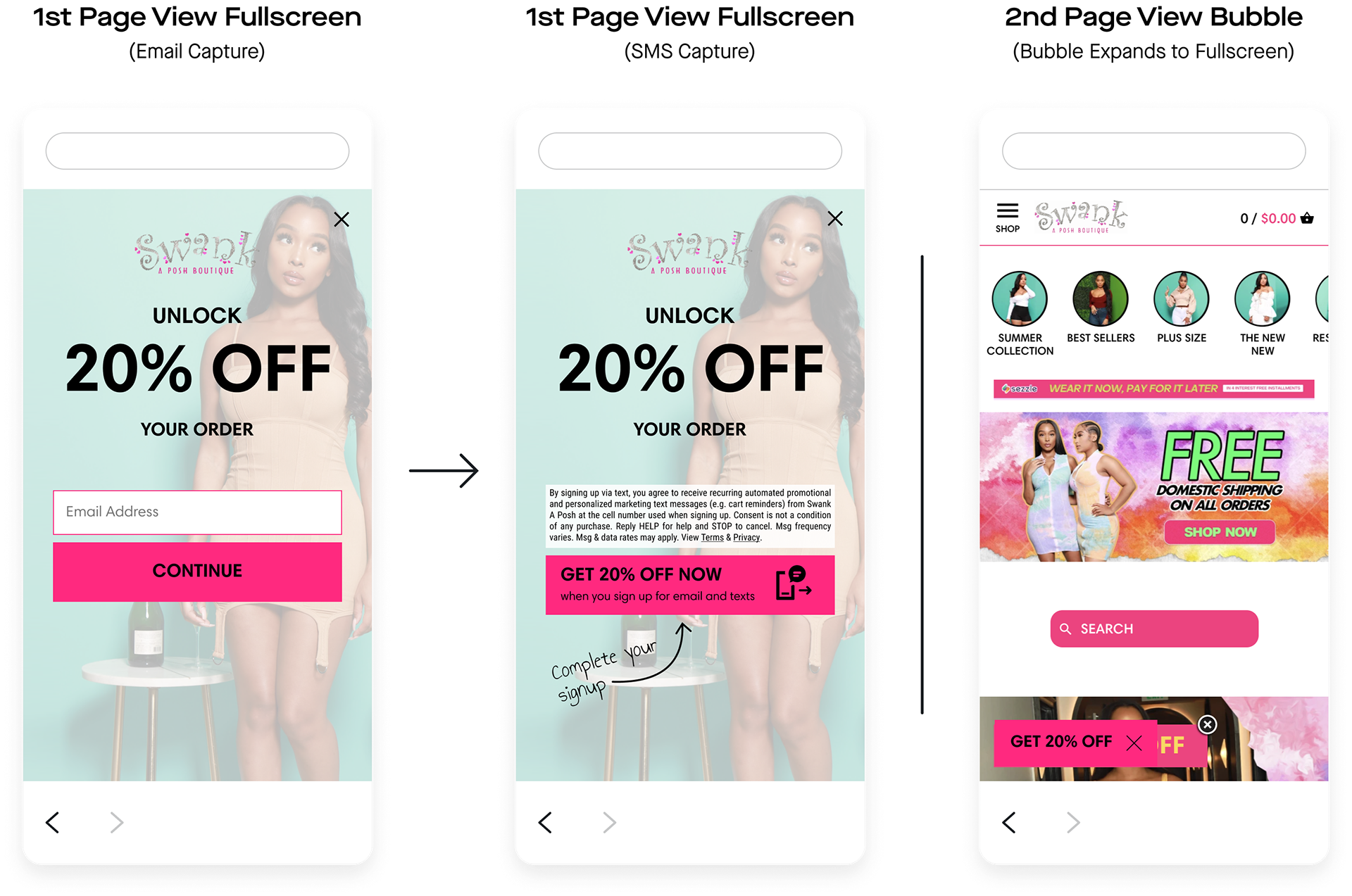
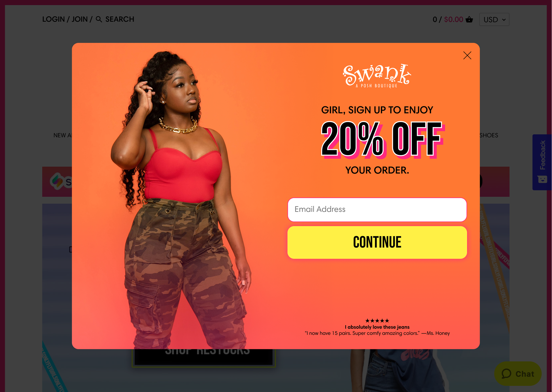
I successfully convinced Swank A Posh to return as an Attentive client by providing them choices that were highly tailored to their brand’s voice. Below are the previous mockups (top) and my new mockups (bottom).

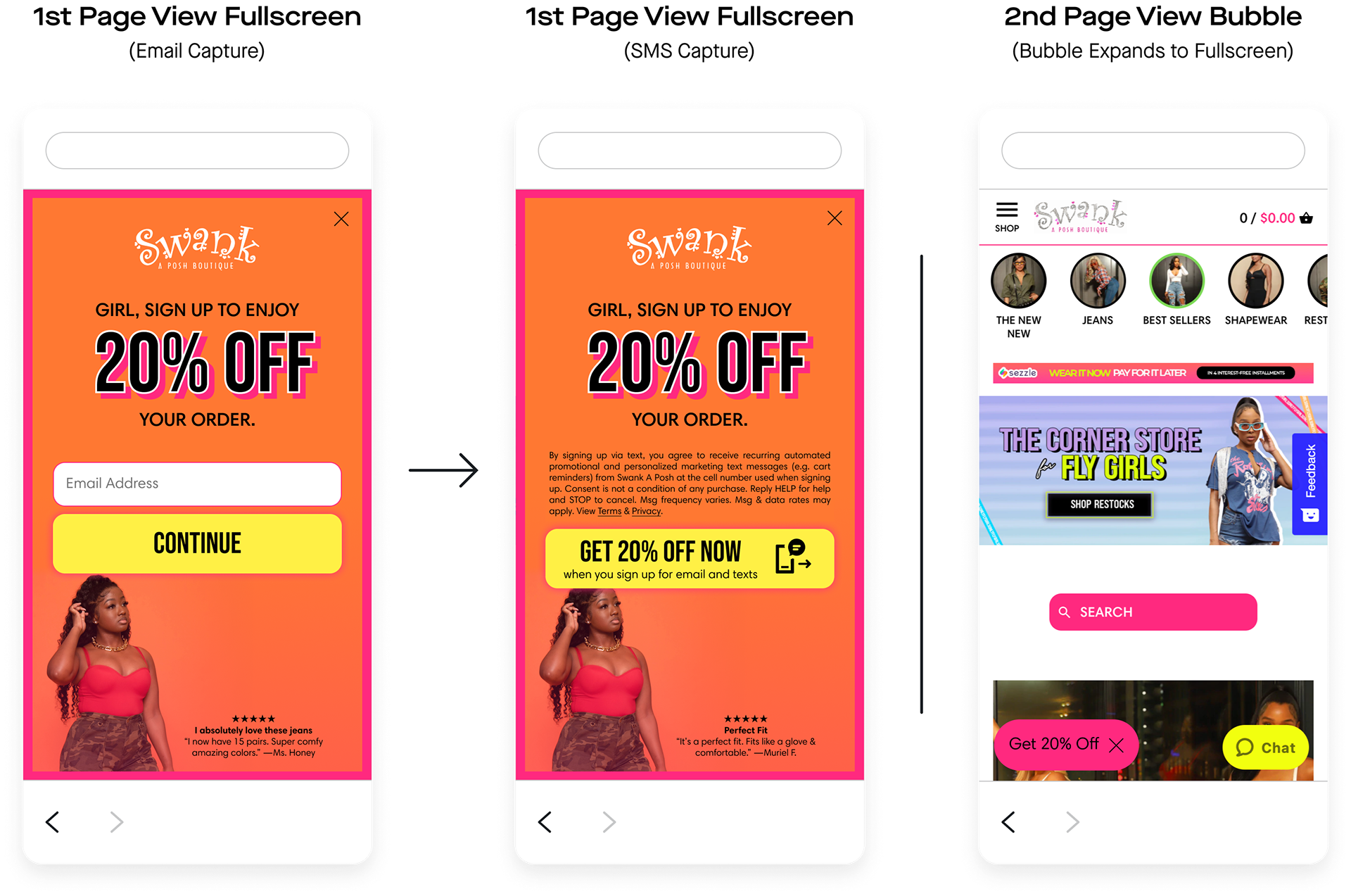

I went above and beyond to retain this client. For the initial set of mockups, I matched the client’s voice, font styling, and button styling. The CSM commented:
@Miles Lee these designs are AMAZING! Best I’ve seen in a long time and I think the brand is going to be very excited. Appreciate your help here 🙂
The client (via the CSM) then requested three rounds of edits.
@Miles Lee would you be able to share an updated mock using the following hex colors? #ff7832, #ff297f, #fff045. Also, the images used are a bit outdated. Would you be able to use the woman found in the asset attached? They love what you did, just want to update some colors/image.
Done.
@Miles Lee these look great! Can we please do one version of each (the two different message copys) and update to the attached logo + include a product review at the bottom of the unit?
Done.
@Miles Lee - the client loved the copy you created with “Girl sign up to enjoy” language. Their only request is to update the reviews at the bottom to all white text. Would this be compliant? From there, all set to add the units to their UI!
I let the CSM know that changing the product review text to white would not be compliant with Attentive’s best practices (AA or AAA color contrast), but if the client insisted, they would need to reach out to our Compliance team (they didn’t).
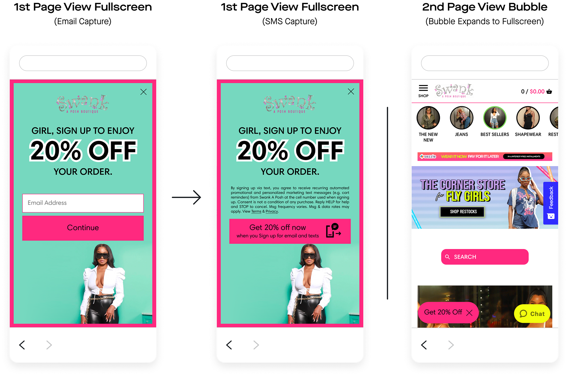
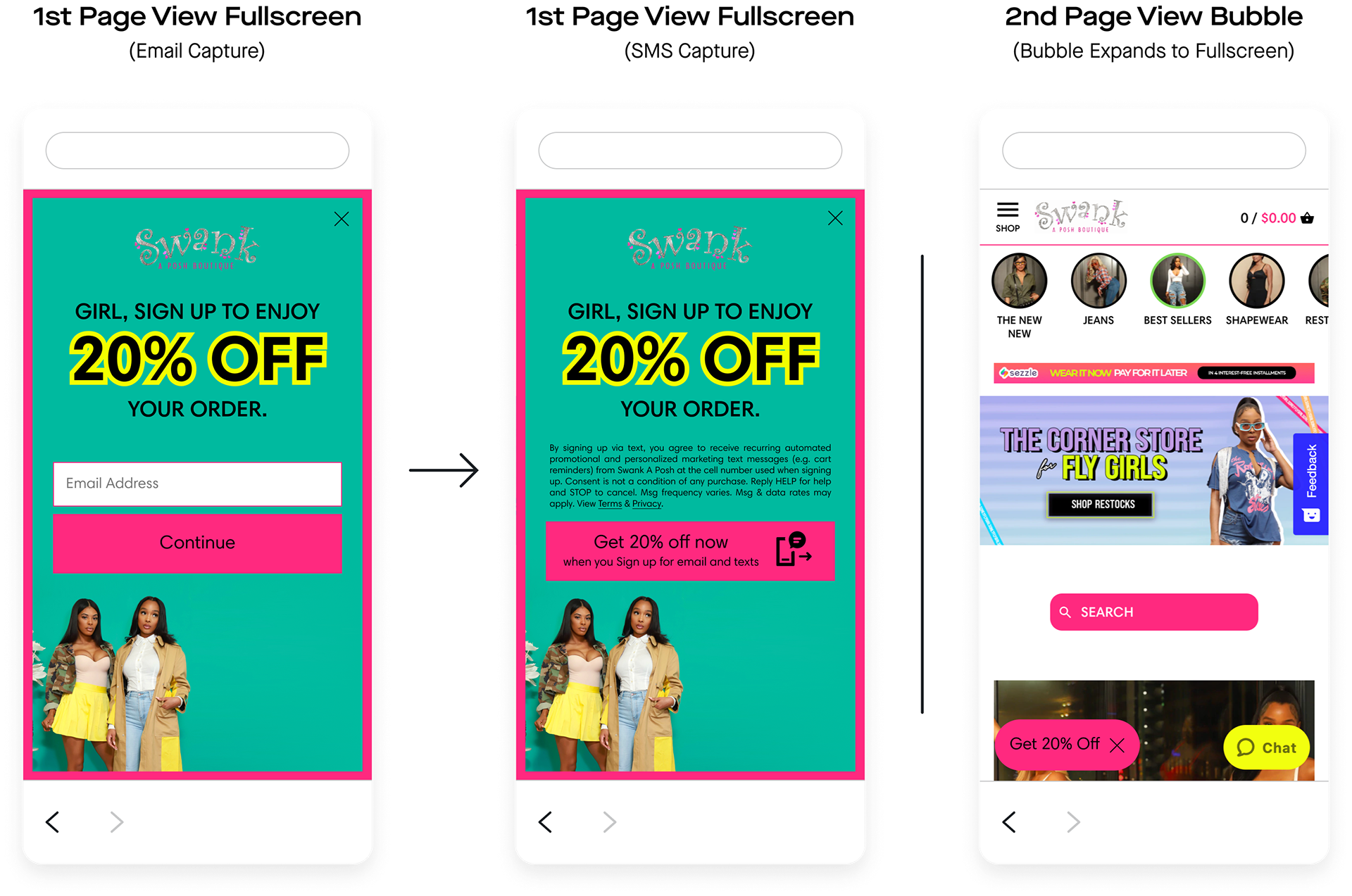
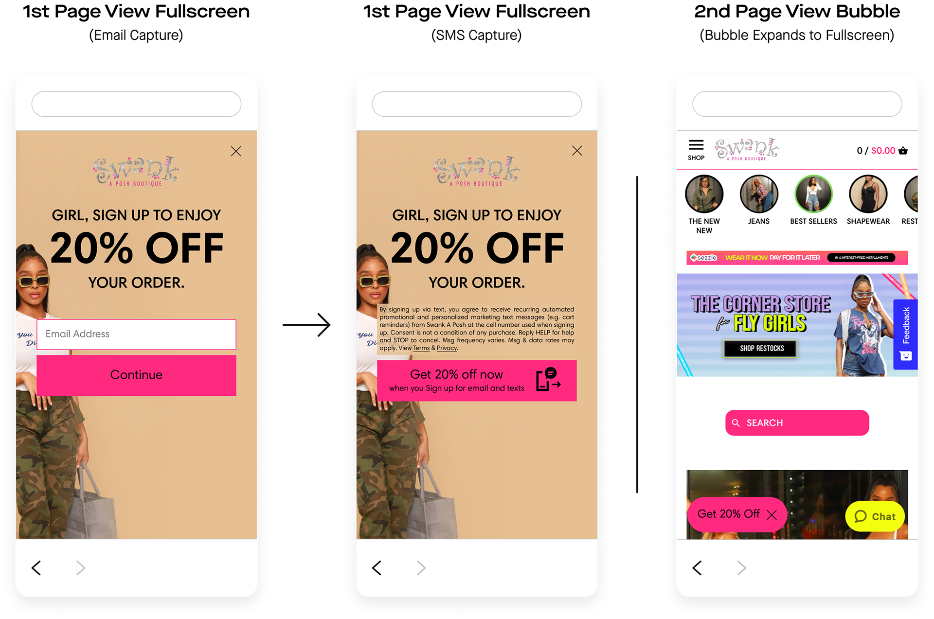
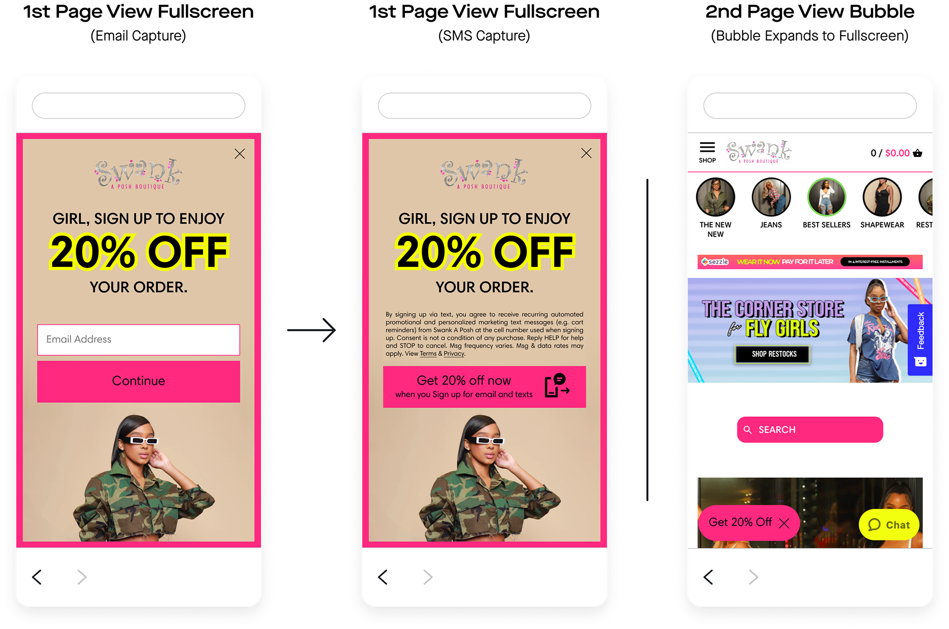
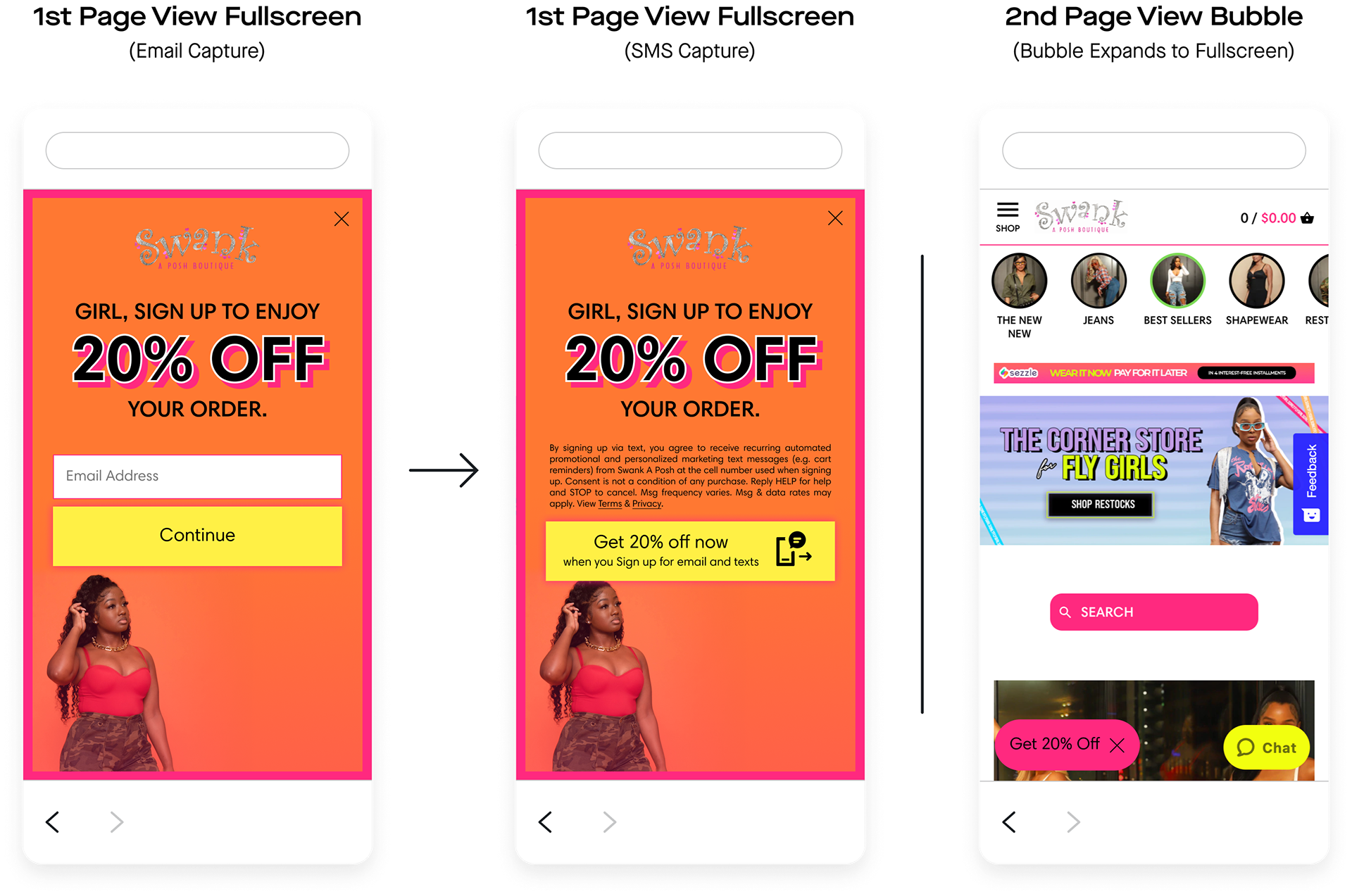
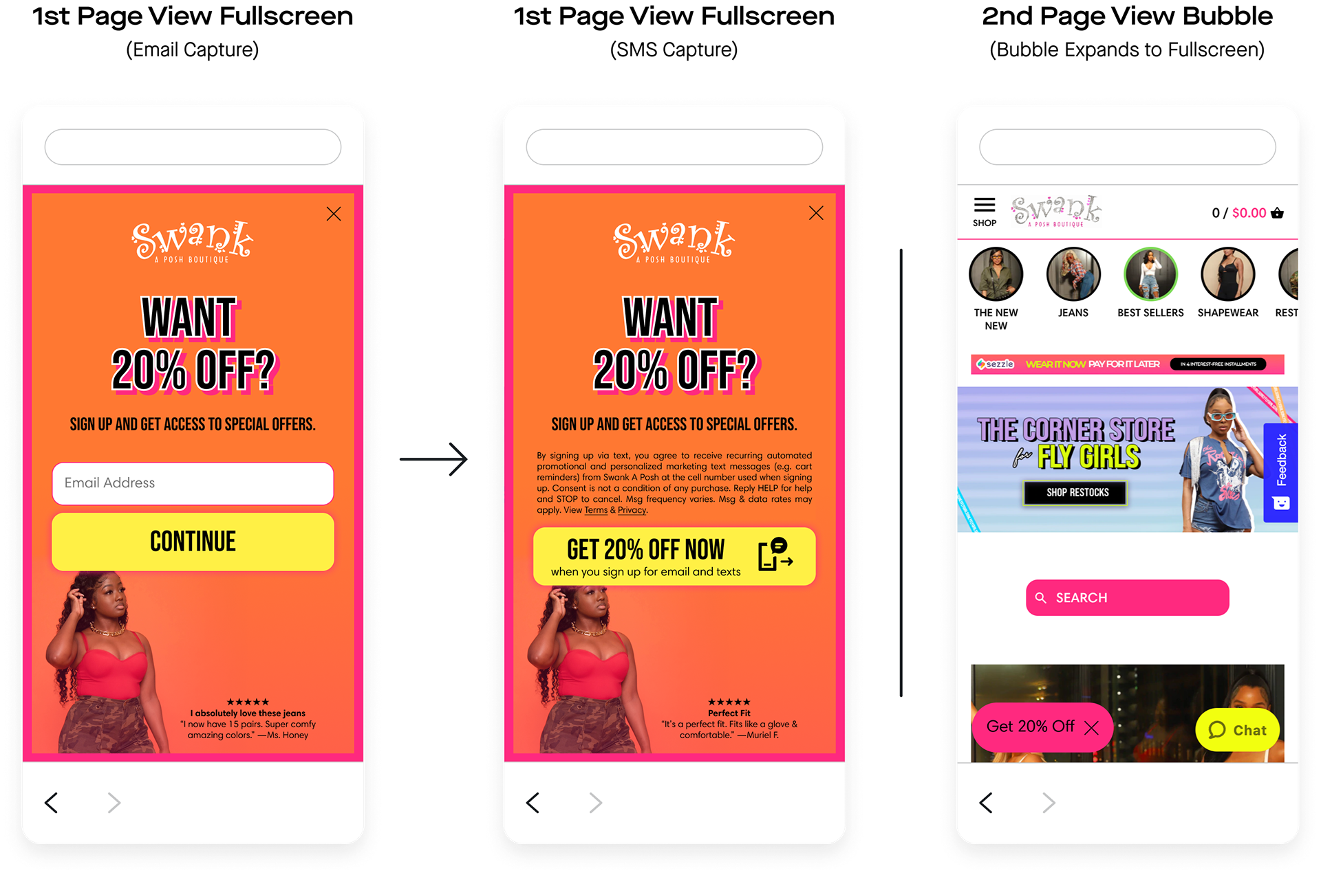


Following the mocks as closely as I could, I built out the units. Attentive’s Builder is somewhat limited in its default capabilities, but we will further tailor units with custom CSS depending on the client’s tier level. Much of the mockup, including the product reviews, the drop shadows and outlines on the headers, and the glow around the button, would require custom CSS during the build. Still, I was happy to oblige, especially if it kept the client from churning yet again.
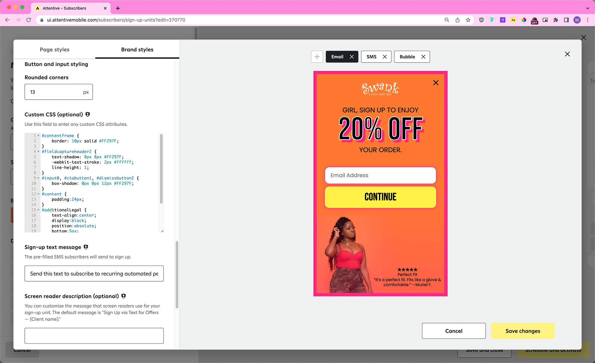
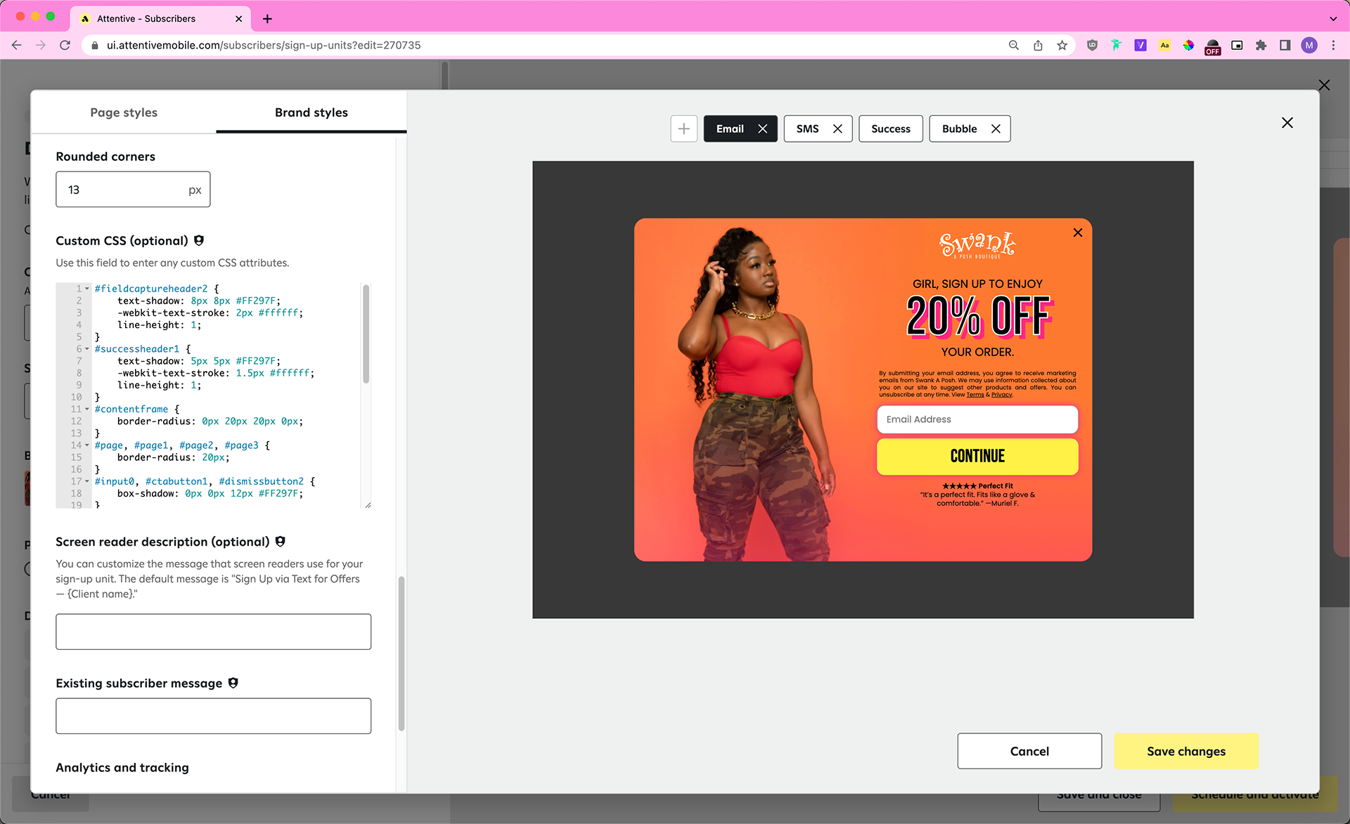
Swank A Posh launched the units I built. Overall, the client gained 17,470 new SMS subscribers and 42,137 new email subscribers directly through these units. Comparatively, the previous units netted the client 10,399 new SMS subscribers and 22,561 new email subscribers, and the client was “very unhappy with” how they looked.
Five months later, I’m happy to say that Swank a Posh is still a client of Attentive (as of October 2022) and is currently utilizing our new spin to win sign-up units (not pictured).

Case Study: Crocs International
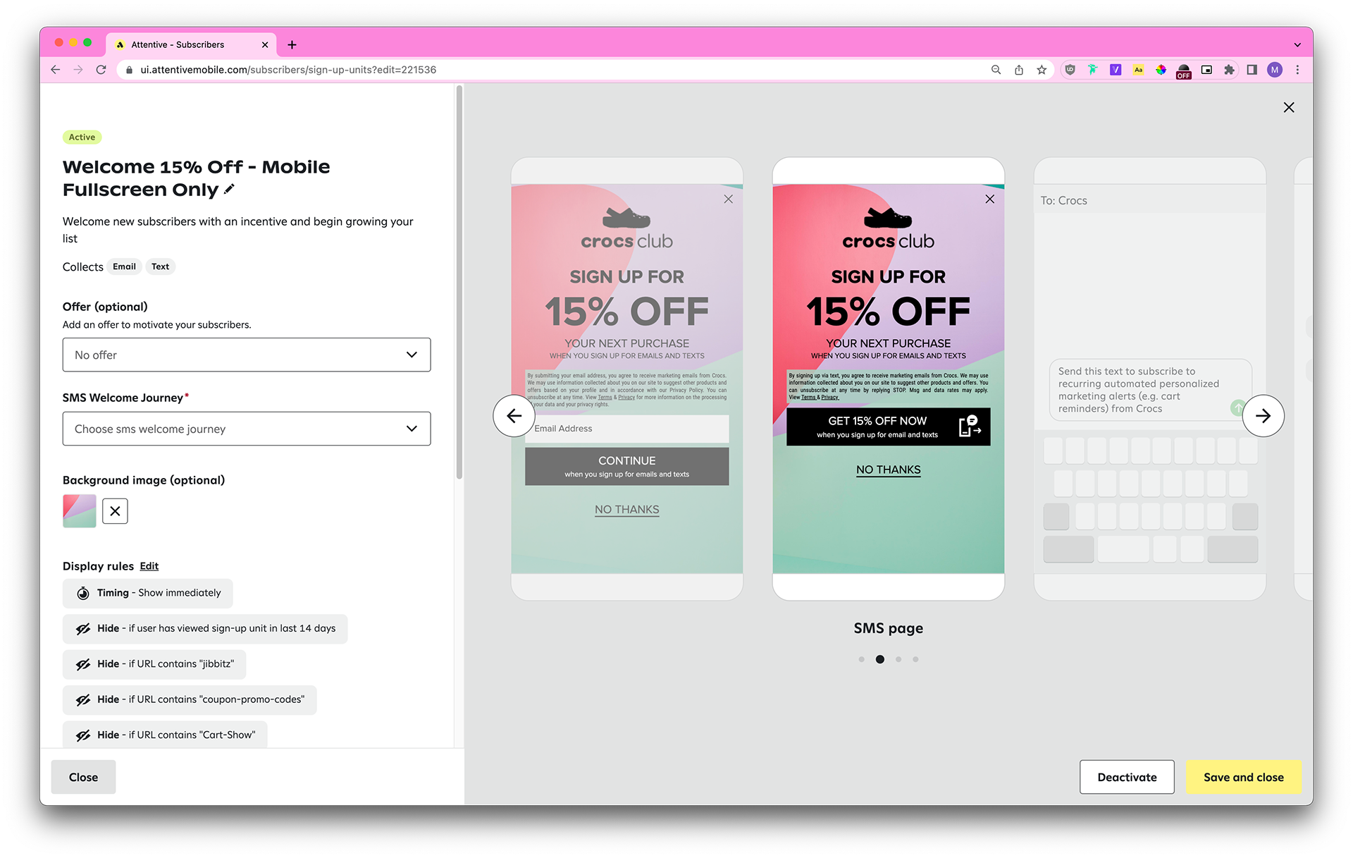
In October 2022, Crocs came to us with a common request: to copy the sign-up units in their US account to their new Netherlands (NL) and France (FR) accounts. Currently, our clients need to create net new accounts if they want to market to customers in countries outside of the US. Strategic Design’s International pod often has to manually build net new 1:1 replicas of sign-up units in clients’ US accounts for their other accounts (UK, AU, FR, CA, etc).
Each country has different laws pertaining to SMS marketing (ie: the legal text needs to contain certain disclaimers, the header copy needs to contain “when you sign up for texts,” the dismiss button styling needs to be the same as the CTA button styling, and so on), so we also take those into account.
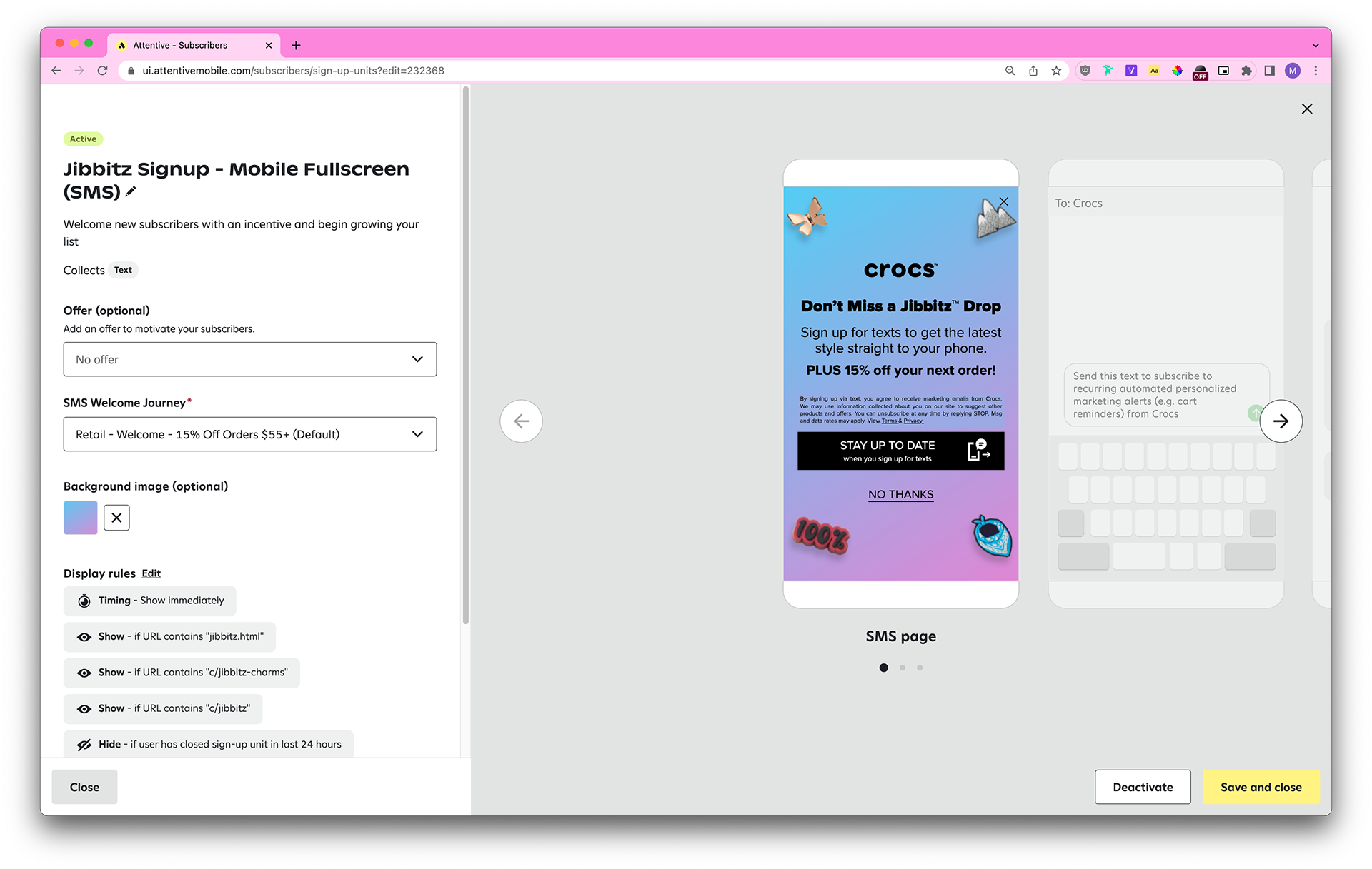
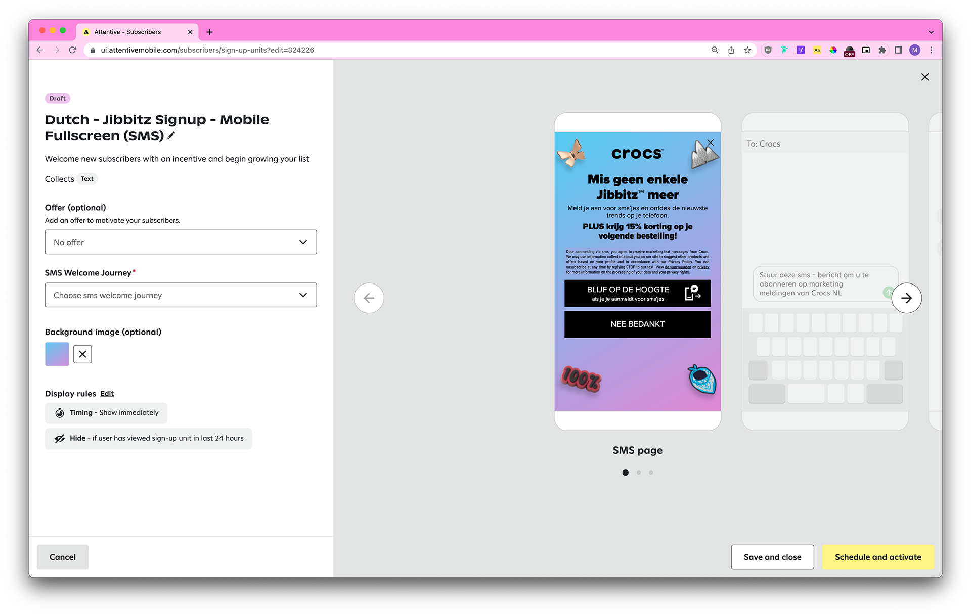
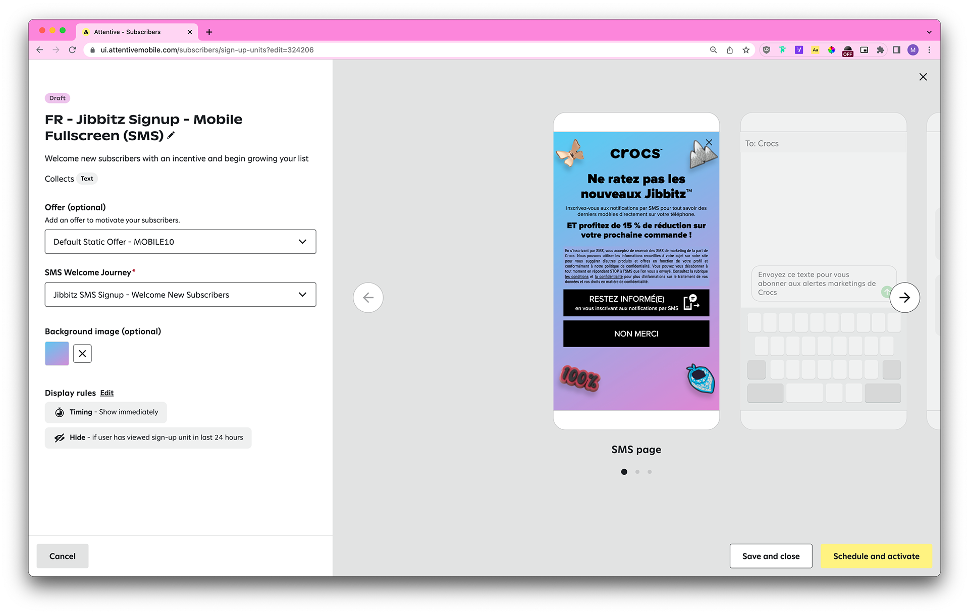
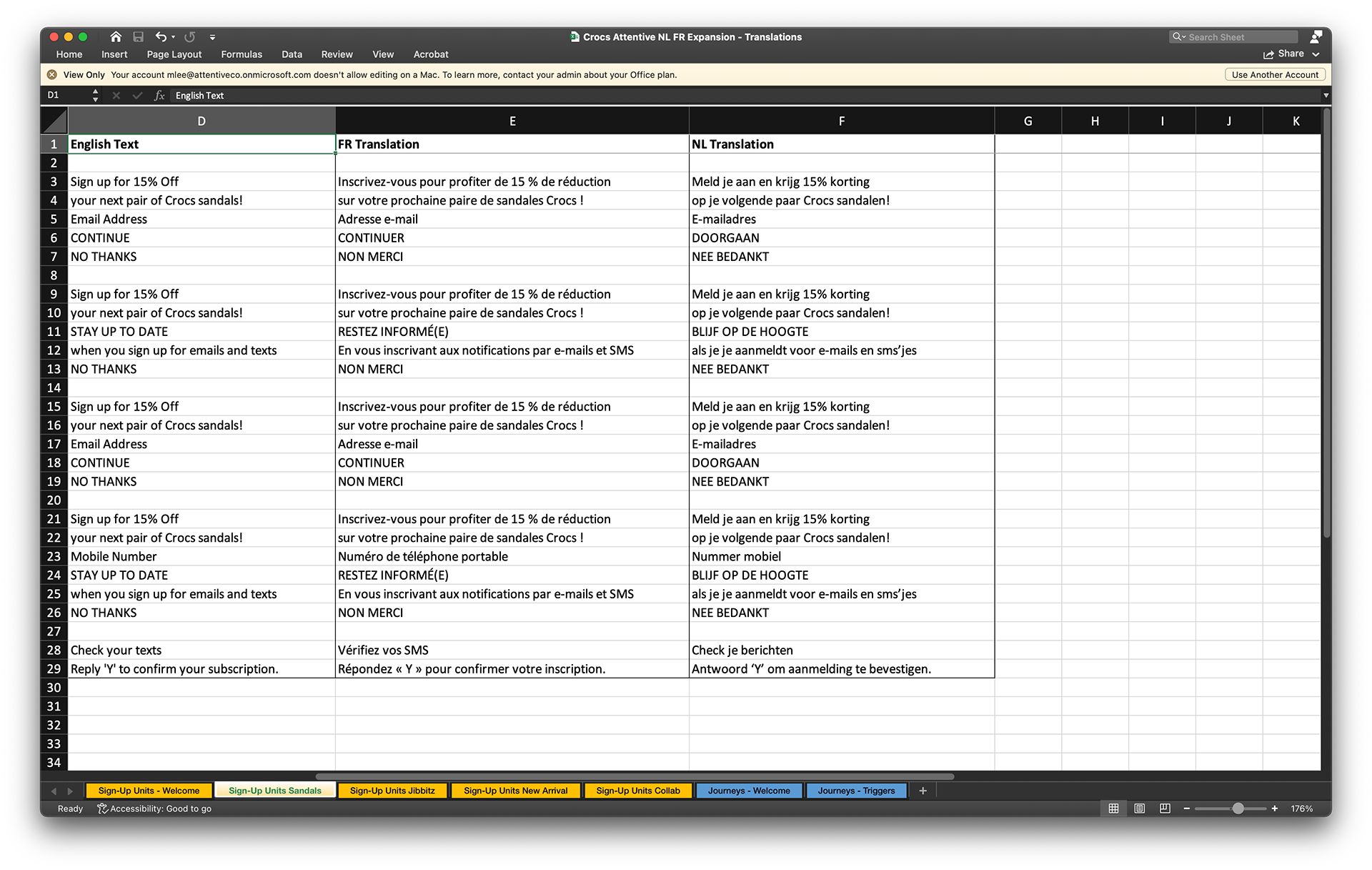
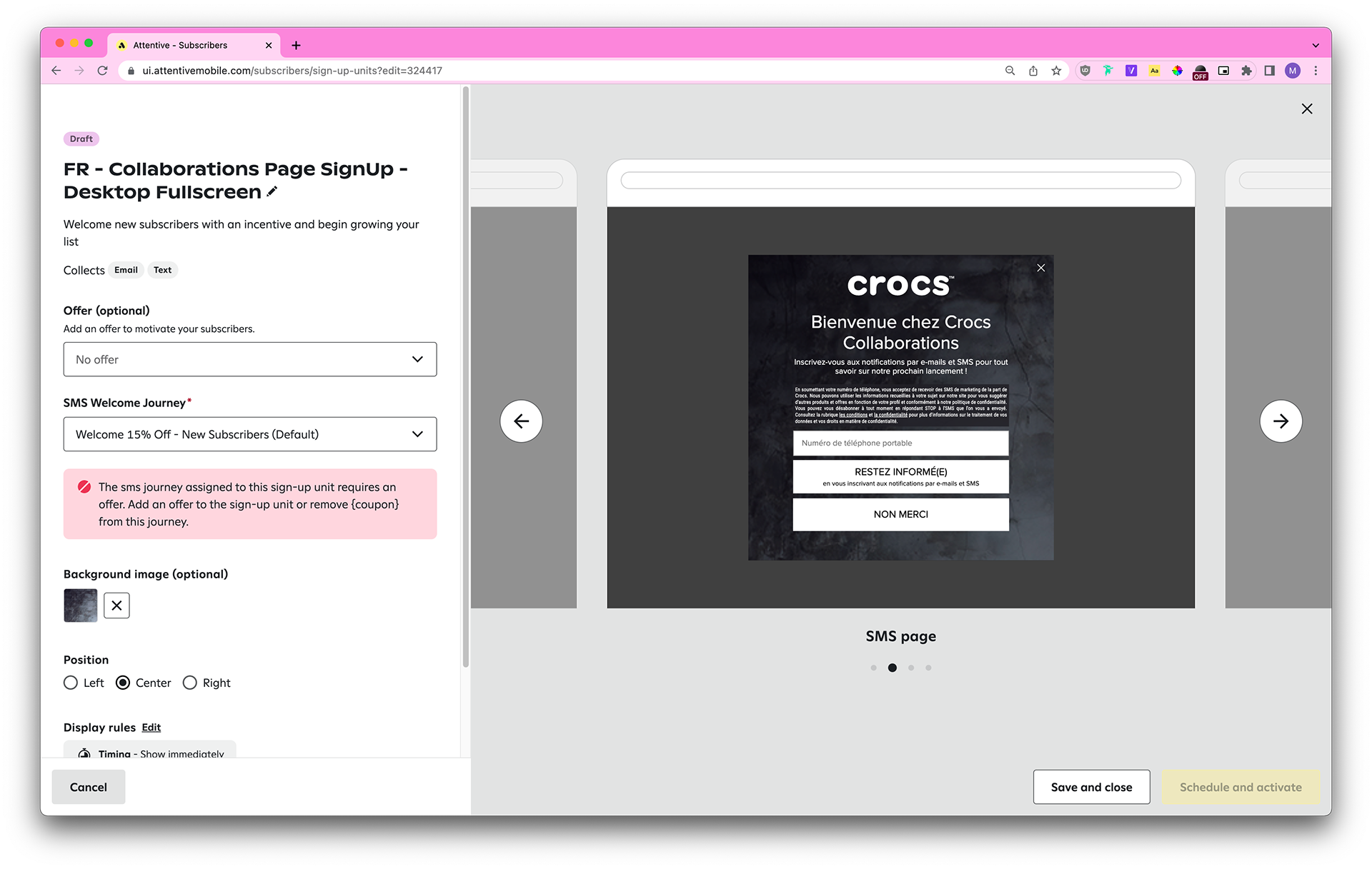
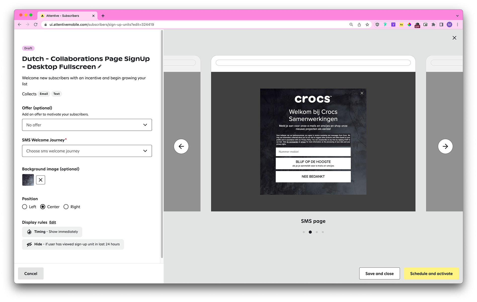
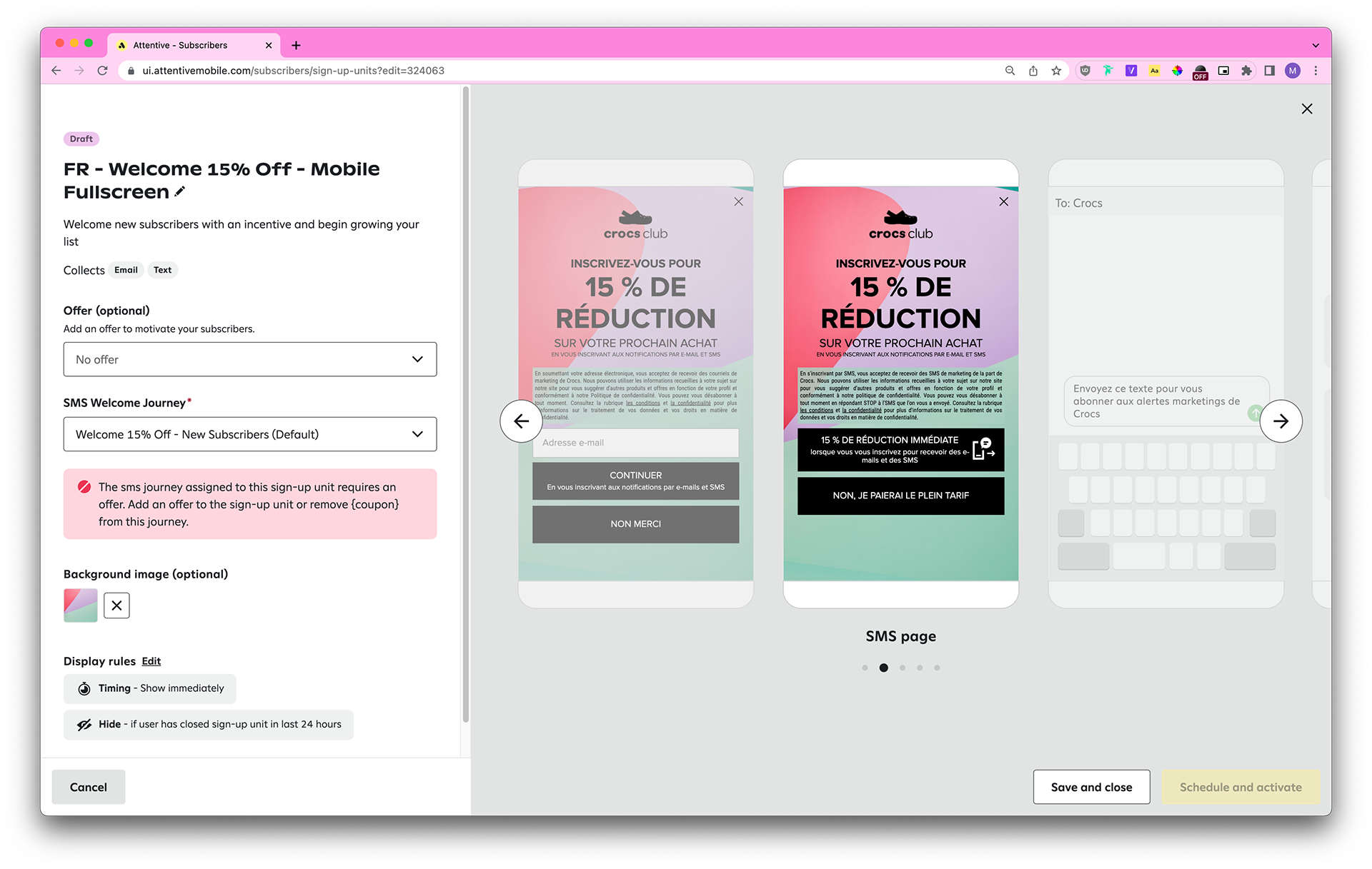
What made this request slightly uncommon is that they requested five sets of sign-up units (one mobile fullscreen and one desktop fullscreen per set) in Dutch and French. The client provided translations, but what you need to know is that short phrases like “GET 15% OFF” become much longer in French (“PROFITEZ DE 15 % DE RÉDUCTION”) and Dutch (“KRIJG 15% KORTING”).
English: Sign up for 15% Off your next pair of Crocs sandals!
French: Inscrivez-vous pour profiter de 15 % de réduction sur votre prochaine paire de sandales Crocs !
Dutch: Meld je aan en krijg 15% korting op je volgende paar Crocs sandalen!
Needless to say, building these units required me to adjust the text size to fit the longer copy.
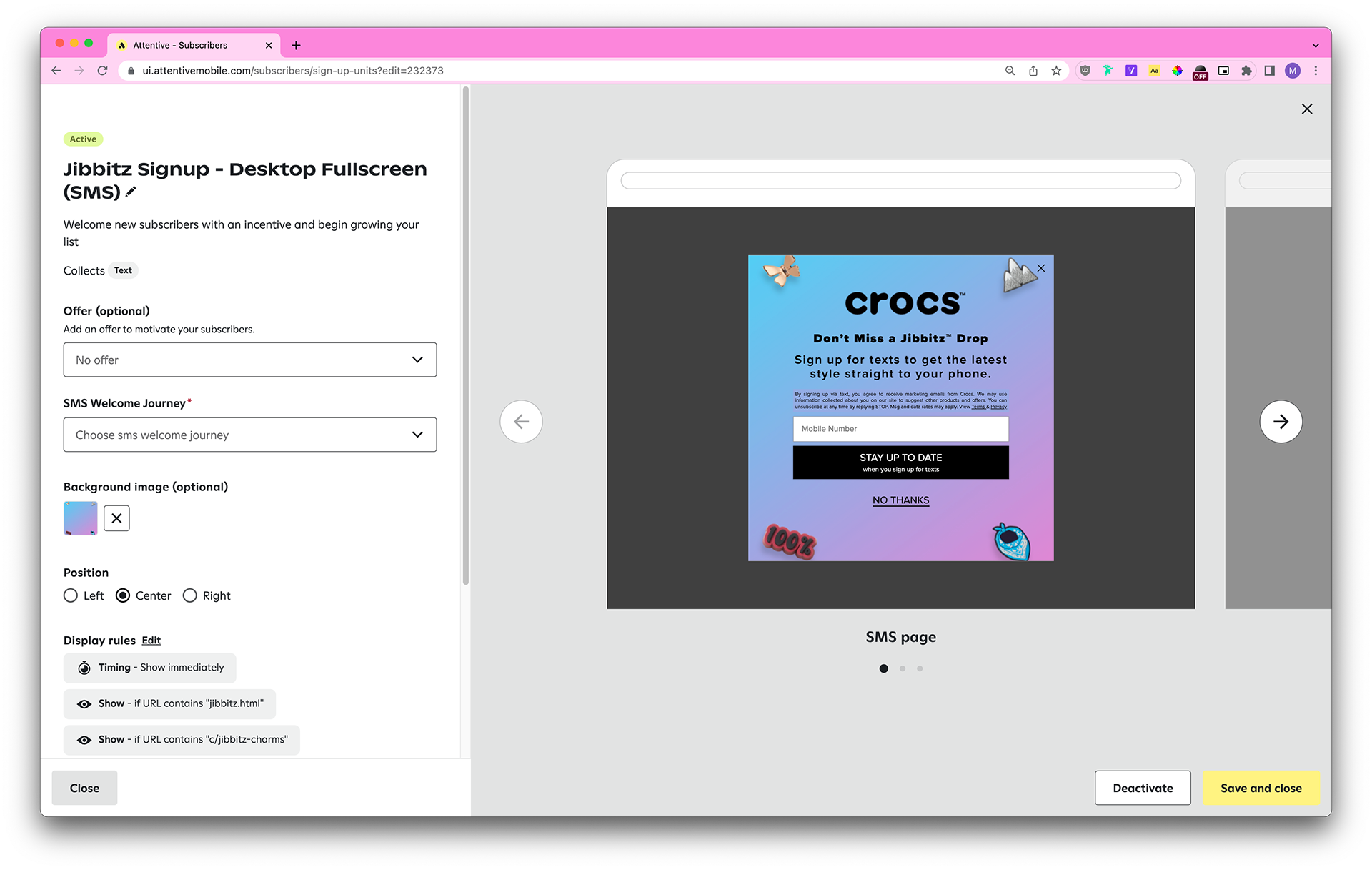
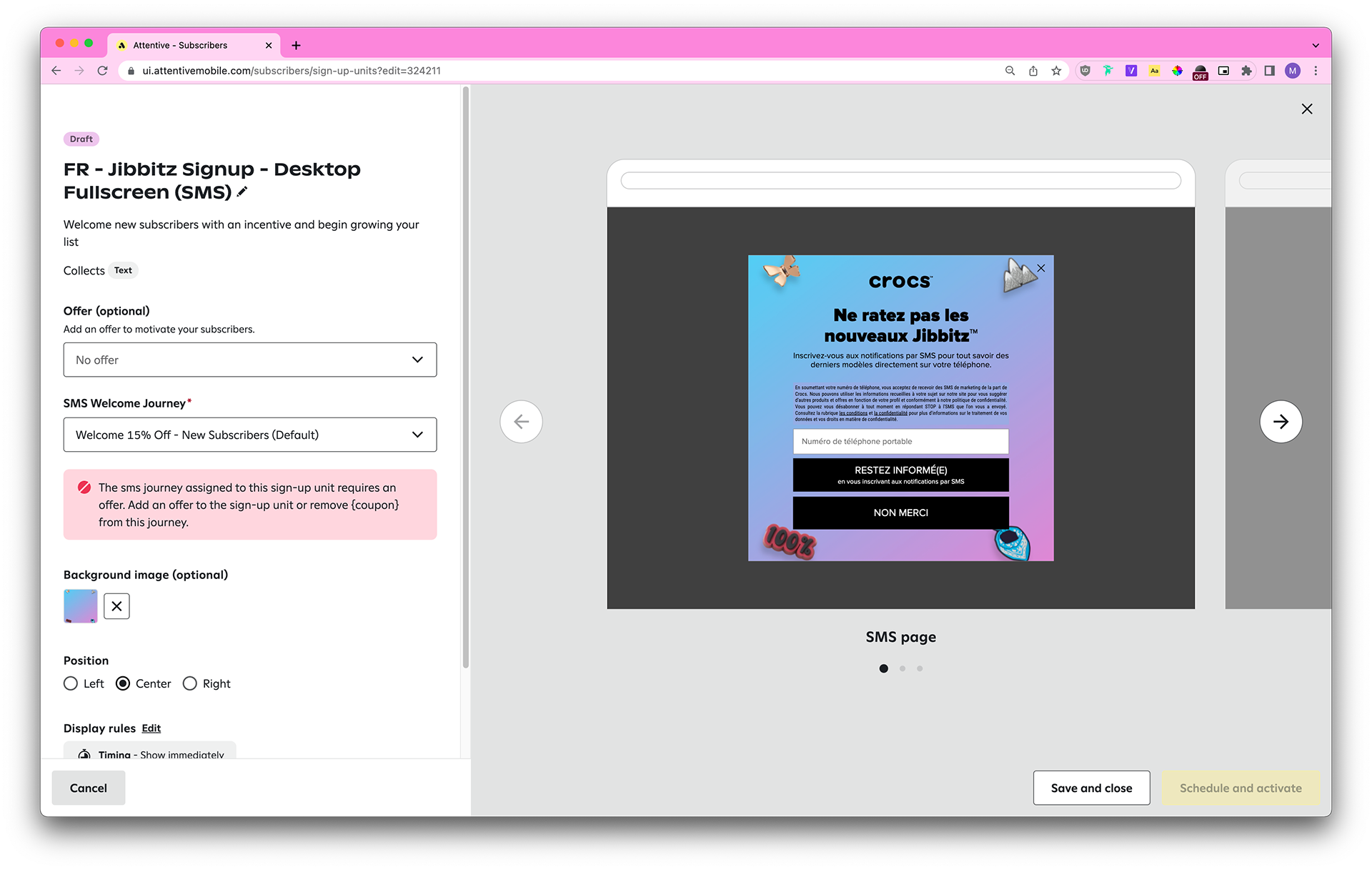
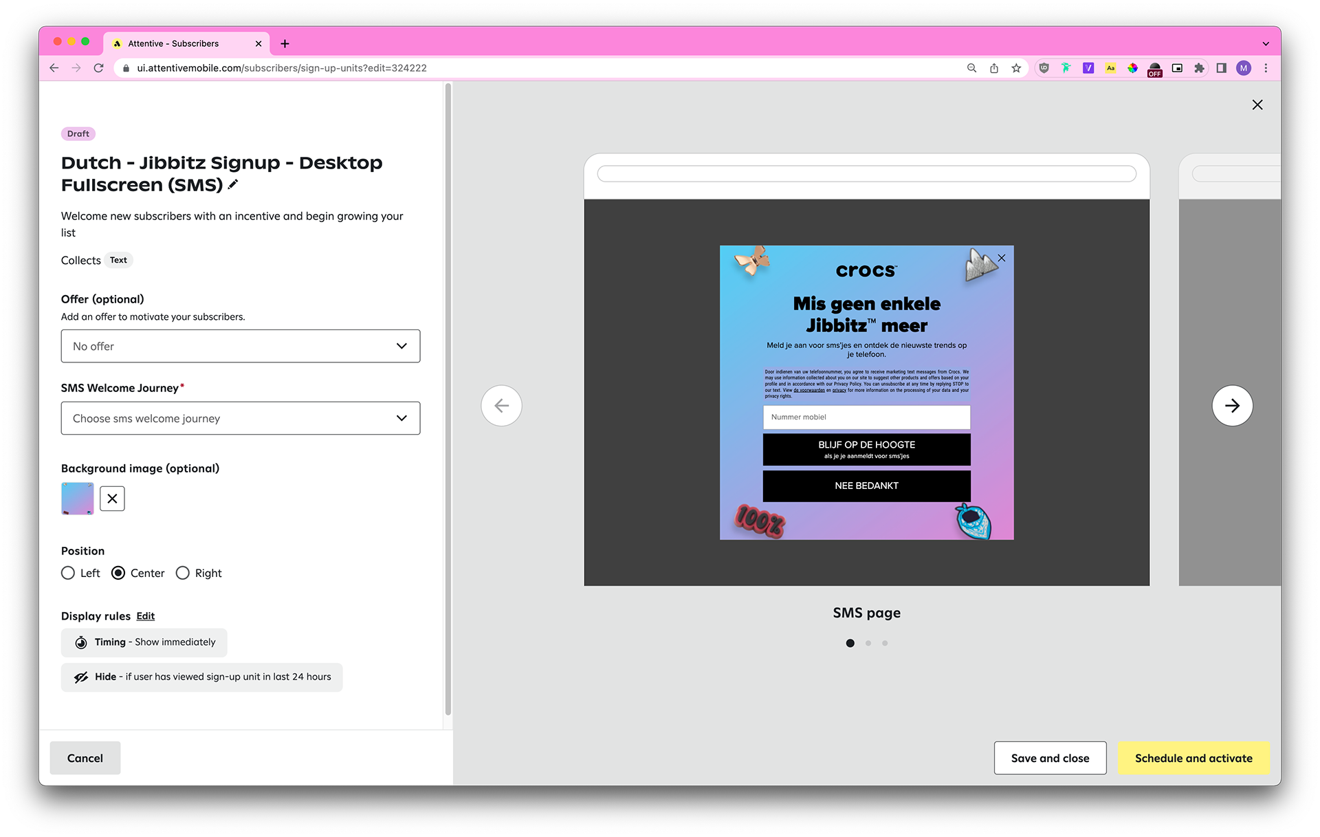
I filled out this request systematically by building each set in both NL and FR and updating the CSM before moving on to the next set.
Hi @Grace Yuan, here are the Jibbitz units!
324206: FR - Jibbitz Signup - Mobile Fullscreen (SMS)
324211: FR - Jibbitz Signup - Desktop Fullscreen (SMS)
324206: FR - Jibbitz Signup - Mobile Fullscreen (SMS)
324211: FR - Jibbitz Signup - Desktop Fullscreen (SMS)
Before closing the request, I triple-checked my work and wrote a thorough comment to the CSM (ie: any changes I’d made to the UK, NL, and FR units to maintain Attentive’s best practices for compliance). The CSM commented:
@Miles Lee - Literally speechless at how efficient & organized you were! Thank you for being SO communicative and so detail-oriented and thorough with your explanations. Not to mention they all look amazing (despite how annoying it must’ve been with the translations). You are amazing, thank you so so much!!!!!
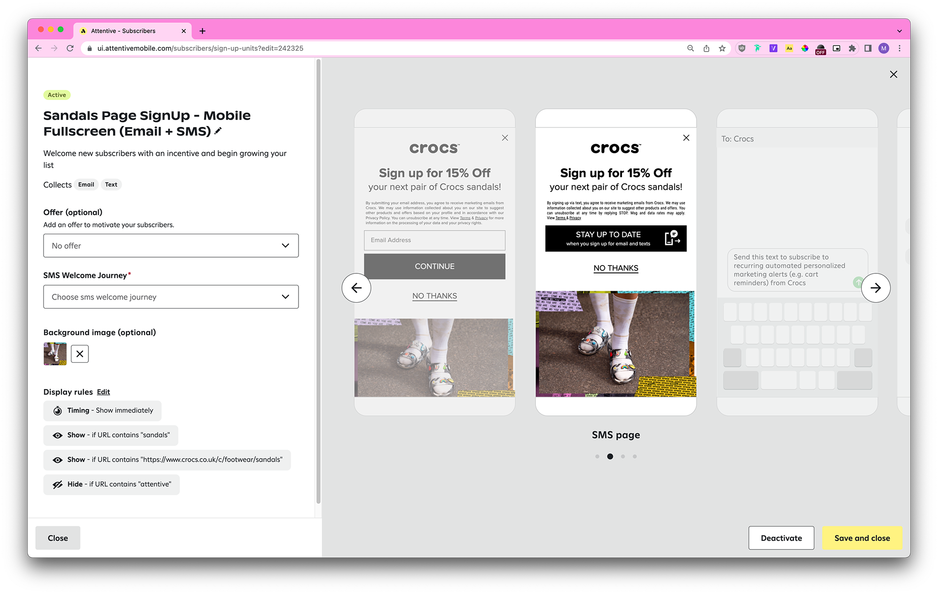
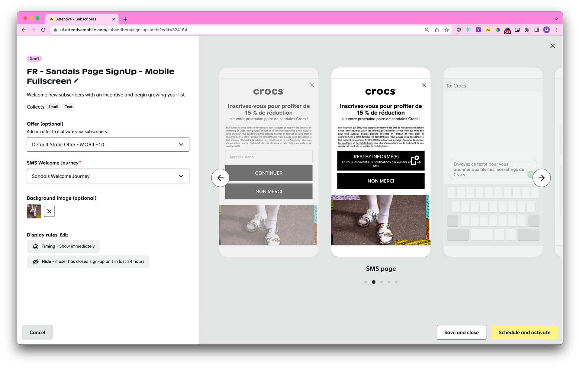
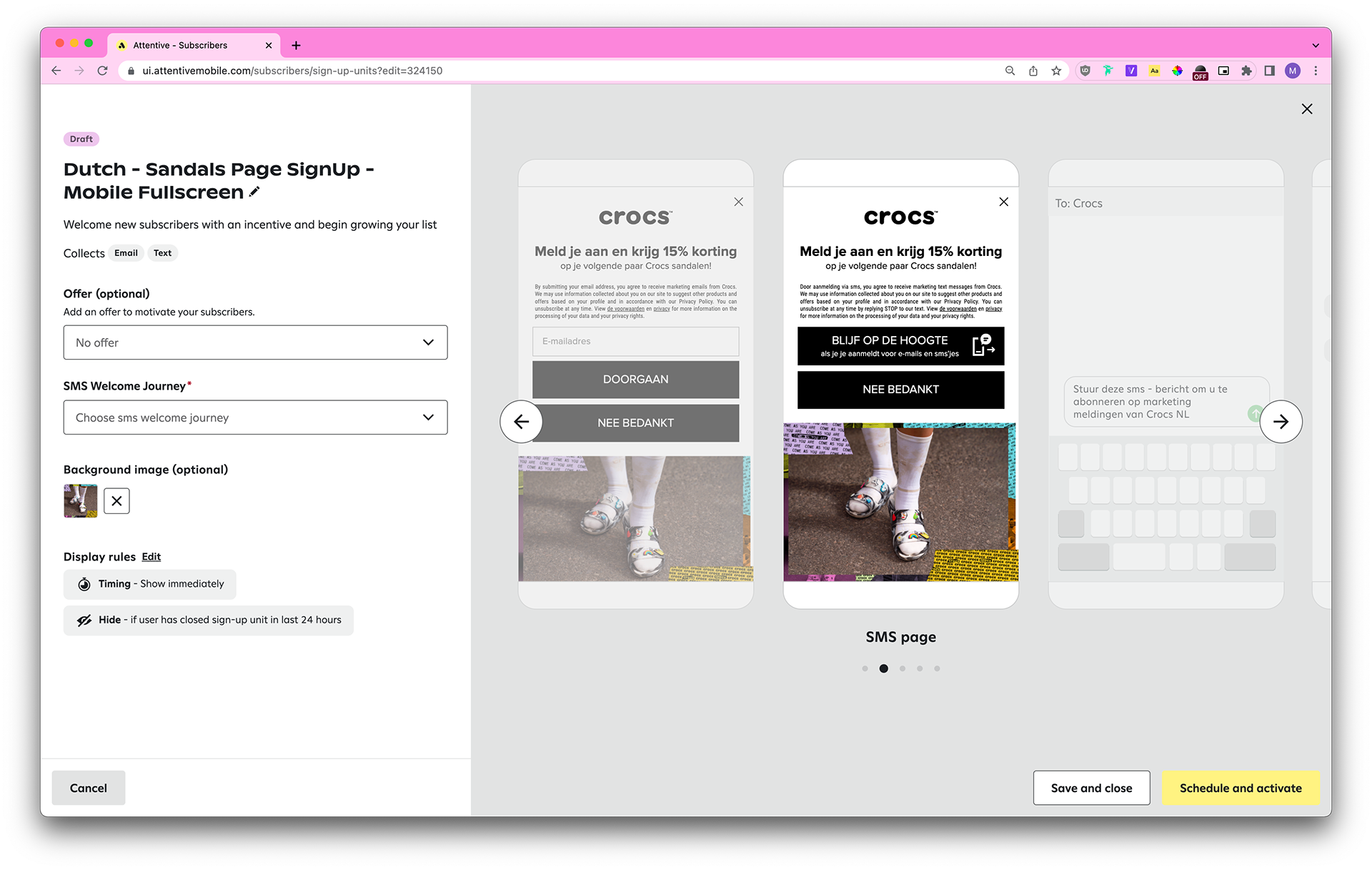
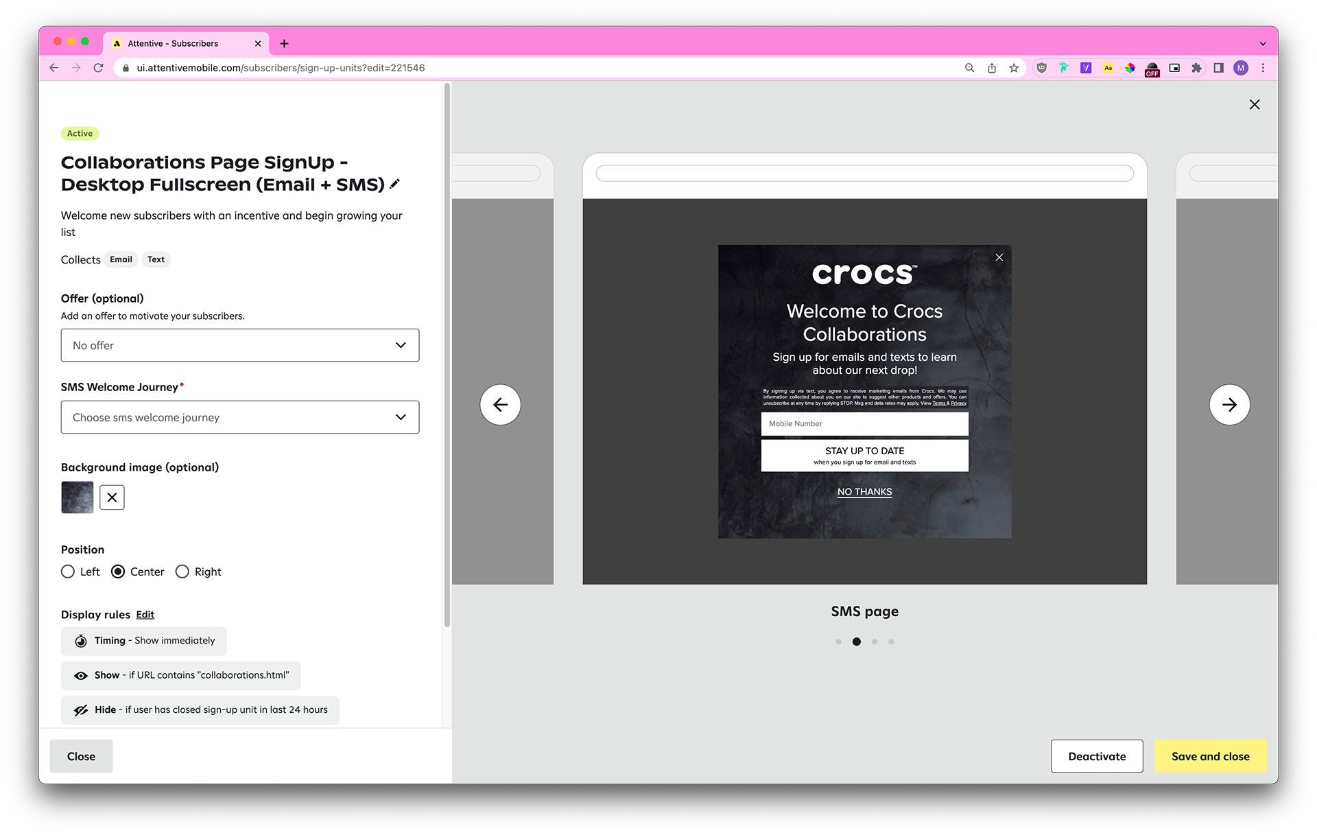
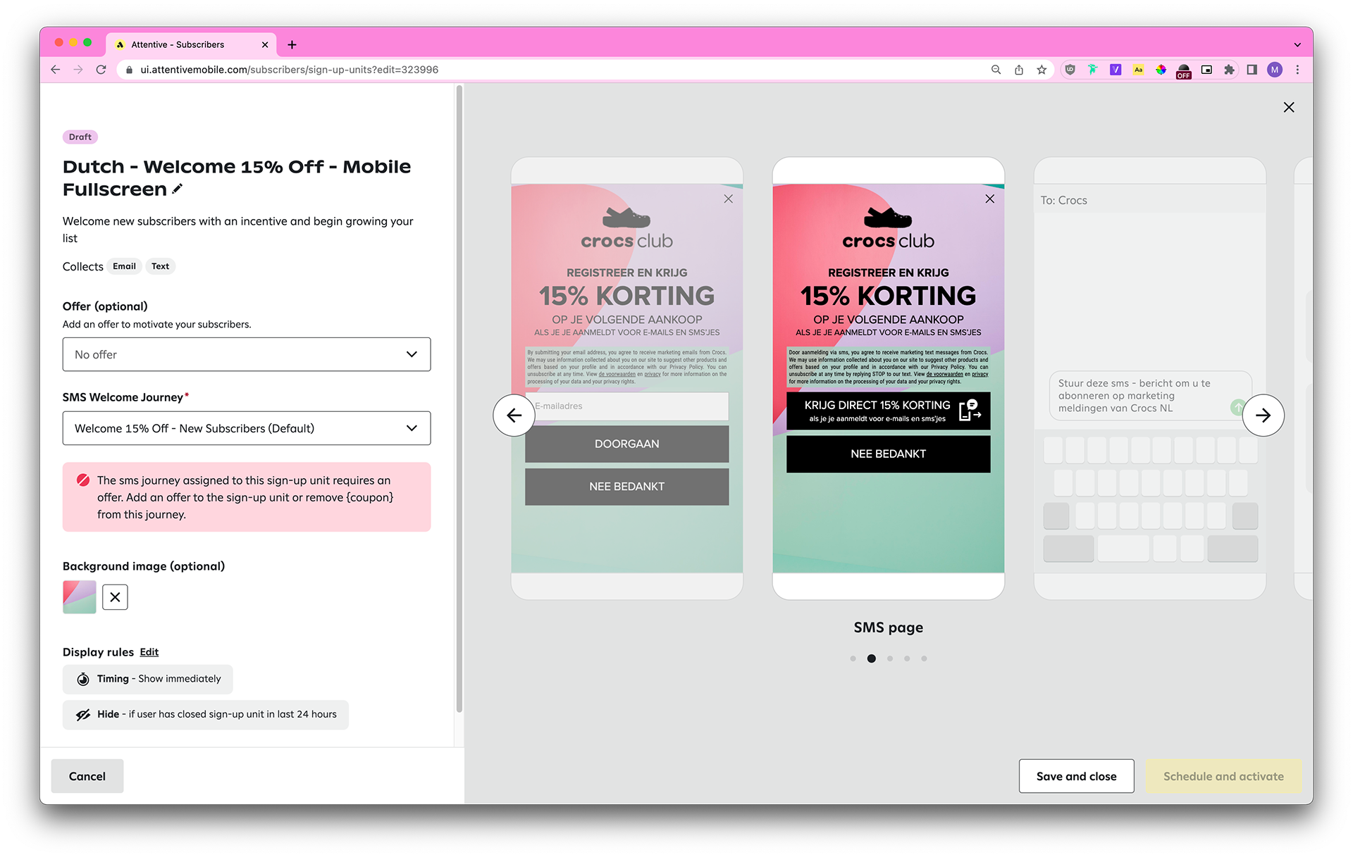
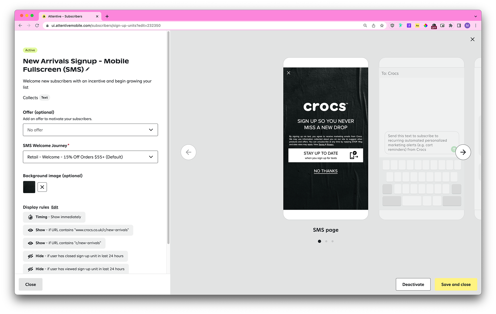
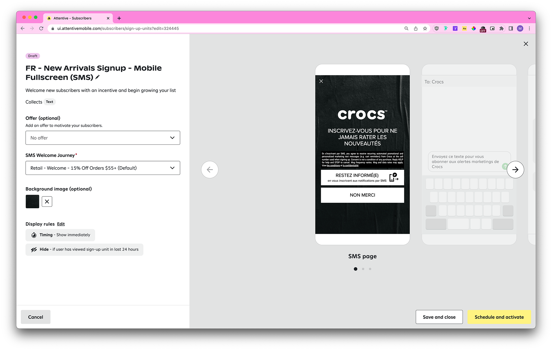
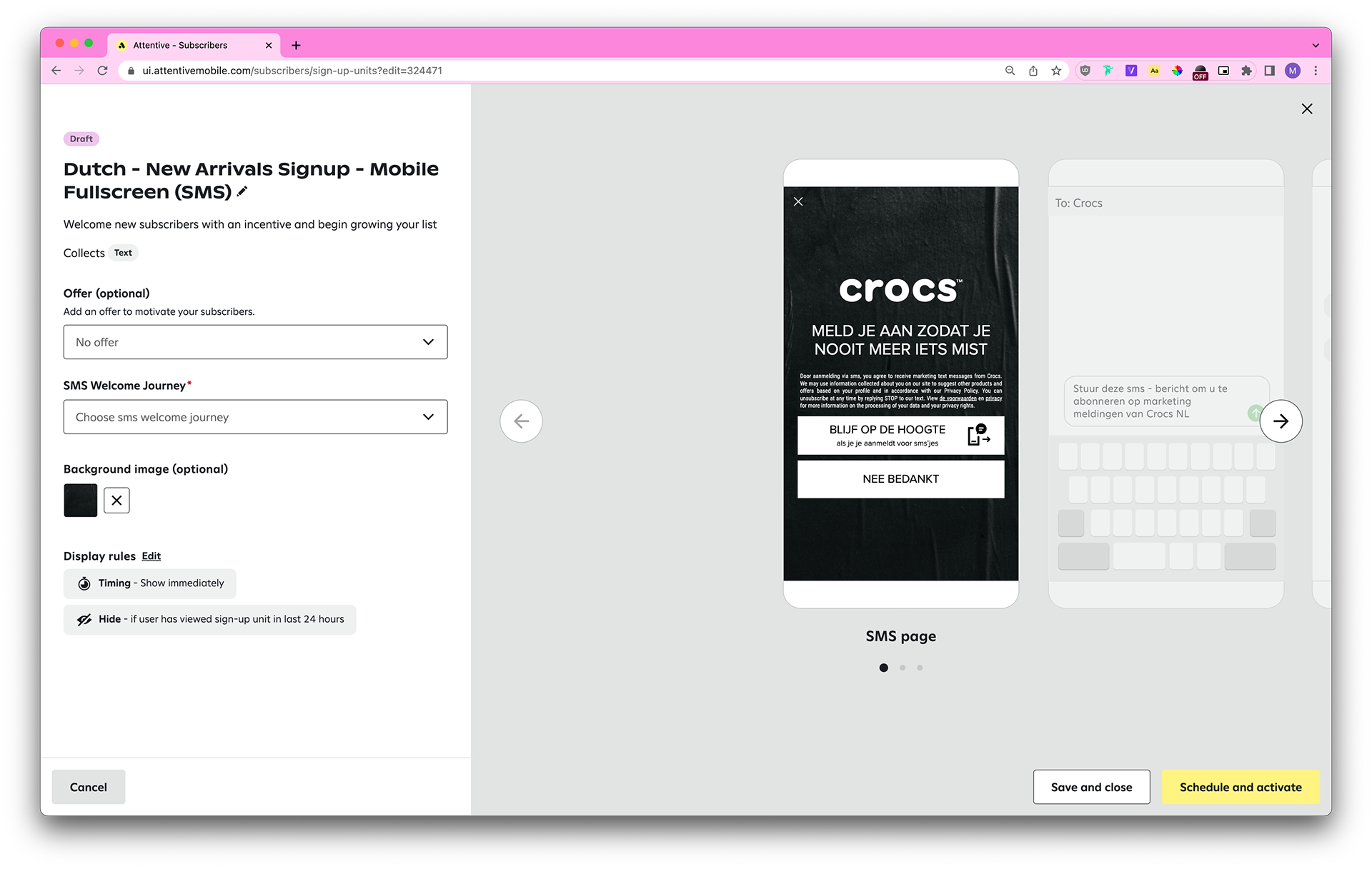
Customer service is central to what the Strategic Design offers. In a remote-first environment, clear written communication is paramount to working with CSMs, and by extension, our clients. My meticulous work for Crocs exemplifies my competence in that area.
Account Based Marketing
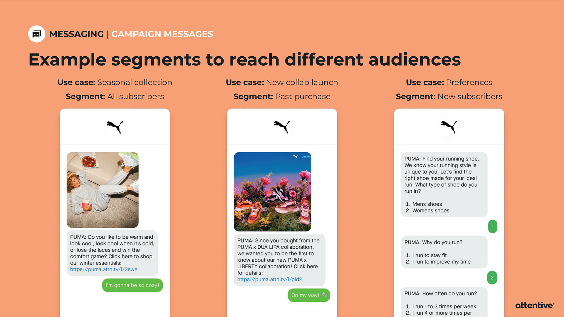
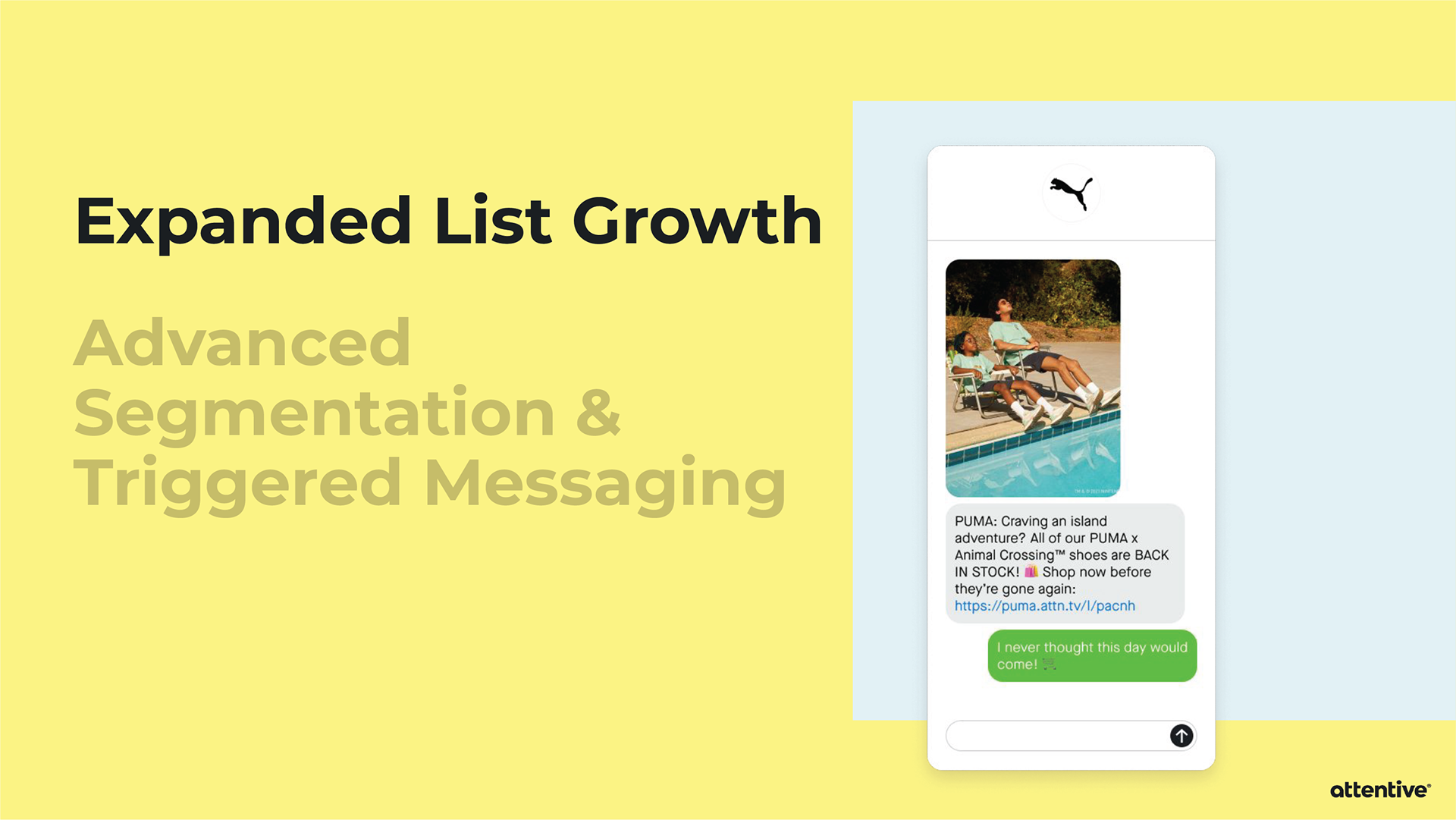
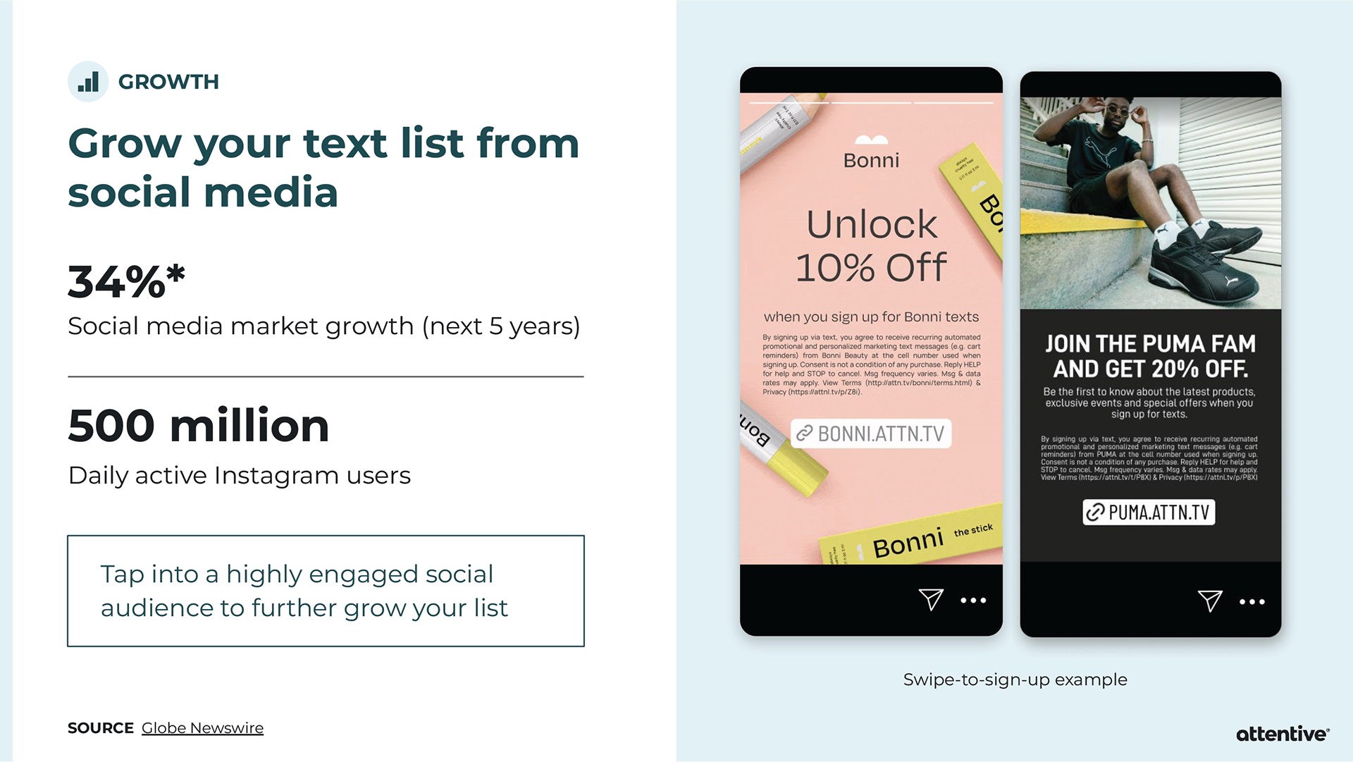
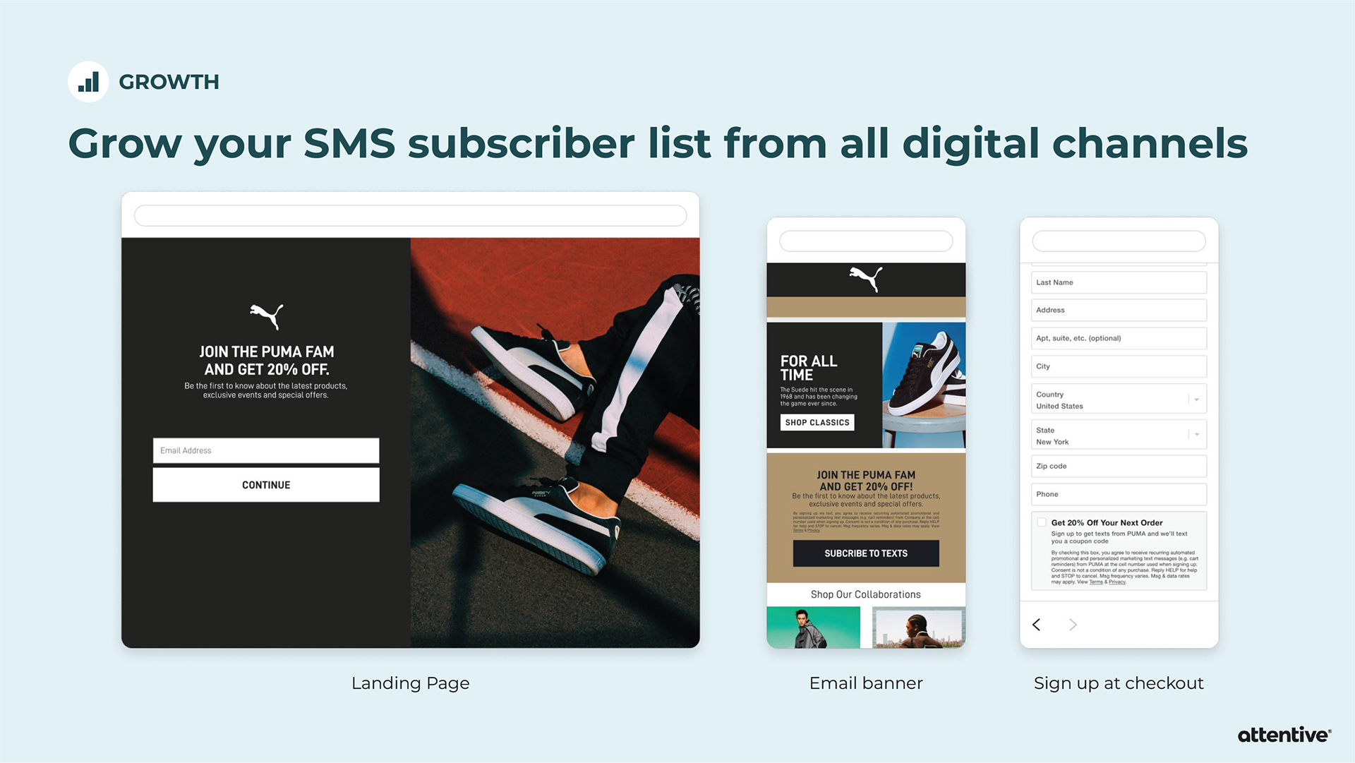
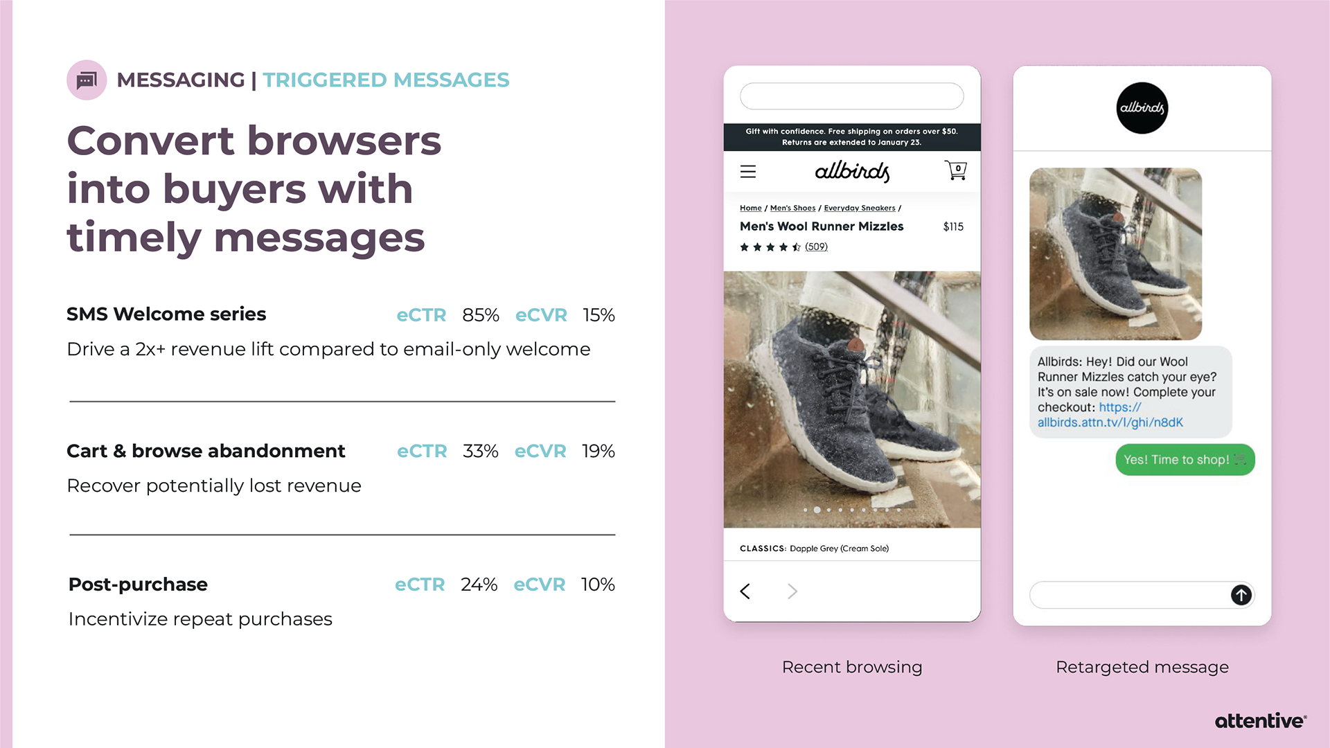
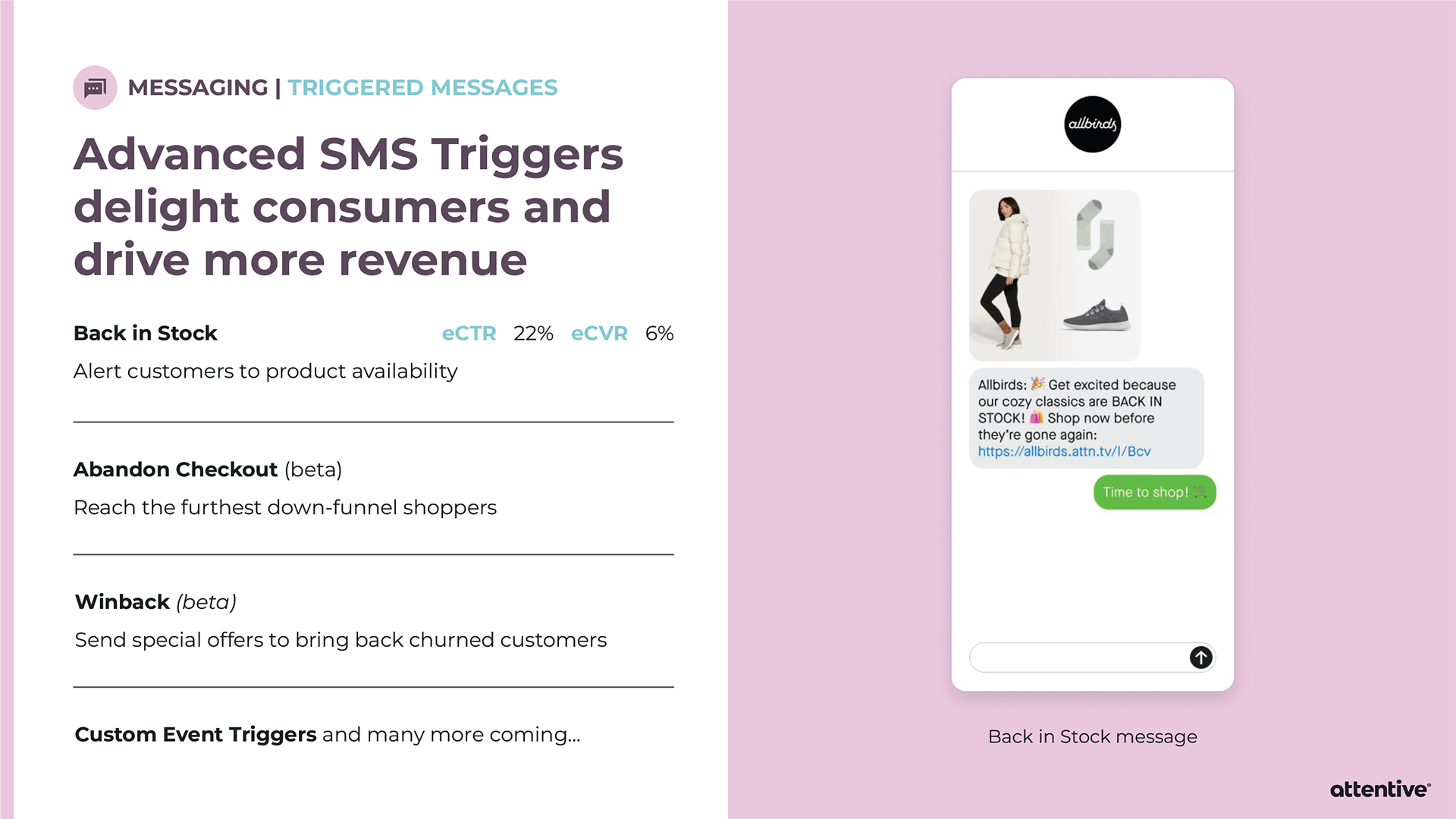
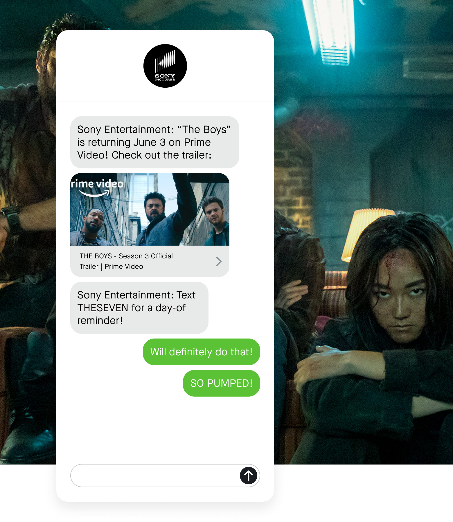
When pitching Attentive to a potential client, sometimes the Sales team will provide an extensive slide deck tailored towards that individual company. Strategic Design is asked to provide custom mockups for the slide deck, and then it’s all up to Sales. I’ve created mockups for Allbirds, PUMA, and Sony Entertainment Pictures.
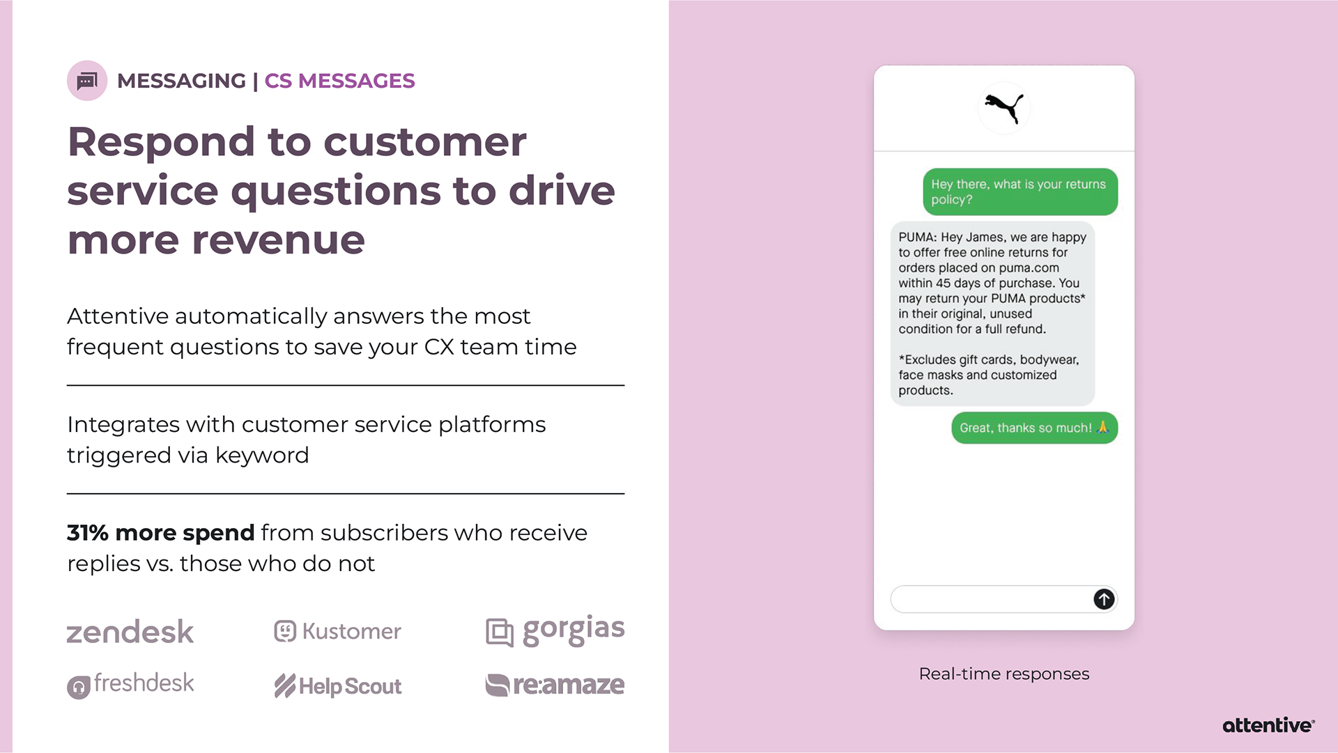
PUMA wanted to see the whole package.
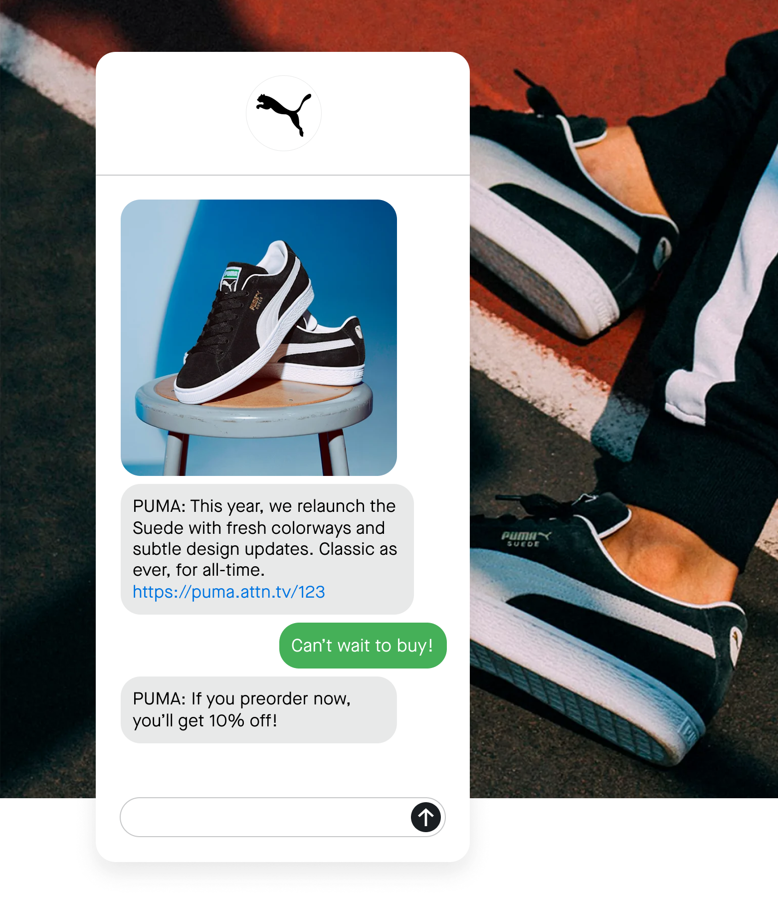
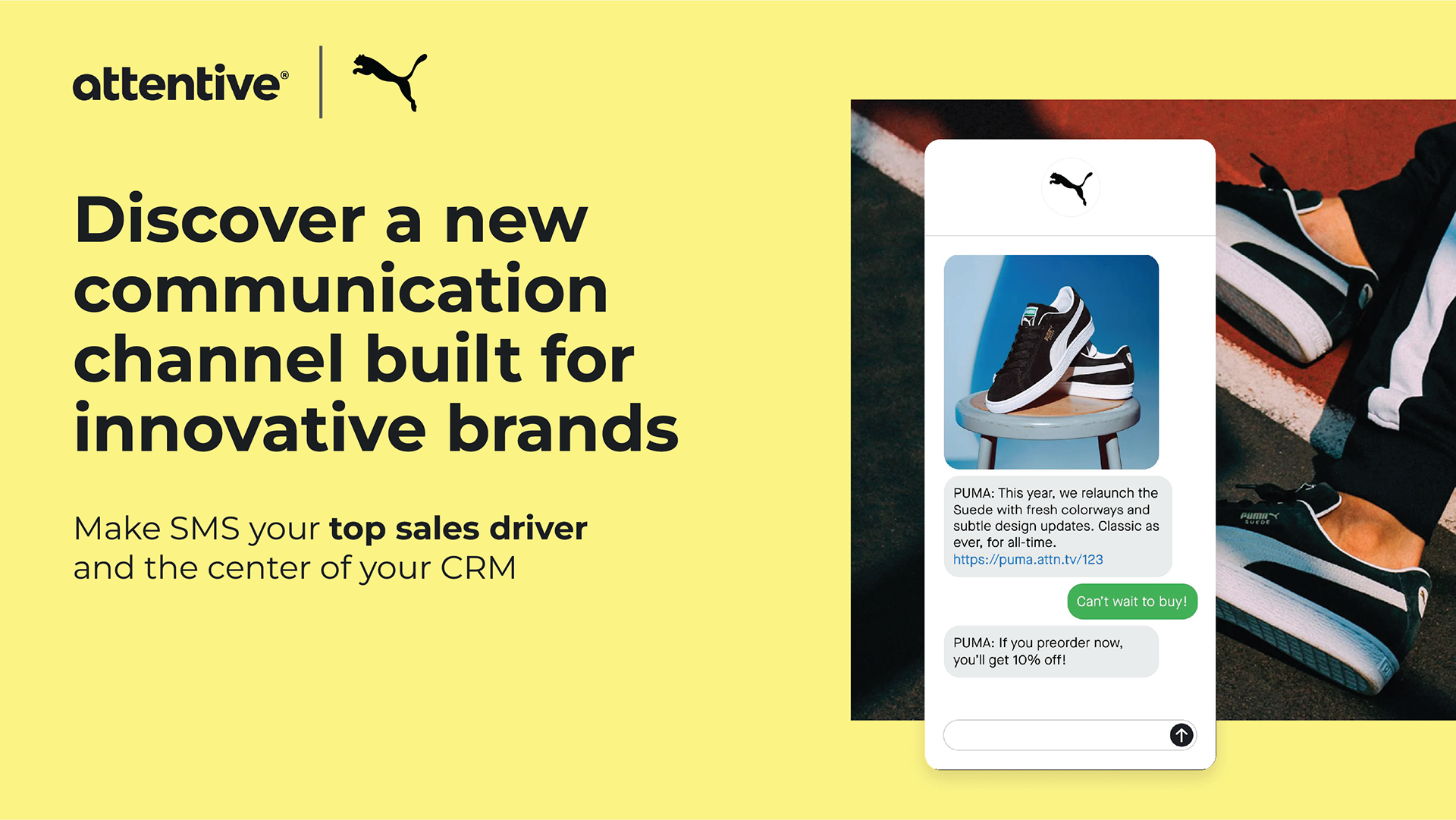
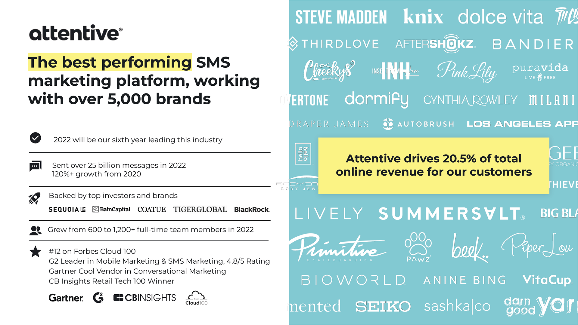
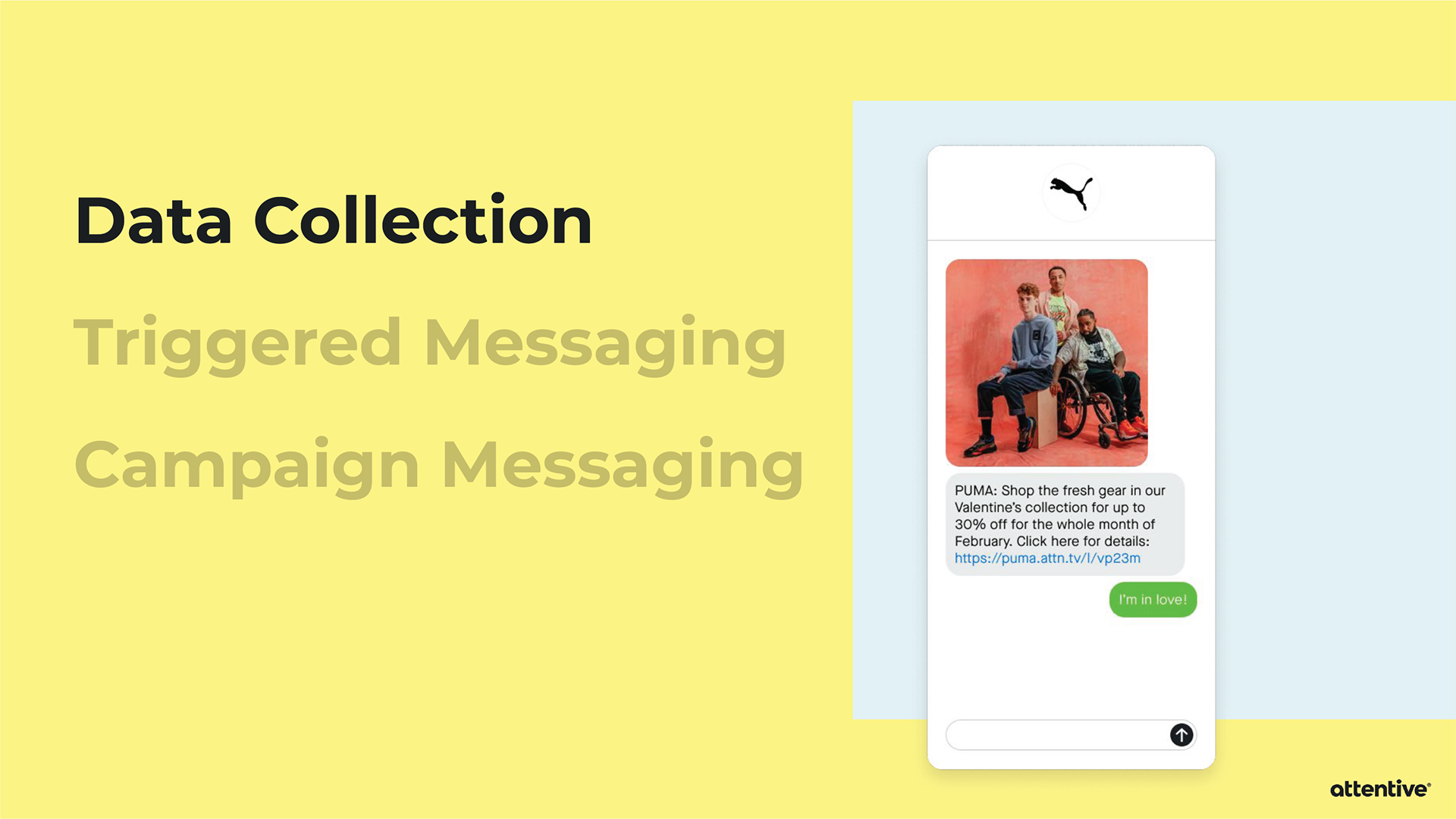
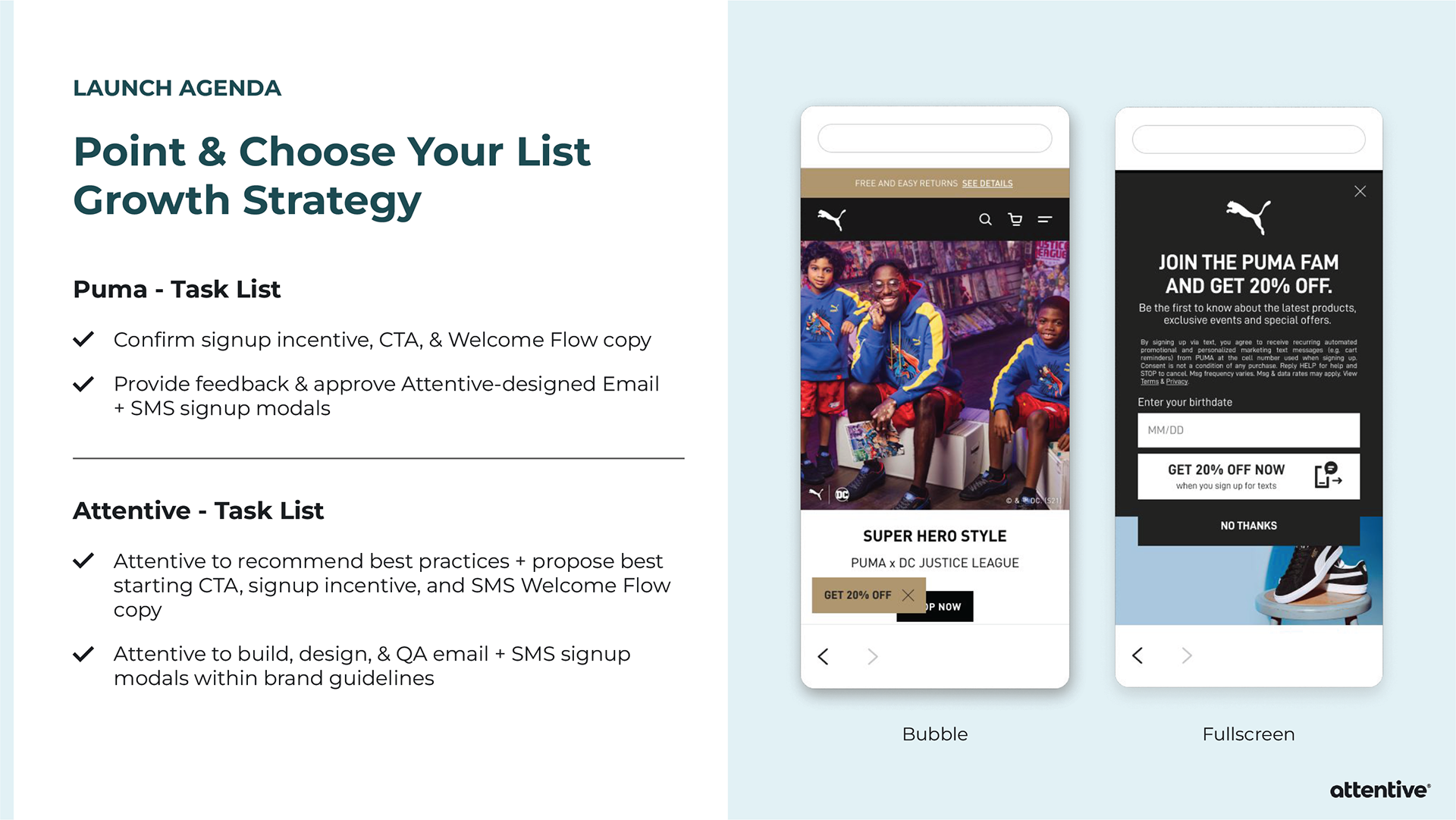
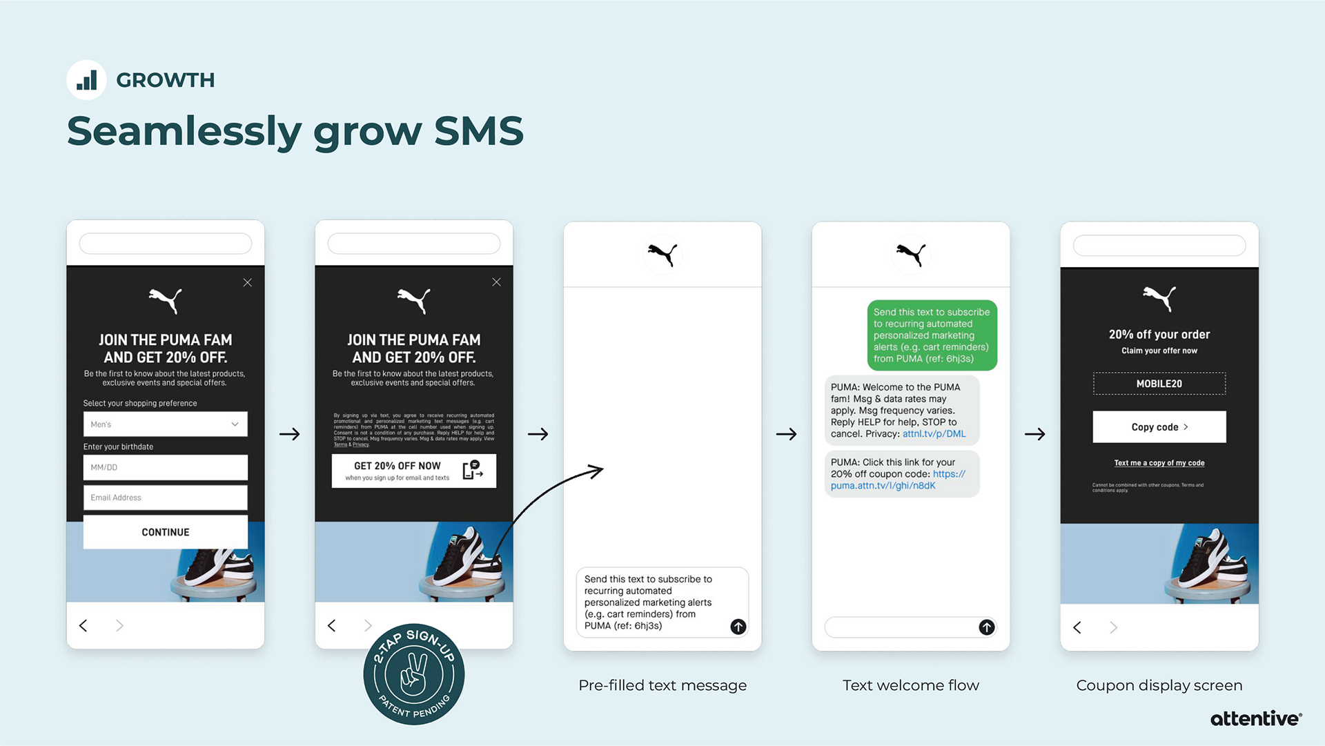
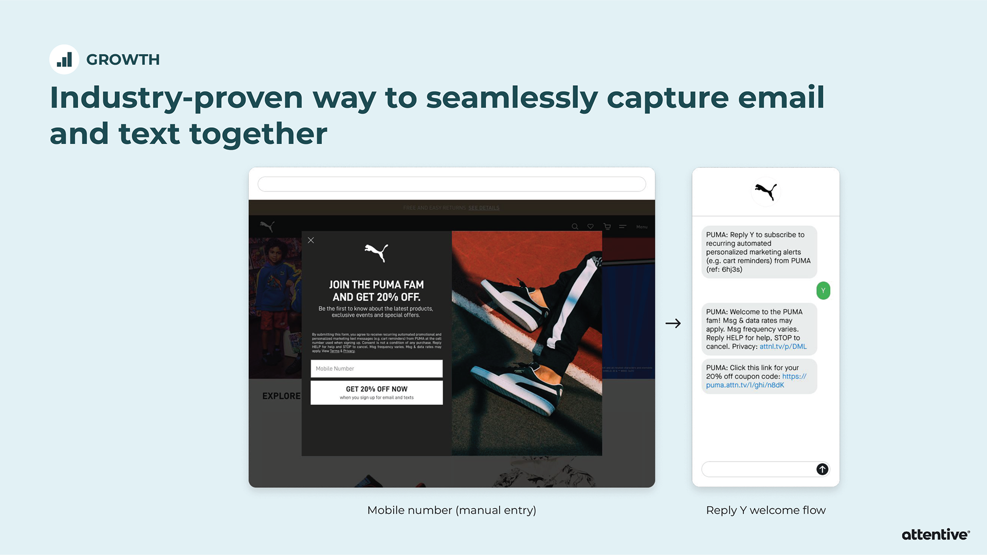
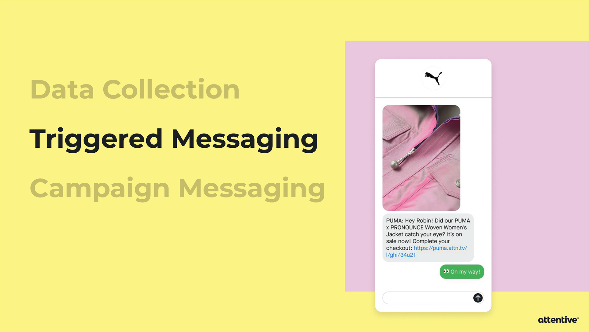
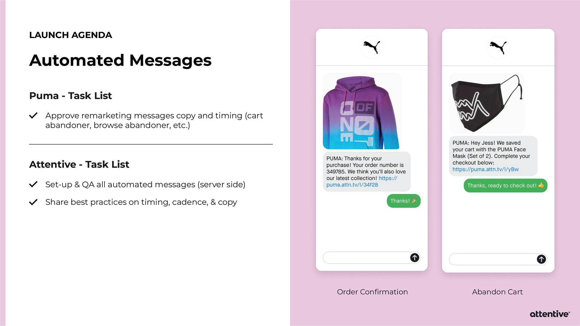
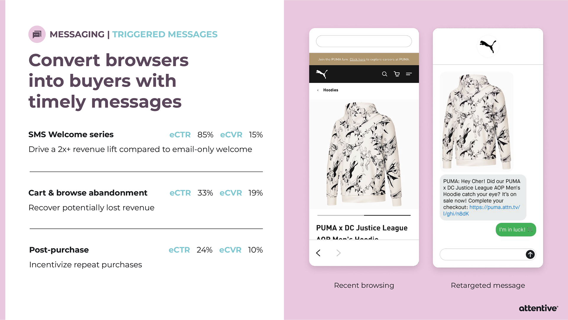
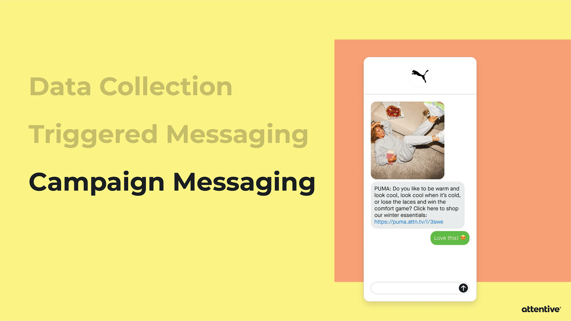
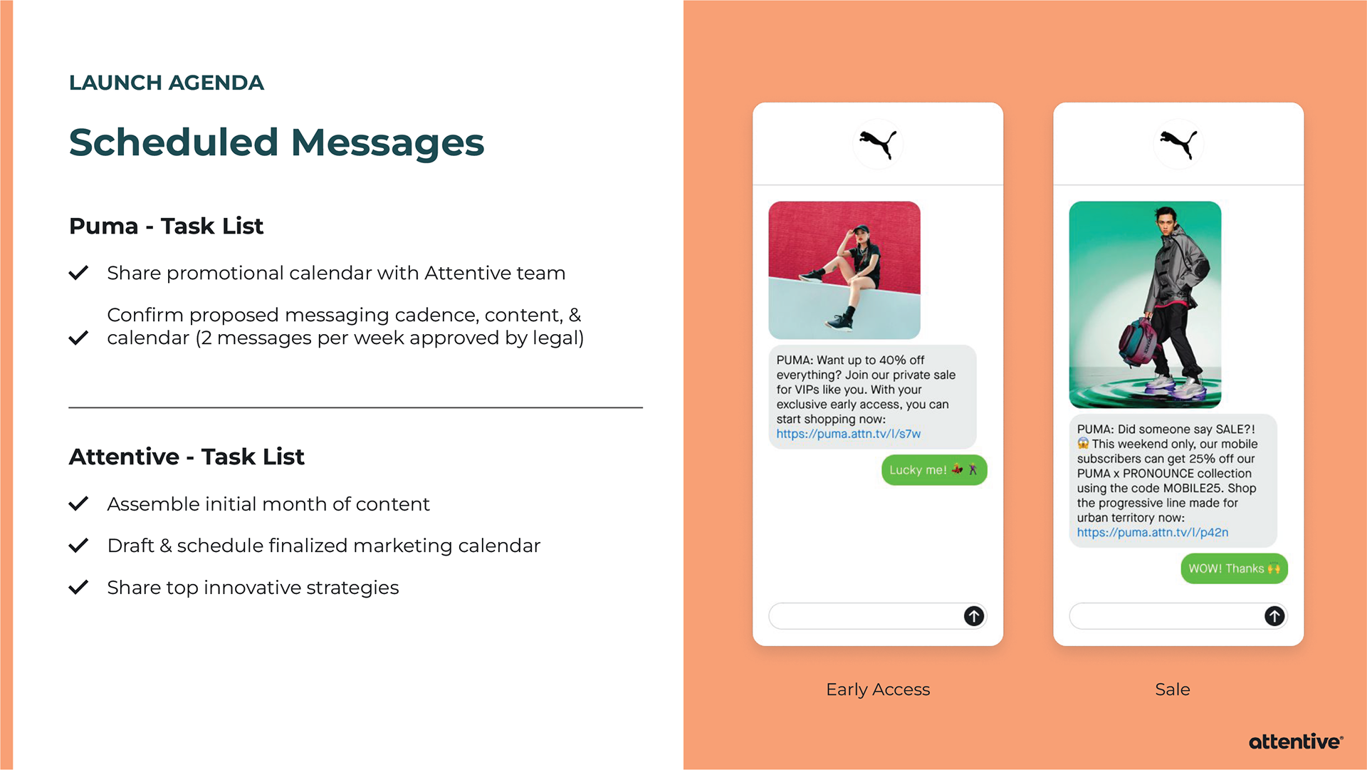
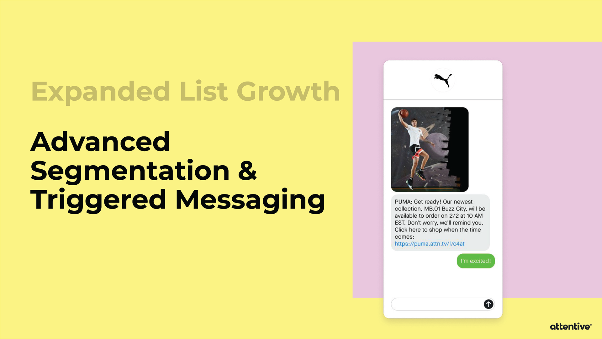
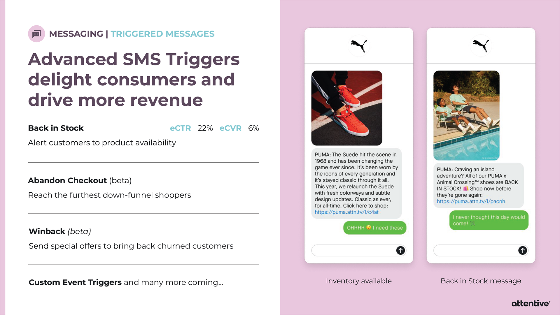
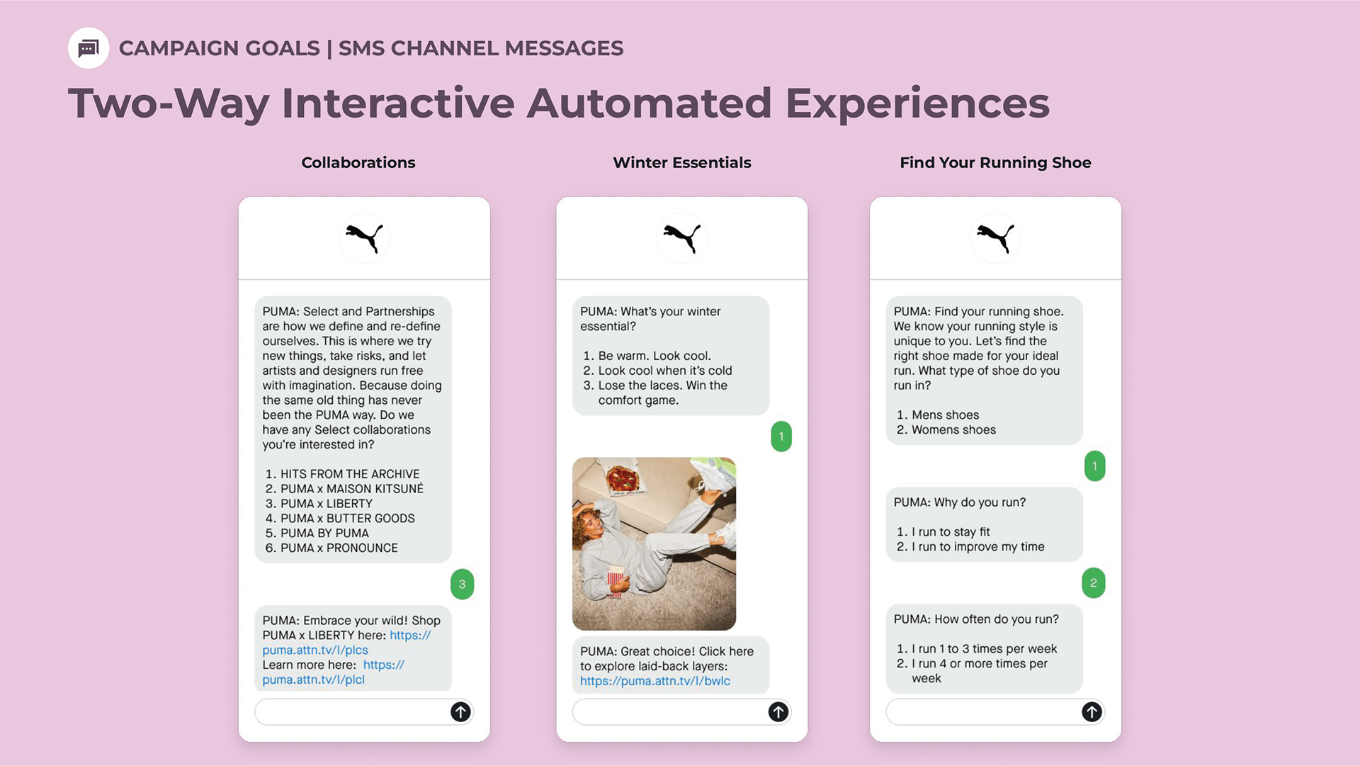
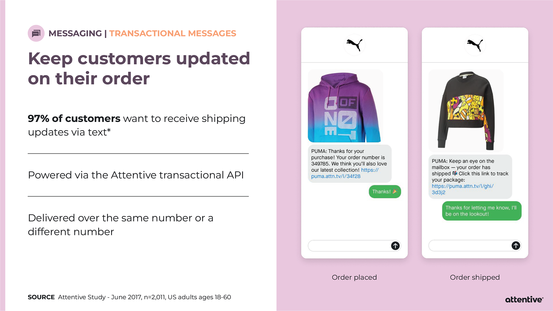
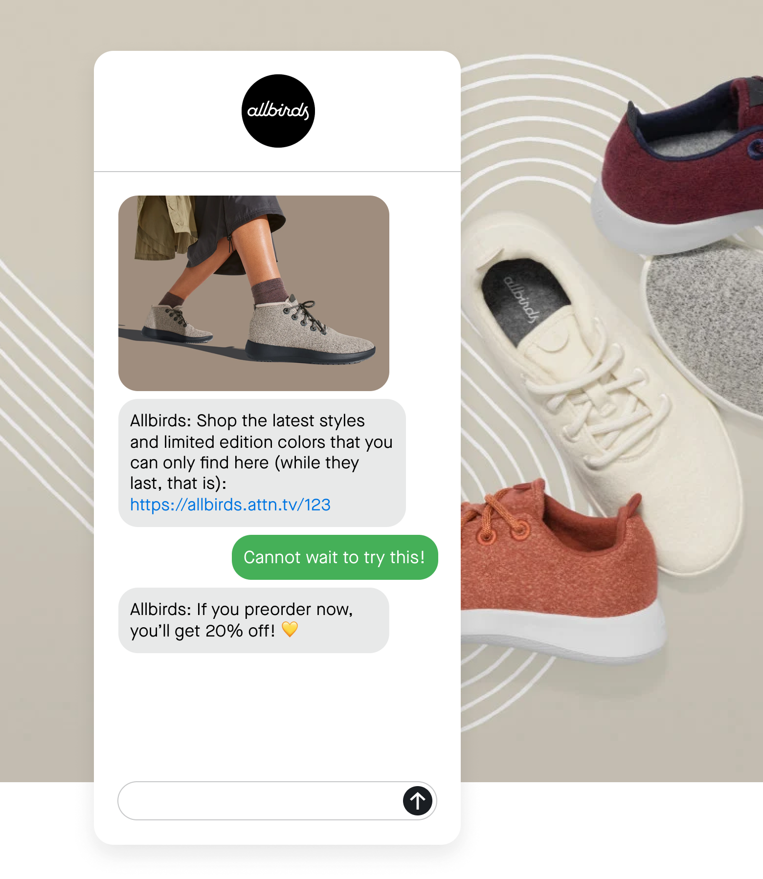
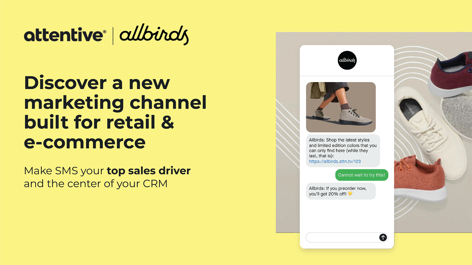
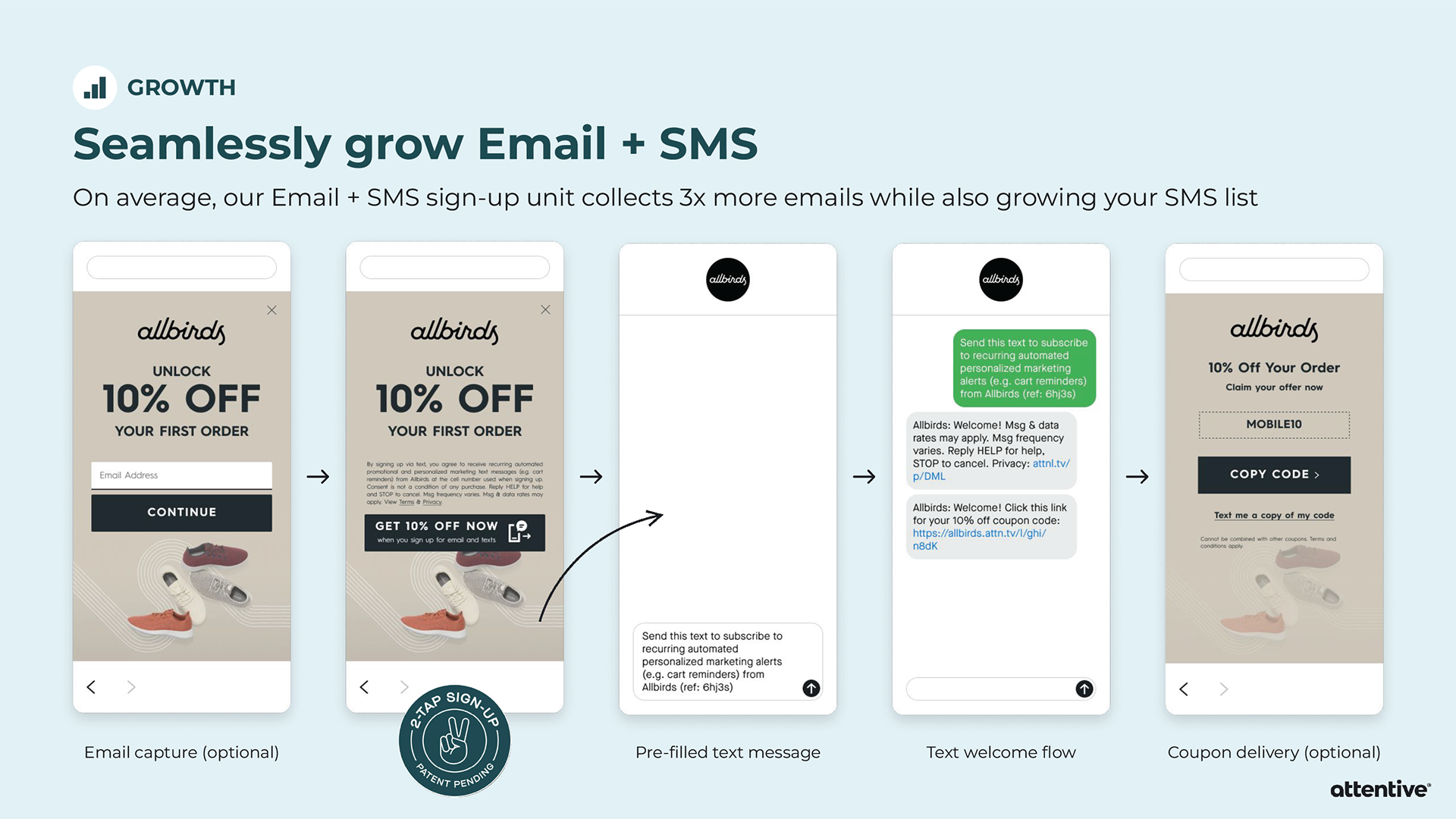
Allbirds wanted to see how they could leverage triggered messaging to increase revenue.
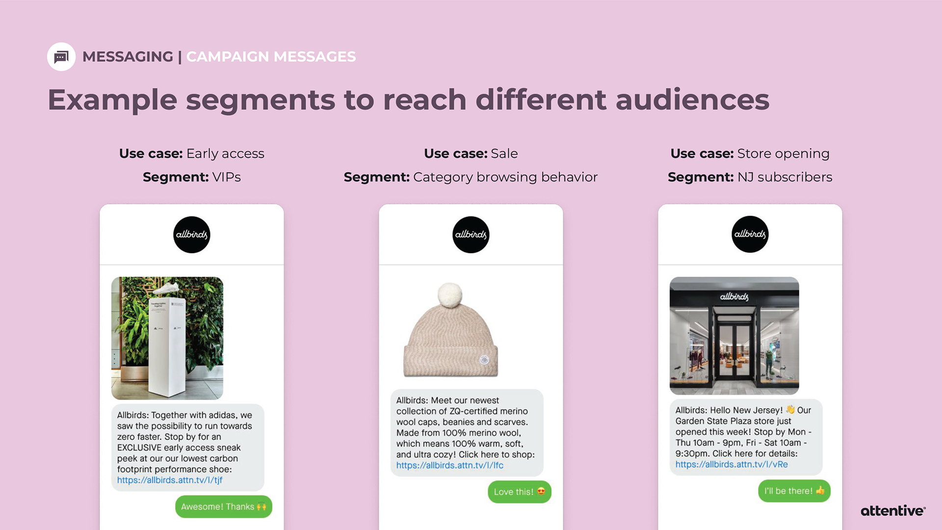
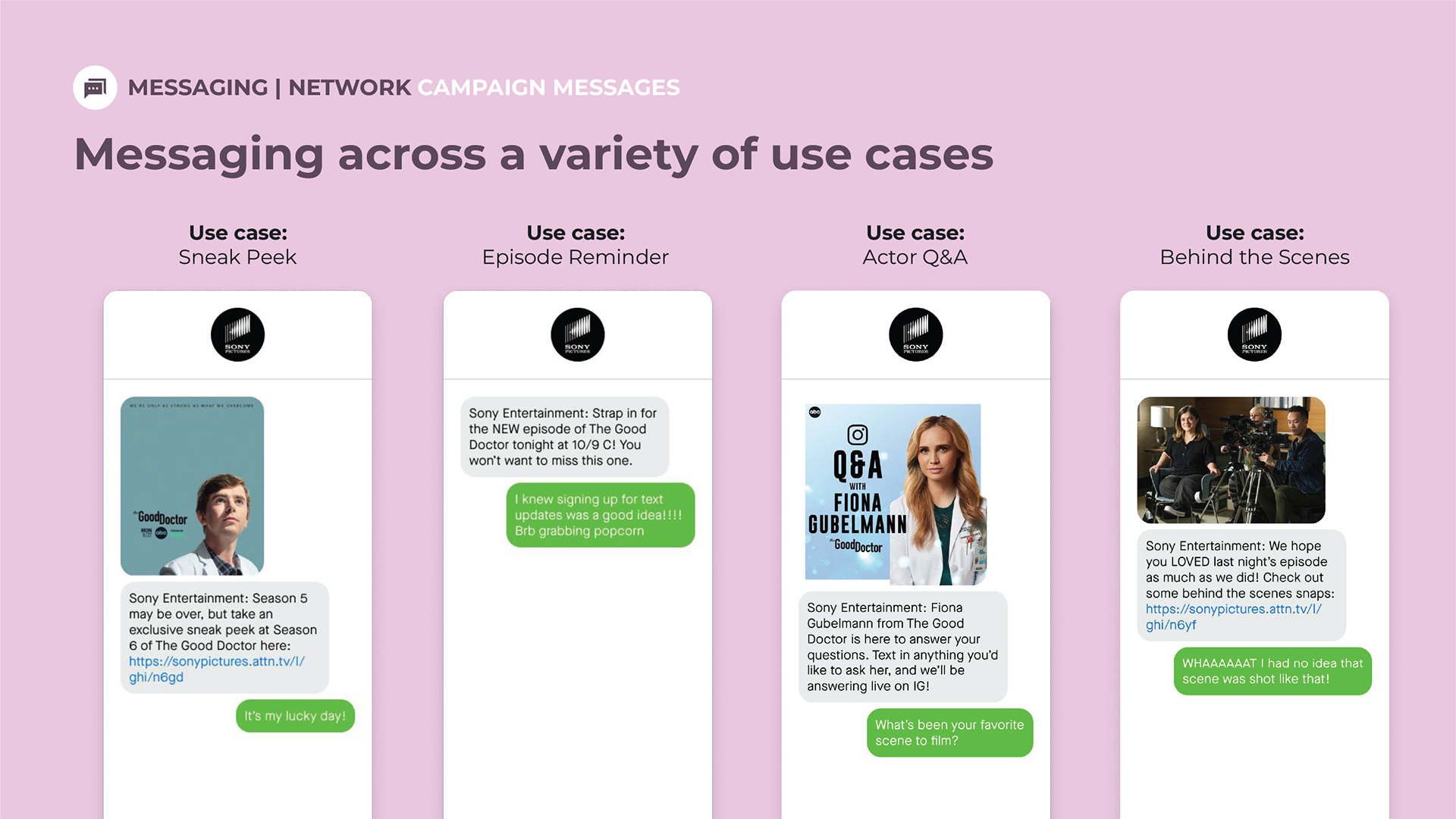
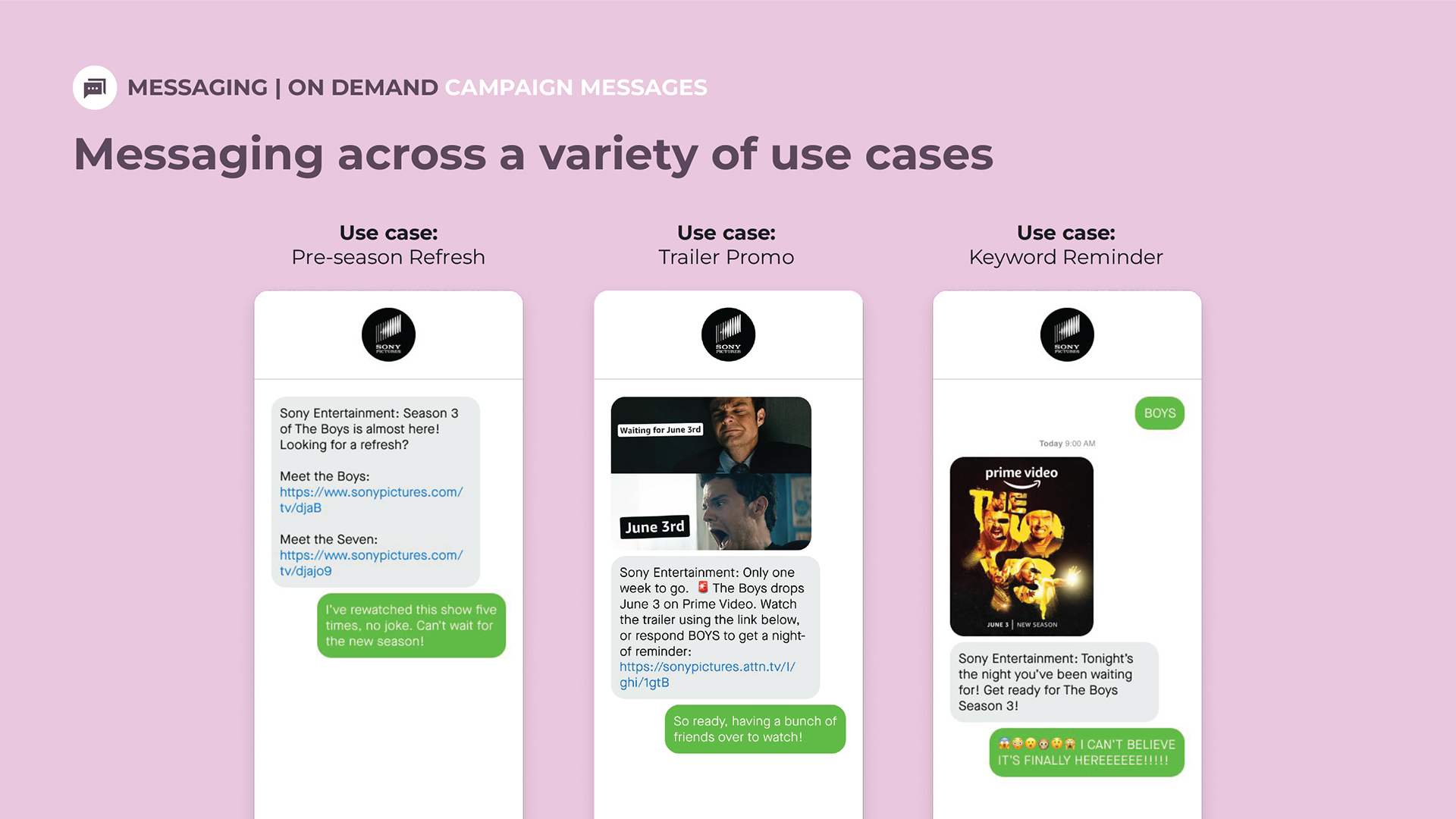
Sony Pictures Entertainment wanted to see messaging across a variety of use cases.
Live Examples
Here’s a screen recording of me signing up for emails and texts for Christopher Elbow Chocolates via a desktop bubble to fullscreen pop-up on their website.
Here’s a screen recording of me signing up for texts from Posh Peanut via a landing page. Against my advice, the client insisted on having white text on a pink background (#FFFFFF on #FF6792 fails in terms of ADA color contrast). I directed the client to Attentive’s Compliance team who let them know about the legal risks associated with not having enough color contrast between the text and background. The client acknowledged those risks and proceeded anyway.
Walkthrough: De Mello Coffee Roasters
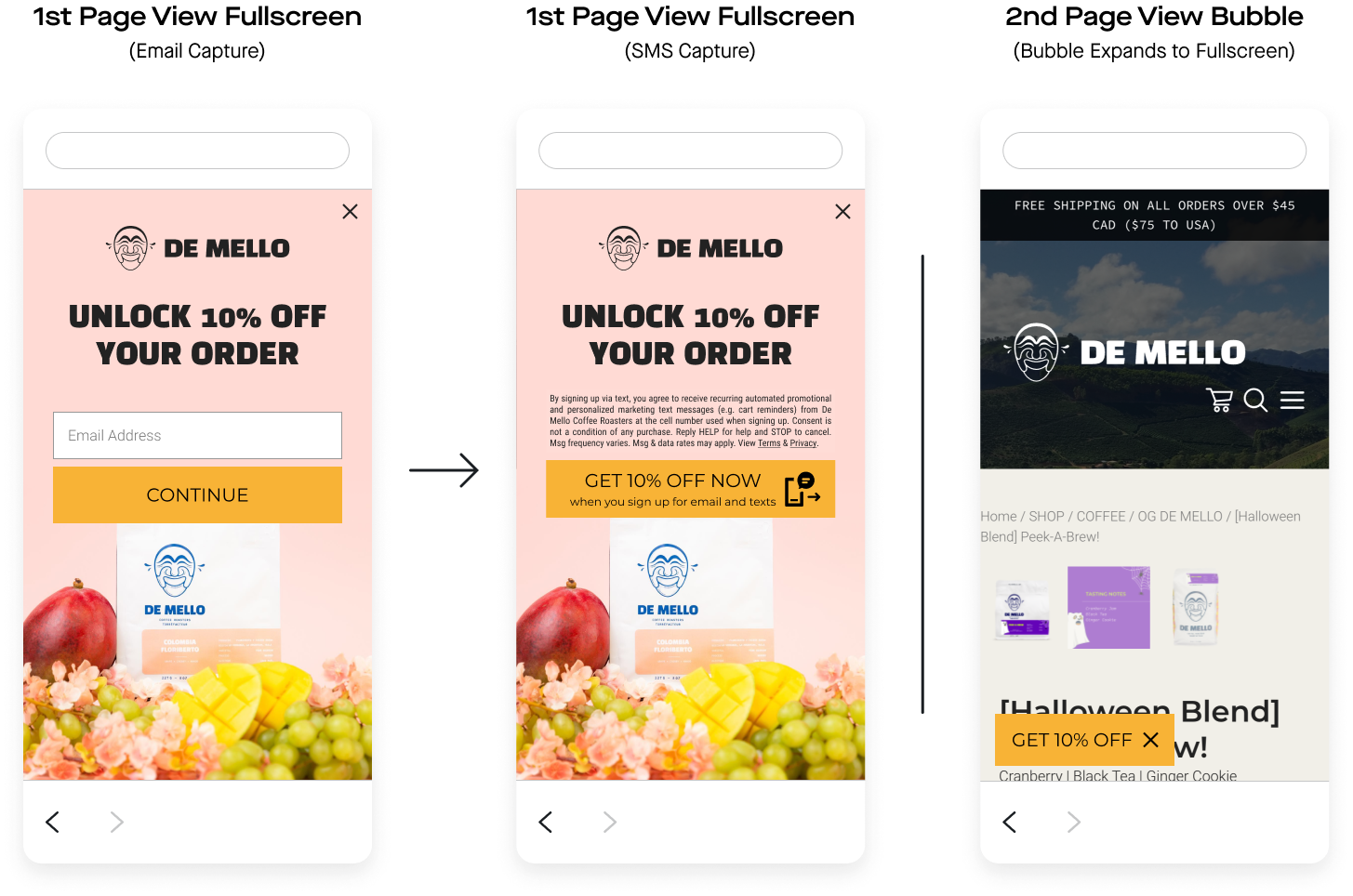
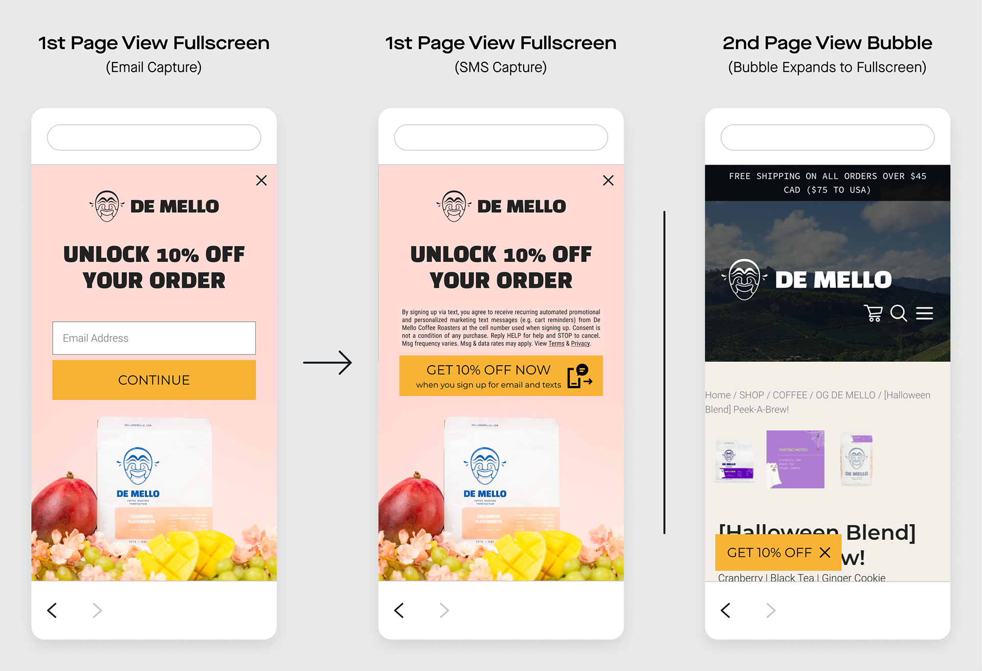
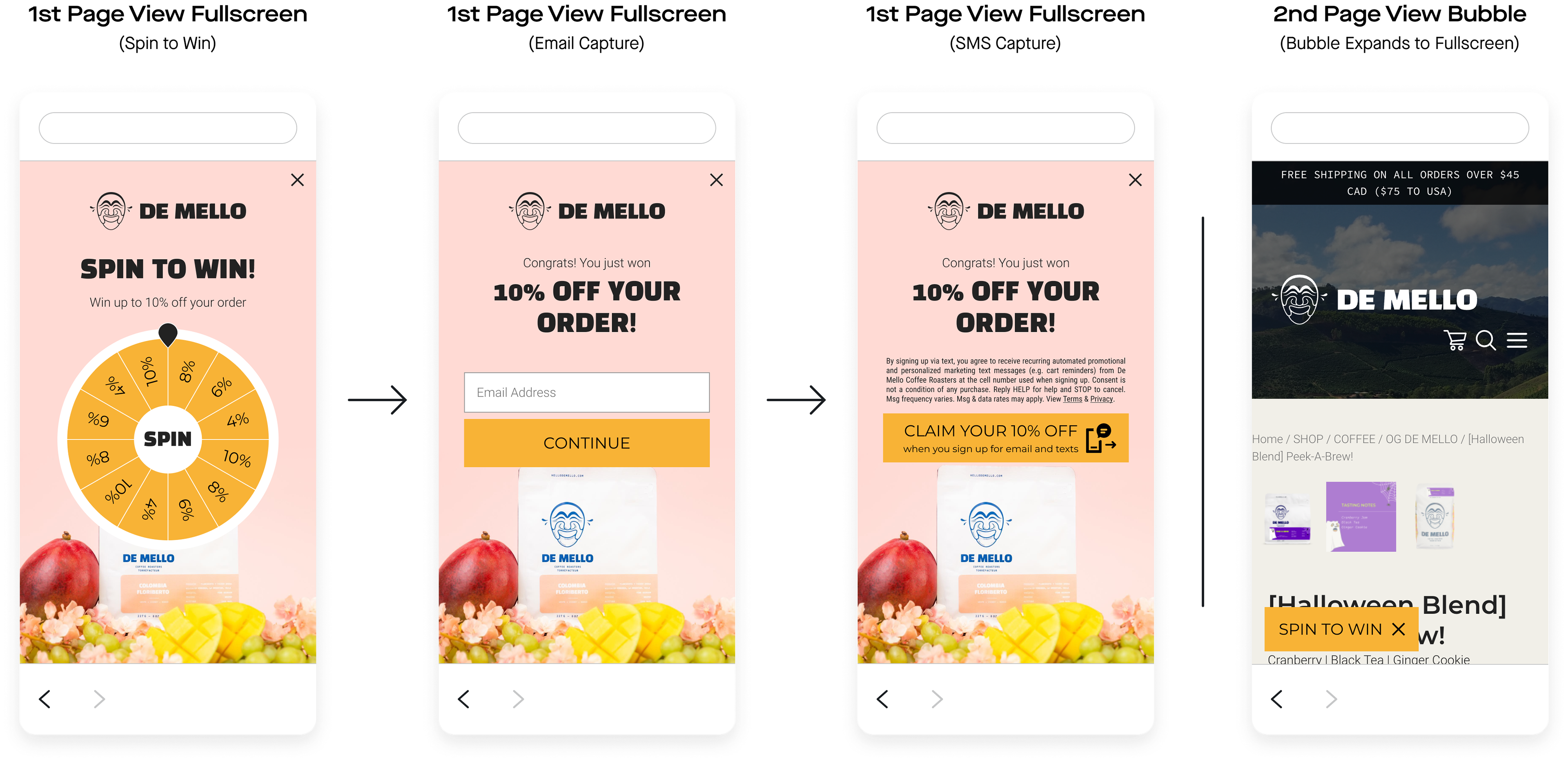
To onboard each new client onto the Attentive platform, the Strategic Design team builds our most popular pop-ups: email and SMS sign-up units for mobile fullscreen, desktop fullscreen, and a landing page. During their first call with a client, a Client Strategy Manager (CSM) will typically walk the client through these initial sign-up units. If the client decides to move forward with using Attentive, these sign-up units are ready to go live on the client’s website. The client’s customers will have the option to sign up for email and/or SMS marketing.
We tailor each client’s sign-up units to their own unique brand. This screen recording walks through my process of building and mocking up sign-up units for De Mello Coffee Roasters.
Generally, I’ll first grab assets (logo, fonts, colors, images) from the client’s website, plug those in to the “Brand Kit” page on Attentive’s platform, and build out one mobile fullscreen unit, one desktop fullscreen unit, and one landing page unit. I ensure there’s enough contrast between the background and text colors by using a color contrast checker like colorable.jxnblk.com or the one built into Attentive’s platform.
