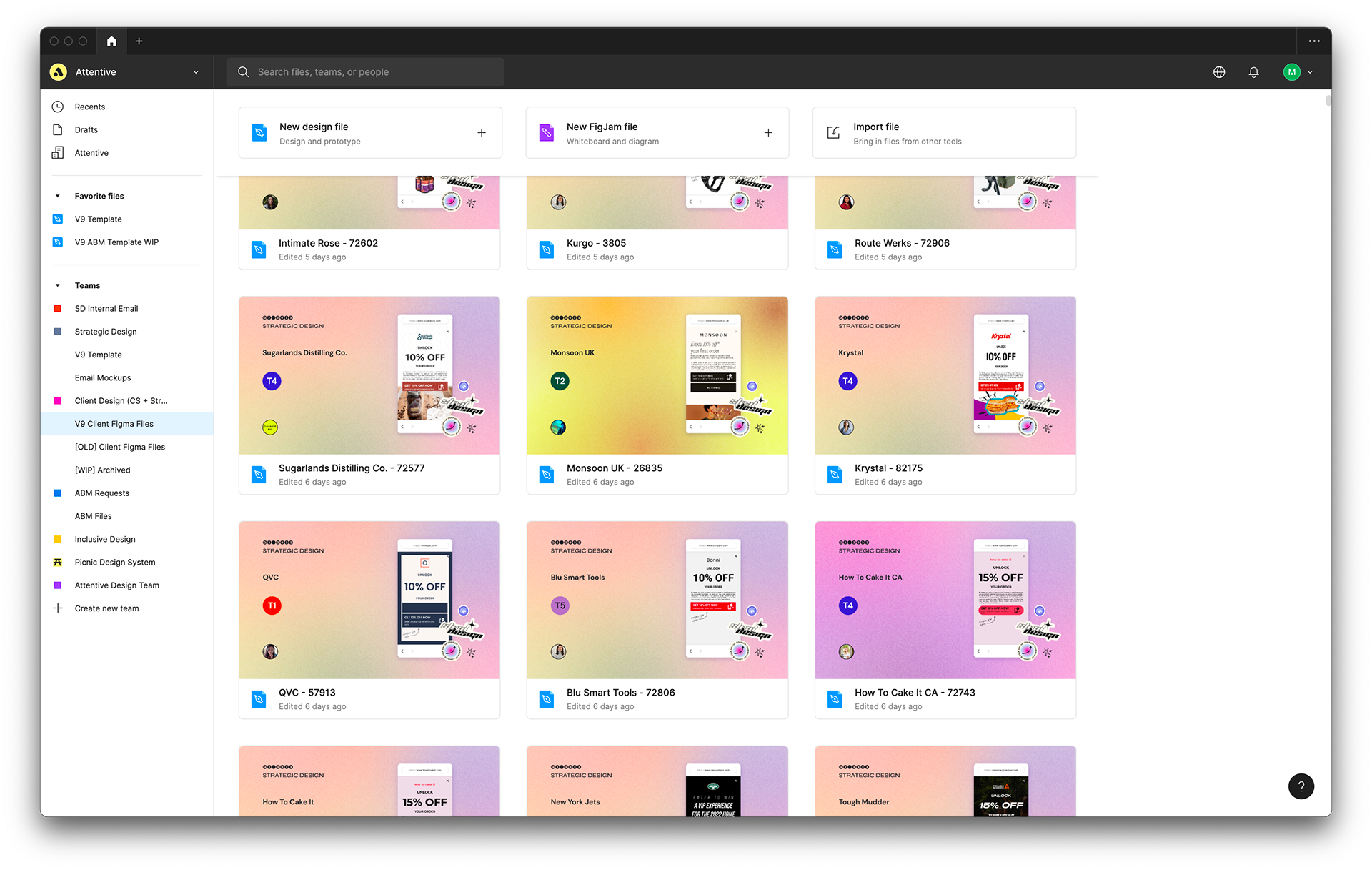
From February to April, I led a revamp of the internal Figma file that houses the Strategic Design team’s client workflow. I adopted this revamp project from Sol Park and worked closely with Audrey Zhang and Katherine Homer.
The three of us crafted a project timeline, ran four rounds of user testing with our team, provided onboarding materials, and launched the revamp. As the project lead, I performed detailed, pixel-perfect design work within the Figma file itself. Post-launch, I continue to update the file in accordance with new features in Attentive’s Creative Builder (for example, I added new mockups for Attentive’s new spin to win landing pages). Throughout the process, I became my team’s subject matter expert in Figma.
V9
V9
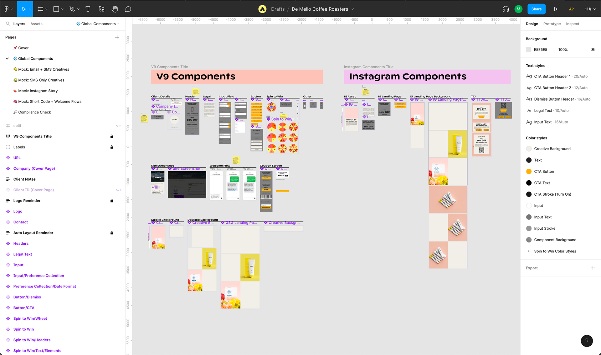
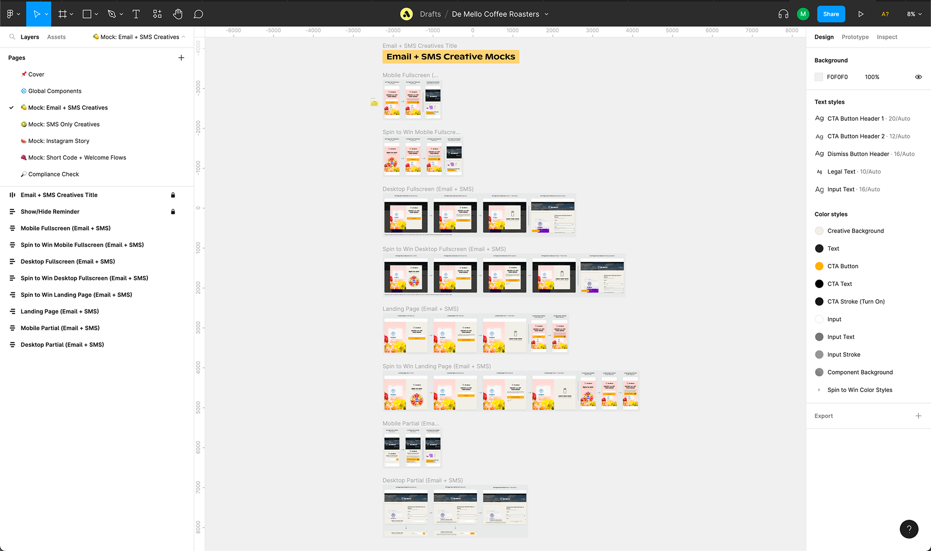
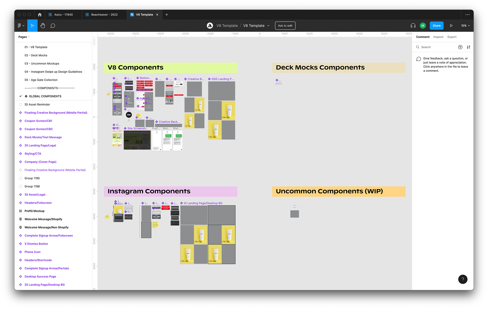
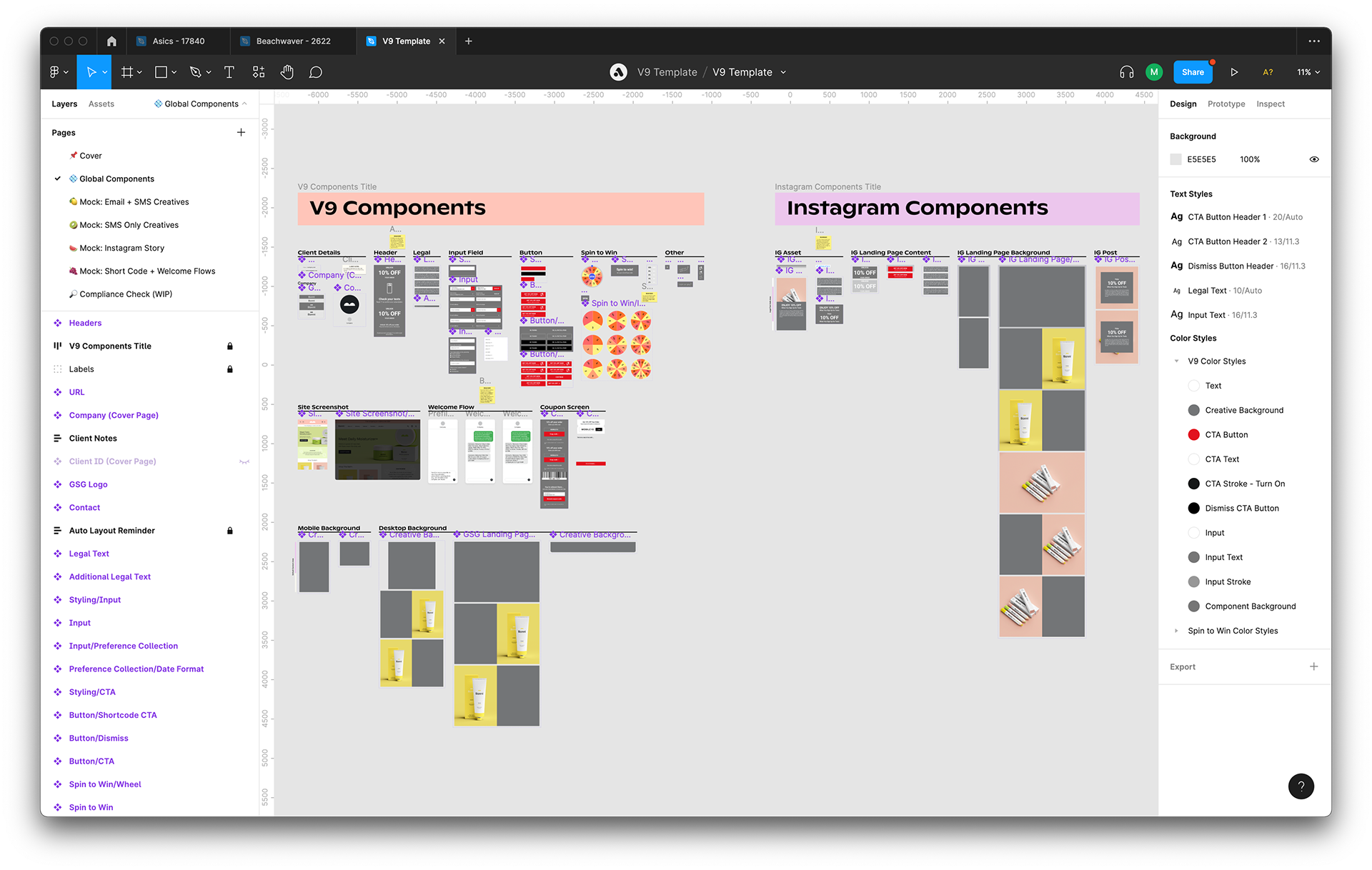
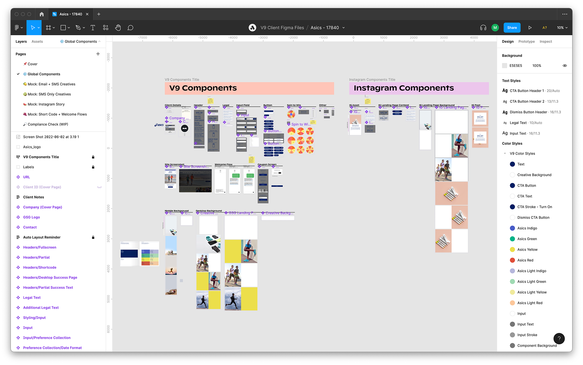
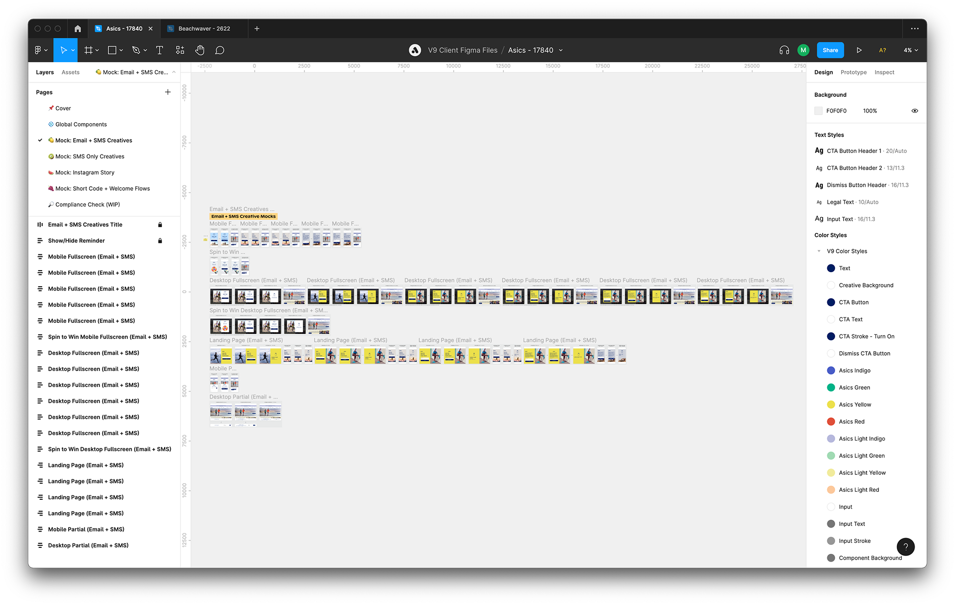
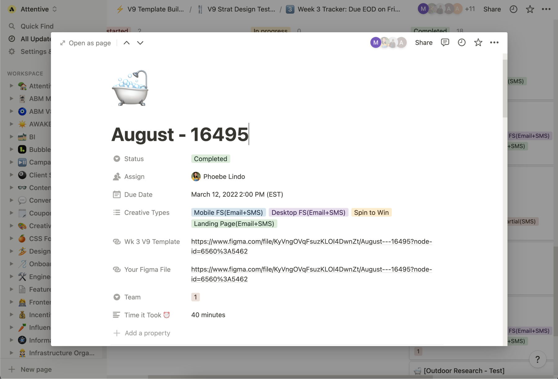
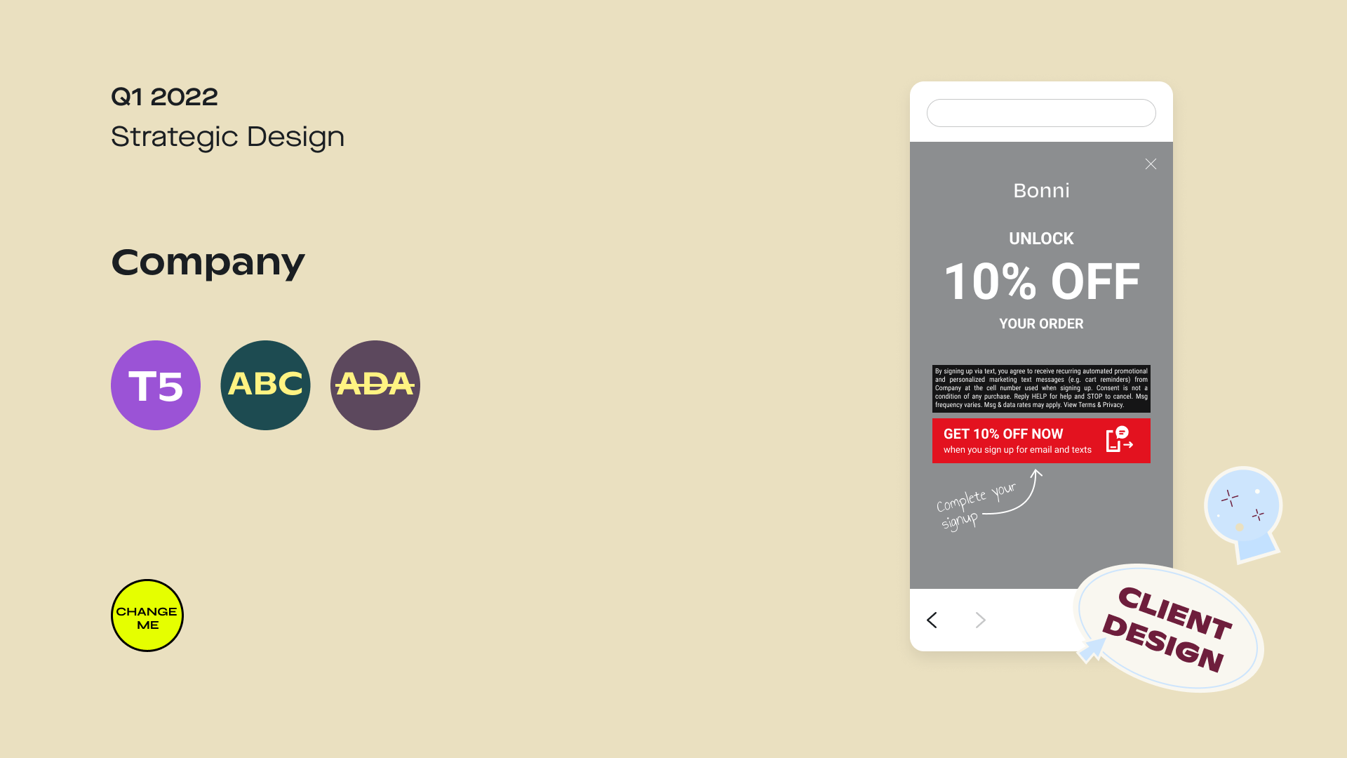
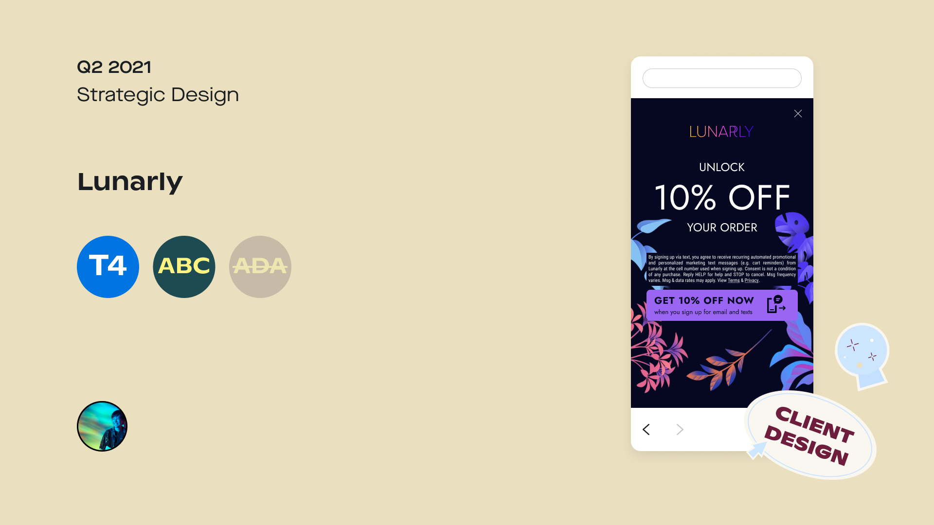
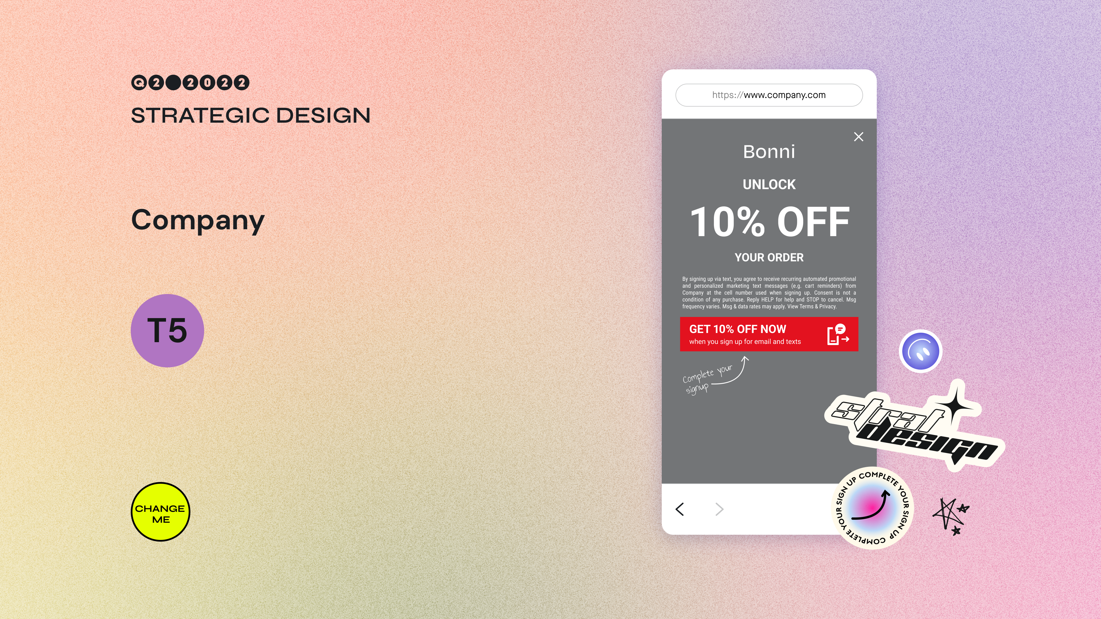
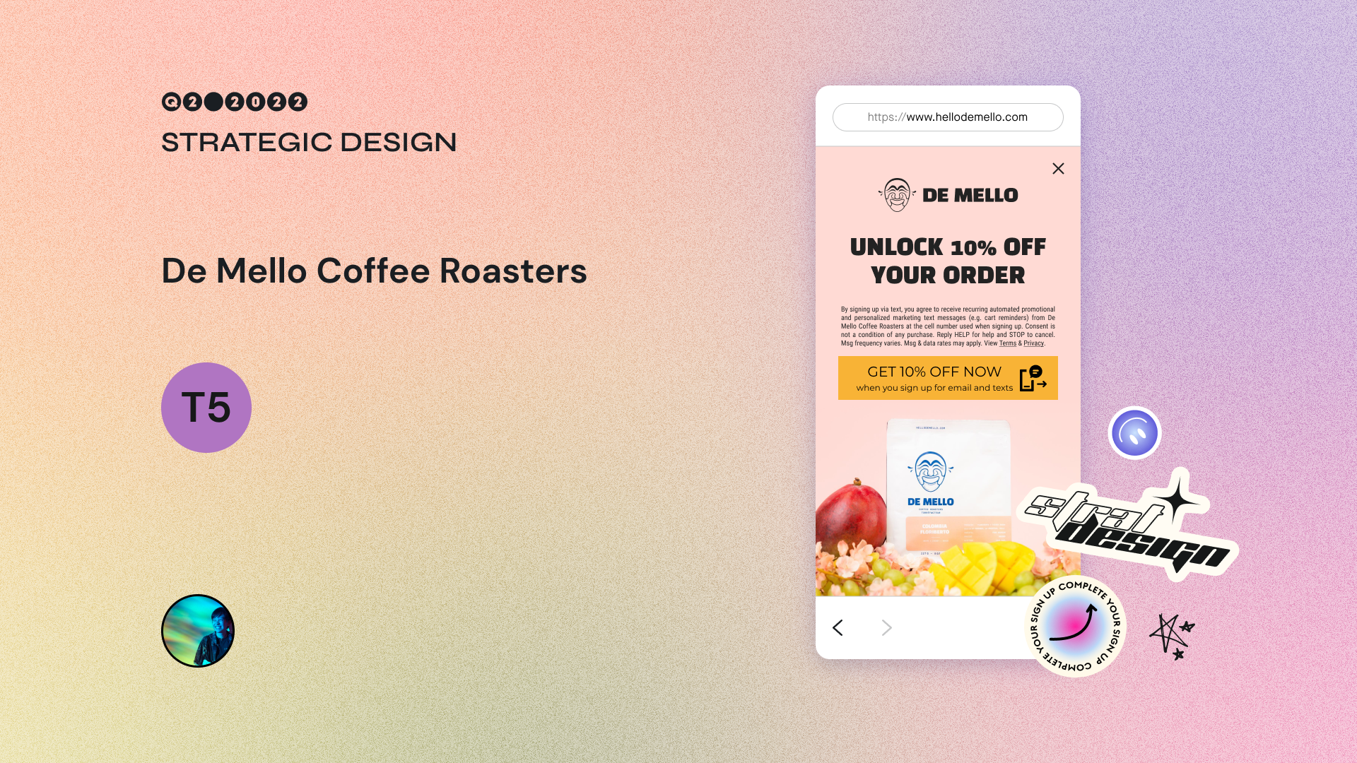
You saw me use the V9 Template in the De Mello Coffee Roasters video above. Whenever we onboard a new client, we duplicate the V9 Template and plug in all of that client’s brand assets (logo, fonts, colors, imagery) into the “Global Components” page. The file houses all of the sign-up unit-related assets and deliverables (in the “Mock” pages) we have for that client.

V9
V9
We keep all of our clients’ files on hand. Should a client request more sign-up units and/or more mockups, members of our team will continue to add to the file.
V8
V9
Some pain points of the previous V8 Template (pictured below) included:
File becomes unwieldy as more assets and mocks are created. It’s difficult to create custom layouts for higher tier clients. Many pages in the file have been phased out of our workflow, so they were left just sitting there. It takes too much time to make client files for lower tier clients. Less opportunity for highly custom work for higher tier clients since mockups don’t fully reflect what built sign-up units look like. Older templates became less usable.
V8
V8
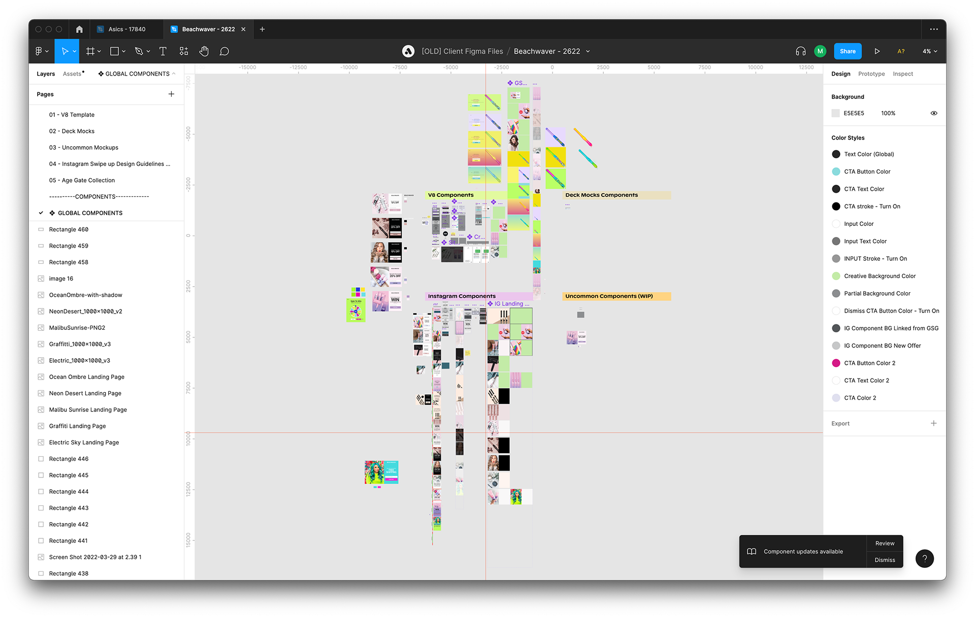
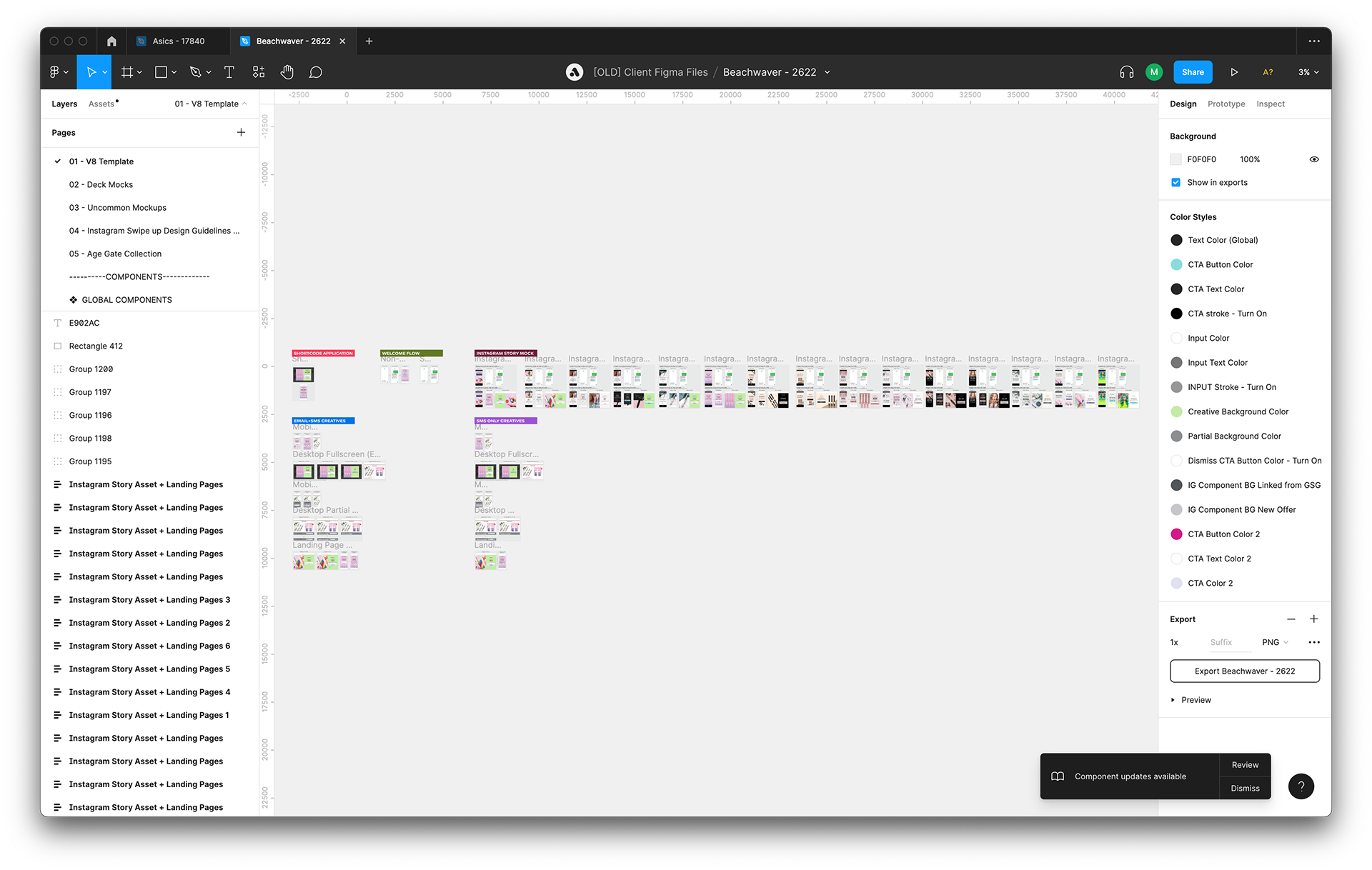
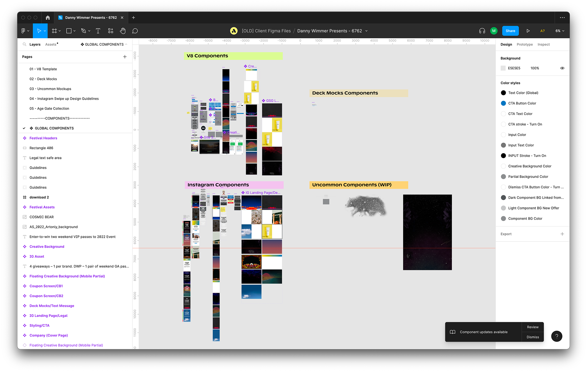
Below is an example of the V8 file for Beachwaver. You can see that this file’s “GLOBAL COMPONENTS” page has so many assets that it’s become disorganized and cluttered. The people who worked on it had to move the background image components to a completely different area (or else the component would run into other components like the welcome flow mockups or the Instagram components). This is a result of poor file longevity and failing to consider the future (ie: that clients may eventually want us to build more than one or two sets of sign-up units).
V8
V8
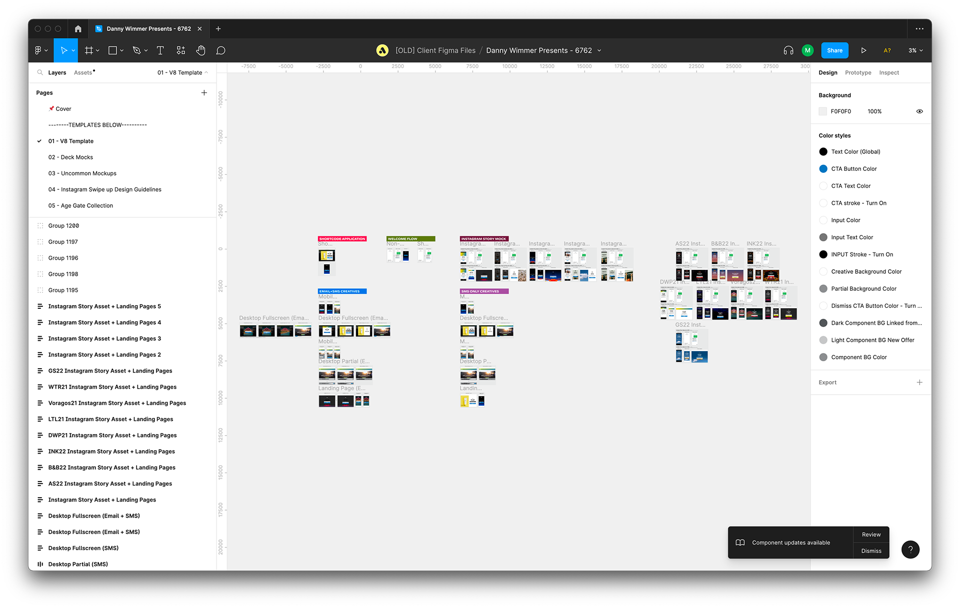
The V8 file also housed all of our common mockups on one page in a horseshoe shape. This worked out fine for Beachwaver since they only requested multiple Instagram mockups, but for clients like Danny Wimmer Presents who request multiple mockups for desktop fullscreens, there’s not enough room in the horseshoe to accommodate another one if we’re using Ctrl + D to duplicate mockups. The person who made the second desktop fullscreen mockup moved theirs to the left of the initial mockup because there was no room to the right of it.
V8
V8
Our main goals for the revamp were:
Streamline workflow to save time. The Strategic Design team spends an unimaginable amount of time onboarding new customers onto the Attentive platform. Anything that cuts time is worth investigating.
Make mockups more accurate to manage client expectations. Implement auto layout to help mockup elements behave more like web elements. Add mockups for new Builder functionality such as preference collection and spin to win units.
Anticipate future needs to increase file longevity. Re-organize the template’s layout to create space for an infinite number of background images and mockups. Improve the systems for layer names, components, and variants.
V9

V9
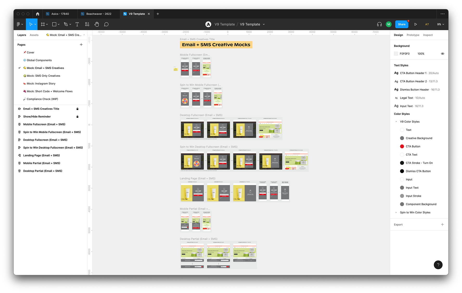
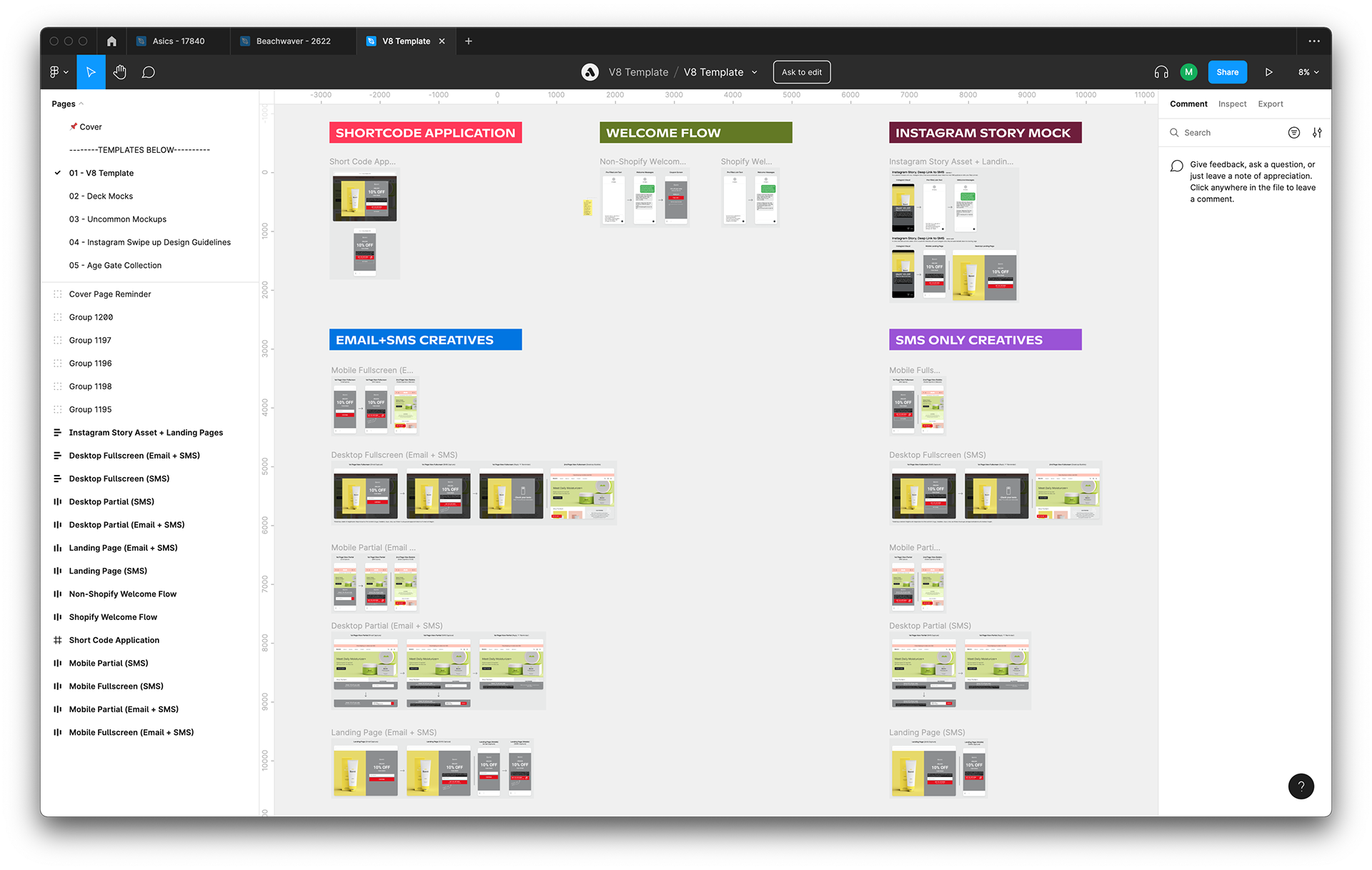
Below is Asic’s new V9 file. The client requested multiple rounds of edits on the mockups I made for them, so I ended up adding several different mobile background images and duplicating a large number of mockups. But it worked out with V9, because its new layout anticipates future needs by allowing for an infinite number of background images and mockups.
V9
V9
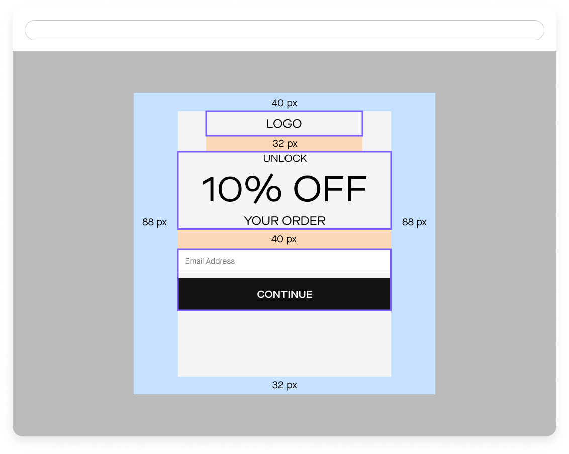
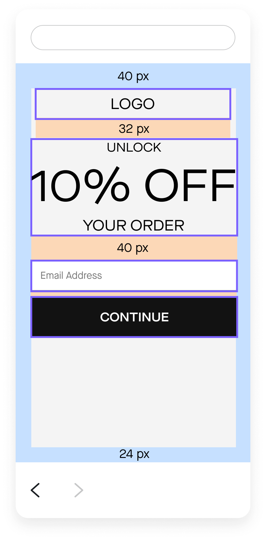
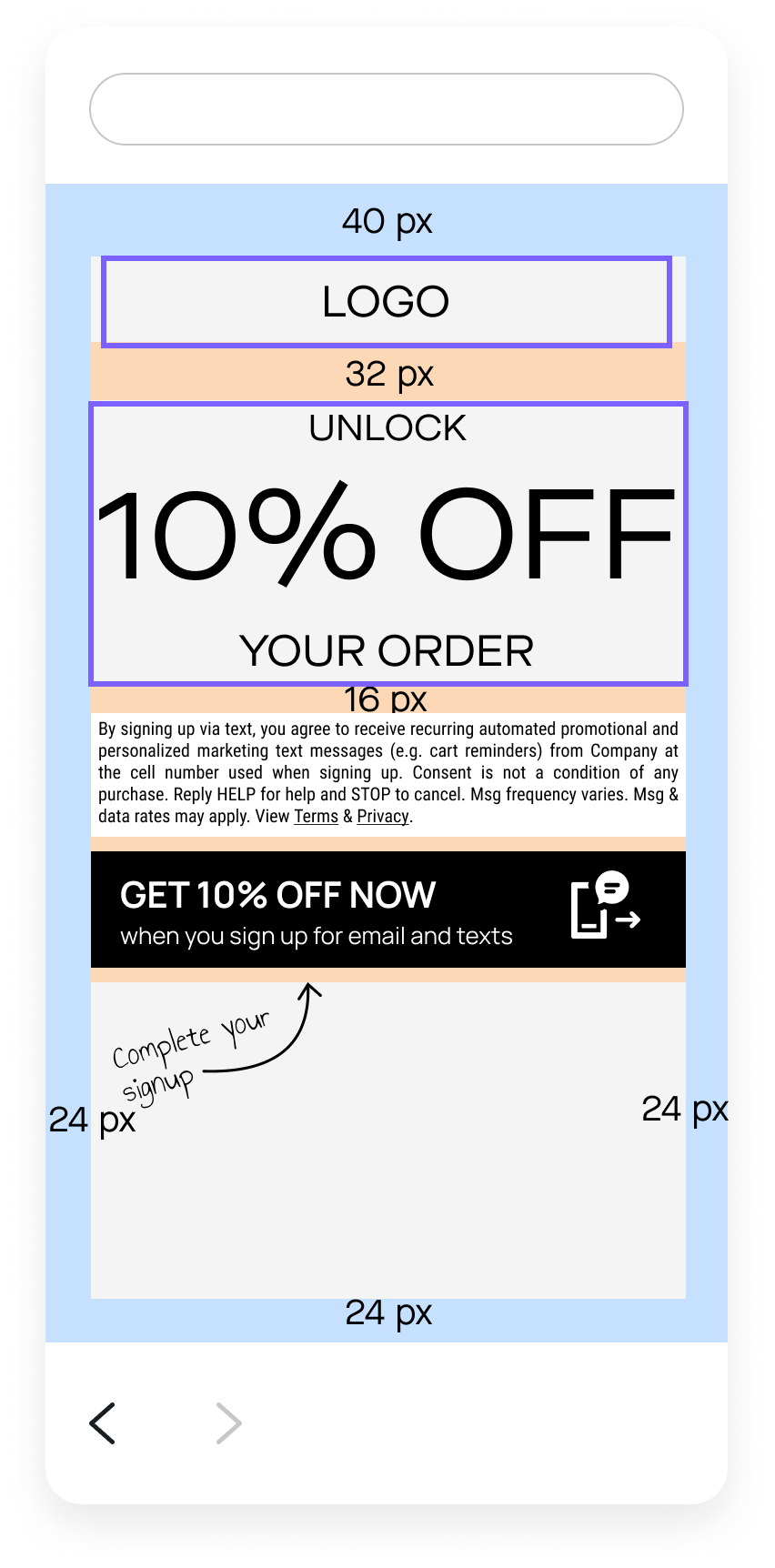
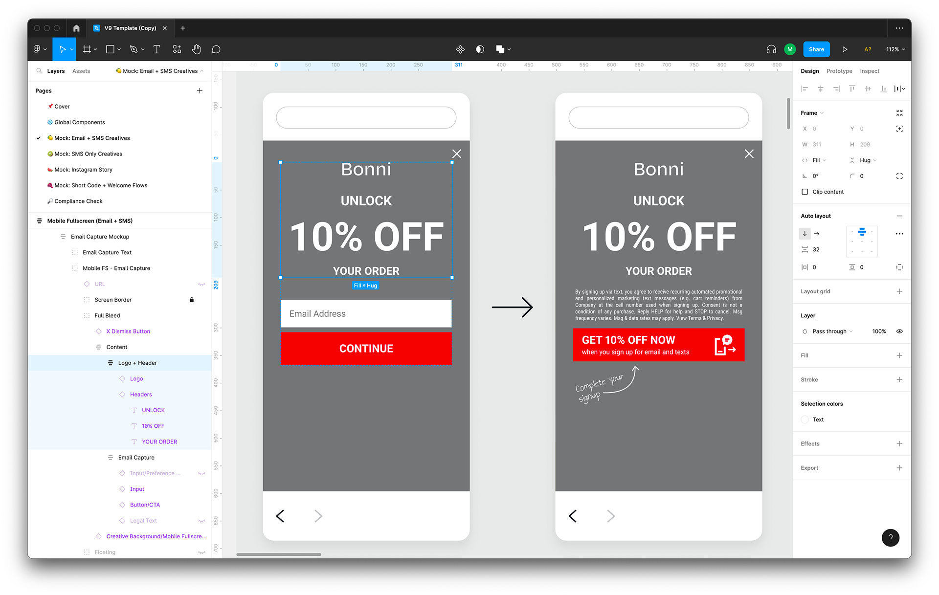
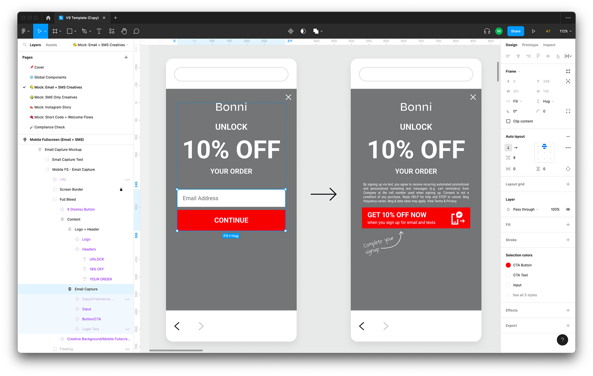
The Creative Builder has default spacing between elements, such as 32 pixels between logo and header and 8 pixels between the input field and CTA button.
To manage client expectations, we applied auto layout to all mockups specifying the exact vertical spacing between elements. The V8 template mockups didn’t include auto layout, so if someone changed the default “UNLOCK 10% OFF YOUR ORDER” header to something else, they might then need to manually adjust the vertical spacing between elements on the mockups.
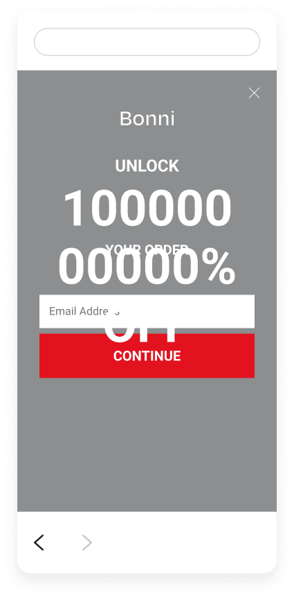
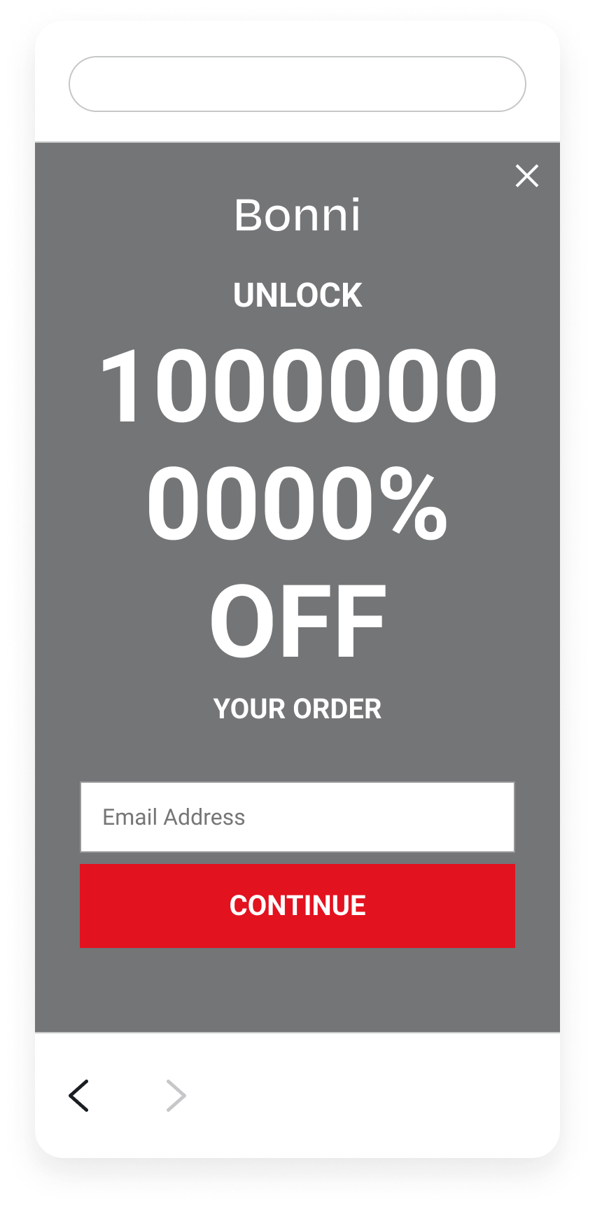
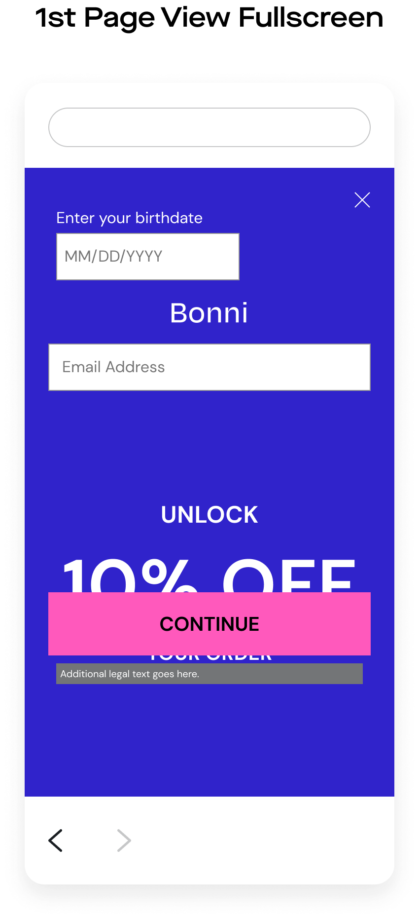
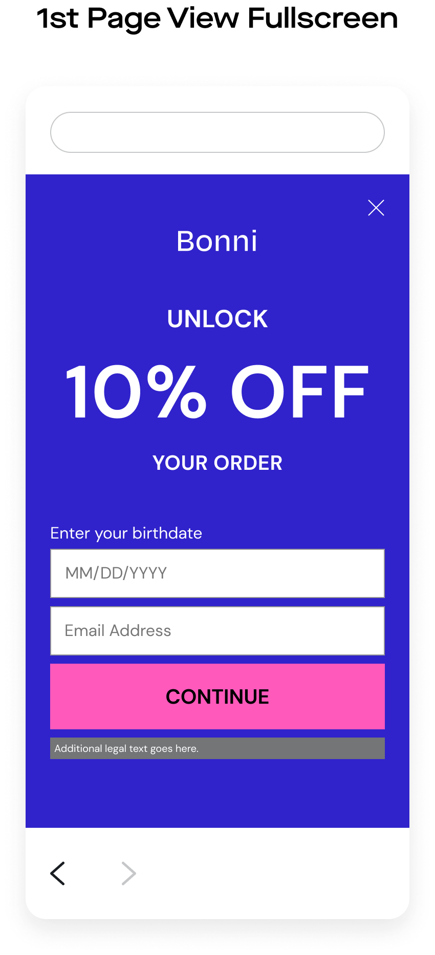
Figma’s auto layout functionality basically allows elements to behave how they would on a website. Here’s a comparison of what would happen if I changed the header to say “UNLOCK 10000000000% OFF YOUR ORDER” on the V8 template (left) and the V9 template (right). You can see that all elements after “10000000000% OFF” shift down, just like they would in the Creative Builder (and on a website). Not having auto layouted mockups was one of the reasons why working with the V8 template took so long.
V8
V9
By using auto layout to ensure consistent spacing between elements, we cut down on how long it takes to design faithful mockups.
Each mockup’s content (ie: everything except the background image and “X” close button) falls within one auto layout group named “Content” with 40 pixels of vertical space between elements. That means its contents, the “Logo + Header” and “Email Capture” auto layout groups, are vertically spaced 40 pixels apart at all times. The contents within the “Logo + Header” auto layout group (the “Logo” and “Header” layers) have a vertical spacing of 32 pixels. The contents within the “Email Capture” auto layout group (optional preference collection, input field, CTA button, and optional additional legal text) have a vertical spacing of 8 pixels.
V9
V9
V9
Not familiar with auto layout? Neither was our team! But they were willing to adapt to auto layout if it meant streamlining their workflow. So Katherine, Audrey, and I put together a two-part auto layout demo for our team. We covered both how auto layout functions in general and how auto layout functions in the V9 template.
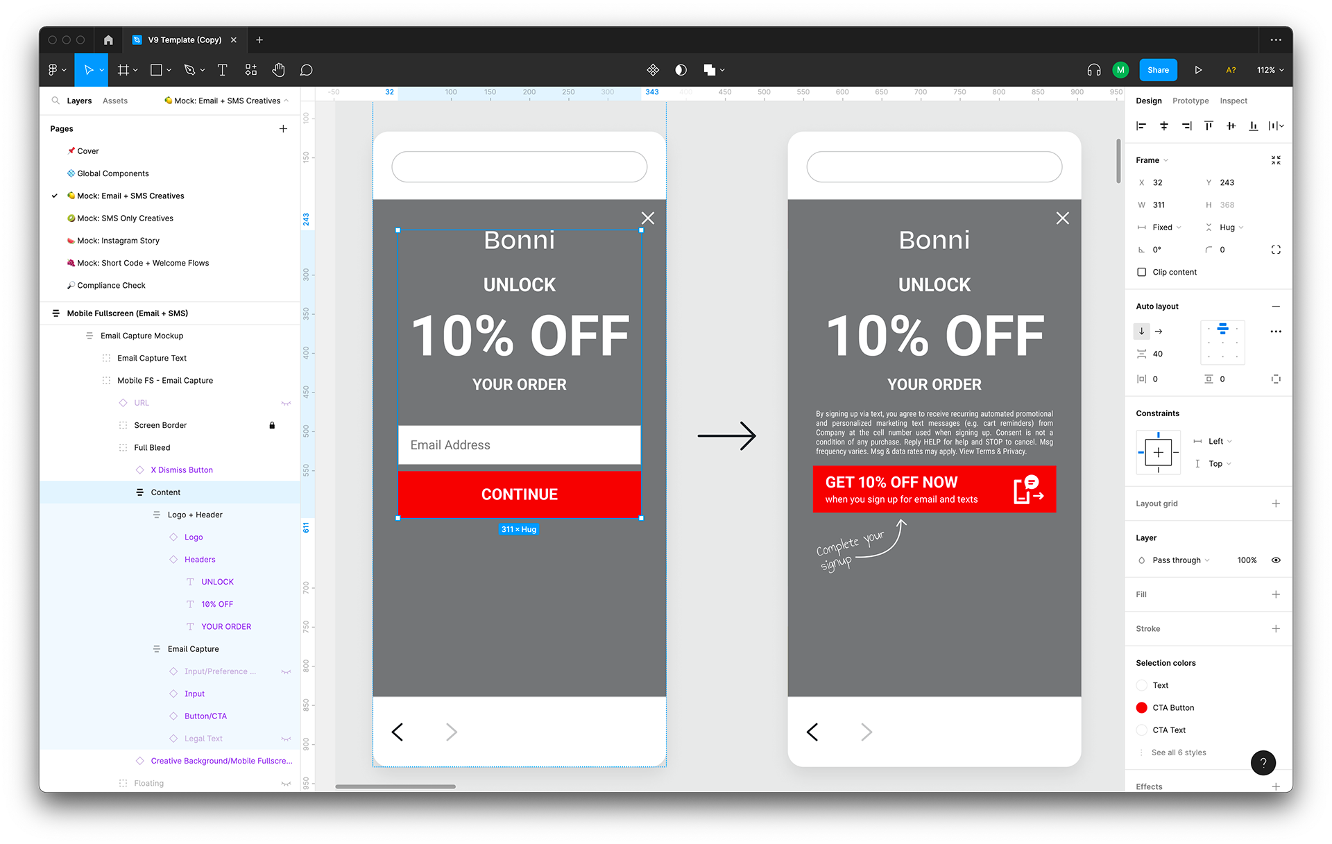
For one of our post-demo practice exercises, we asked everyone on our team to use auto layout to “fix” a messed up mobile fullscreen mockup (left). We asked, “Make sure all the layers have the correct vertical spacing in between them (see reference). Make sure all input elements (ie: age gating) span the full width of the CTA button.” I then demo’ed how I would fix this mockup (right).
We knew from the beginning of the project that we’d want to do extensive user testing to make sure the rest of our team could voice what was and wasn’t working with the revamp. In our project timeline, we budgeted time for four week-long rounds of user testing. This included splitting our team up into four groups. For week one, each group made one set of mockups (ie: mobile) for fake clients. For week two, each group made the other set of mockups (ie: desktop) for fake clients. For week three, each group moved on to more specialized mockups (ie: Instagram) for fake clients. For week four, each group made mockups for real clients.
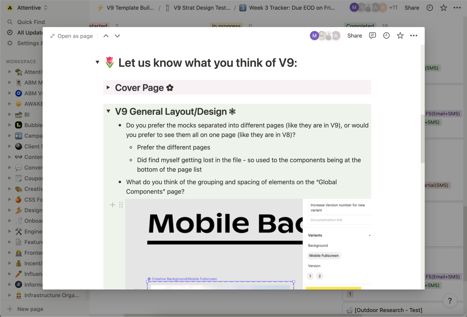
Along with their mockups, we asked everyone to answer a list of questions about their experience working with the V9 Template WIP, such as:
Did you encounter any other roadblocks or pain points? Is there anything you wish the V9 Template had? Is there anything you wish the V9 Template didn’t have? Do you think there are any elements that are unnecessarily auto layouted? Can you see any of this auto layout stuff speeding up or slowing down your workflow? Please briefly explain why. Anything else you would like to mention or suggest?
Team members reported any bugs, suggestions, and concerns to us. We evaluated all of this and made changes to the V9 Template WIP each week. Many noted they were confused by auto layout but could see it speeding up their workflow in the long run, which is one of the main reasons why we led an auto layout demo.
In retrospect, I wish we sat down with each team member synchronously (as opposed to asynchronously) to ask them to walk us through their experience.
V8
V8
V9
V9
Throughout this process, I learned so much about roadmapping a project, creating a realistic project timeline, collaborating with others while taking on distinct roles, user testing, onboarding, leading a project, presenting said project to others outside of my team, and, of course, the ins and outs of Figma (auto layout, components, variants, you name it). To this day, I continue to update the V9 Template to stay in line with new features in Attentive’s Creative Builder (like spin to win landing pages and adding backgrounds to the “X” close icon) and Figma (like absolute position).
Within my team, I’m the go-to person to ask about Figma auto layout and potential updates to the V9 Template. We’ve recently started a new initiative to create a consolidated international V9 Template (many of our clients use Attentive to reach customers outside the US), so I’ve been co-leading it with our team’s International subject matter expert. I introduced Figma’s branching feature as a potential way to speed up our workflow, and the team readily adapted it.
A manager on my team commented:
The V9 template, while I don’t use it often, is a dream. It’s a true work of art. So much better than the last one. I didn’t realize so much could be improved. I like that you took so much into consideration.
And that’s how I helped speed up my team’s workflow and became a subject matter expert in Figma.
Want to see more of my work at Attentive?
Navigate to the collection or an individual page: