Role: Lead UX Designer, UX Researcher
Process: research and synthesis from October to December 2023, designing, prototyping, testing, and iterating from January to May 2024, finalizing design system components in May 2024.
Team: Damien Plouzek (PM), Kristin Vaughn, Rob Wright, Liah Wallace, Jack Mueller (Engineers), Sierra Willenburg (UX support), Christina Cuatto (PM support), Christina Wong (UX research support)
Goal: Relayout Dealer Finder (sidebar heavy) for the new navigation system (sidebar heavy)
Solution: Relayouted Dealer Finder to be top heavy. Found other gaps in the product and solved them.
Impact: Improved a high-visibility (30k visitors since 2022) internal tool to decrease time-to-solution for 11+ teams. Achieved a company OKR.
Takeaways: Survey users on the current tool. Find out what needs to be fixed fast. Make a prioritization matrix and product roadmap. When making a testing prototype, choose a straightforward task that will answer your questions.
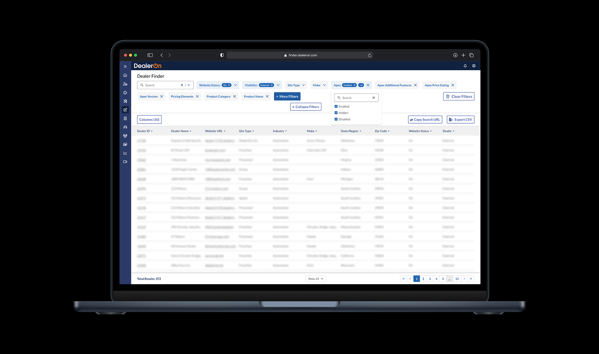
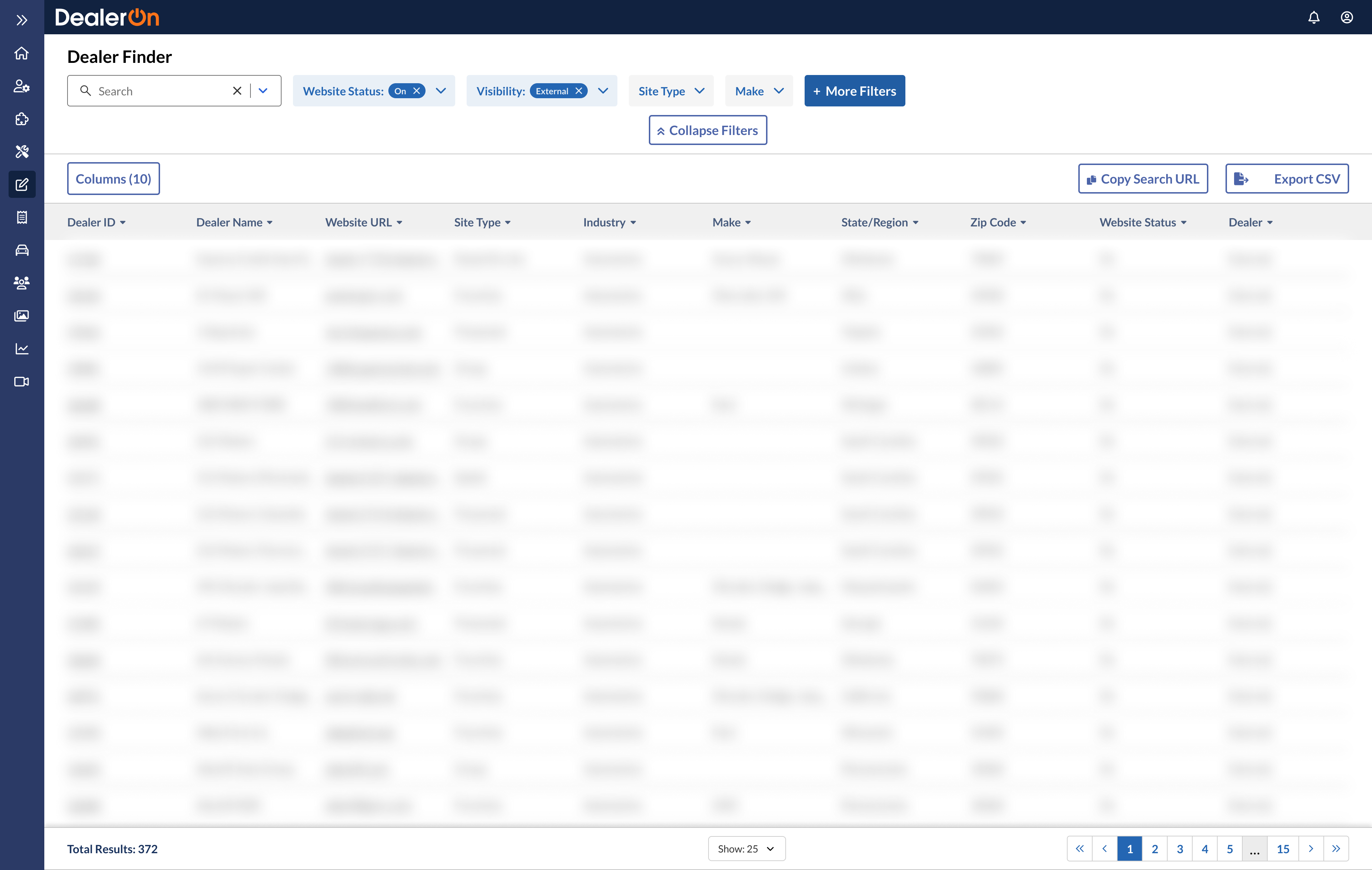
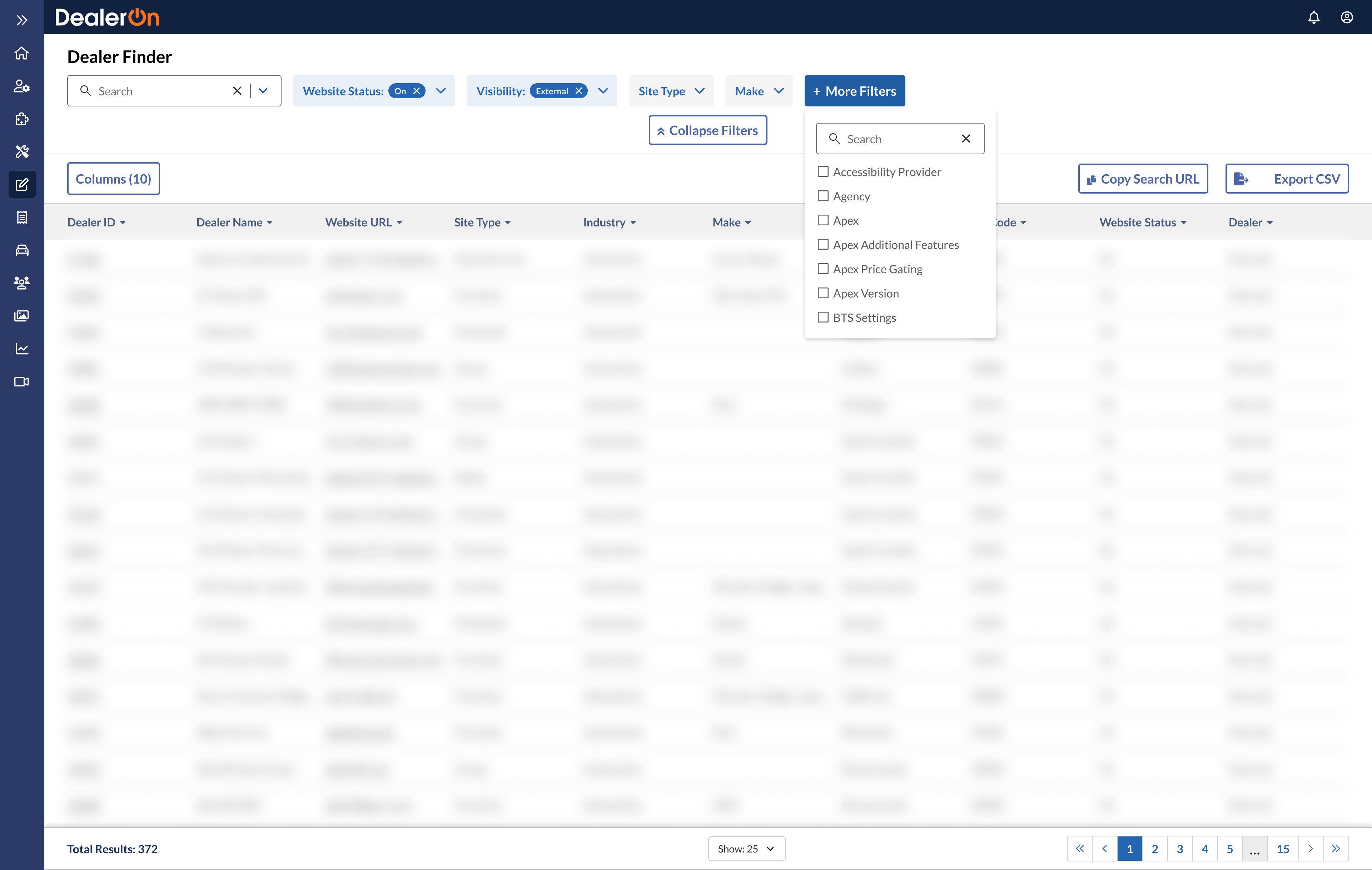
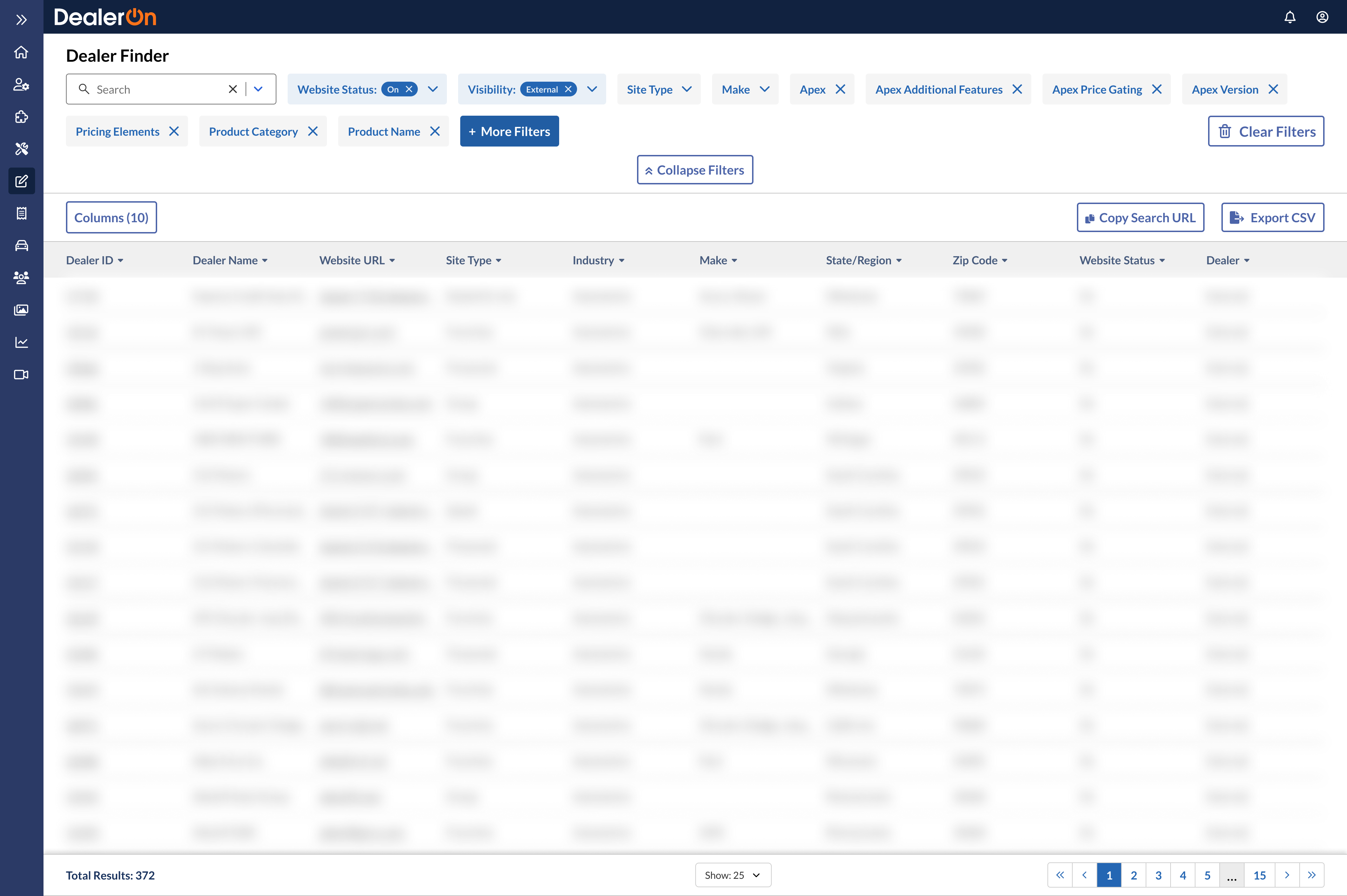
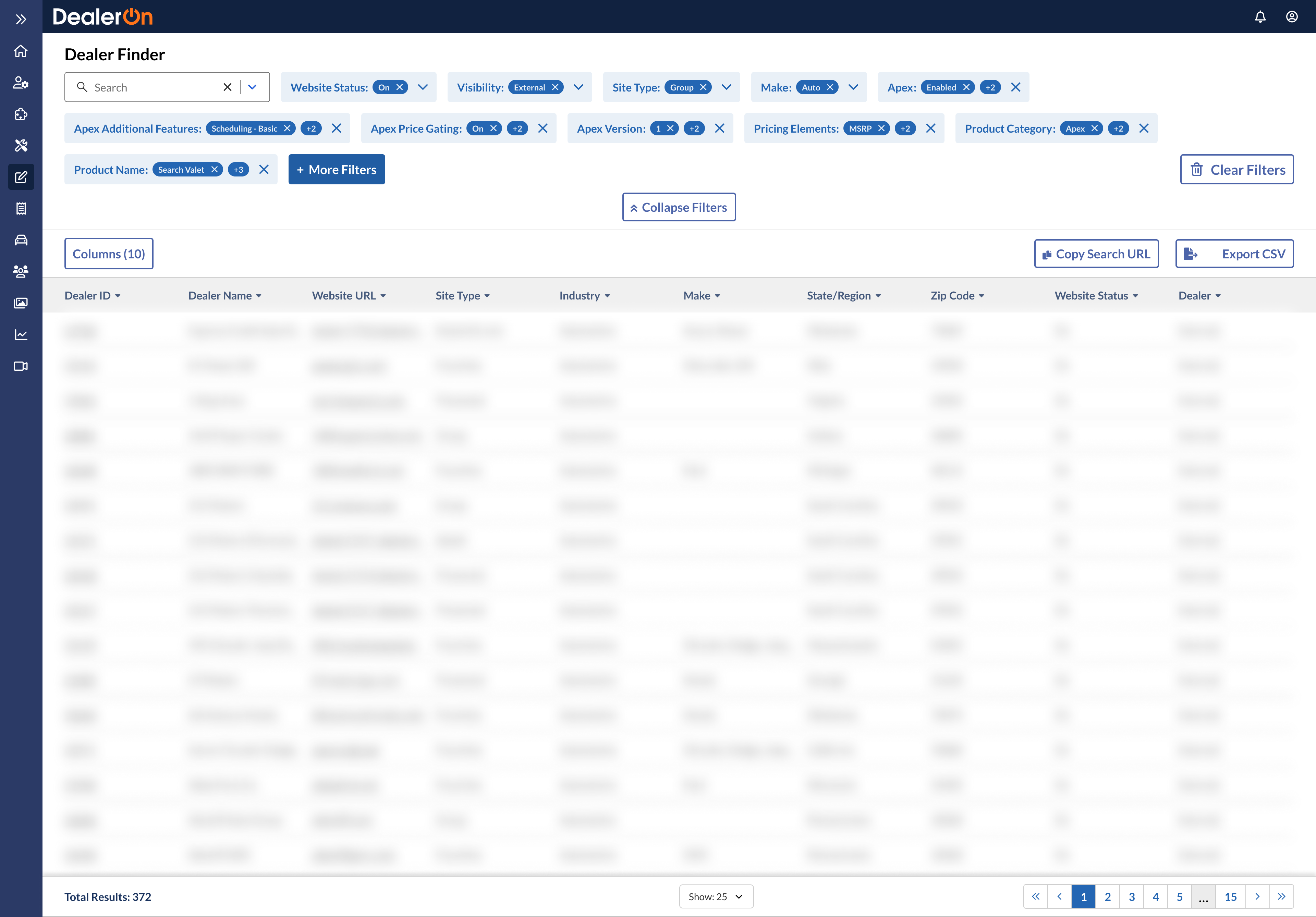
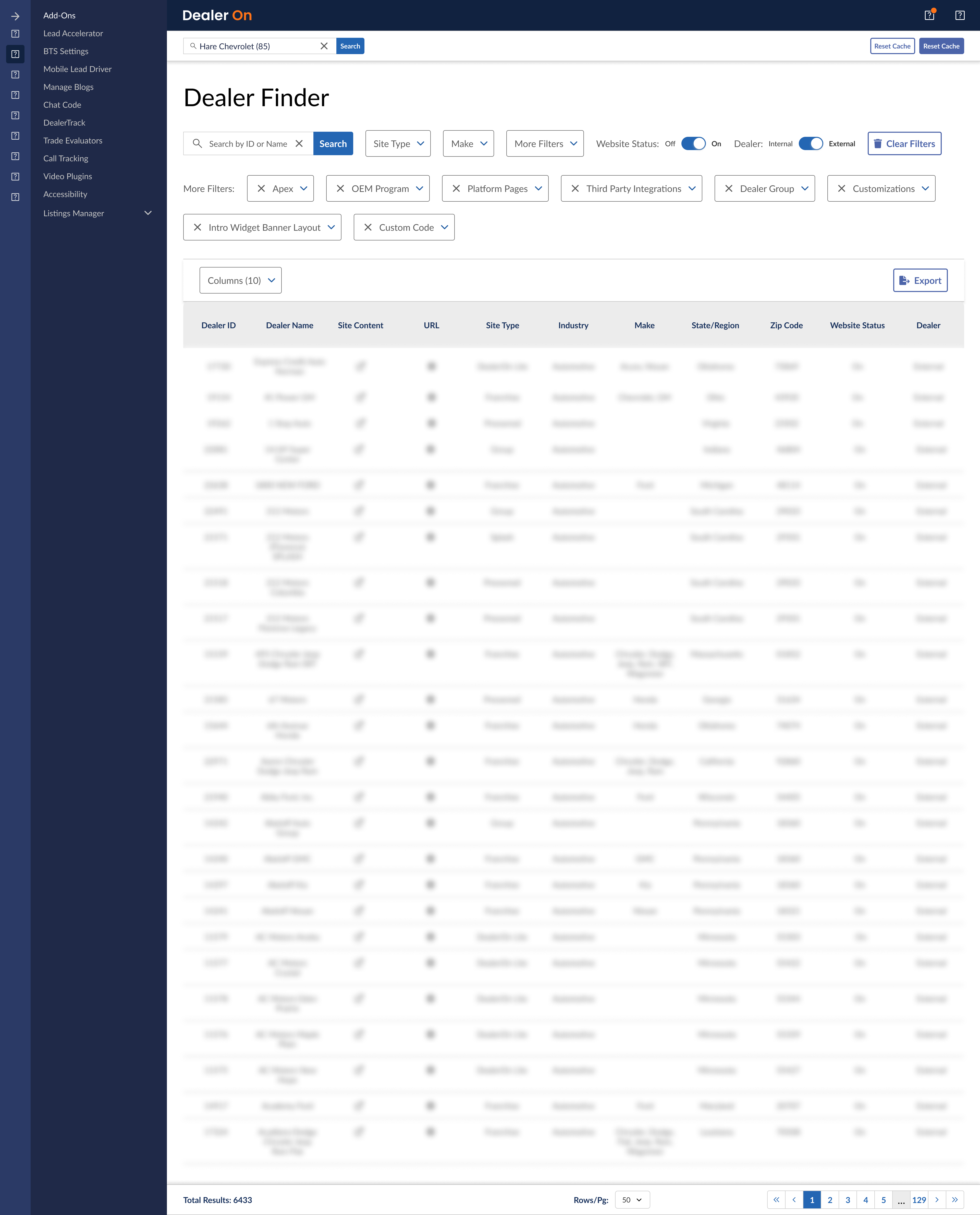
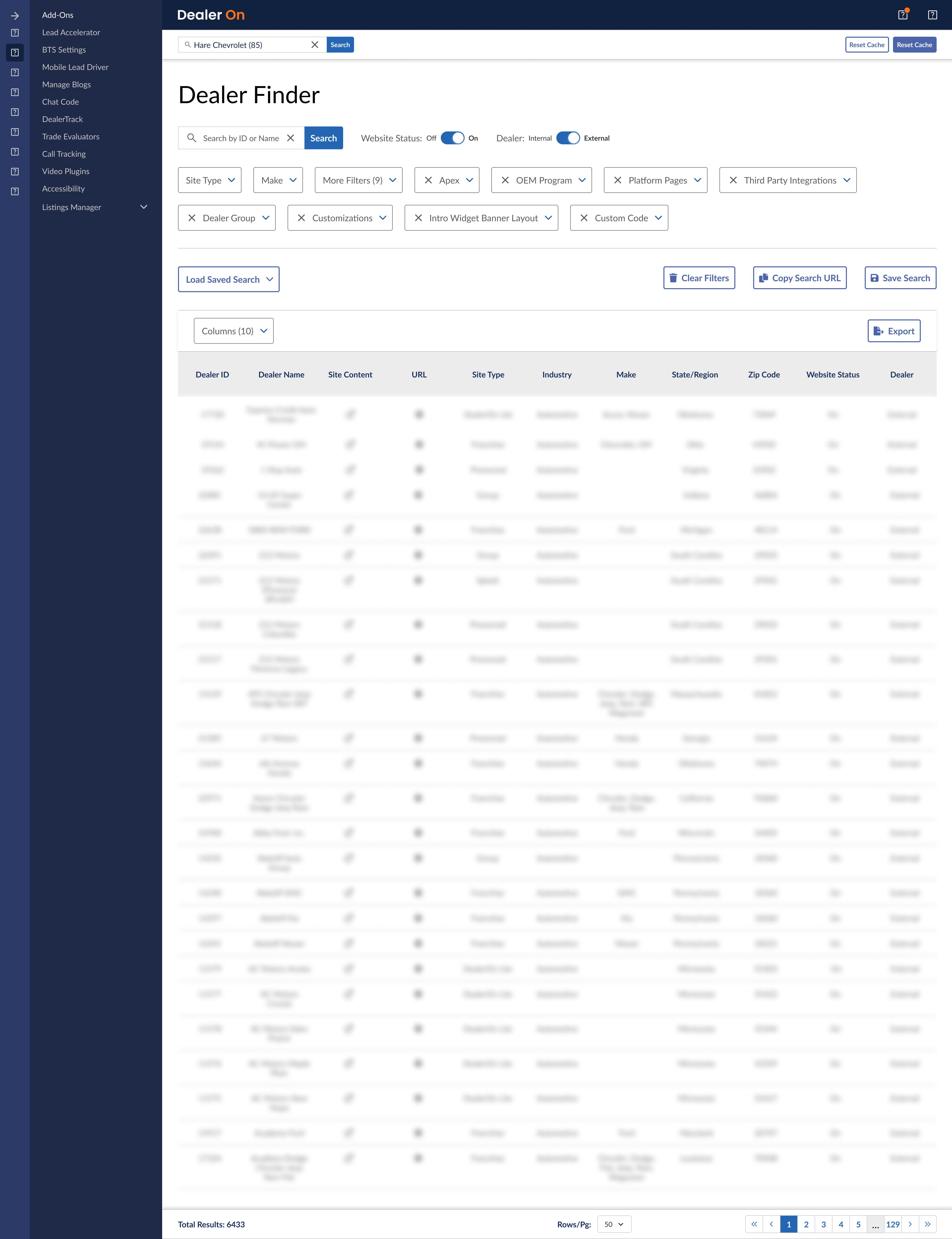
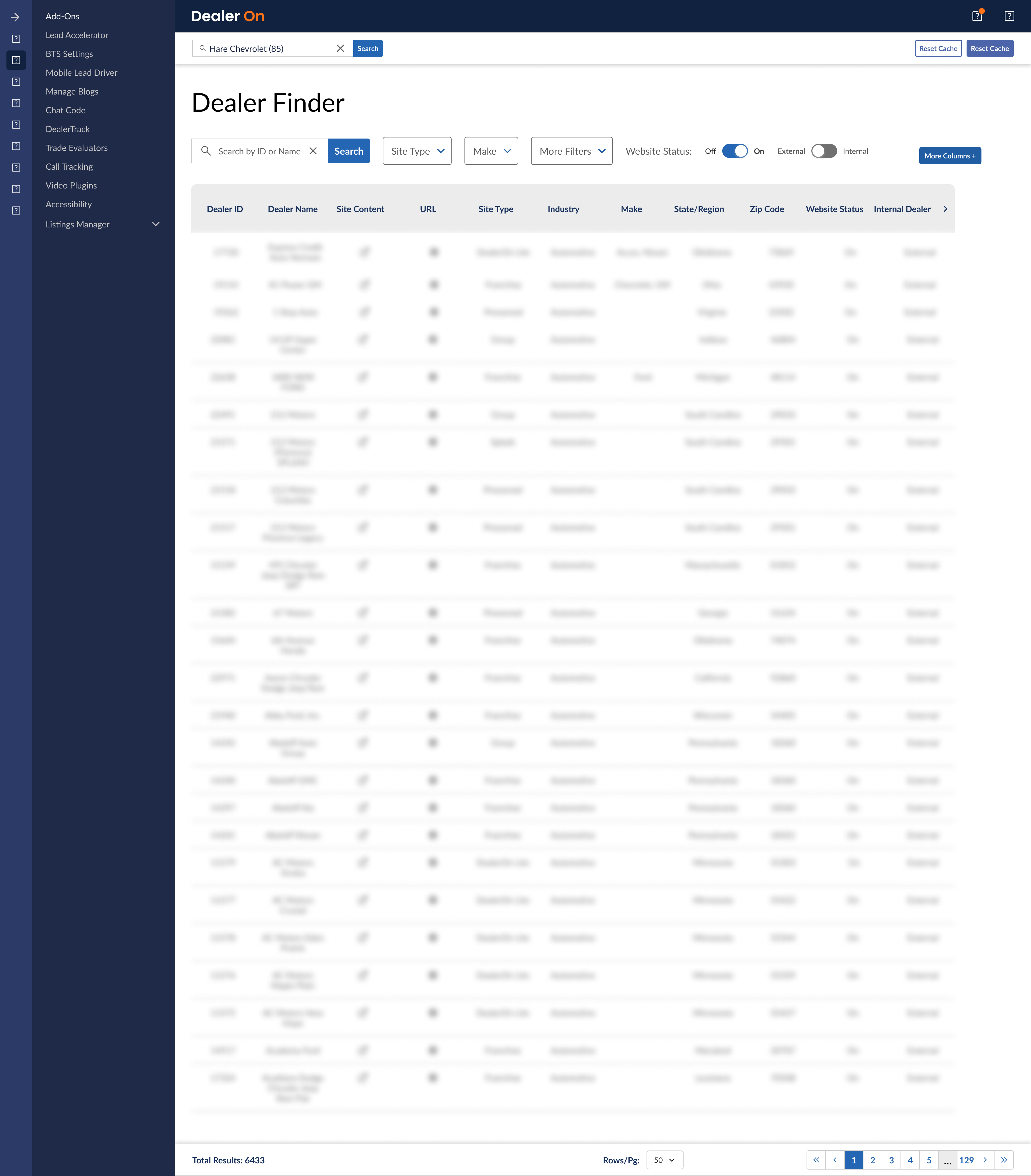
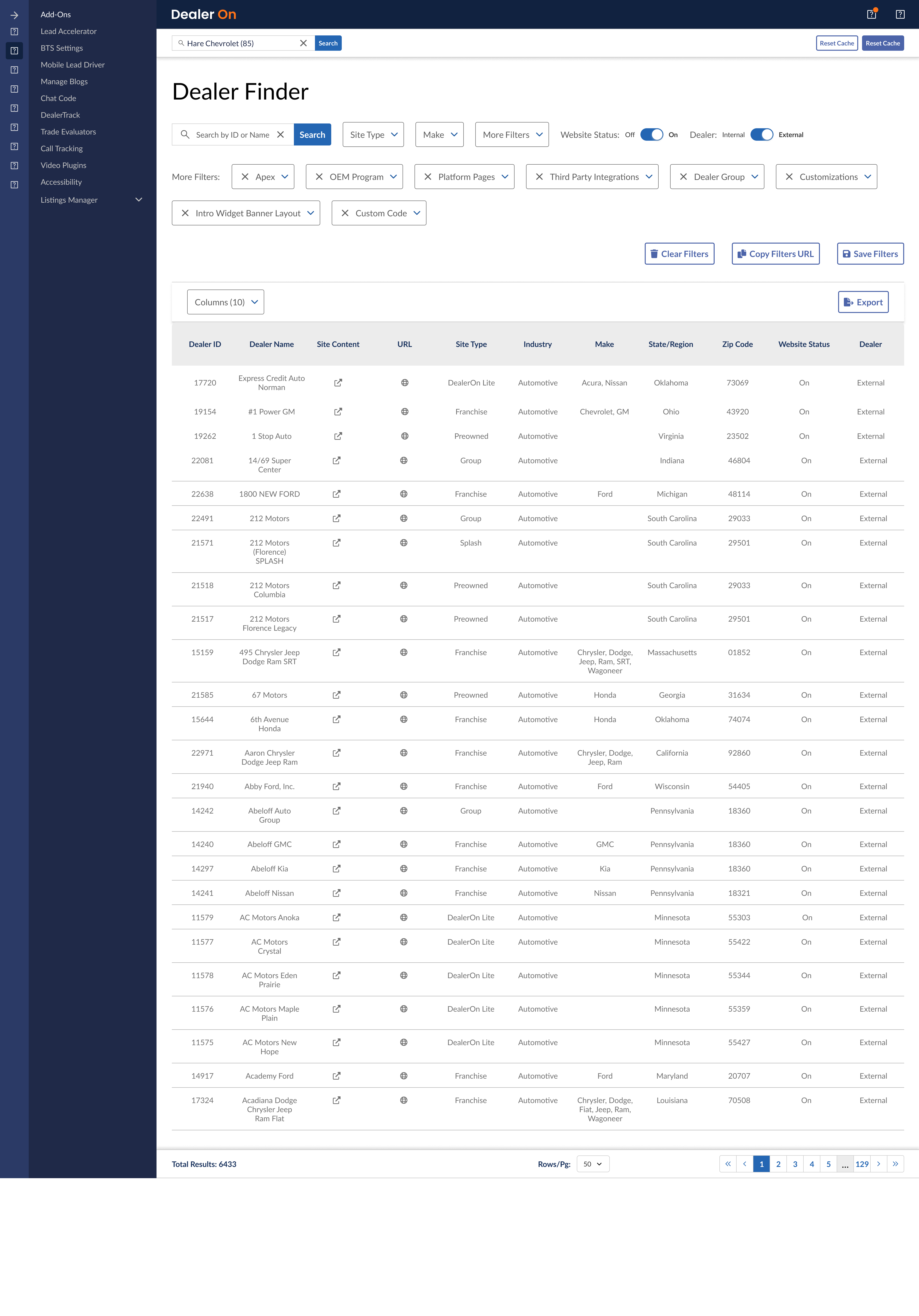
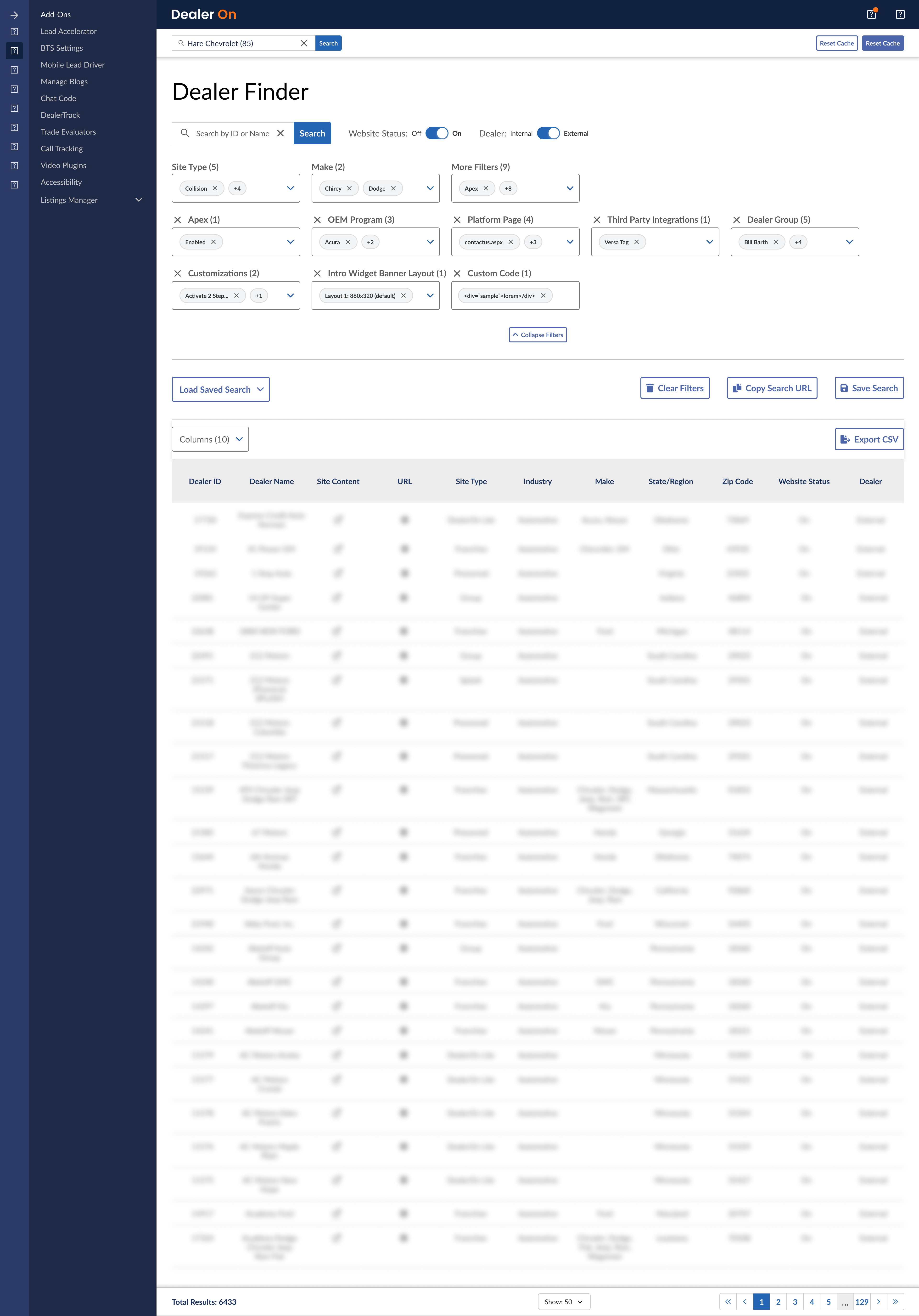
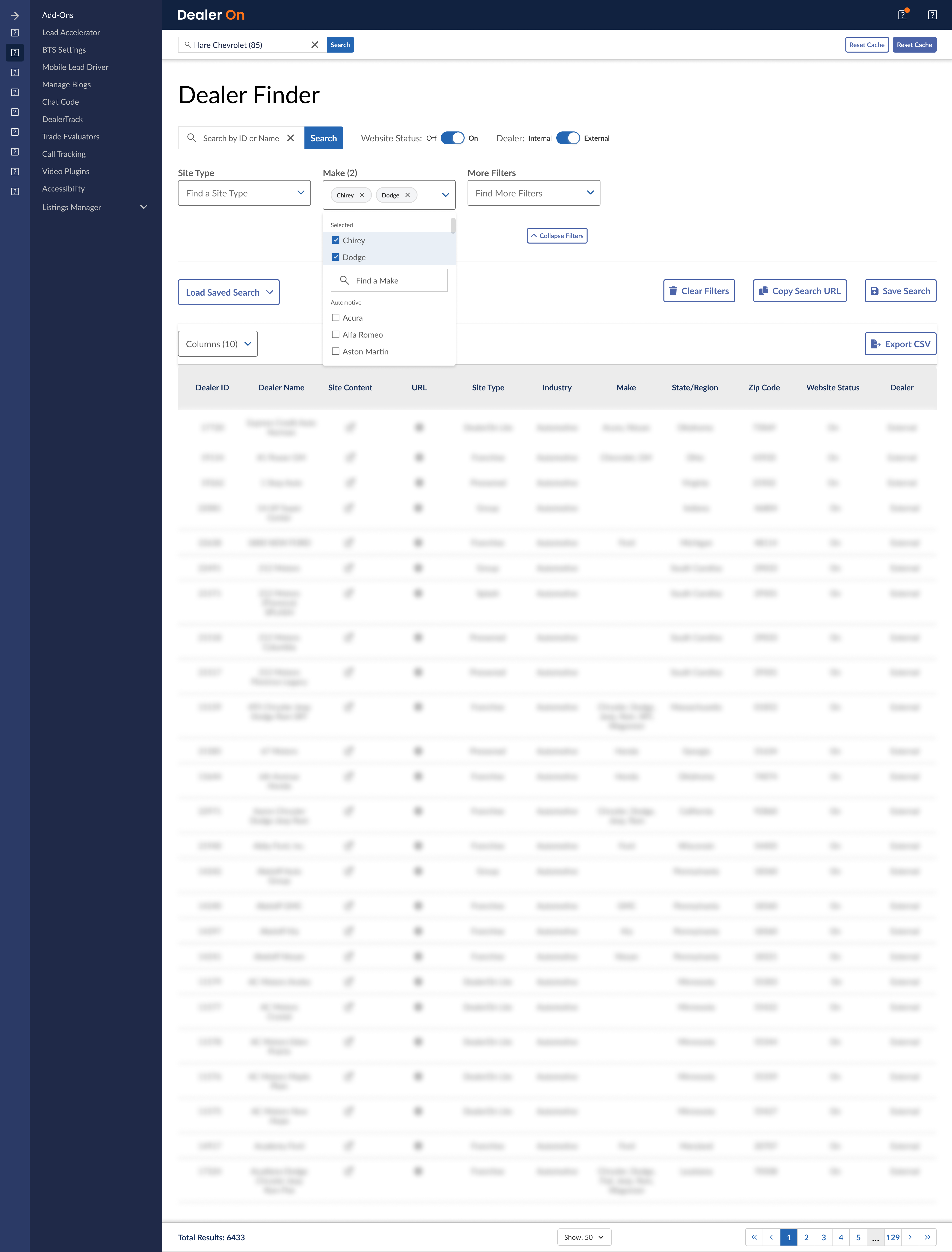
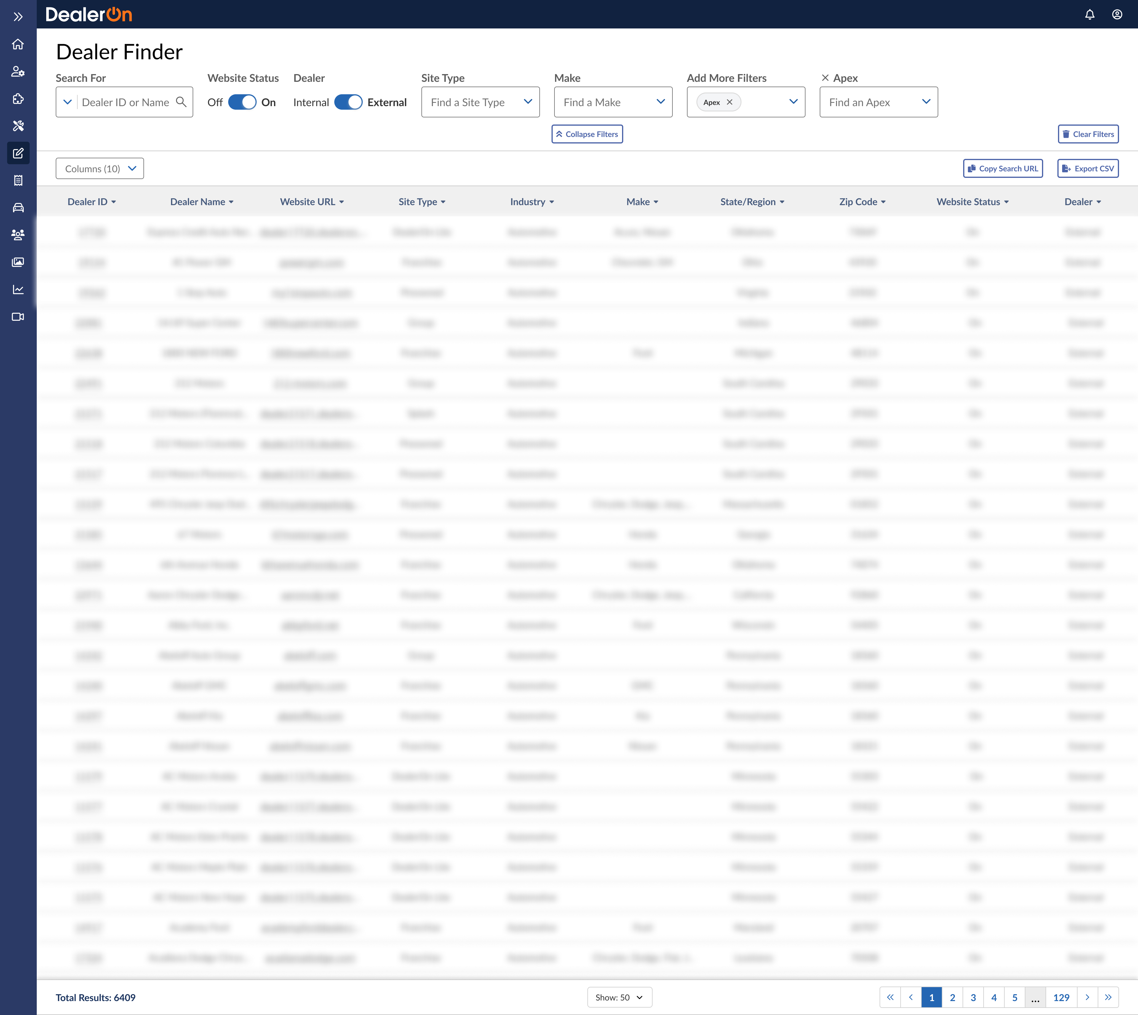
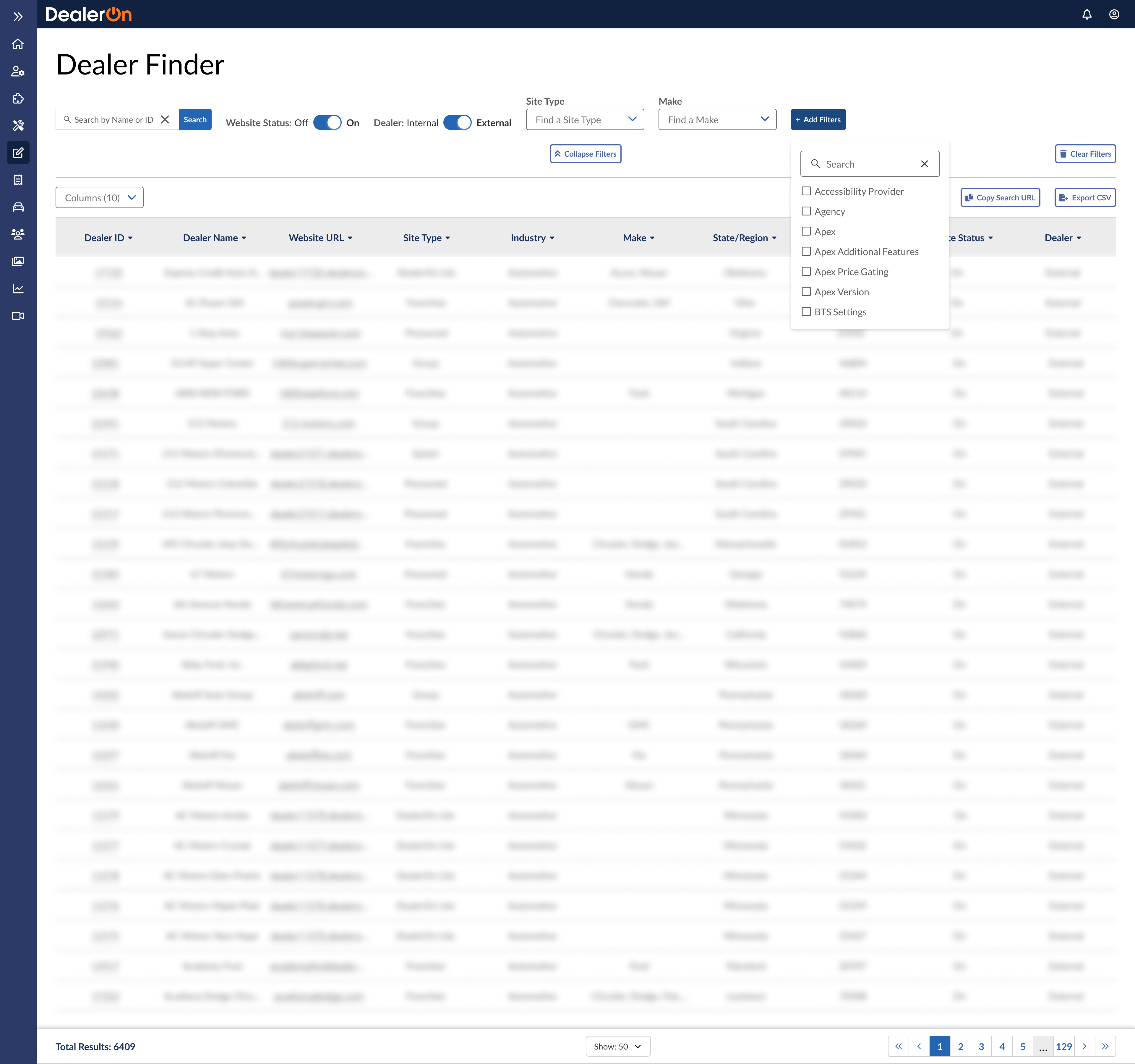
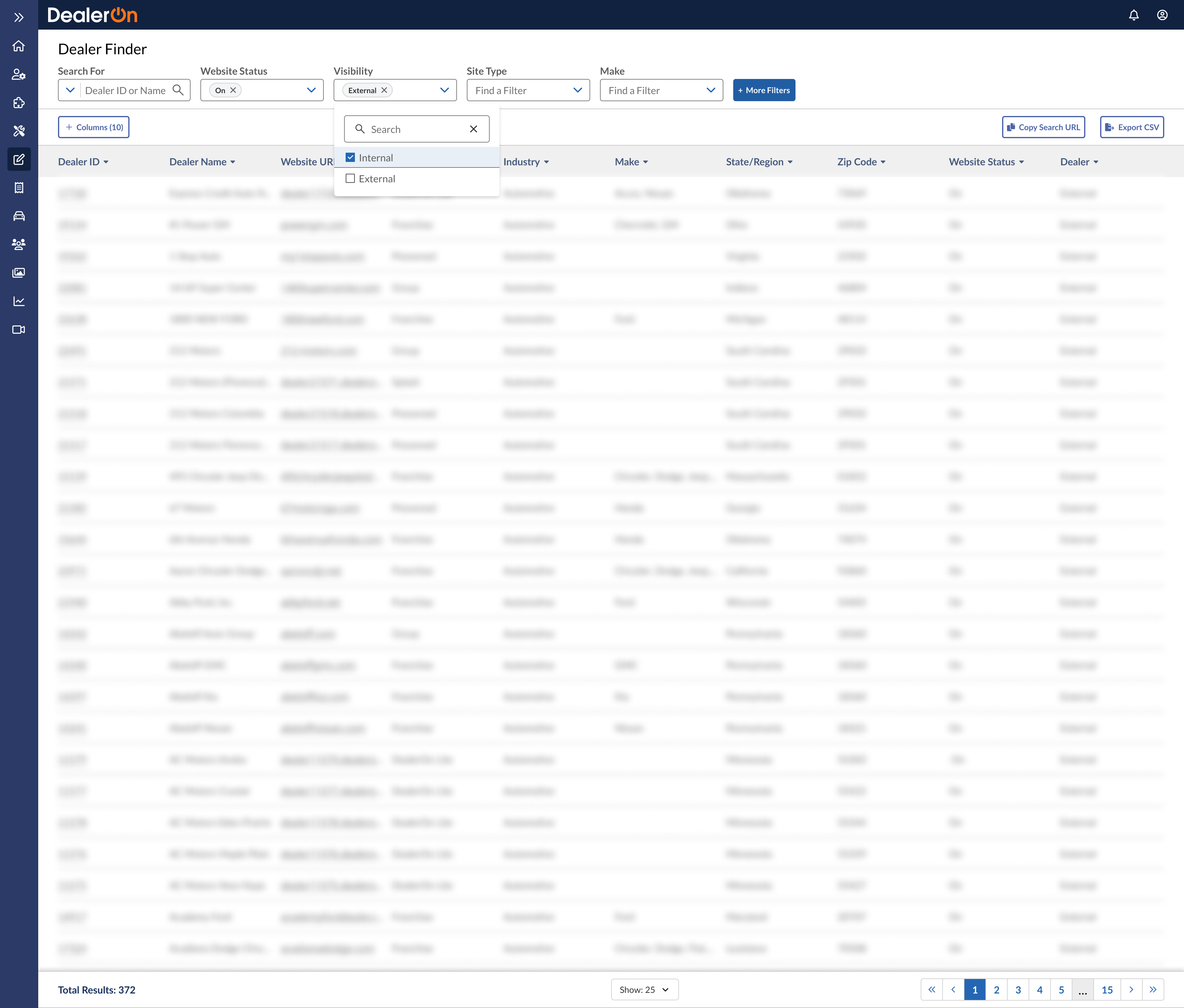
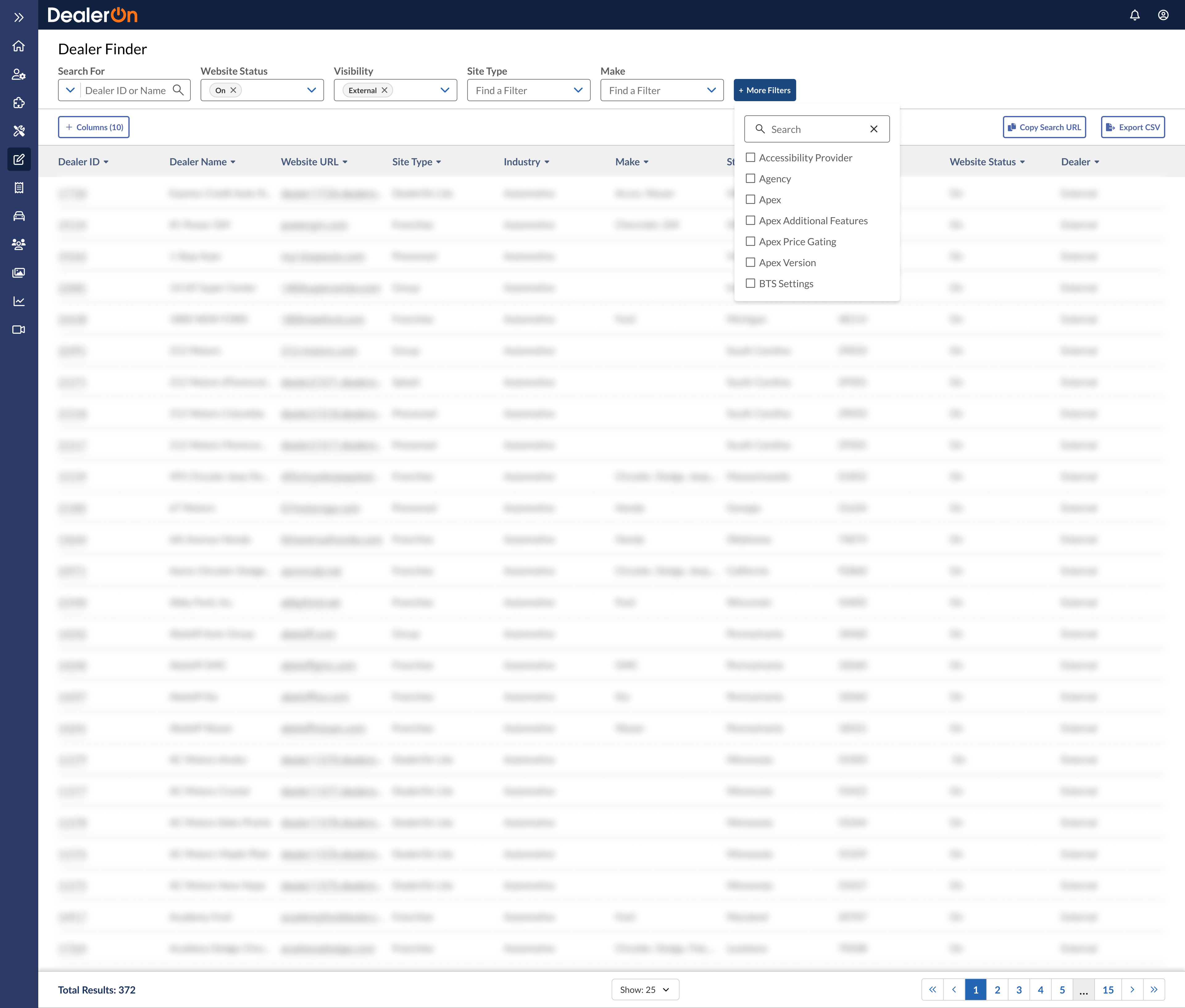
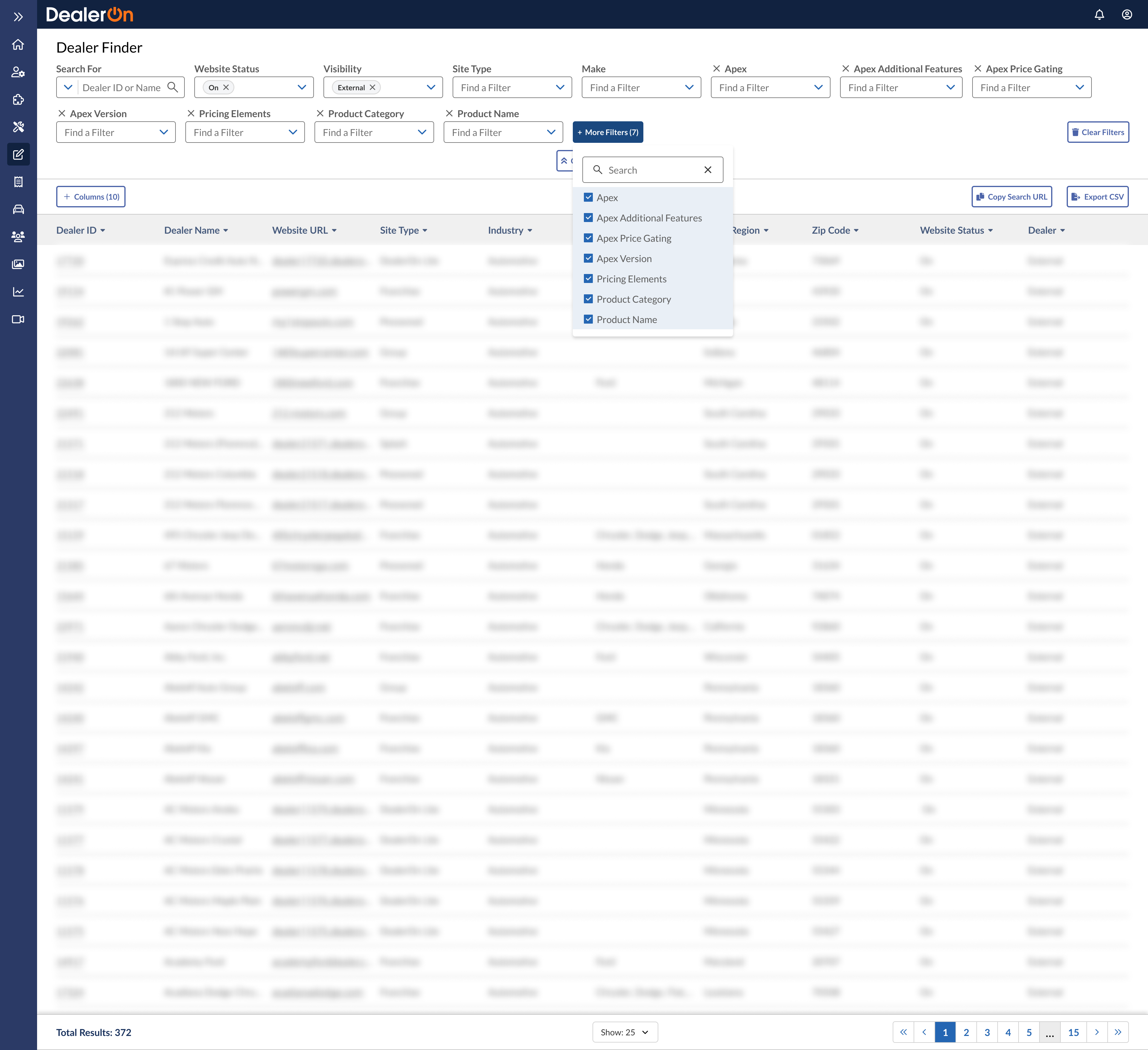
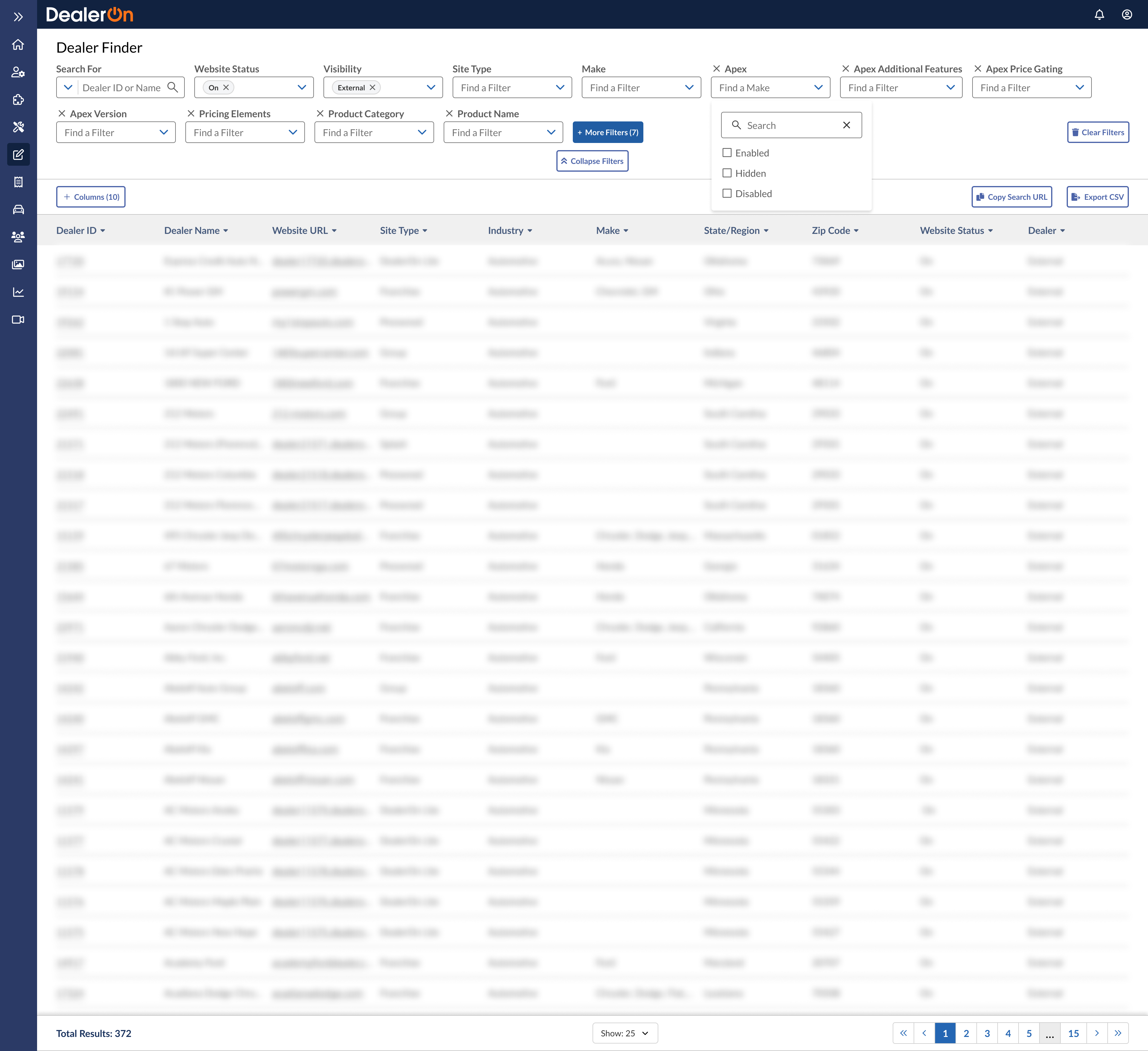
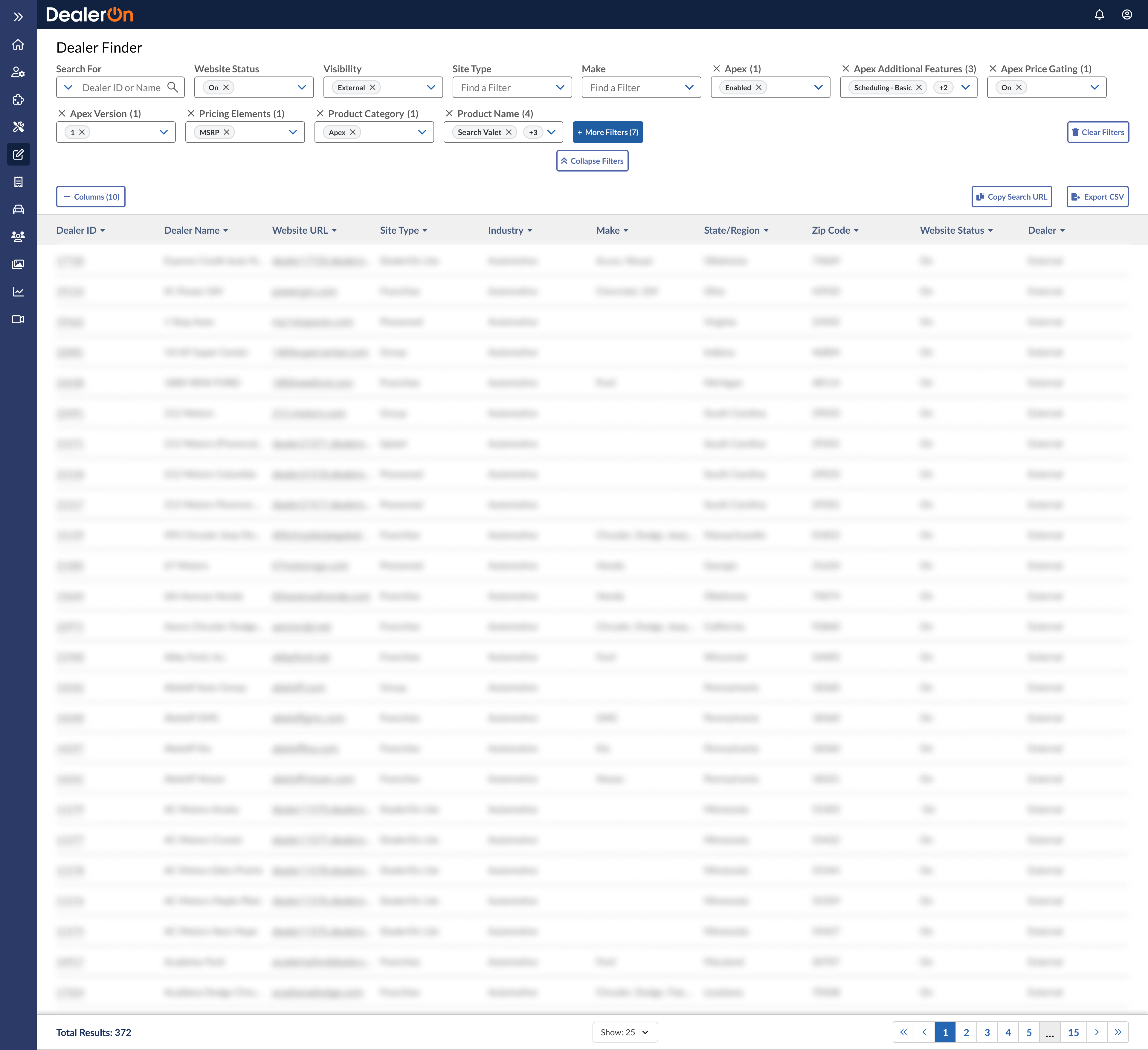
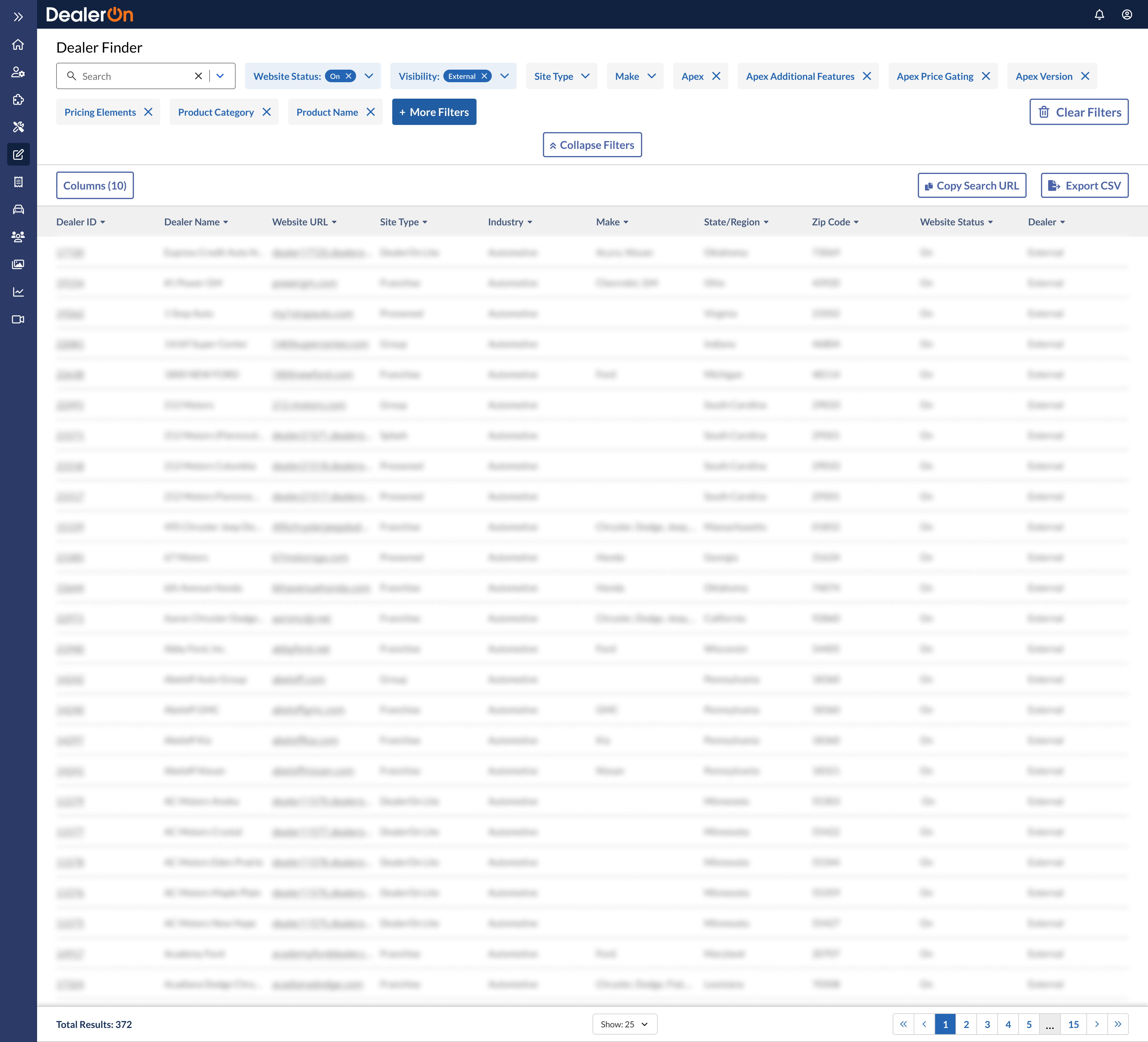
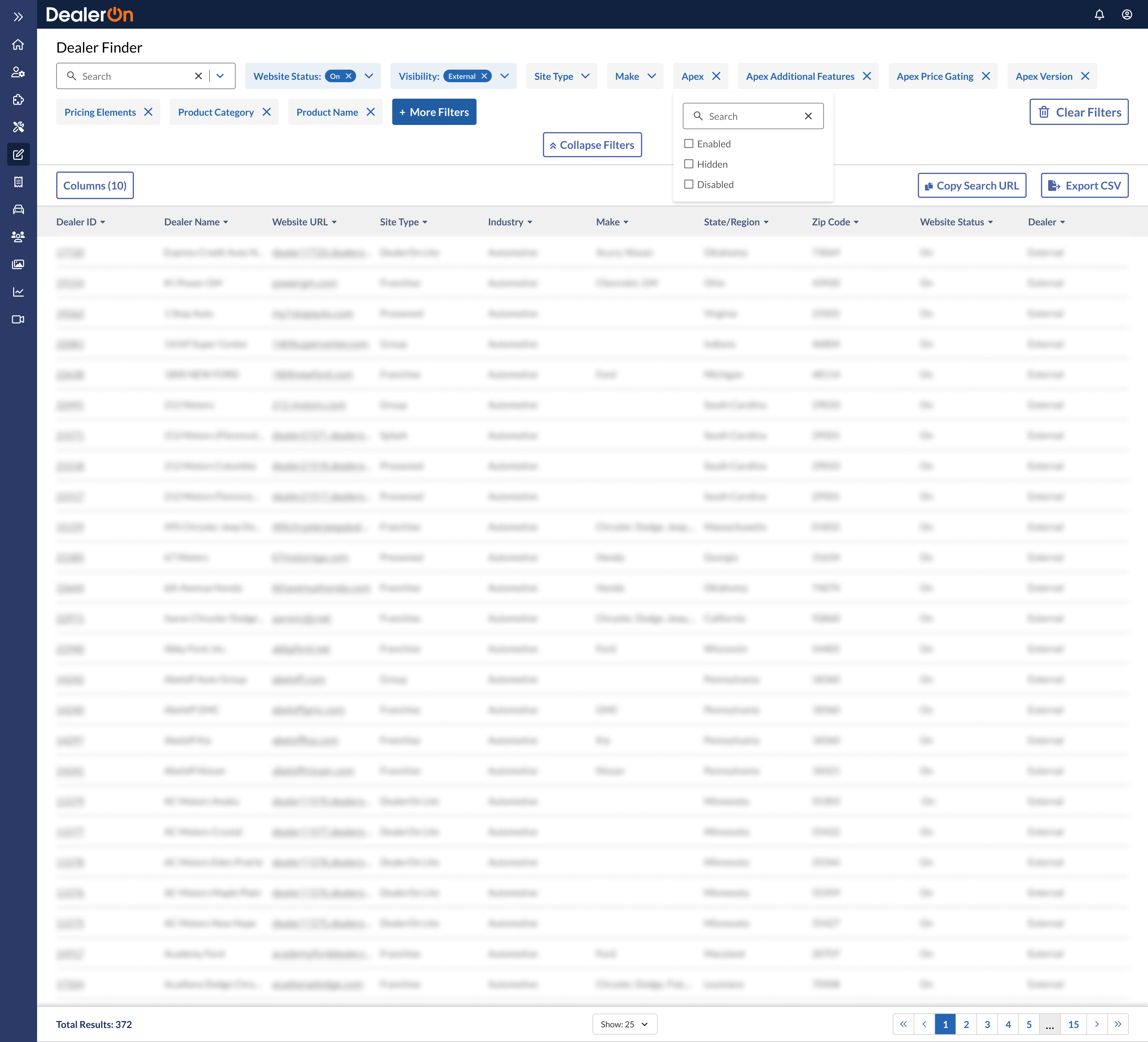
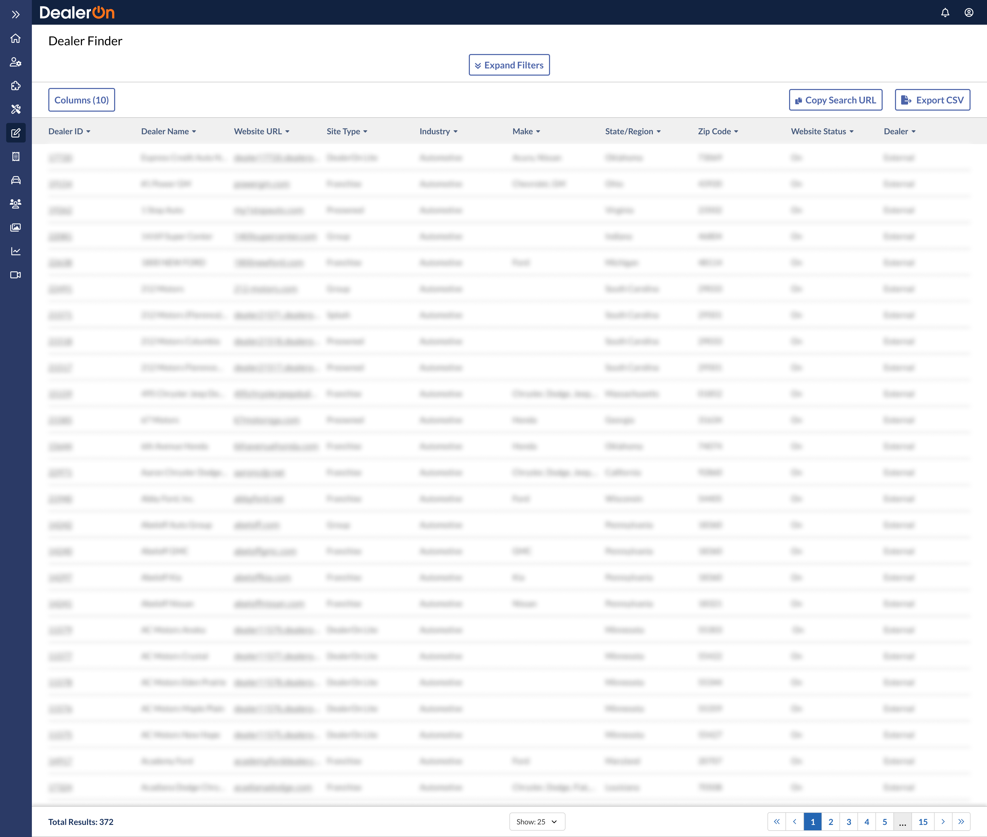
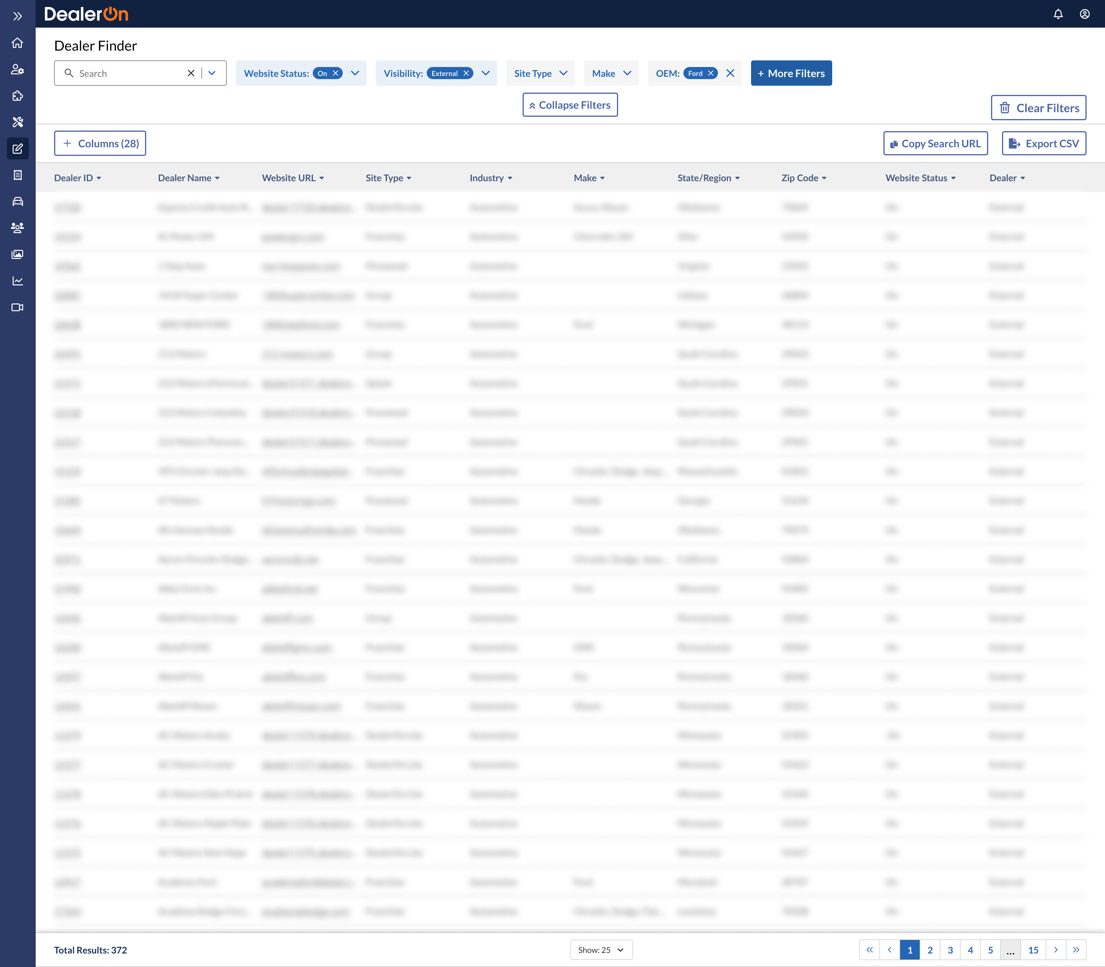
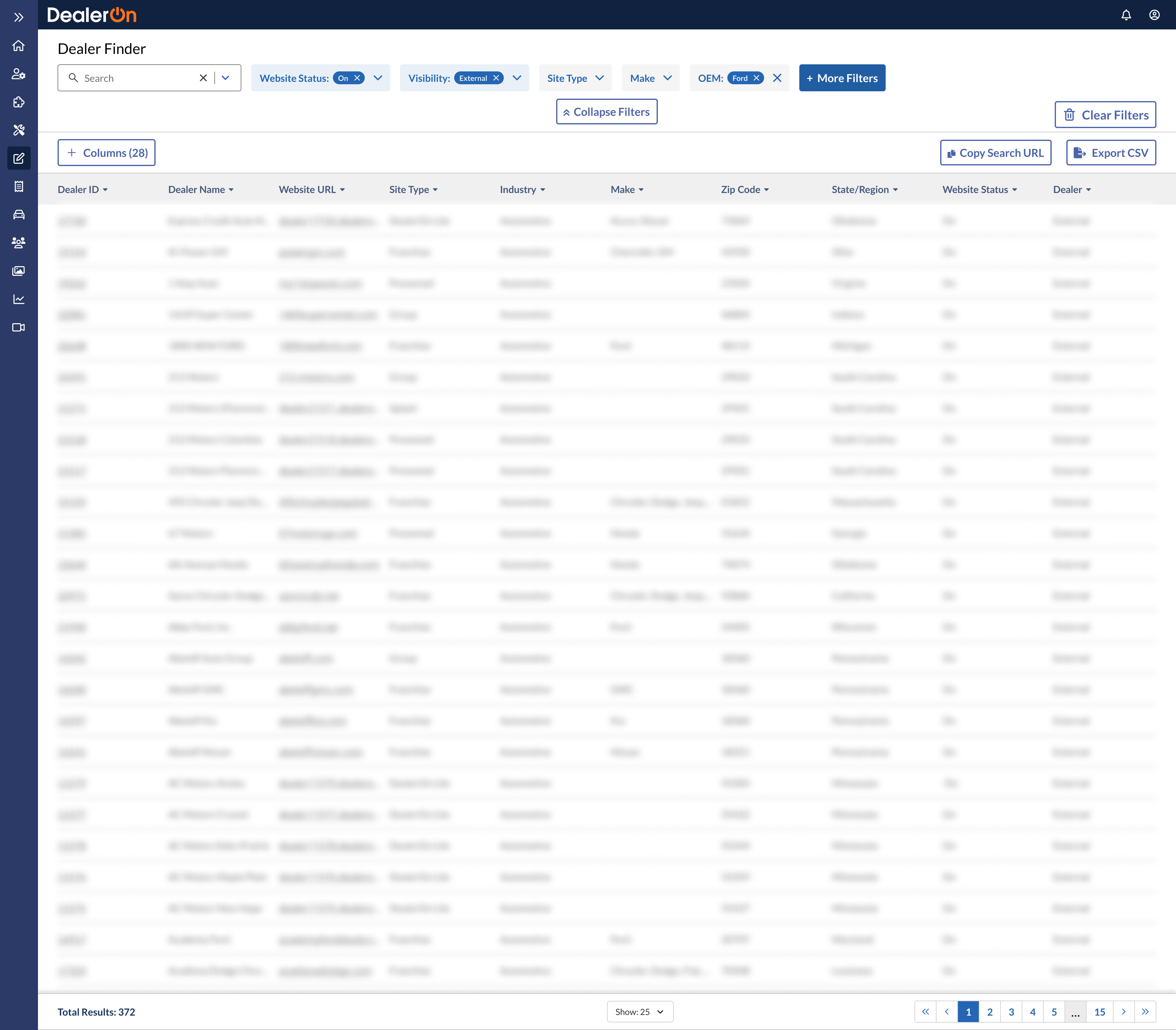
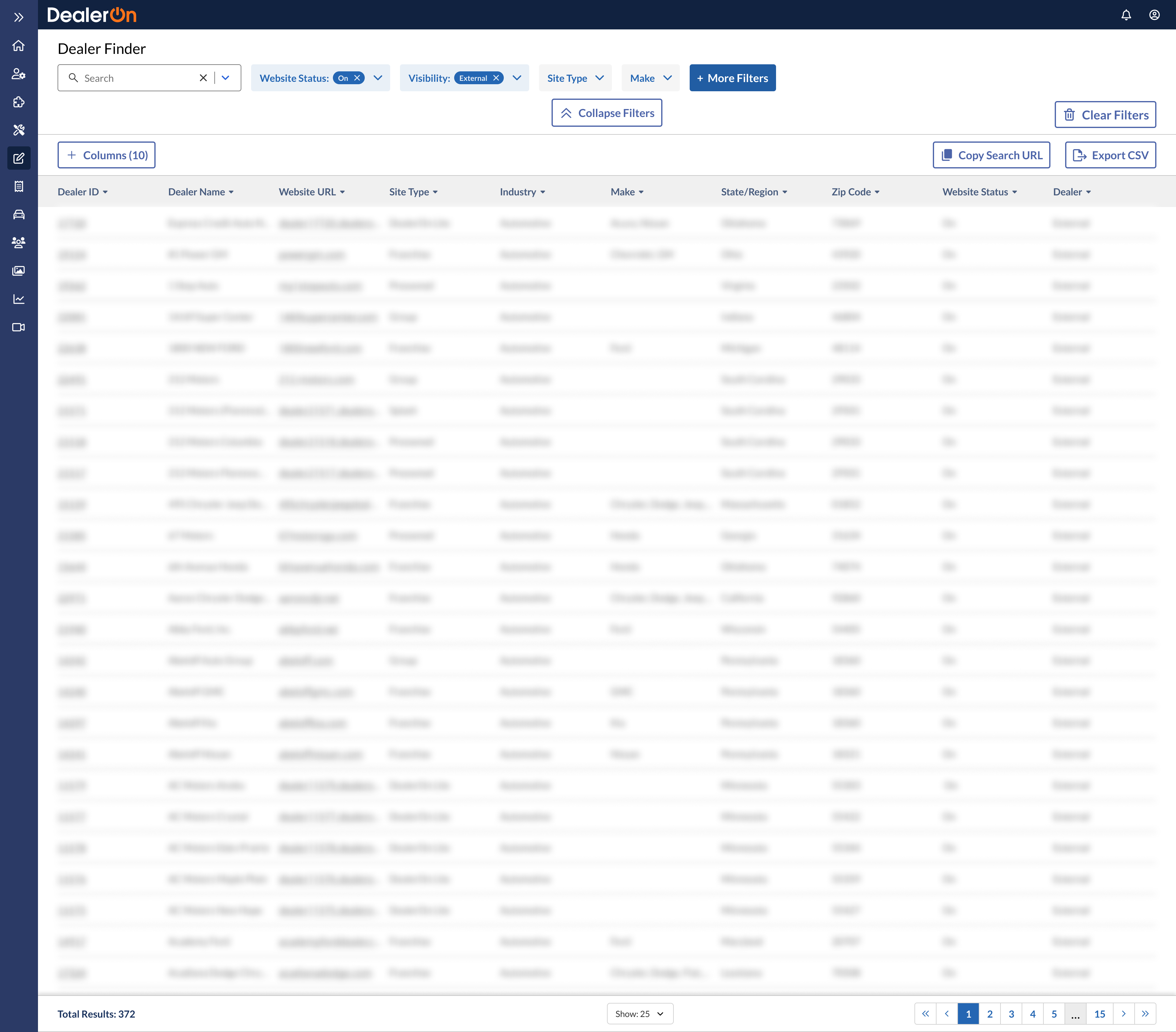
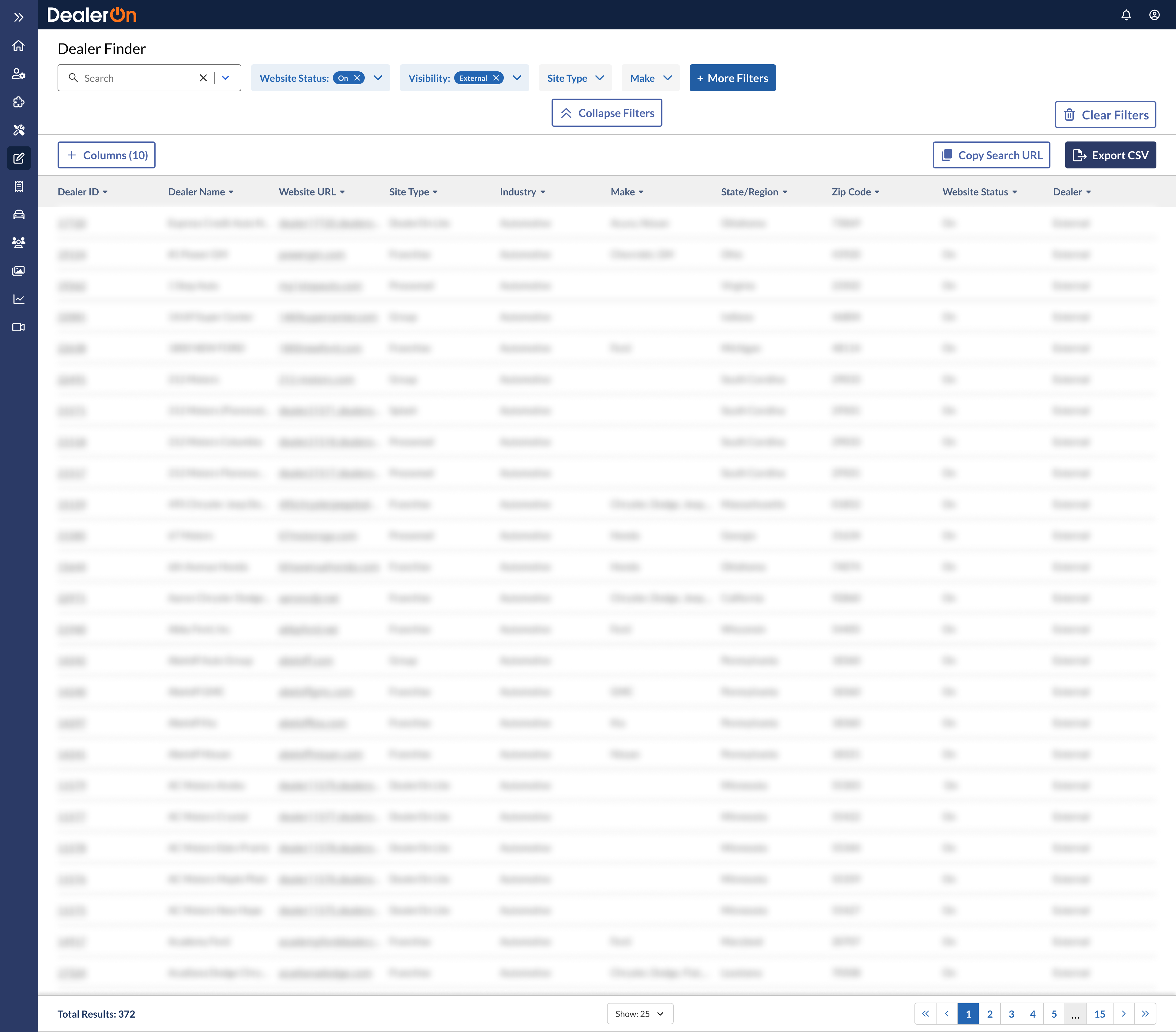
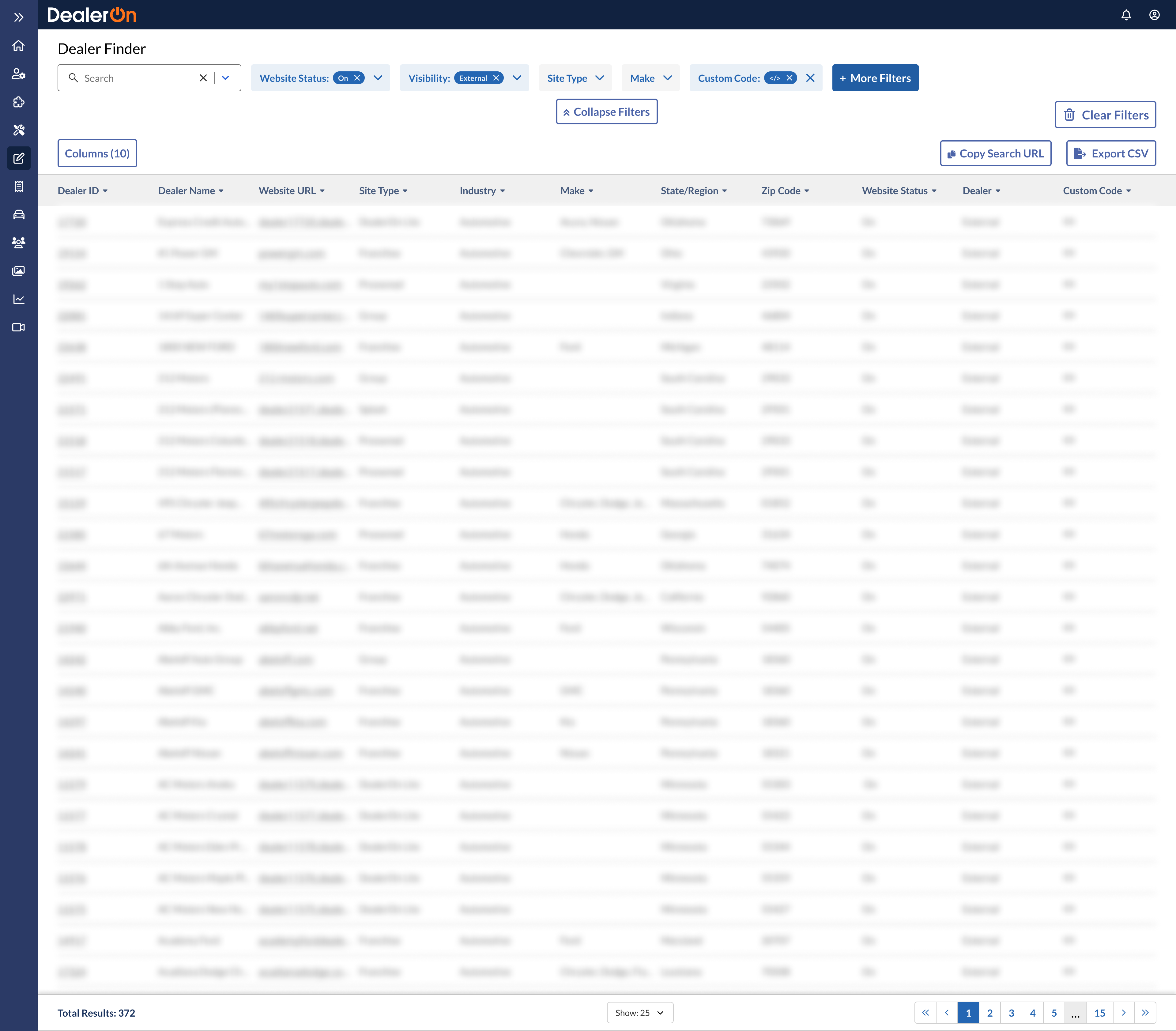
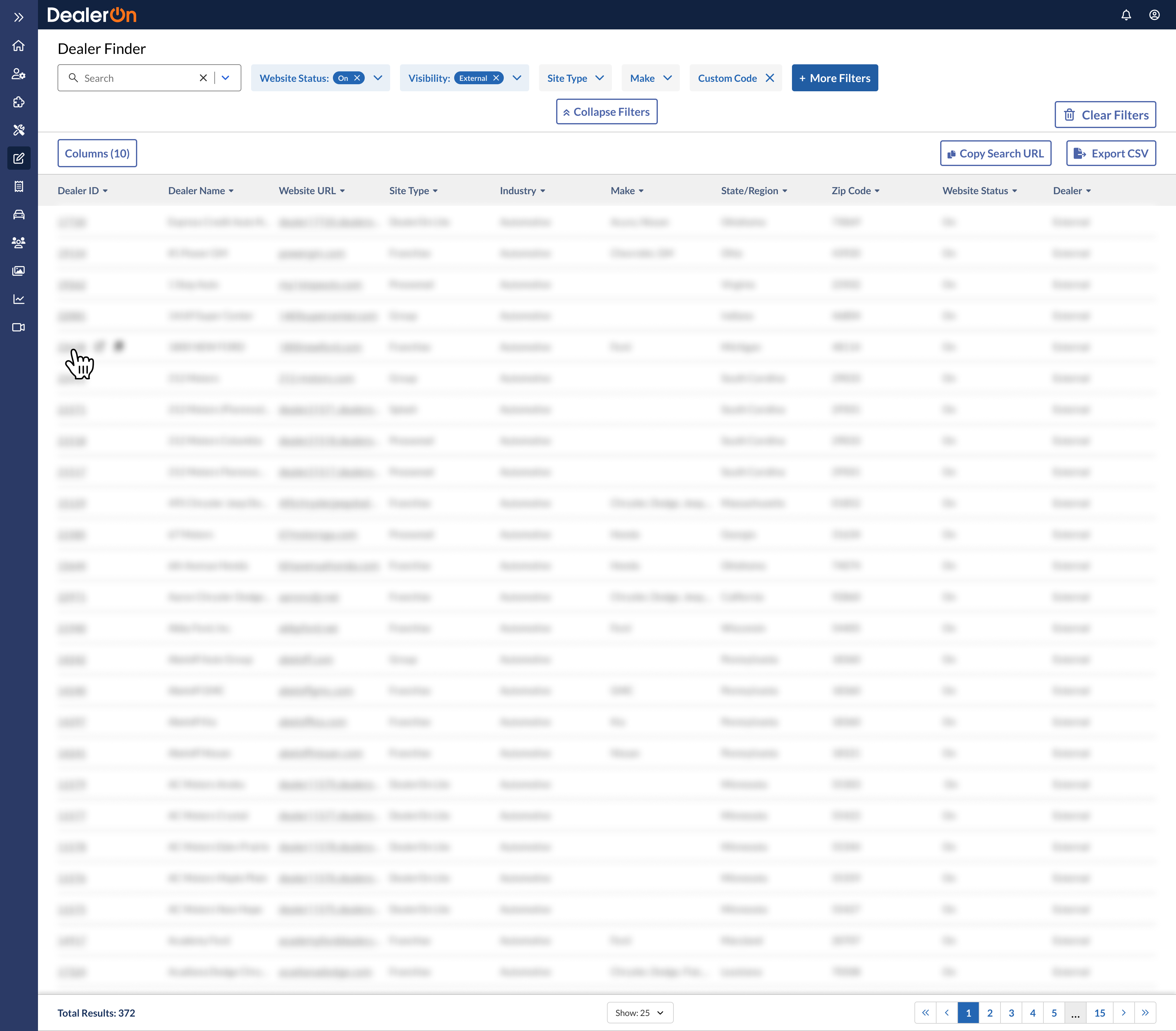
The main purpose of this project is to update Dealer Finder’s UI to accommodate for our new navigation container (shell nav), a company OKR. The shell nav contains a thin sidebar on the left, which is incompatible with the sidebar-heavy filtering in Dealer Finder.
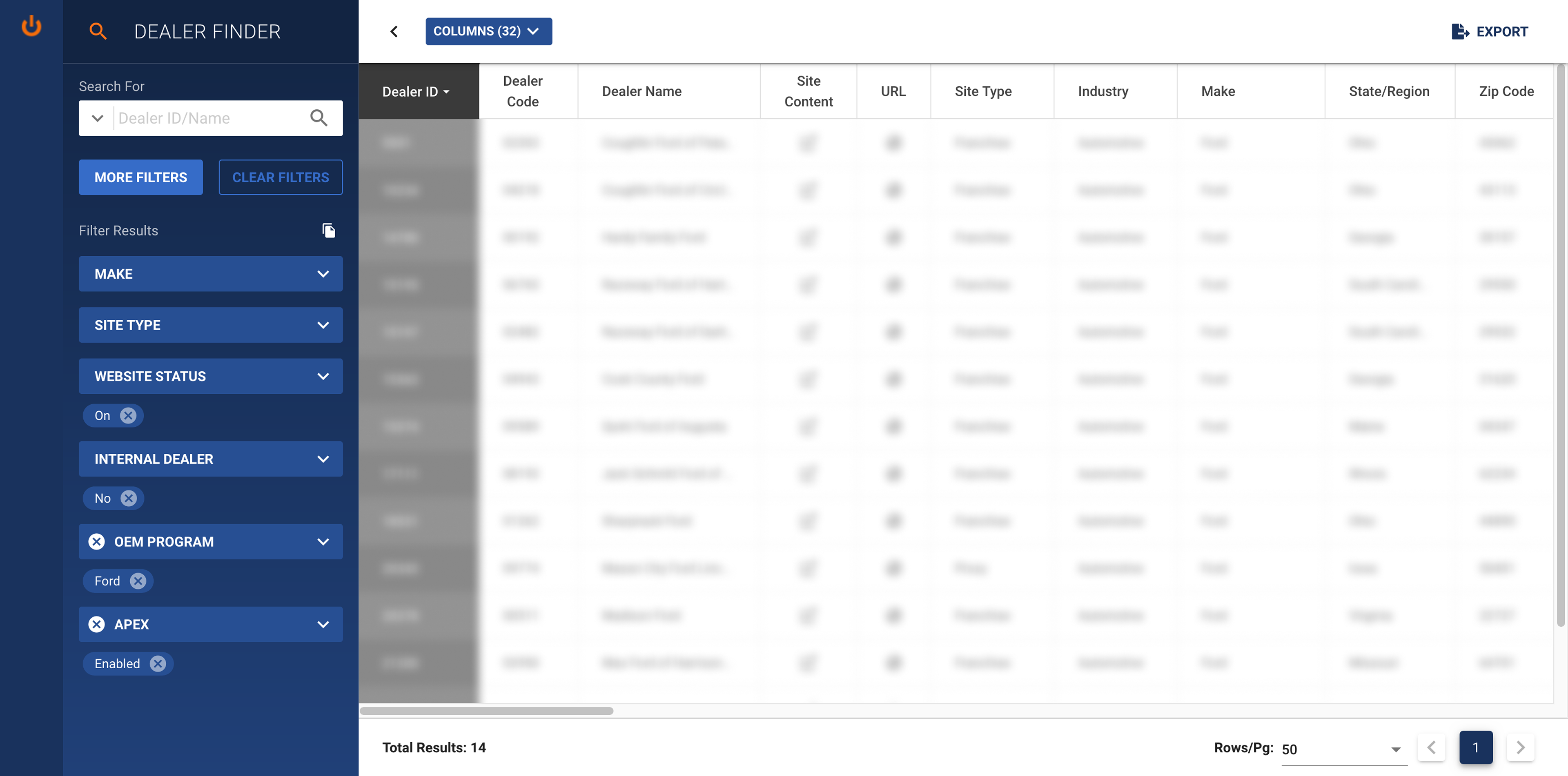
Before
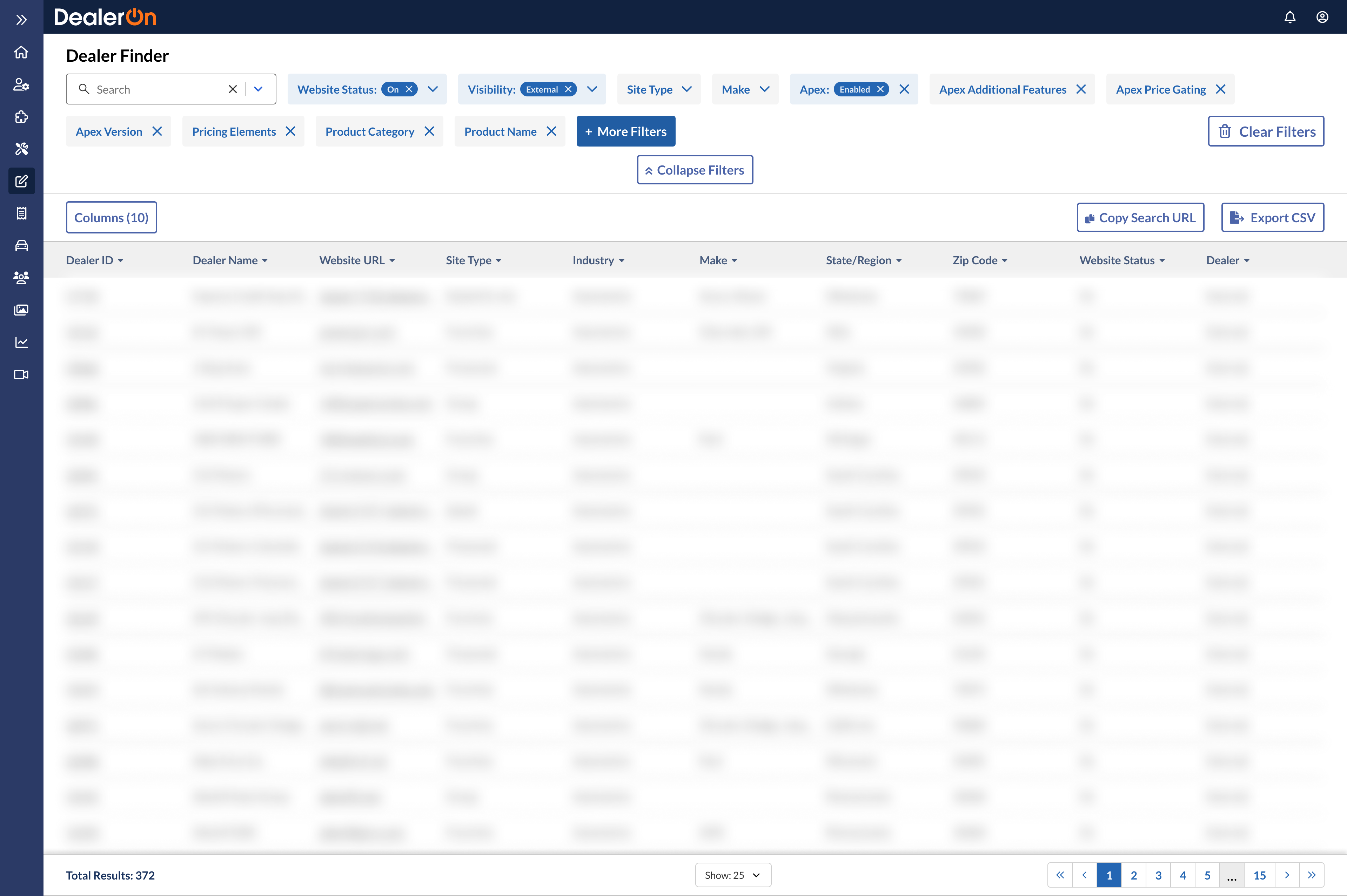
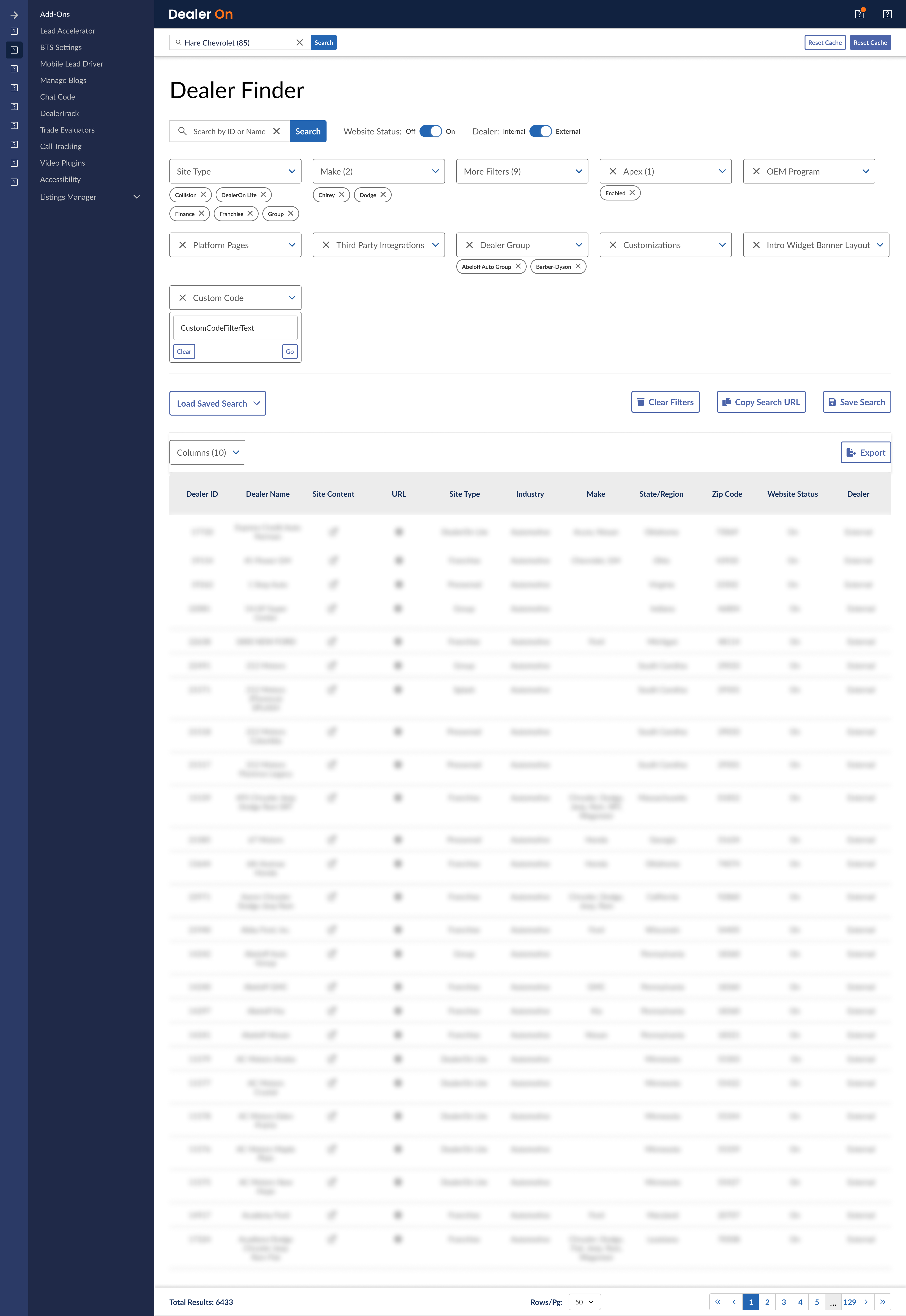
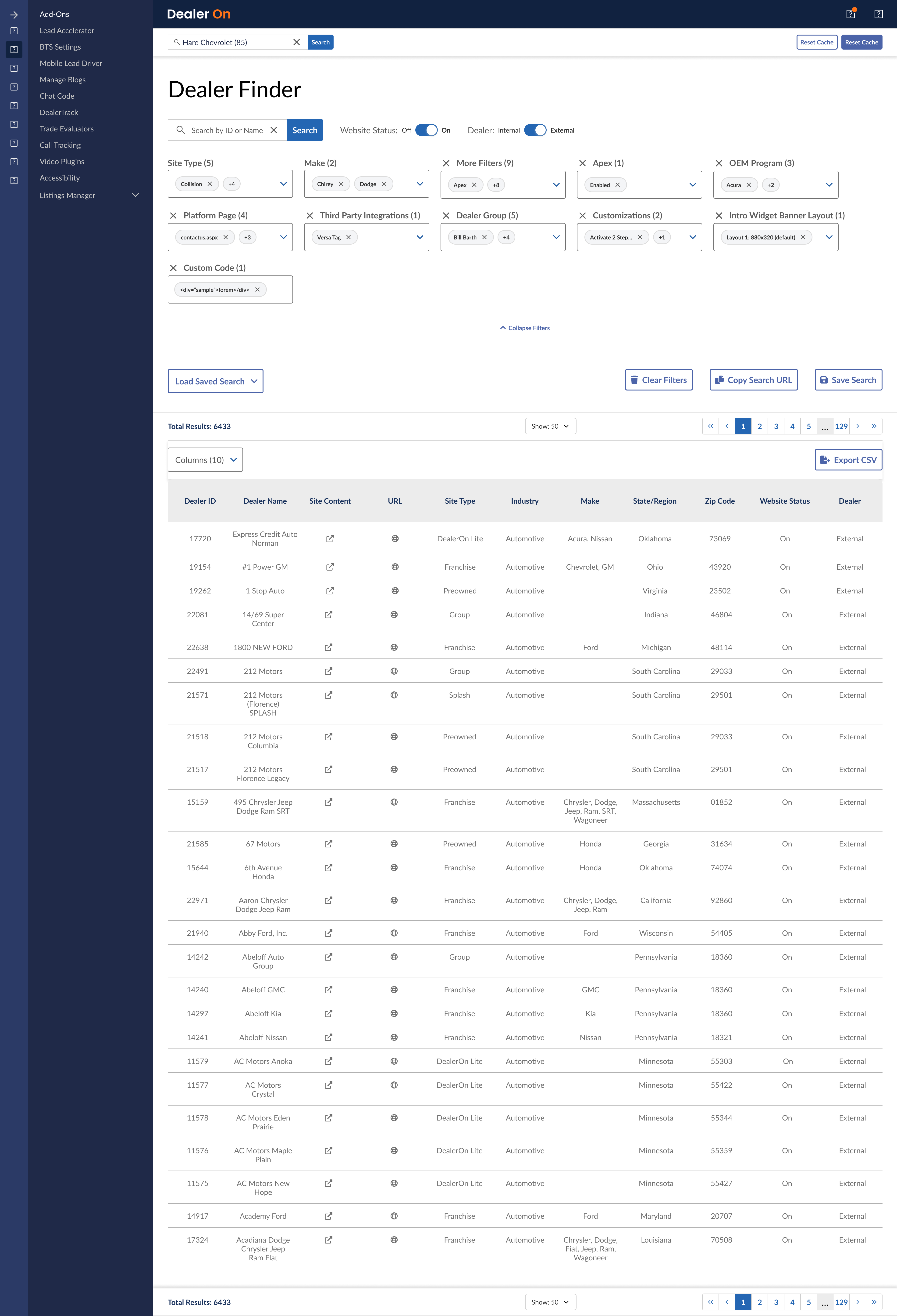
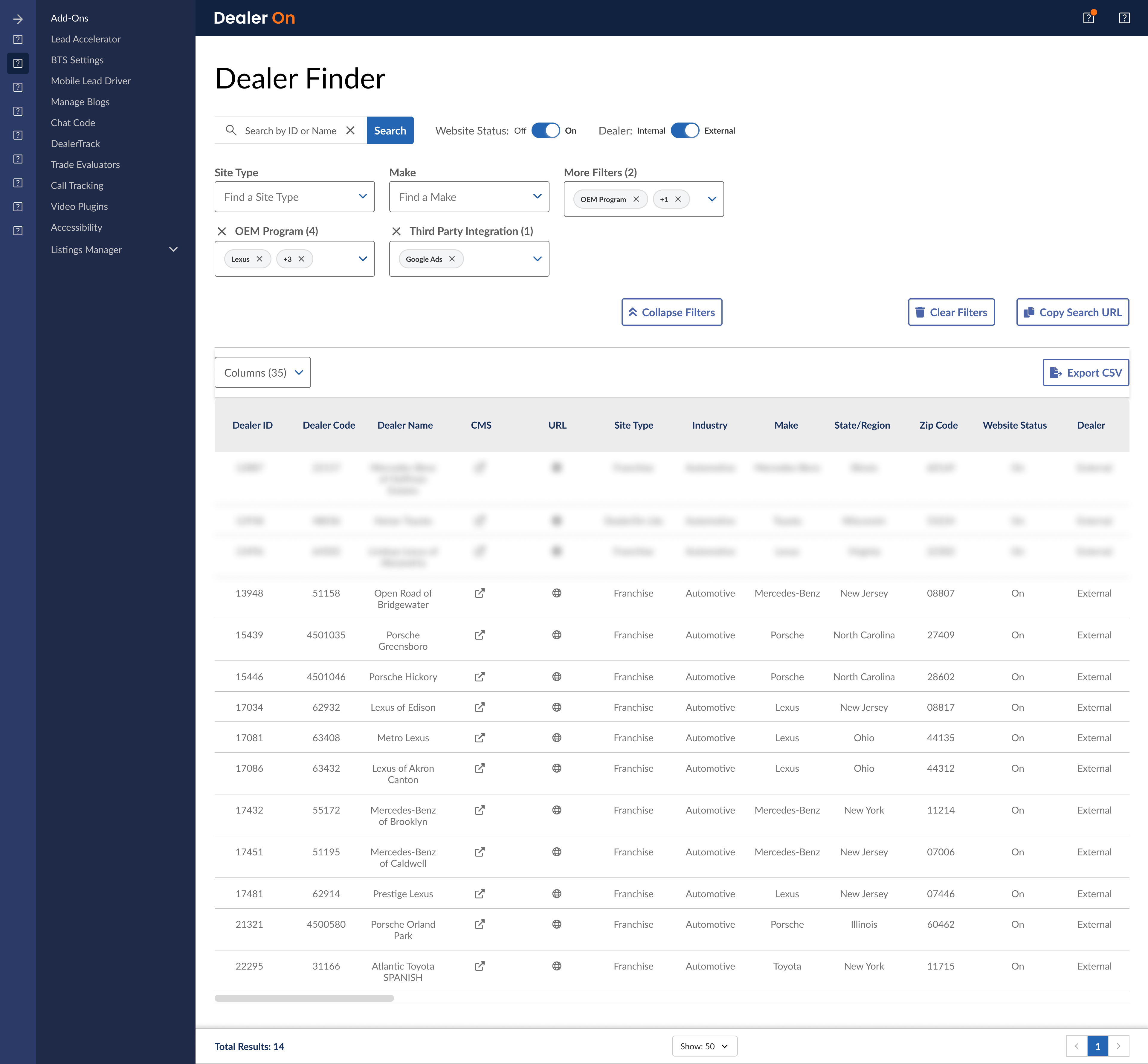
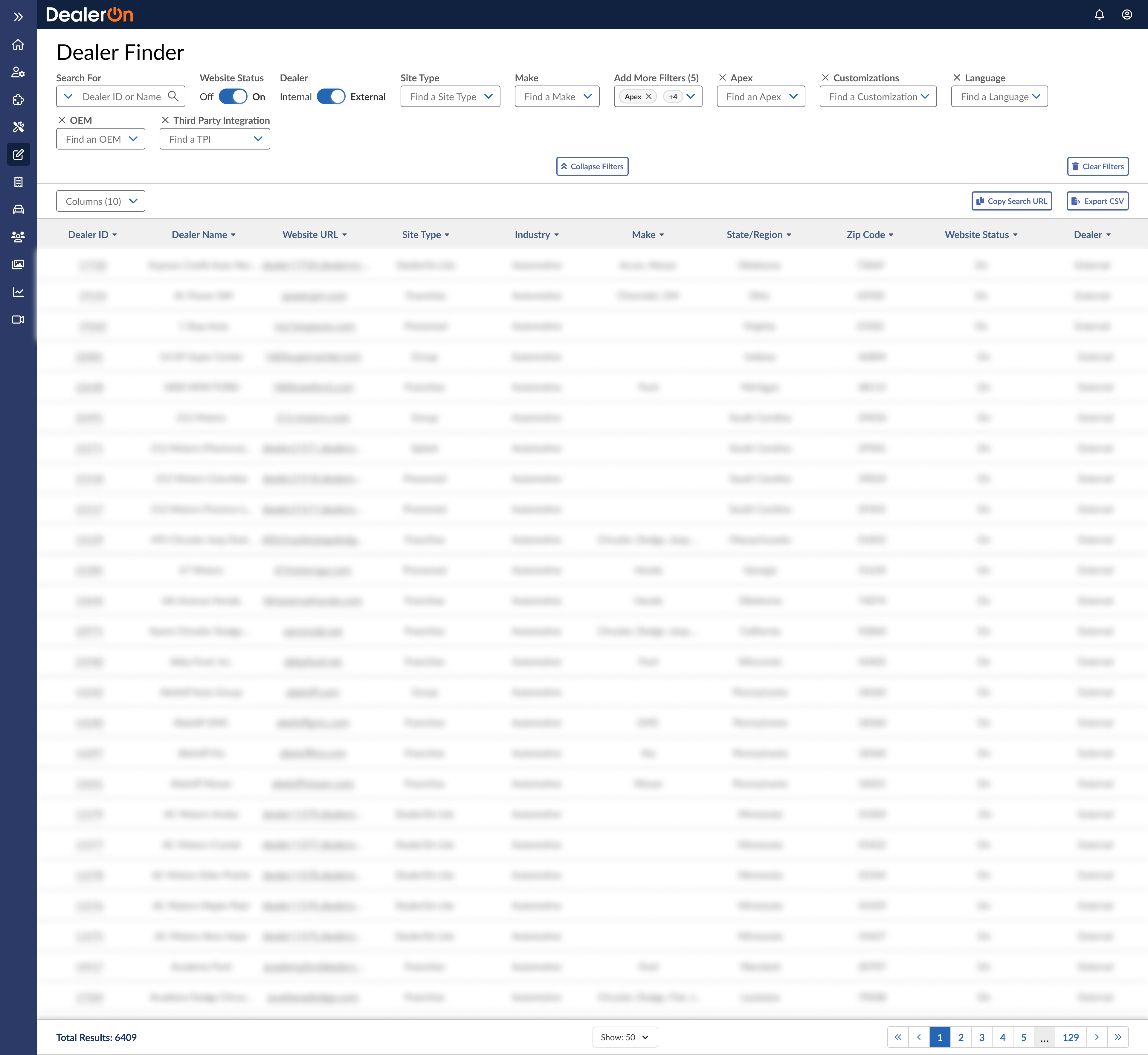
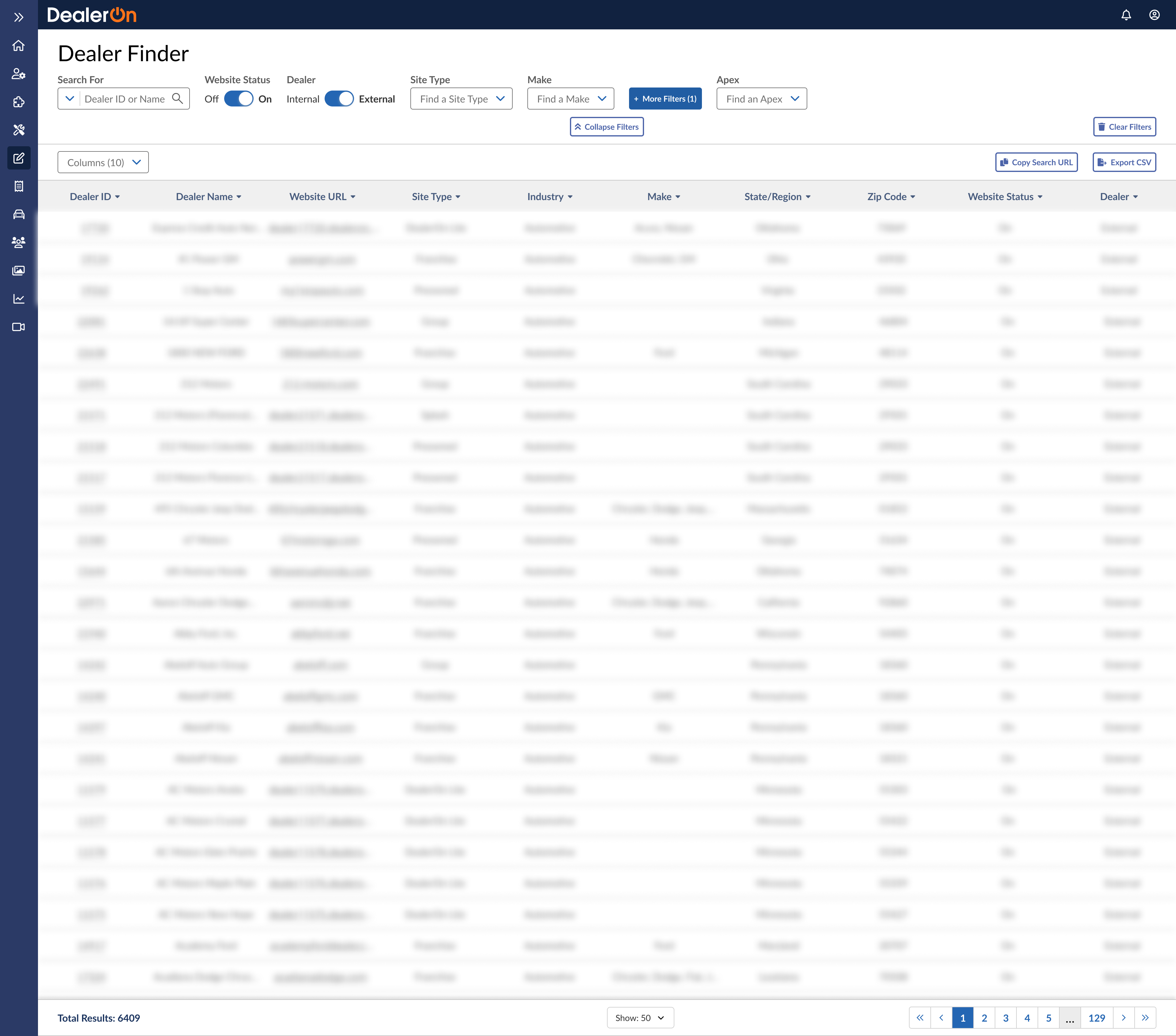
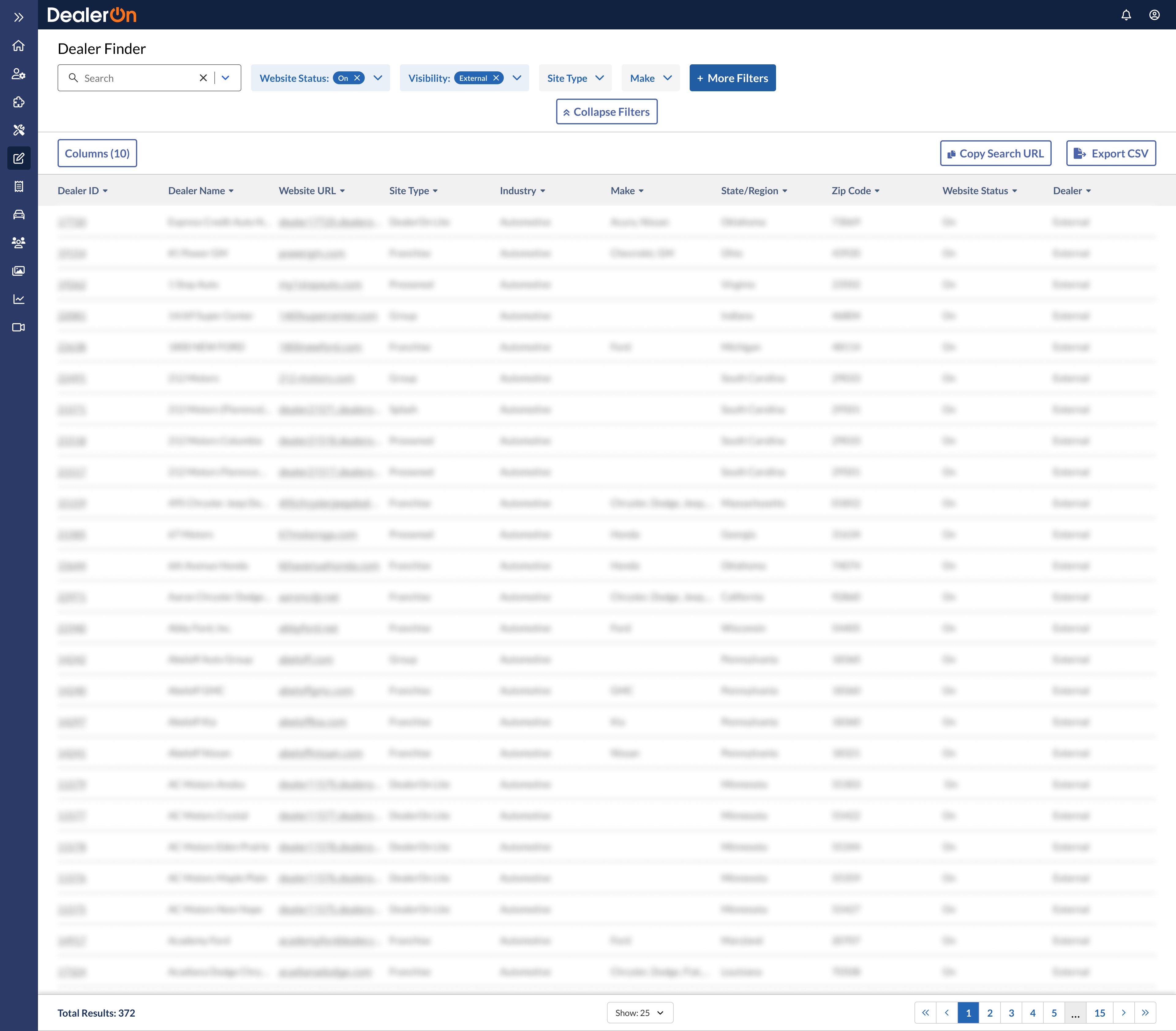
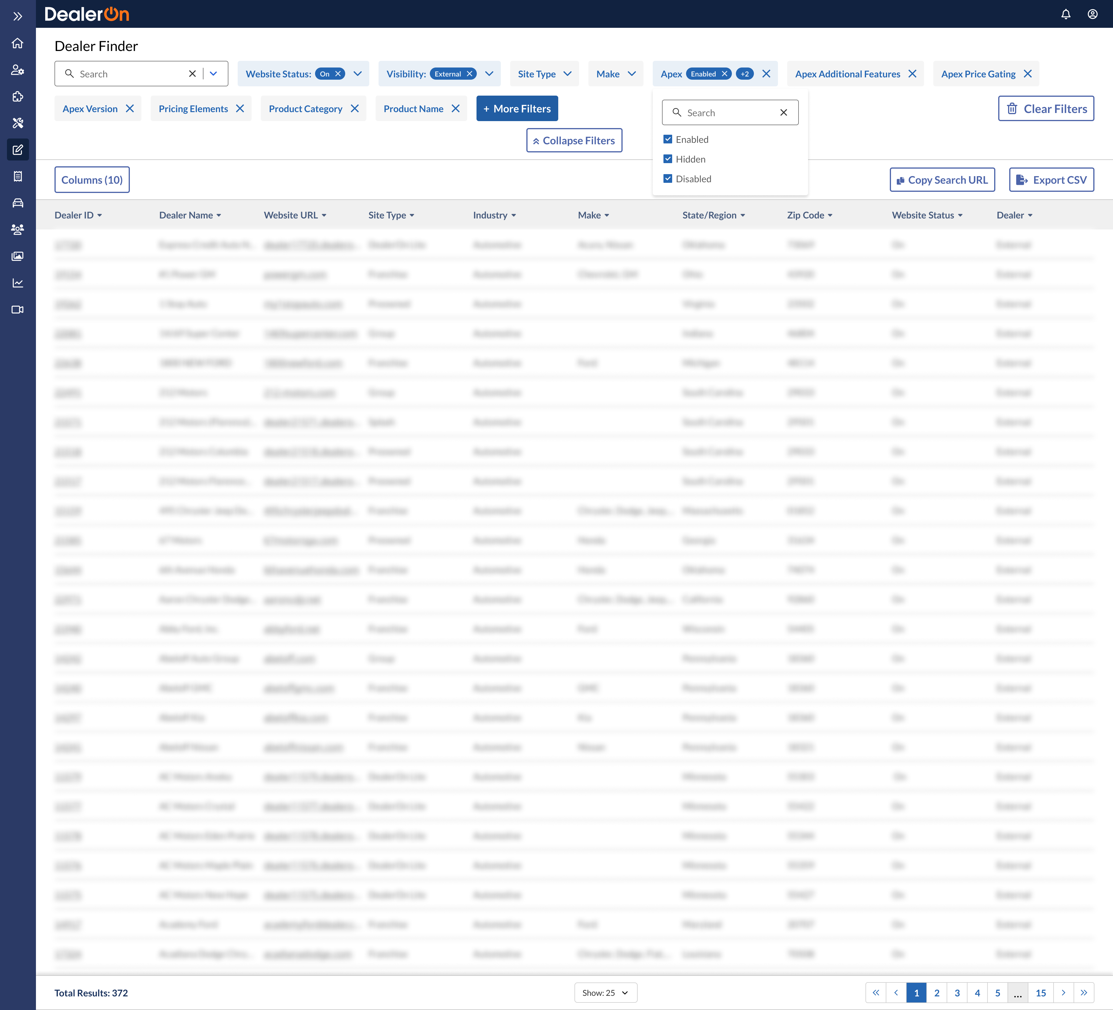
After
I moved the filtering to the top of the page instead.

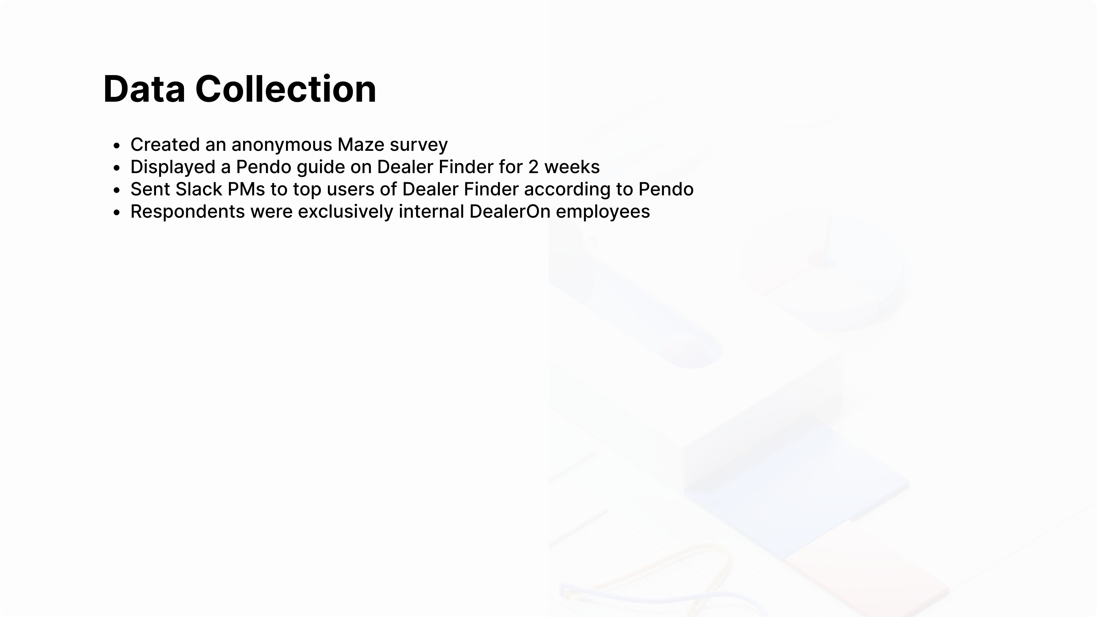
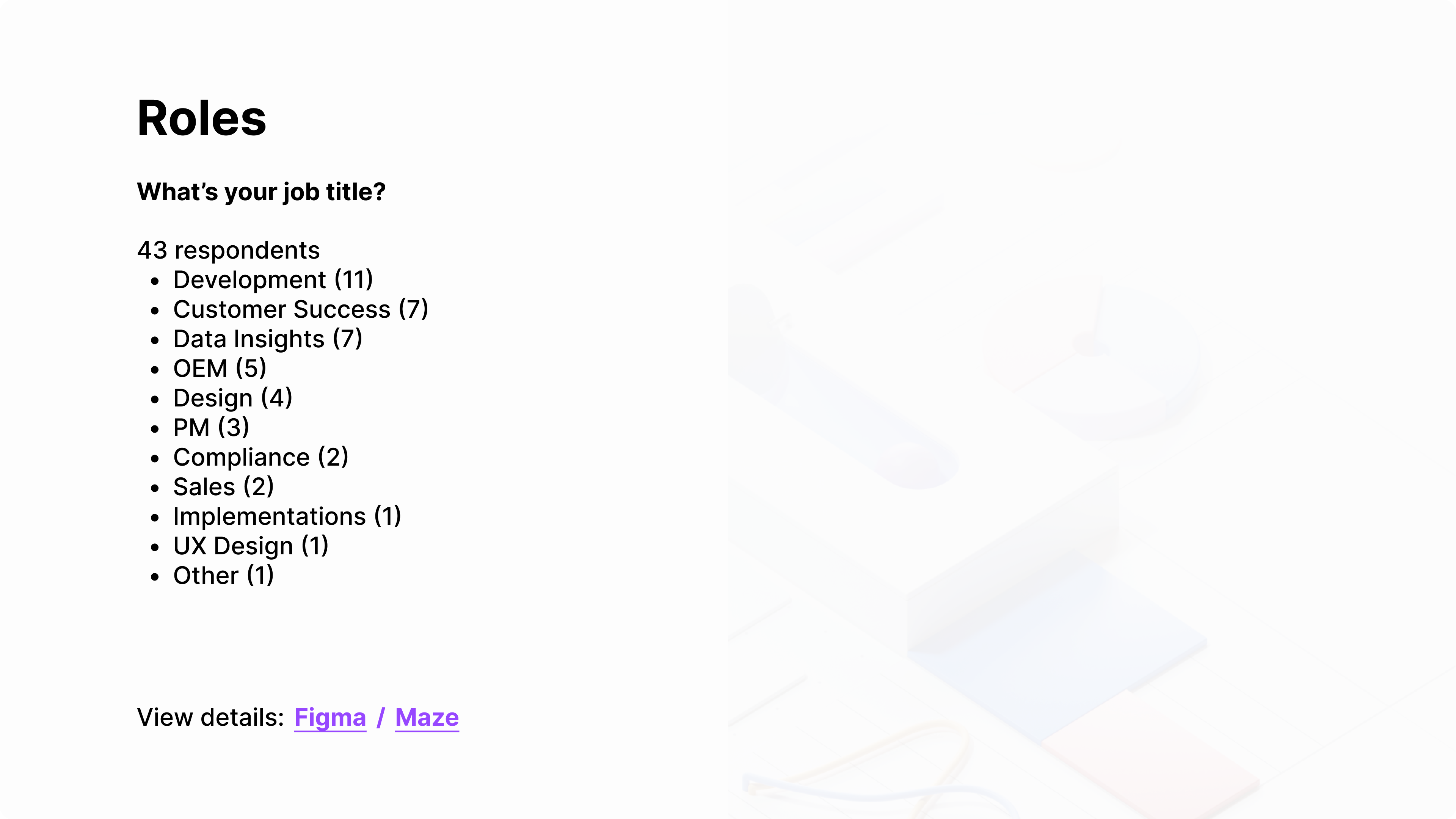
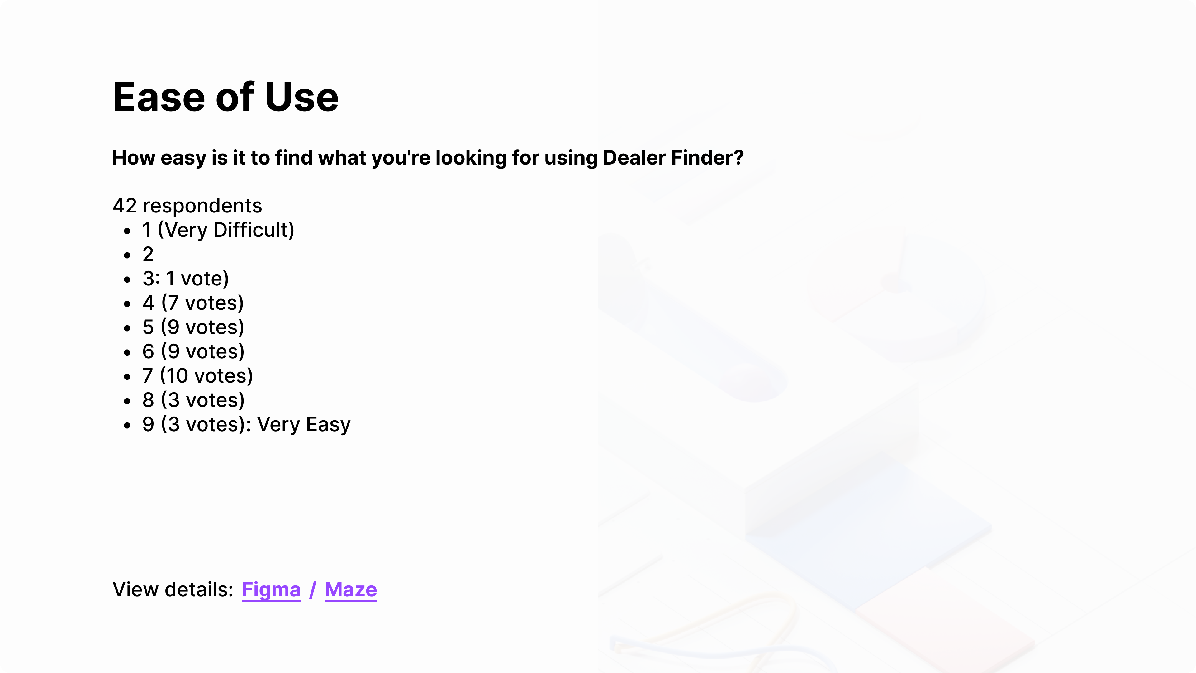
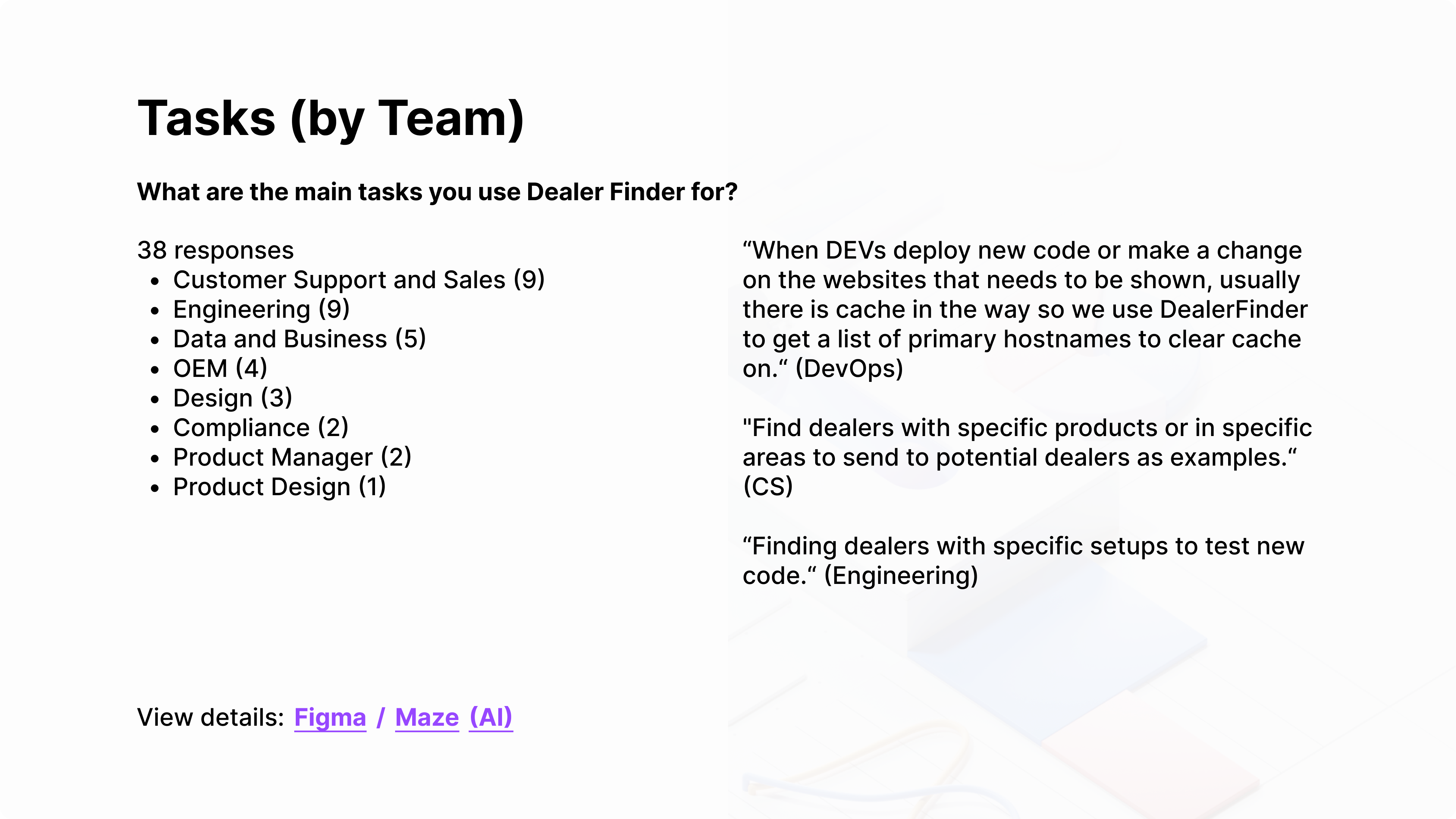
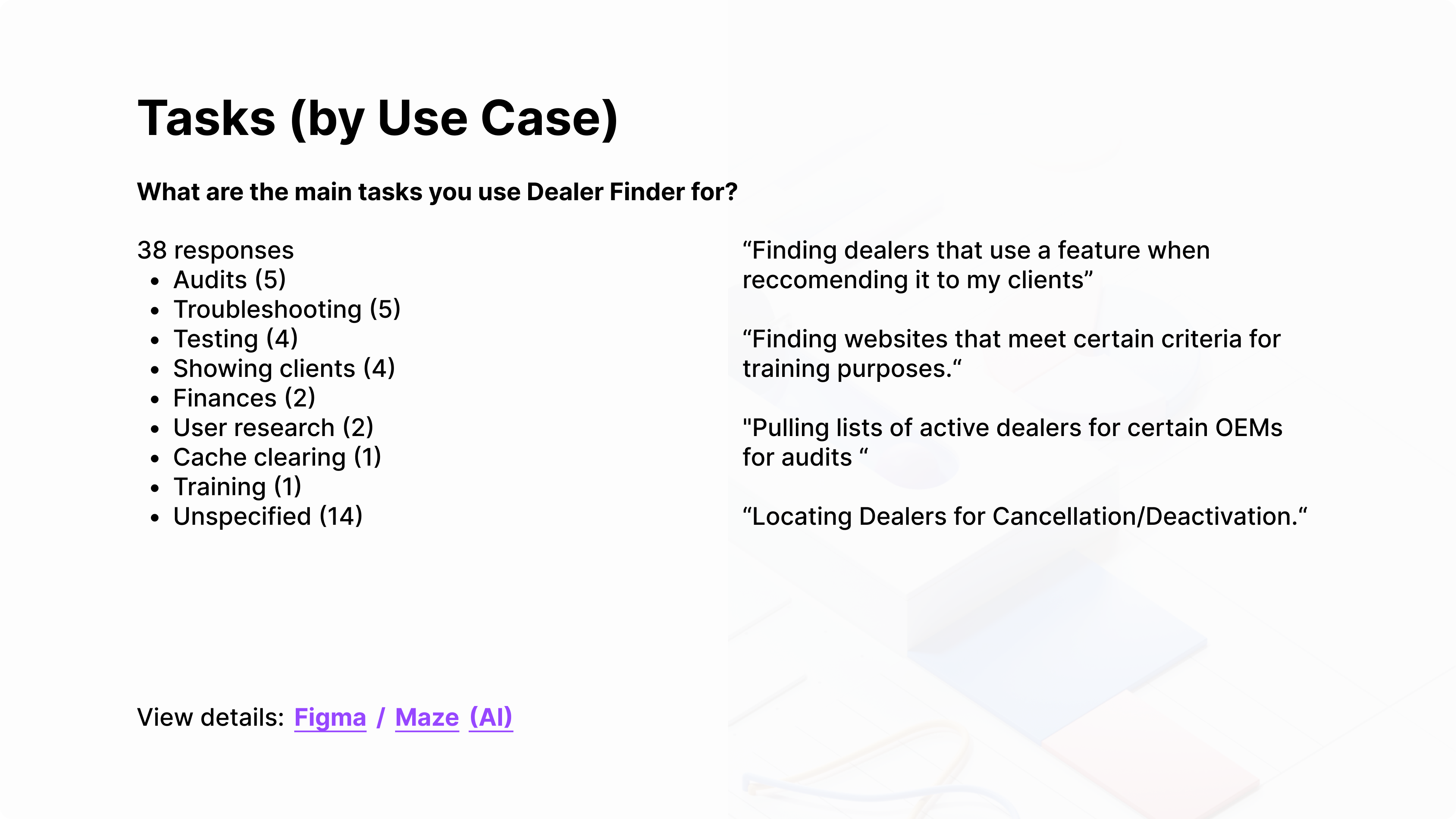
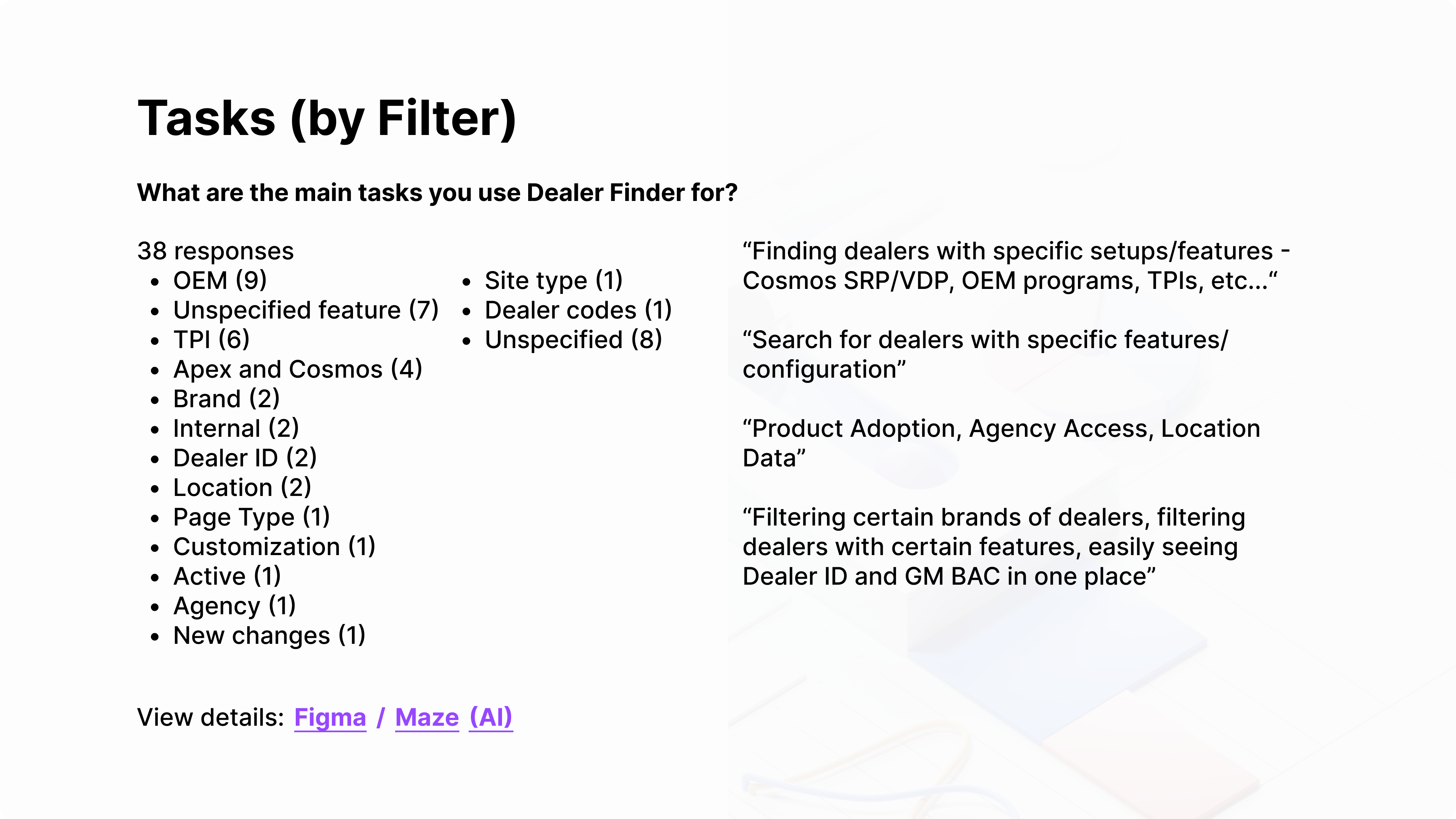
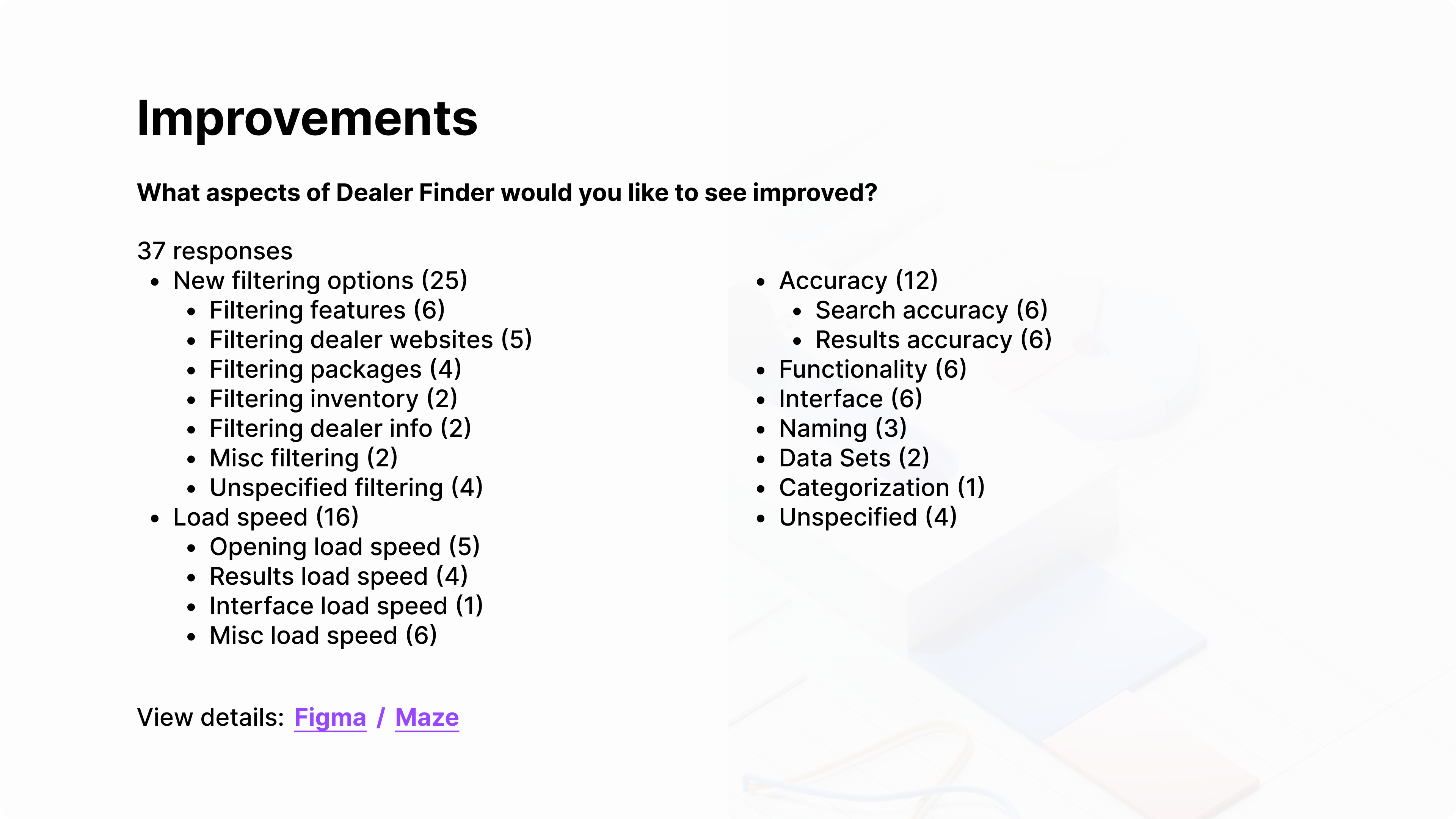
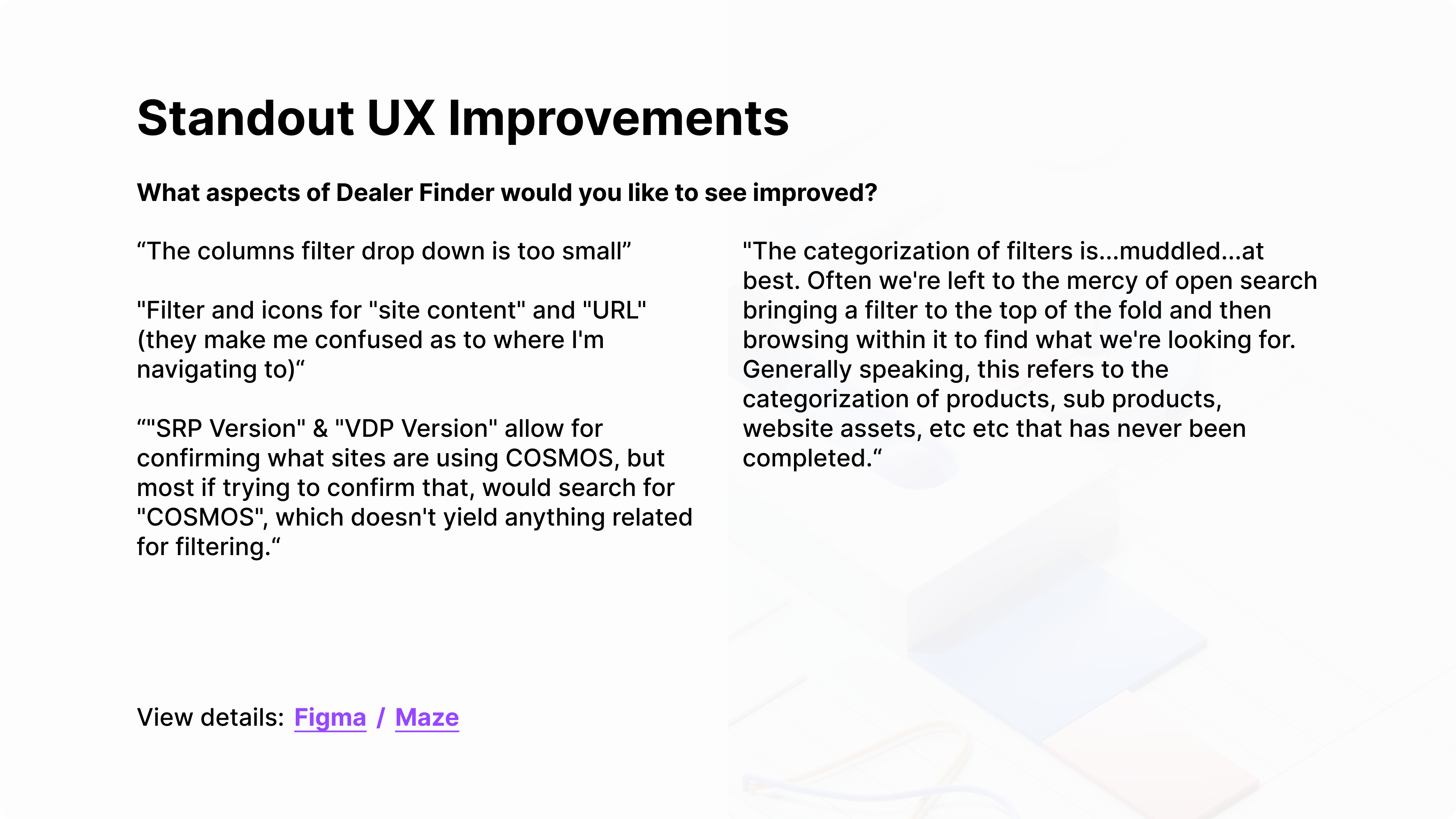
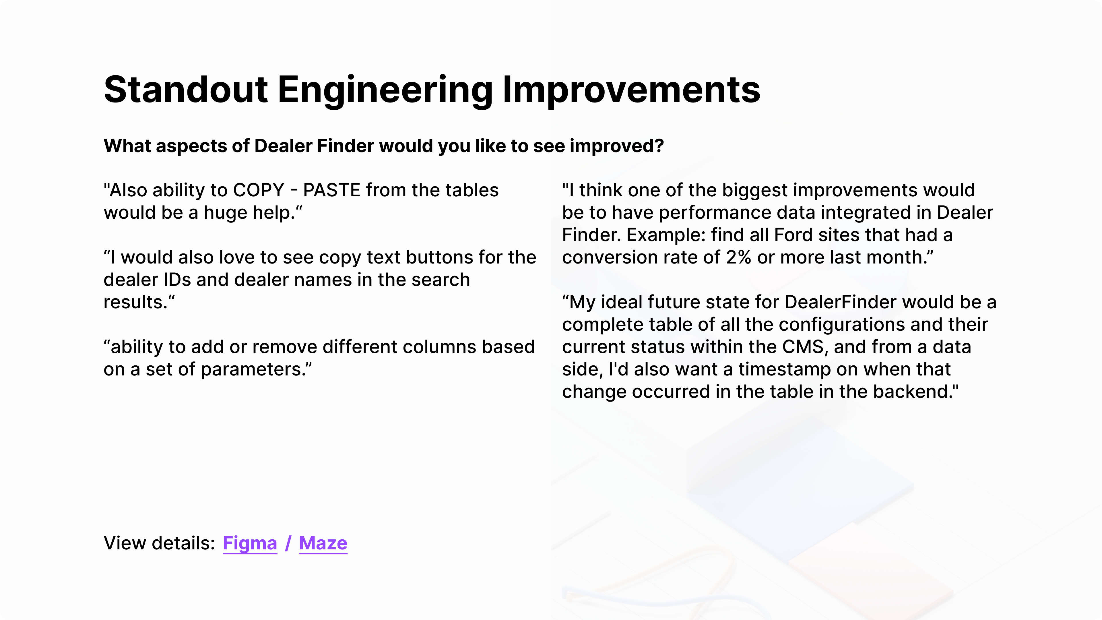
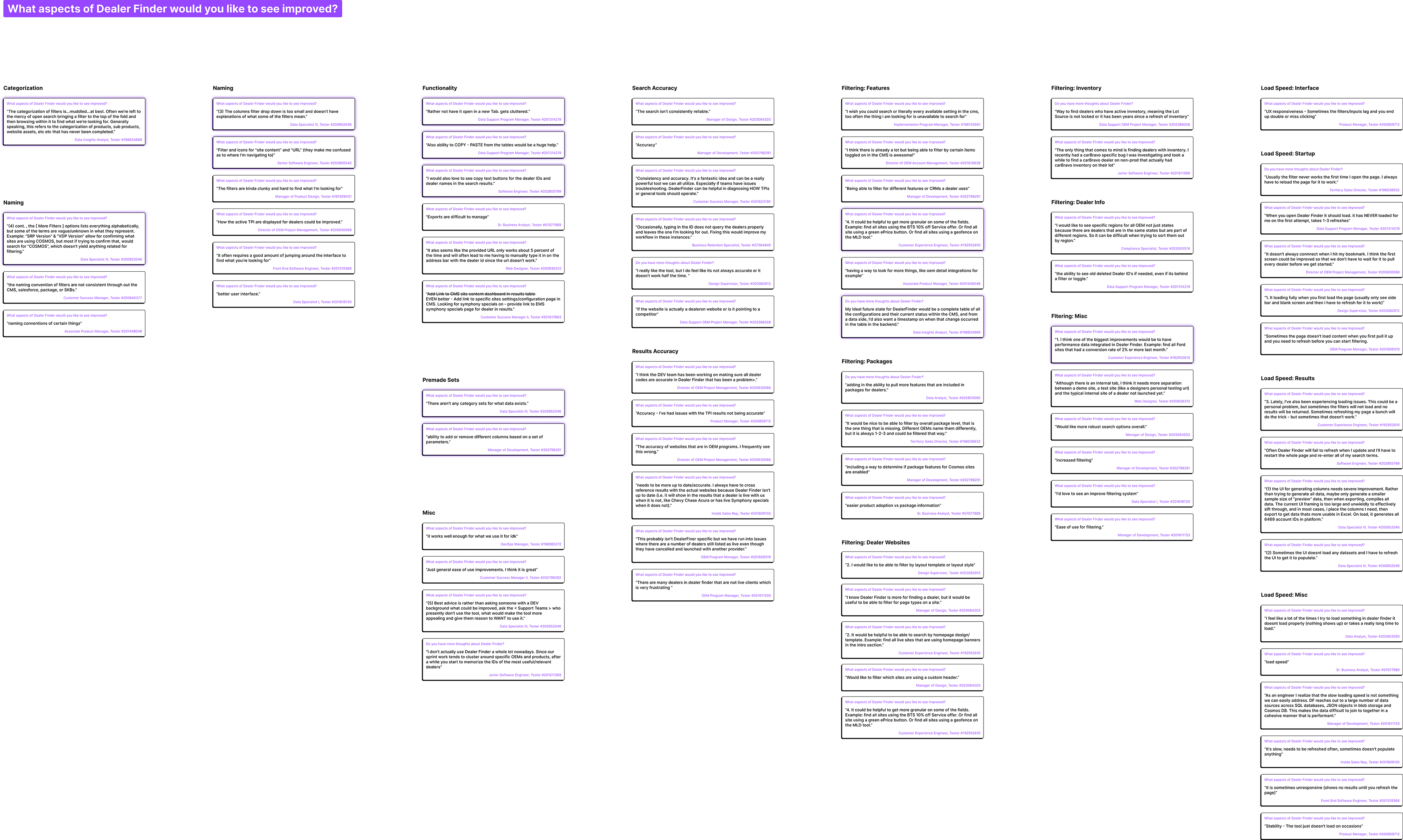
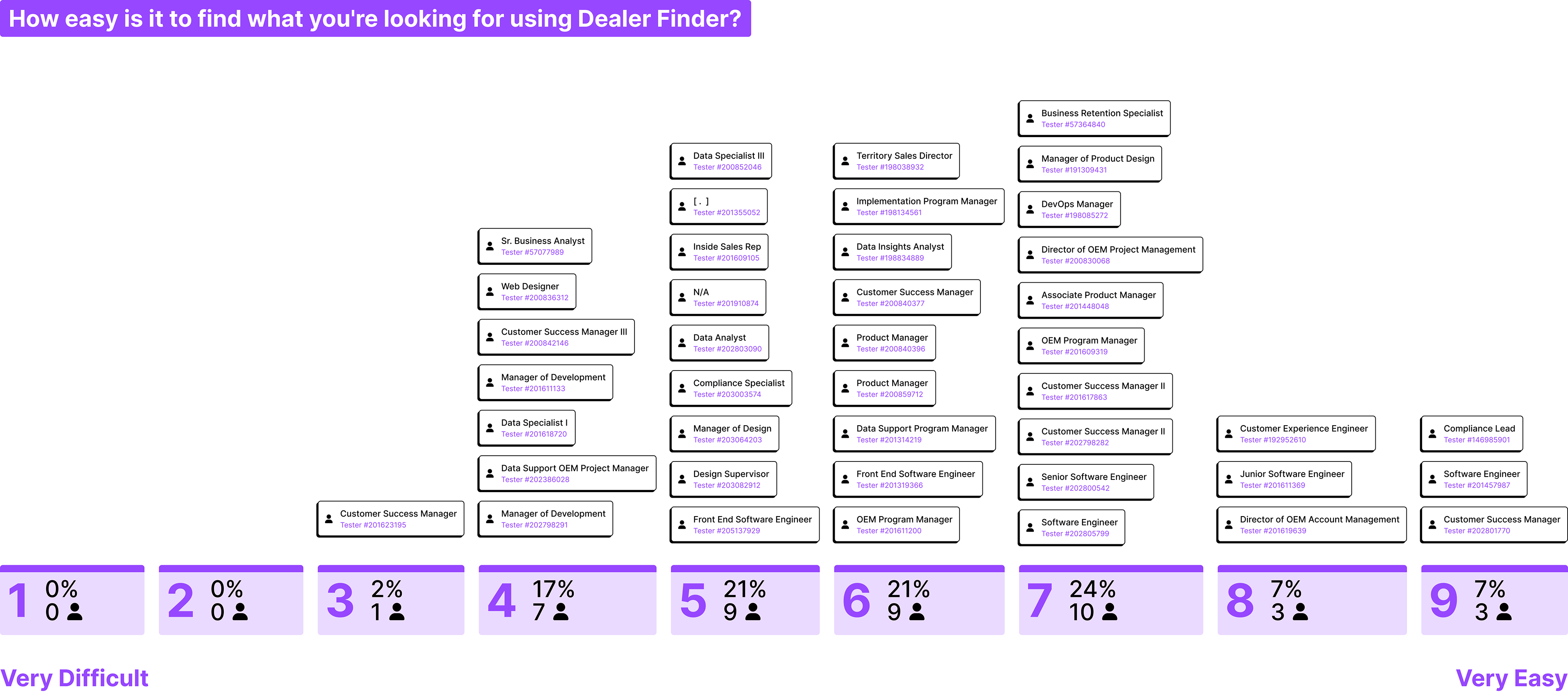
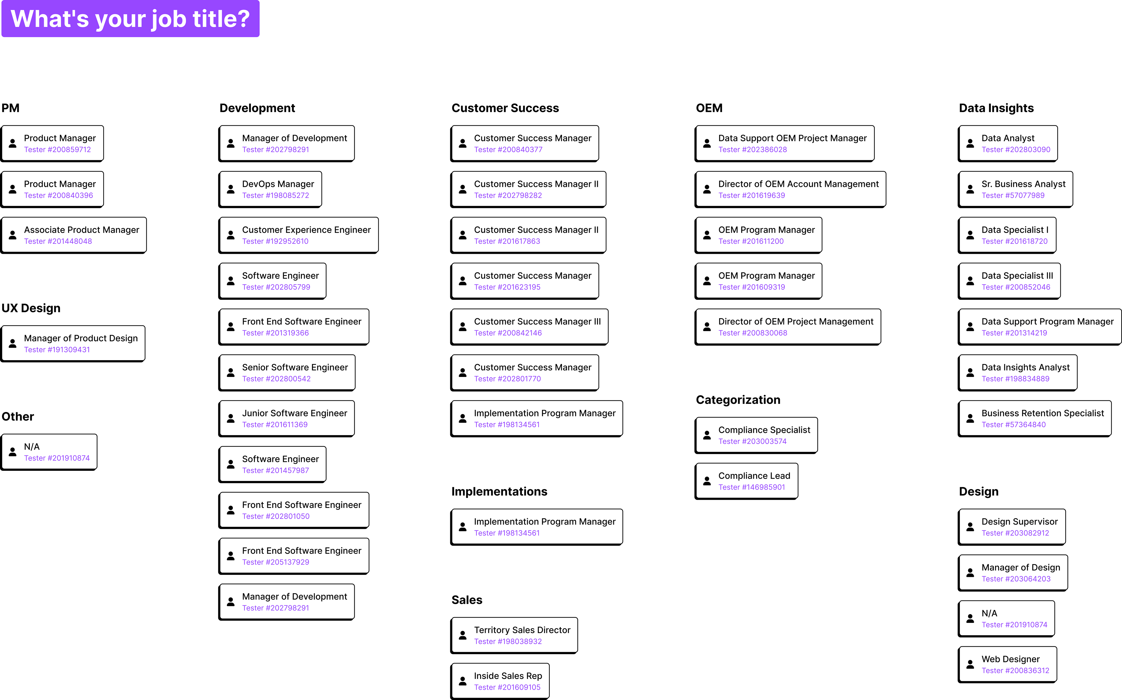
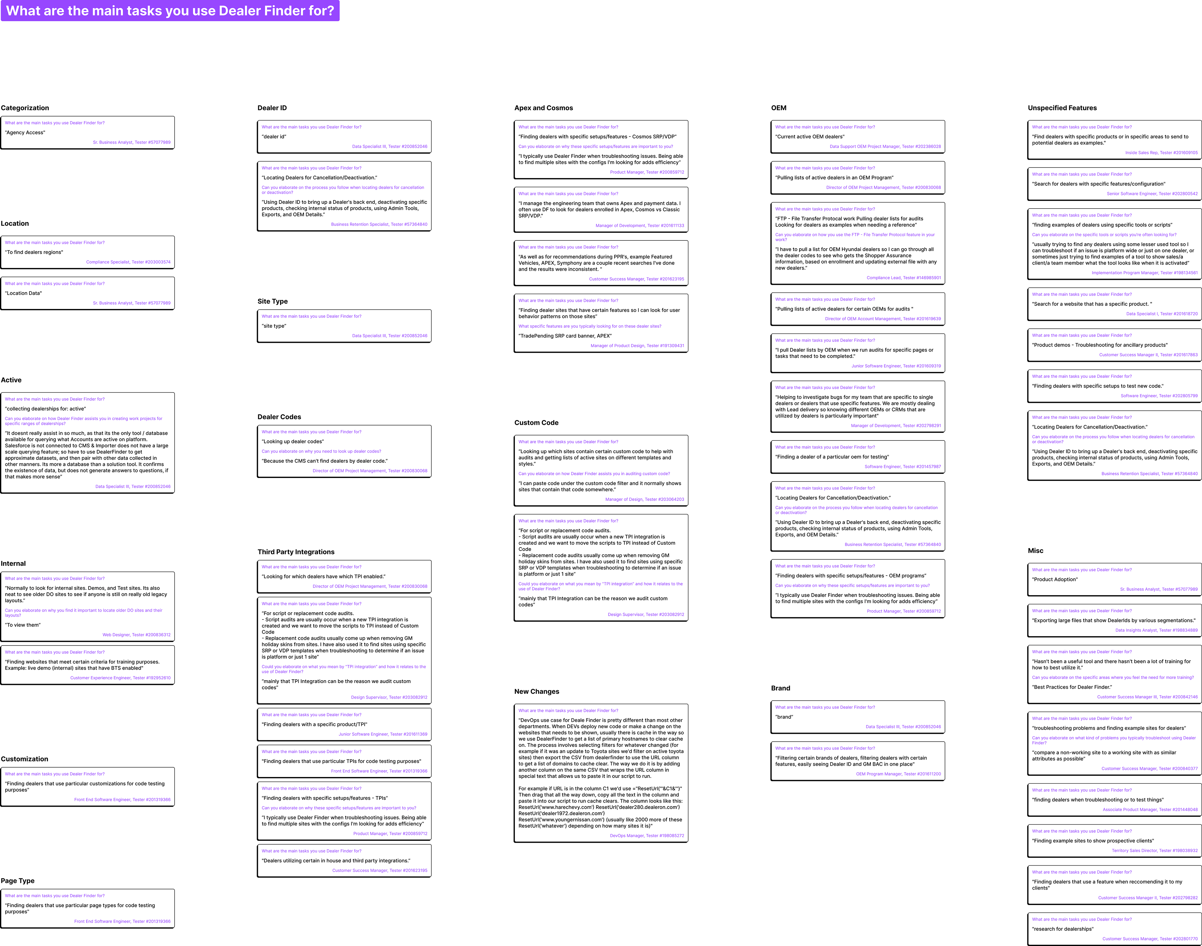
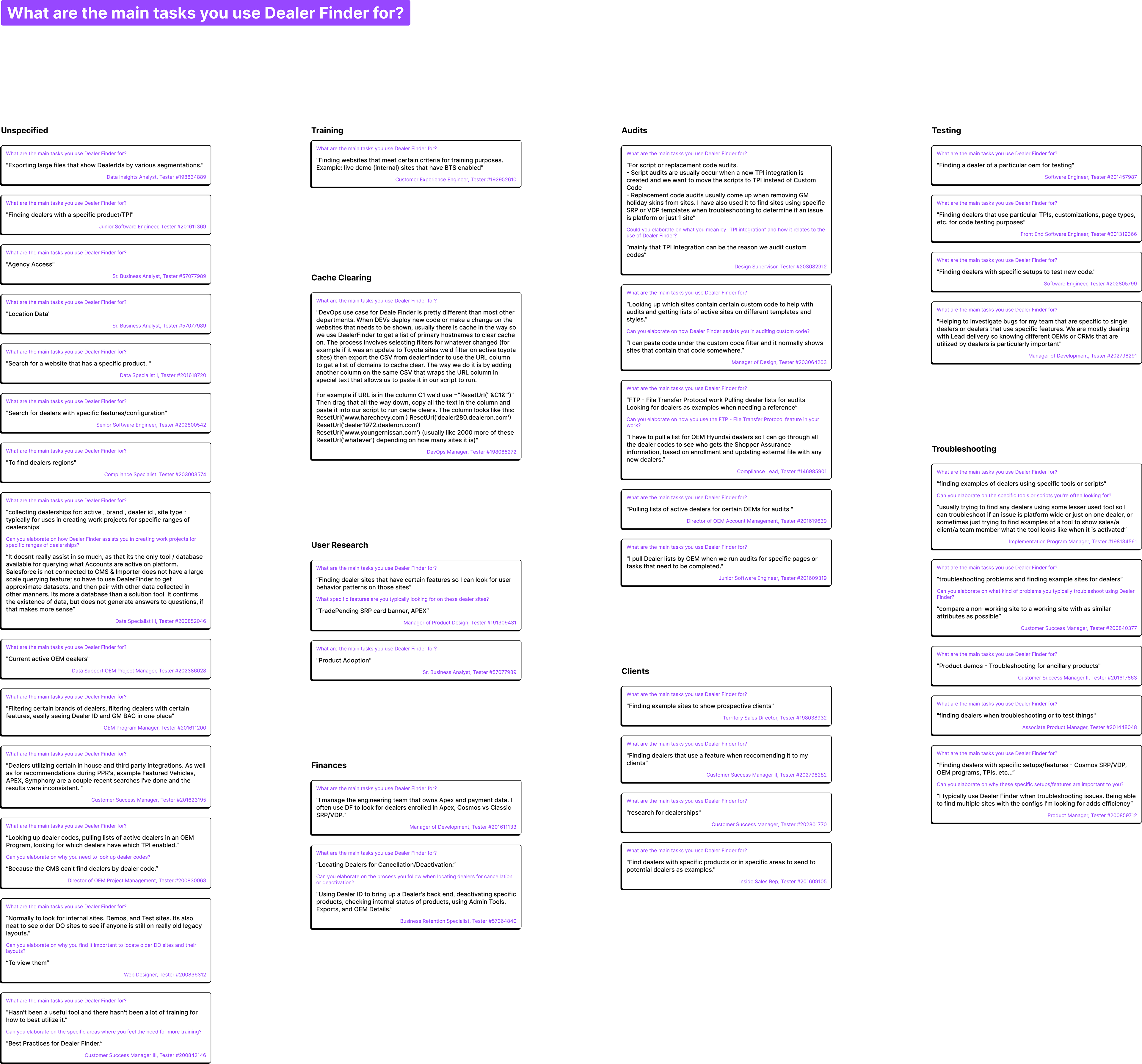
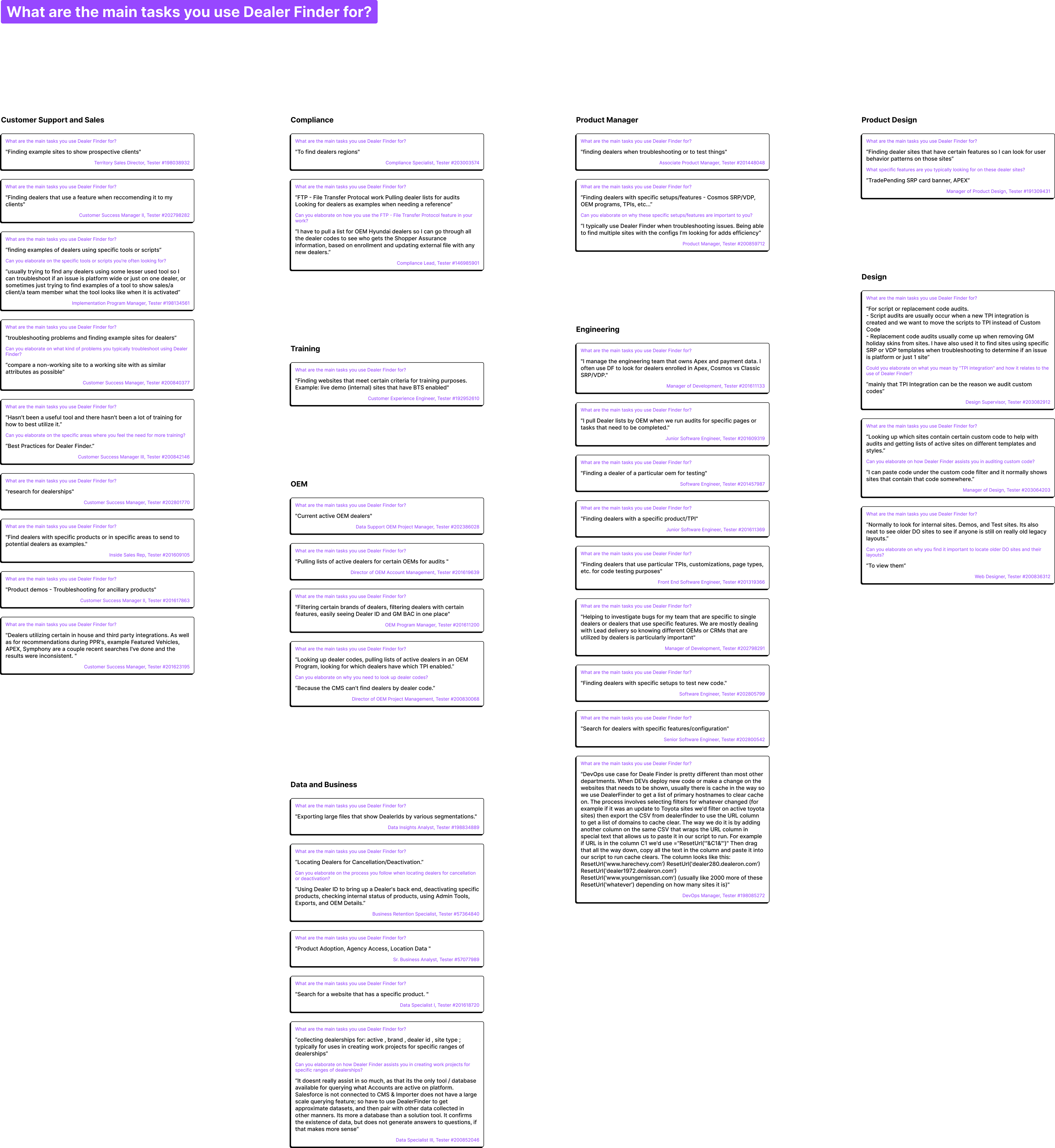
Since this is an internal tool used by DealerOn employees across departments, I crafted a survey to understand how each respondent uses Dealer Finder. The six-question survey received 44 responses.
“This is what I call top tier research synthesis.”
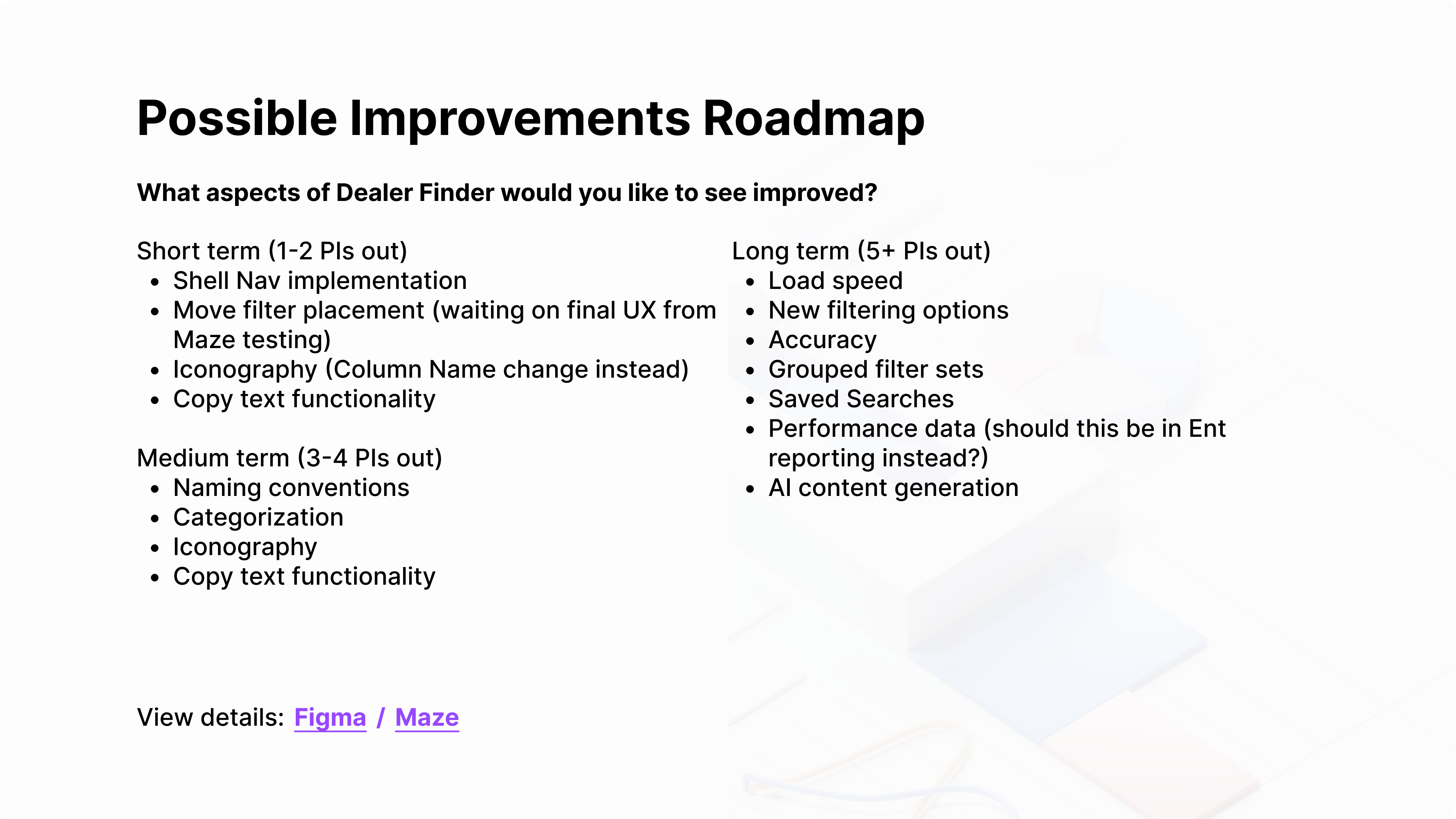
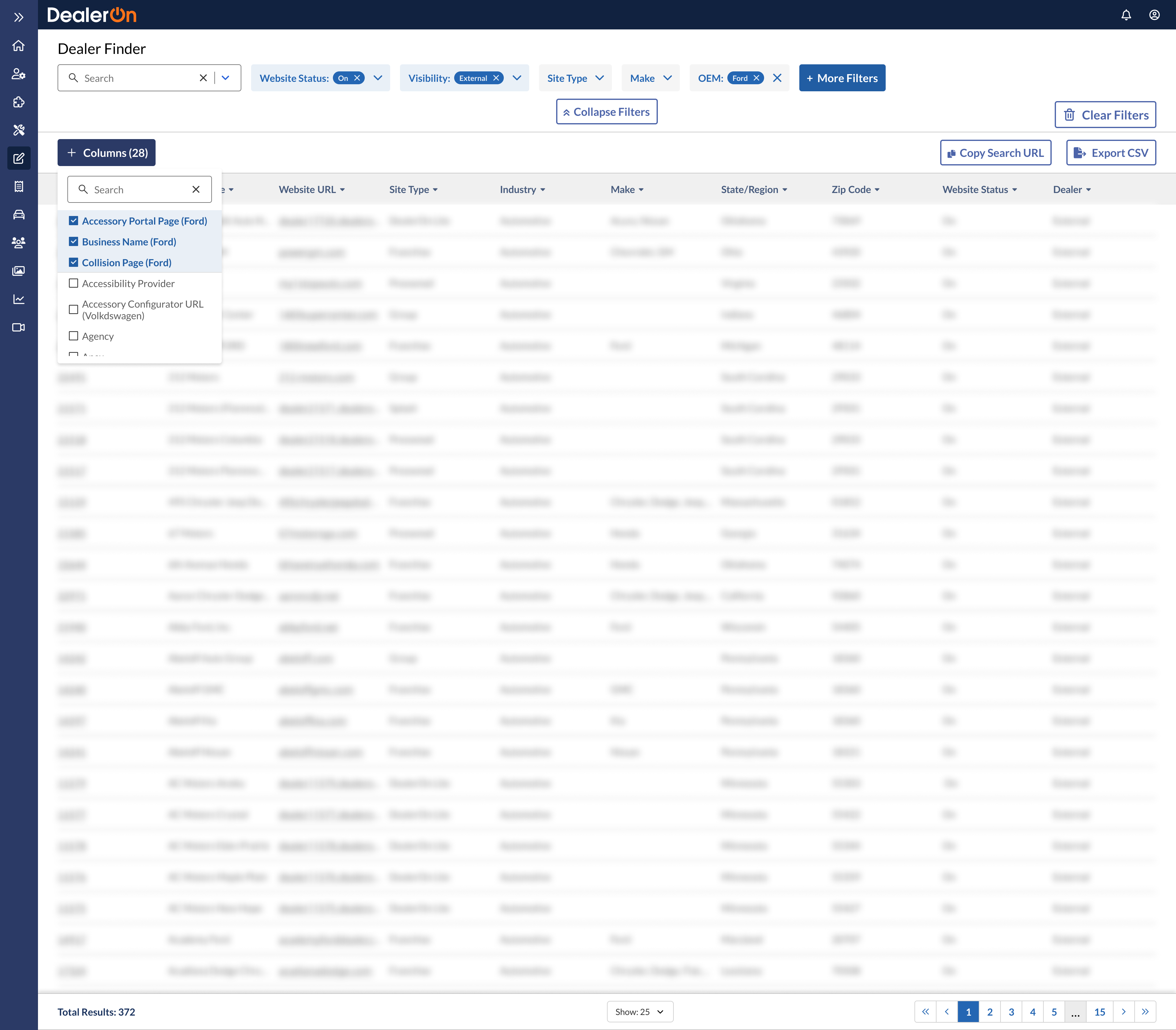
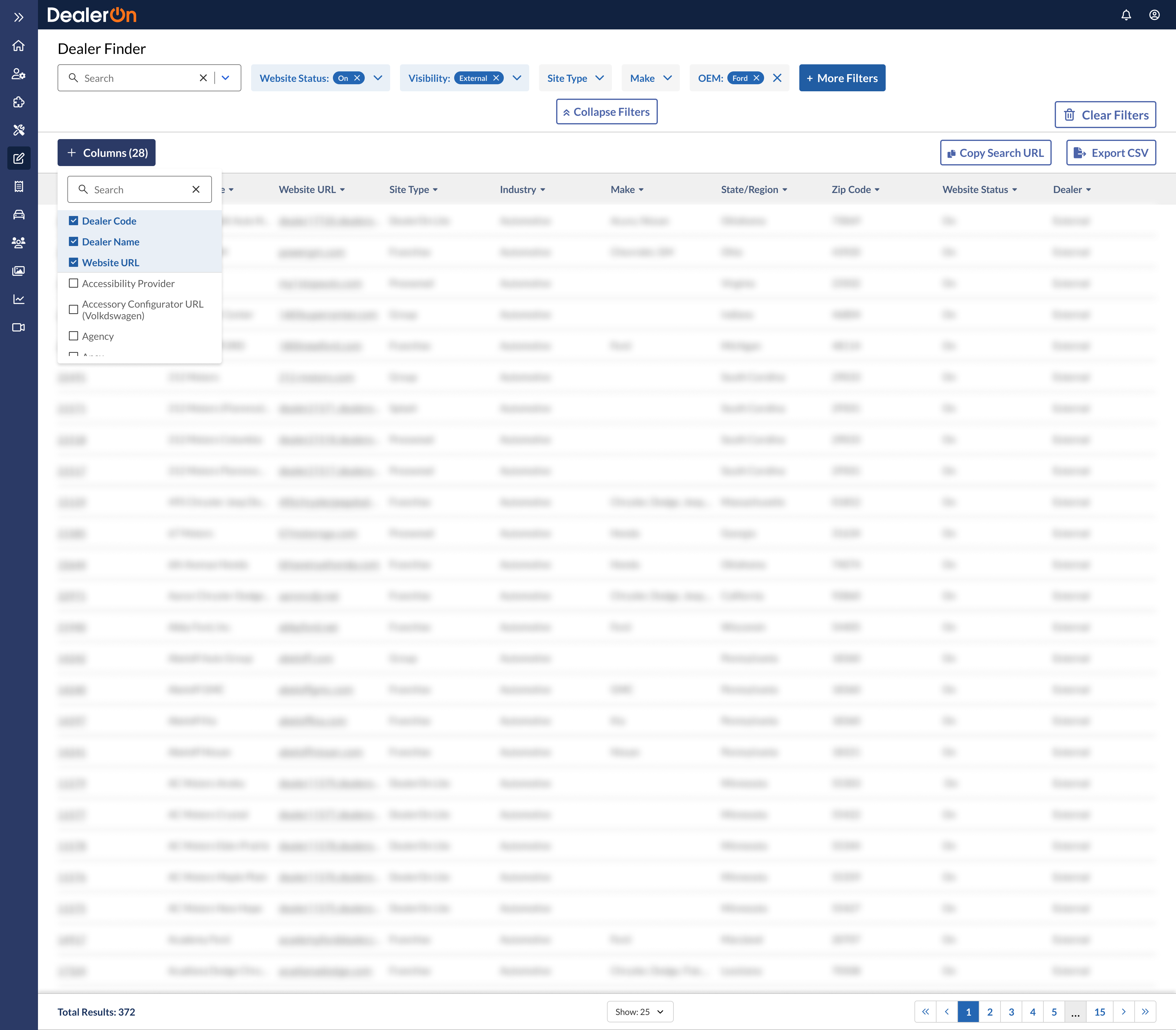
I collected all responses and categorized them into groups such as team, usage, and feedback. Using my synthesis, I proposed a roadmap prioritized by feature and worked with Director of Product Christina Cuatto to finalize it.
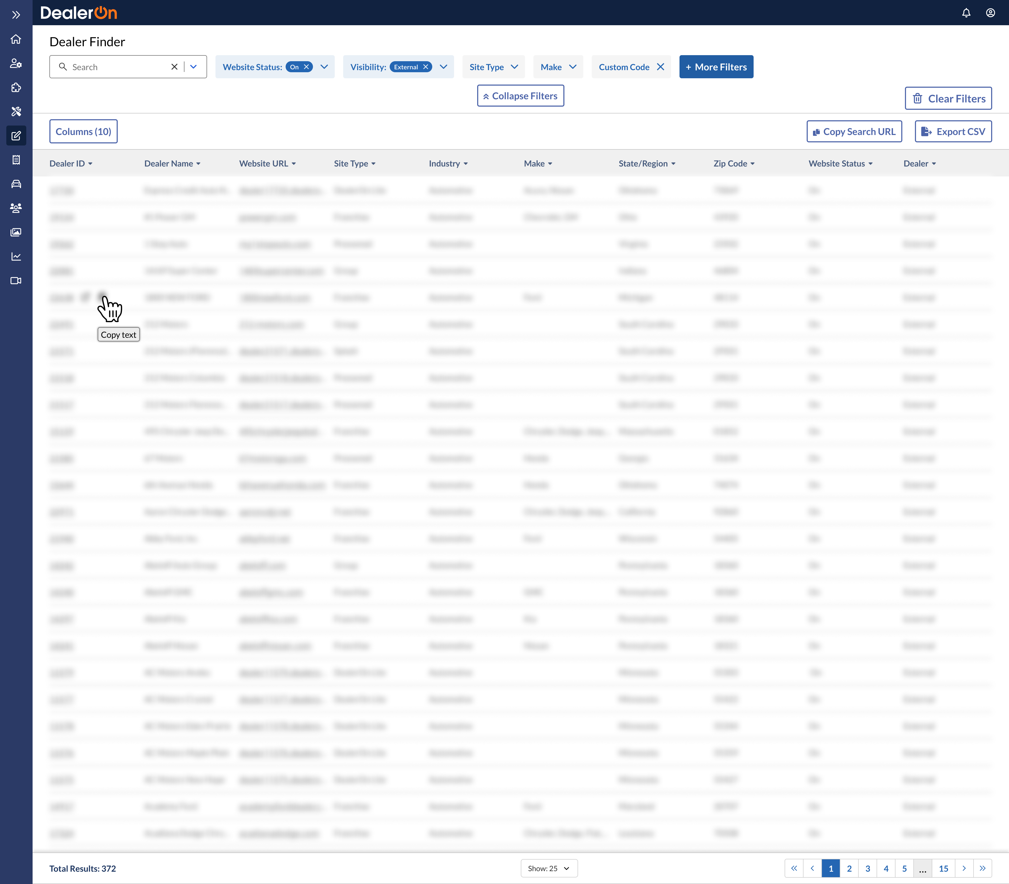
Some features I suggested based on my research, such as copy text functionality, icon changes, and column renaming, are now live.
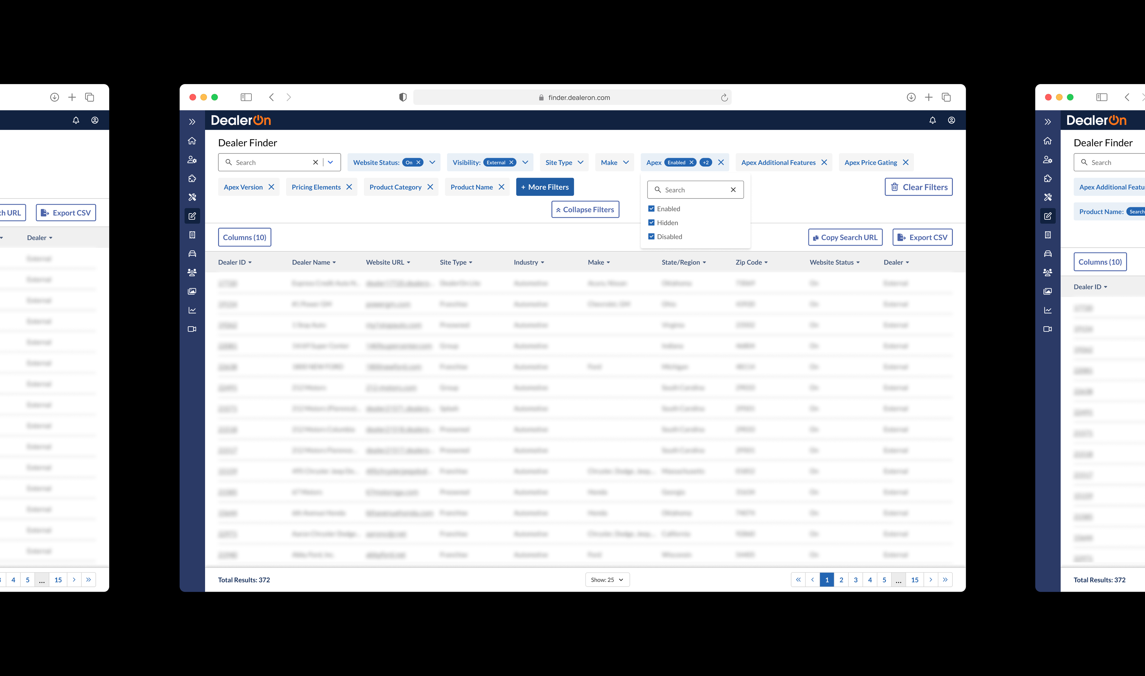
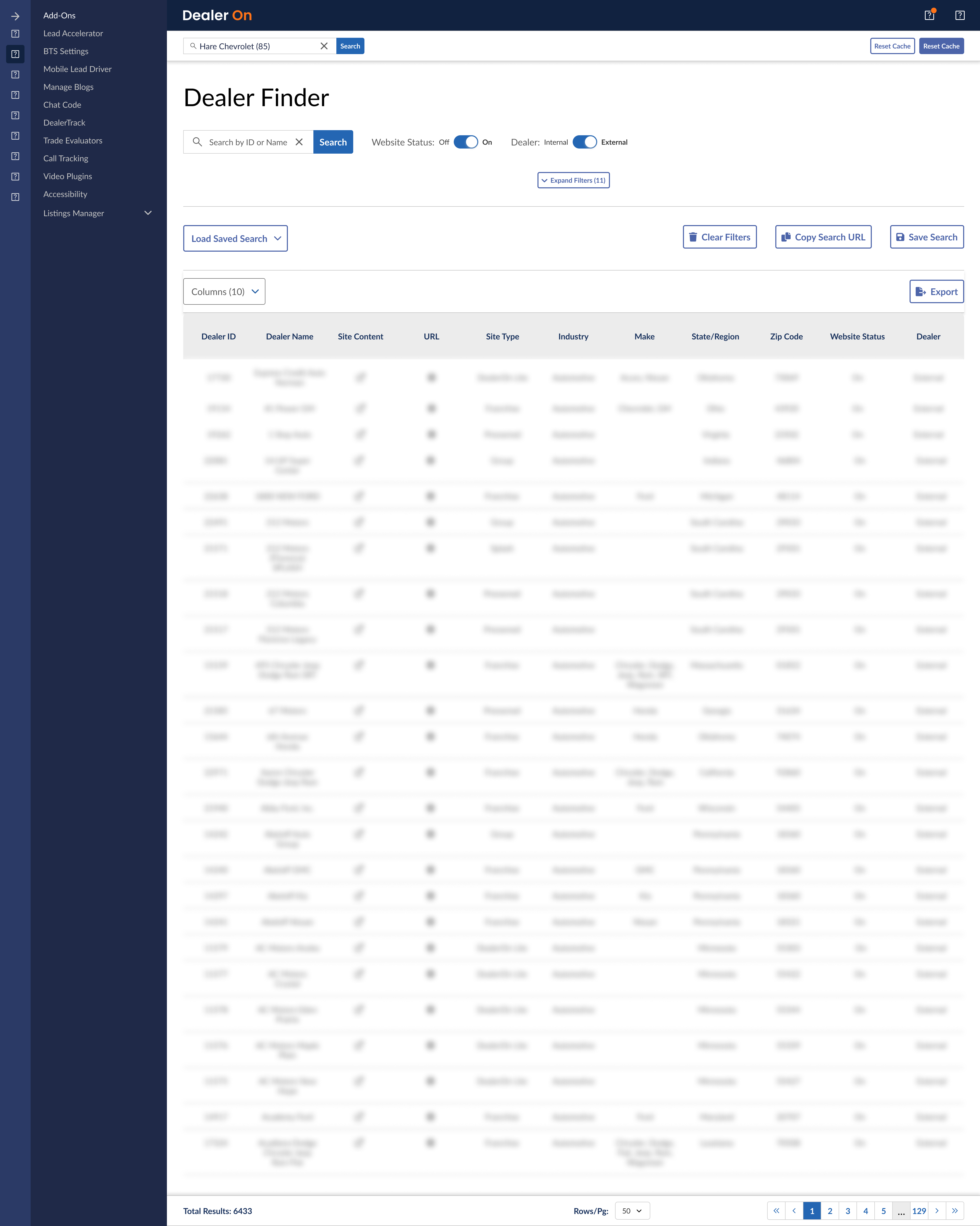
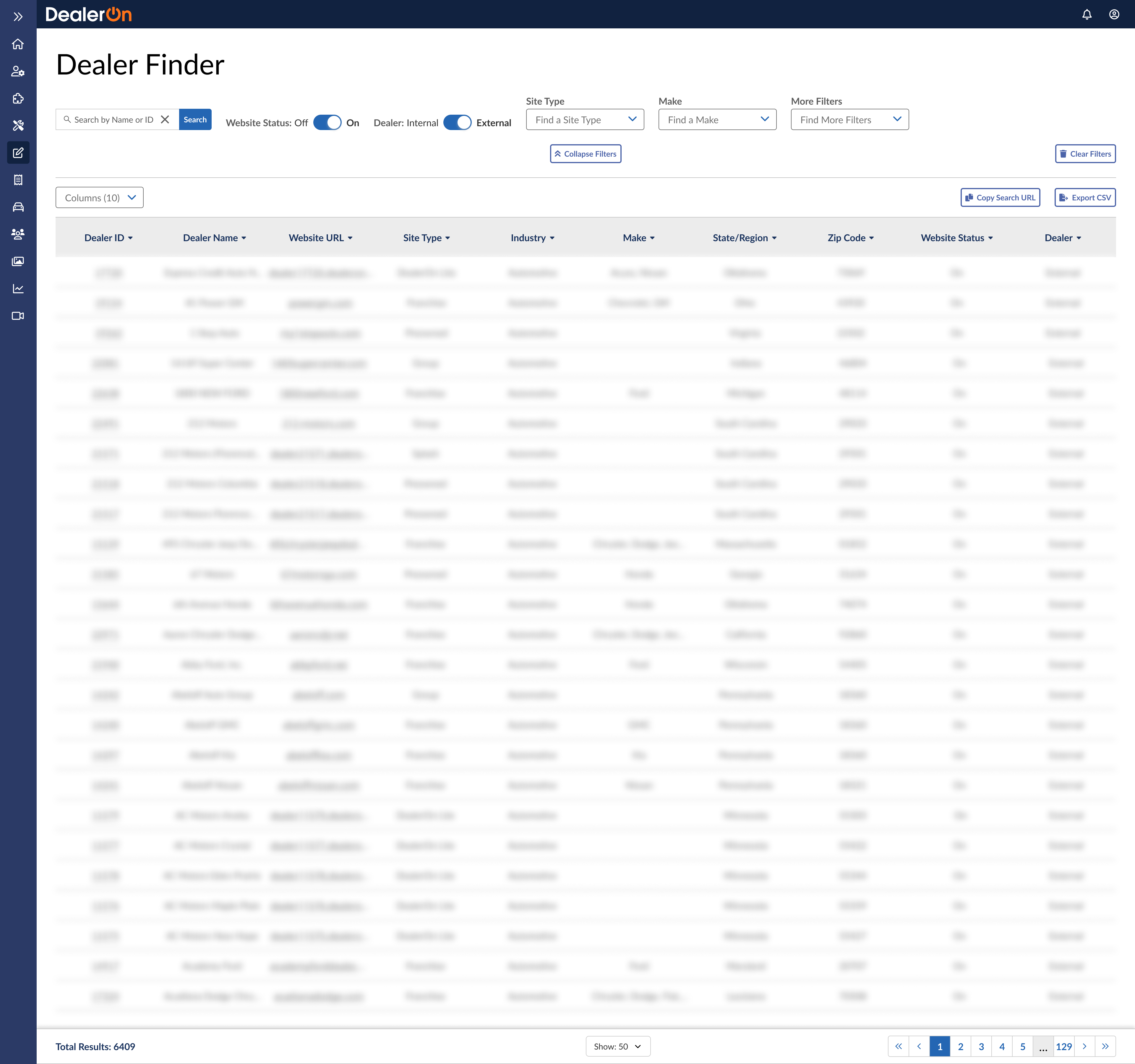
First drafts

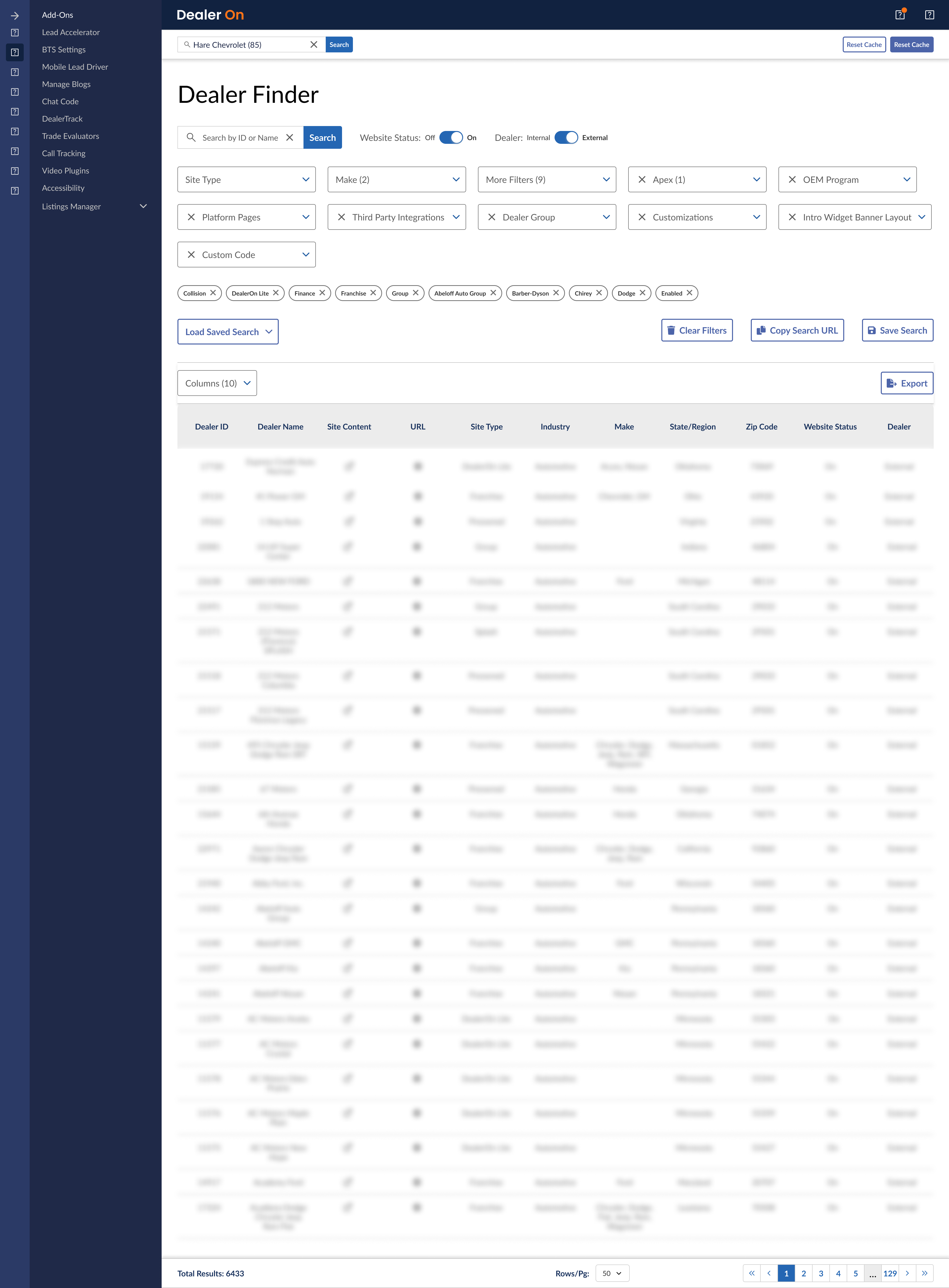
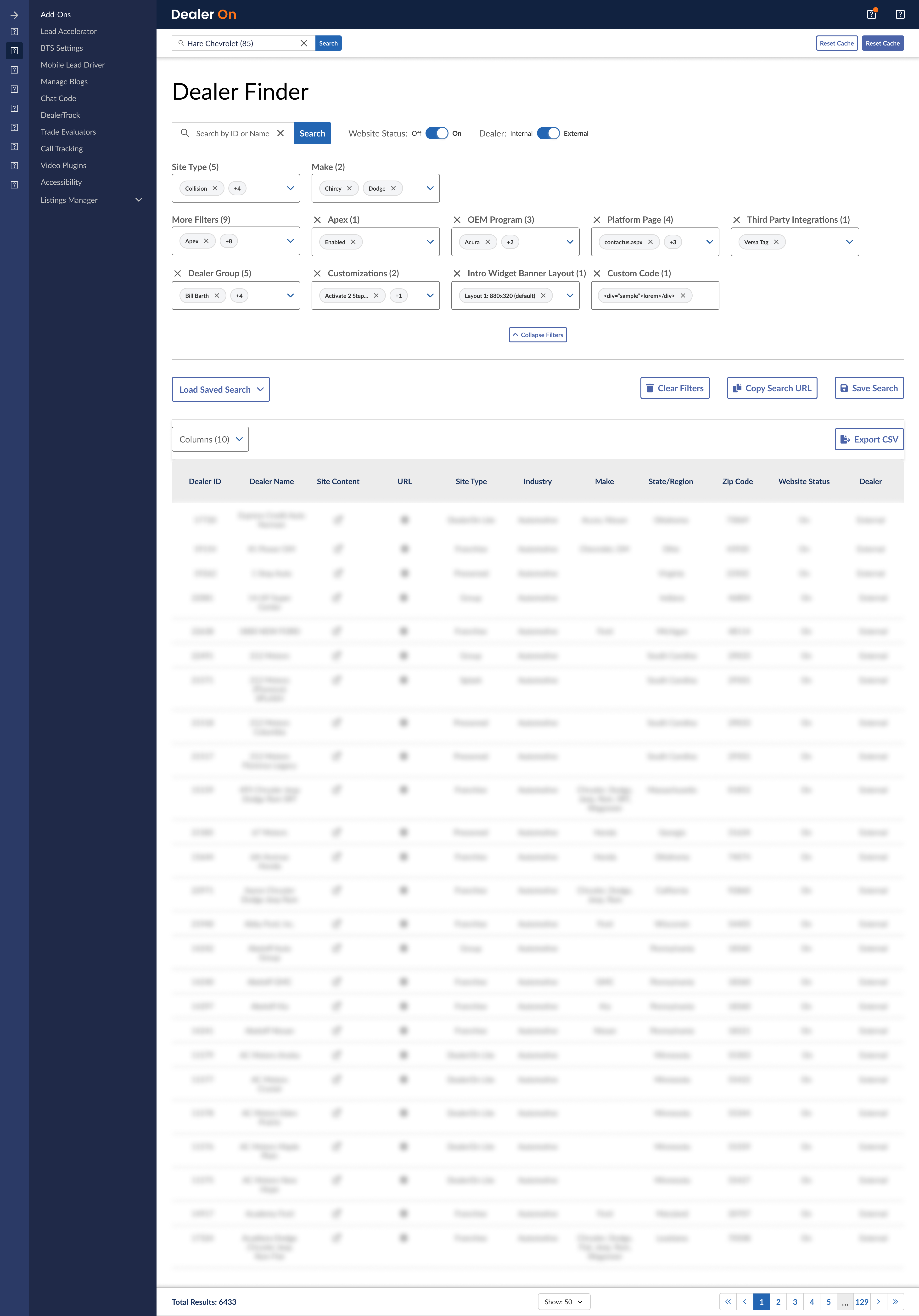
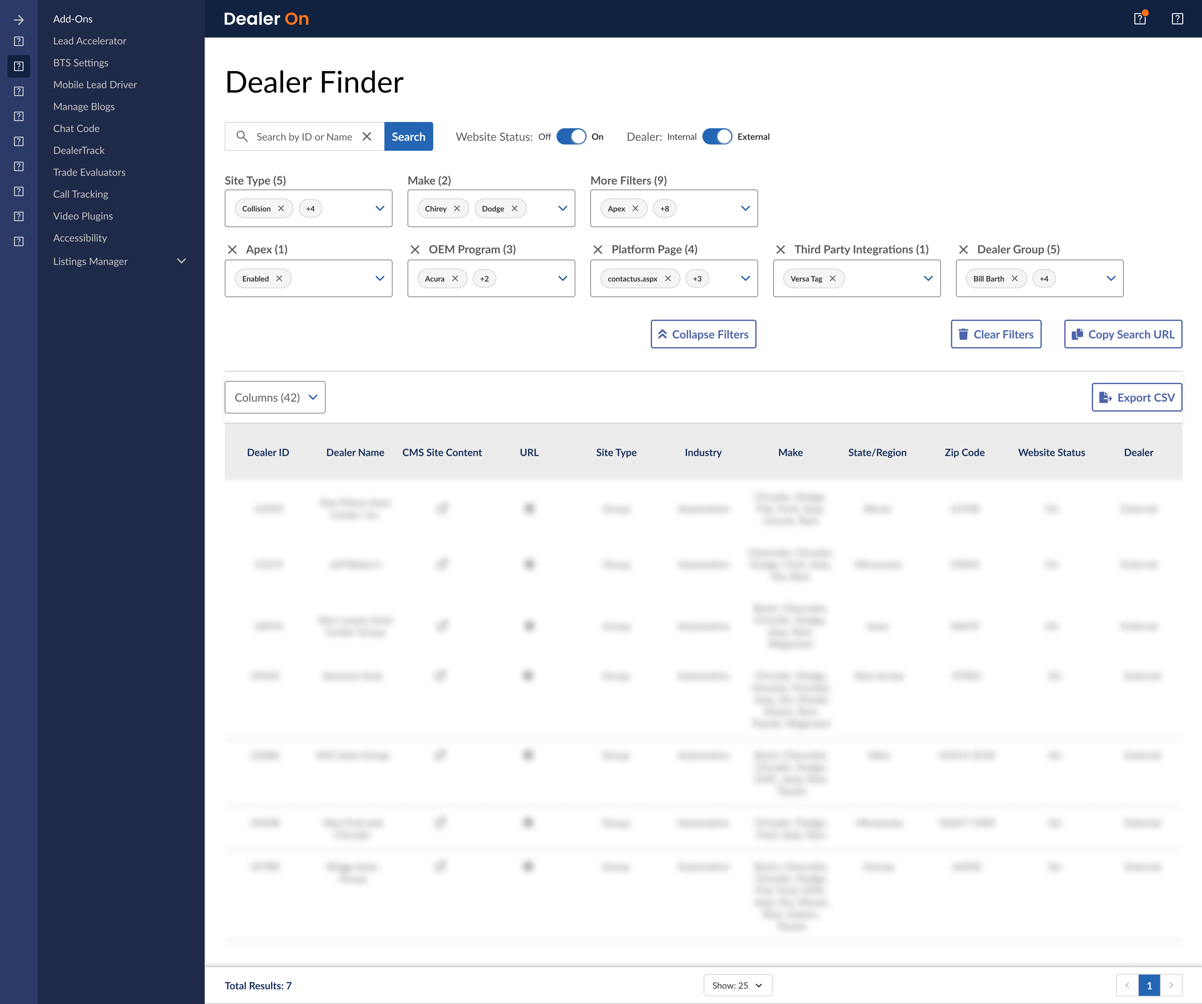
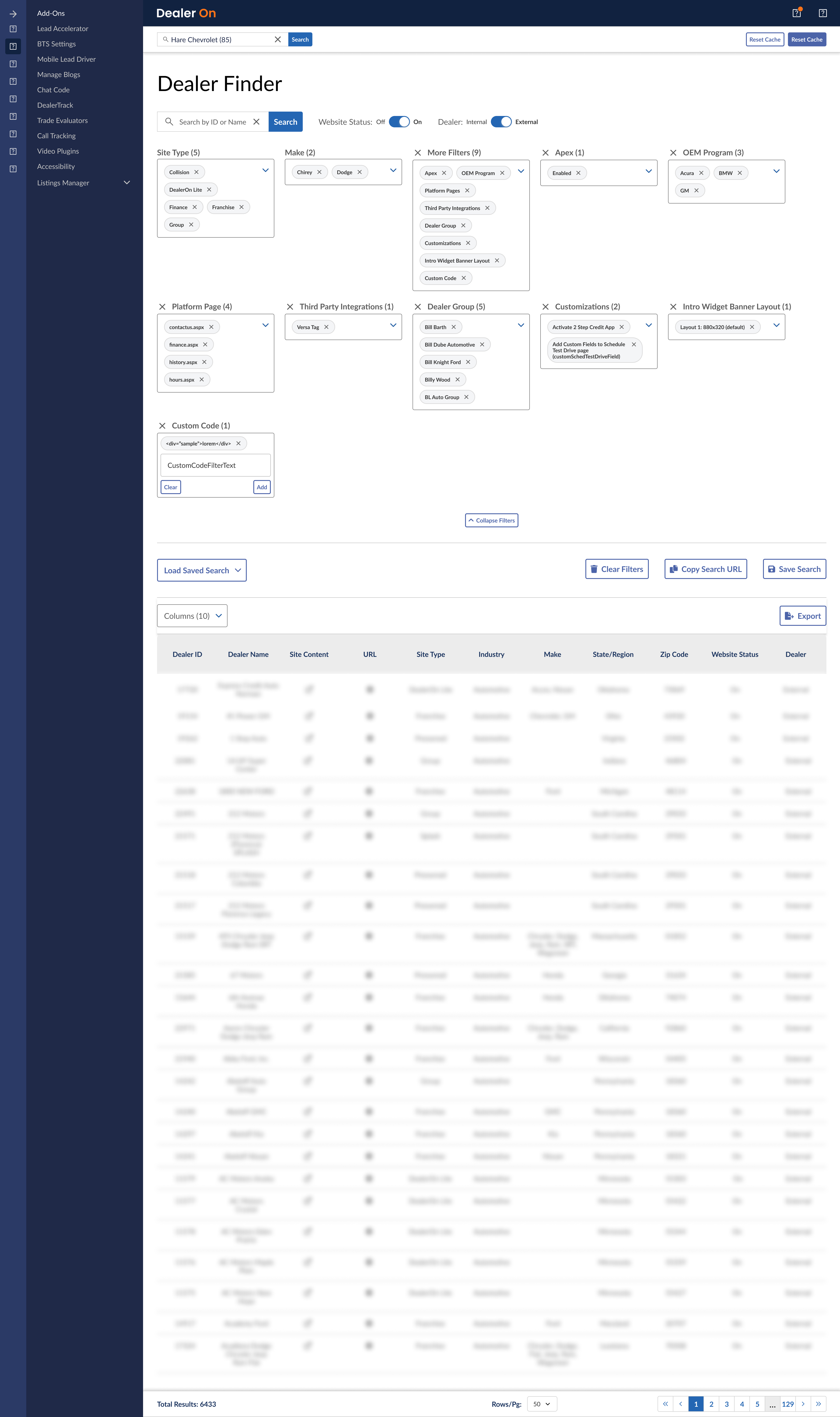
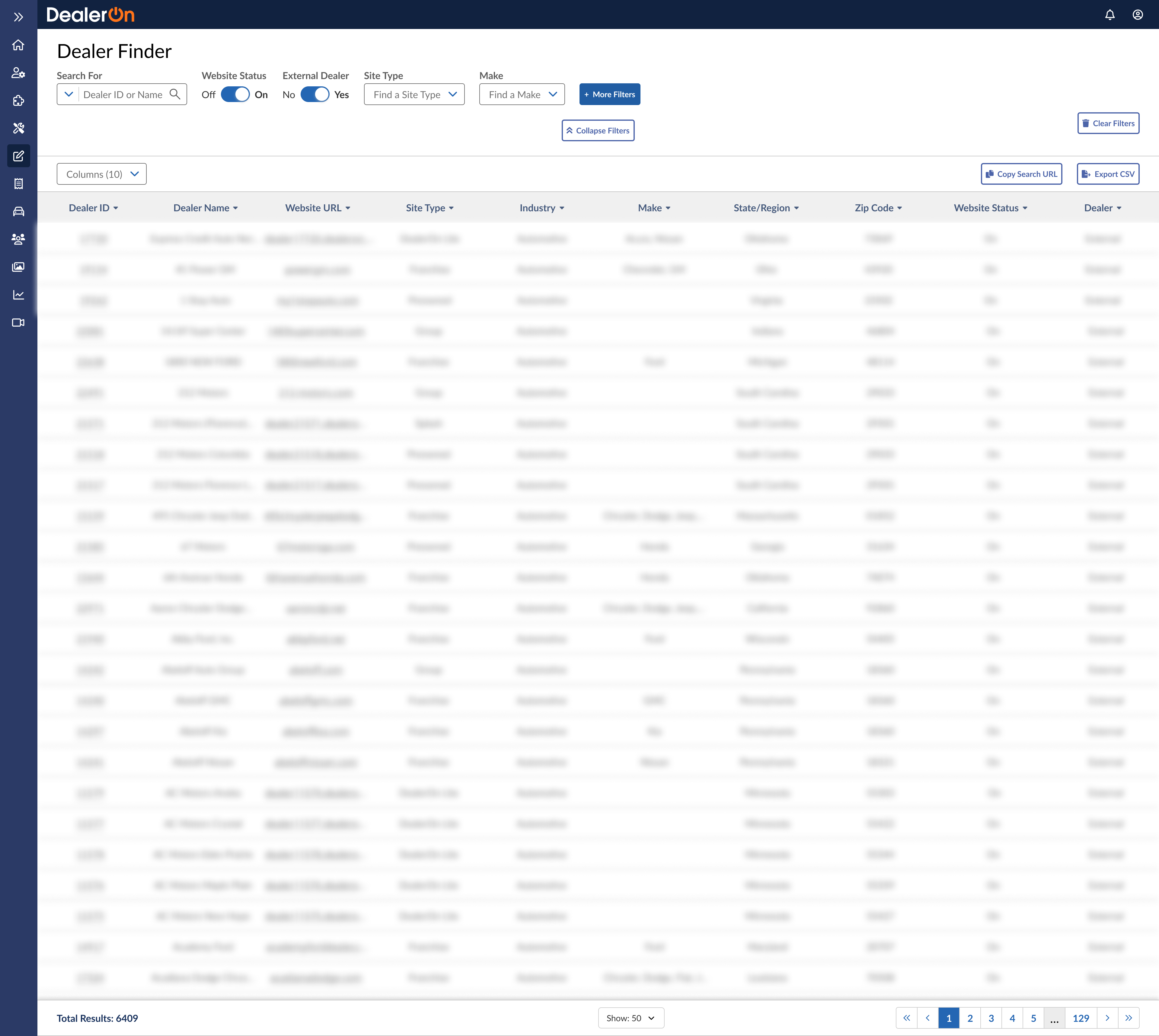
Test Prototype
Task: Find all dealers with the make Ford who have Apex enabled.
This was actually the fourth prototype I created to test; the other tasks were too complicated for unfamiliar users.
“Feels easier to access.”
Prototype Testing results, 34 responses
“Feels easier to access, and I can see all my filter selections in a glance and do not have to scroll as compared to the sidebar on the current tool, which feels too cluttered.”
“The topbar navigation has more visual clarity than the sidebar navigation because dropdowns aren’t obscuring each other and you don’t have to scroll to see all selected filters.”
“The items in the dropdowns don’t get cut off at the bottom of the page, it’s easier to see enabled filters, filter types are easier to distinguish.”
Action items
“This doesn’t feel any different than the current solution… actually it’s kind of worse since the filters will now push the results off the page.”
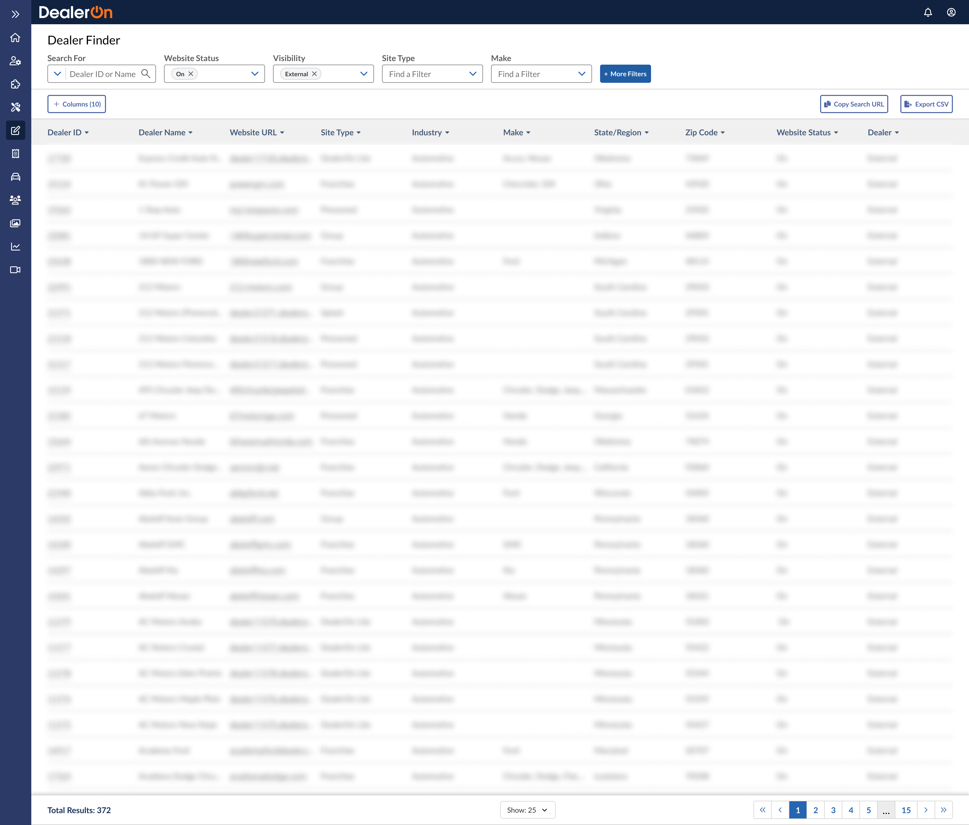
“Many of the queries I’m doing return a lot of dealers. For example, the actual query we just did returns 16 results in prod, but 24 in QA. Often, you are getting a list of a couple hundred dealers, so it helps to see more results in the table.”
↓
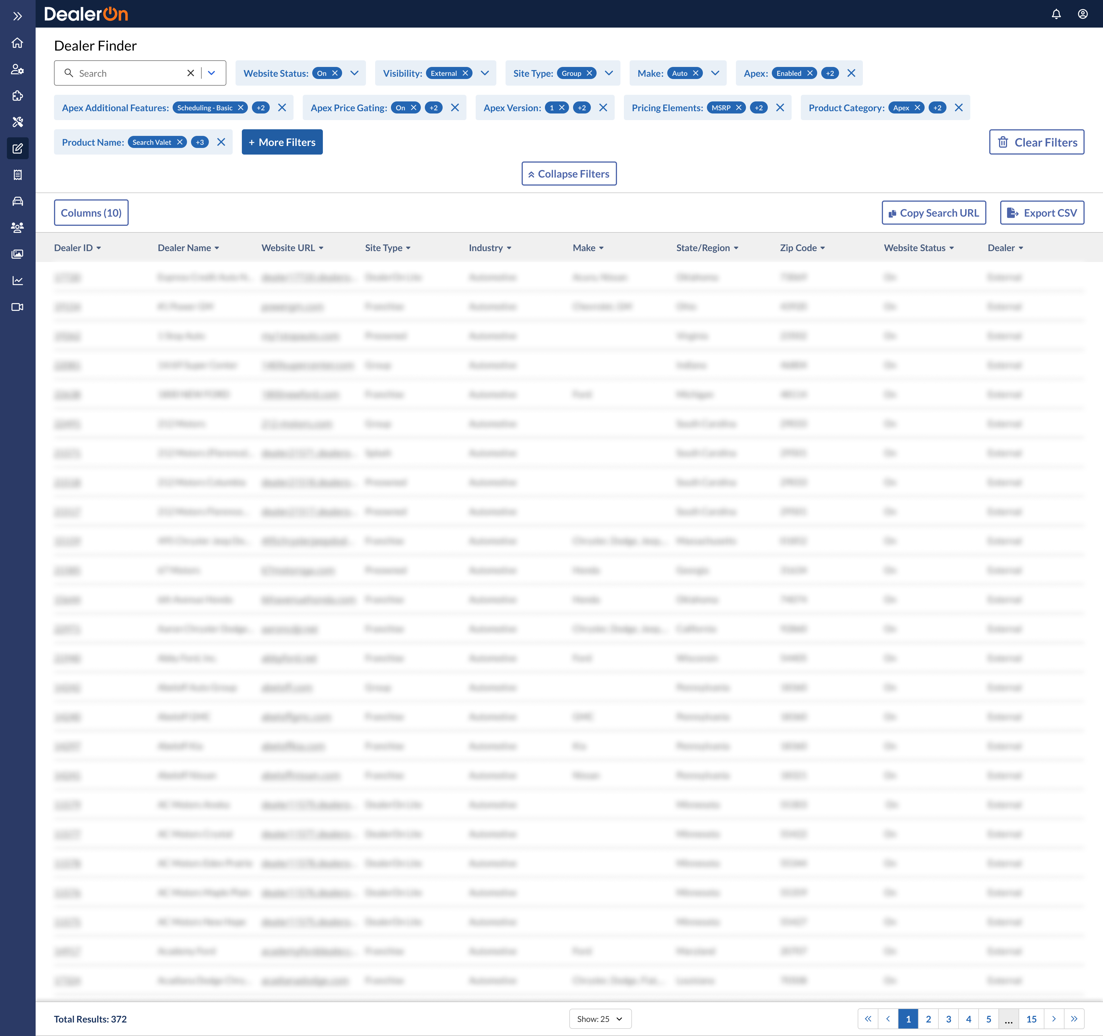
The filters need to take up less vertical space
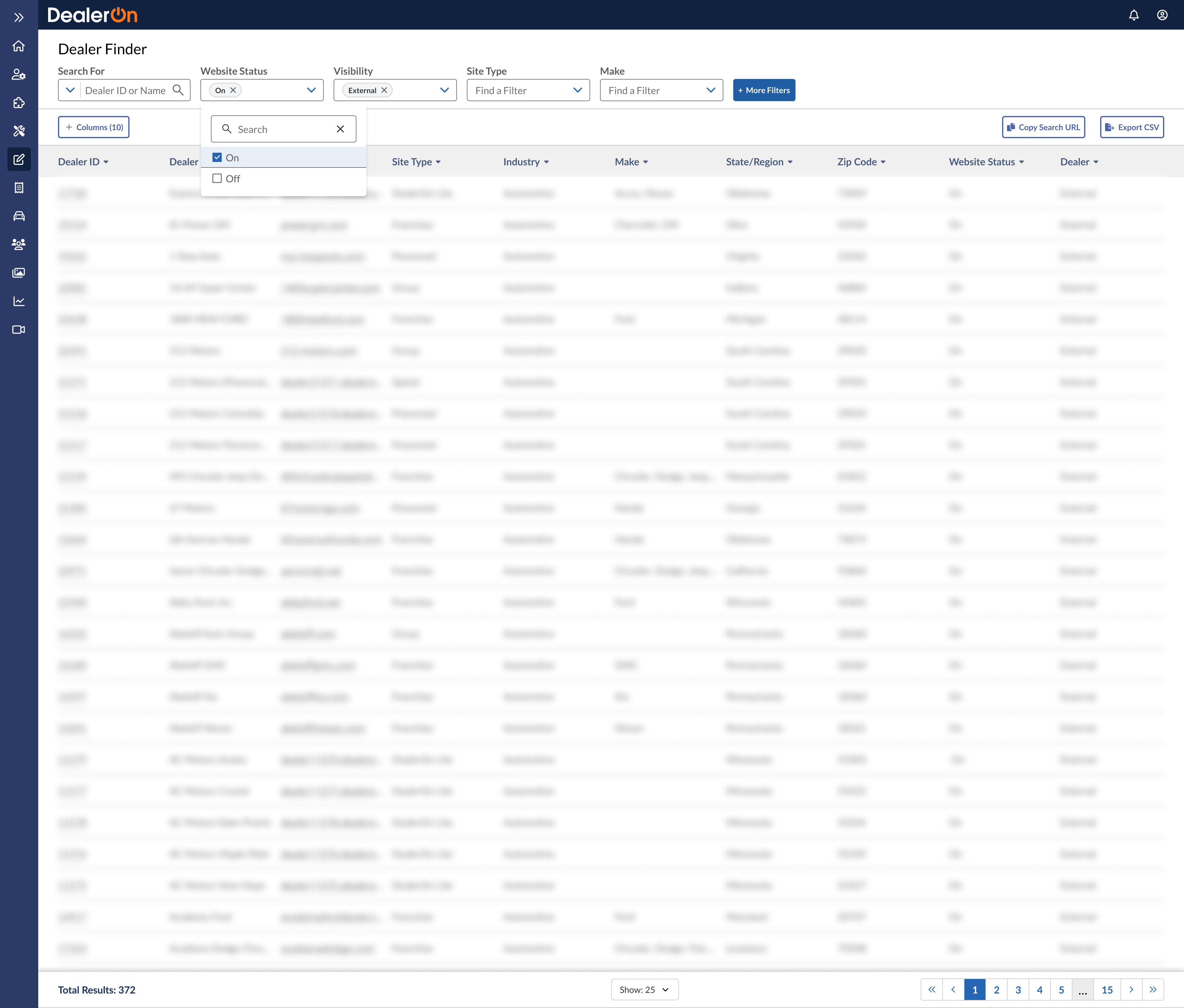
“The appearance of a new field was not immediately obvious to me. It appeared onscreen as I was pressing a button in another field. It also matches the ‘white-space’ aesthetic of the UI so closely that I did not sense it as ’new’ at first.”
“I felt the APEX enabled/disabled dropdown popped up in a weird spot. Why was it on the next line. They were related so I expected their location to be related.”
↓
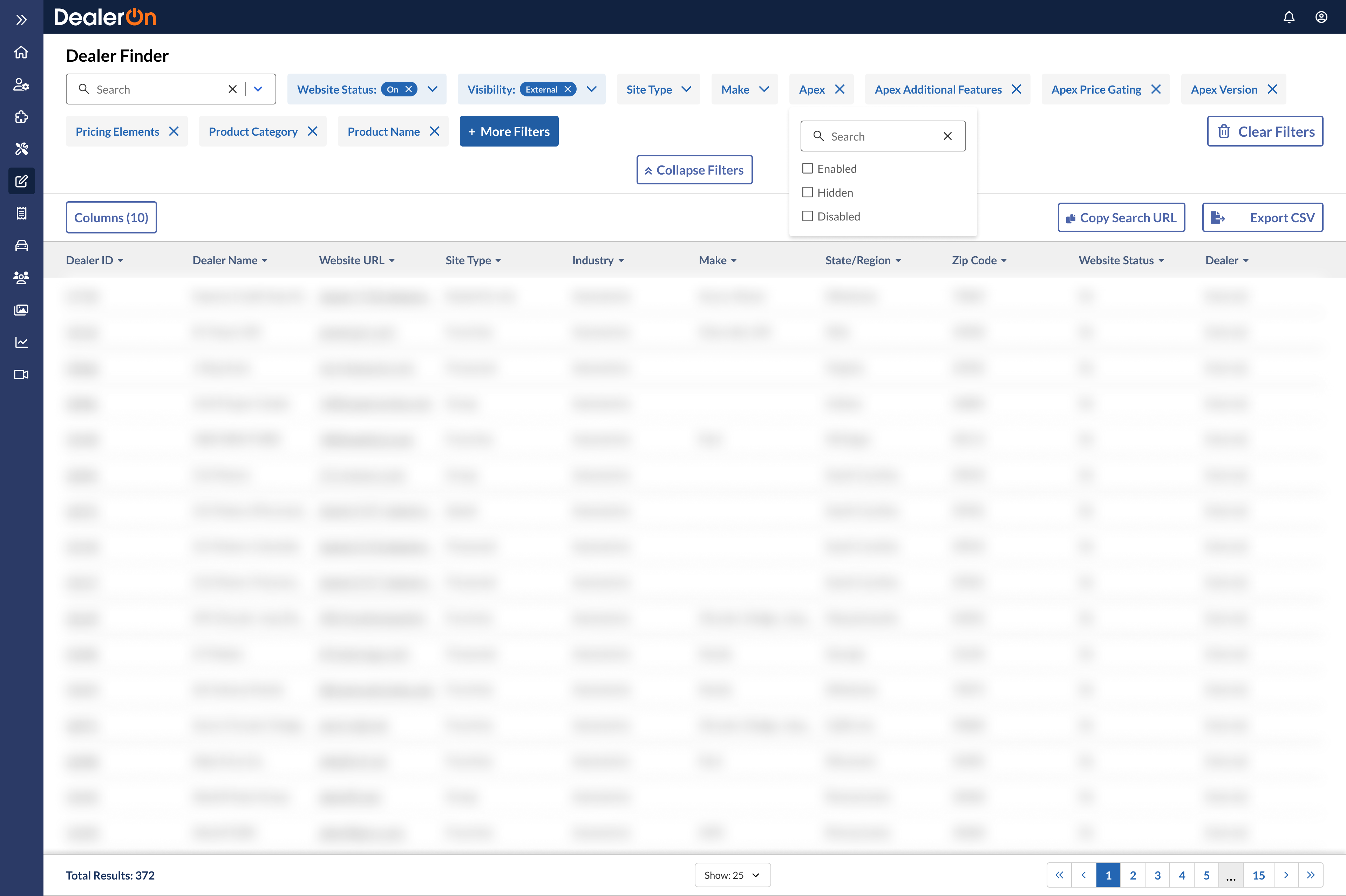
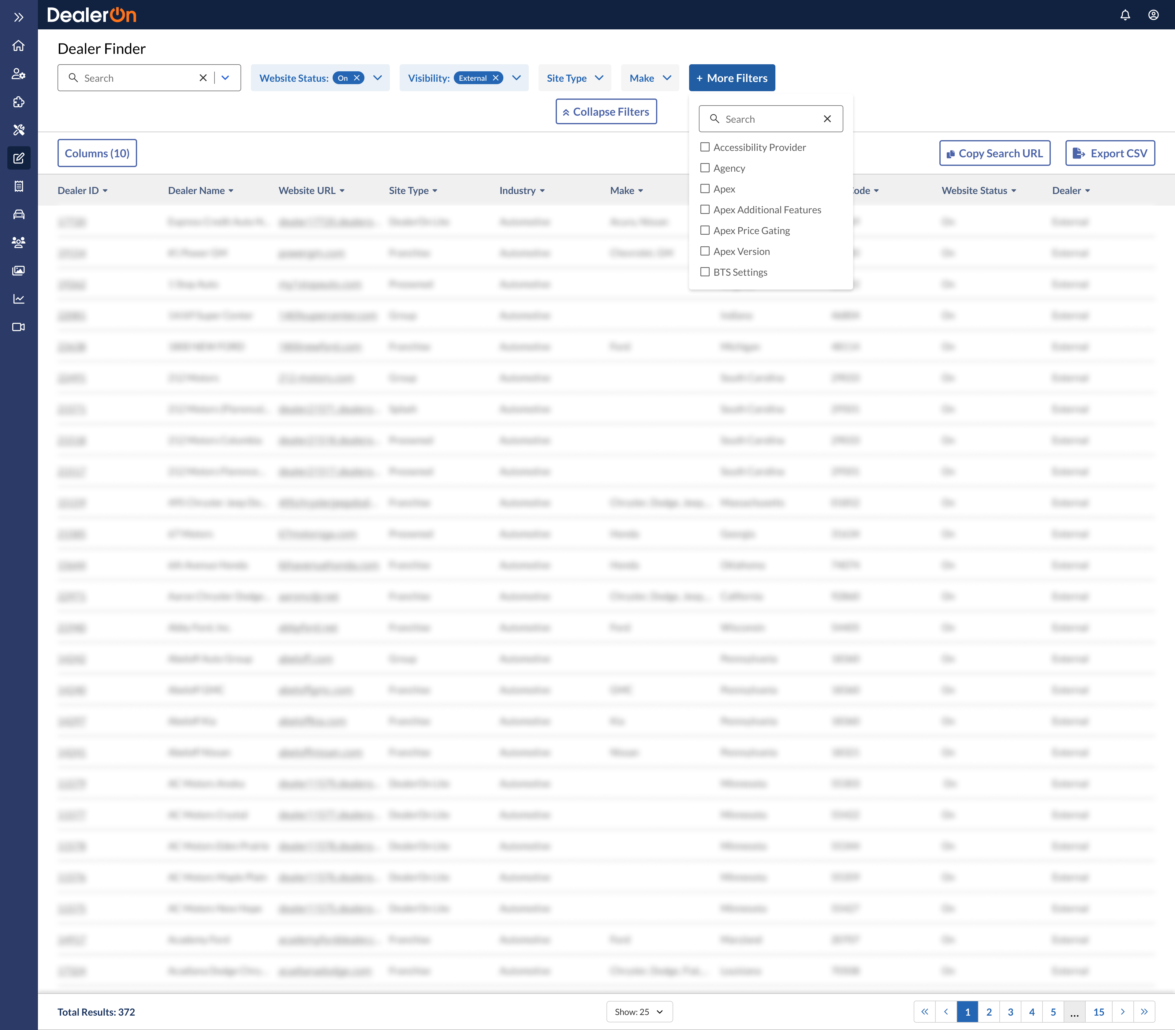
Any filters added via the “More Filters” button need to appear next to the “More Filters” button for organizational clarity
“The difference in the heights of the form elements bothers me a little. It seems that everything is a little misaligned. I think the positioning of the elements could be improved to give the layout more balance. The colors, sizes, thickness, and rounded corners of the elements (checkboxes, input fields, buttons) don’t follow the same pattern. It seems that each element has a slightly different design compared to other elements, which gives me a feeling of lack of unity.”
↓
Filter elements must all visually align in terms of height, etc. Design system needs updating
Tackling layout and alignment
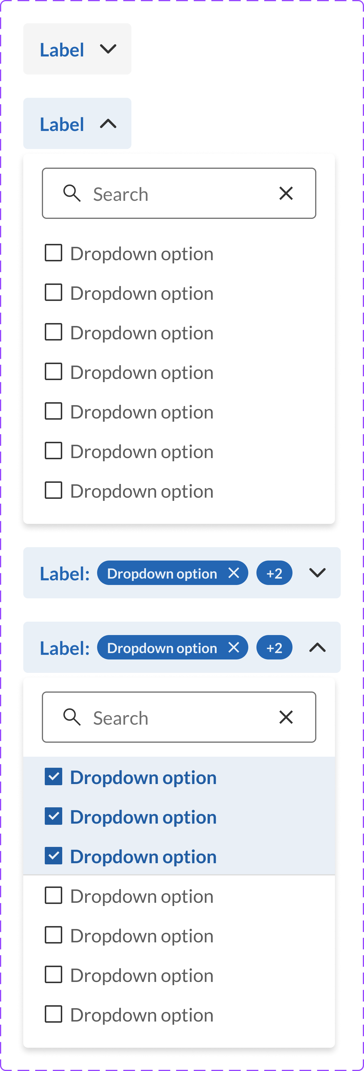
Designing a new removable combo box
Front end software engineer Kristin Vaughn was concerned about the accessibility of the removable combo box. The x/close button was placed too close to the label. I worked with her to design a new, more accessible component for our design system.

The leftmost option is the original. The options next to it are newer iterations.

“This is looking fantastic” Kristin
Here are the components we settled on. One is removable (for additional filters) and one is not (for default filters).
This is one of my many contributions to our design system.

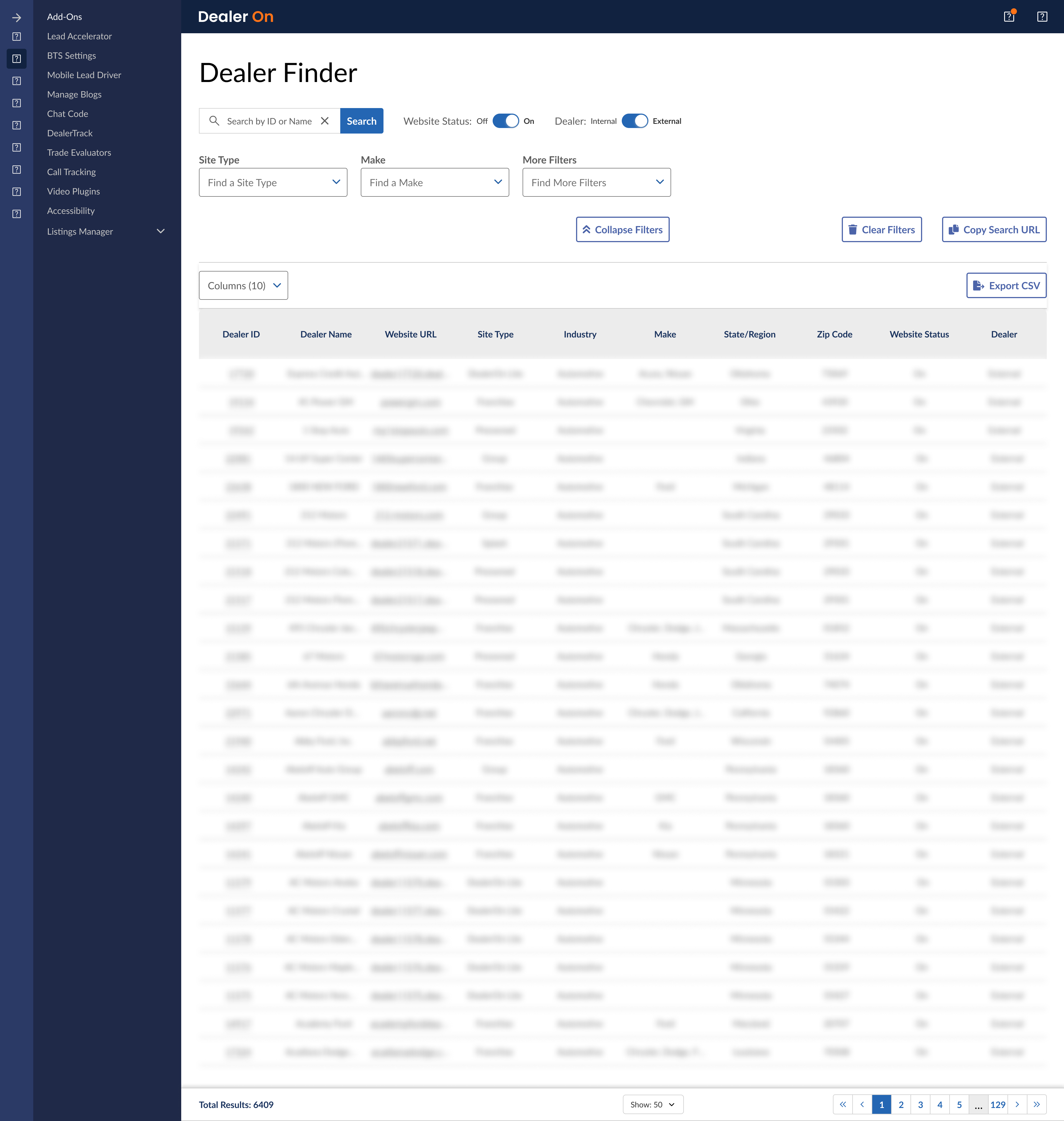
Deliverables
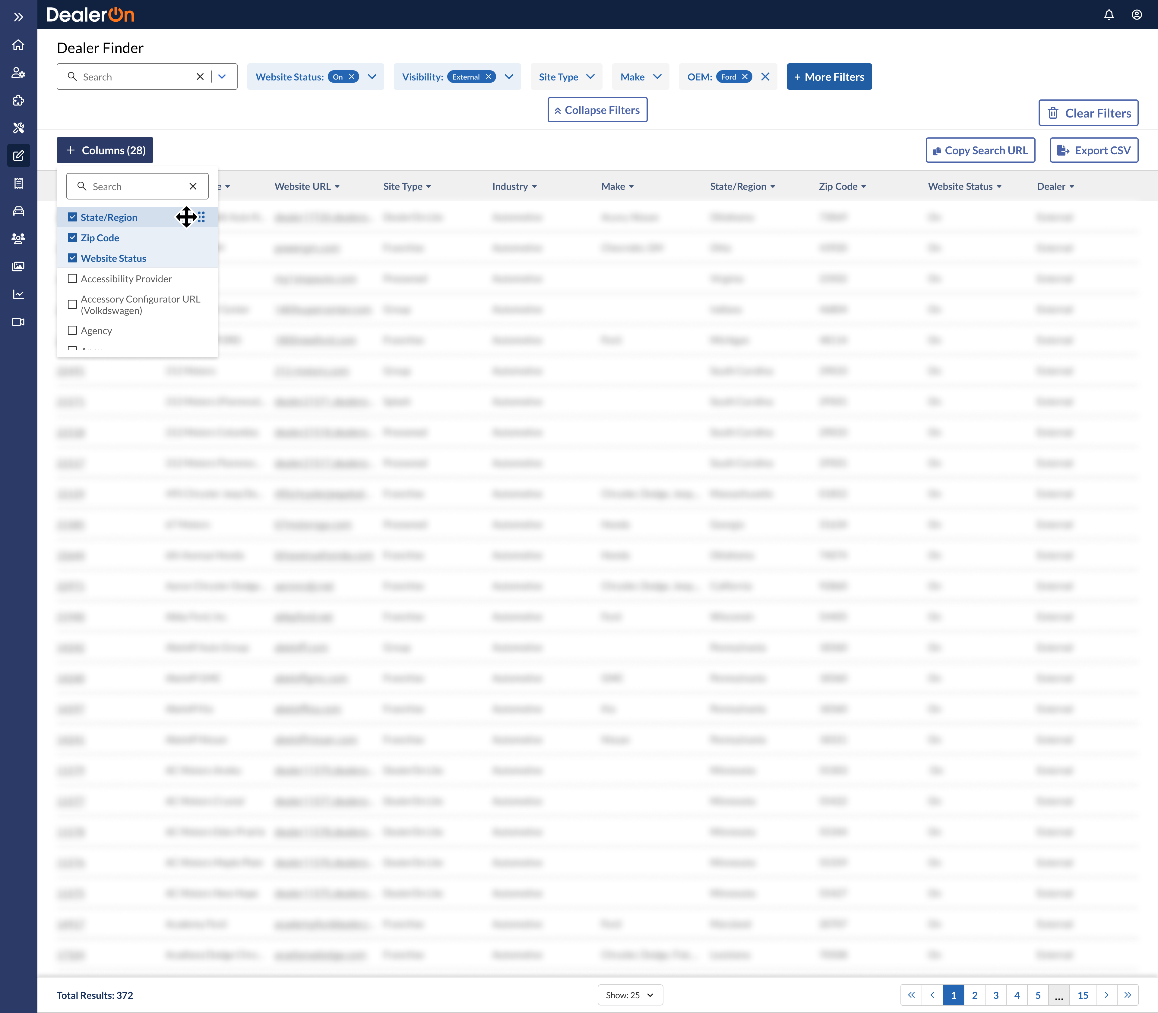
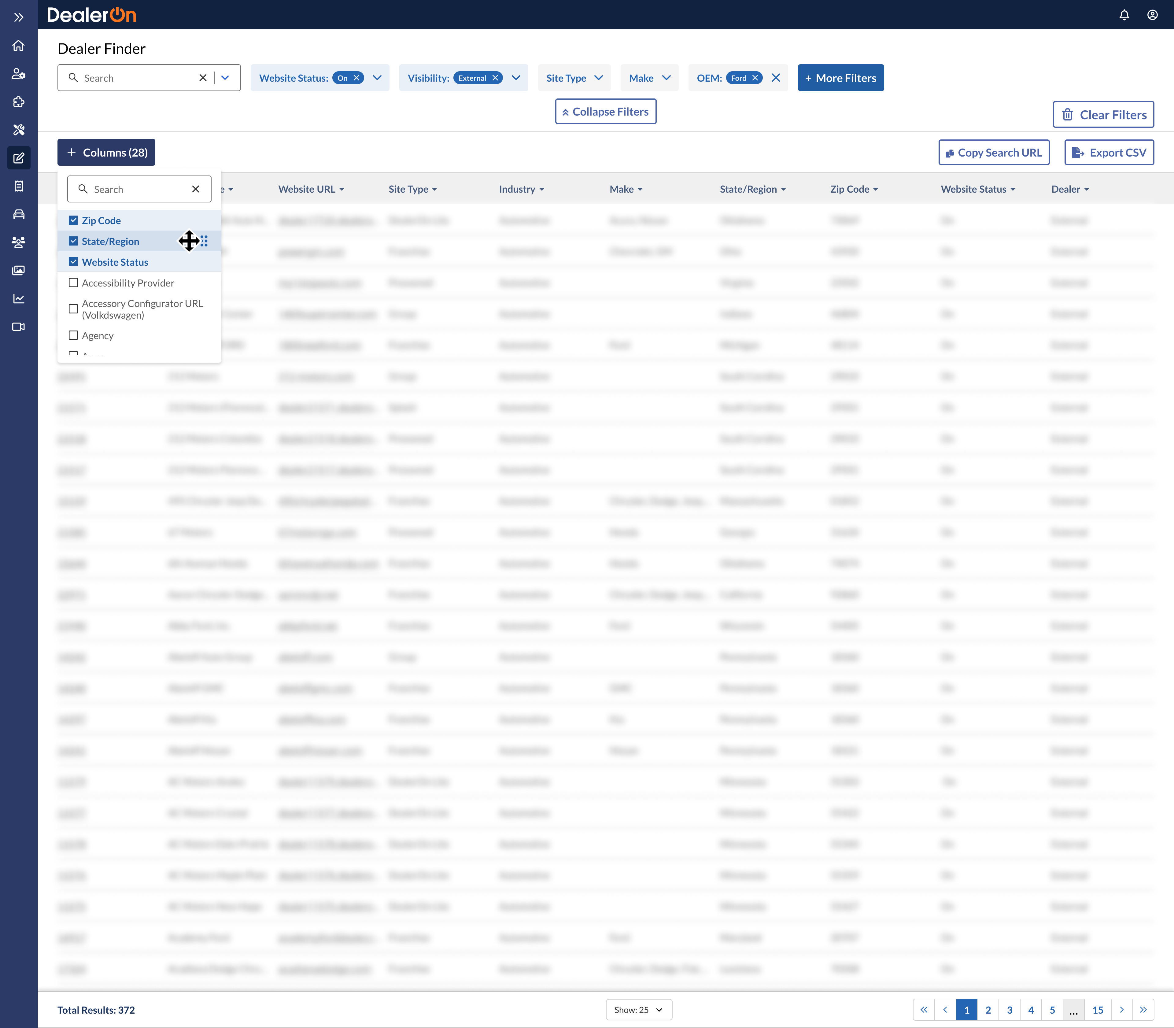
Filtering
Adding and removing columns
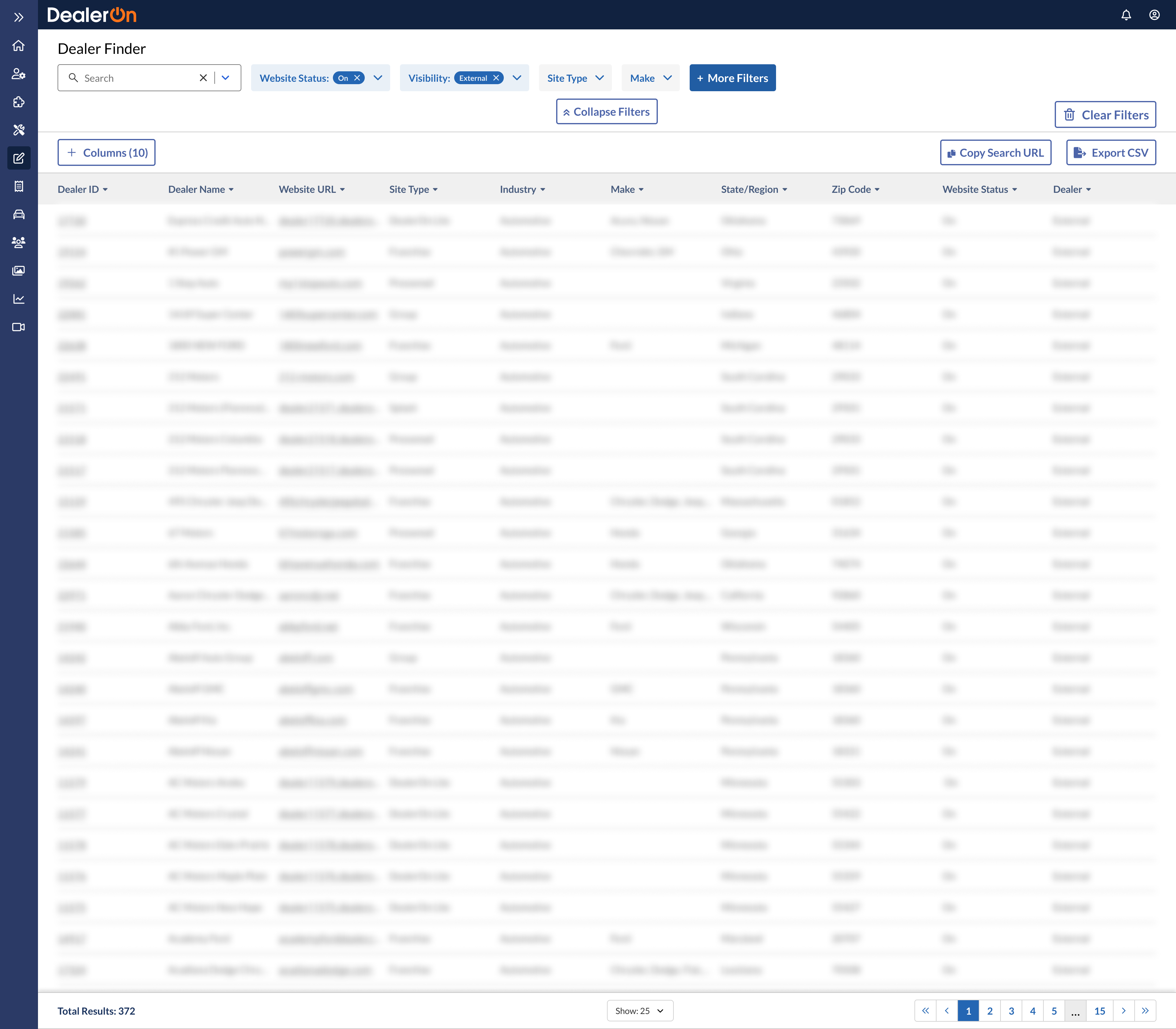
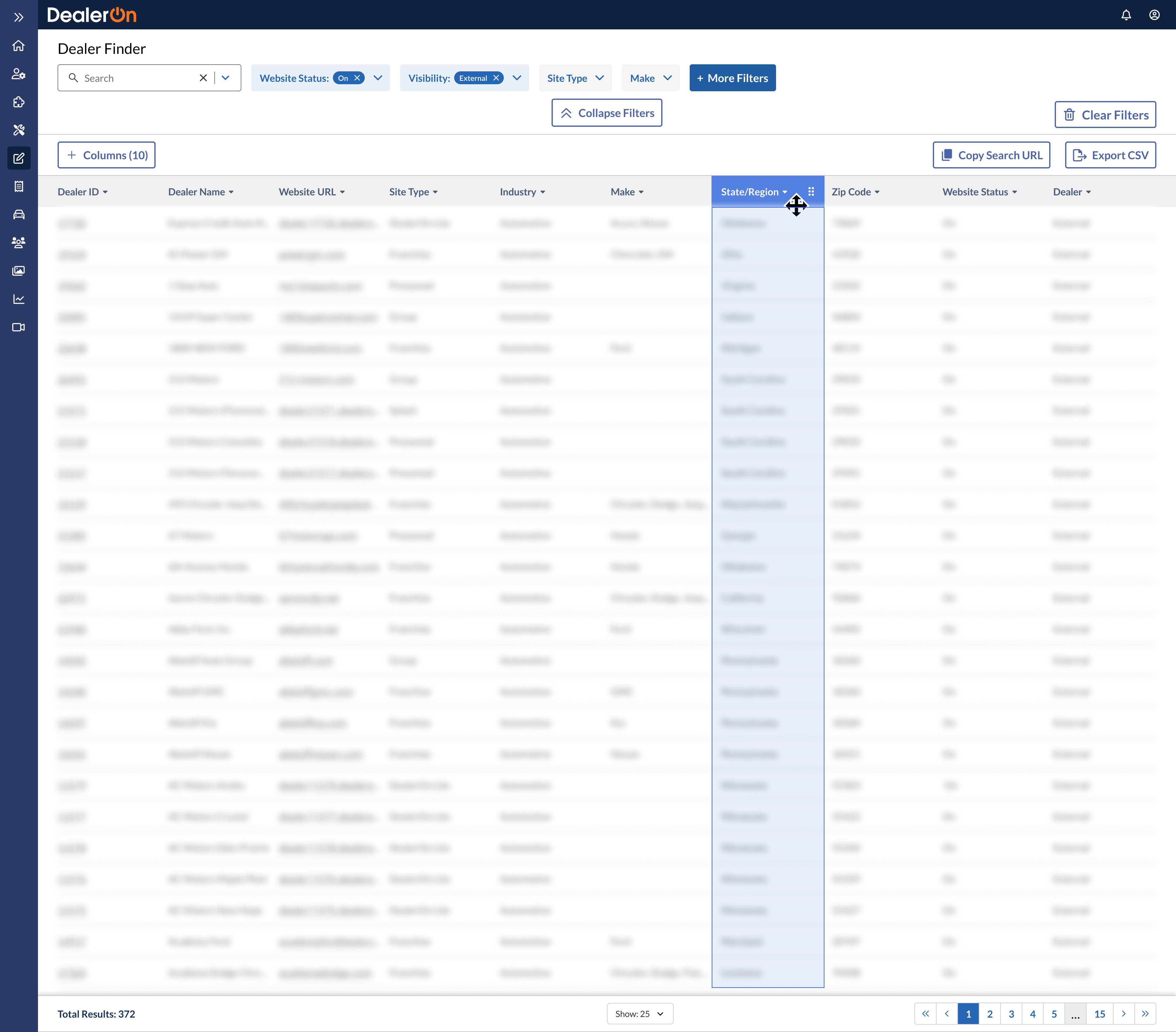
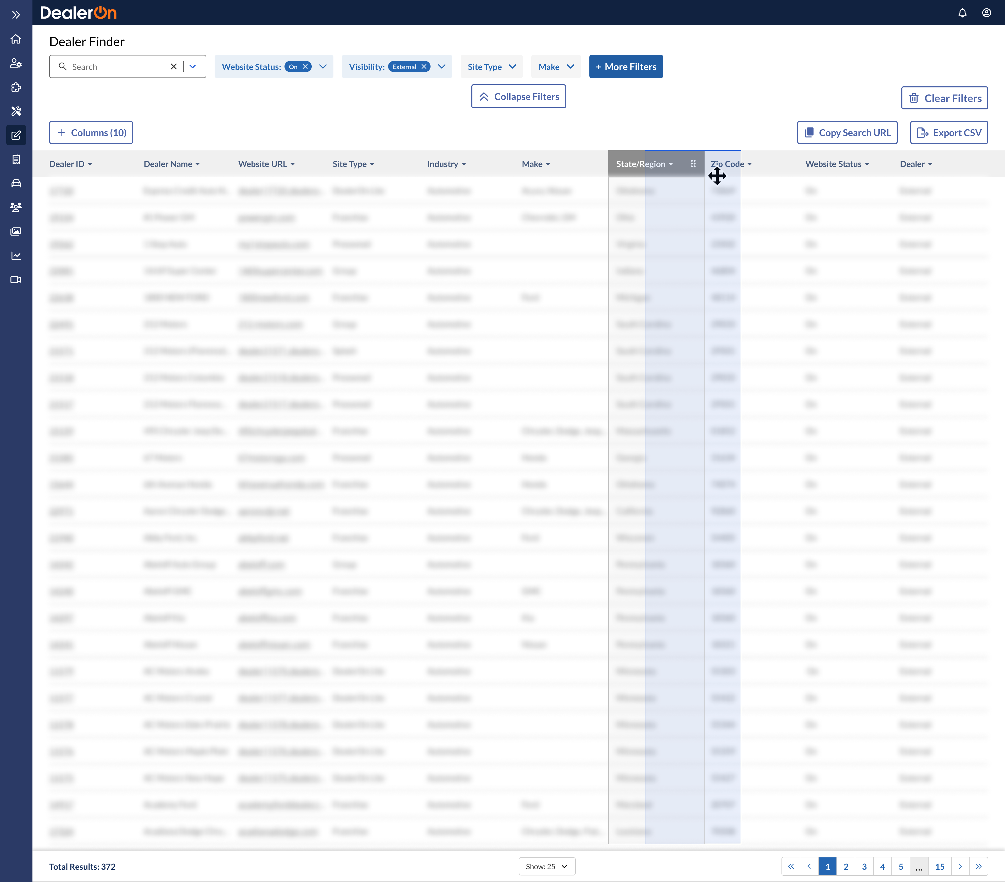
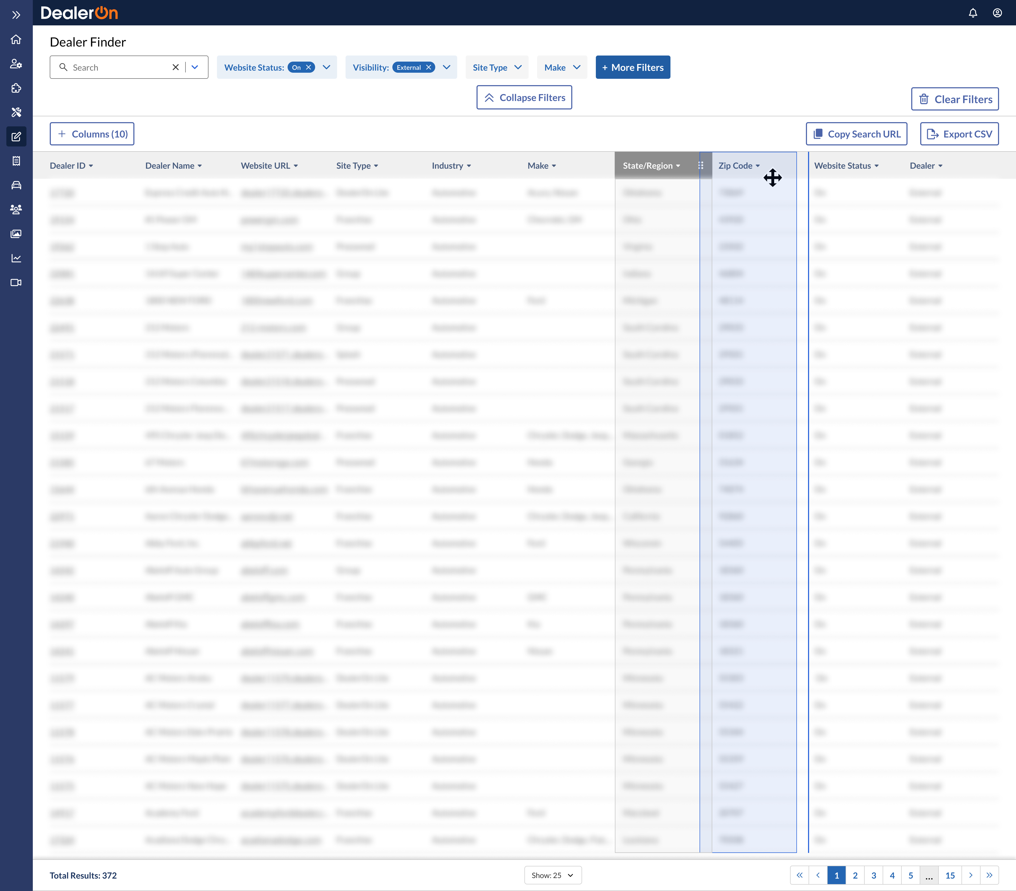
Rearranging columns

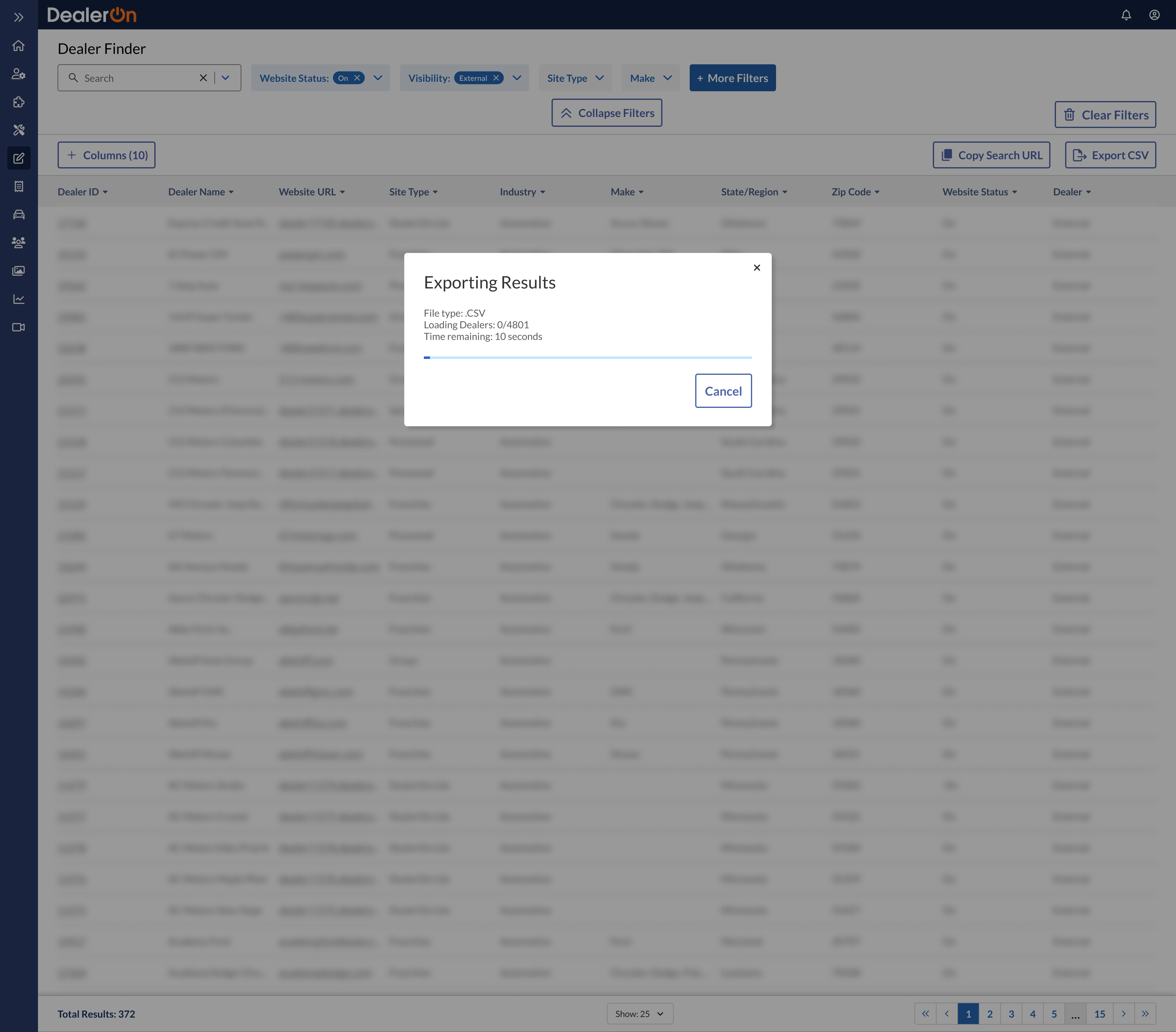
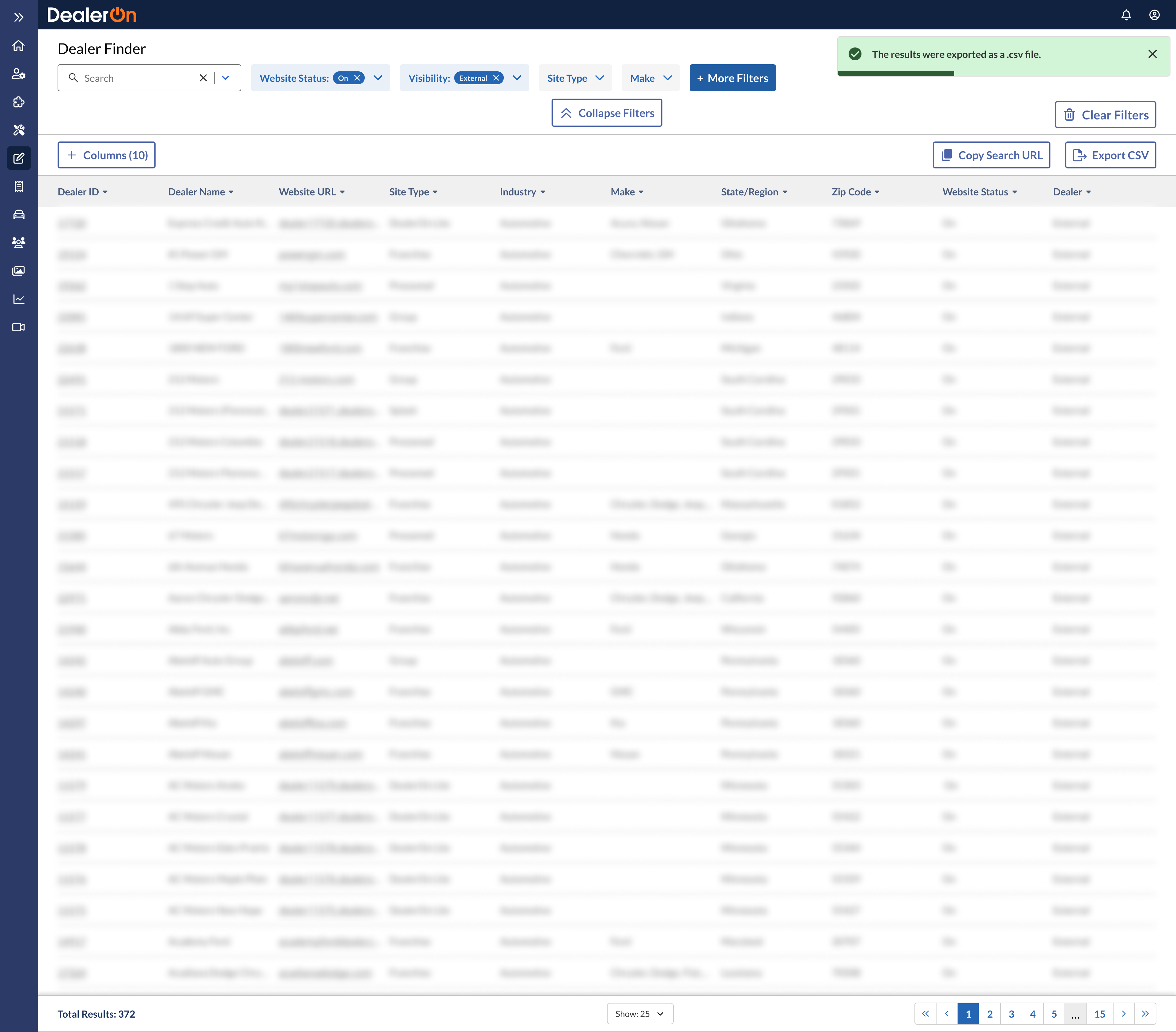
Exporting search results

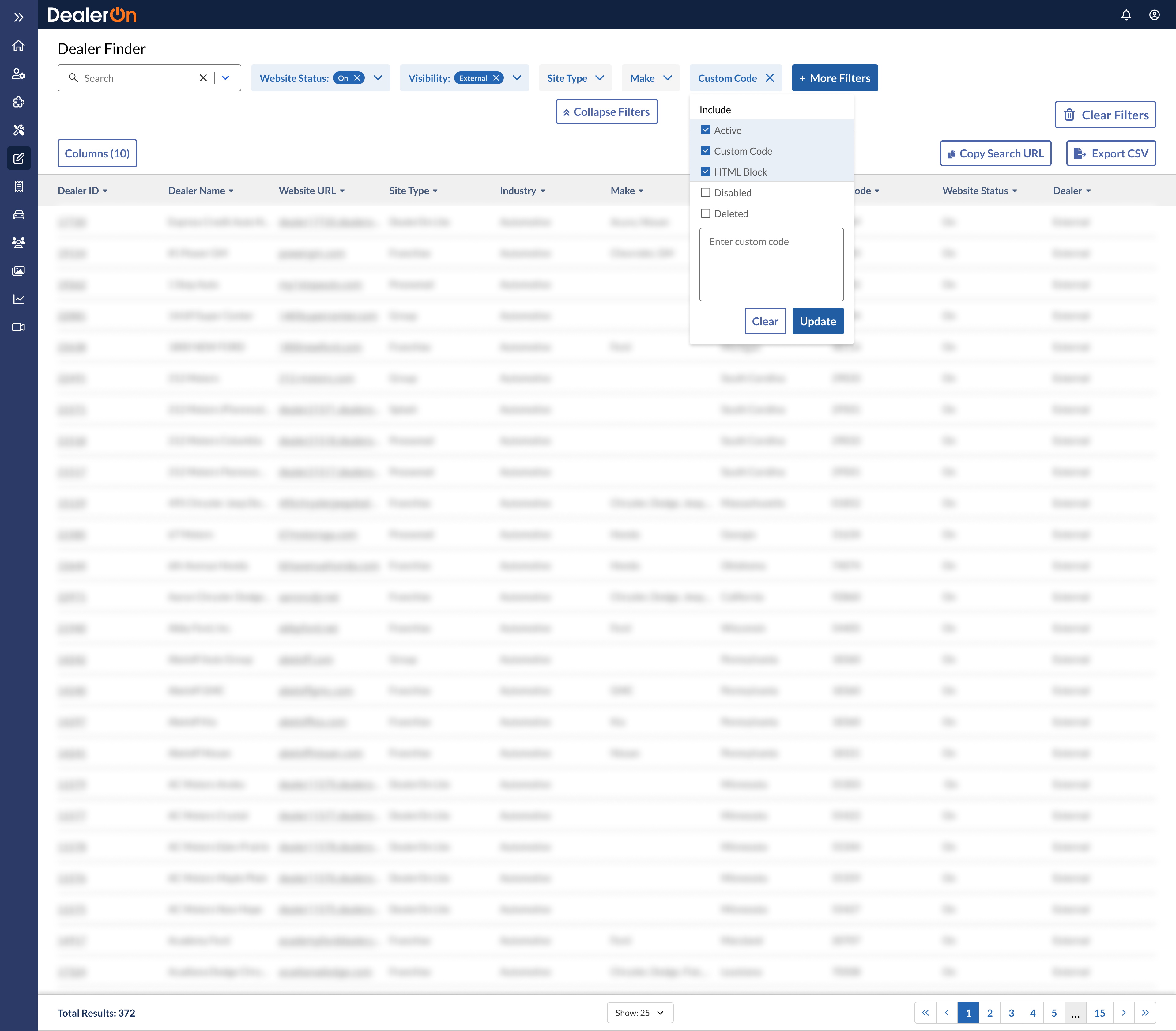
Filtering by custom code


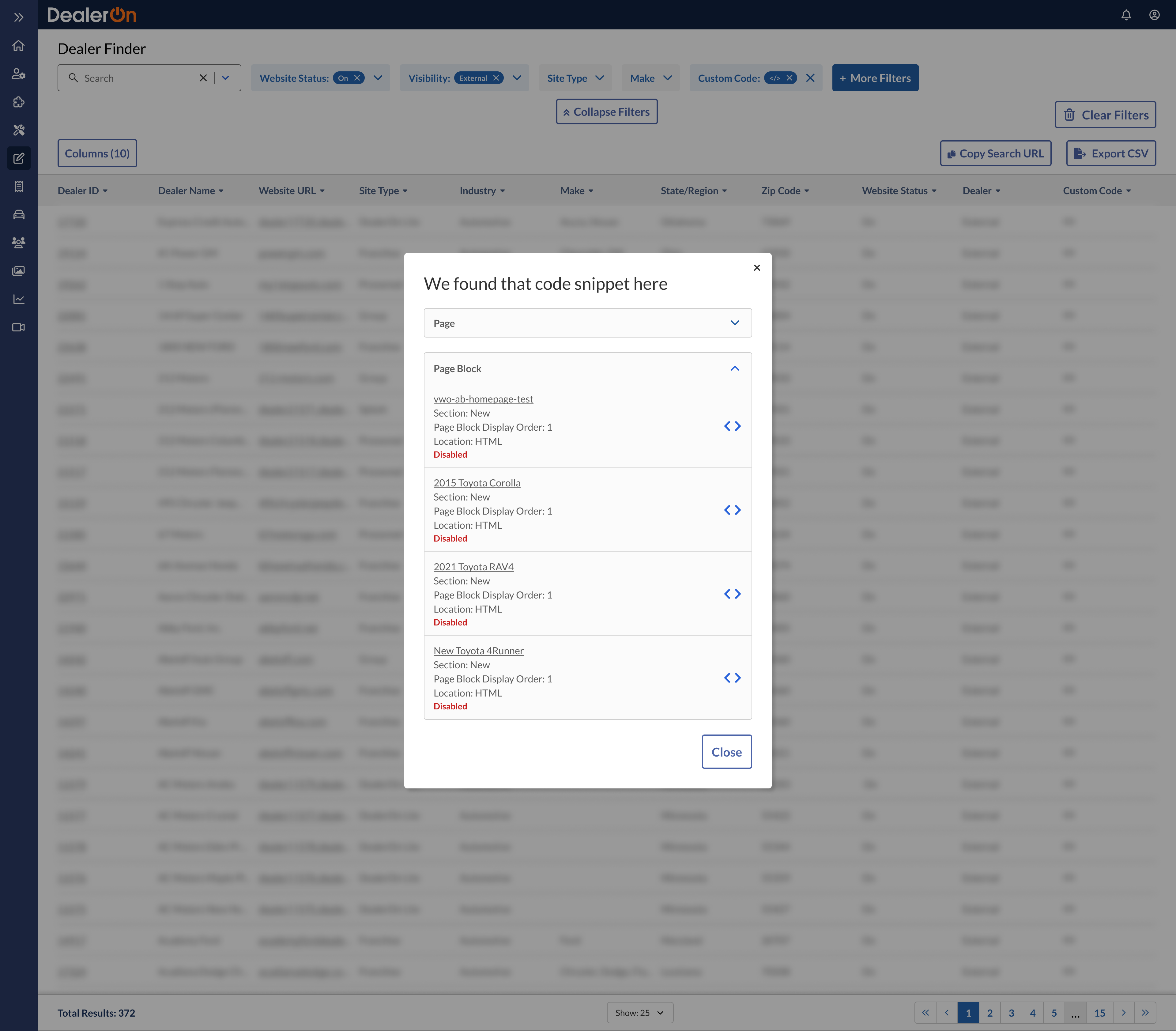
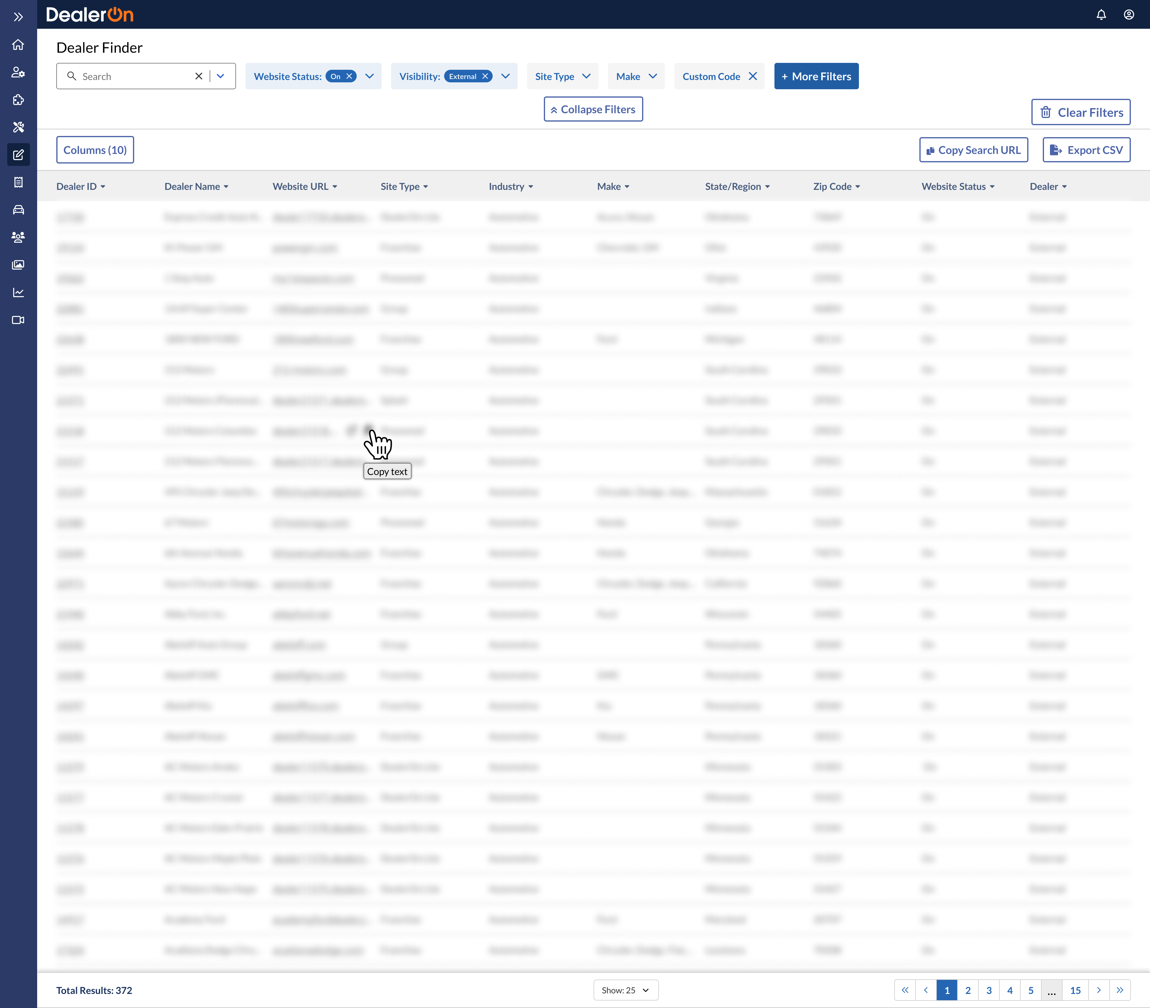
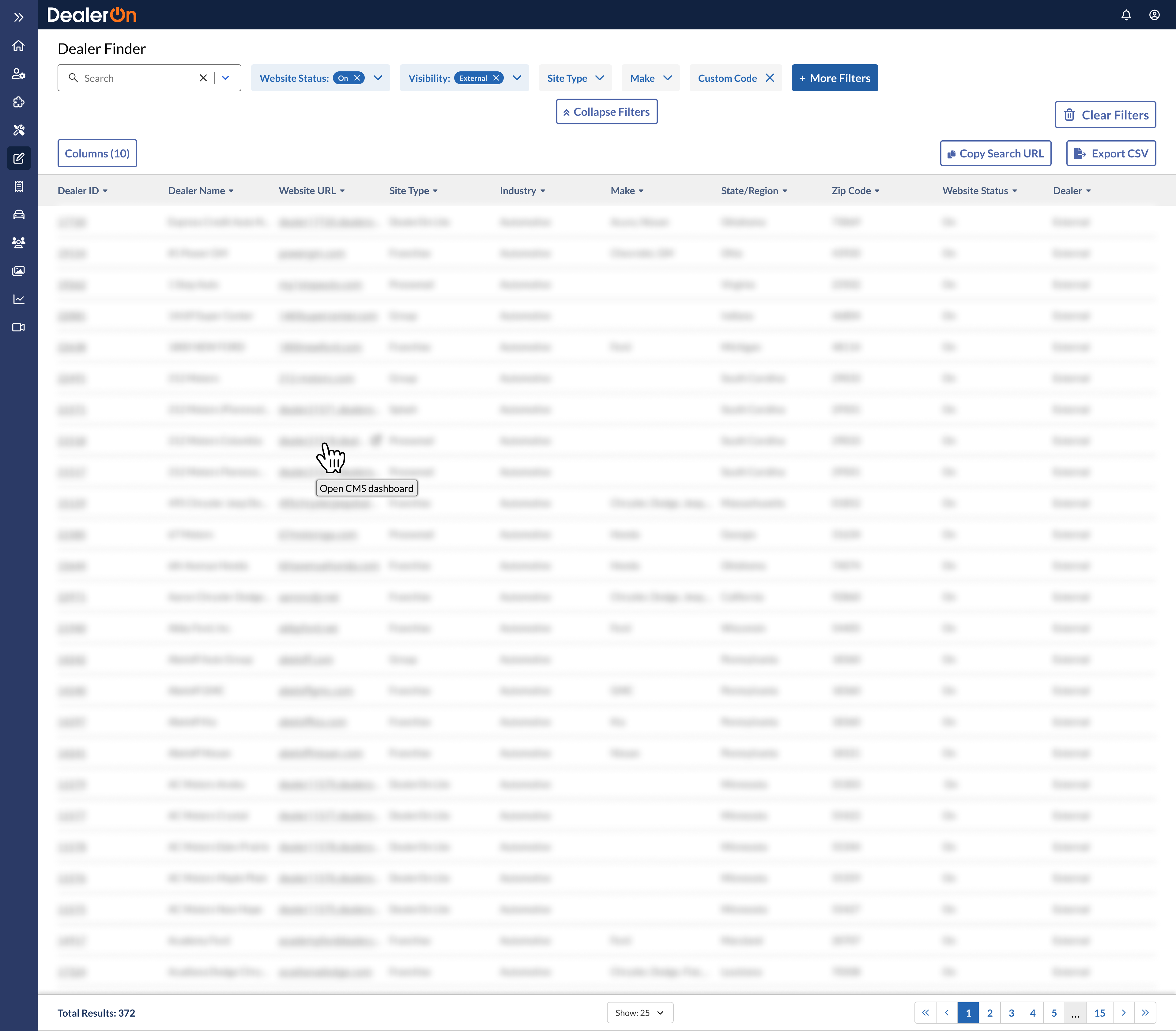
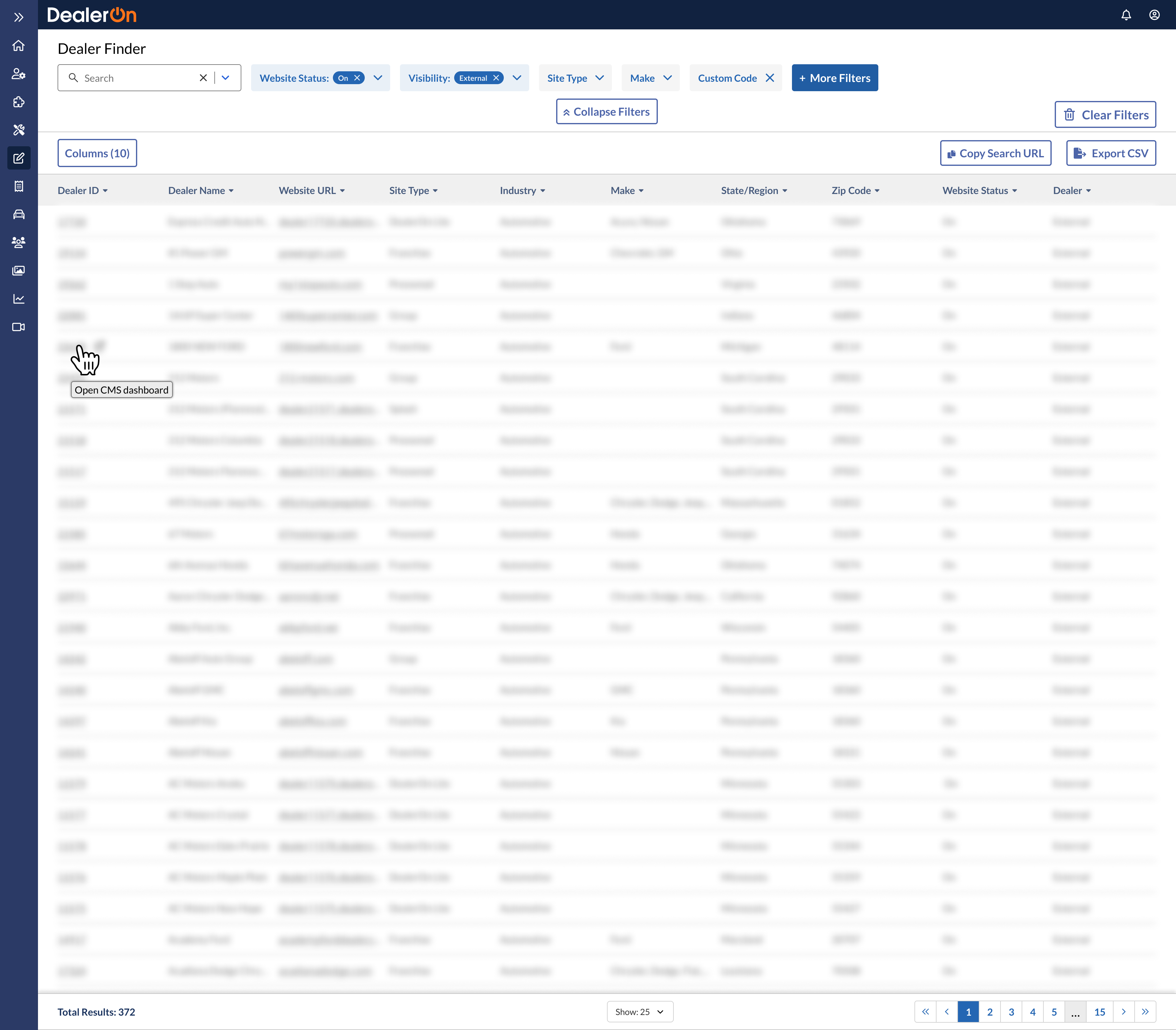
Copying text and opening links
Impact
Improved a high-visibility (30k visitors since 2022) internal tool to speed up time-to-solution for 11+ teams.
Achieved a company OKR (add new navigation system to all pages across the CMS).
Testimonials
“It’s very well organized. I’m very proud of your synthesis. This is great. This is what I call top tier research synthesis. Well done, very well done.” Christina Wong, UX Researcher
Takeaways
Taking a survey on how the current tool is used reveals problem areas and core user groups. You can return to those core user groups with further questions.
When making prototype tasks, choose a straightforward task that won’t frustrate users but will allow you to learn what you’re trying to learn. In the earlier drafts of my test prototype, the tasks I chose were too complex (ie: having testers find dealers in the Ford OEM required them to select “OEM” from “More Filters” and then choose “Ford,” instead of the most obvious process of choosing “Ford” from “Make.” Christina Cuatto asked, “what are we trying to learn from this?” which brought me back to our initial goal, which was to test how users felt about the layout change from sidebar to topbar, not if they knew they had to choose “OEM” from “More Filters” first.
Double check if components are accessible. My team has also recently had to increase the height of our interactive components (ie: buttons) from 36px to 44px in accordance with WCAG’s minimum target size guide.
Product roadmaps are a PM’s best friend.
As always, get feedback and iterate and get feedback and iterate.
