Role: UX Designer
Process: February (menu styling, focus group research, reset cache) to March (card sorting) 2025
Team: in collaboration with UX designer Xing He. Initial redesign by the wonderful Olivia Rosario
Goal: revisit aspects of DealerOn’s CMS menu (the “Shell Nav”) to improve the experience for both new and old users
Impact: Uncovered gaps in the highest visible product before its release to 8,000+ customers. Improved the most important button in the product.
Takeaways: Talking to engineering to understand limitations allows you to craft a user experience that works around those limitations. Also, sometimes ignoring a problem just causes issues later down the line. There are always tradeoffs.
DealerOn is a legacy company with a legacy CMS. Its navigation menu got a revamp in 2023 (called “Shell Nav”) that has been released to internal users (ie: DealerOn employees).

Xing He
Before the Shell Nav’s public release, it’s being re-evaluated to see if it meets user needs.
Shell Nav Revisit
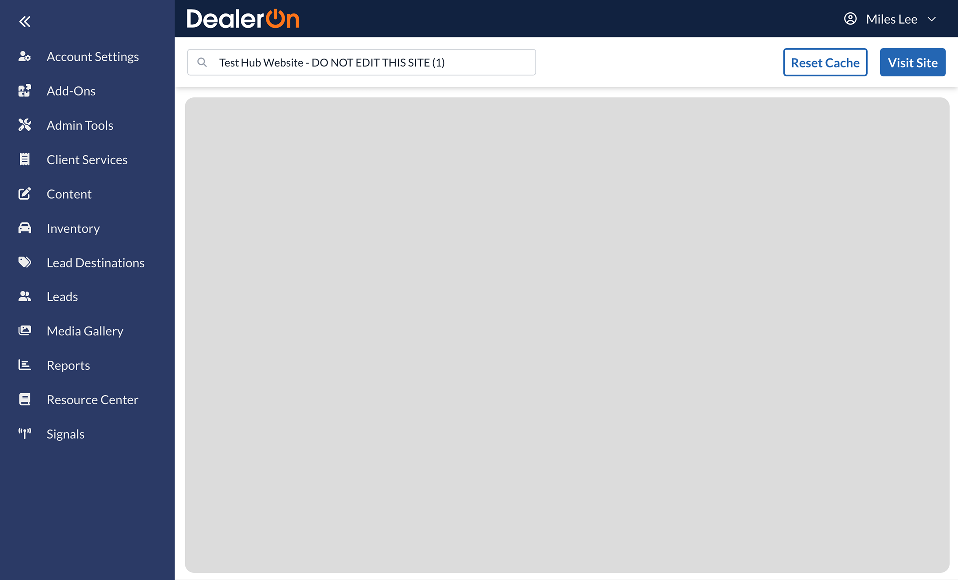
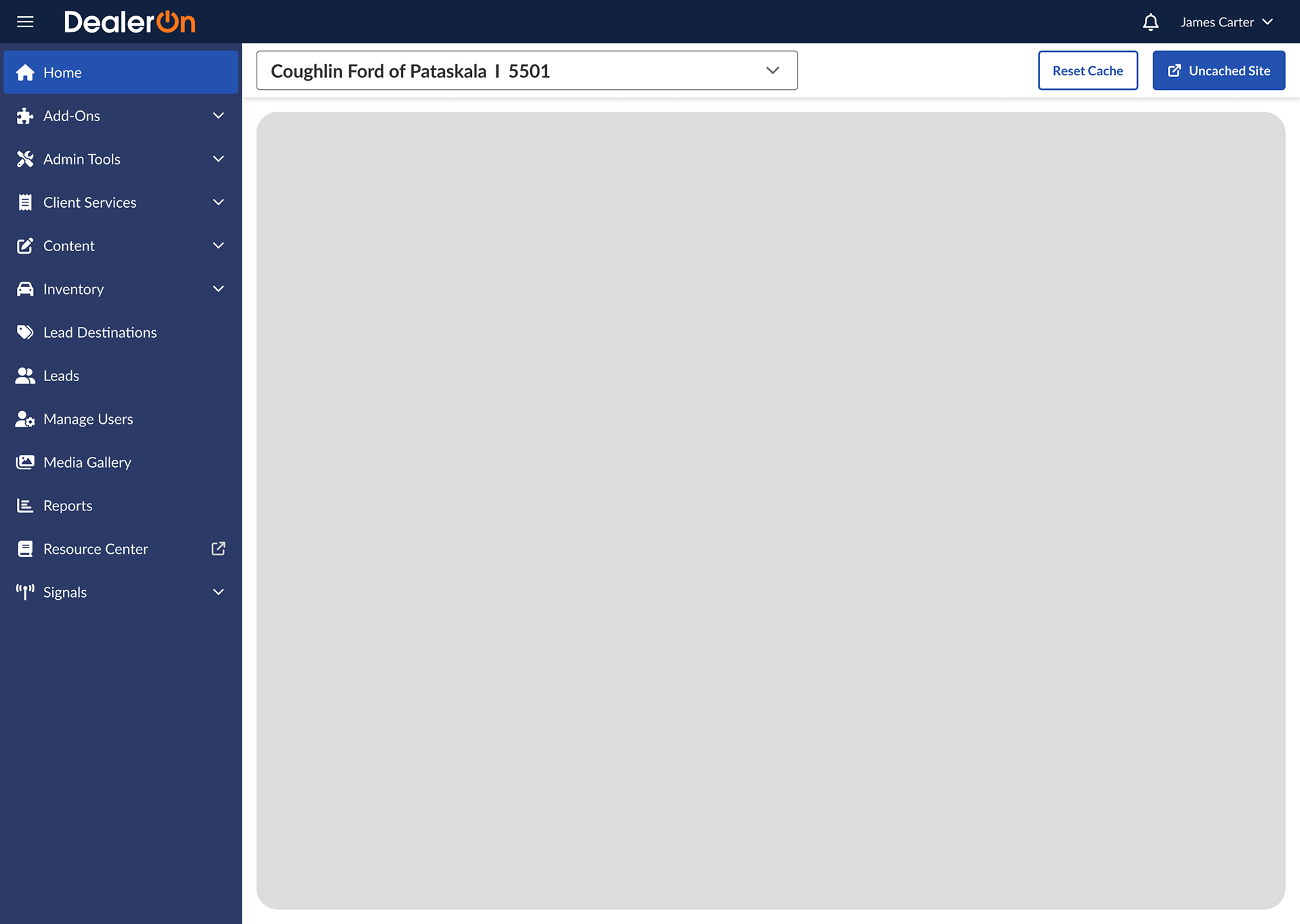
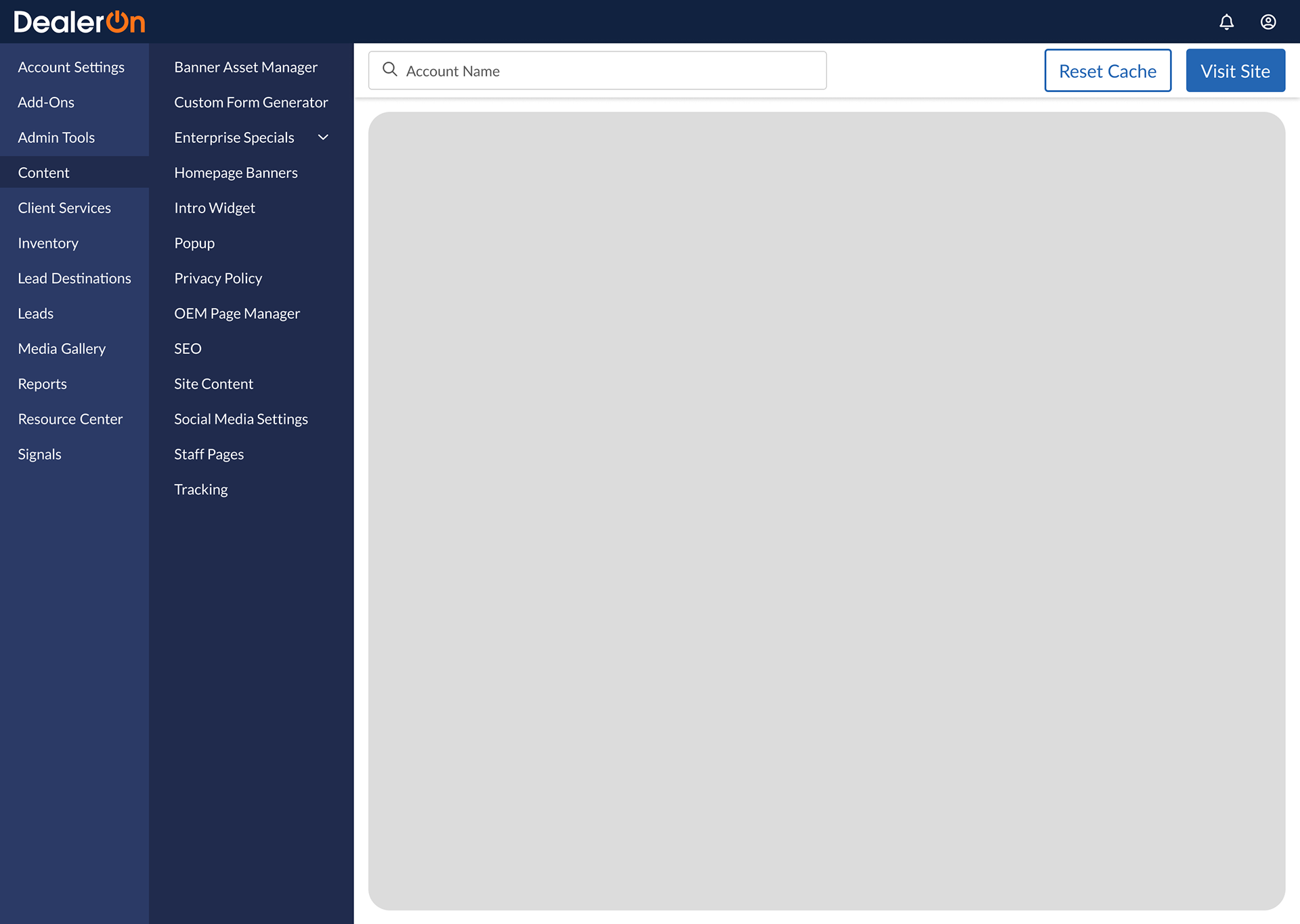
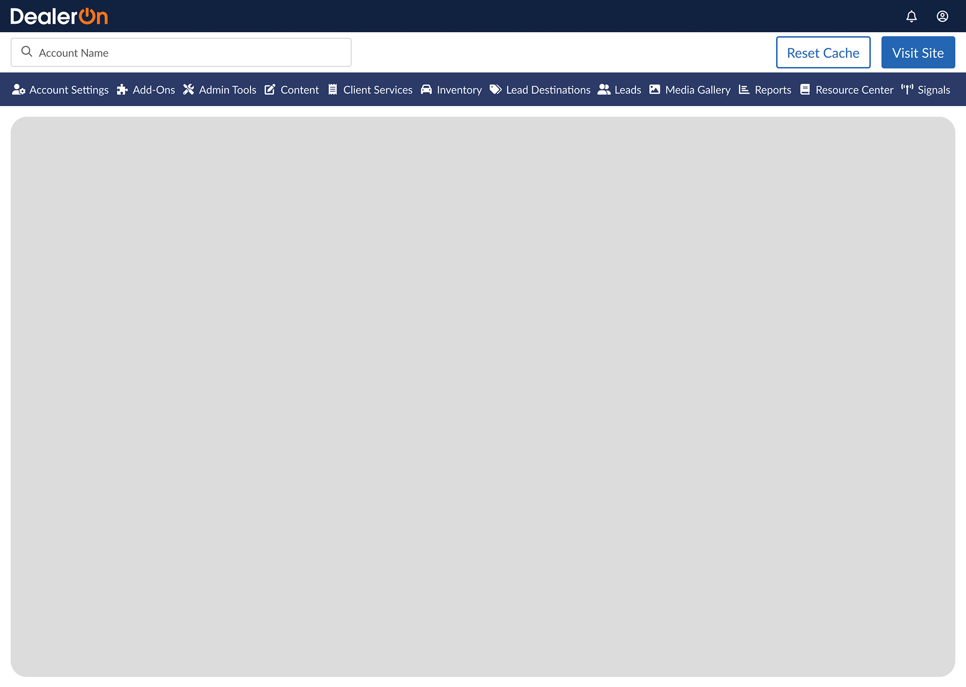
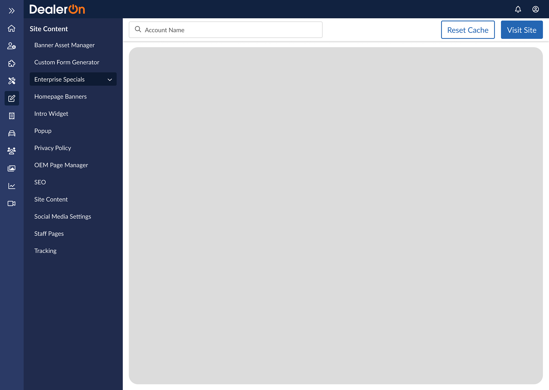
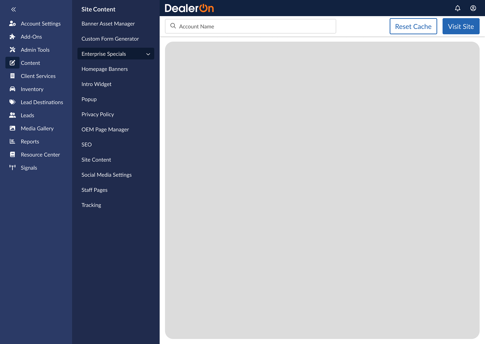
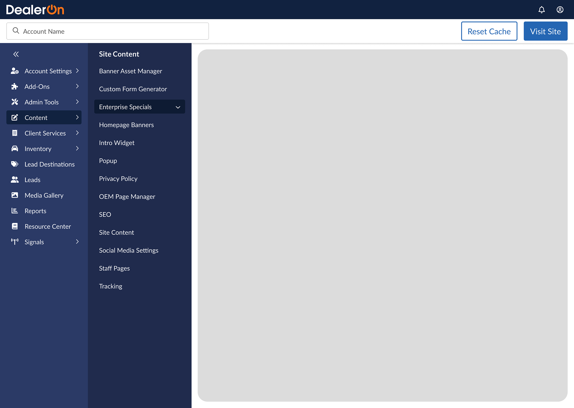
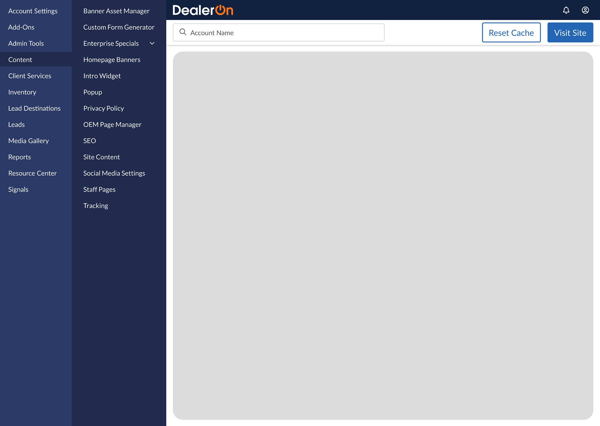
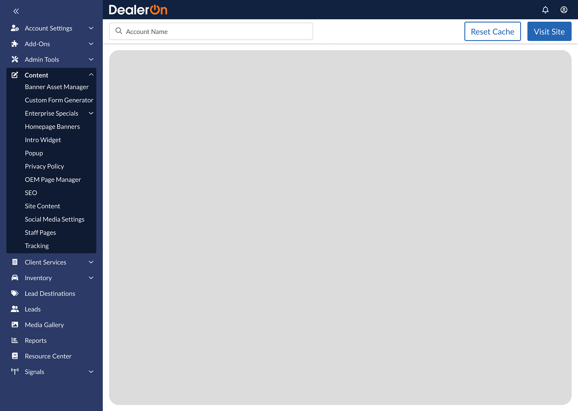
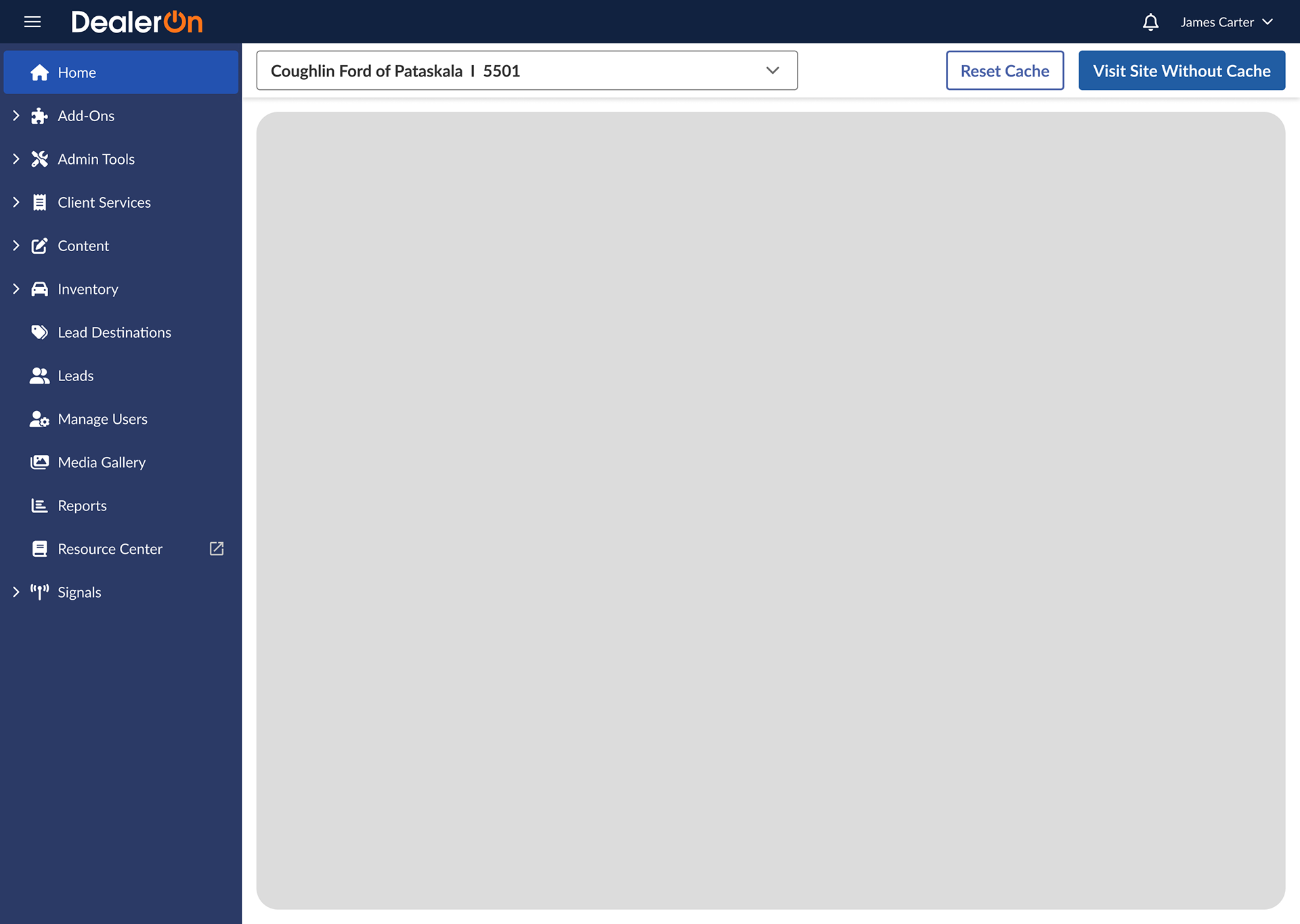
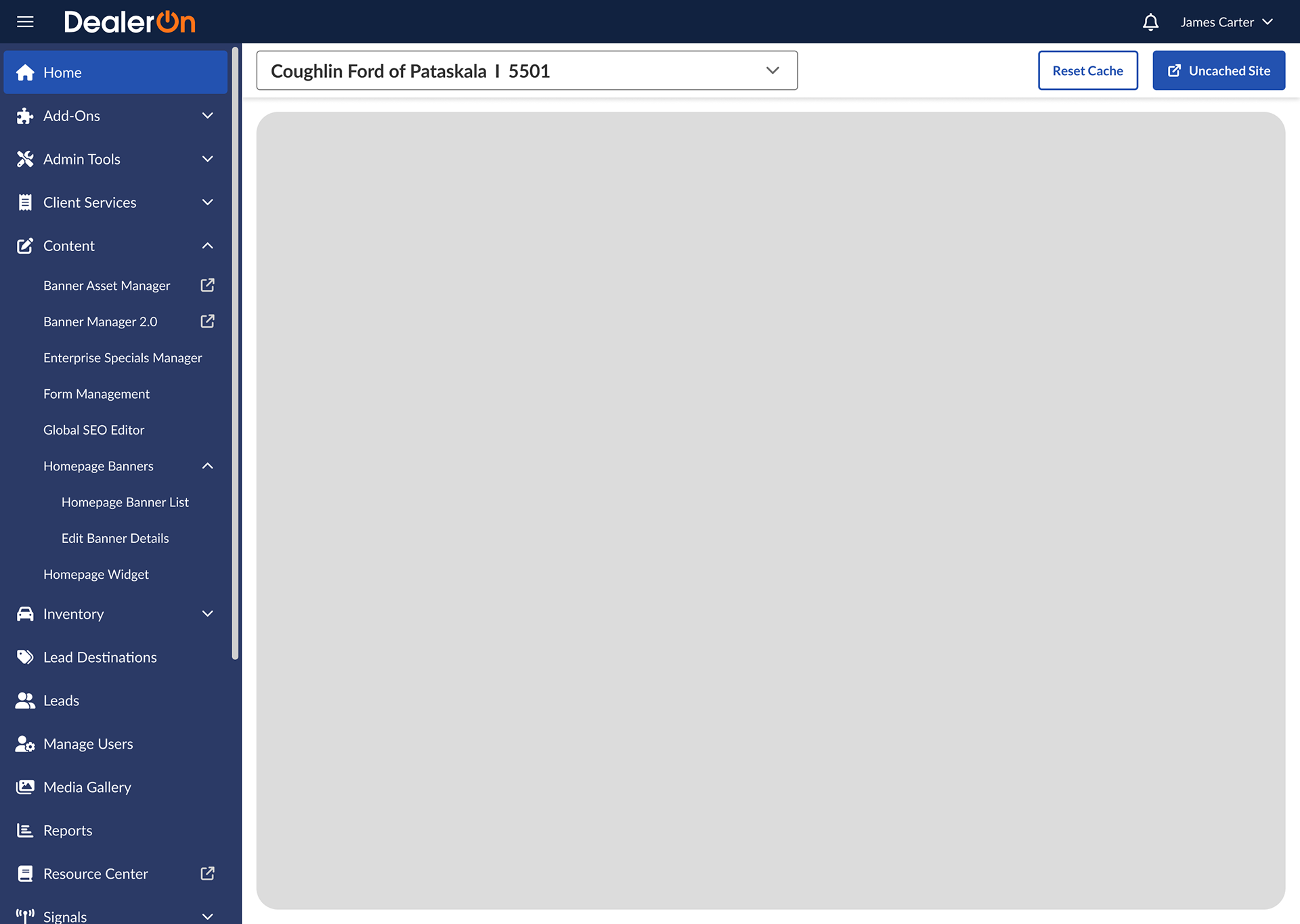
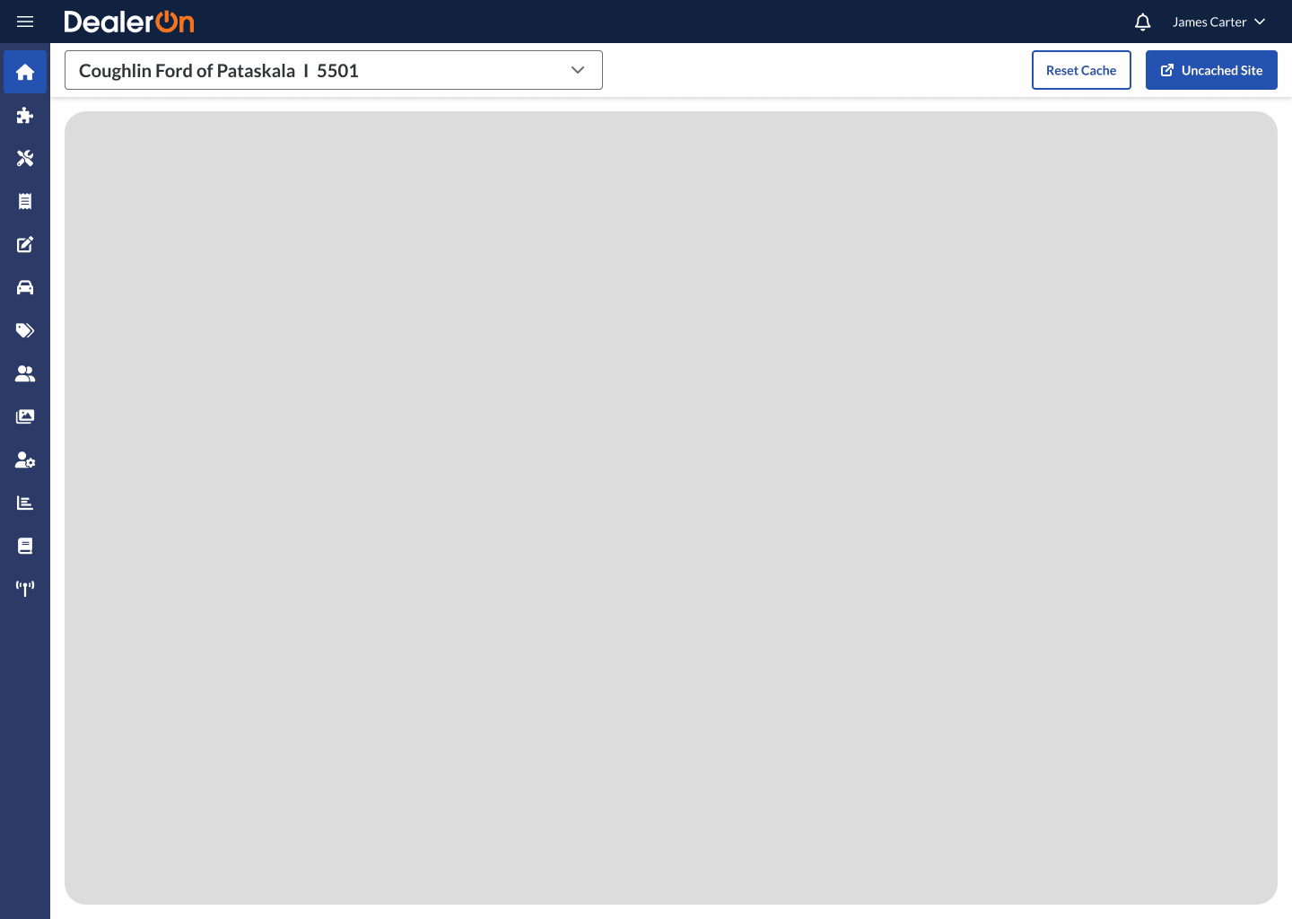
The Shell Nav includes multiple pieces.
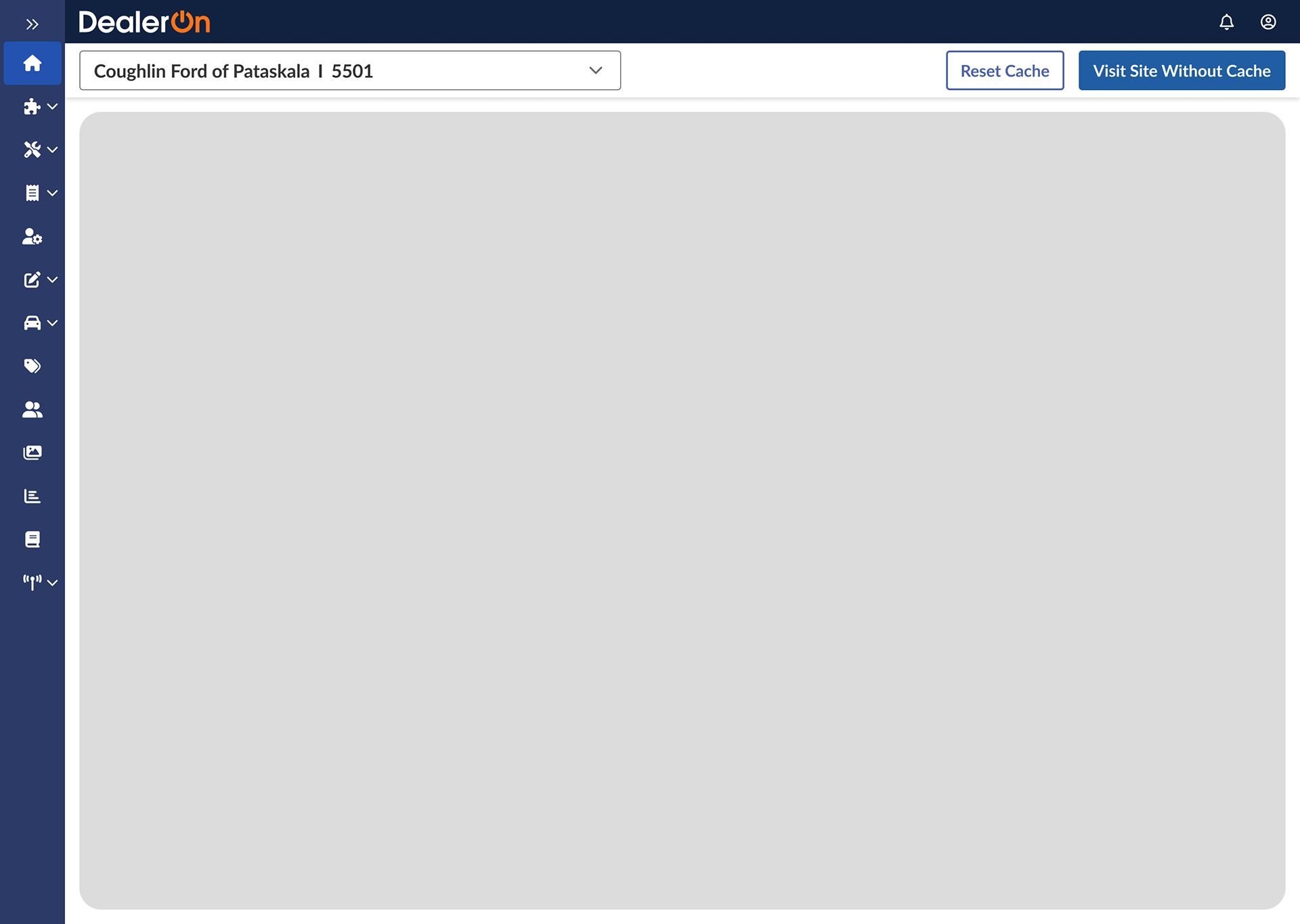
The sidebar: contains site navigation. Has a collapsed and expanded view and two levels of items
The header: contains the DealerOn logo and login infoThe subheader: contains the dealer selector (choose which dealer’s site to work on), “reset cache” button, and “visit site” button
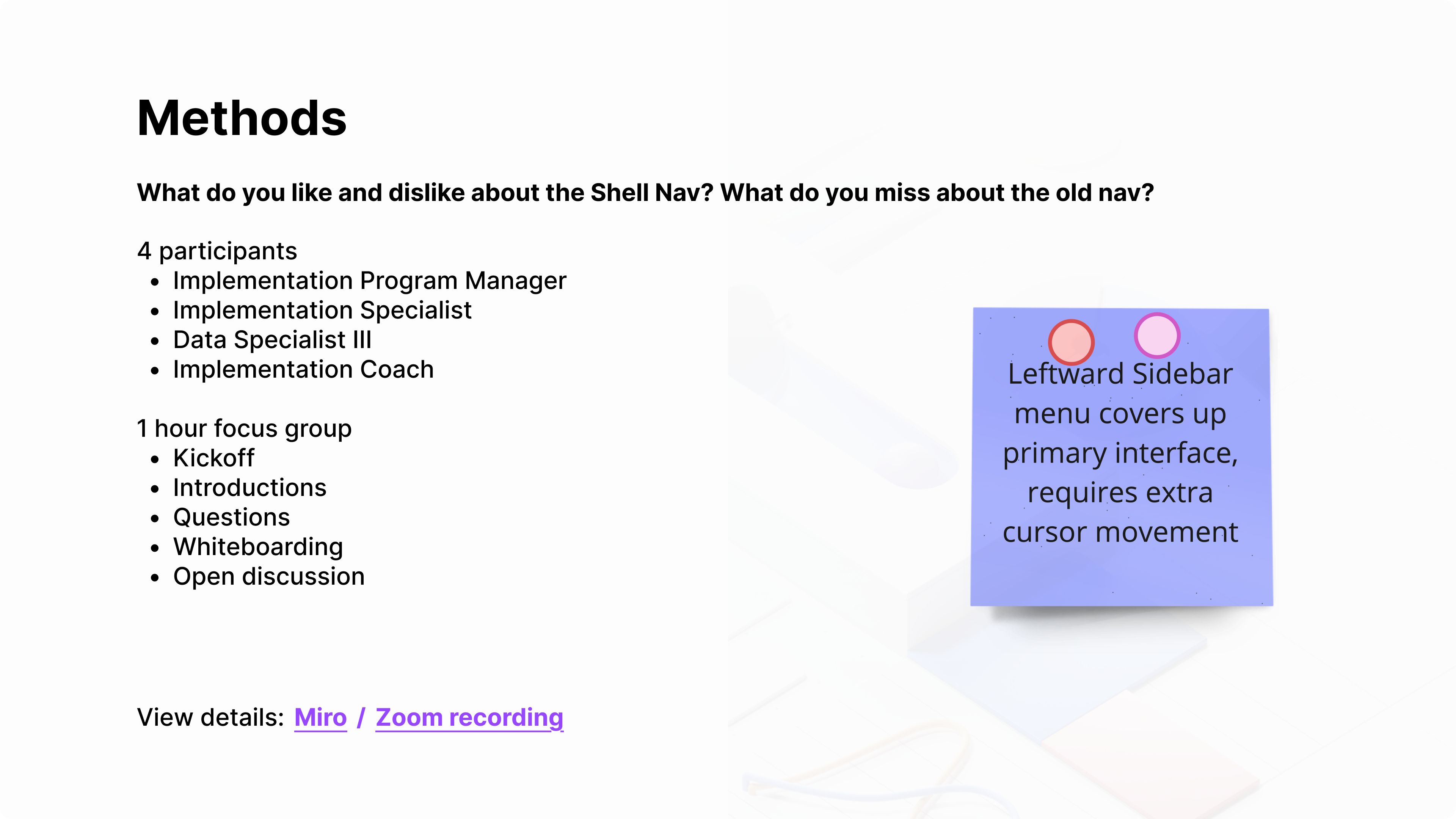
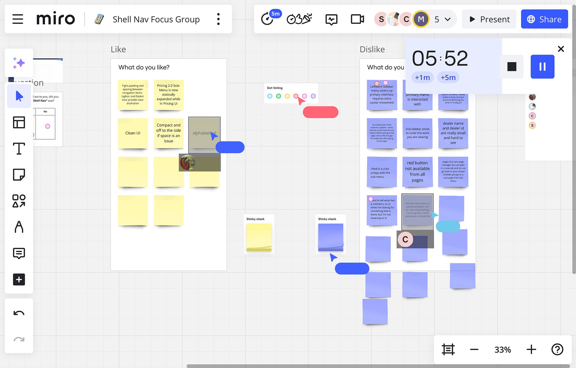
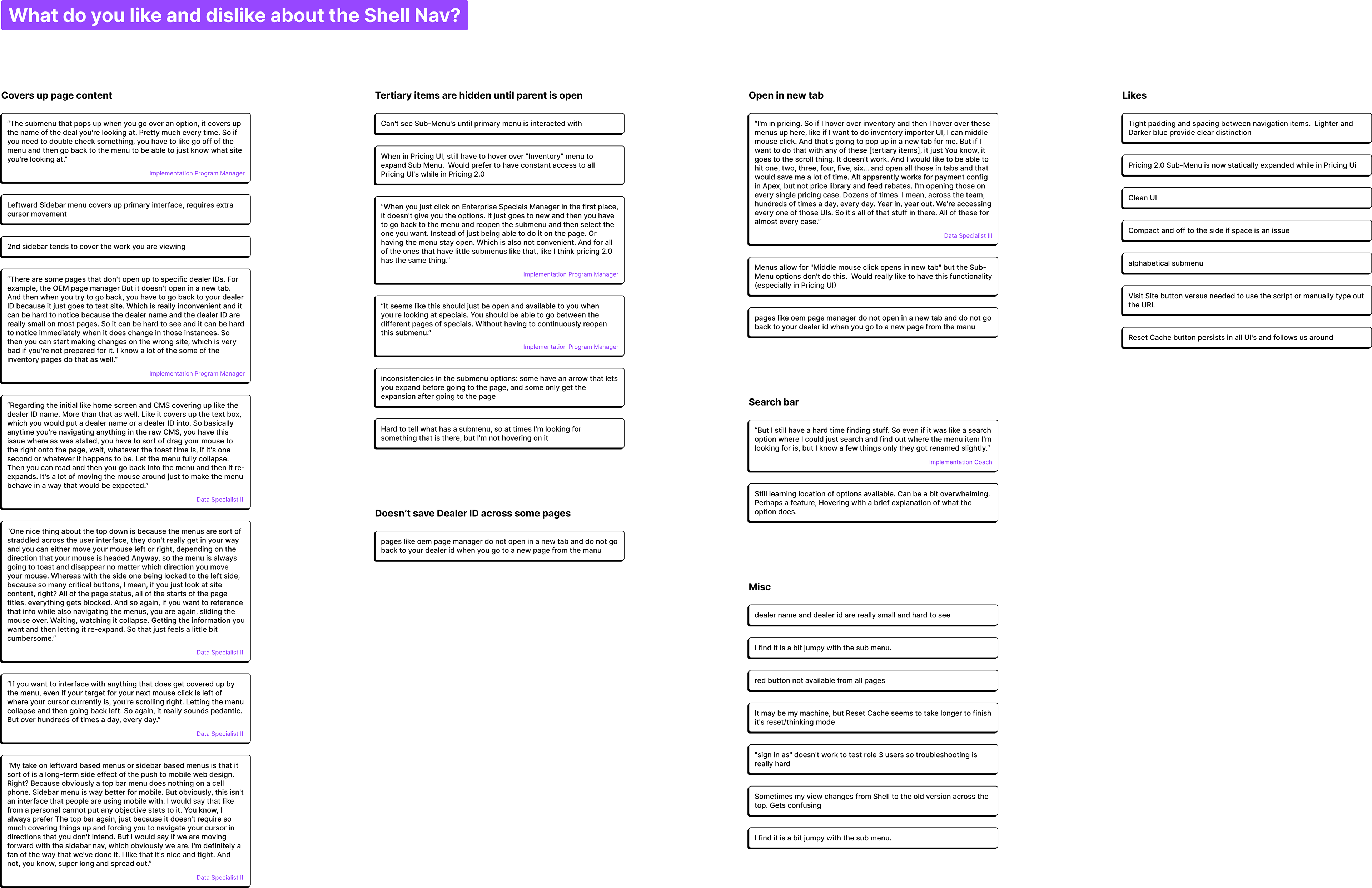
I led a focus group to find out what users thought about the Shell Nav. I had 4 participants (2 couldn’t make it) from 2 teams that use the CMS heavily in their day to day work. I recruited a range of old to new employees to get a variety of knowledge. The most voiced concerns:
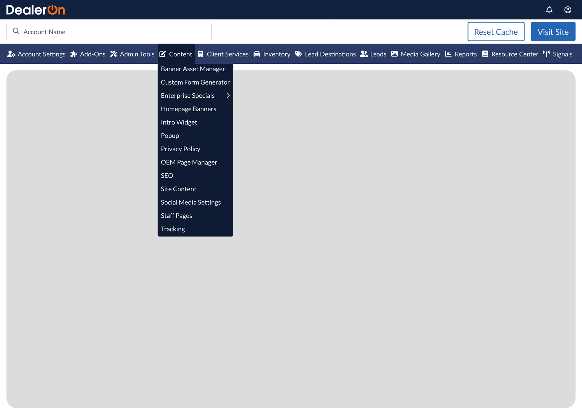
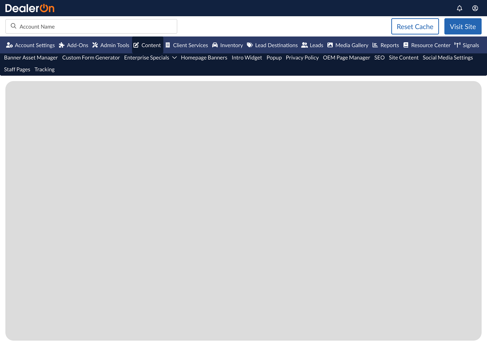
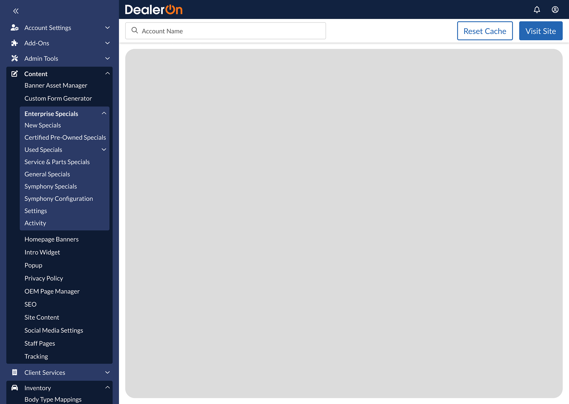
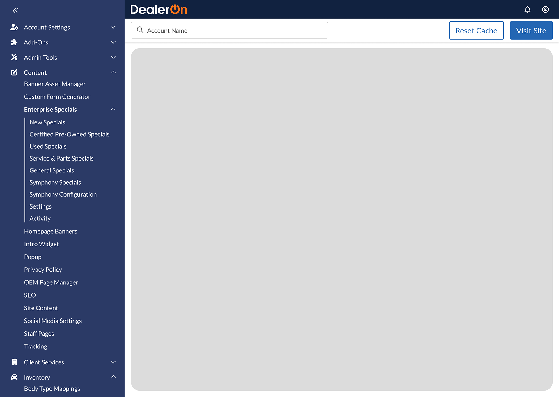
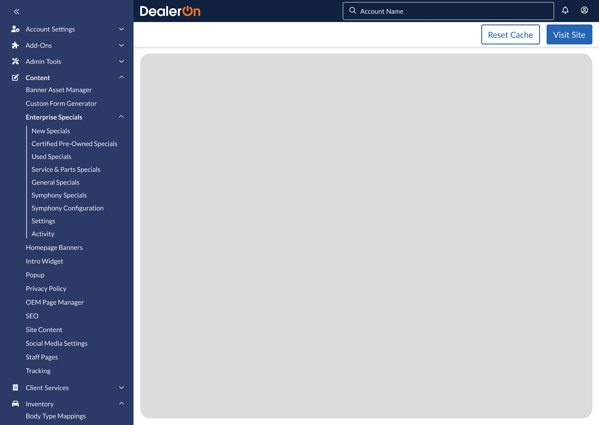
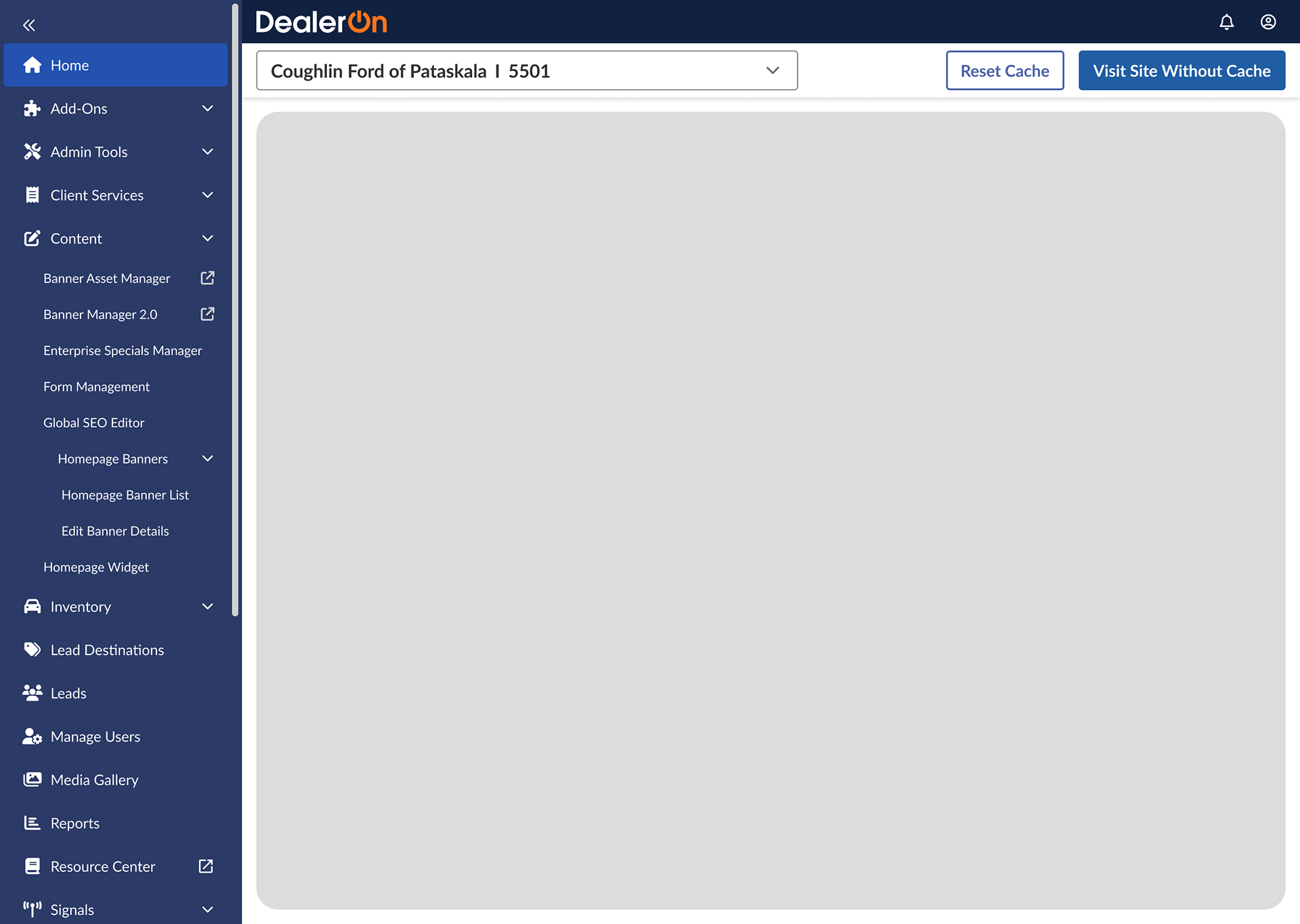
The Shell Nav covers up page content when the second level is expanded (8+ mentions)
Tertiary menu items aren’t visible until the second level is open, like menu items related to Banners aren’t visible until the Banners page is open (6+ mentions)
Some items can’t open in a new tab (3+ mentions)
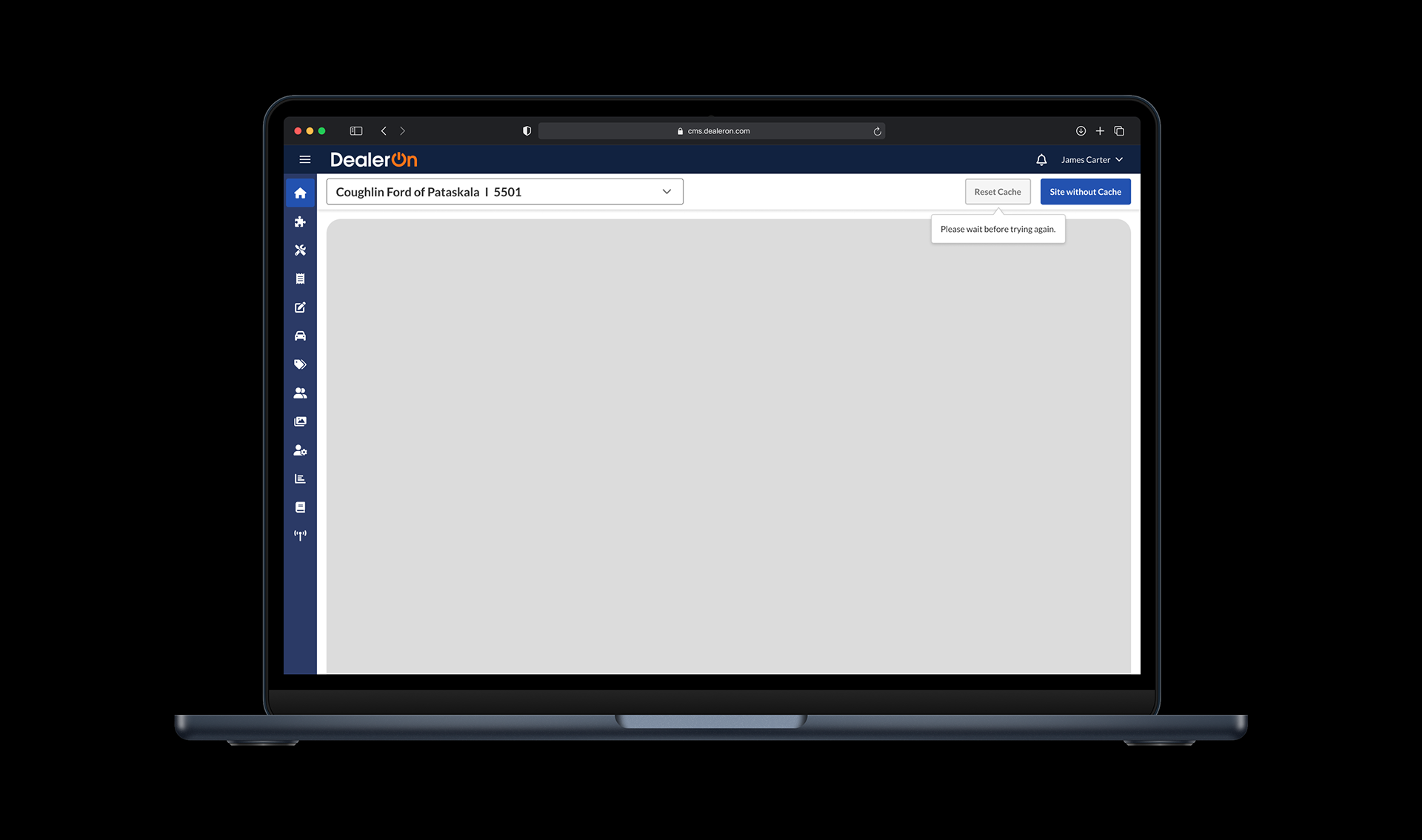
The reset cache button takes a long time to load (1+ mention)
The dealer’s ID (in dealer selector) isn’t maintained across pages (1+ mention)
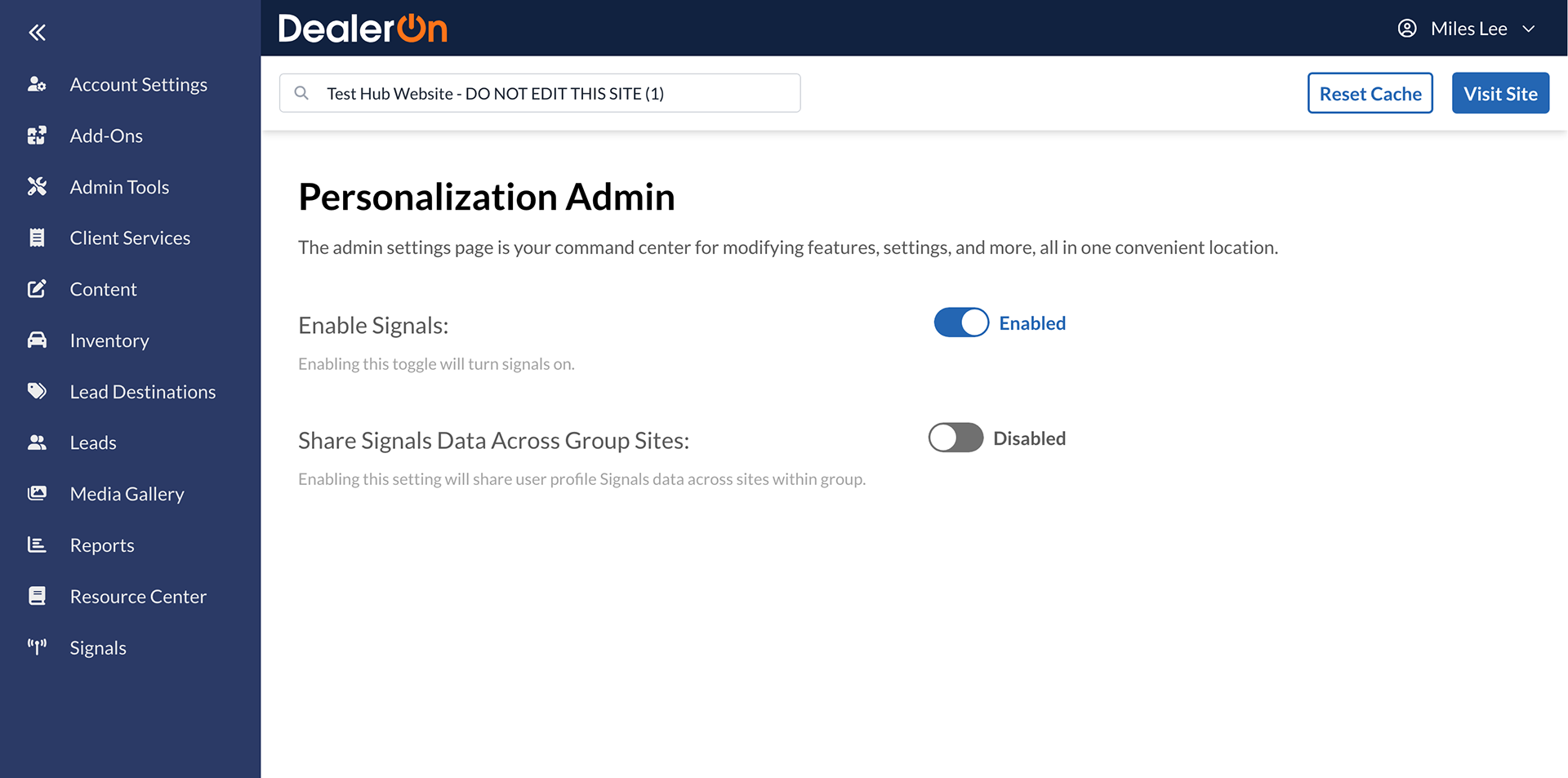
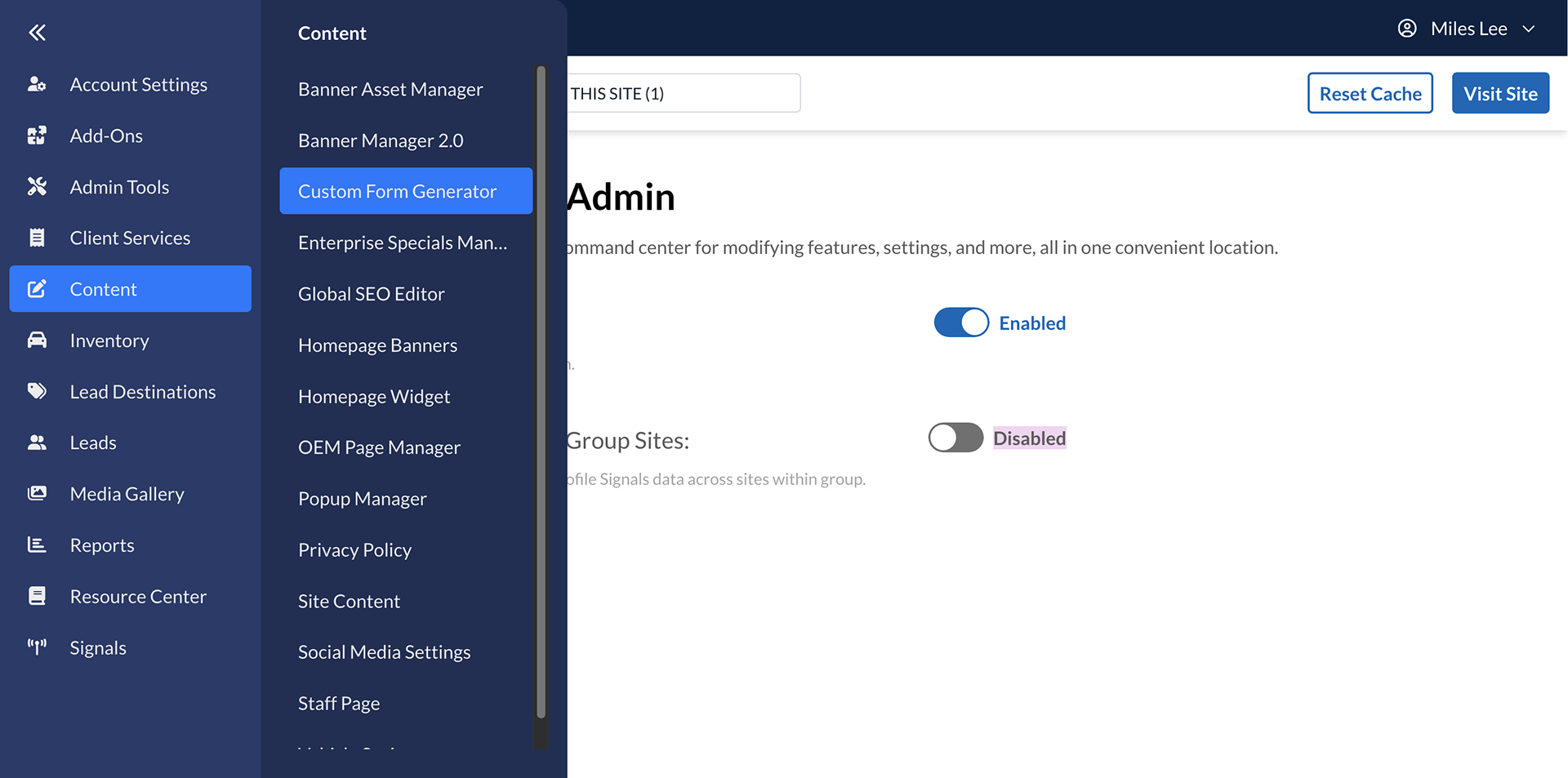
Here’s an example of the expanded second level covering up page content and dealer selector:
I created a prioritization matrix with possible improvements addressing these concerns and reviewed these with our software architect Rob Wright. Several of these are technical issues that aren’t solvable with the current structure. He told me each page populates the Shell Nav (bottom up), not the other way around (top down), which causes some indexing issues (ie: tertiary menu items not always being visible).
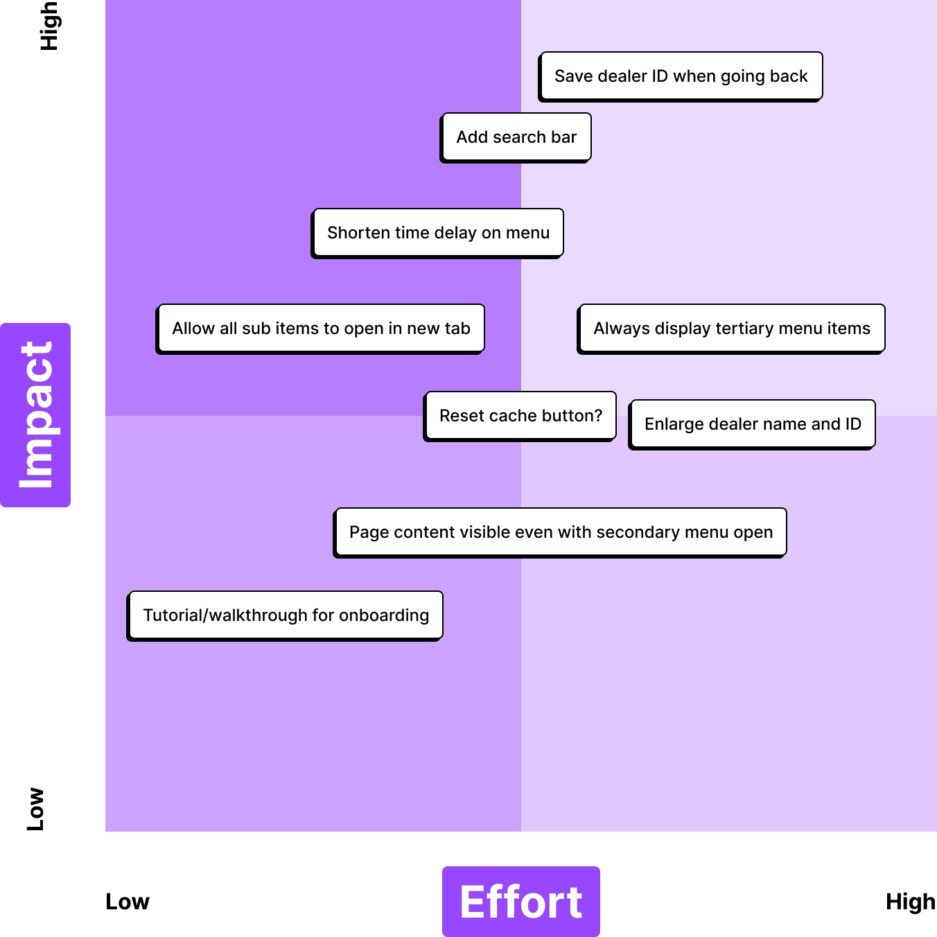
My team and I decided that a search bar (2+ mentions) is a cop-out because it doesn’t address the underlying problem: confusing information architecture. I learned that when the Shell Nav was first being worked on, the UX team wanted to improve information architecture and did card sorting tests and proposed new solutions, but Product decided it wasn’t a priority. All menu items are listed alphabetically. This will come up later… shocker!
I decided to focus on 3 aspects of the Shell Nav: the behavior of the navigation menu, the “reset cache” button, and the overall information architecture.
Reset Cache button
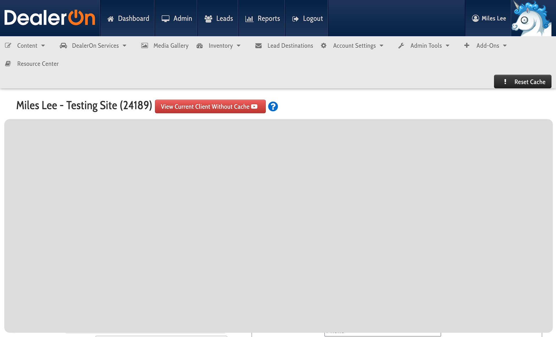
The “reset cache” button is one of the most important buttons in DealerOn’s CMS. It clears the user’s cache, allows users to see changes they made on their website.
In the original navigation system, the “reset cache” button is simple. You press it. A spinner saying “Resetting cache…” appears on the screen for a second or two. You go about your business.
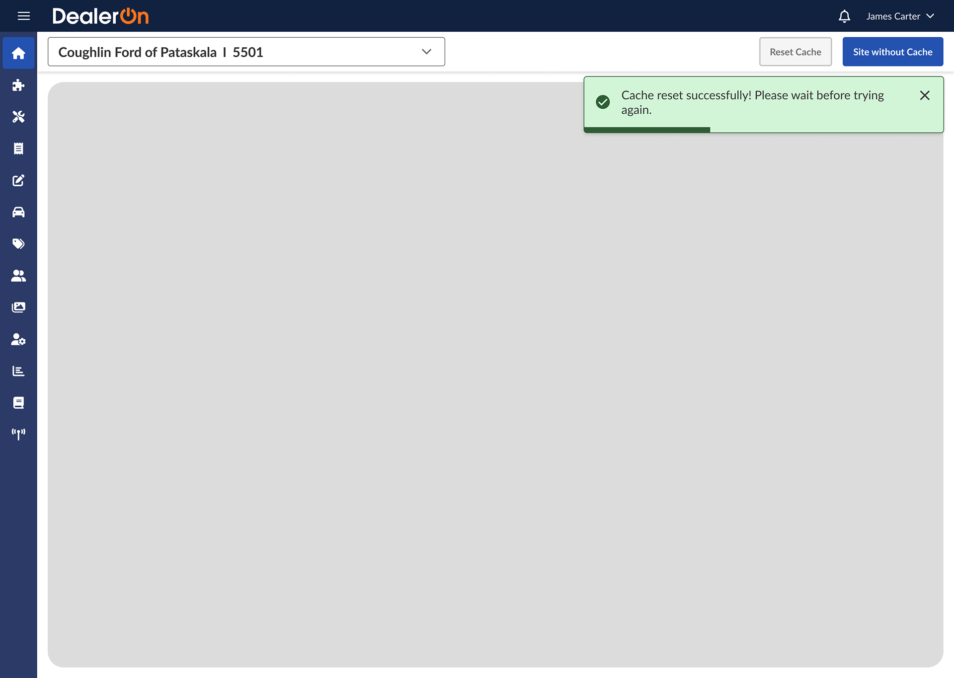
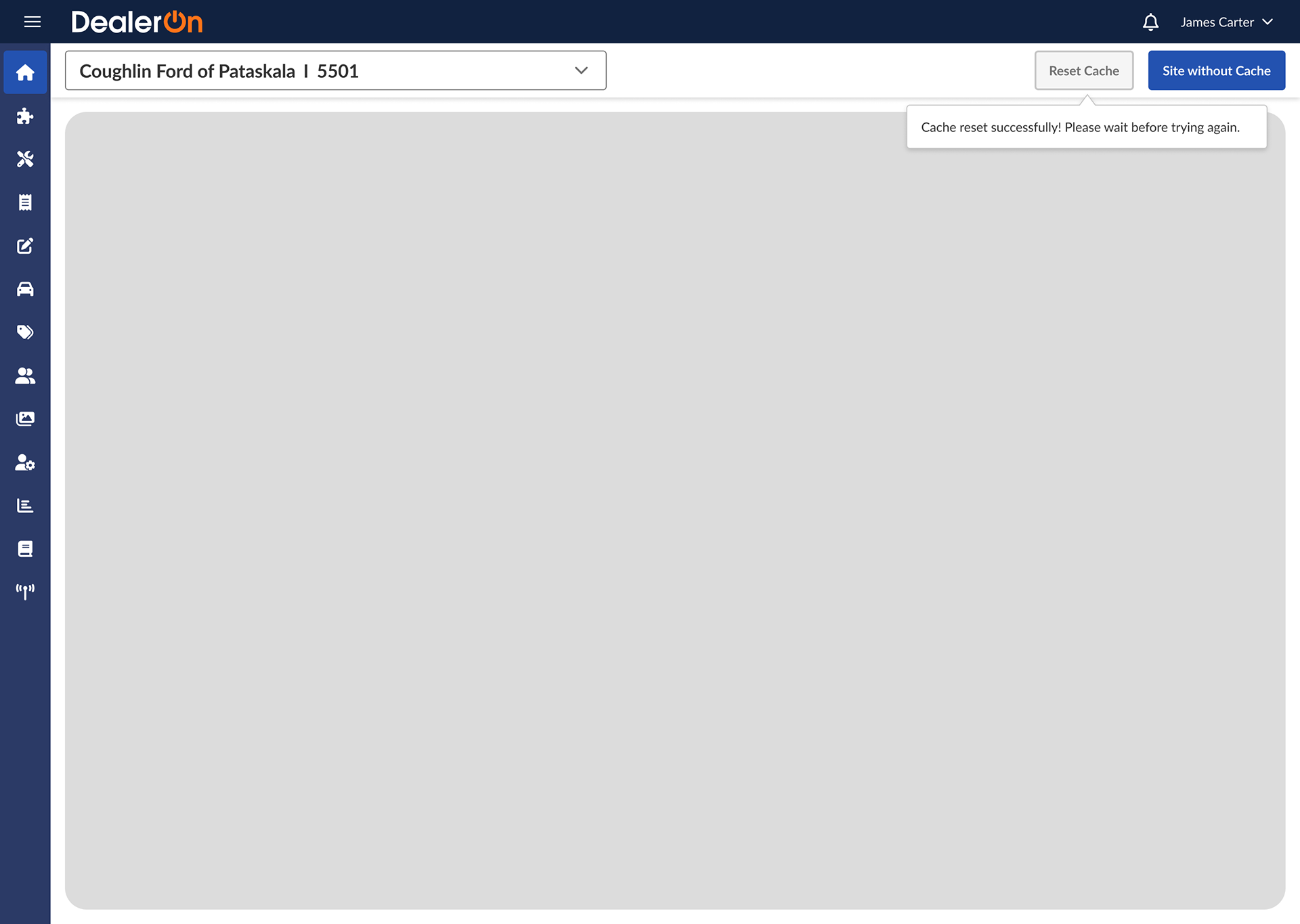
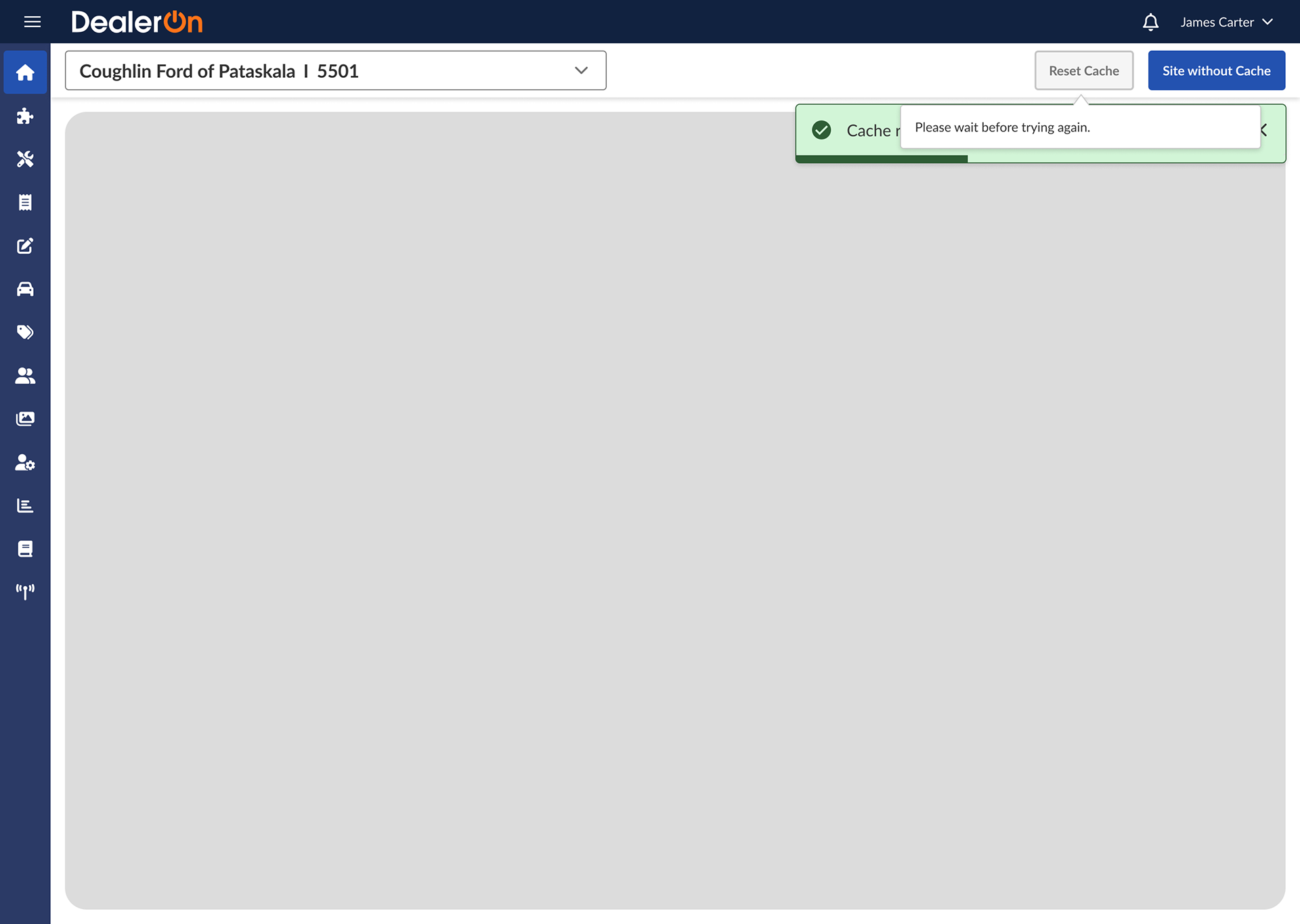
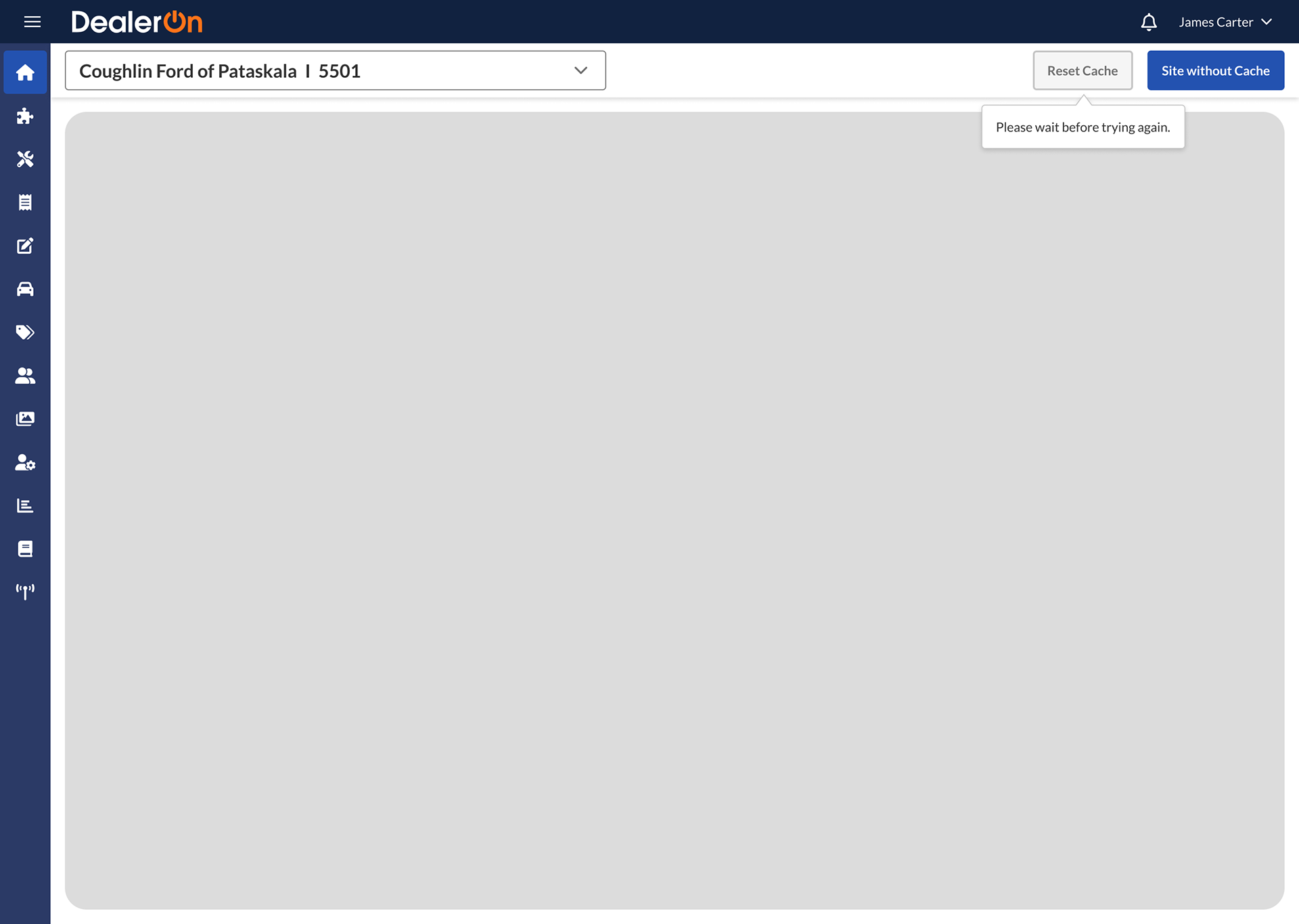
In the current Shell Nav, you press the “reset cache” button and a spinner appears on the button, which is grayed out, for… 10 seconds. That’s a lot!
Focus group participants were not used to this lengthened delay, so I asked software architect Rob Wright about it. He said the delay was implemented to stop users from spamming the button. 10 seconds is an arbitrary number because the system doesn’t actually “know” if/when the cache is reset. He told me, “the actual reset can be immediate, or maybe take a few seconds, but there is no way to know when it’s actually complete.”
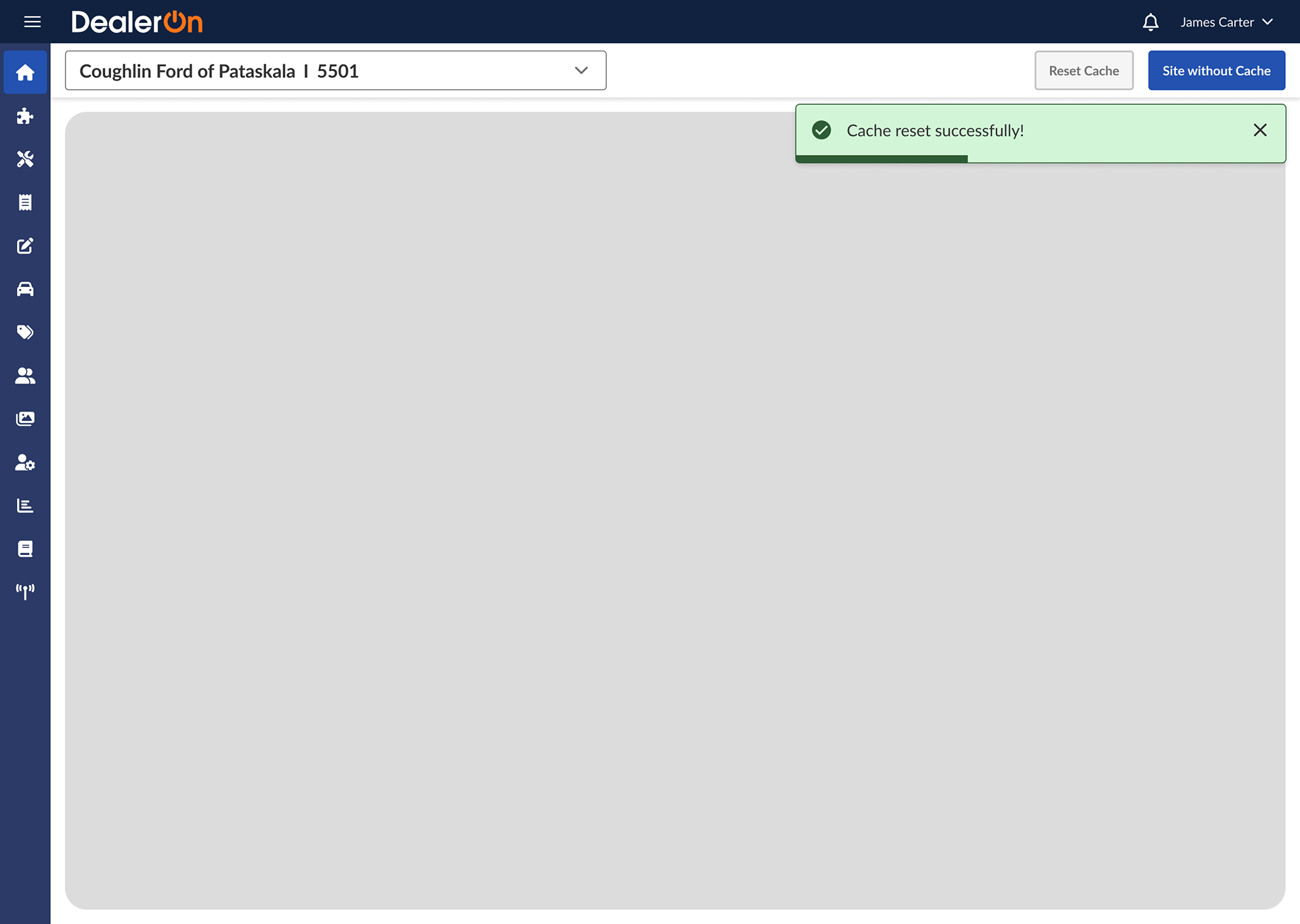
I wanted to find a solution that didn’t let users spam the button but also notified them about the status of their cache reset.
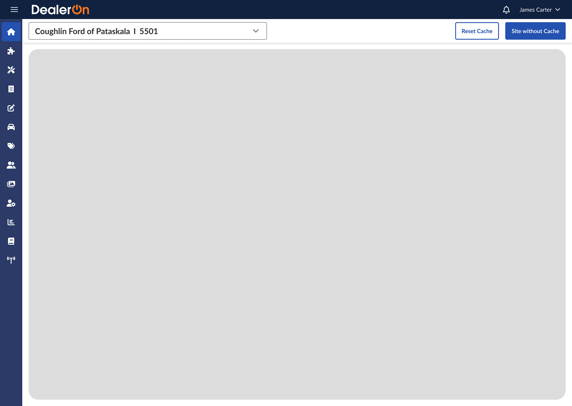
Default state
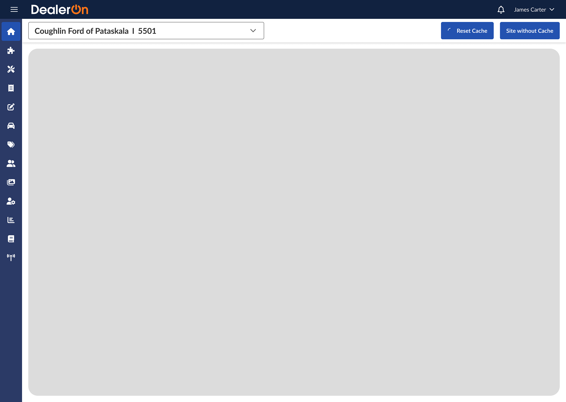
Button clicked; spinner state
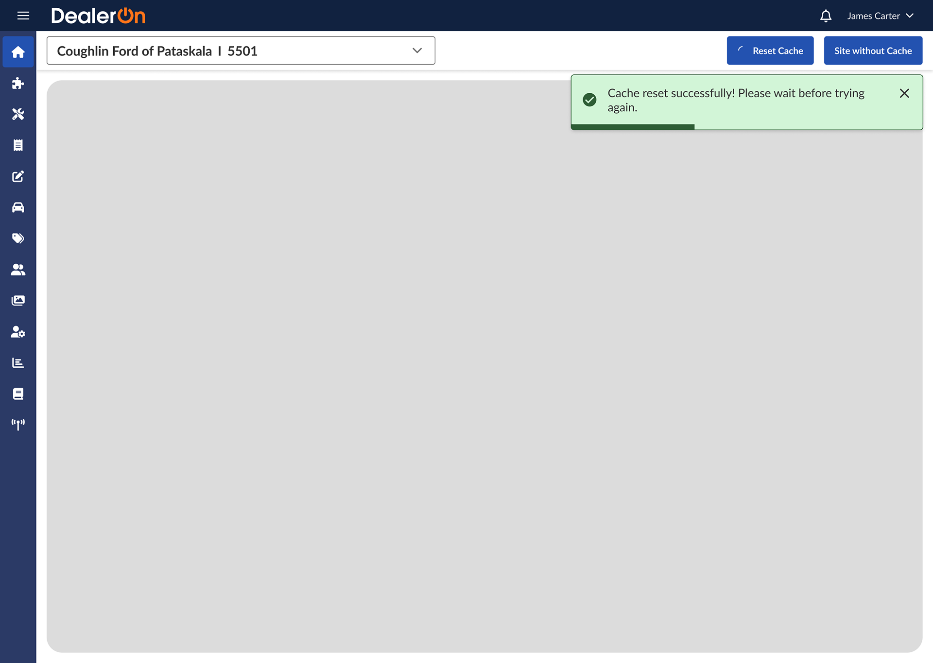
Toast notif
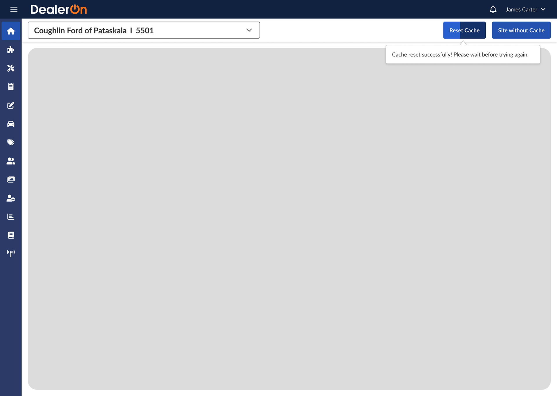
Toast notif and disabled button
Toast notif and disabled button
Tooltip over disabled button
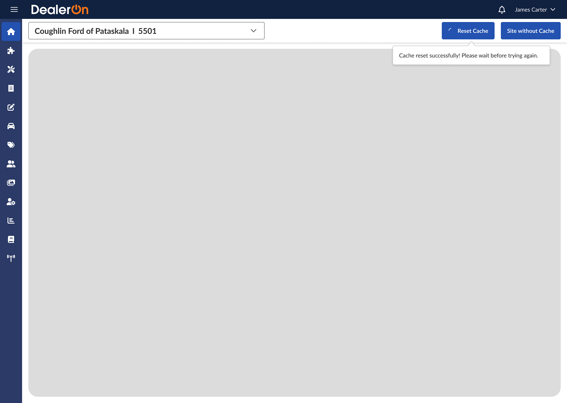
Tooltip over spinner button
Tooltip over progress bar button
Toast notif AND tooltip over disabled button
Toast notif AND tooltip over disabled button
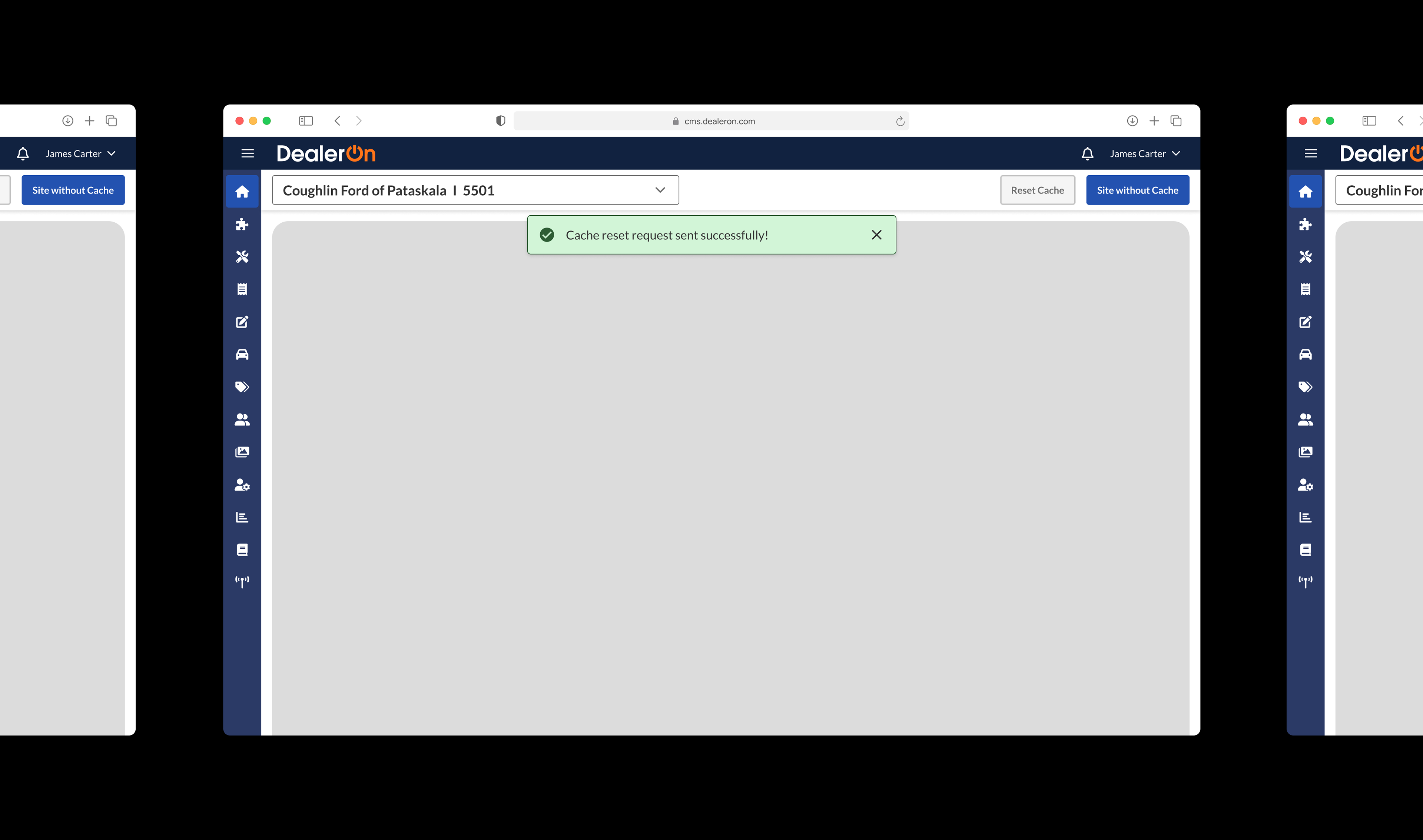
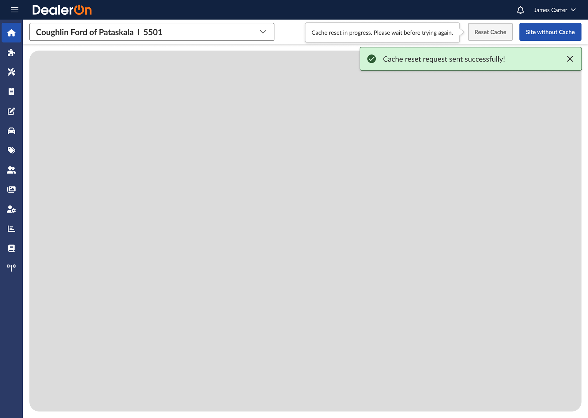
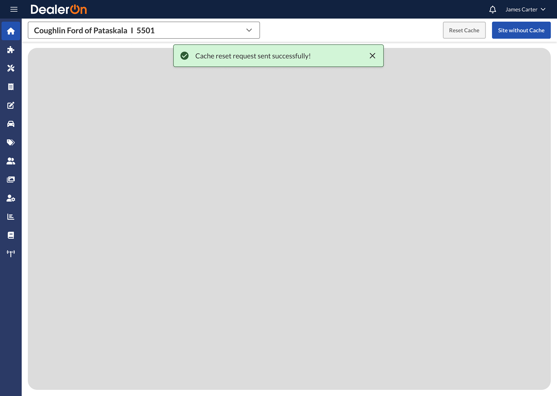
I settled on a toast notif in the center of the screen so as not to overlap with the tooltip. Per Rob’s feedback that the system doesn’t “know” when the cache is actually reset, I changed the verbiage to “cache reset request sent successfully!”
Final flow by Xing:

The goal of this change is to communicate what’s going on in the backend to the user. For success metrics, I would expect to see the “reset cache” button receive fewer clicks during its timeout period.
Navigation Menu
In the spirit of rapid iteration, I made a bunch of exploratory mocks trying to address some participants’ concerns. I decided that the expanded Shell Nav shouldn’t cover up page content or dealer selector (participants constantly switching between pages and dealer accounts want that information readily available, not hidden). I also explored a top menu (one participant said he missed our original top menu) and ways to differentiate between levels (indents, chevrons, background color).


Inspired by my exploratory mocks, Xing made these:

One piece of feedback from the focus group was that sometimes dealer account info isn’t saved between pages (technical constraint). Participants reported that it’s bad when they don’t realize a page has switched to a different account and start making changes on the wrong site). Xing made a workaround to open dealer account-agnostic pages in new tabs (denoted by the “new tab” icon) so that the main tab will keep its set dealer account.
During team critique, our team voiced concerns about the chevrons being right-aligned and pointing in different directions (ie: the chevrons on primary menu items point right but open downward). So, I made these:
I think the chevrons visible at the collapsed primary level add too much noise, so we decided against them. Xing made the final designs we settled on:


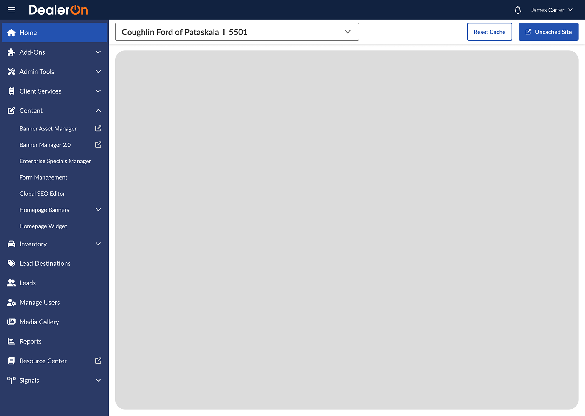
All chevrons face down and up, and leveling is indicated by indentation. Removing the second panel helps keep page content visible (and even if the page content shifted over responsively like in my exploratory mocks, the page content might appear too squished).
Information Architecture
Yep, we all knew this was coming. Remember how focus group participants asked for a search bar so they could actually find menu items? Product realized they actually didn’t want to release this confusing information architecture to external users, so they asked us to take another stab at it.
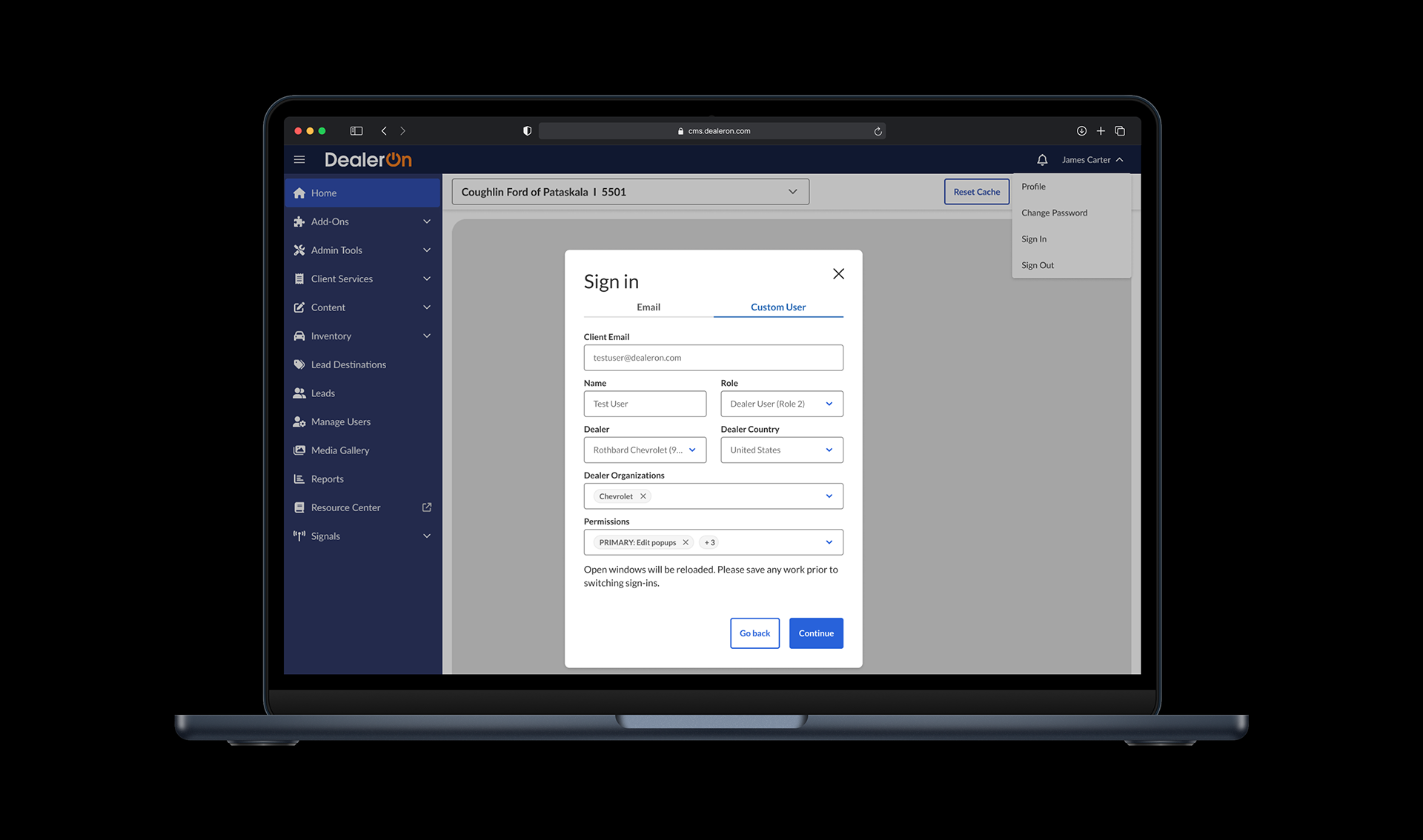
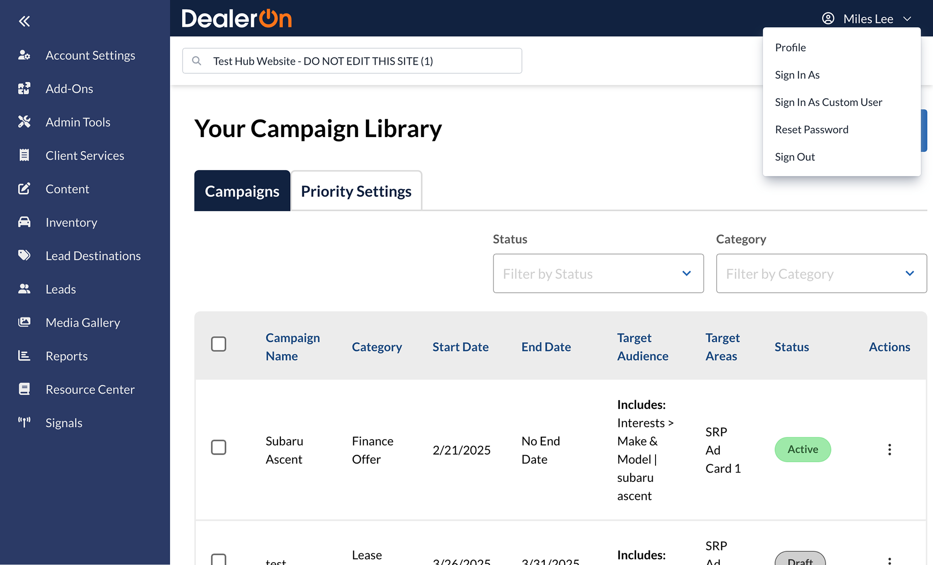
Xing and I noticed that in the account info menu, there was some redundancy: “Sign In As” and “Sign In As Custom User” were both menu items. Upon clicking, they open up new small windows. One exists so internal users can troubleshoot, but we felt these could be combined into one.
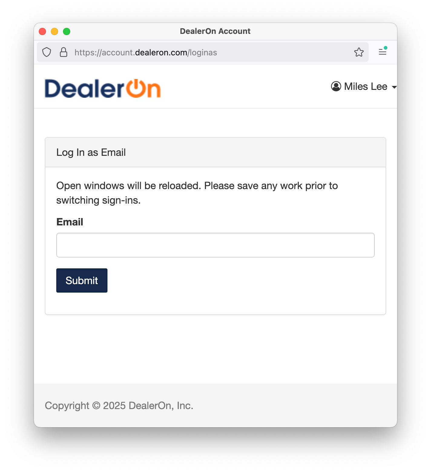
I made these quick and dirty edits to show a tab structure accommodating these two portals.
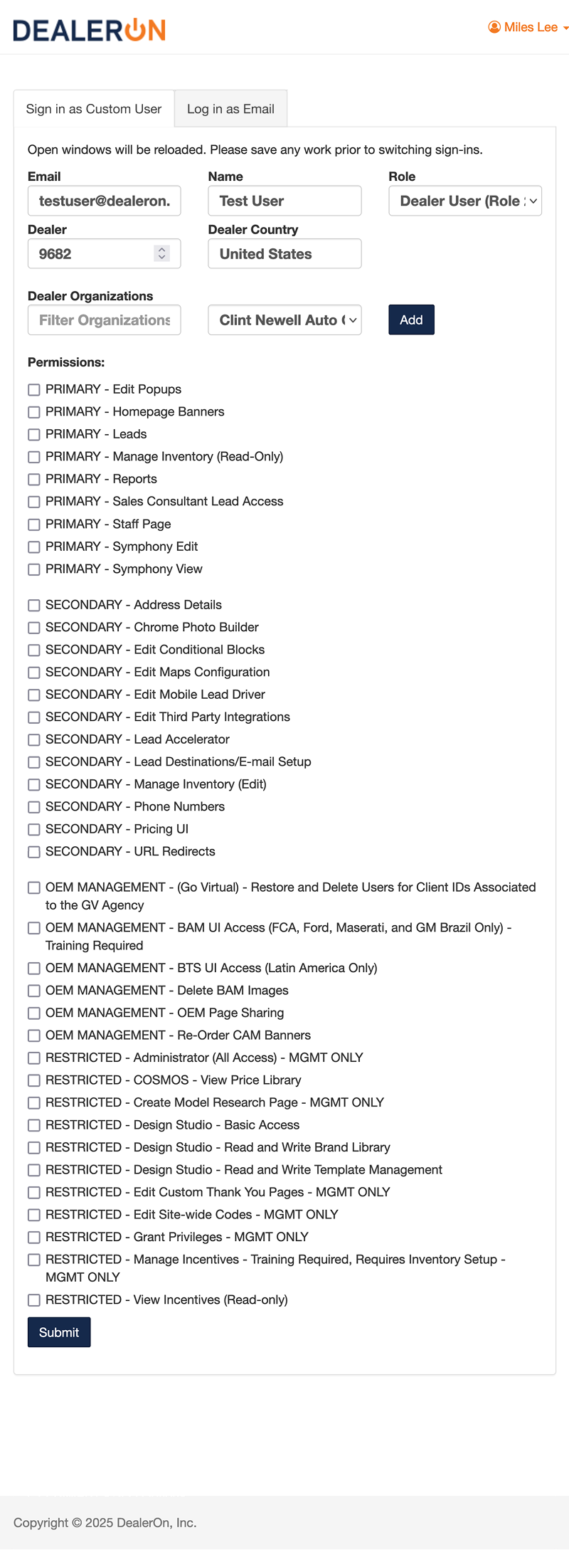
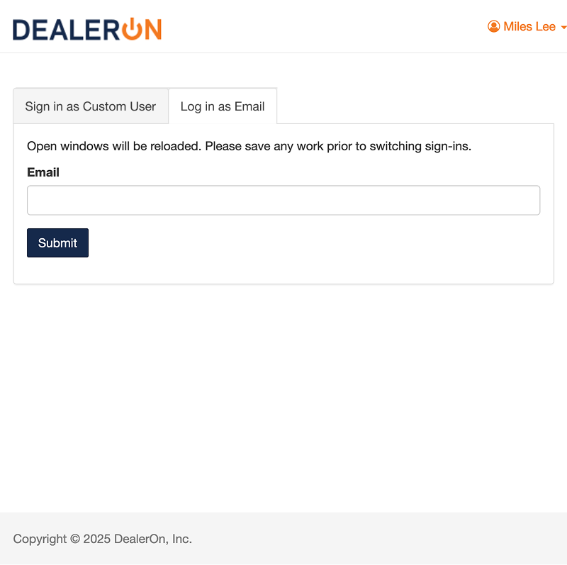
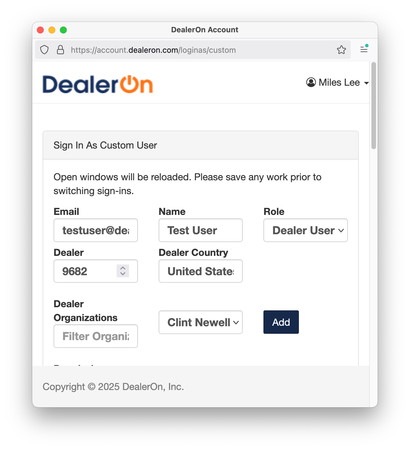
“Sign In As Custom User” opens up a really long list of checkbox options that I rolled into one dropdown.
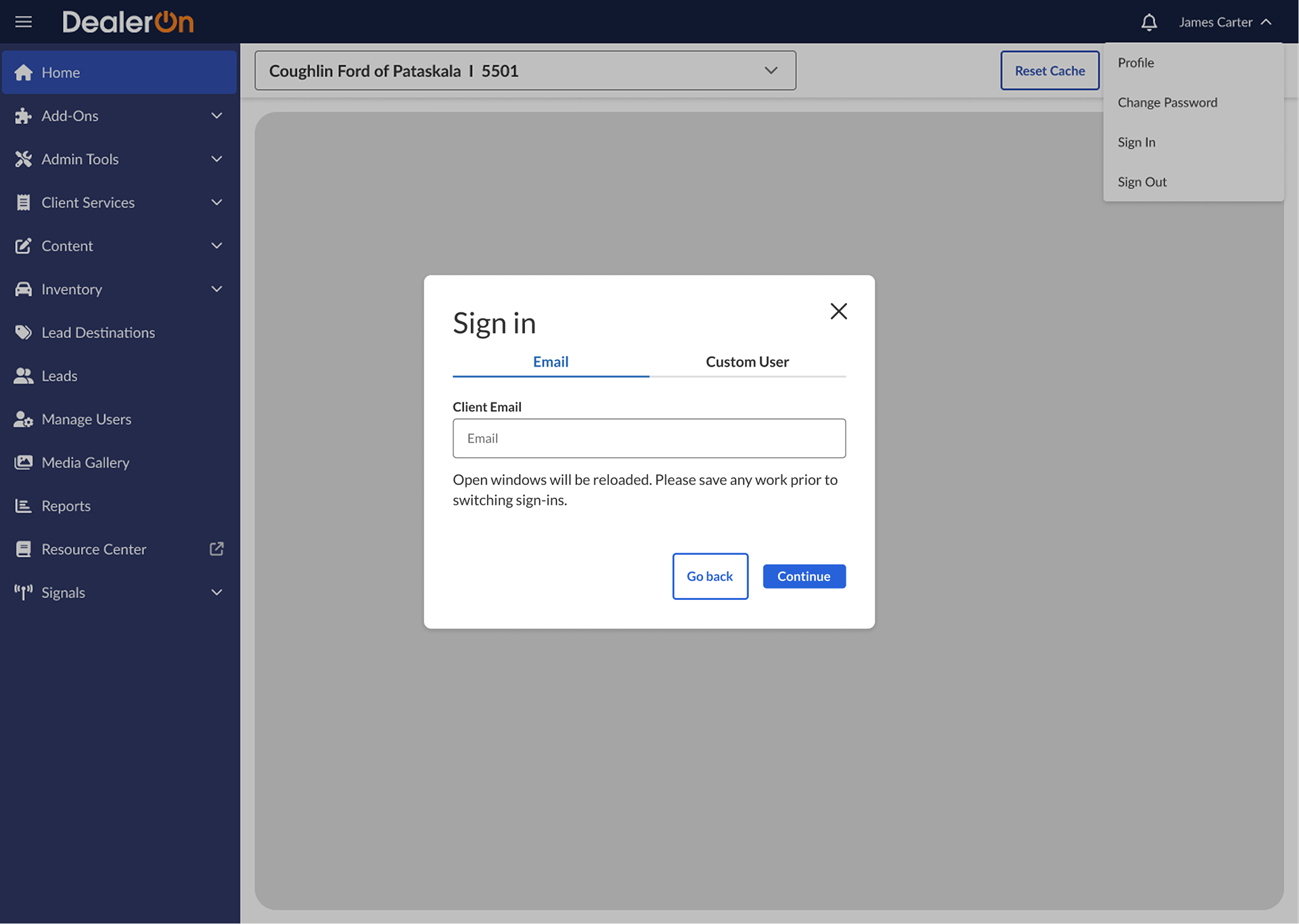
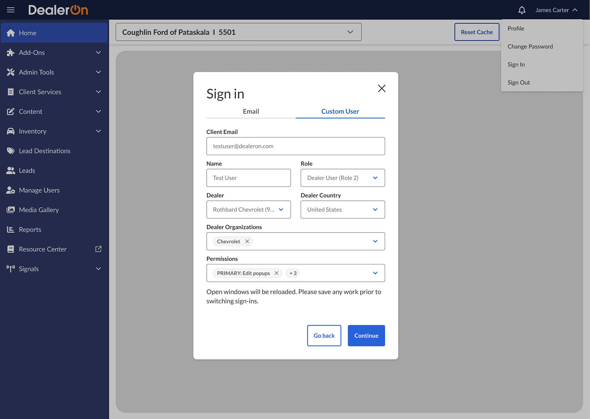
And here’s the full flow:
What about the rest of the menu items?
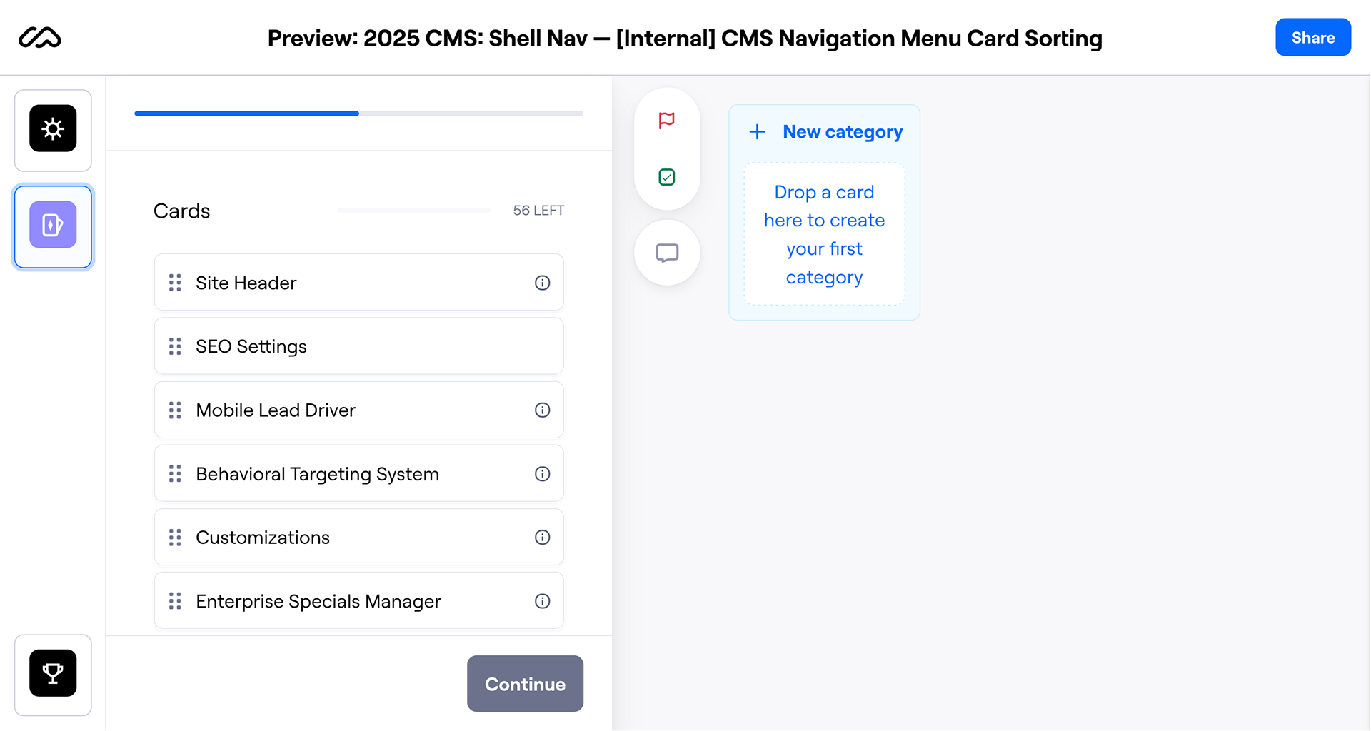
We just wrapped up a bunch of card sorting tests with users early April. In these, we asked users to read through the whole list of menu items and tell us what they thought the labels meant and if any labels confused them. Then we asked them to sort these items into whatever and however many categories they wanted.
Sifting through these results has been hard; everyone has different opinions about everything. It’s not an easy task, but we hope to improve the Shell Nav’s information architecture for users new and old, internal and external.
Impact
Uncovered gaps in the highest visible product before its release to 8,000+ customers.
Improved messaging and managed expectations around the most important button in the product.
Takeaways
Sometimes ignoring a problem just causes issues later down the line. If information architecture wasn’t de-prioritized two years ago, we probably wouldn’t be scrambling to find a better solution now. Perhaps we wouldn’t have had to delay the external release of the Shell Nav. I understand there are always tradeoffs. Some tradeoffs cause bigger issues down the line than others.
Talking to engineering to understand limitations allows you to craft a user experience that works around those limitations (ie: opening dealer account-agnostic pages in new tabs) or conveys them to users (ie: adding messaging to reset cache button).