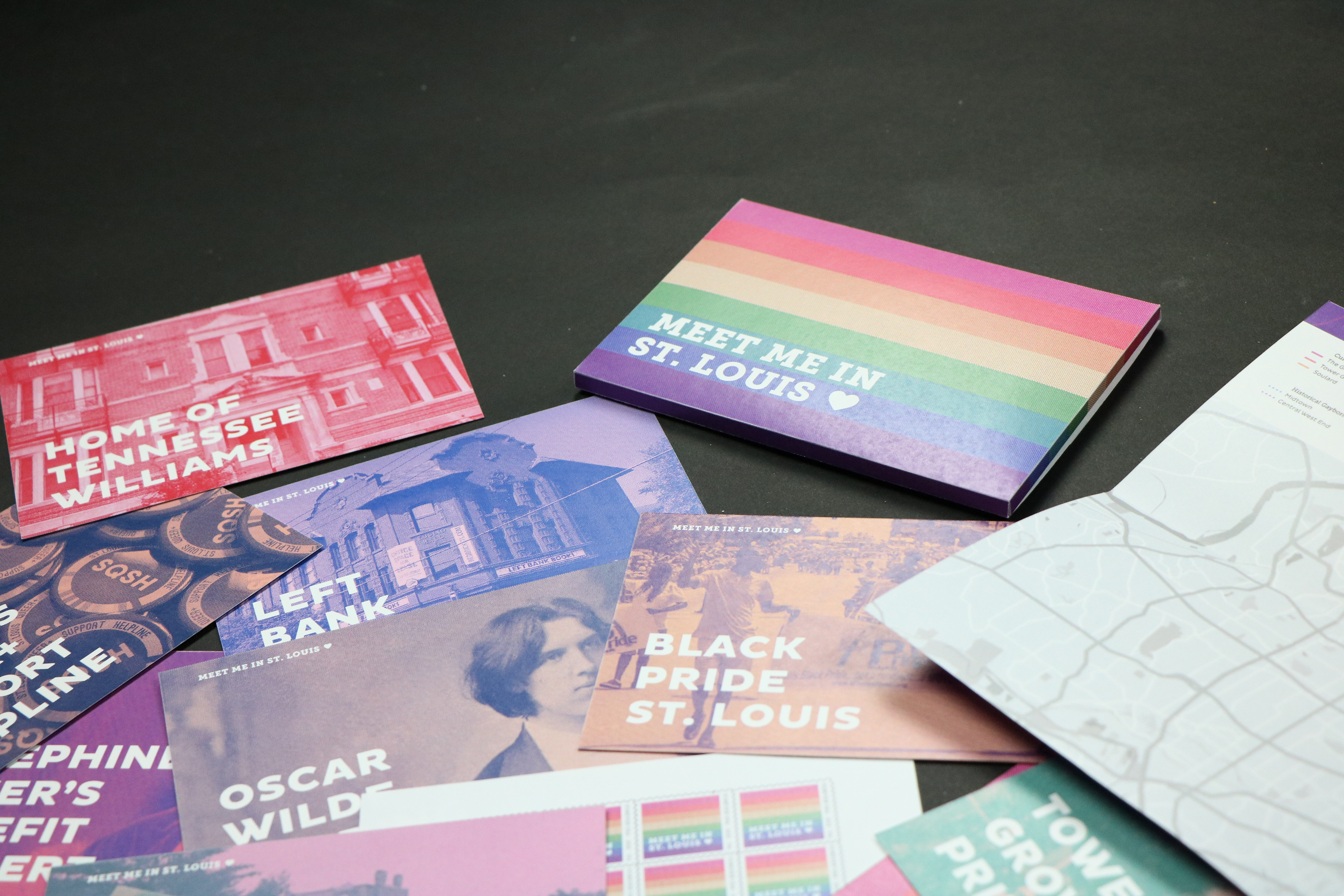
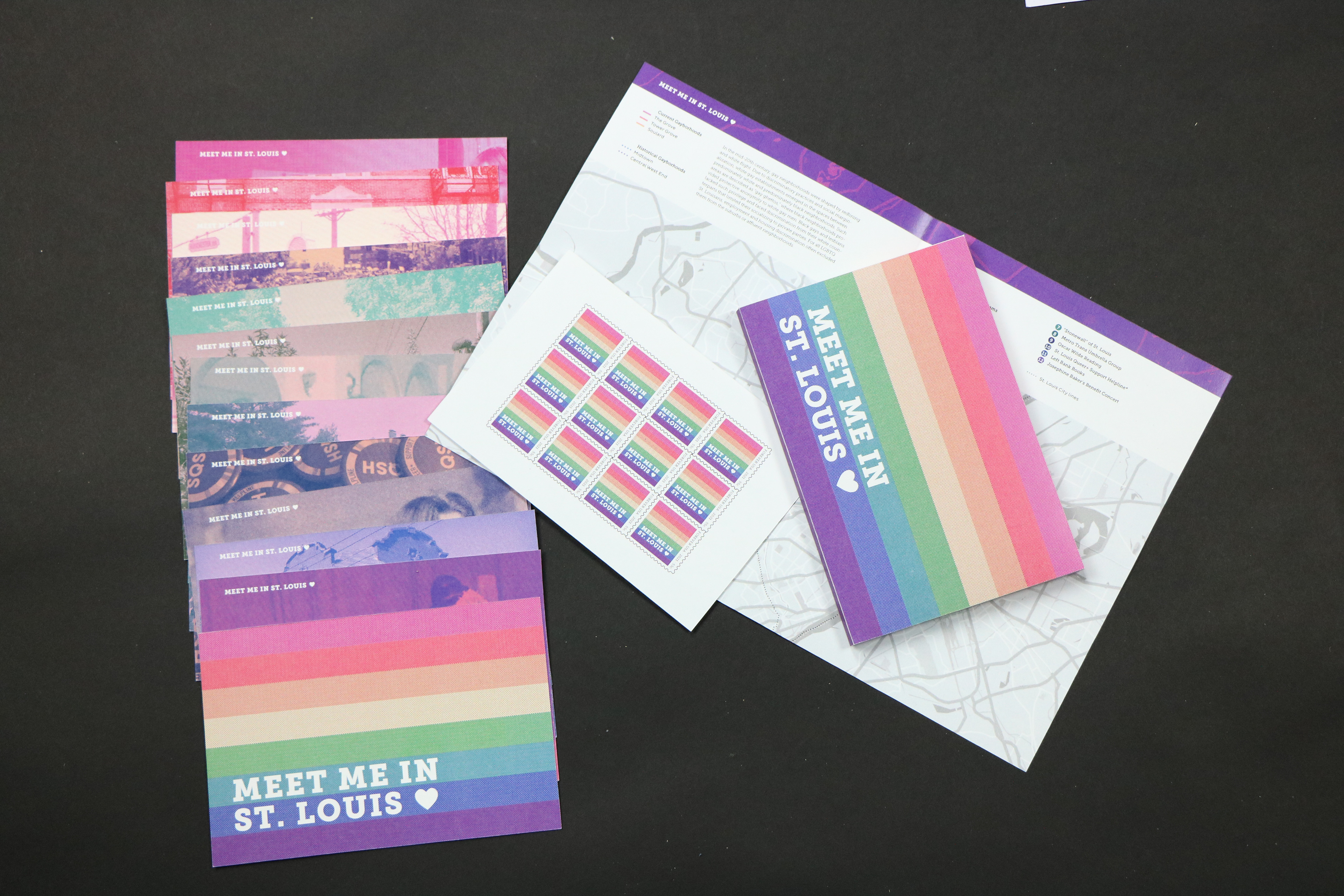
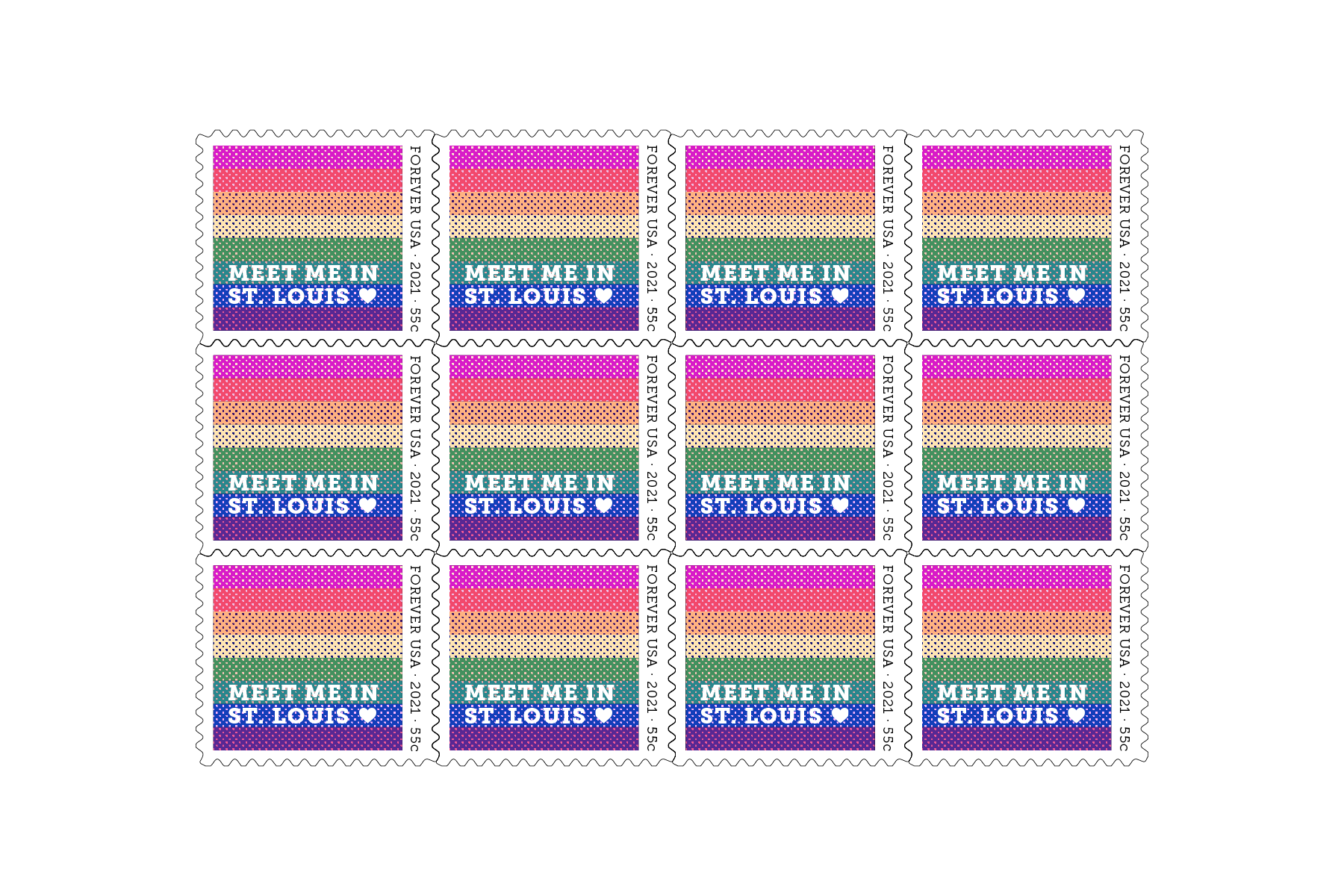
Responding to a prompt to create a set of 12 postcards for the St. Louis bicentennial (2020), I developed a set of what I see as some of the most important LGBTQ+ cultural landmarks of St. Louis. These include St. Louis-specific organizations, historical figures, places, and resources. Within the rainbow-colored packaging (a nod to Gilbert Baker's original gay pride flag), I included 12 postcards, a stamp sheet, an introduction card, and a map of each landmark.
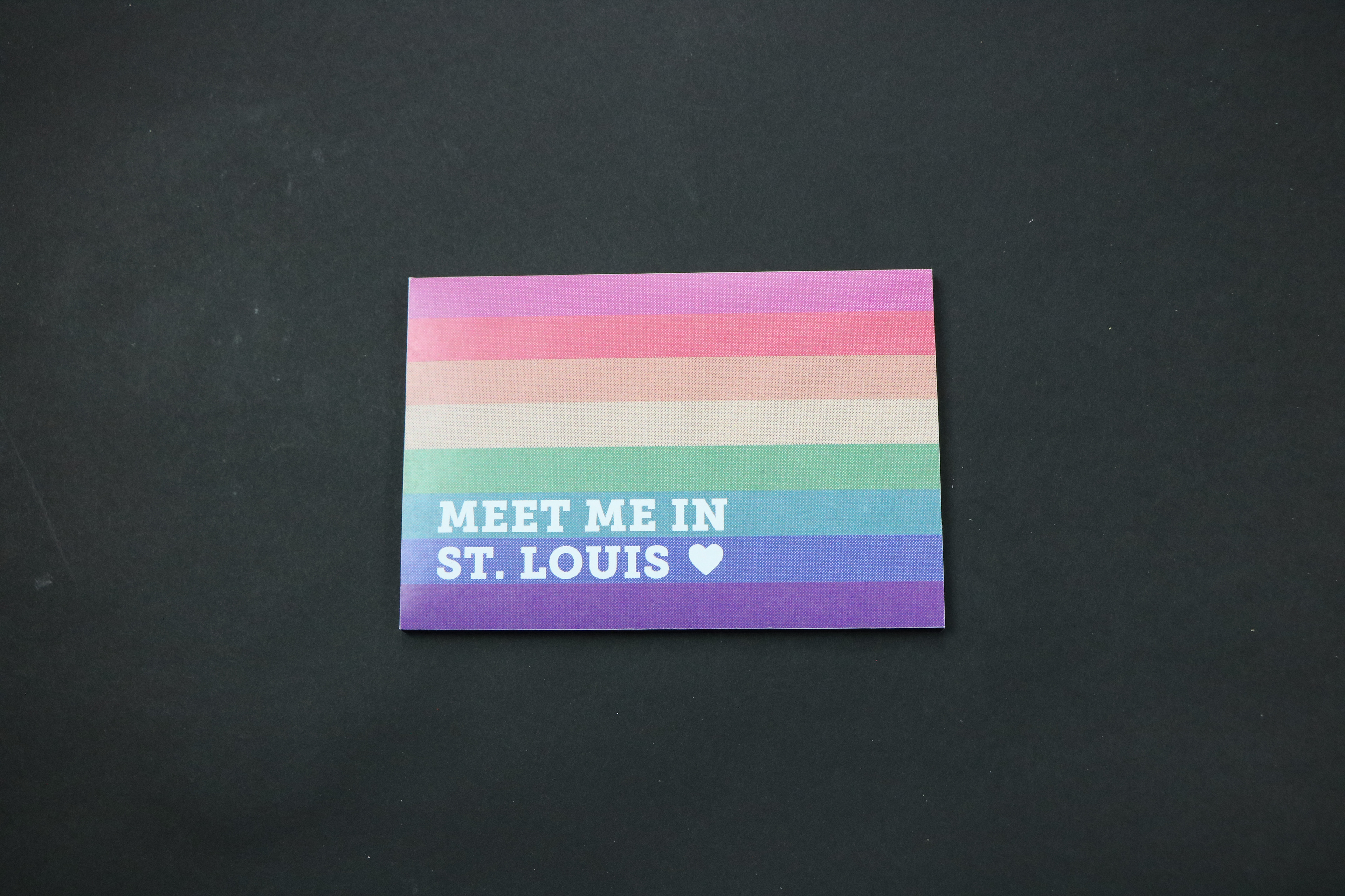
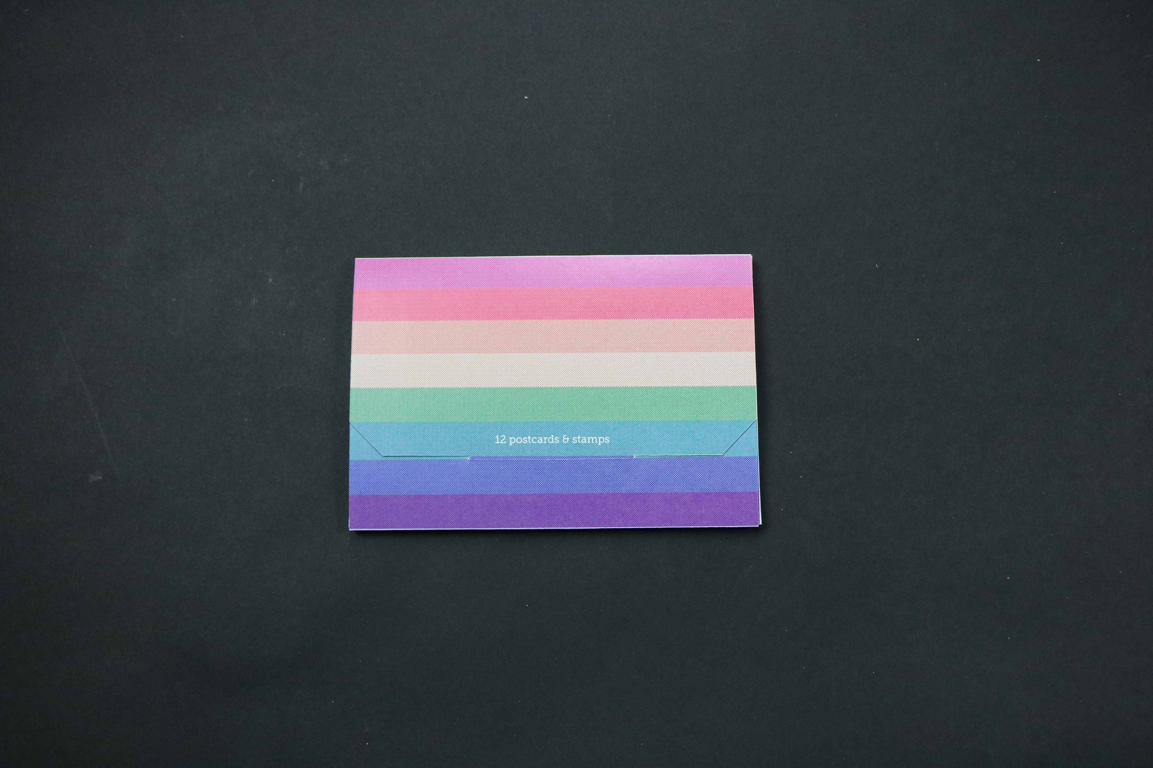
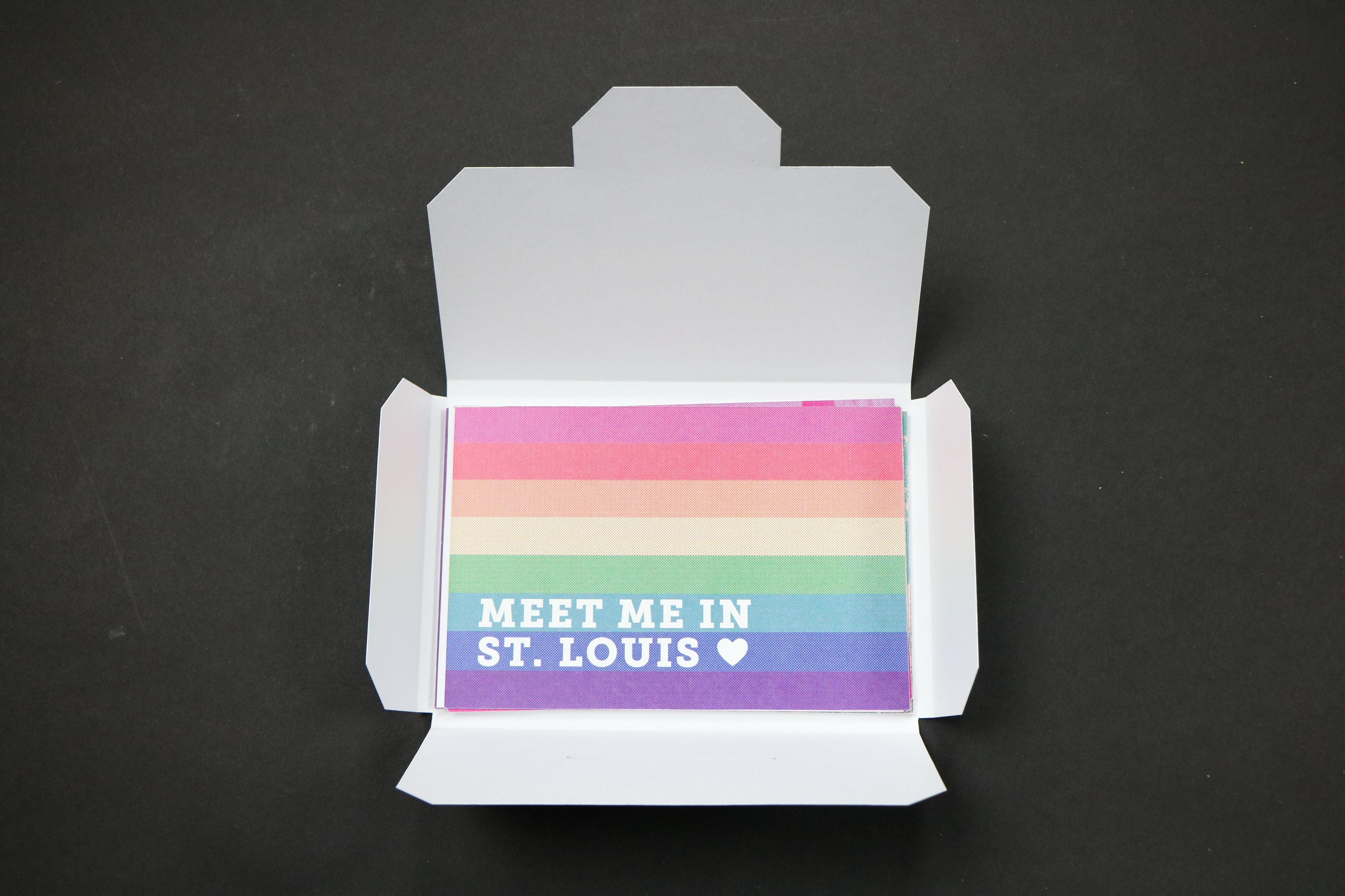
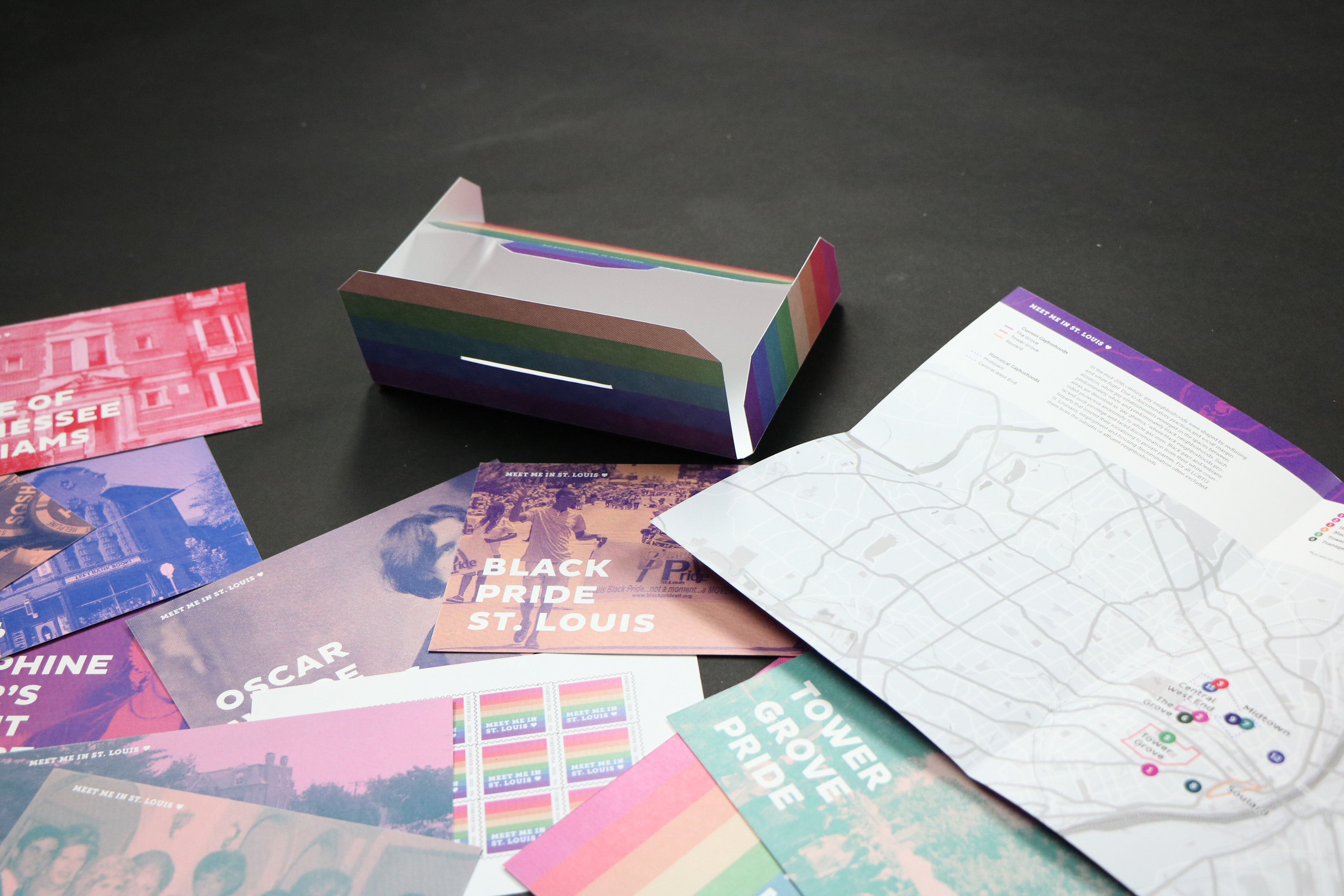
While working on this project, I paid close attention to the tone of the overall set and each card (friendly and informative) in order to create a psuedo-guide for new LGBTQ+ St. Louisans.
For visual research, I spent hours browsing fontsinuse.com for projects that involved using a system across multiple formats, as well as LGBTQ+ focused marketing campaigns and products (Destination Pride, Bellweather Agency's World Pride/Stonewall 50 marketing). Doing so helped me get an understanding of how to approach this project.
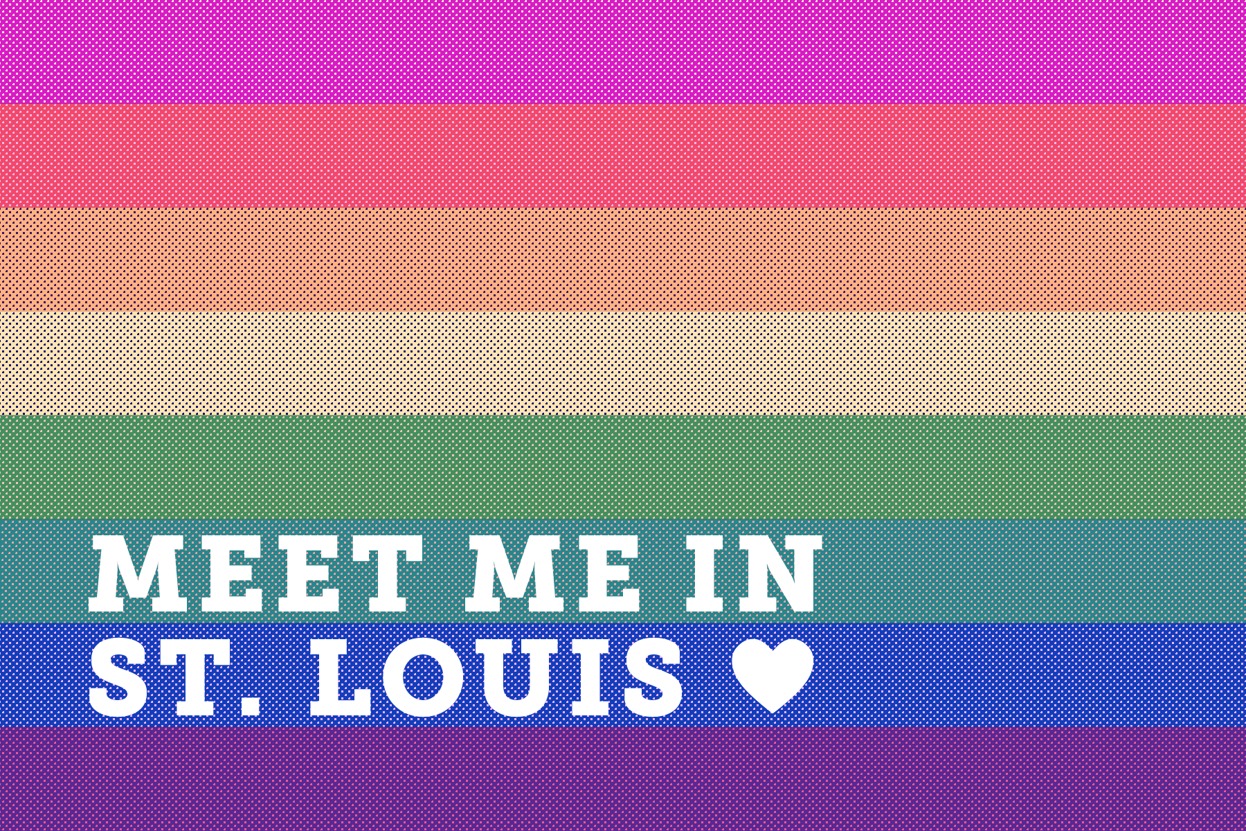
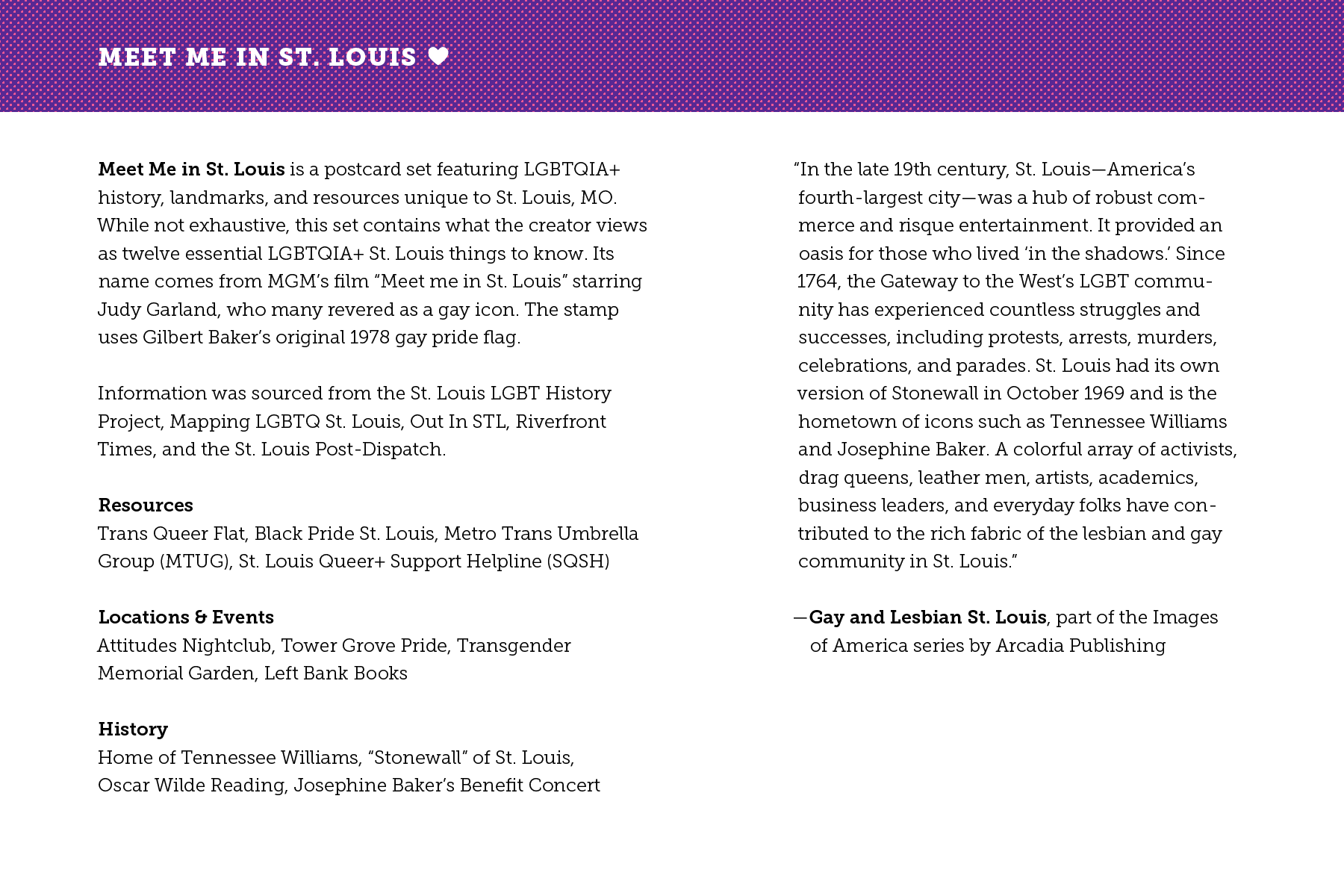
The name "Meet me in St. Louis" comes from MGM's 1944 film starring Judy Garland, revered by many as a gay icon. It came to me pretty early on, when I thought jokingly about creating an LGBTQ+ rendition of the movie. "Meet me" can be read both platonically and romantically, which matches the bright colors and playfulness of the set.
After researching LGBTQ+ St. Louis resources like the St. Louis LGBT History Project, Mapping LGBTQ+ St. Louis, Out In STL, Riverfront Times, and the St. Louis Post-Dispatch, I compiled a long list of potential postcards. After deciding that the postcard needed to be St. Louis-exclusive, I settled on these twelve.
Resources: Trans Queer Flat, Black Pride St. Louis, Metro Trans Umbrella Group (MTUG), St. Louis Queer+ Support Helpline (SQSH)
Locations & Events: Attitudes Nightclub, Tower Grove Pride, Transgender Memorial Garden, Left Bank Books
History: Home of Tennessee Williams, “Stonewall” of St. Louis, Oscar Wilde Reading, Josephine Baker’s Benefit Concert
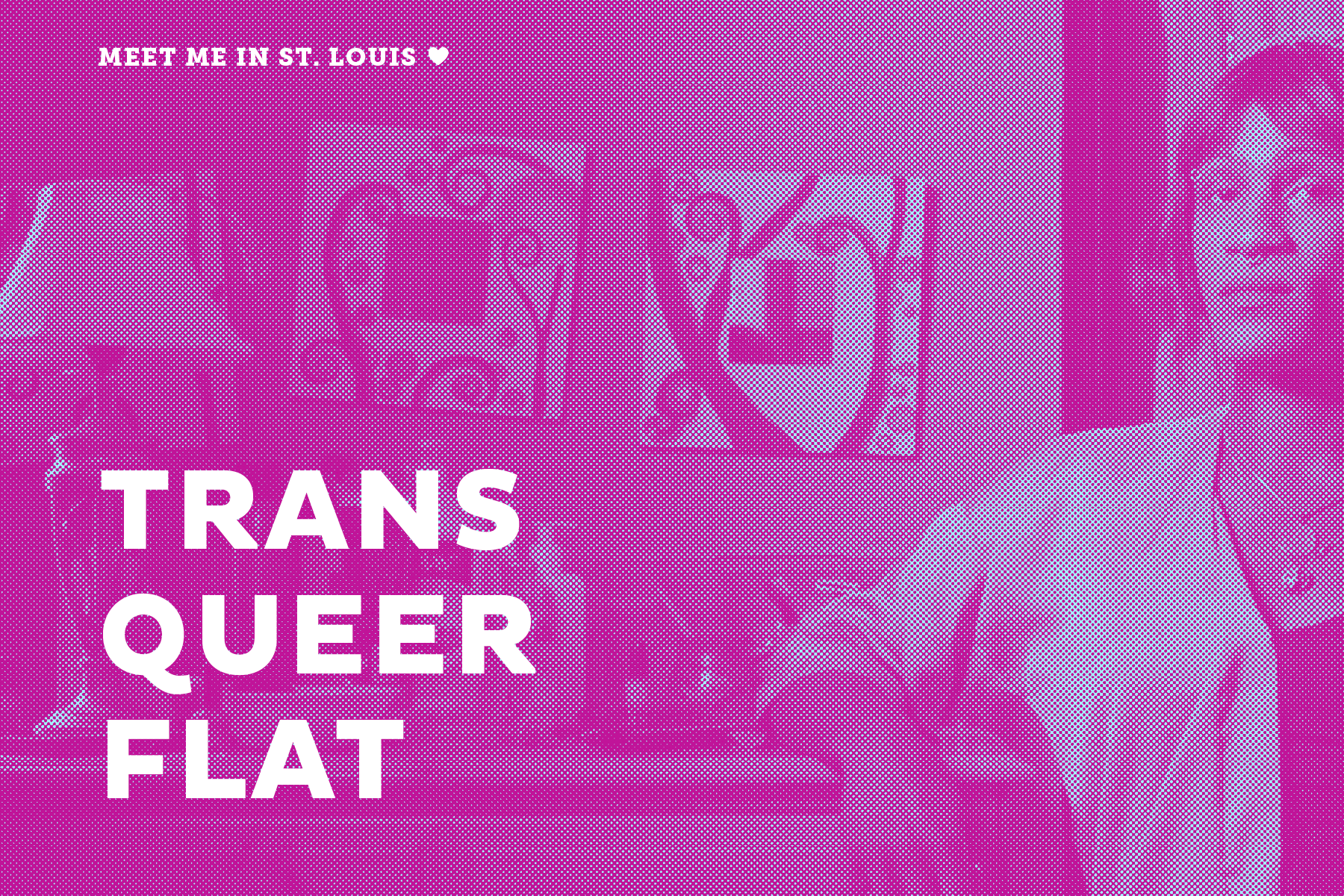
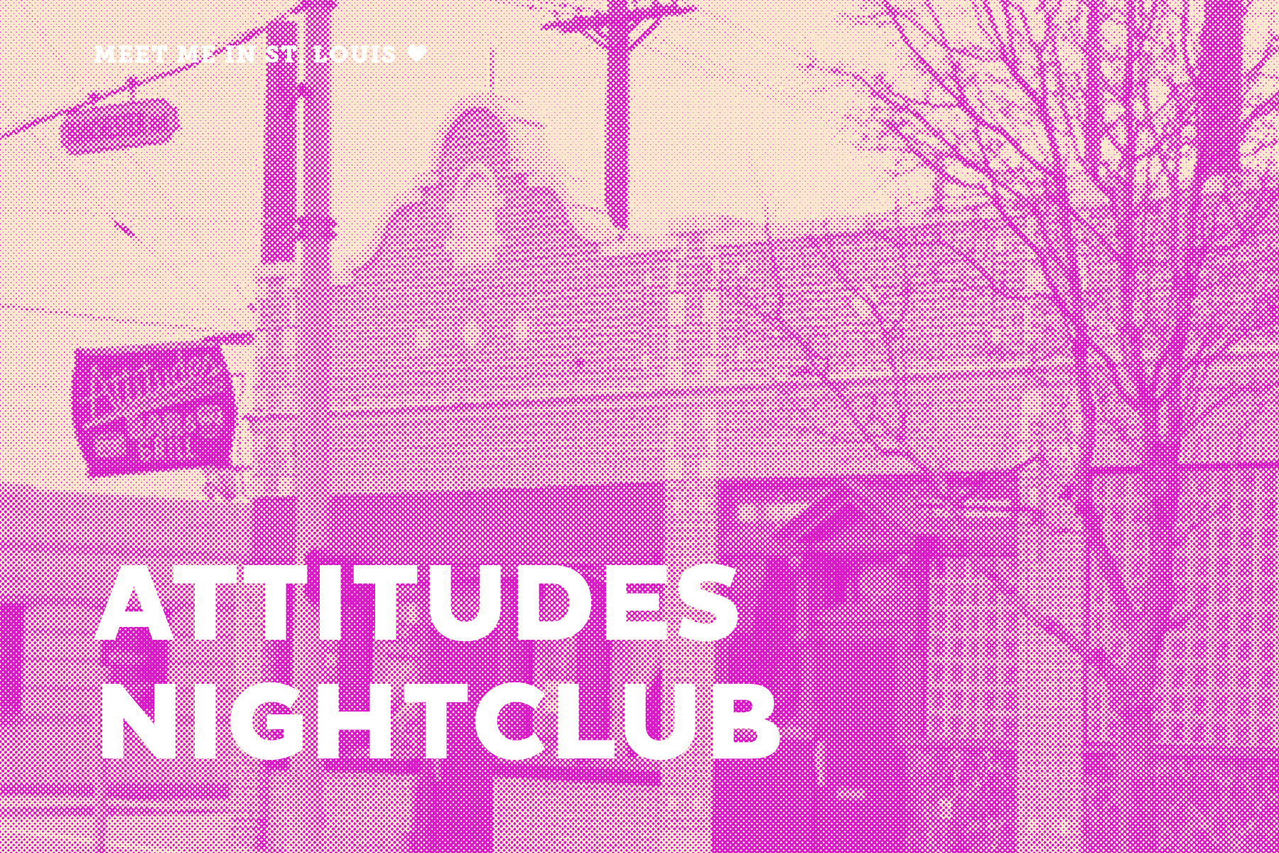
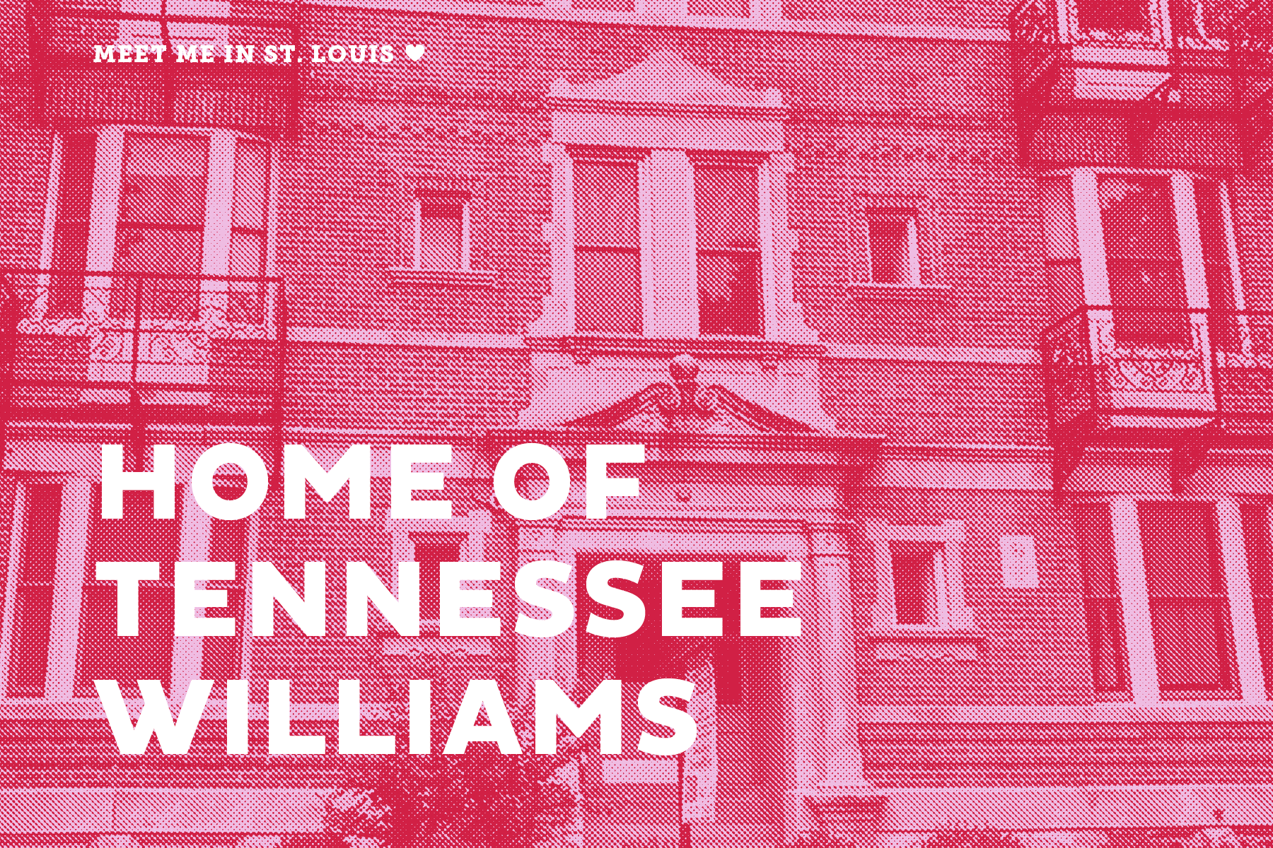
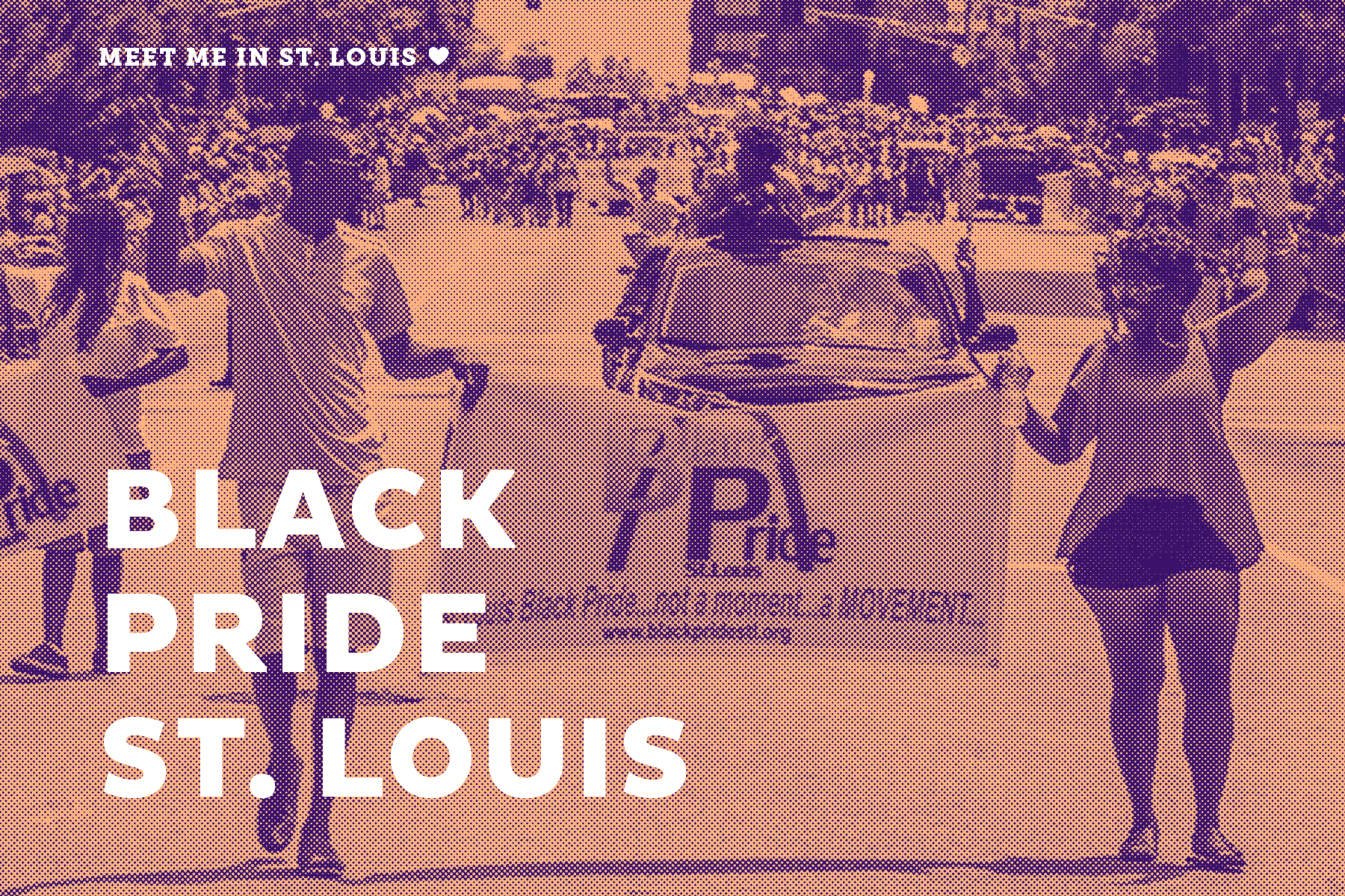
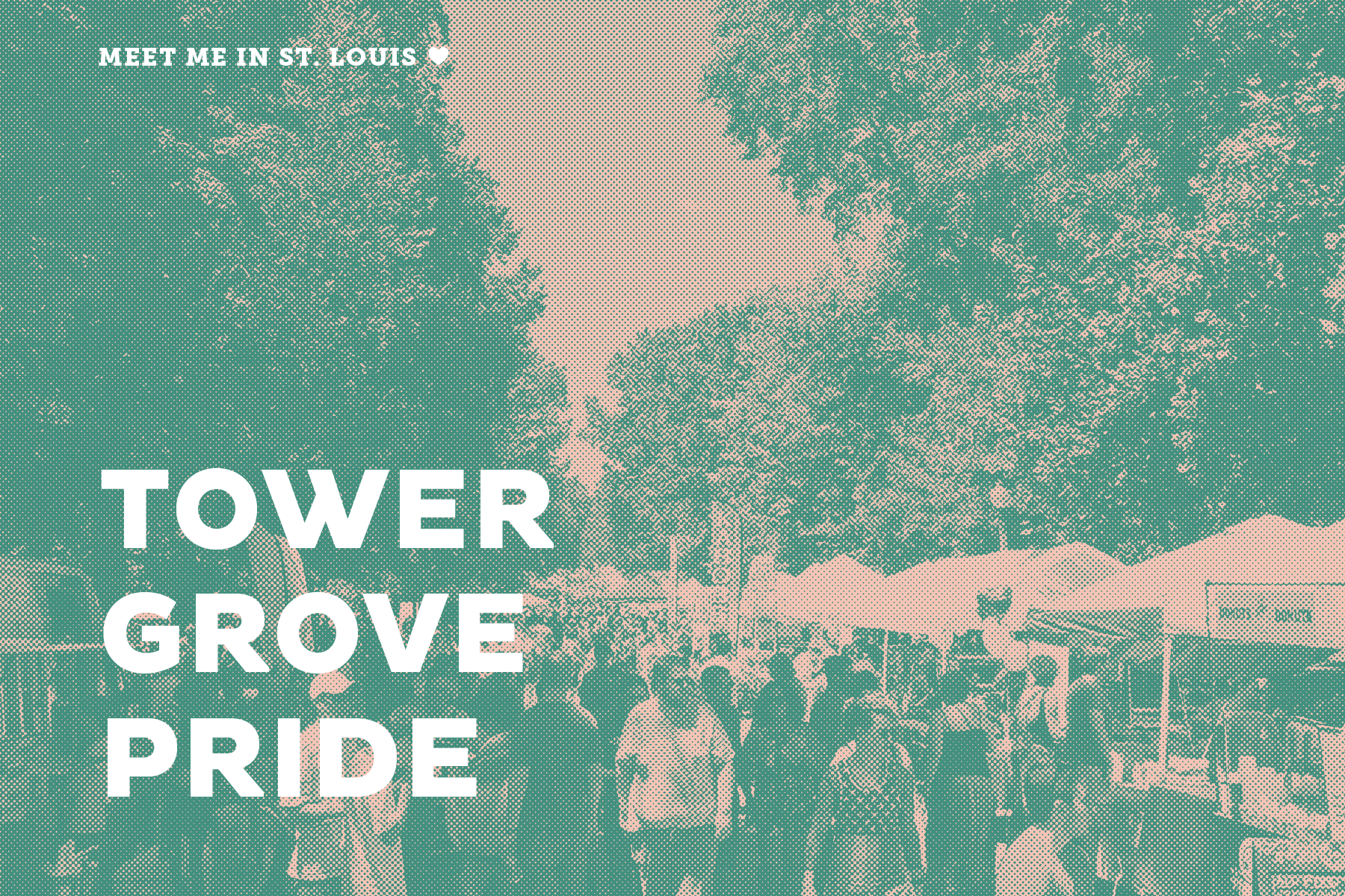
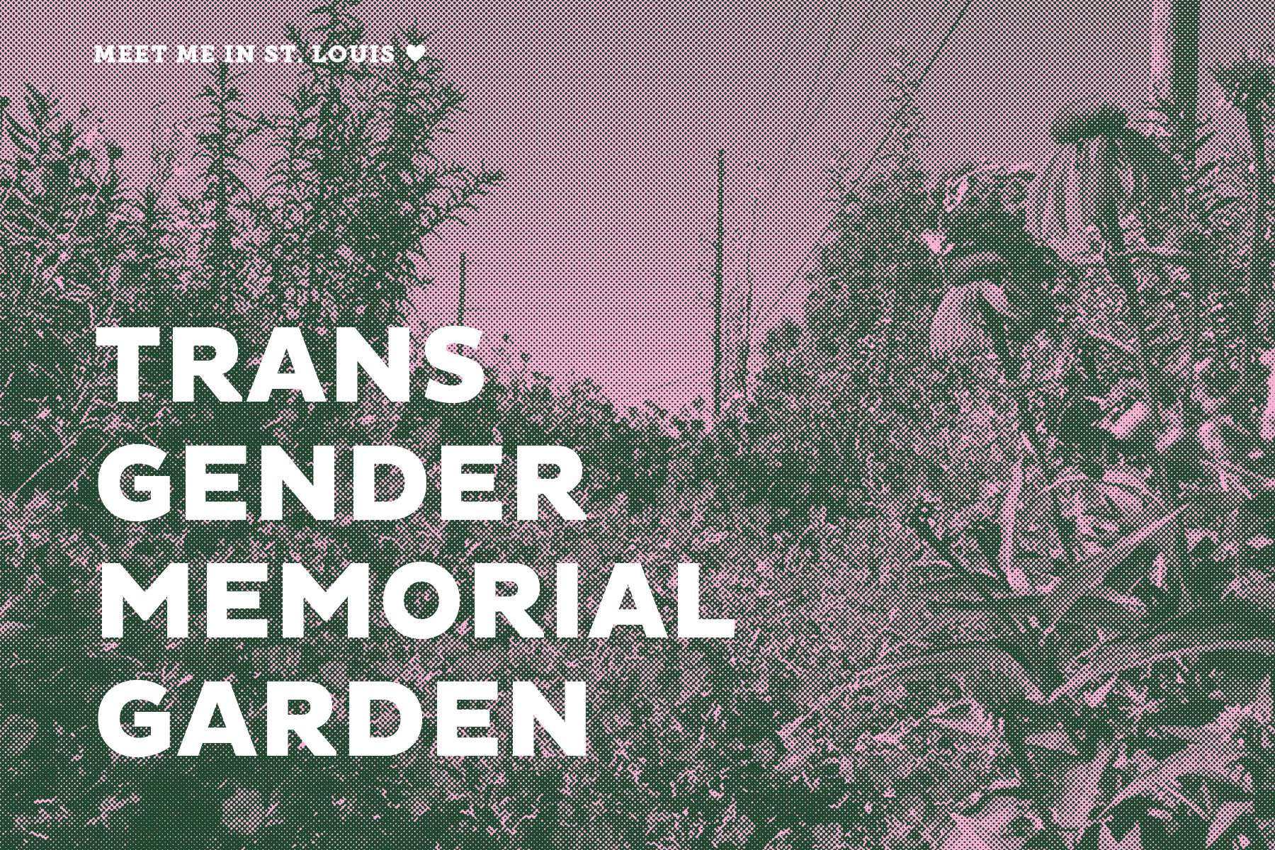
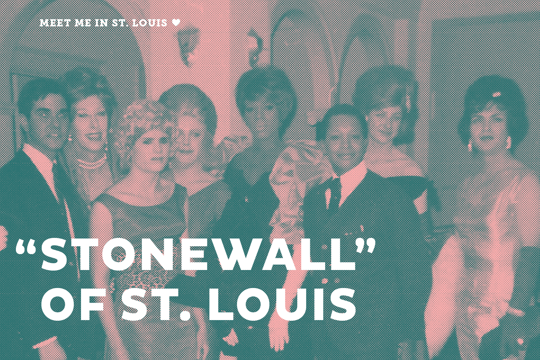
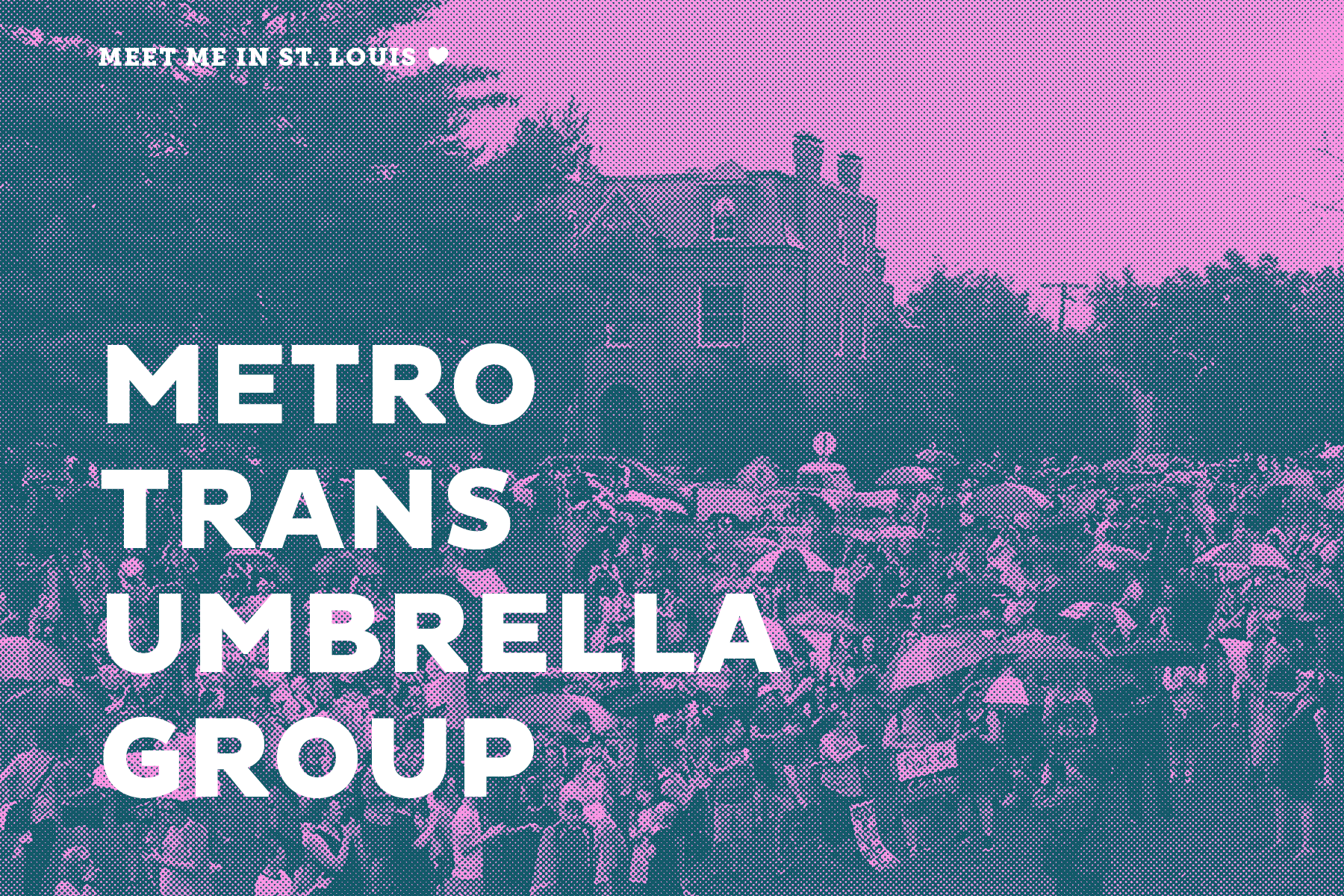
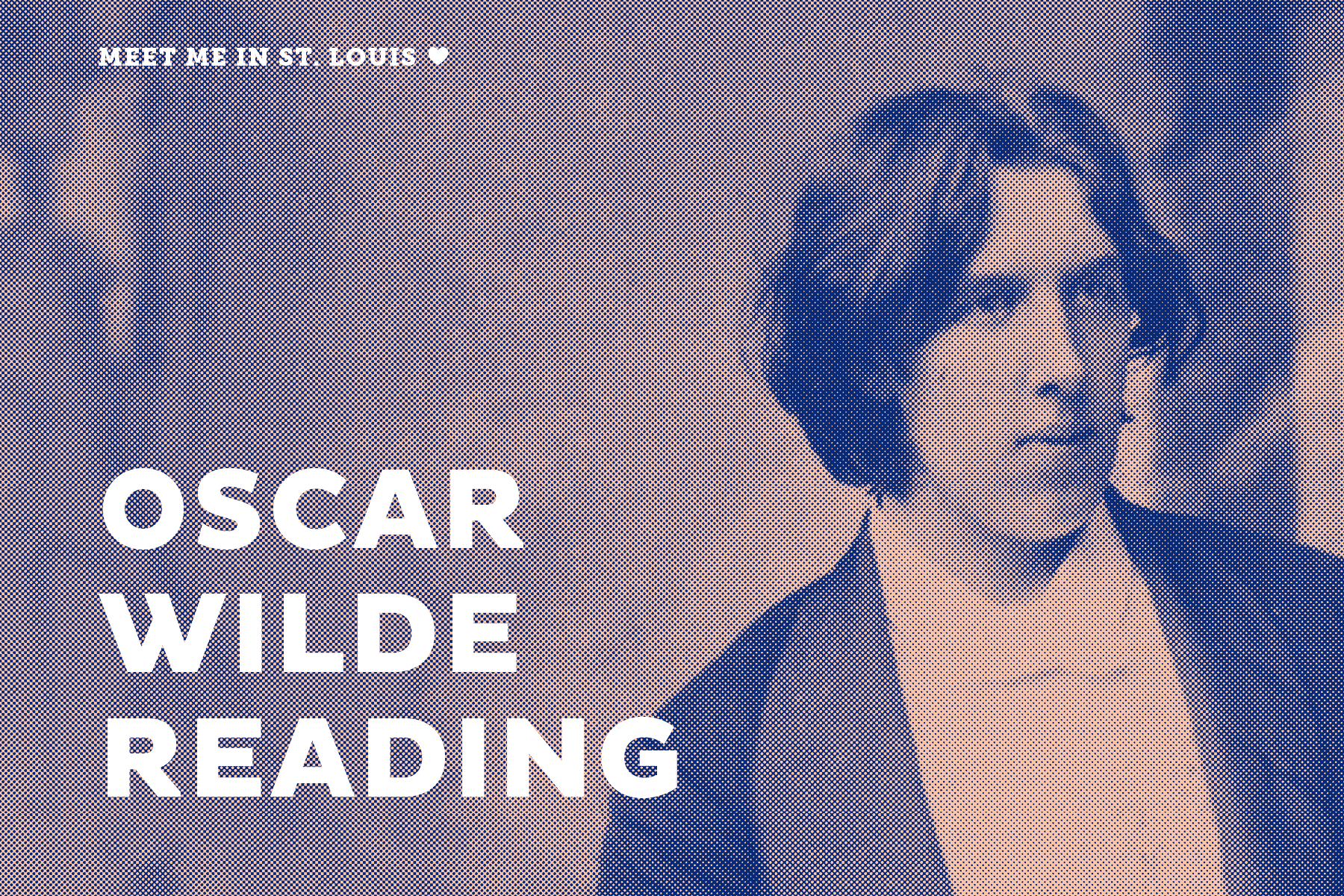
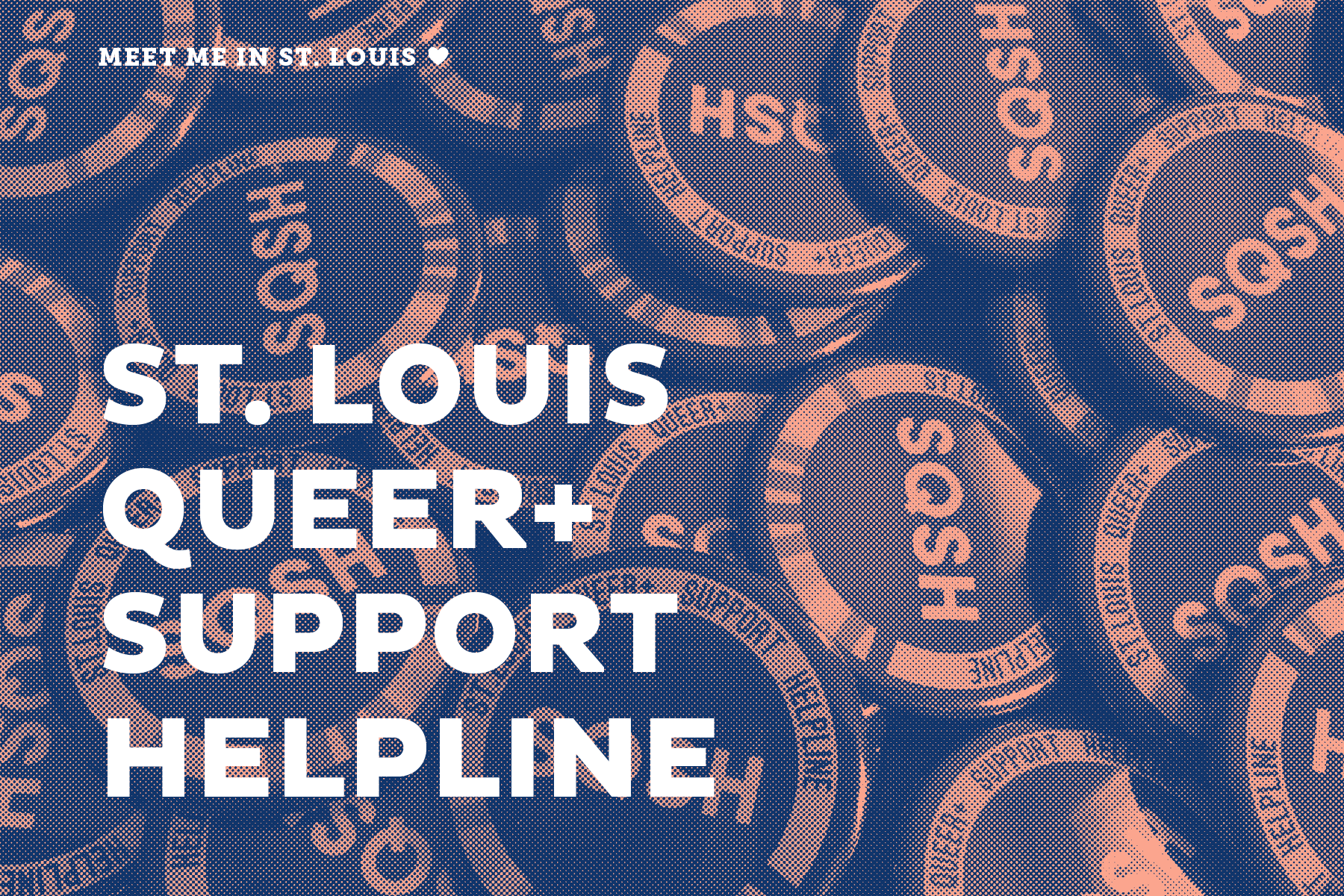
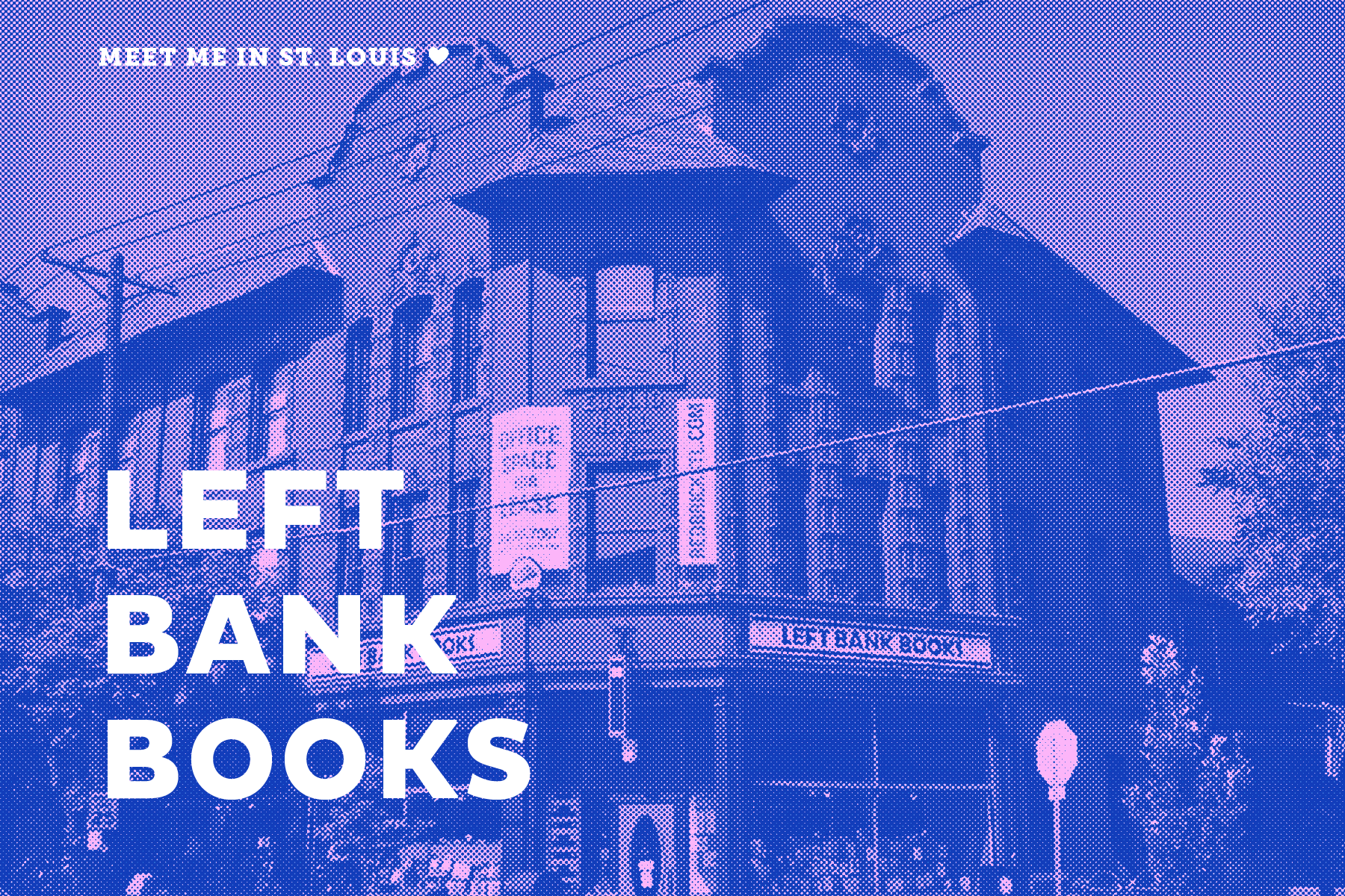
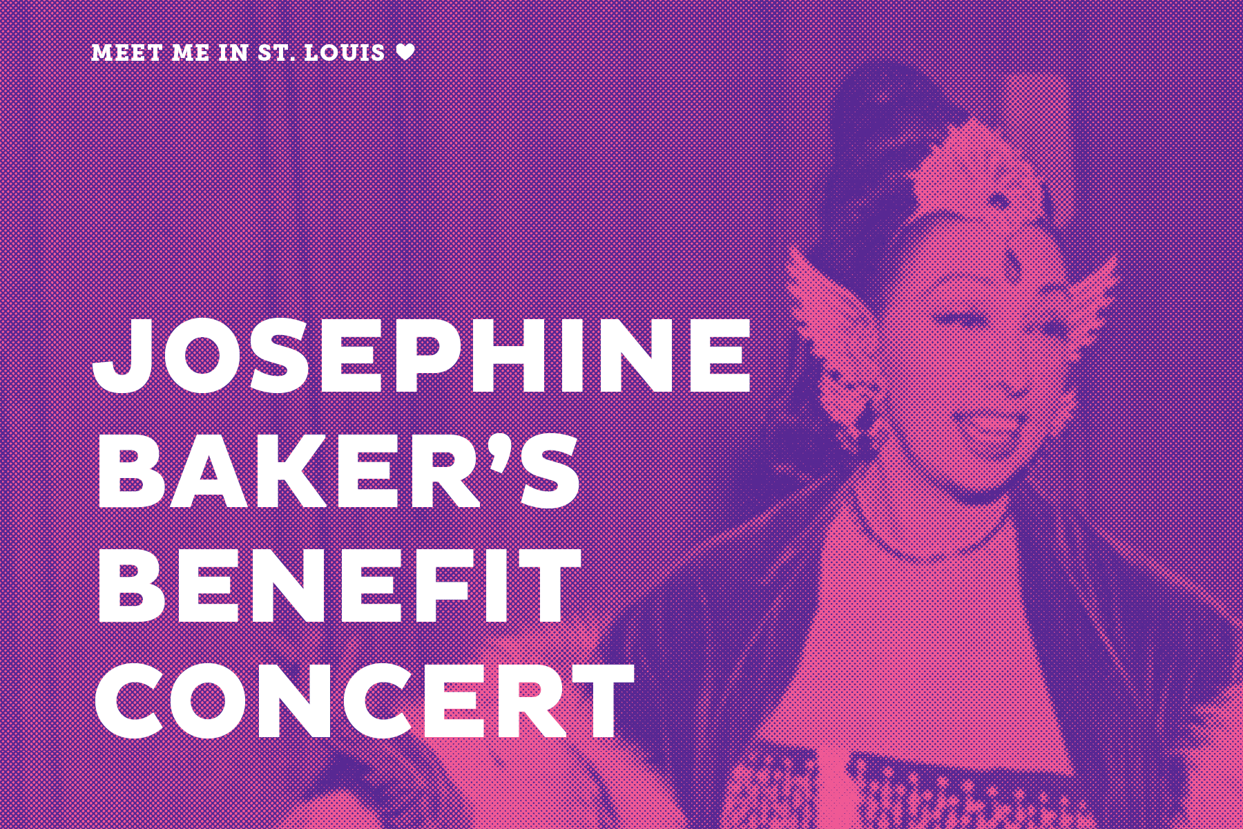
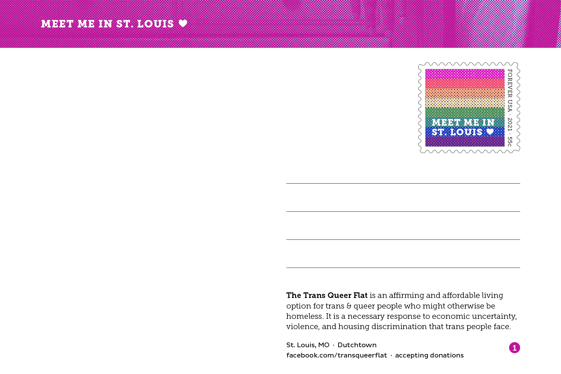
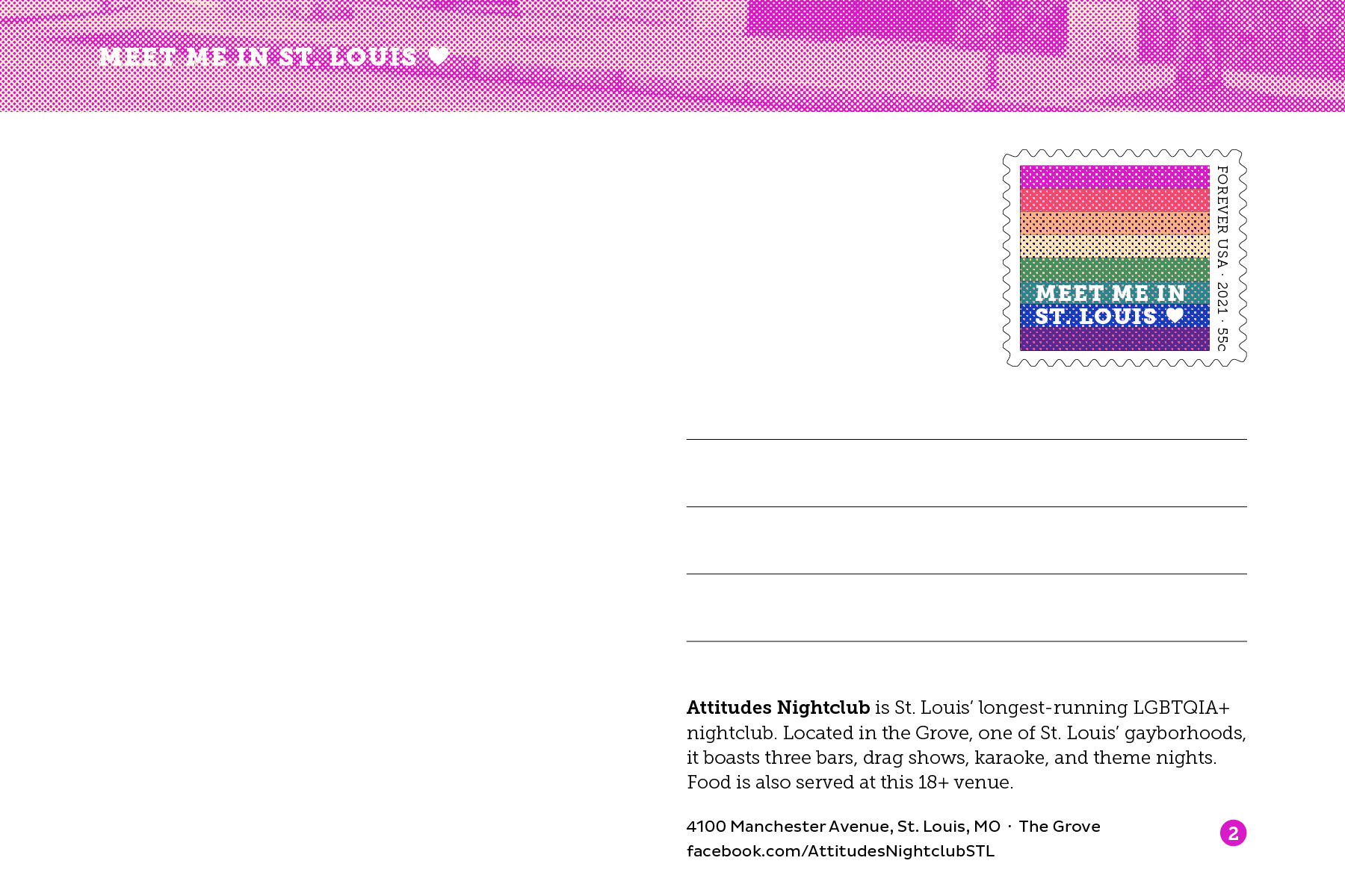
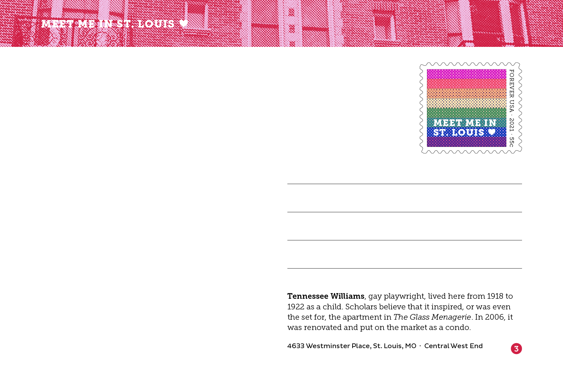
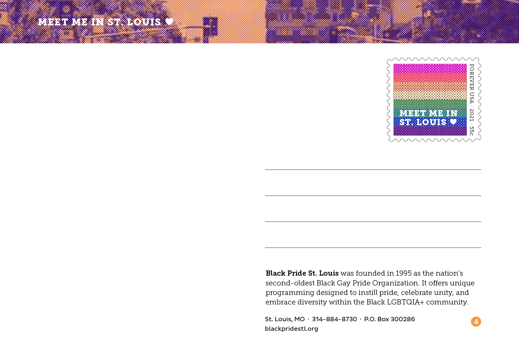
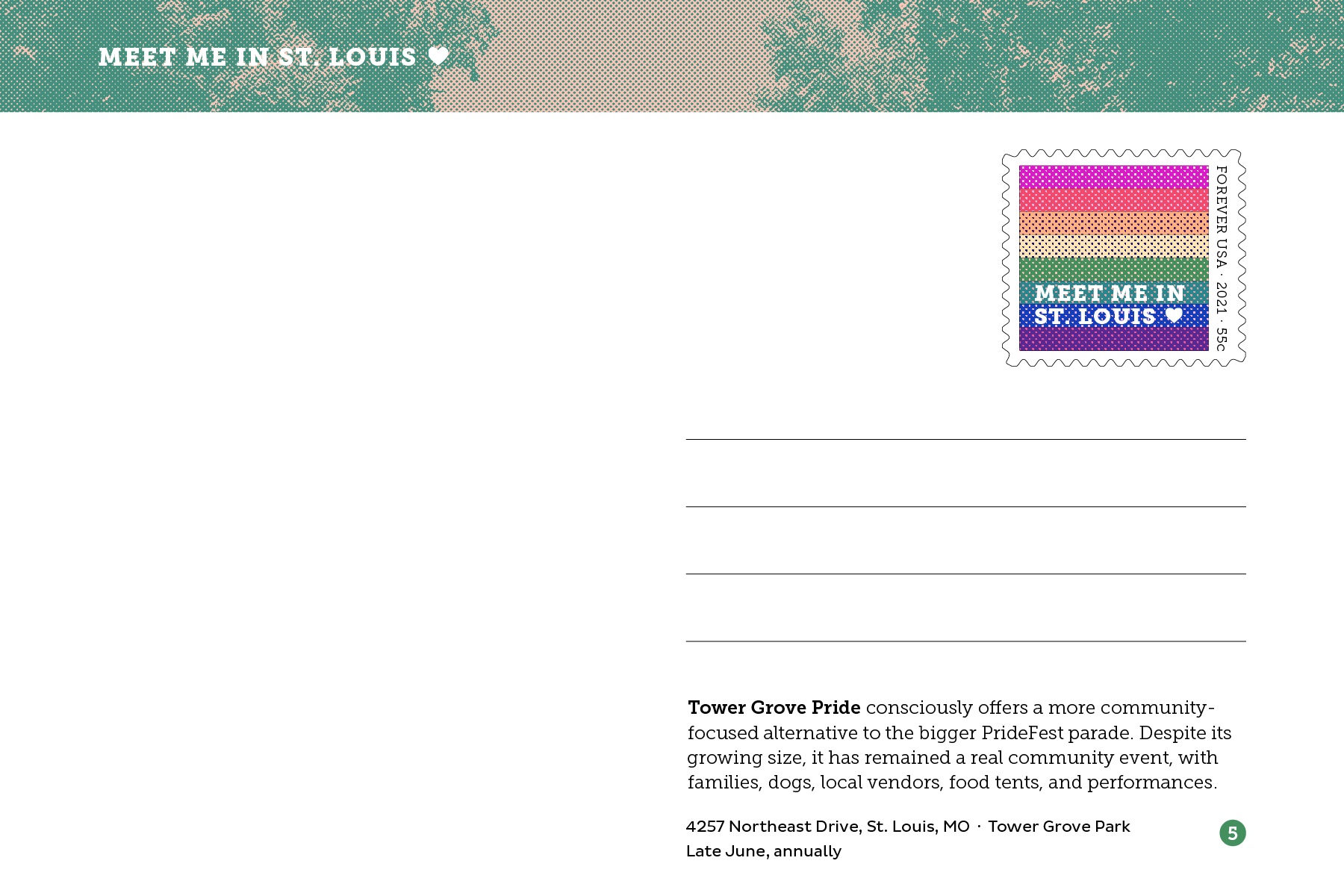
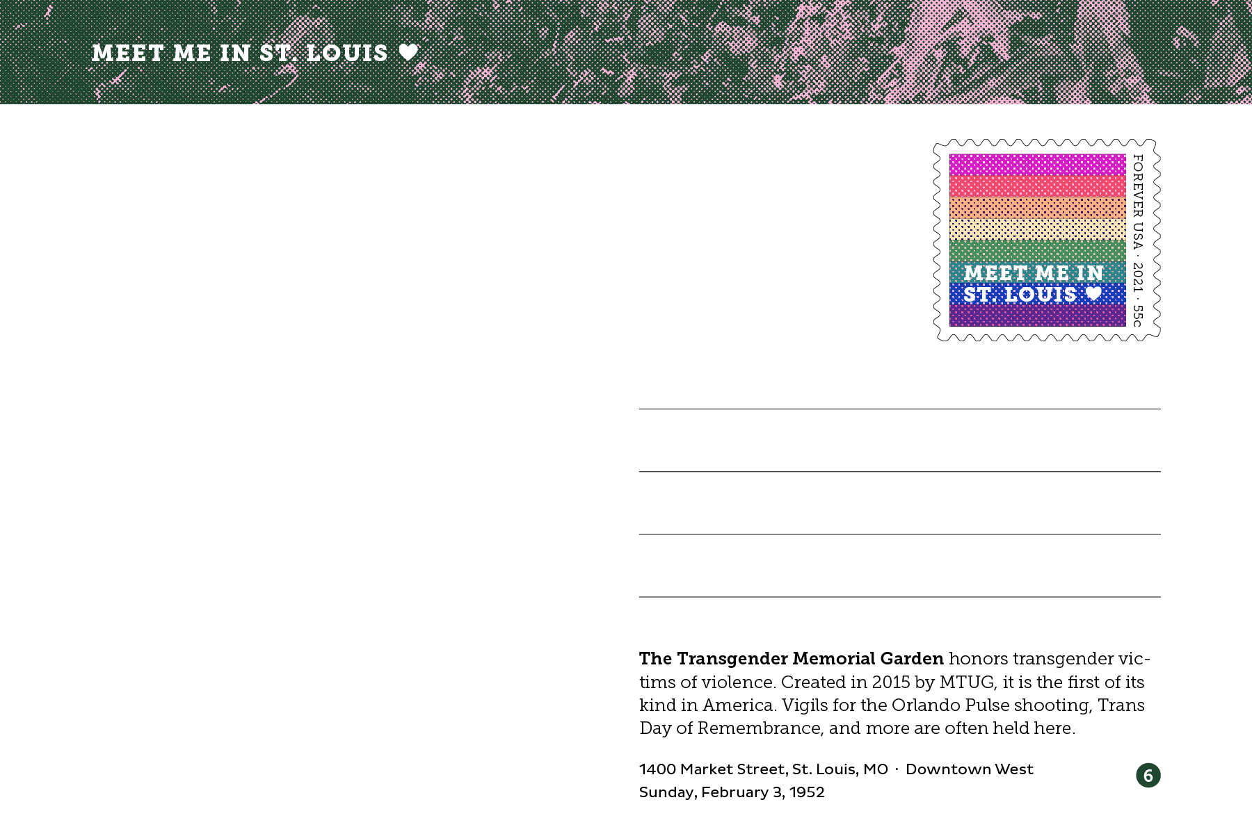
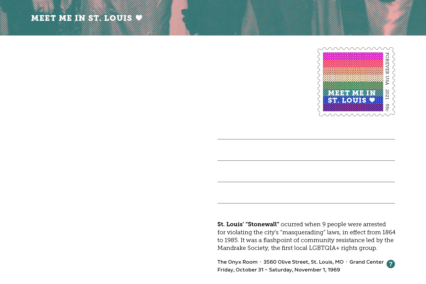
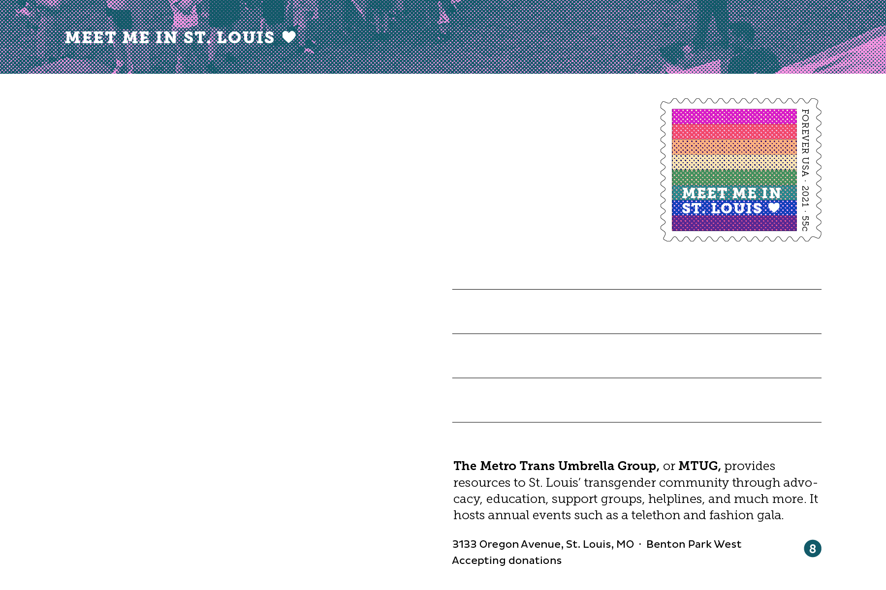
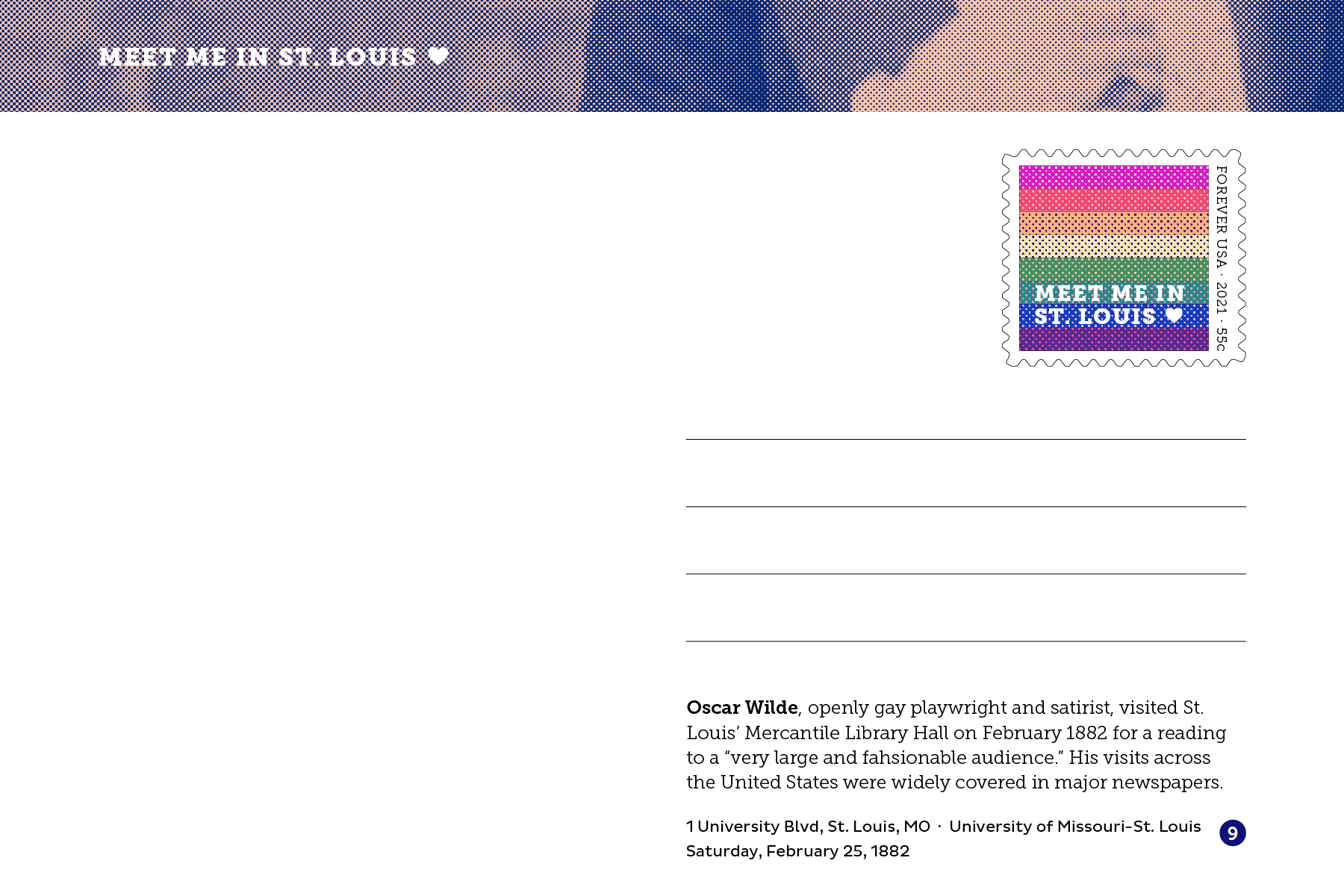
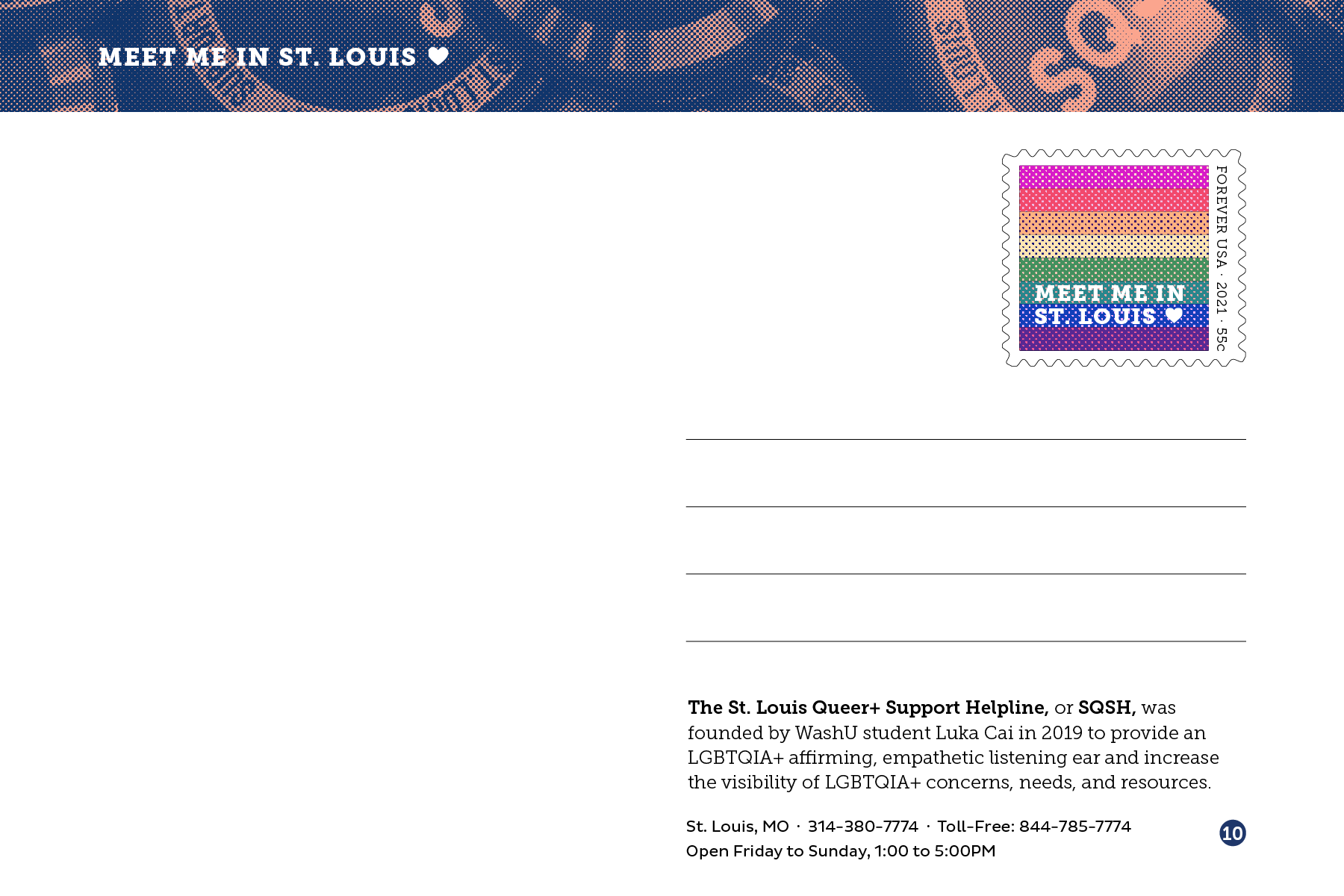
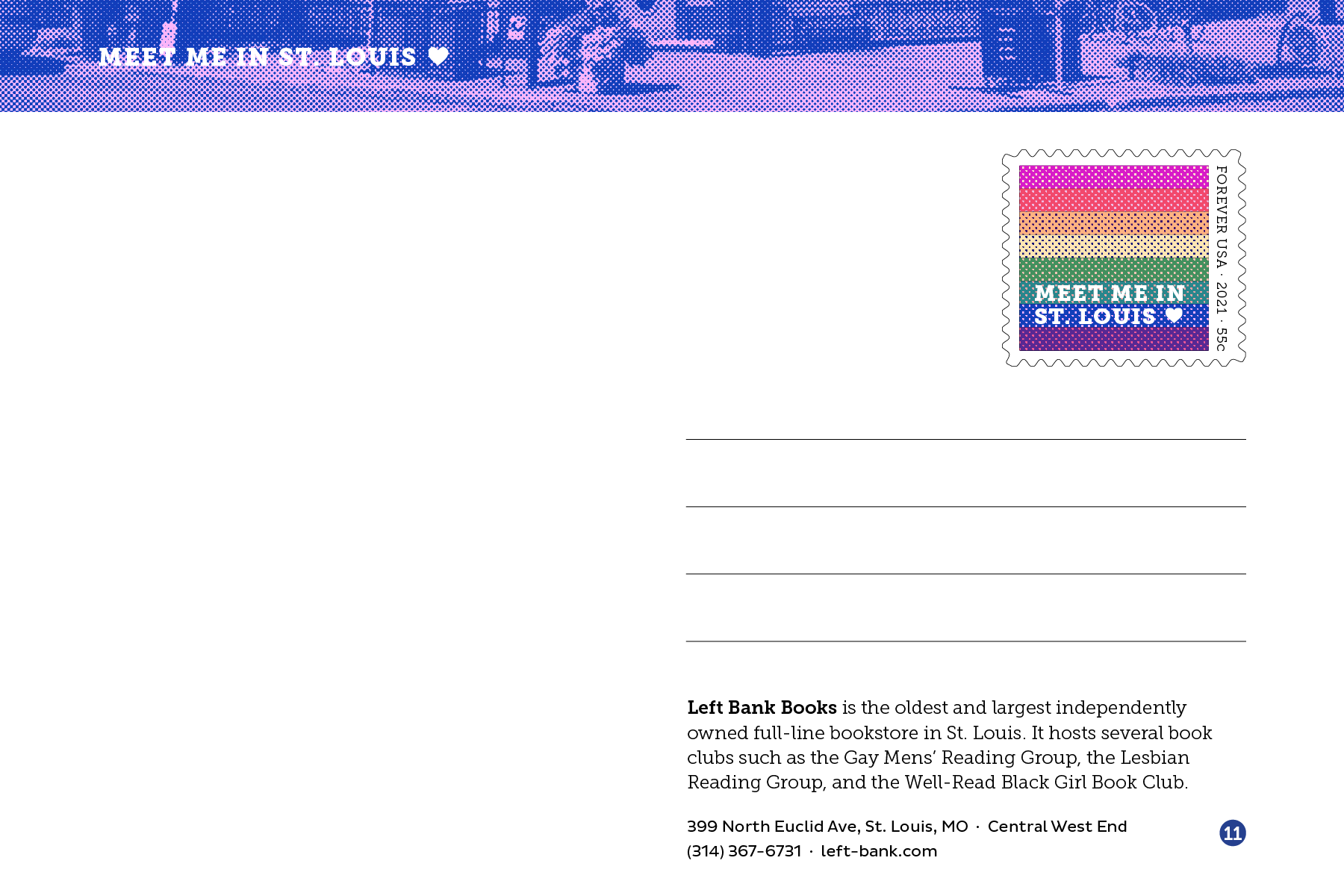
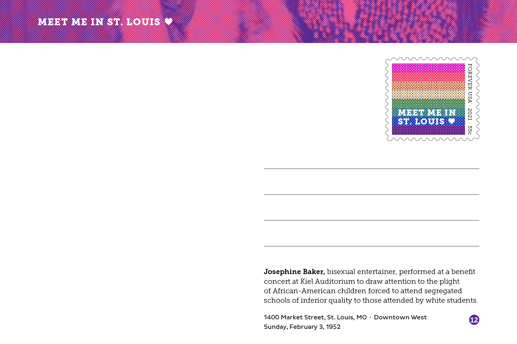
On each postcard’s back, I wanted the description to explain the front as well as justify why the postcard was part of the set. This was especially important with famous figures who people might not recognize as LGBTQ+, such as Tennessee Williams and Josephine Baker.
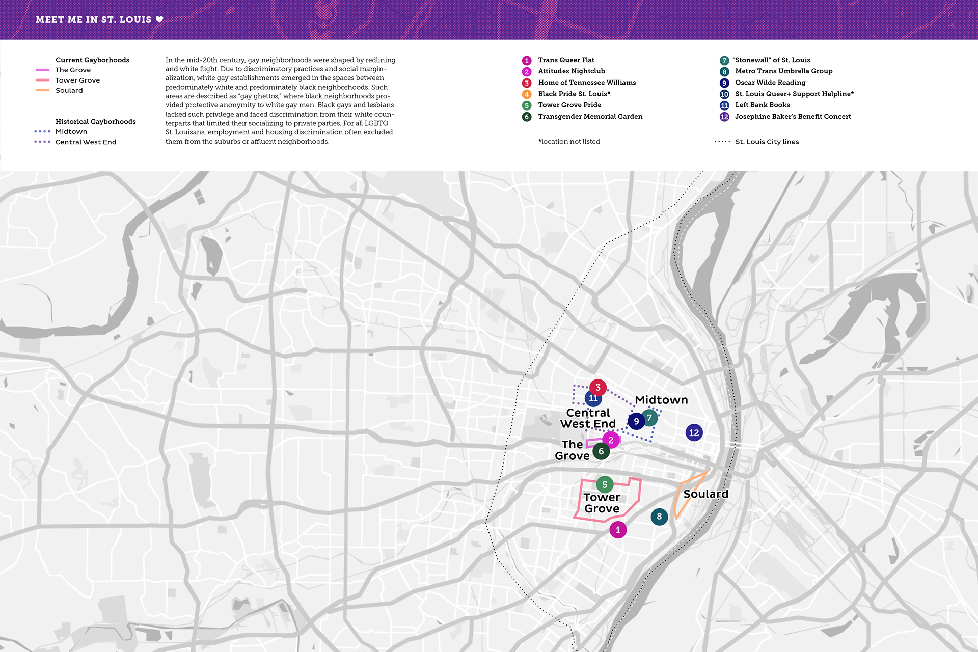
The back of the foldable map
The front of the foldable map
My process was more linear than most of my projects this semester. I felt like I had a decently clear vision from the beginning of what I wanted to do, though I wasn’t always sure how to execute it. Compiling and editing the photographs was probably the longest part. I’d never really made a package for anything (except for my tea box last semester), so it was difficult yet exciting to create a working box.
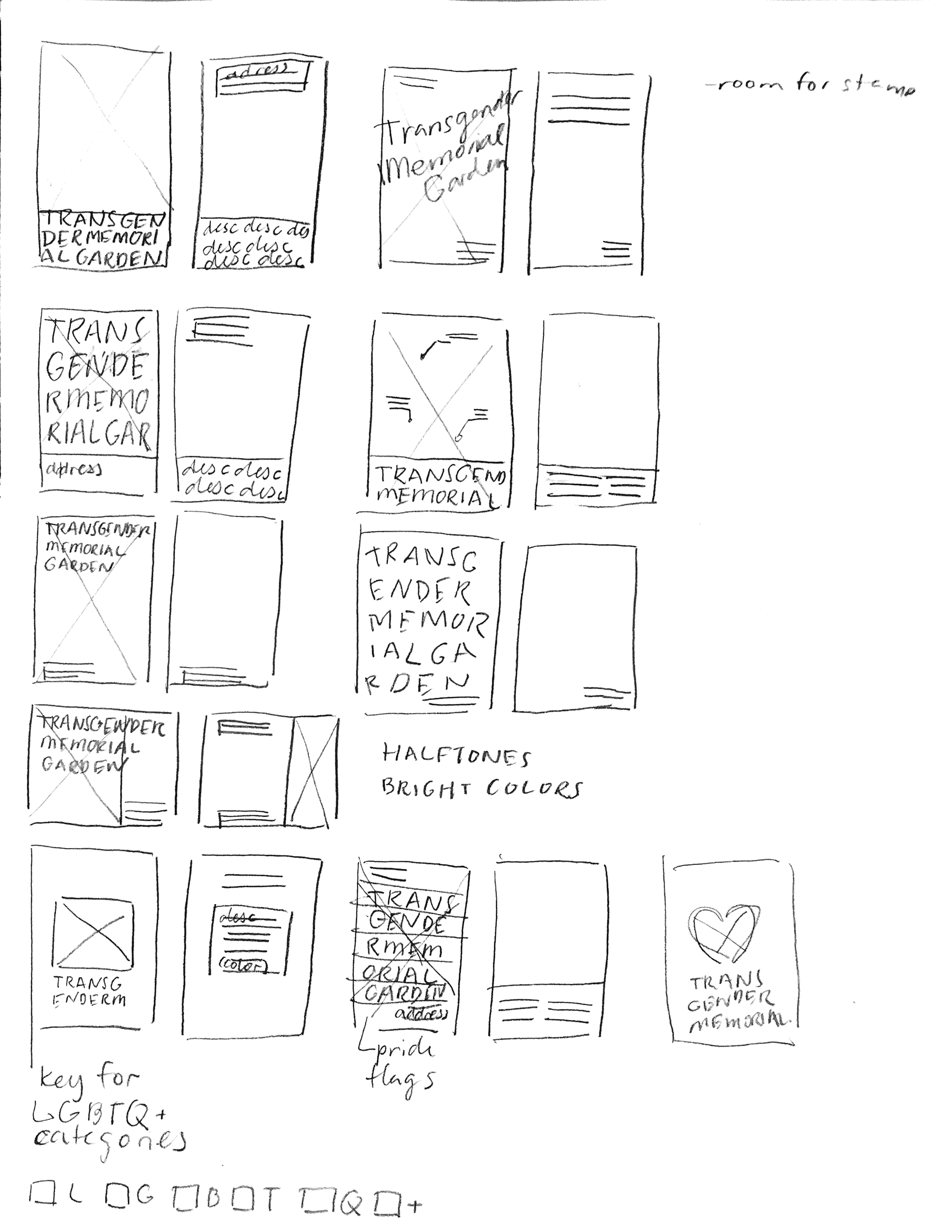
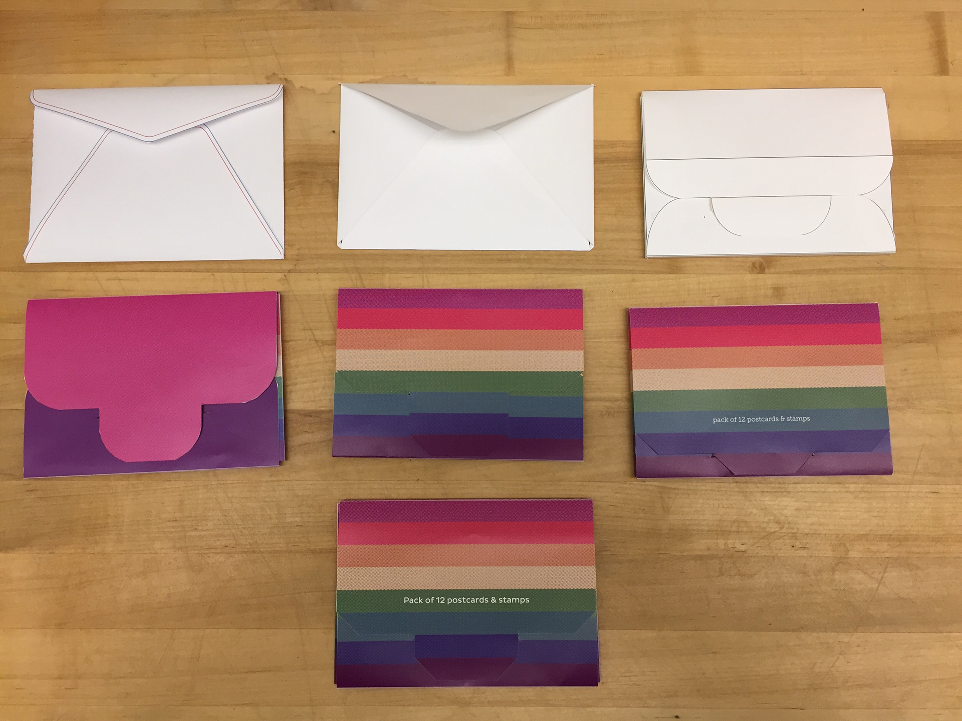
I think I am overall happy with how this project turned out. I wish I had spent more time in the beginning designing different variations of what the fronts could look like, because at a certain point I began to feel they were a bit simple (my professor said this was because I’d been staring at them for too long, but I’m not sure).
My peers and professors commented that they enjoyed the wraparound flag stripes on the box, the inclusion of a map, and the clean feel of the packaging. If I were to continue with this project (which is very tempting), I would make more postcards to add to the initial 12 and create more stamps using more pride flags.
Attribution
Pluto Sans designed by Hannes von Döhren for HVD Fonts. Should I feel guilty about using the same typeface in two projects during one semester? Let me know in an email!
Museo Slab designed by Jos Buivenga for exljbris Font Foundry. I first used the Museo family in Spring 2019 and have since noticed it in a lot of unexpected public spaces like ads by the Metro. Do you think it’s overused? Tell me in an email!
Mentorship provided by Jude Agboada
Valuable feedback provided by my classmates
