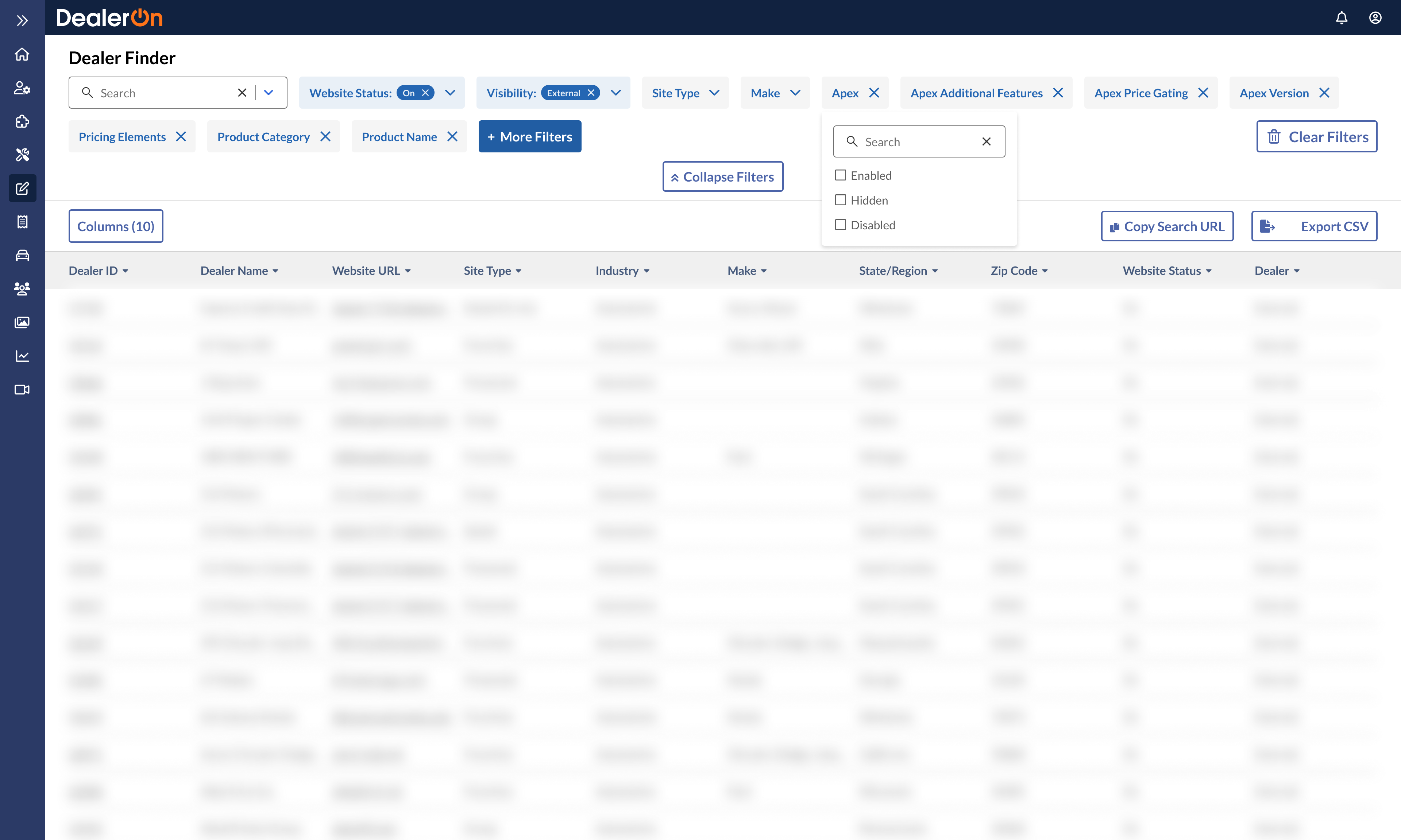
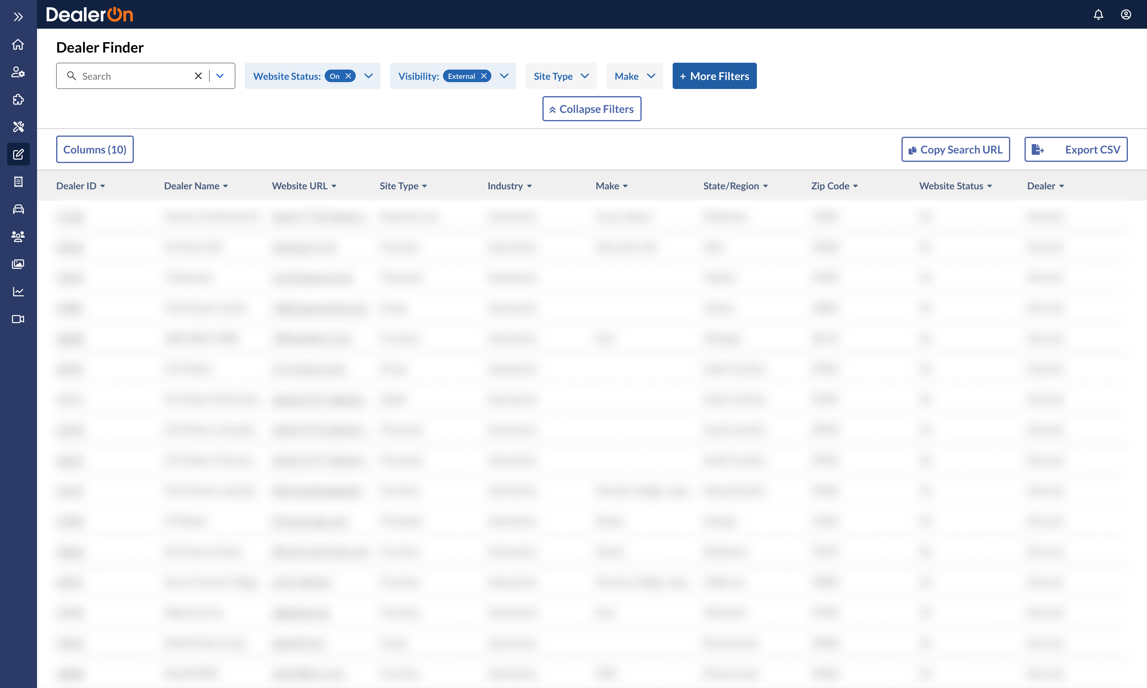
One of the main purposes of a car dealership website is to collect leads, or people who are likely, or at least looking, to buy a car. To collect leads, dealers use forms. But over the span of ten years, DealerOn’s legacy forms management system became cluttered and unmanageable with too many bandaid solutions.
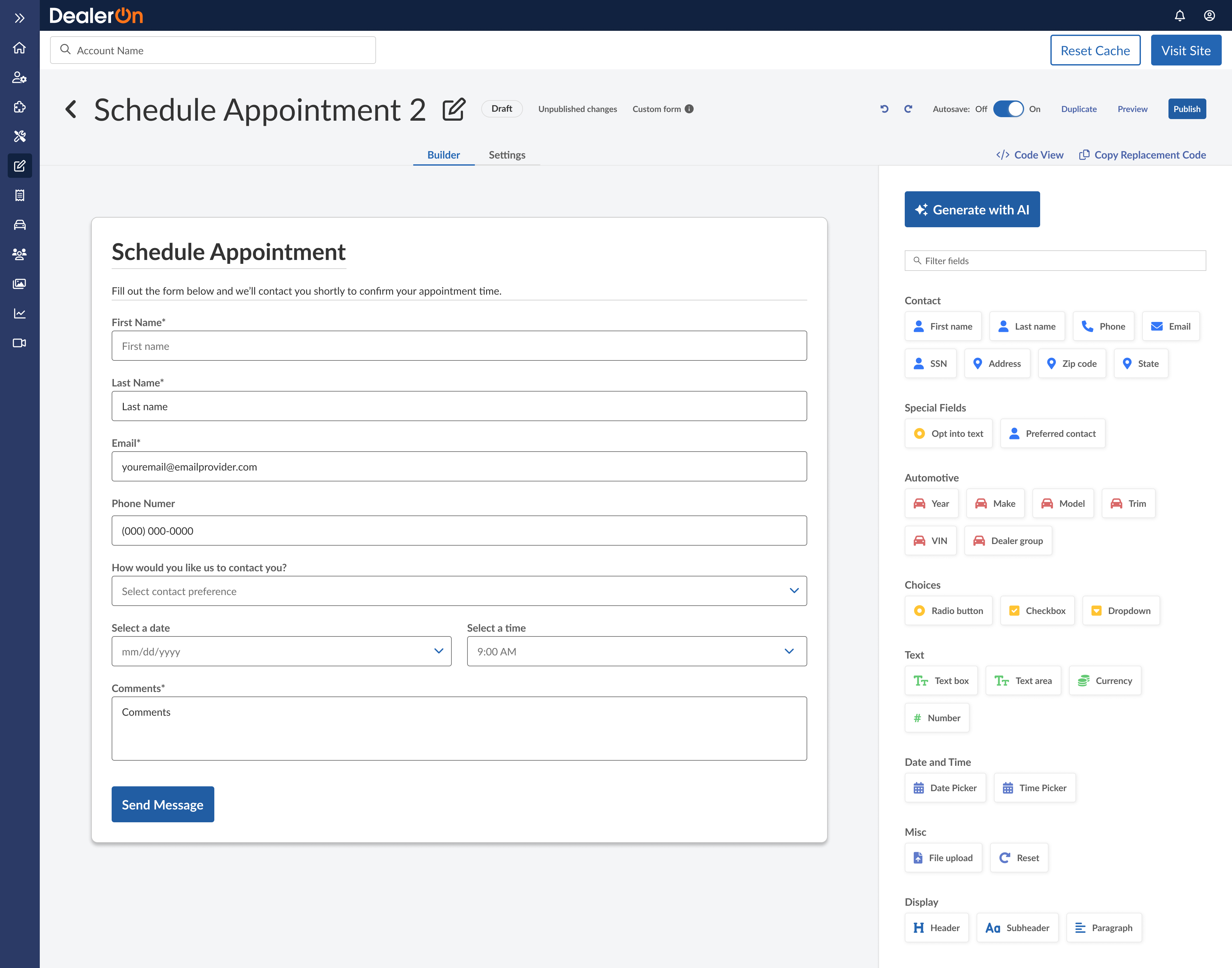
To solve stakeholder concerns, I worked with the PM and engineers to research, design, test, iterate, and develop a form builder and management system.
Role: Lead UX Designer
Project status: MVP built for the National Automobile Dealers Association show in February 2024. Full product currently being built!
Process
June to September: scoping, researching, wireframing, prototyping, iterating
October: concepting, prototyping, and testing generative AI concept
August through May: meeting weekly with Tiger Team engineers, supporting with feedback and mockups
June to September: scoping, researching, wireframing, prototyping, iterating
October: concepting, prototyping, and testing generative AI concept
August through May: meeting weekly with Tiger Team engineers, supporting with feedback and mockups
Team
PM: Javier Urbina
Tiger Team: Megan Korpics, Tom Scheffer, Helene Goyat
Additional UX support: Sierra Willenburg
PM: Javier Urbina
Tiger Team: Megan Korpics, Tom Scheffer, Helene Goyat
Additional UX support: Sierra Willenburg
“It’s a beautiful UI to drag and drop different items to create forms and manage custom forms and platform forms.”
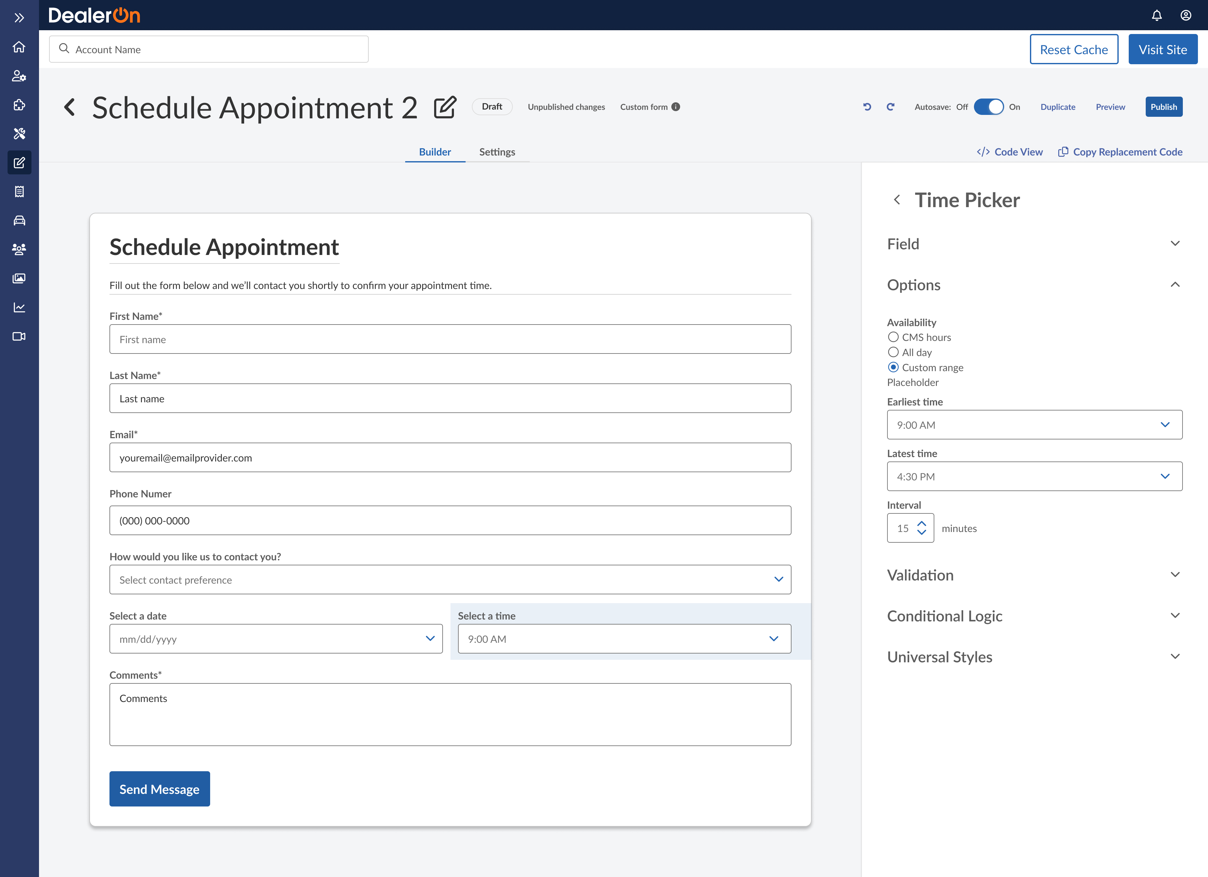
This project is currently being built by our in-house engineering team! Please see the demo below (and feel free to unmute it).
Project Overview
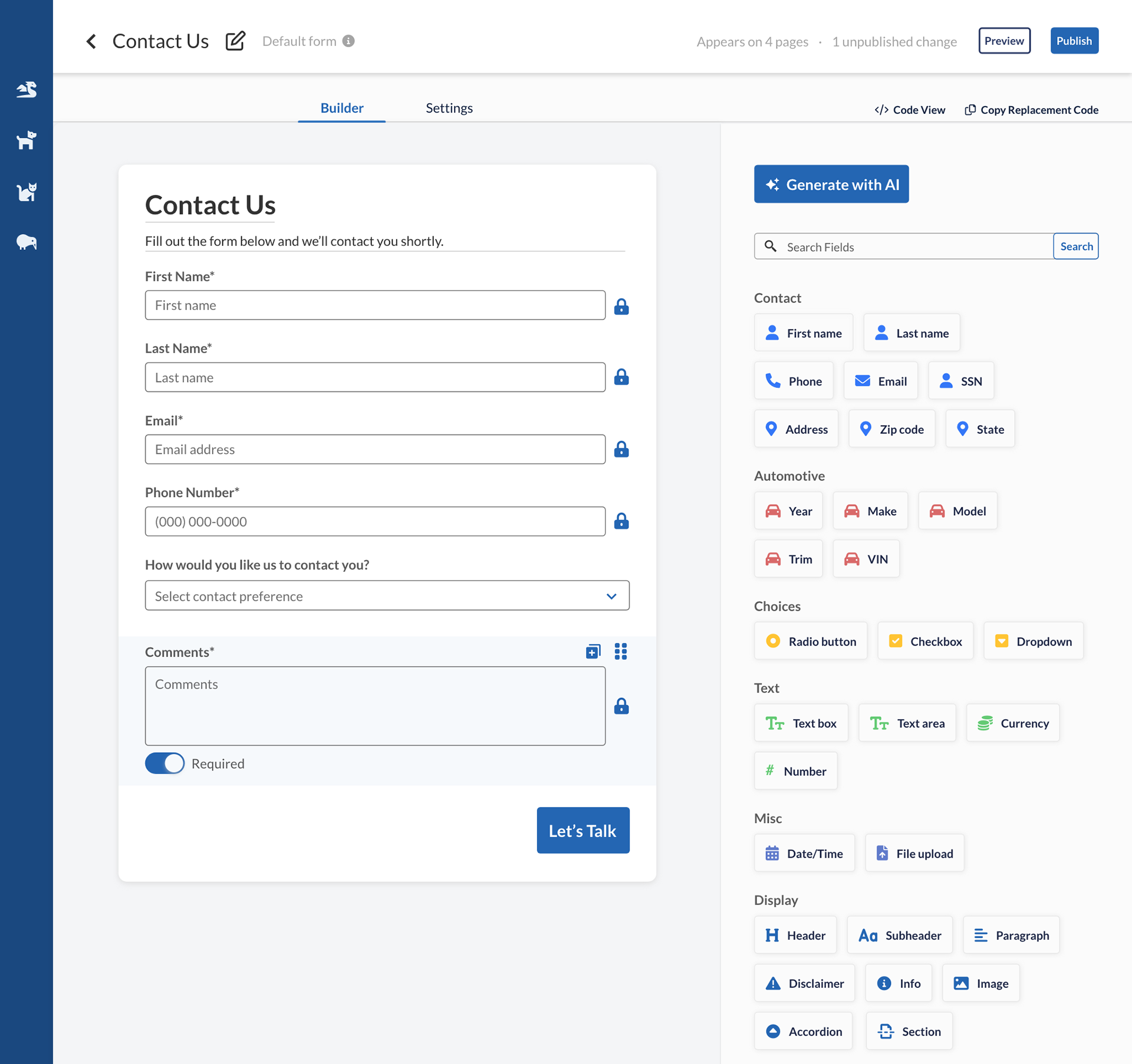
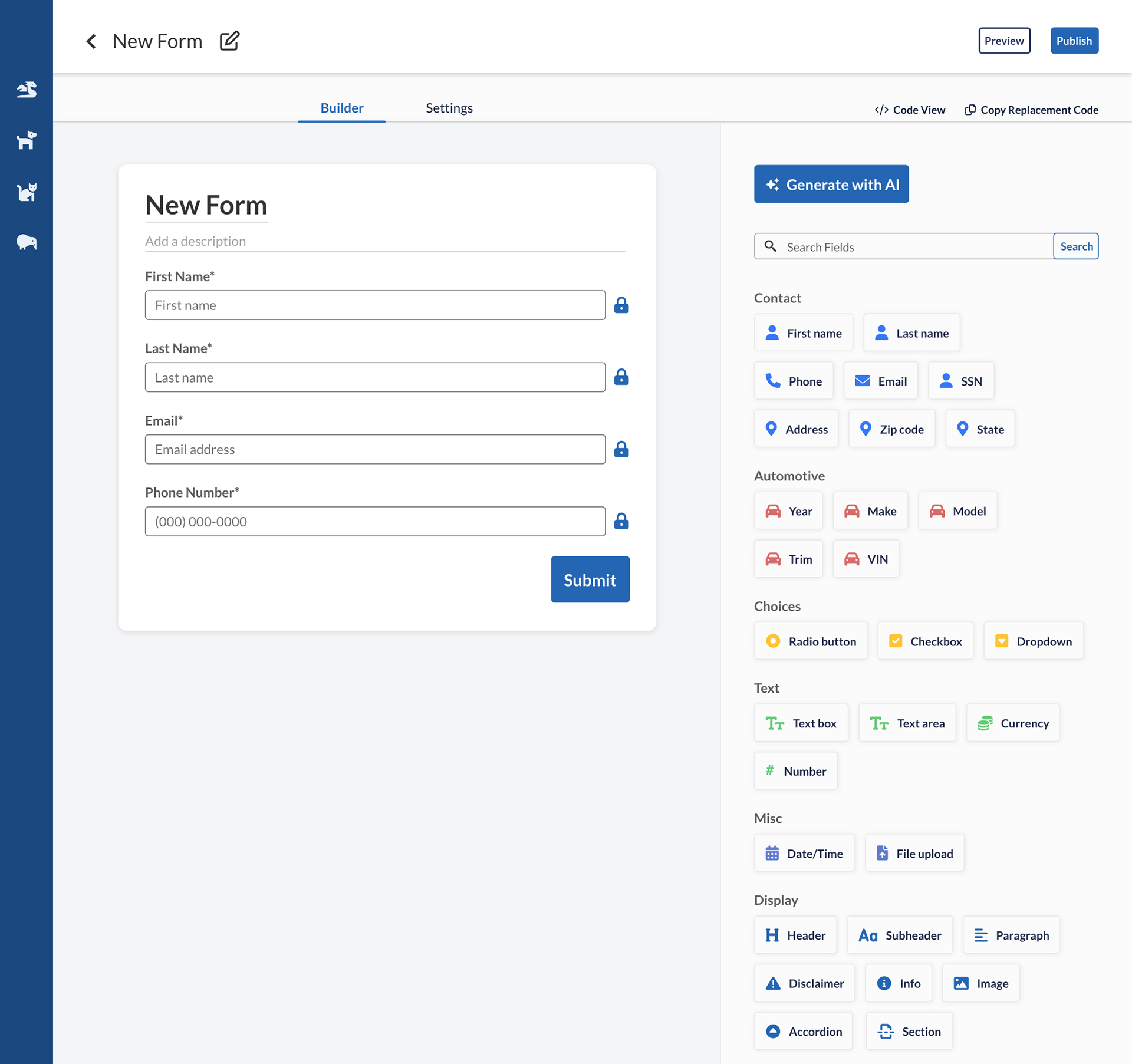
Our goals: make the form builder visual and rethink forms management.
The Senior VP of Operations, a longtime internal stakeholder revealed the true pain point: the monstrosity that was the forms management system.
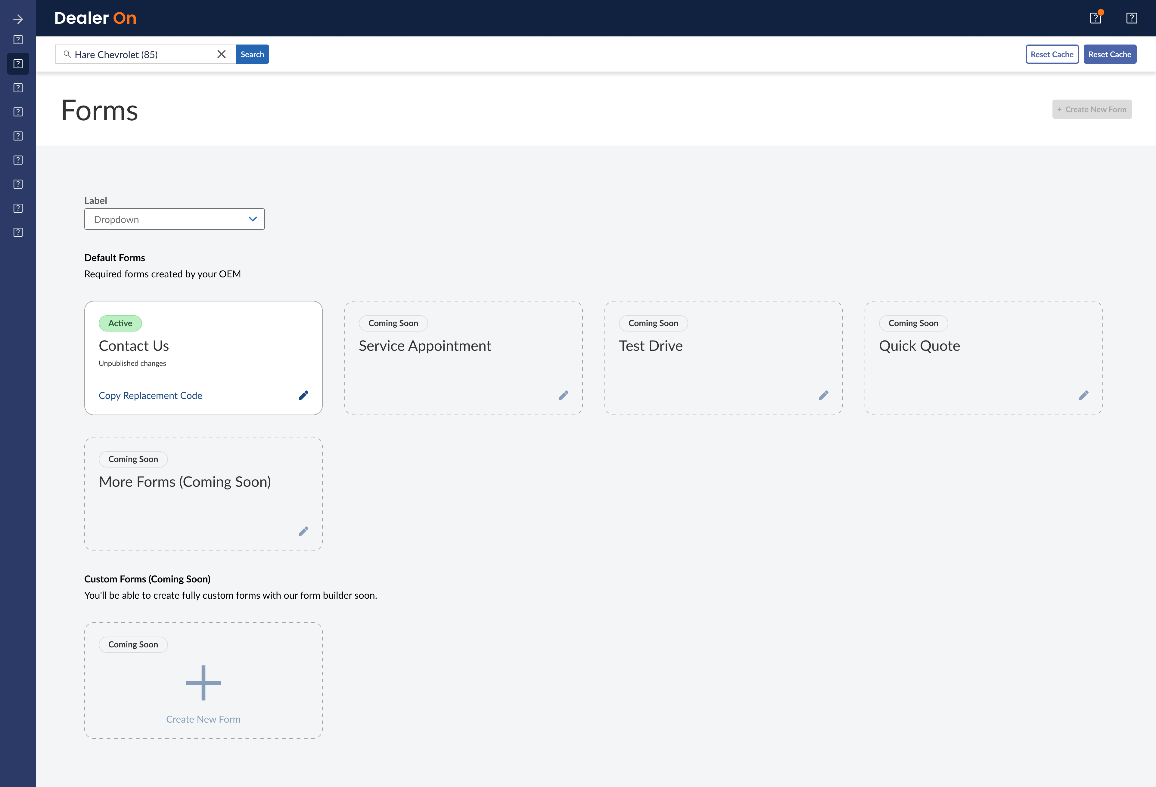
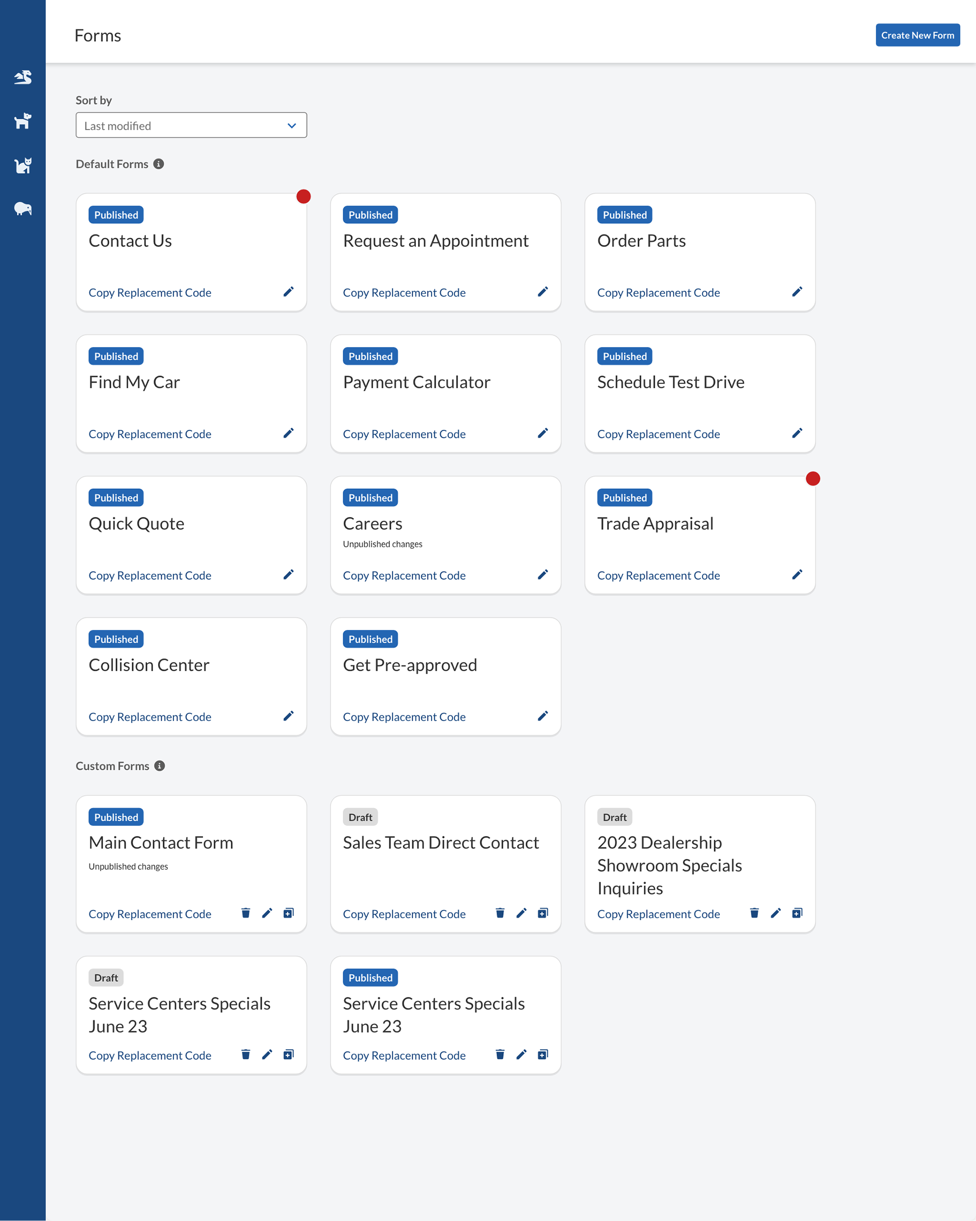
There were two types of forms: “platform forms” and “custom forms.” Platform forms were default forms on every dealership’s website, like Contact Us, Get Pre-Approved, and Schedule an Appointment. They were uneditable. If a dealership wanted to add a field or change anything at all, they had to contact DealerOn to create an entirely new “custom form” from scratch. Still, after being published, custom forms were uneditable too.
DealerOn’s current form builder only lets users export the form as HTML and doesn’t allow saving or managing forms. So there’s no way for users to pick up where they left off unless they know HTML.
Some CMS users manage many websites under a single OEM, so if they need to add a form on 100 different websites, they have to build a custom form and paste that code 100 times. And they’d better hope they don’t have to make any changes to that form, because then they’d have to build a completely new custom form and paste that code 100 times again.
“I’ve waited 13 years. If it takes 1 more year, that’s fine.”
Shortly after I joined DealerOn, I was brought onto this project as the lead UX designer, taking over for Sierra Willenburg. The project was fairly new, but the product itself was old.
“I’ve waited 13 years. If it takes 1 more year, that’s fine. I don’t feel confident in [previous solution]. After all this time, just to do that doesn’t seem like proper path.” —Jon Rothbard, Senior VP of Operations
Some work had been done already, but after hearing how badly Rotbhard wanted this project made right, we knew we needed a closer look into the management strategy.
I gathered all the 4,000+ form-related Jira and Salesforce tickets we could find into a spreadsheet and analyze them to find the most common requests dealerships ask for. Many just wanted to make a preexisting field mandatory. Imagine creating a whole new custom form just for that.
“Based on the 4,000 requests provided, the most common form templates mentioned are as follows…”
I scoured Jira and Salesforce for customer support tickets relating to forms and ended up manually entering 4,000 tickets into a spreadsheet. After removing all PII, I plugged these into ChatGPT, which gave us a good idea of the most frequent requests and the most used forms. We used this data to decide which form fields and template to build out first for the form builder’s debut at the NADA conference.
I ran an internal survey asking what respondents were using to build forms and what they thought about my prototype. In retrospect, this survey was way too long and several respondents dropped off. I’ve learned to keep surveys on the shorter end and keep product questions and prototype testing mostly separate.
My next internal survey about integrating generative AI into the builder was much more successful, with 27 responses. My main takeaways from that and interviews with CS were:
Include bulk add, keyboard shortcuts, AI assisted copy generation and editing, and ability to create new forms from AI prompts. Use AI to create new forms from Salesforce tickets, PDFs of (printed) forms.
Deliverables
Click through the frames below to view almost every deliverable, or scroll down to see happy paths and user stories.
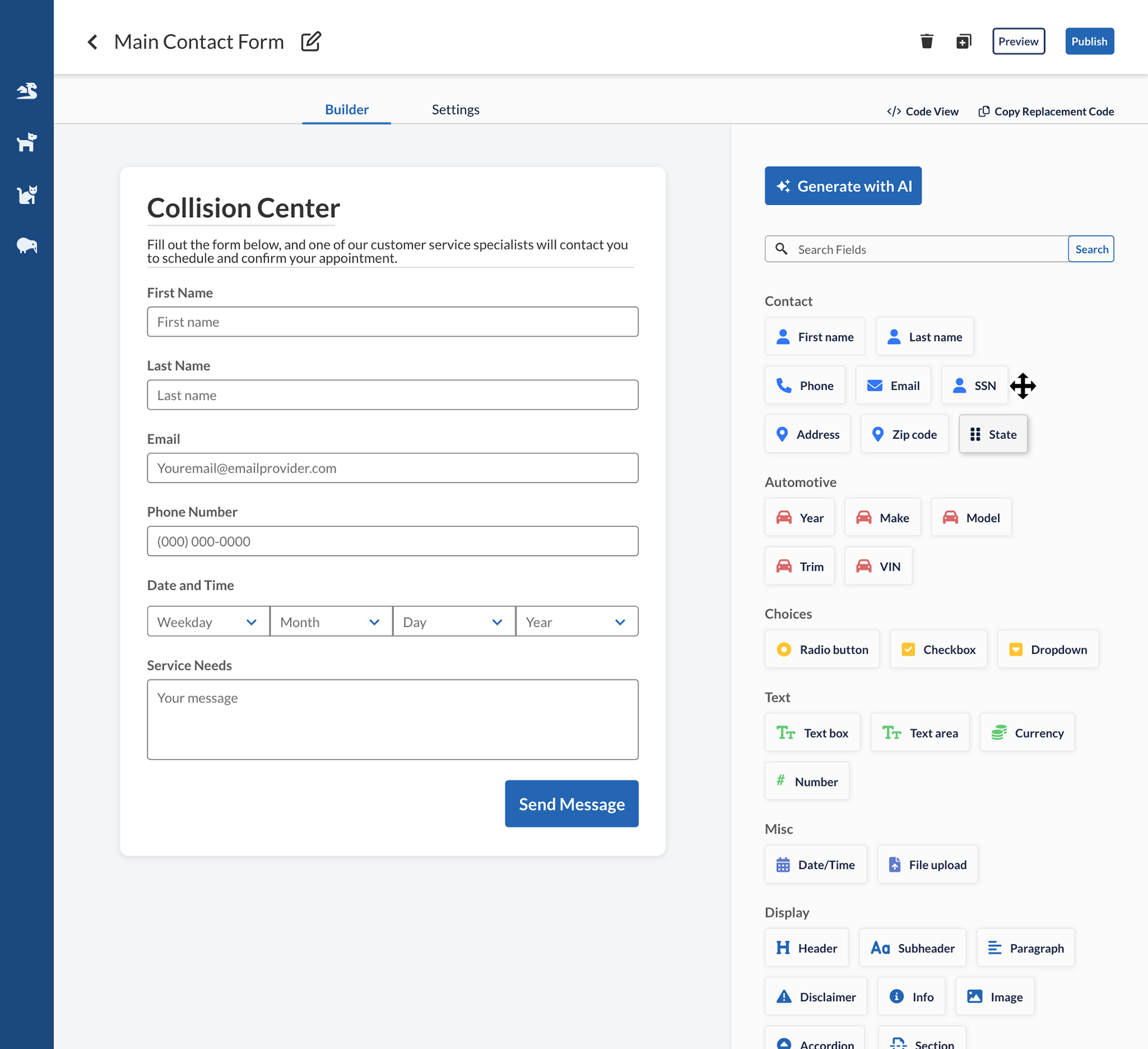
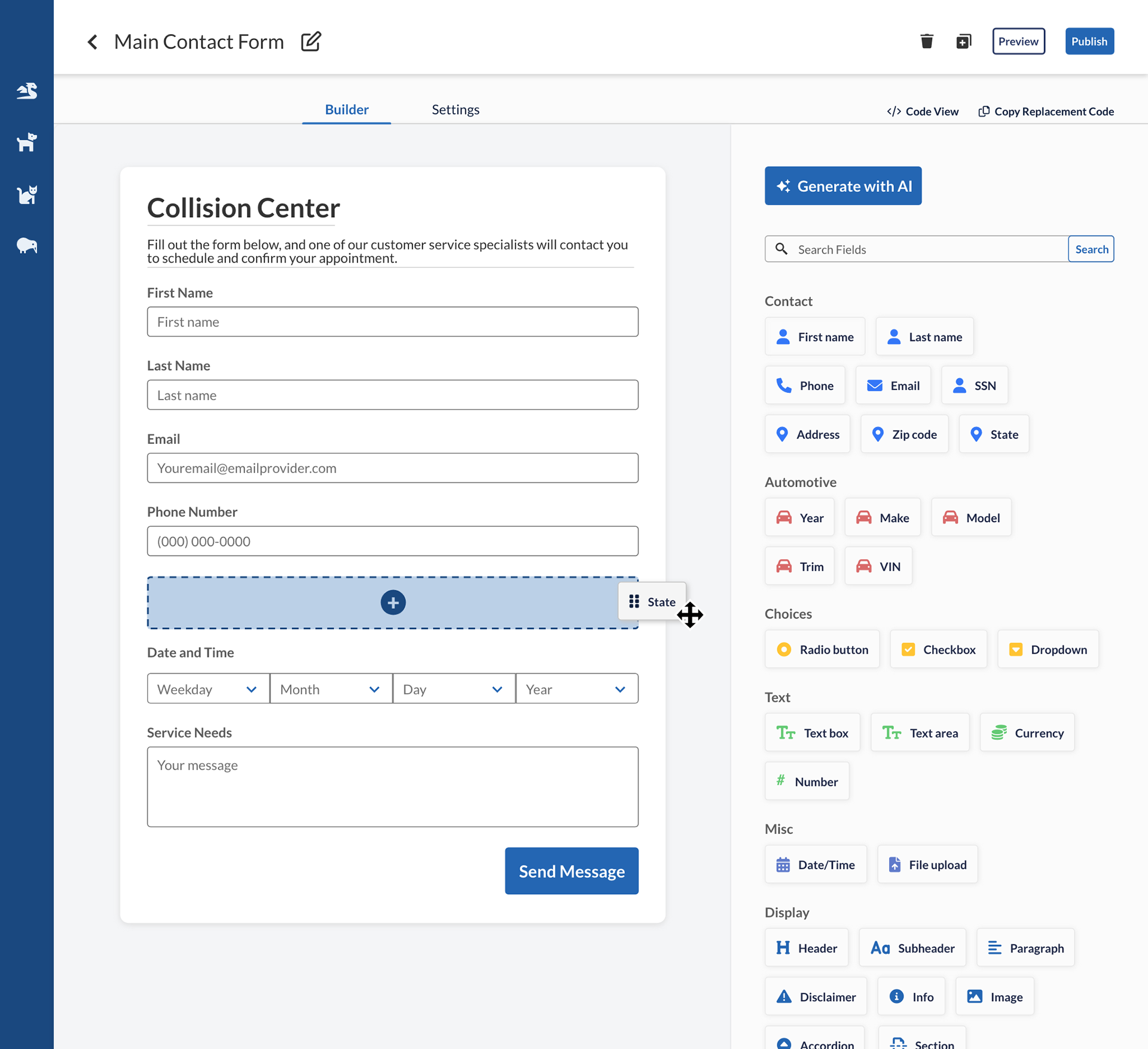
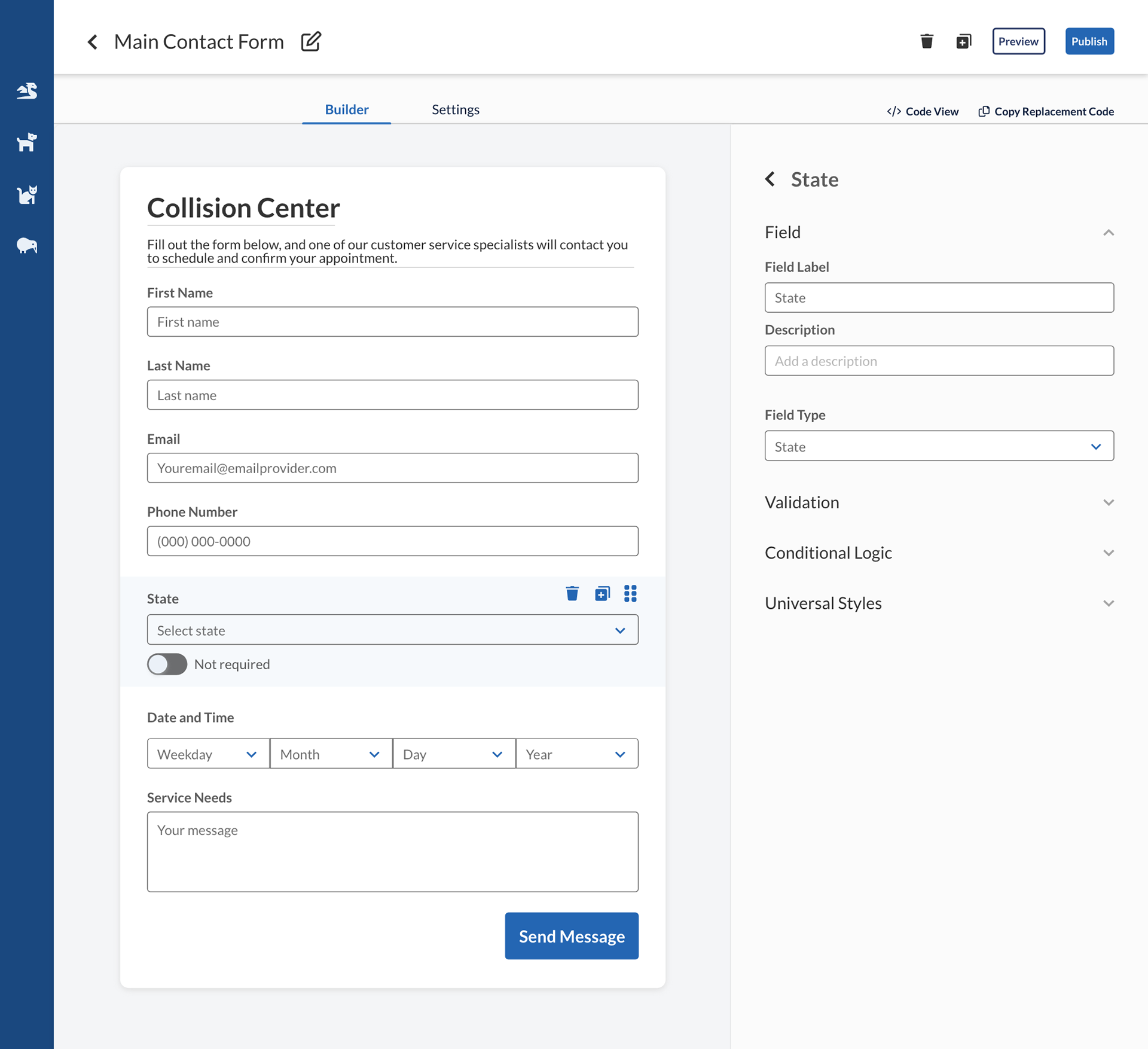
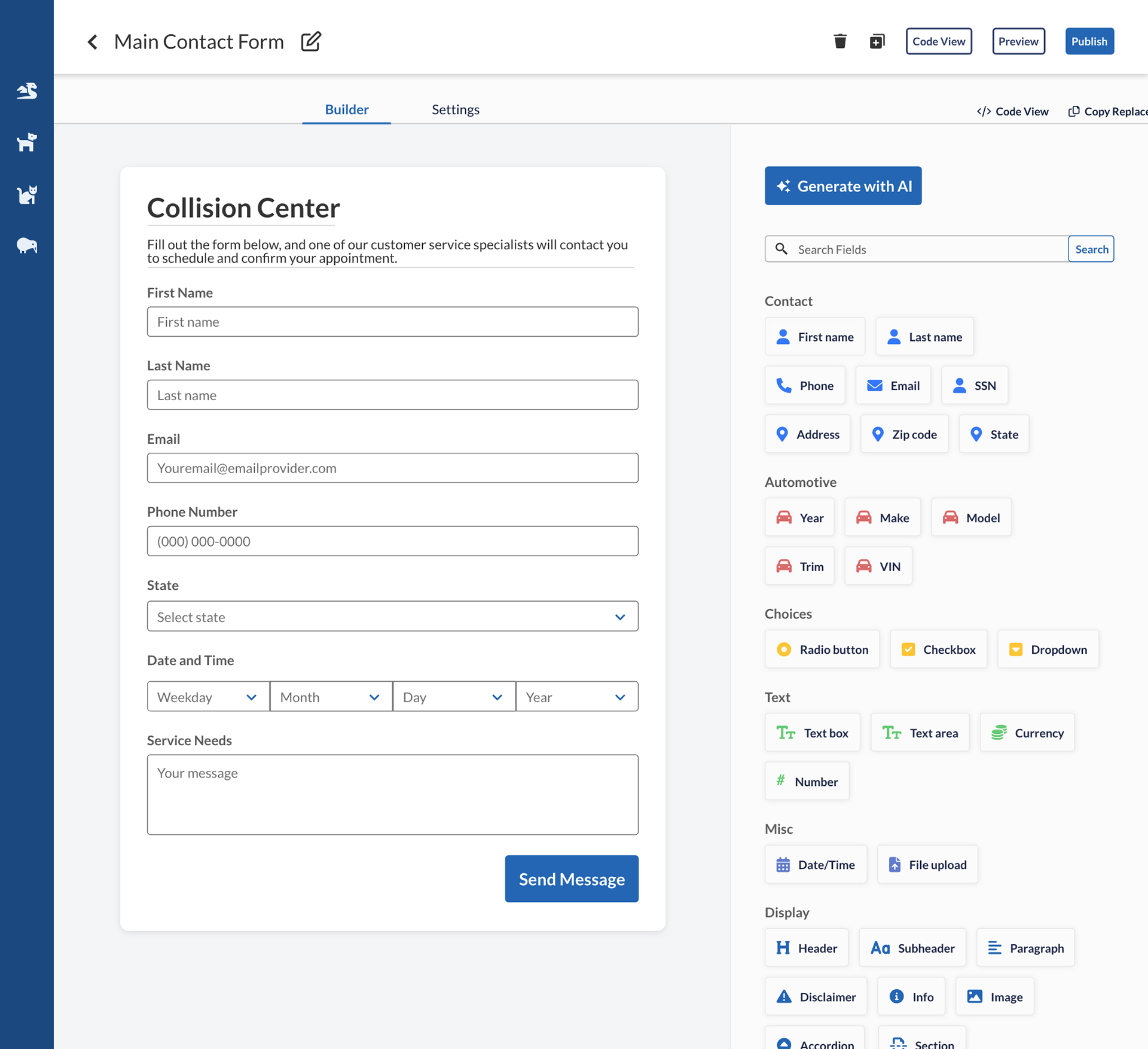
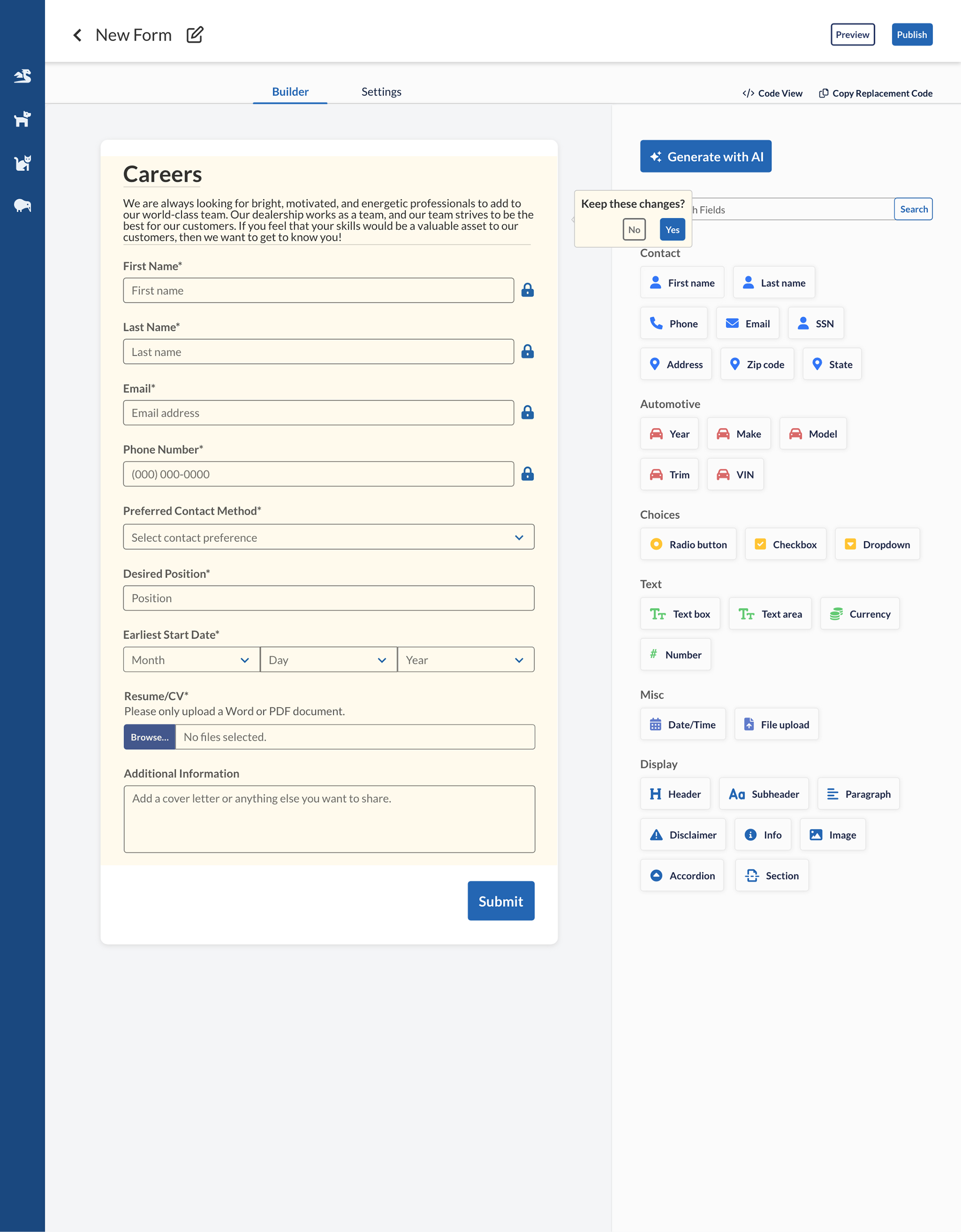
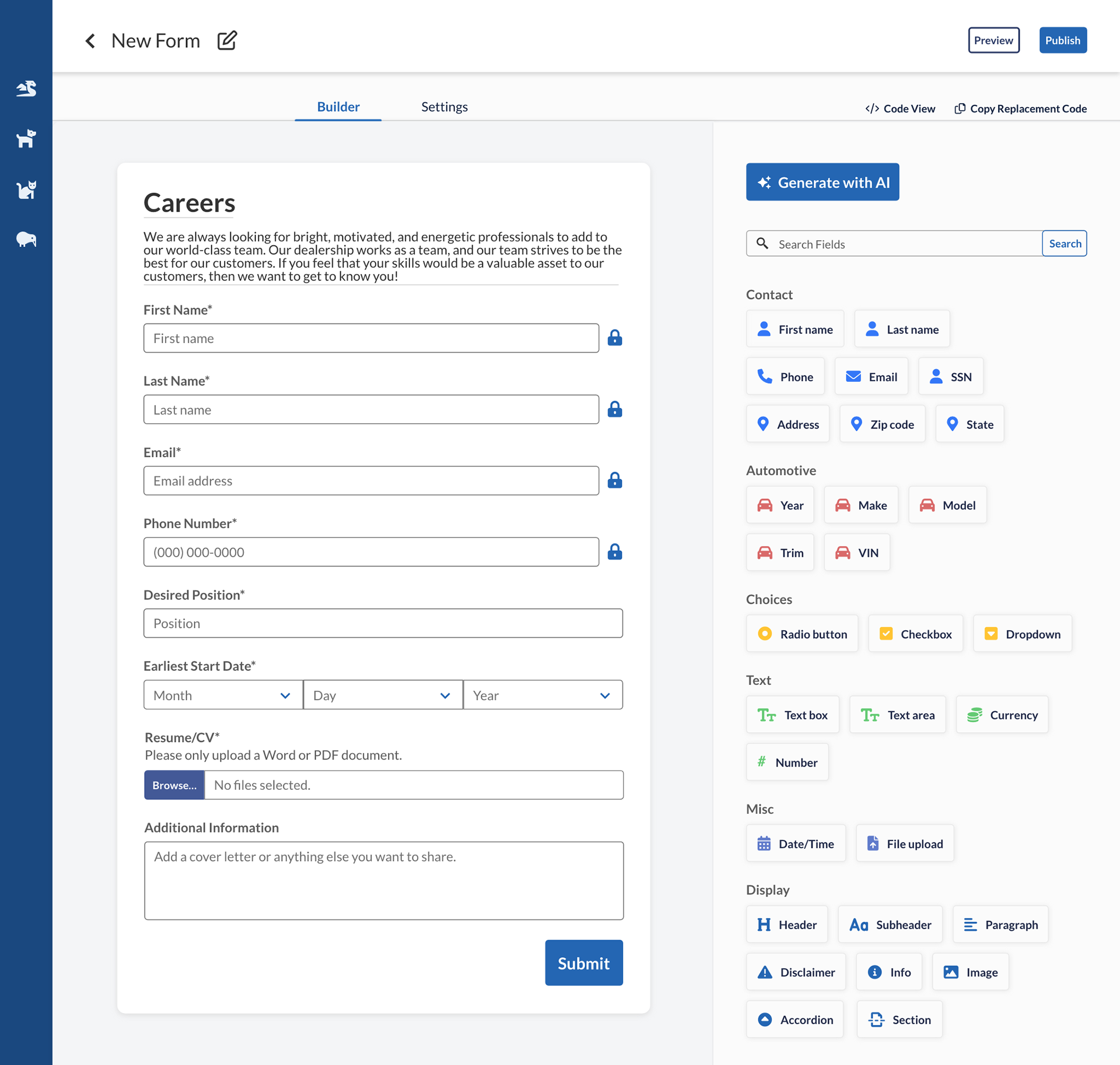
Add a new field
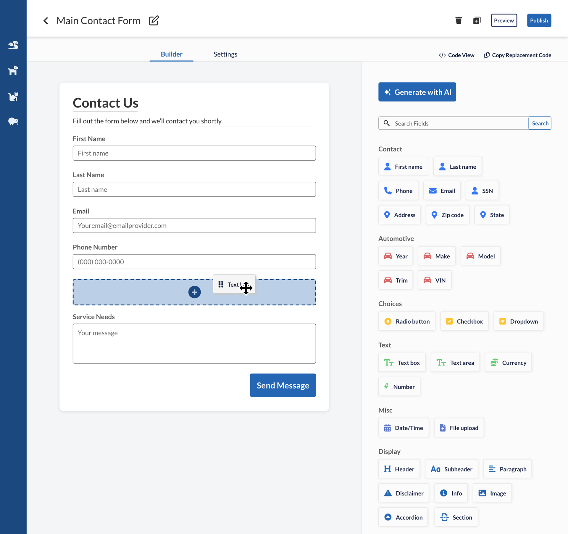
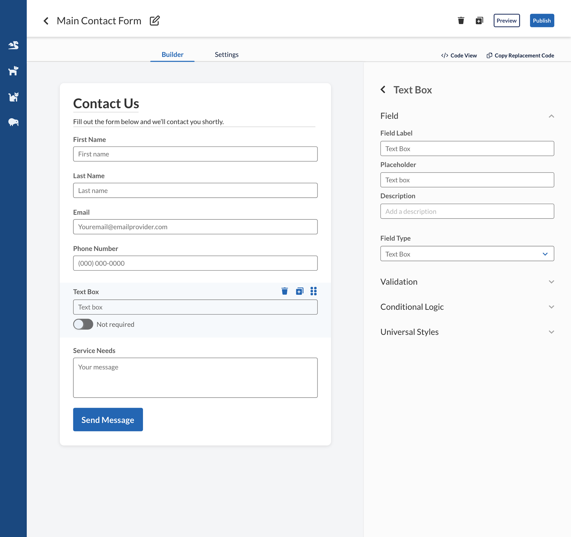
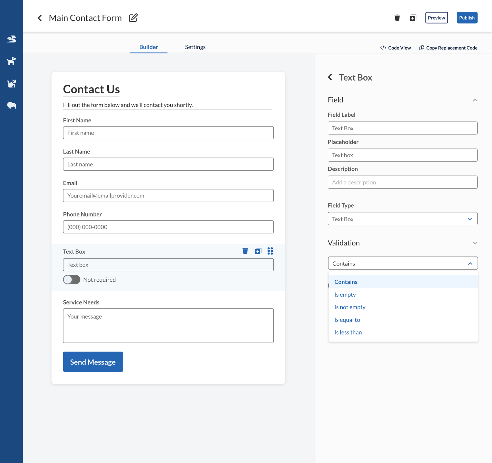
Text field behavior


Checkbox behavior

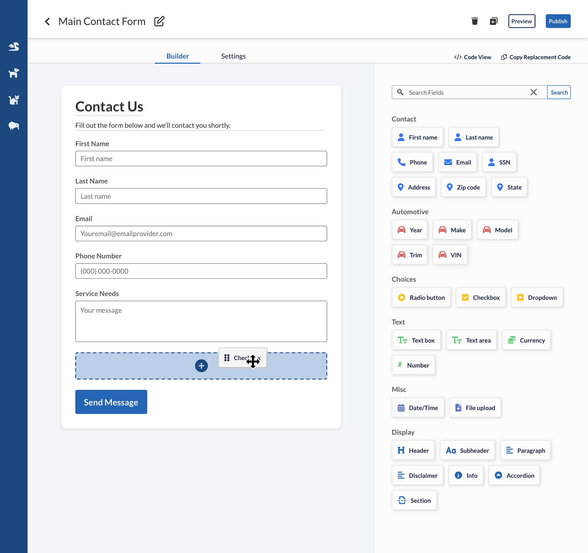
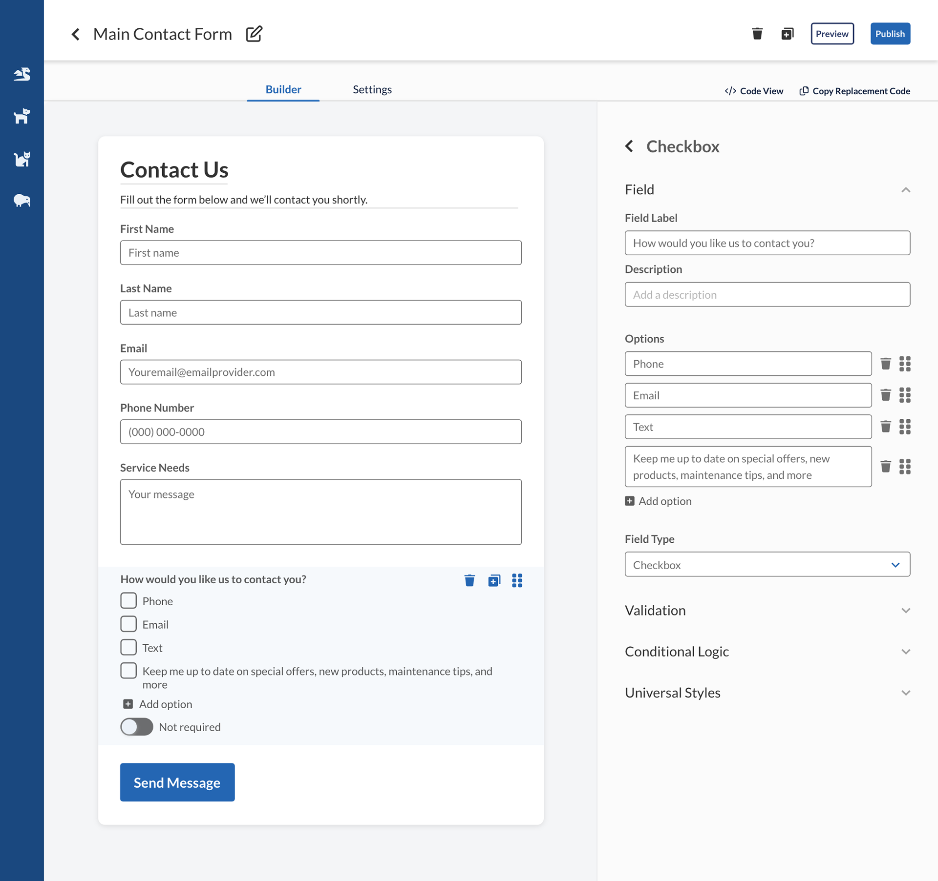
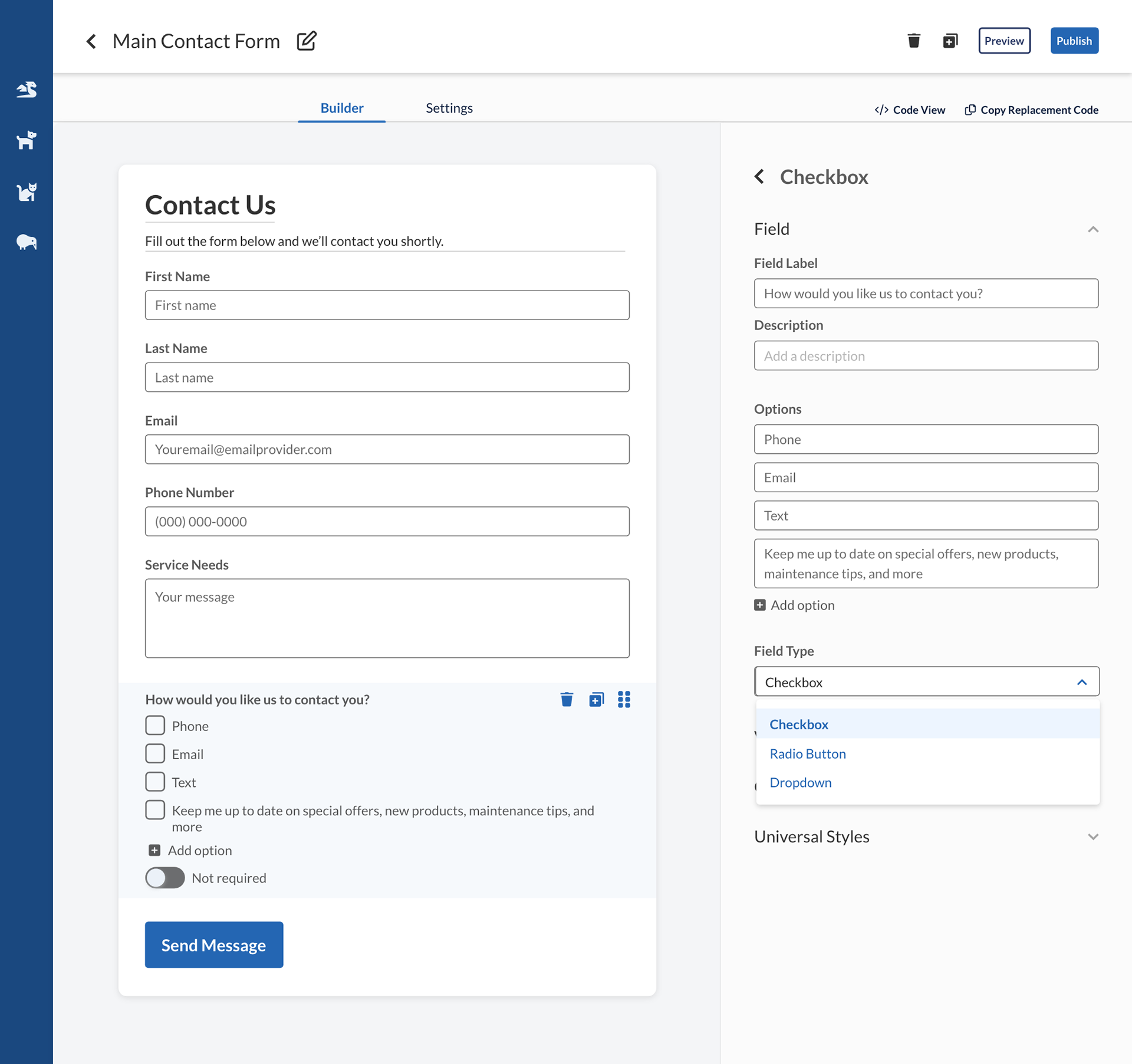
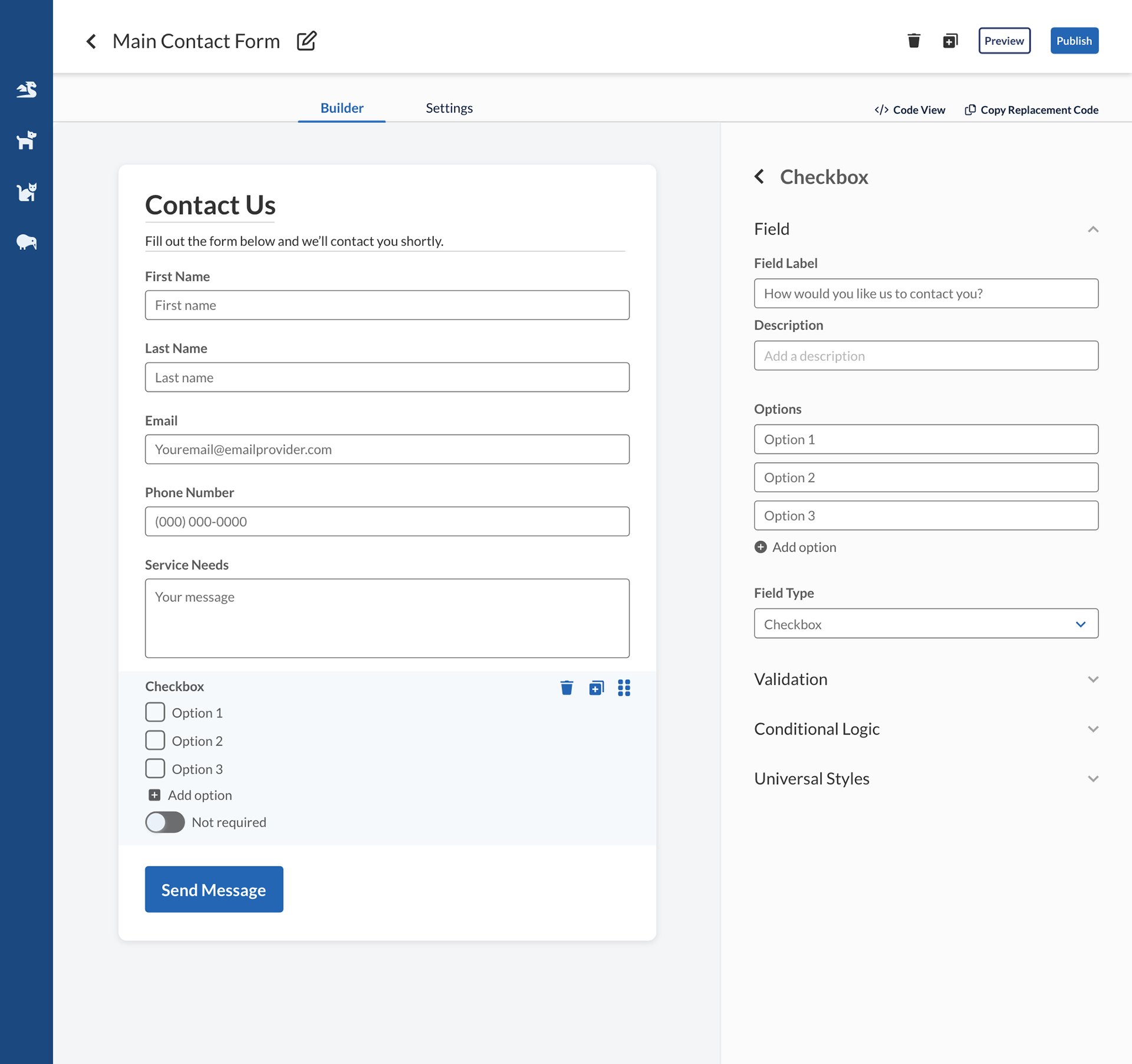
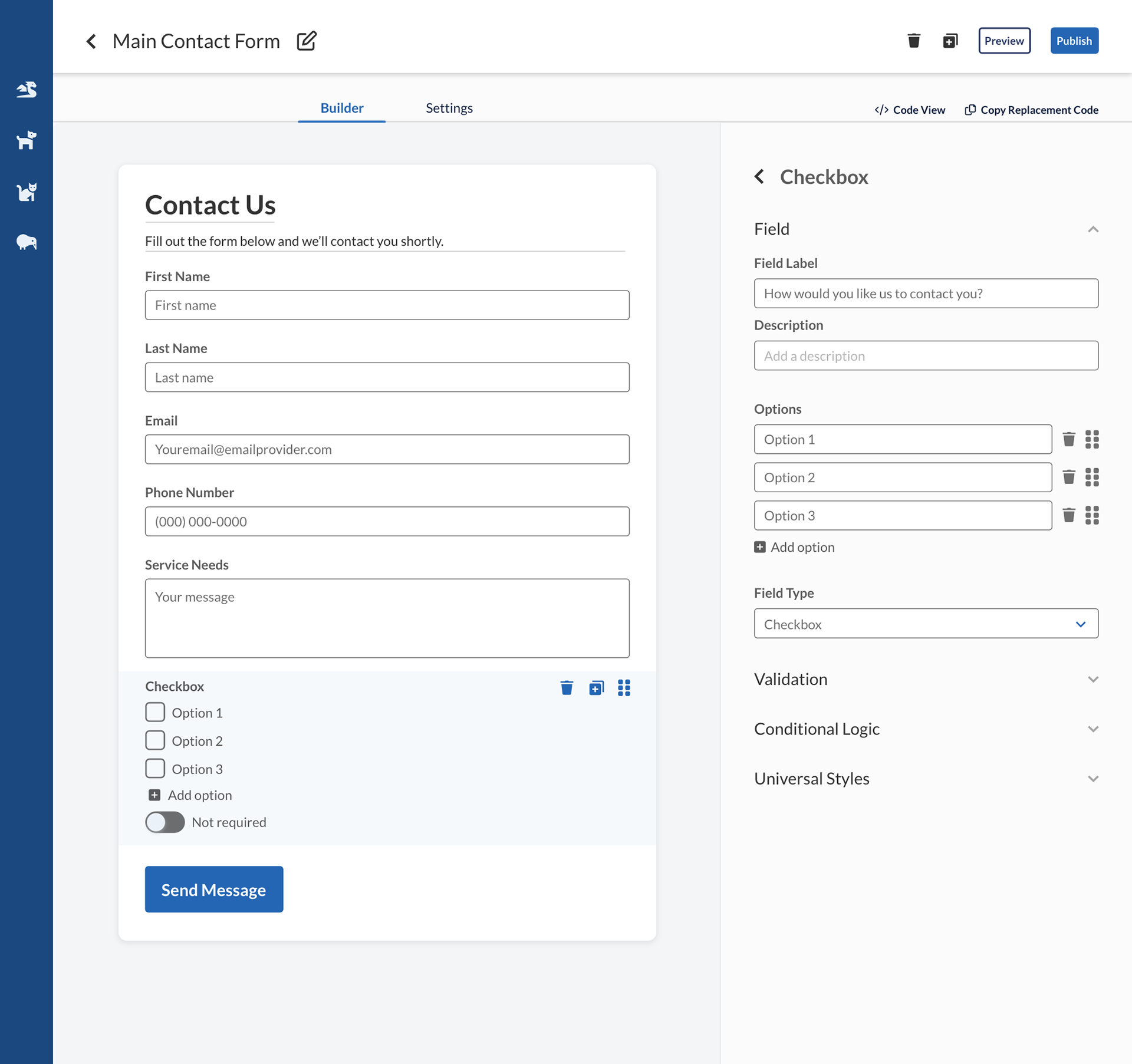
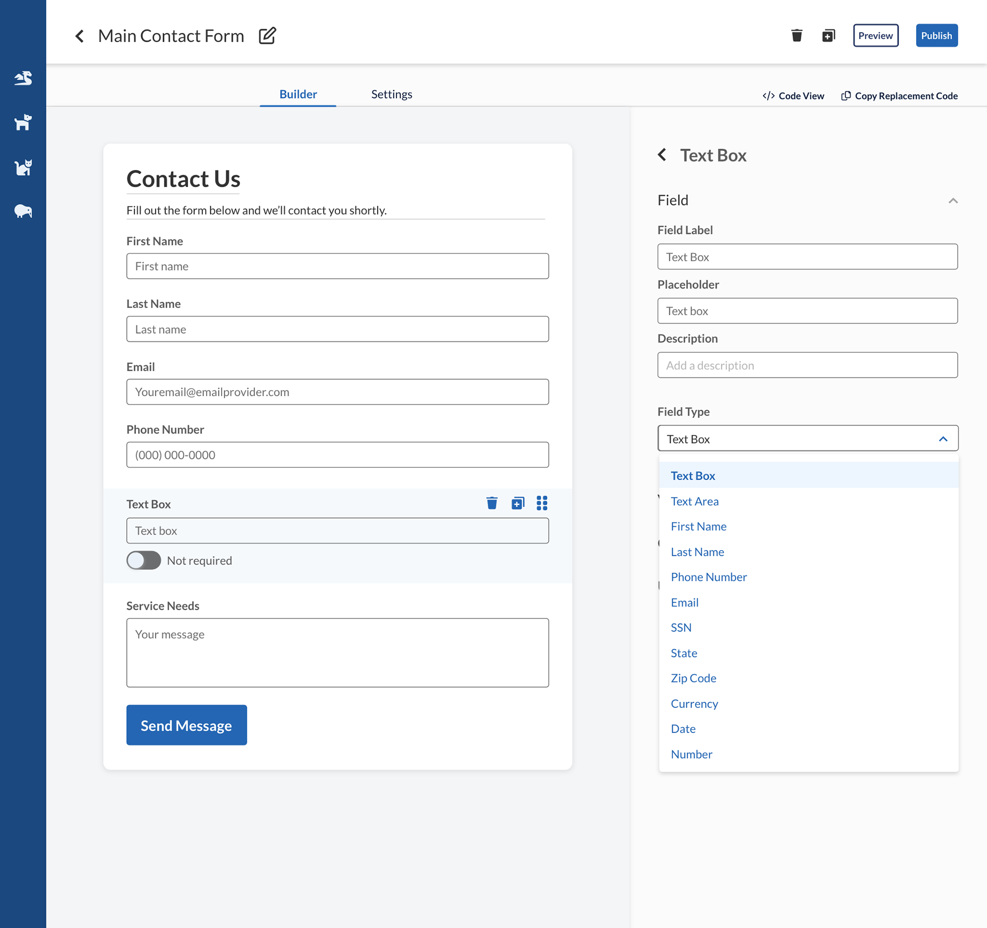
Change field type
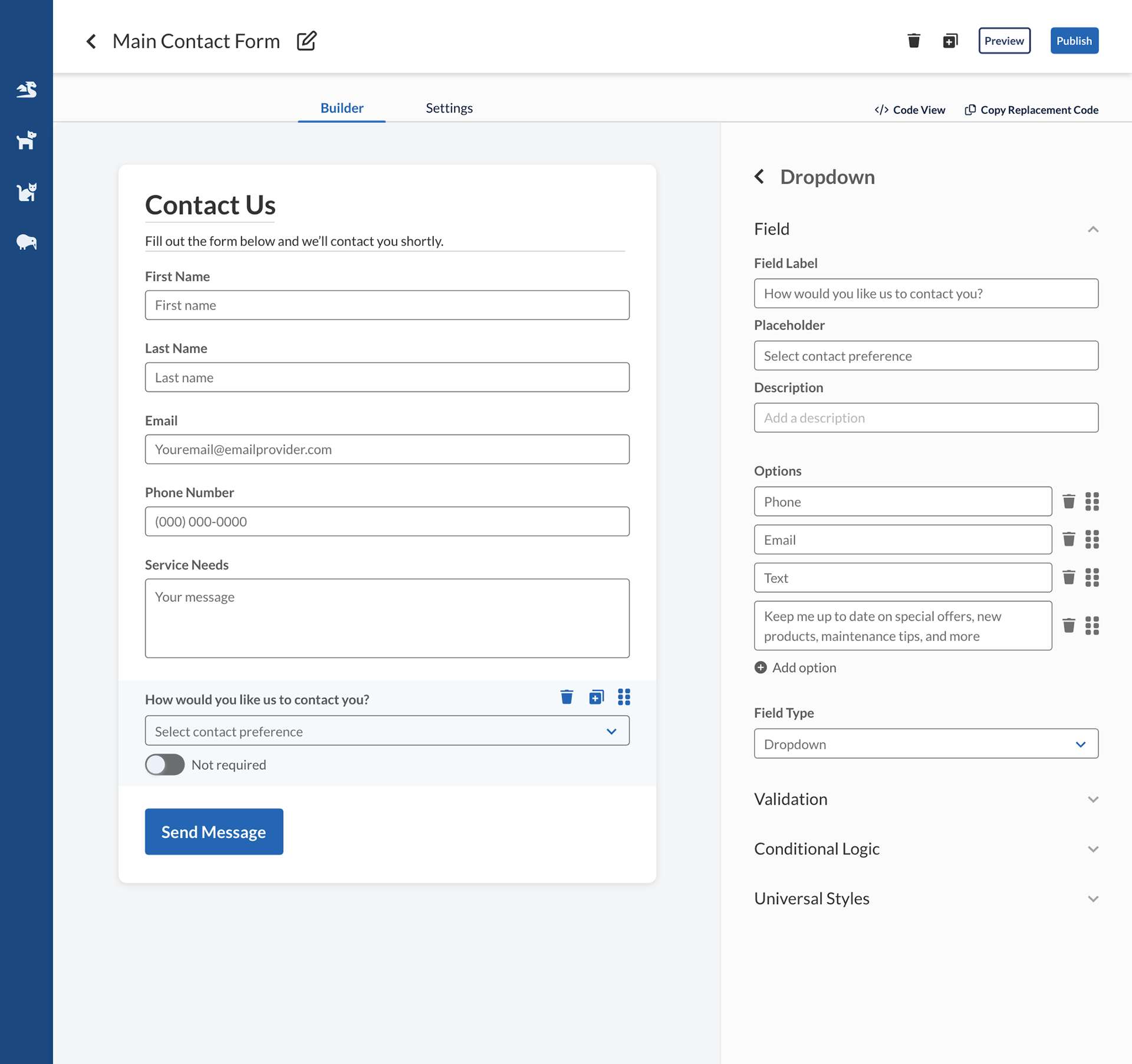
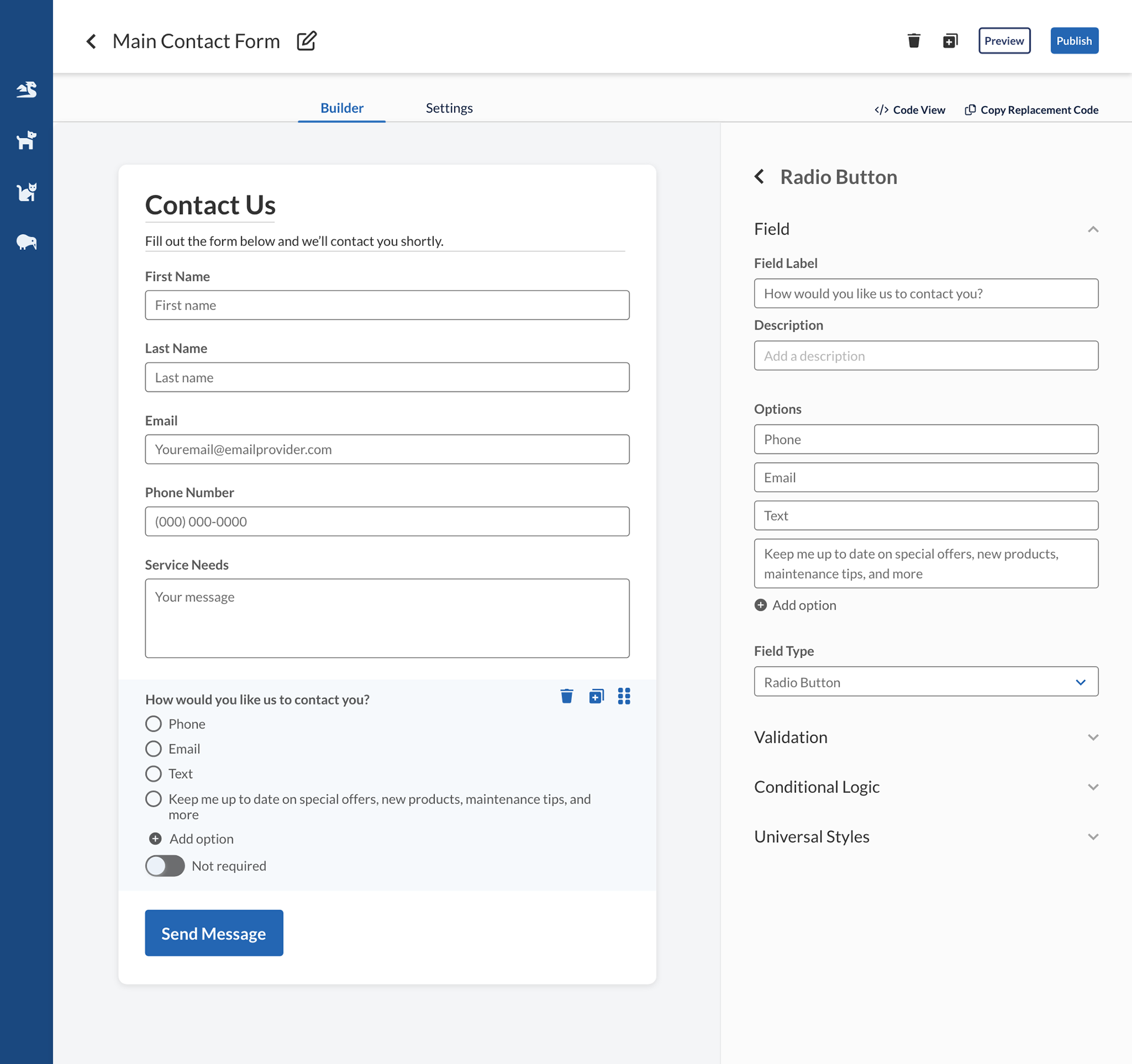
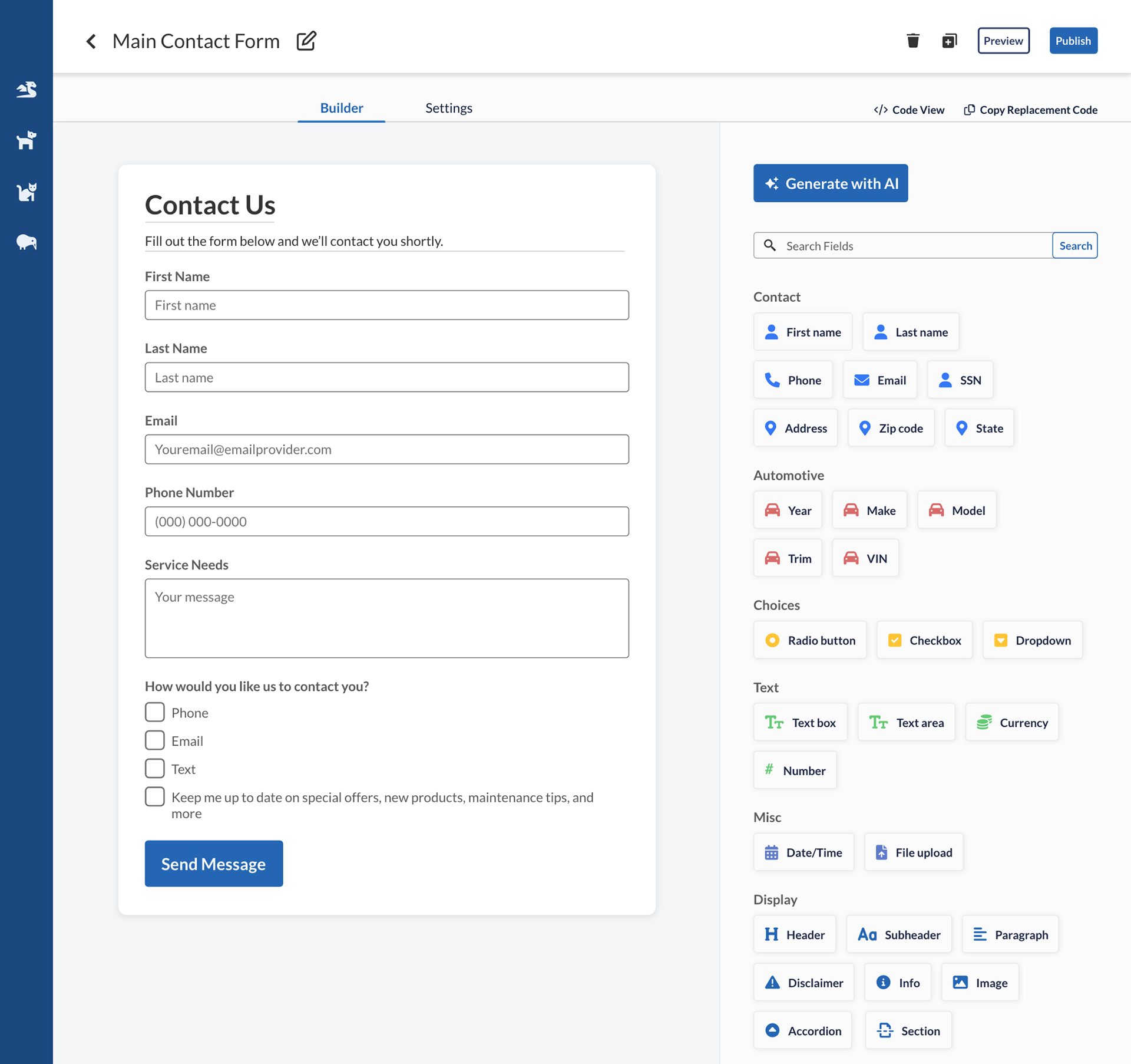
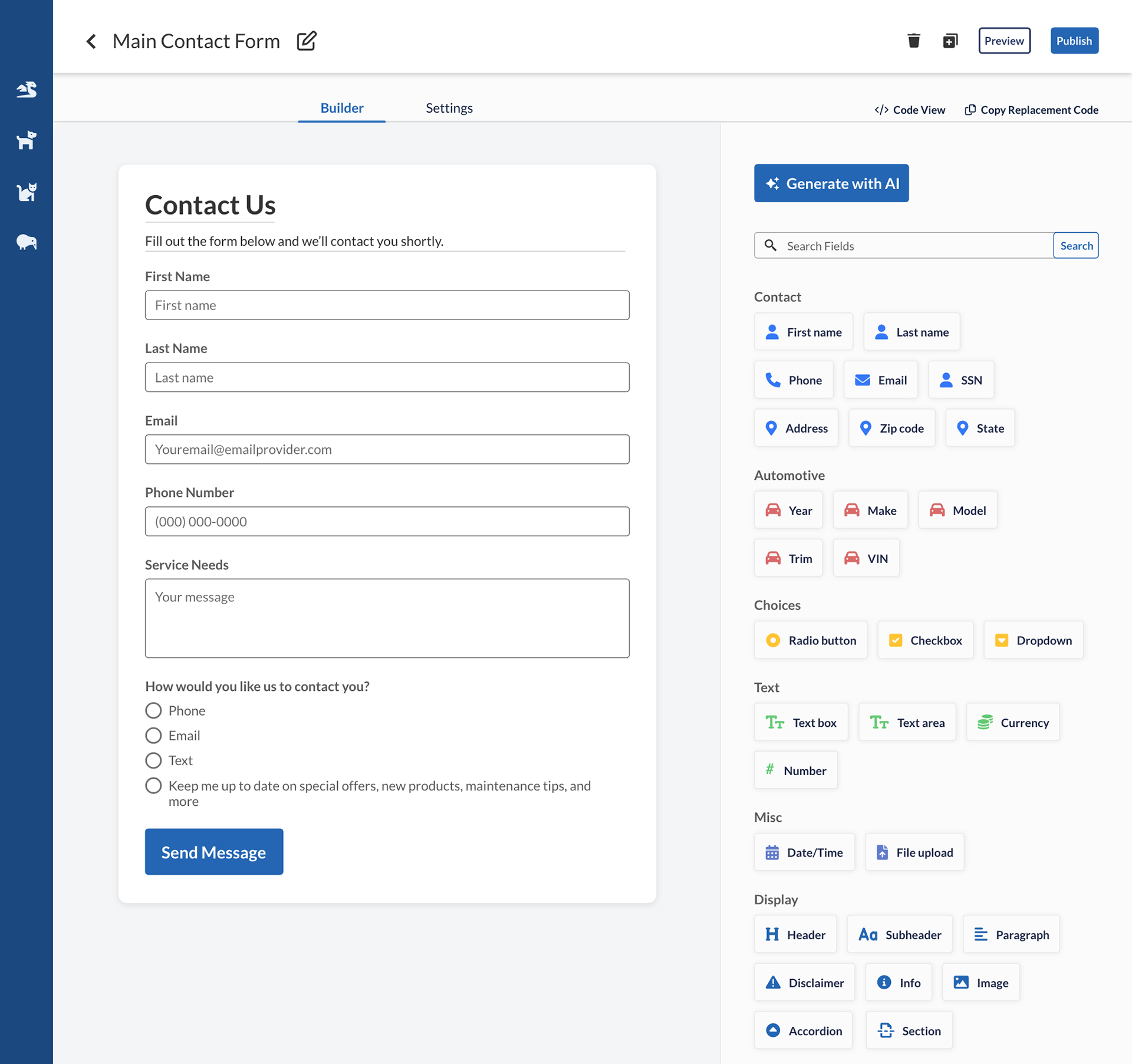
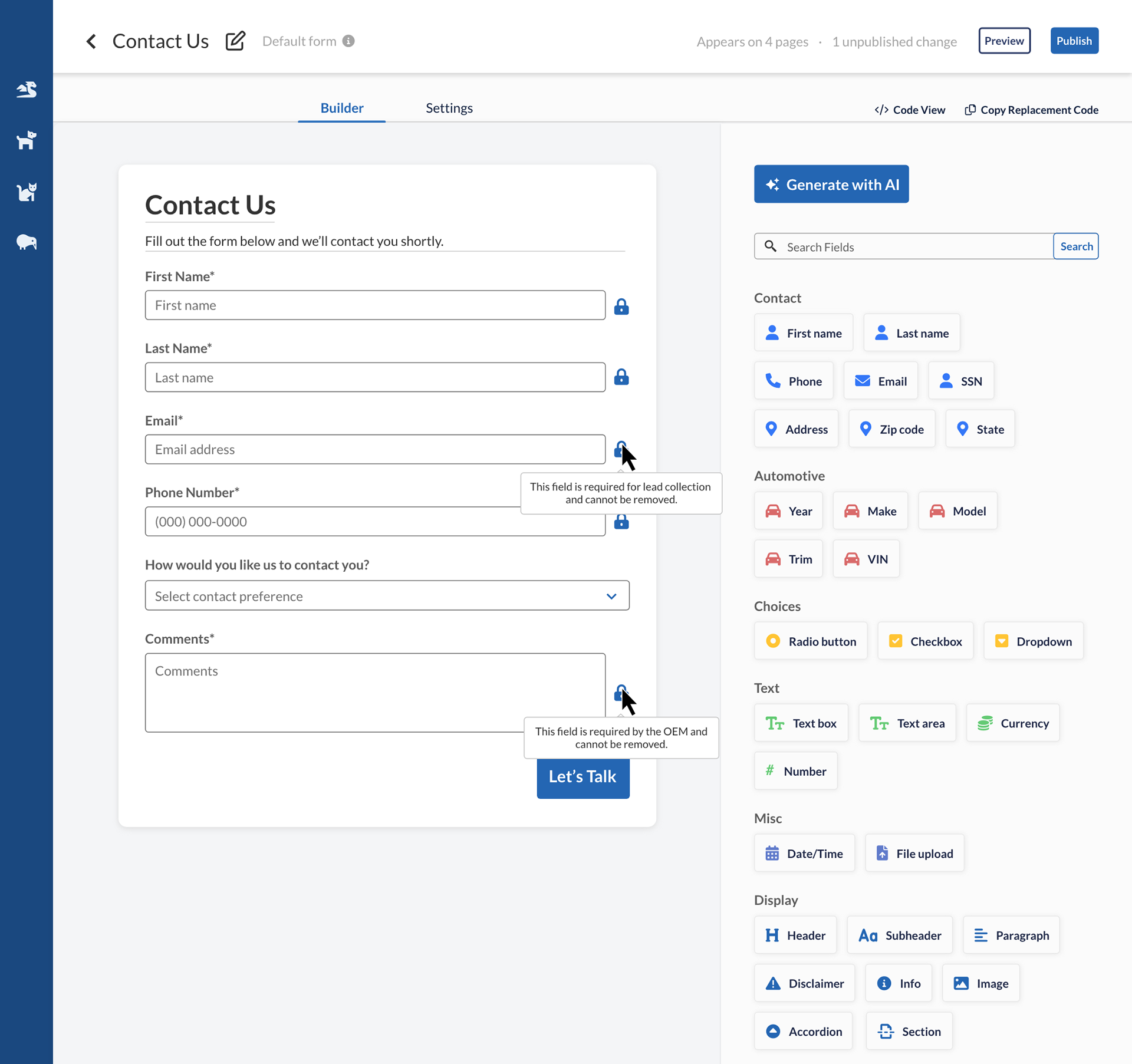
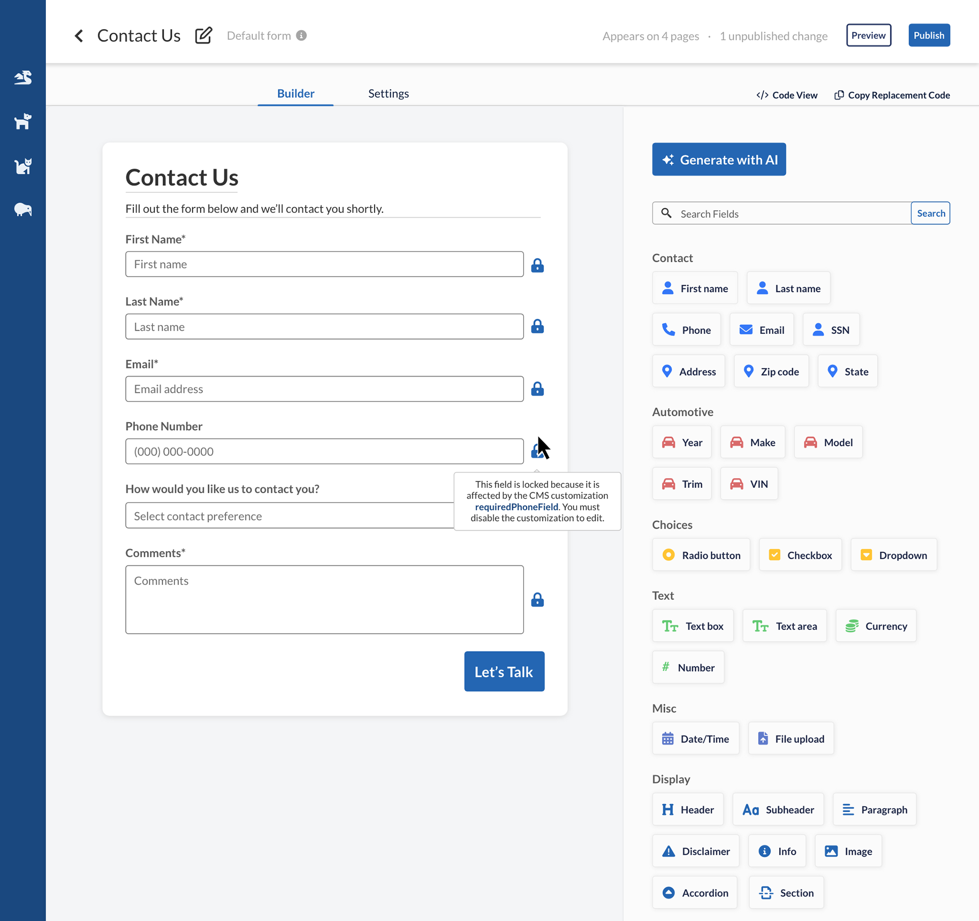
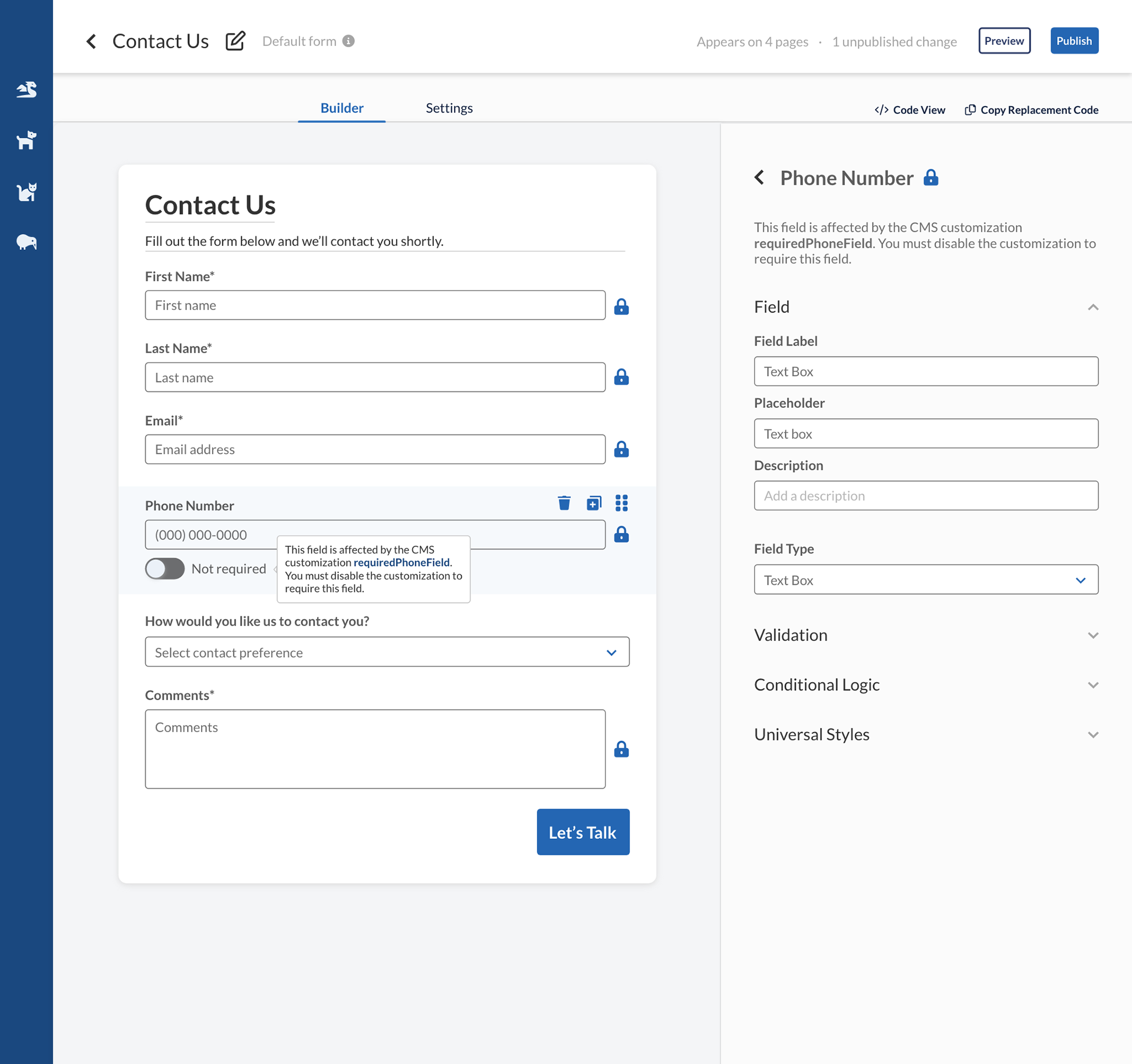
Make field required, delete field


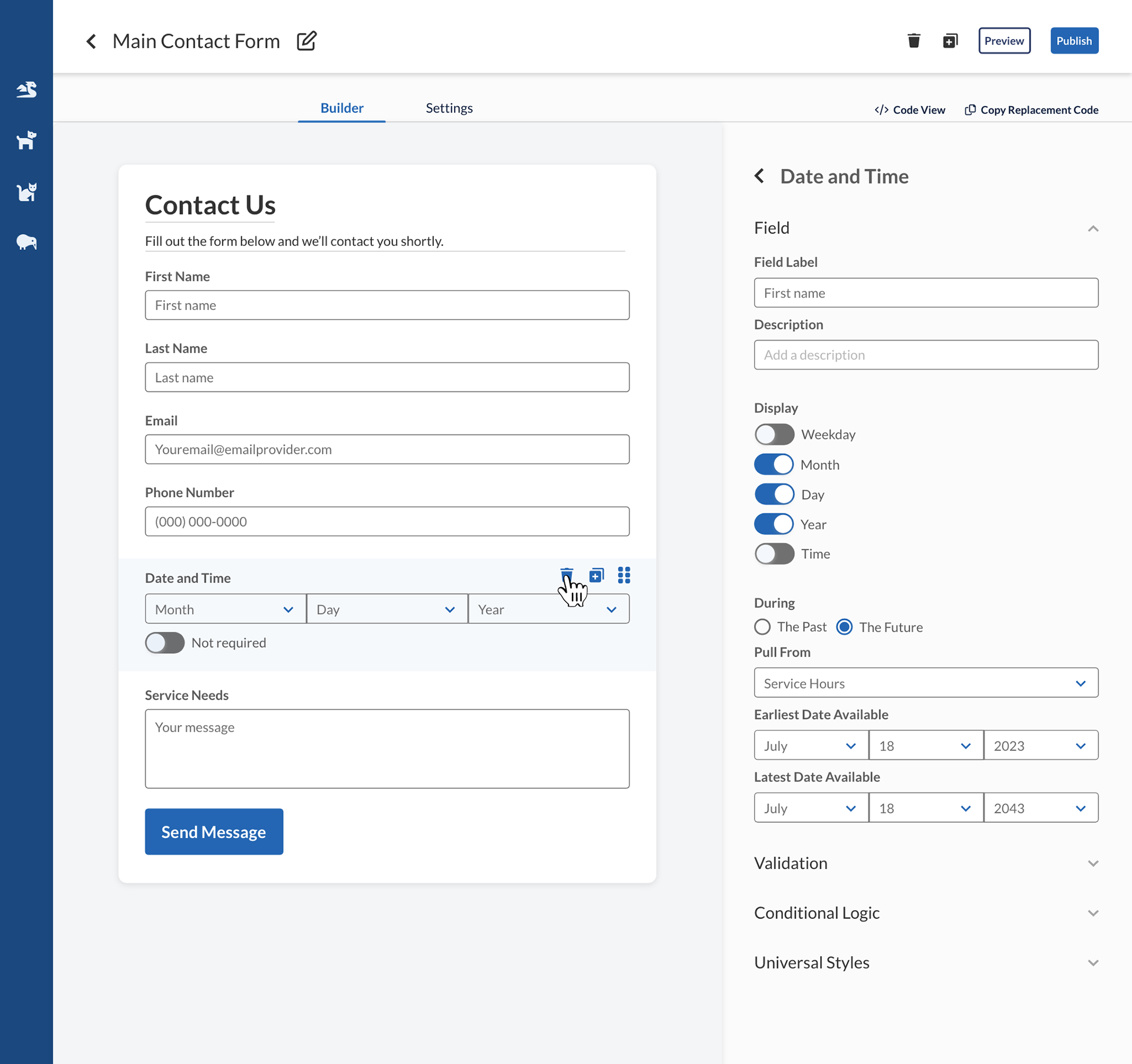
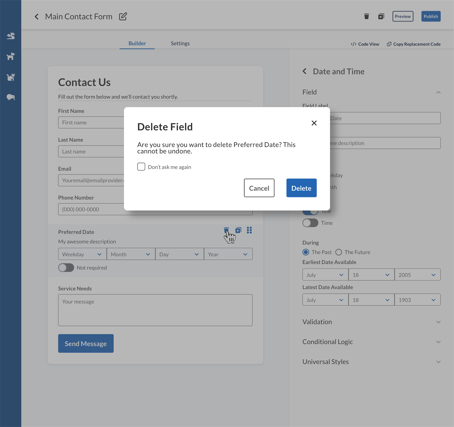
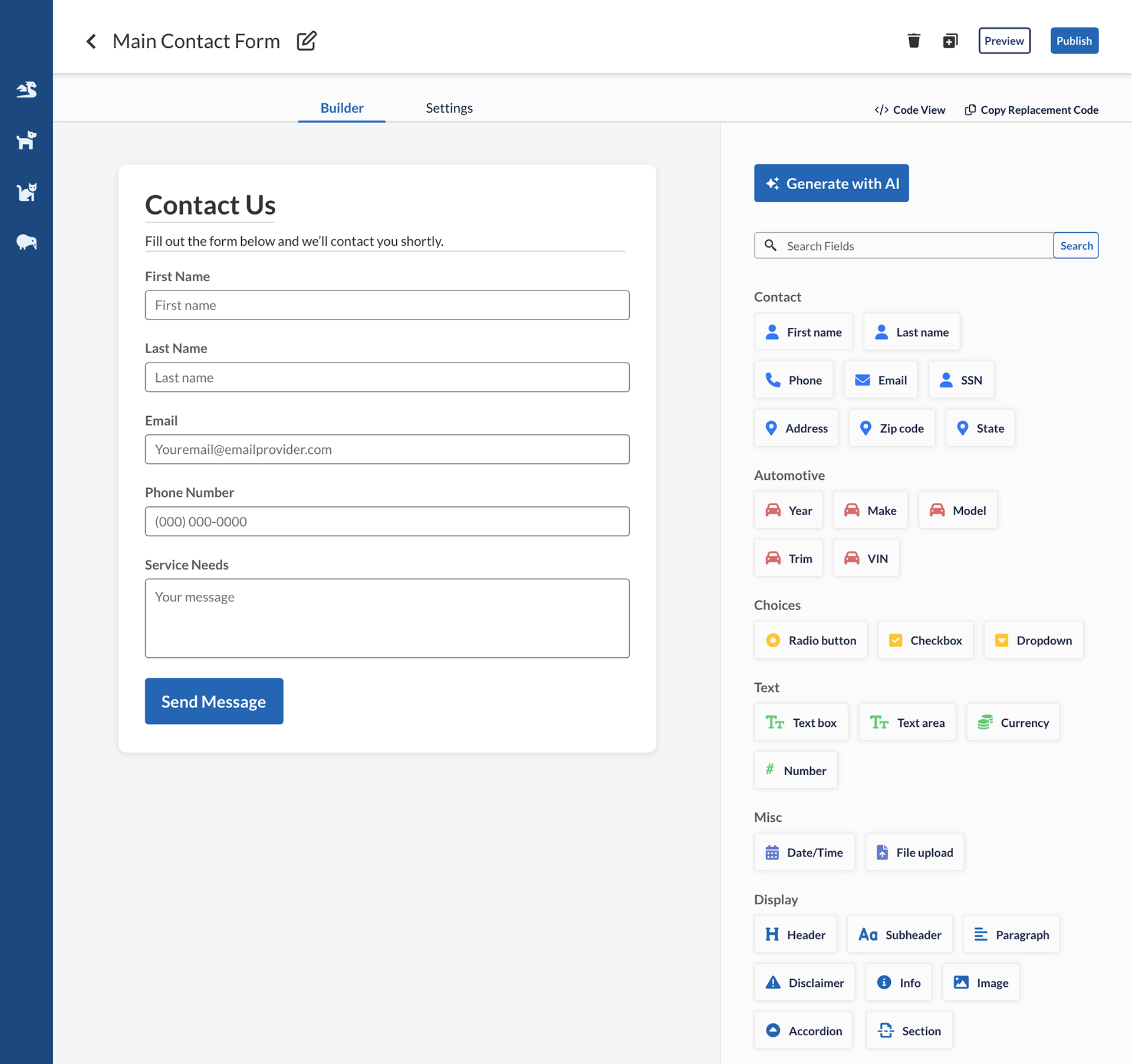
Delete field


Column behavior
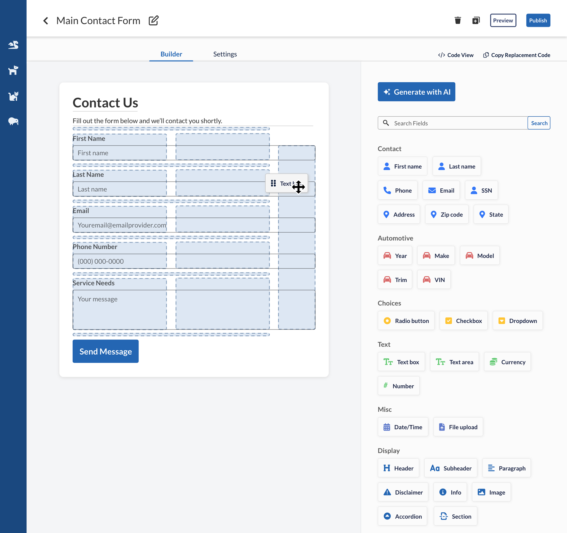
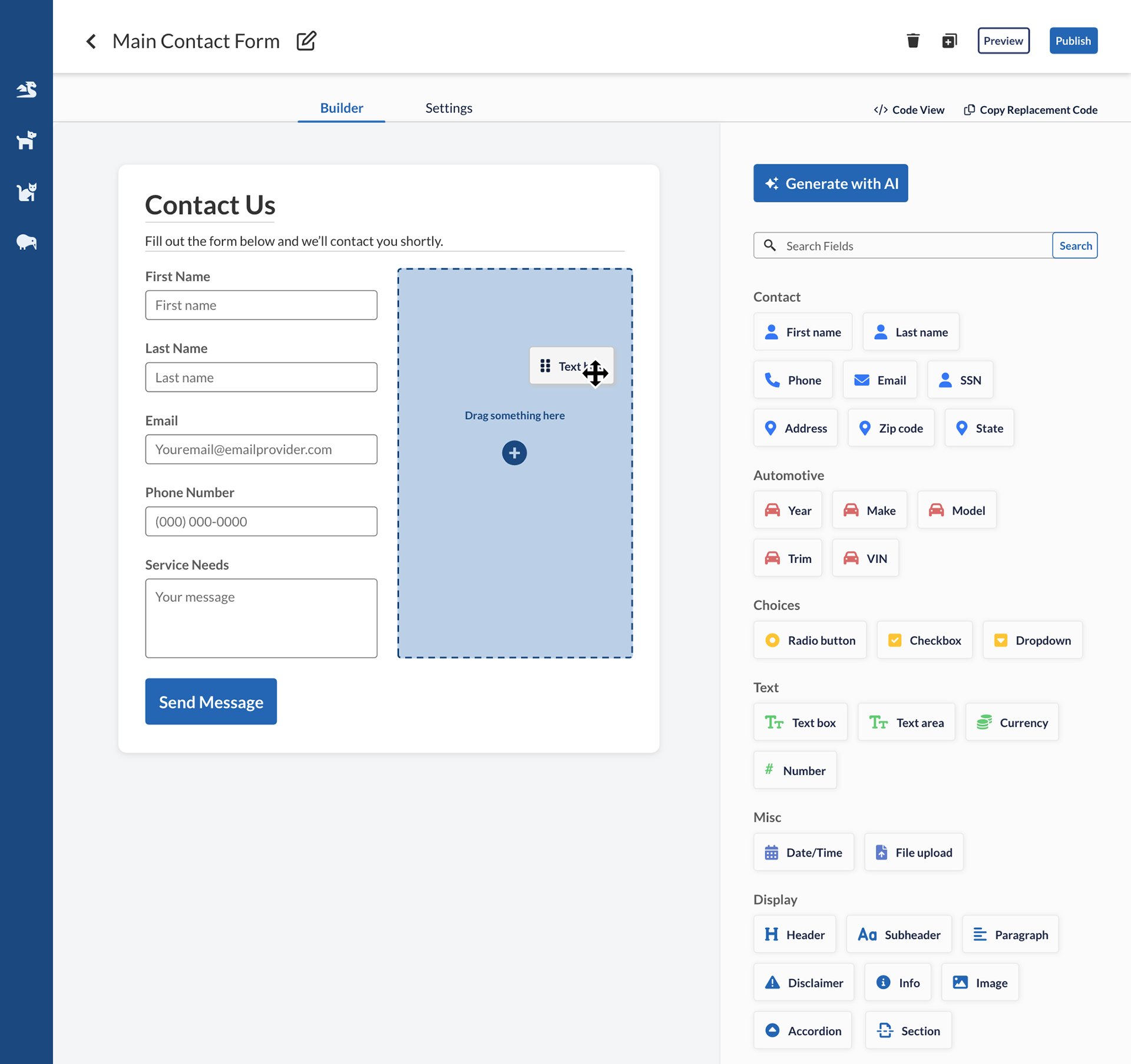
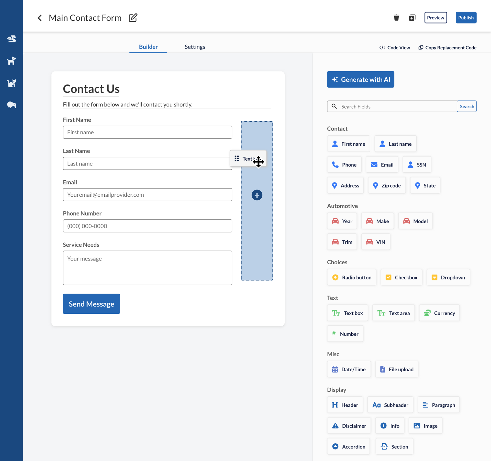
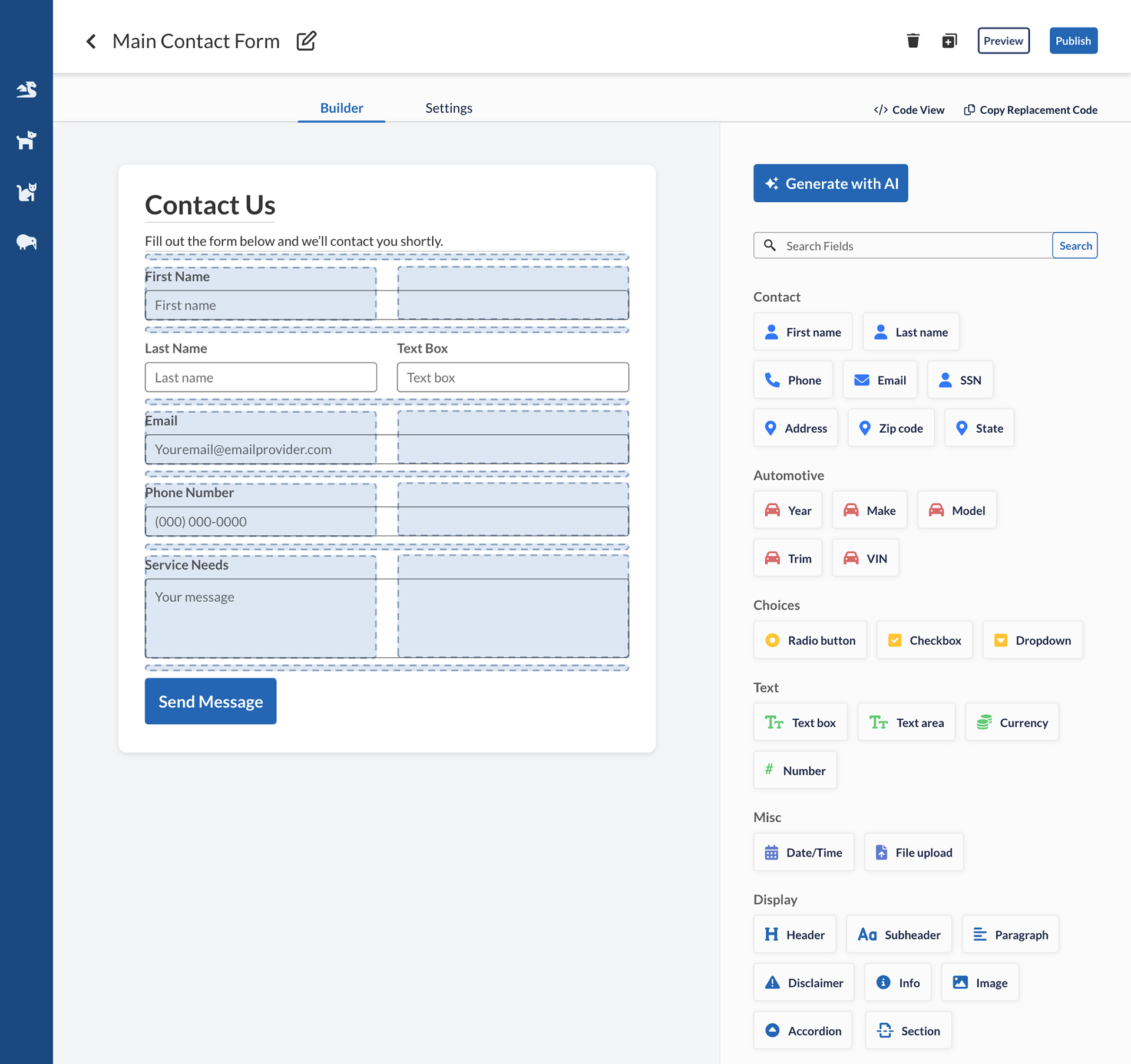
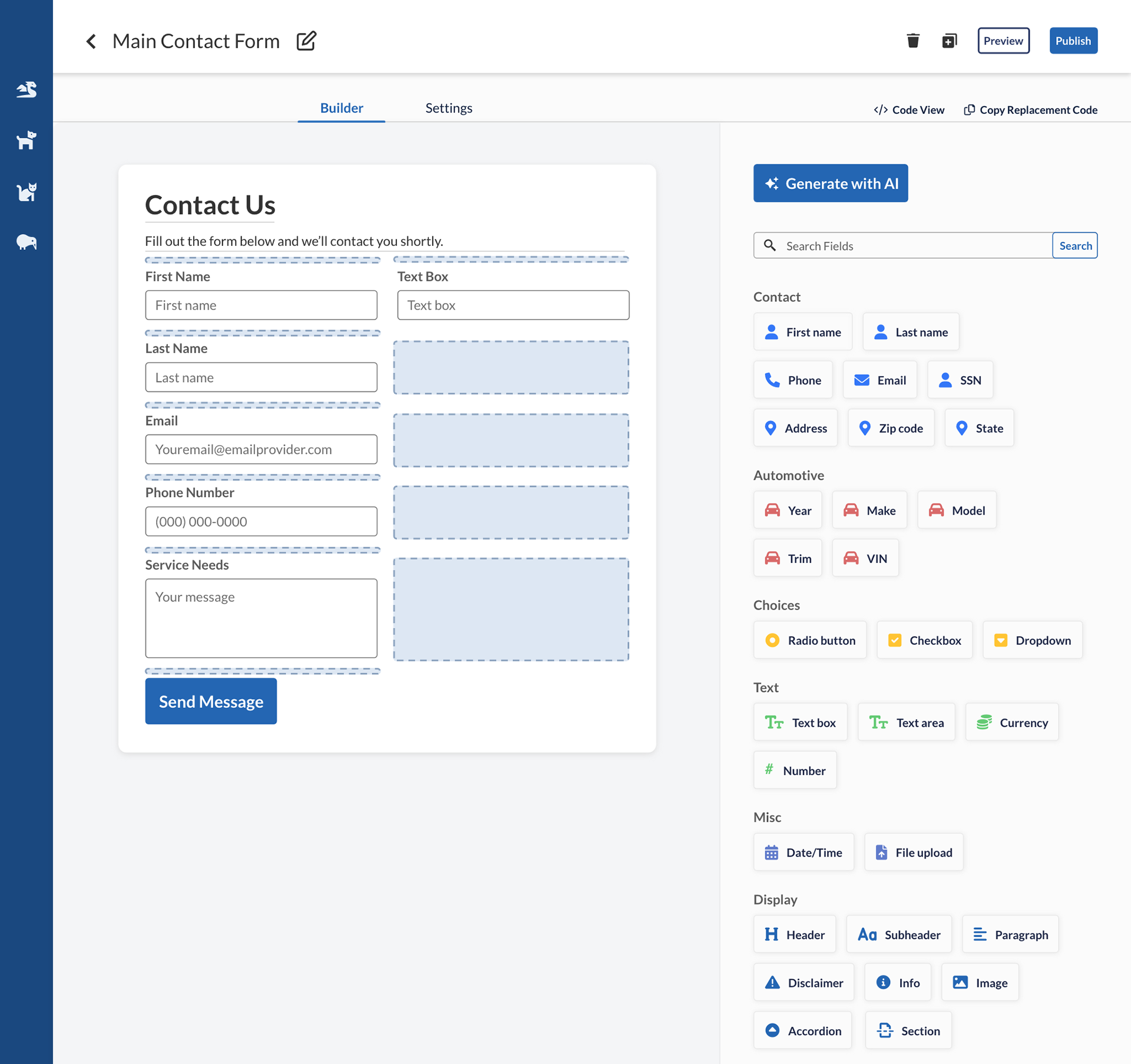
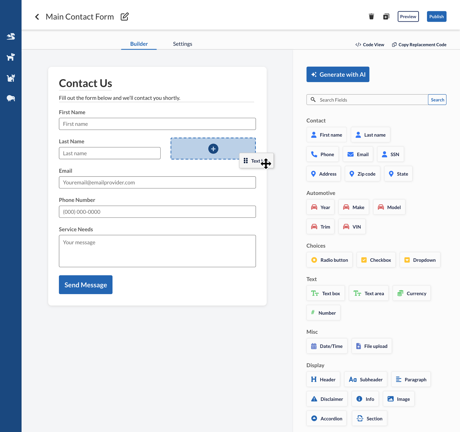
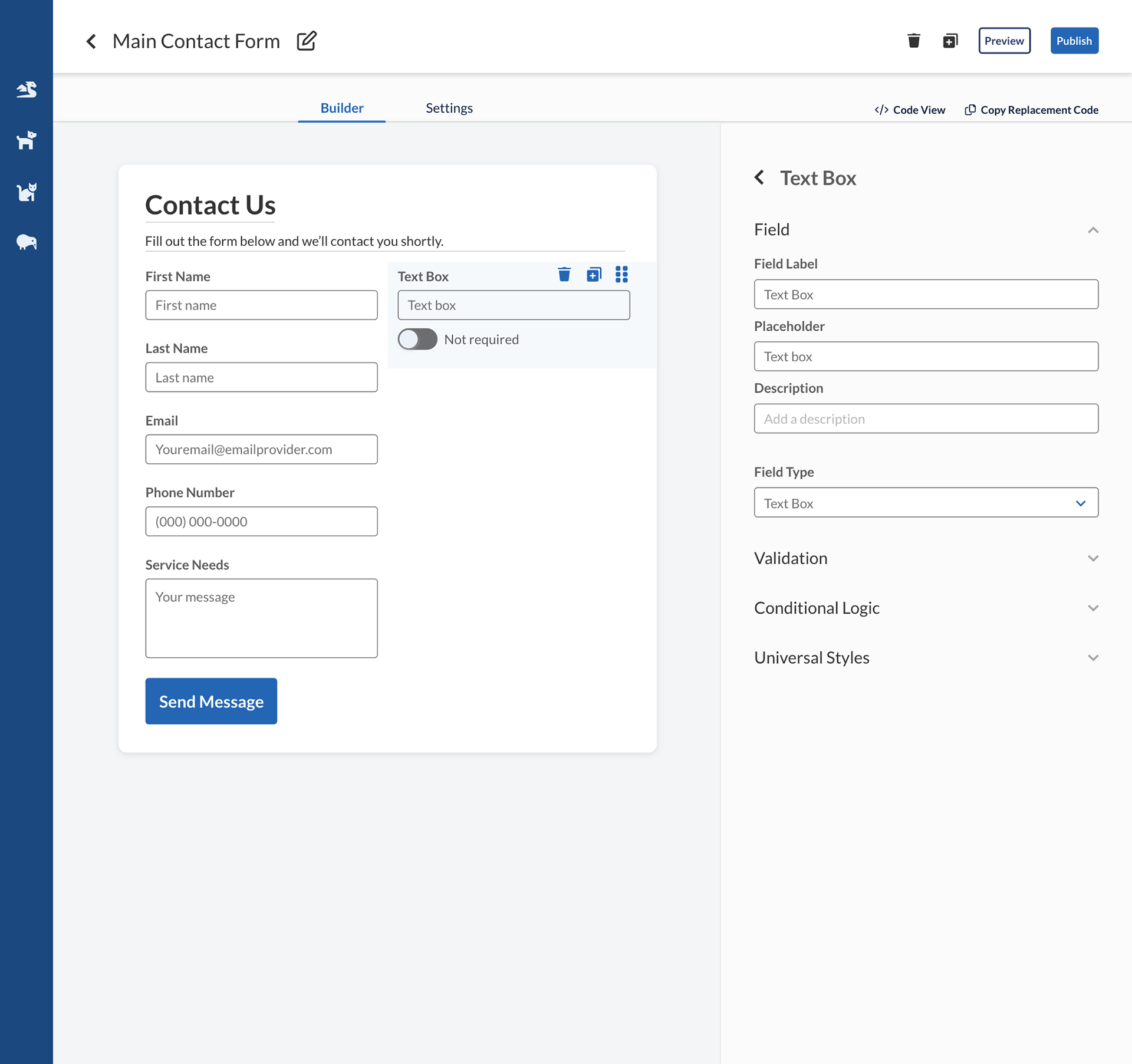
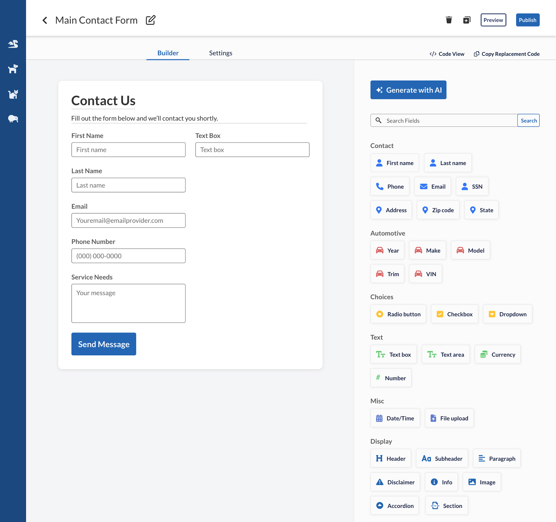
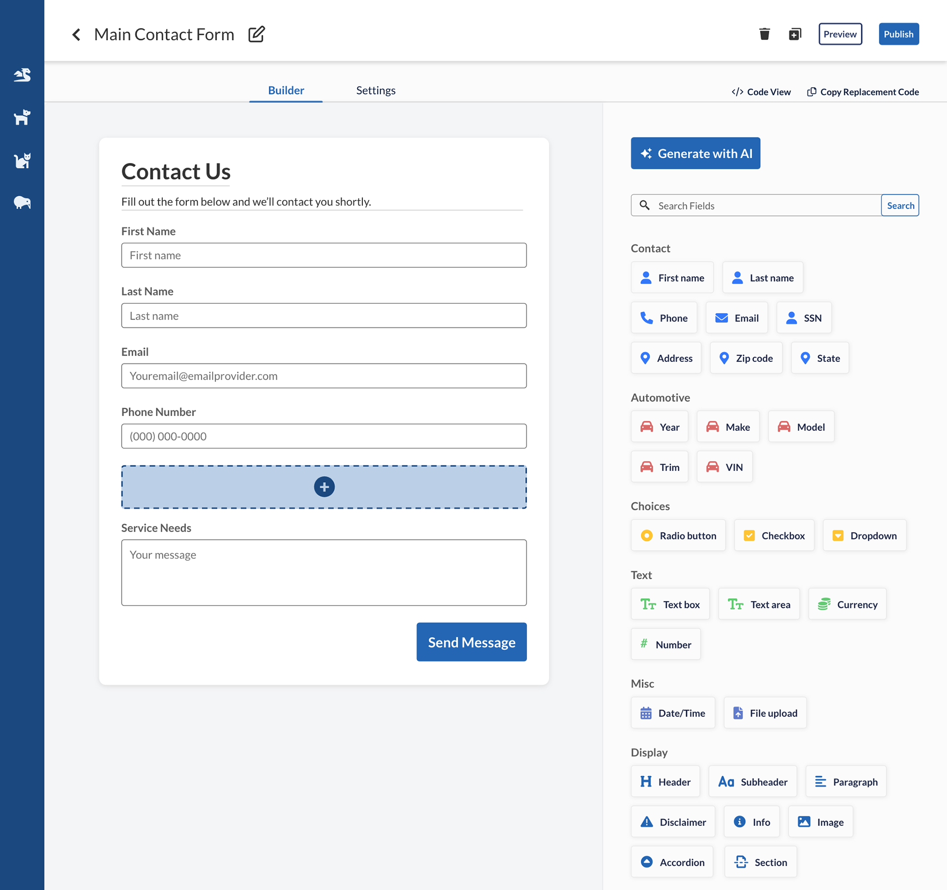
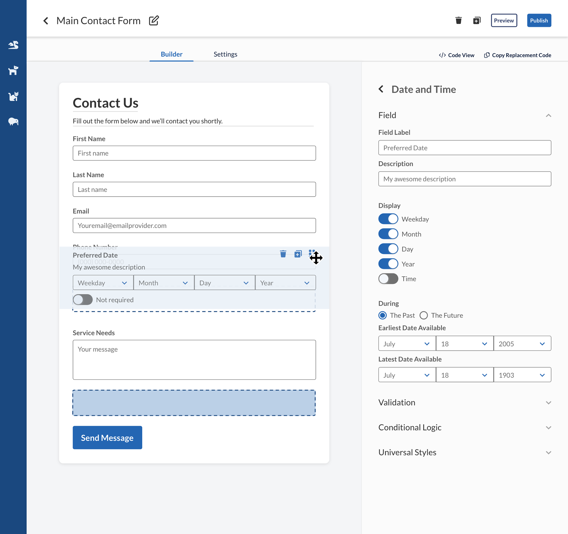
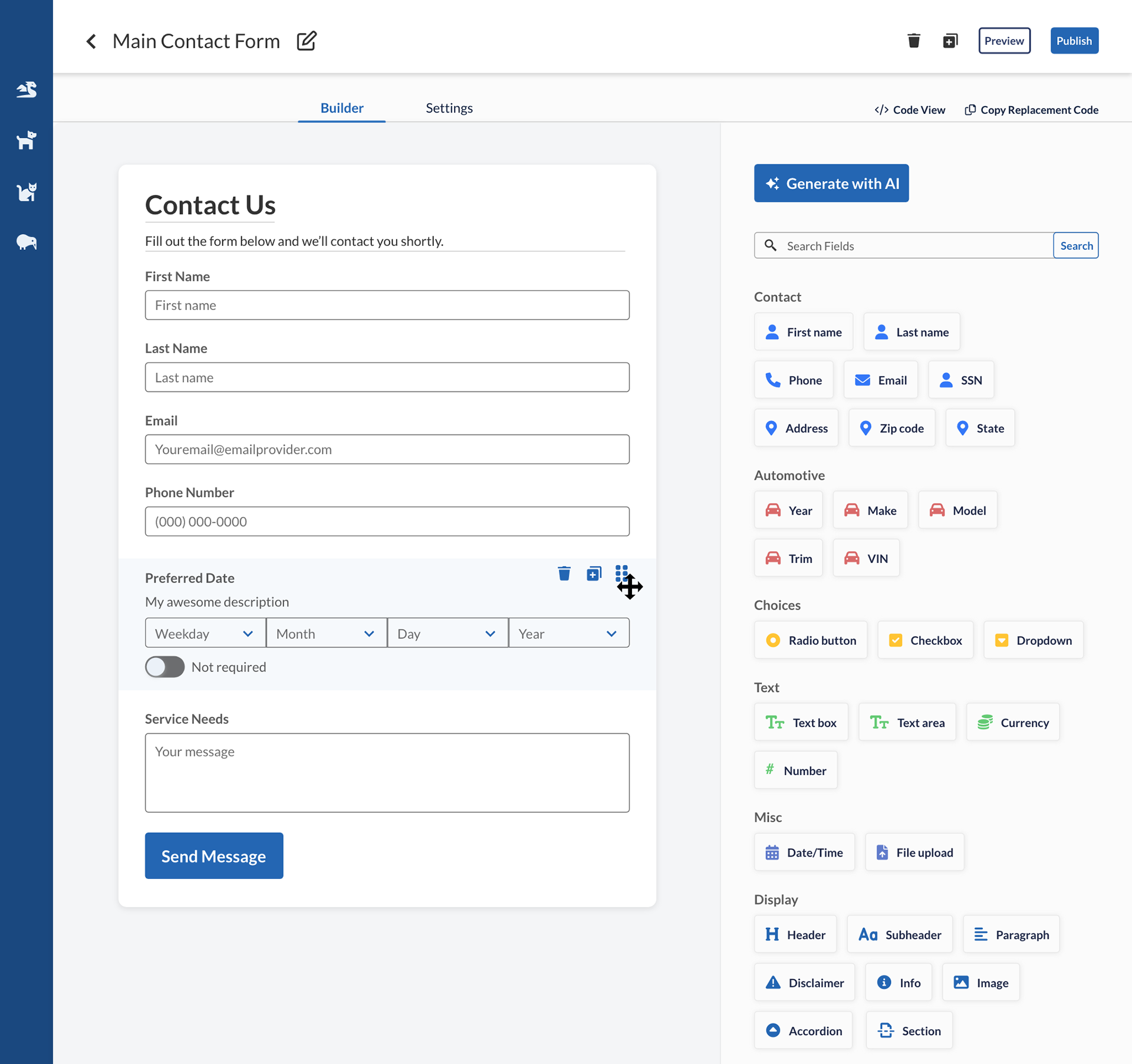
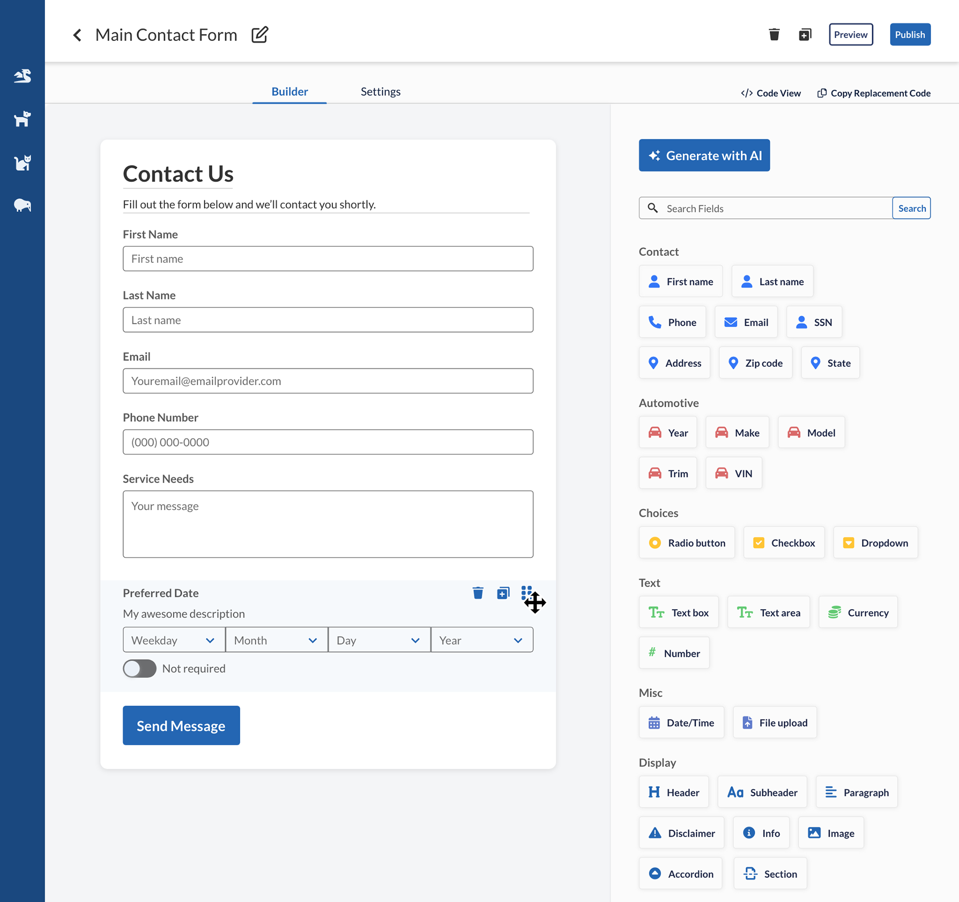
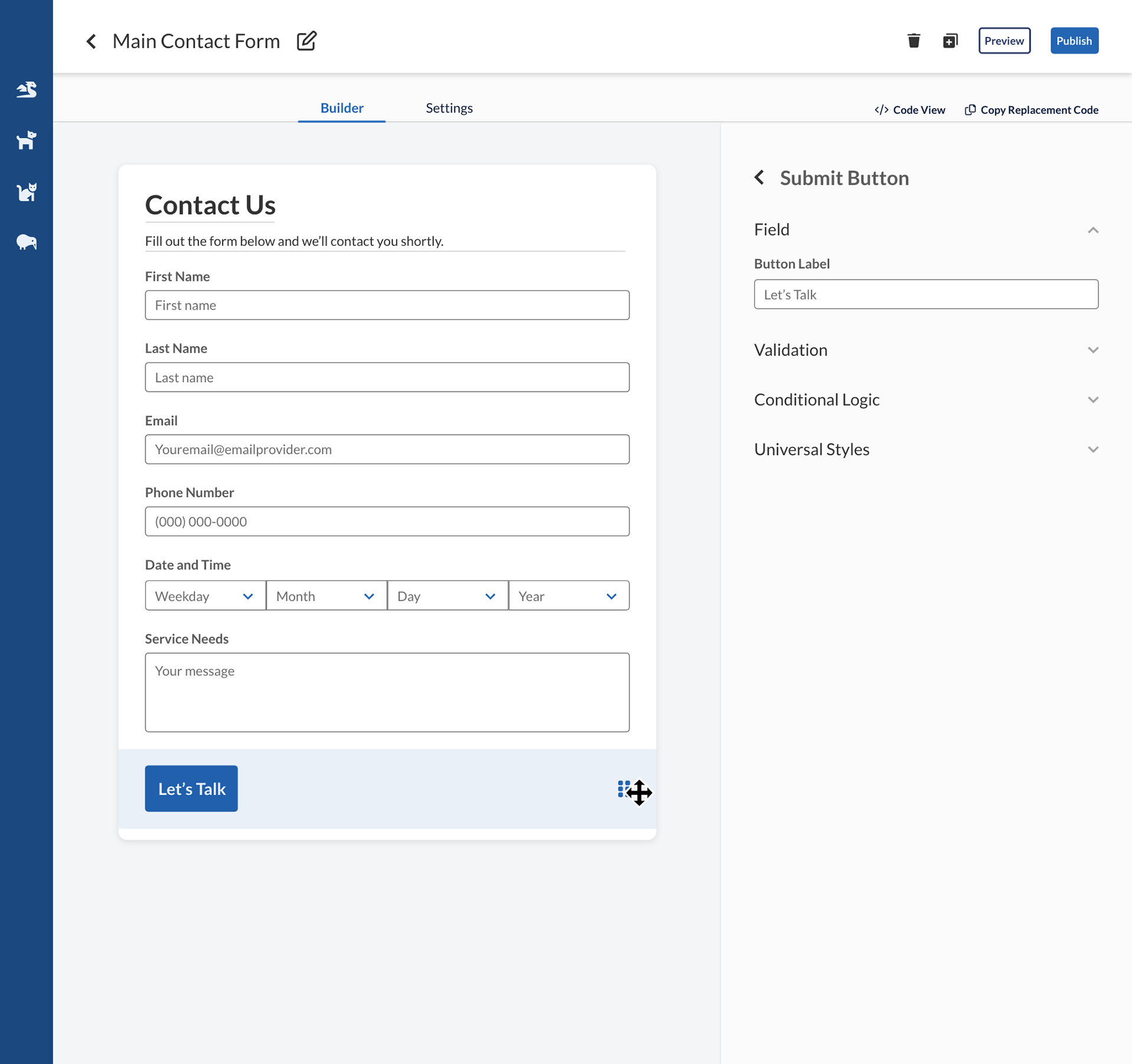
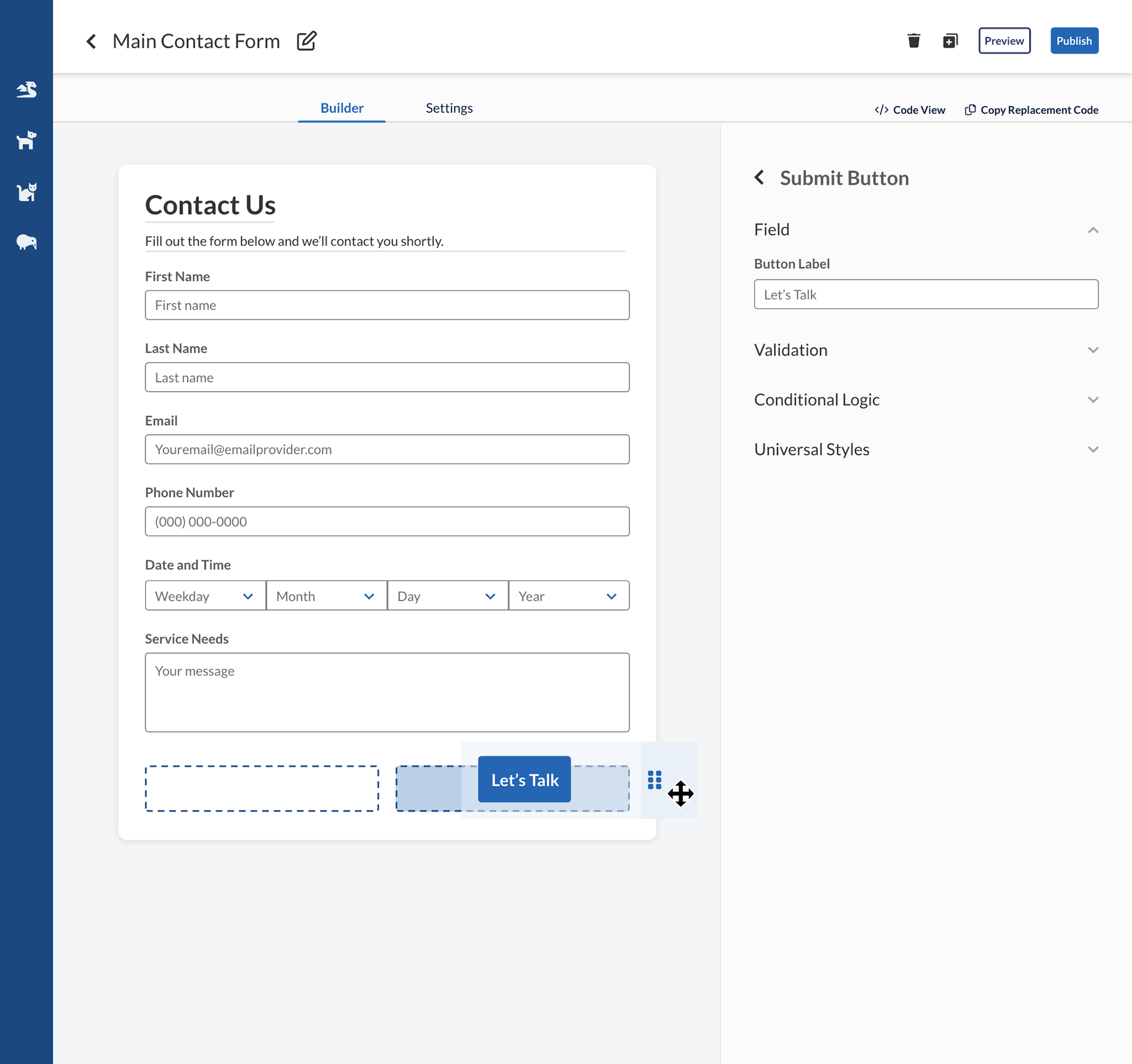
Drag and drop behavior
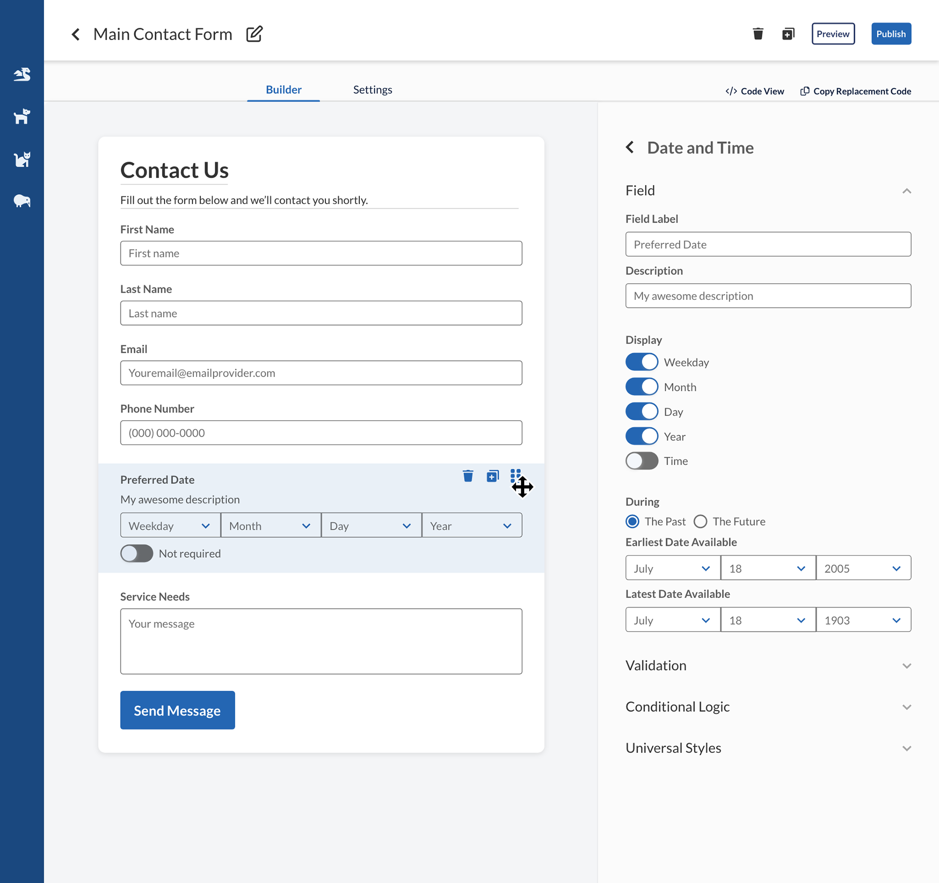
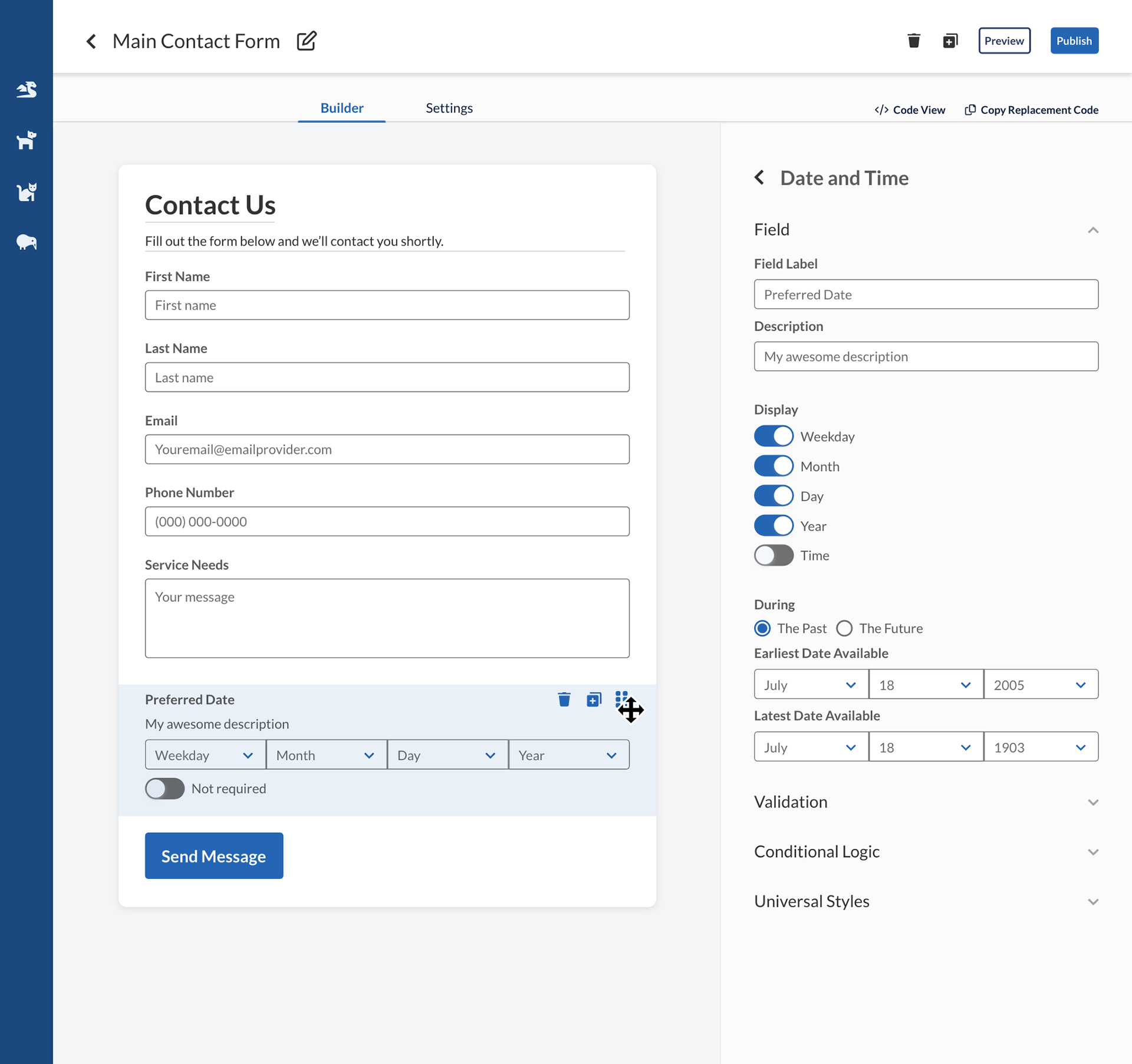

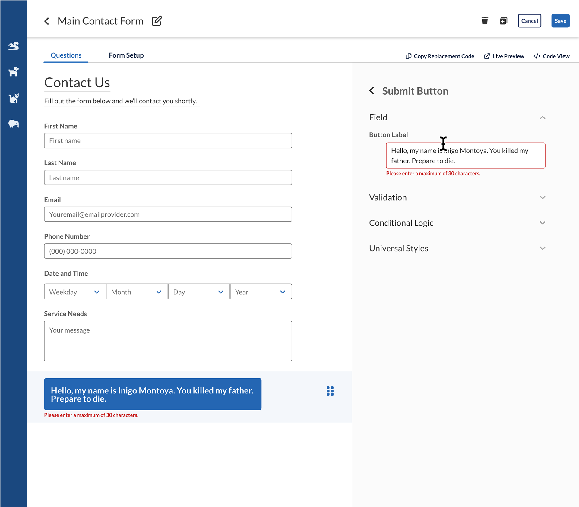
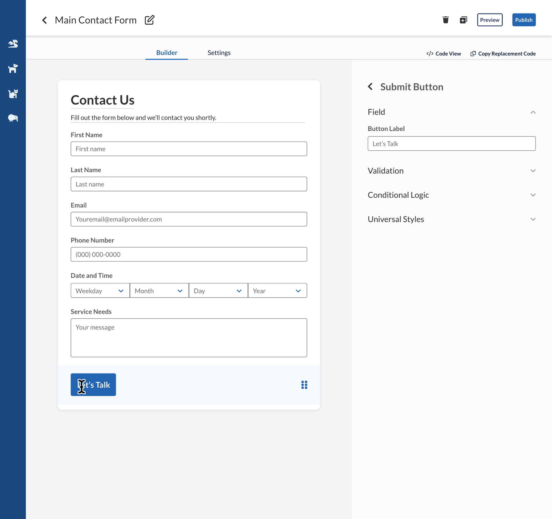
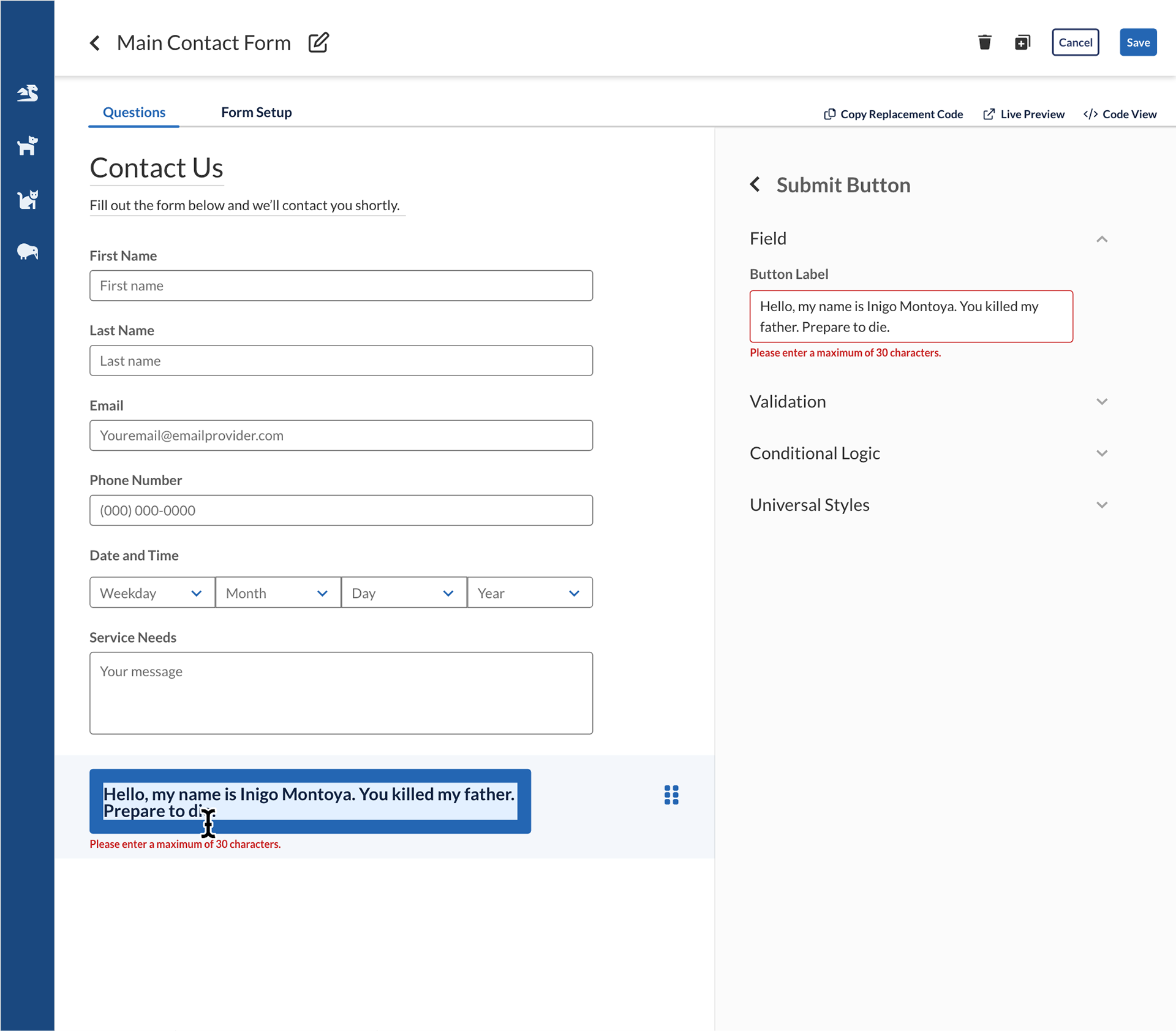
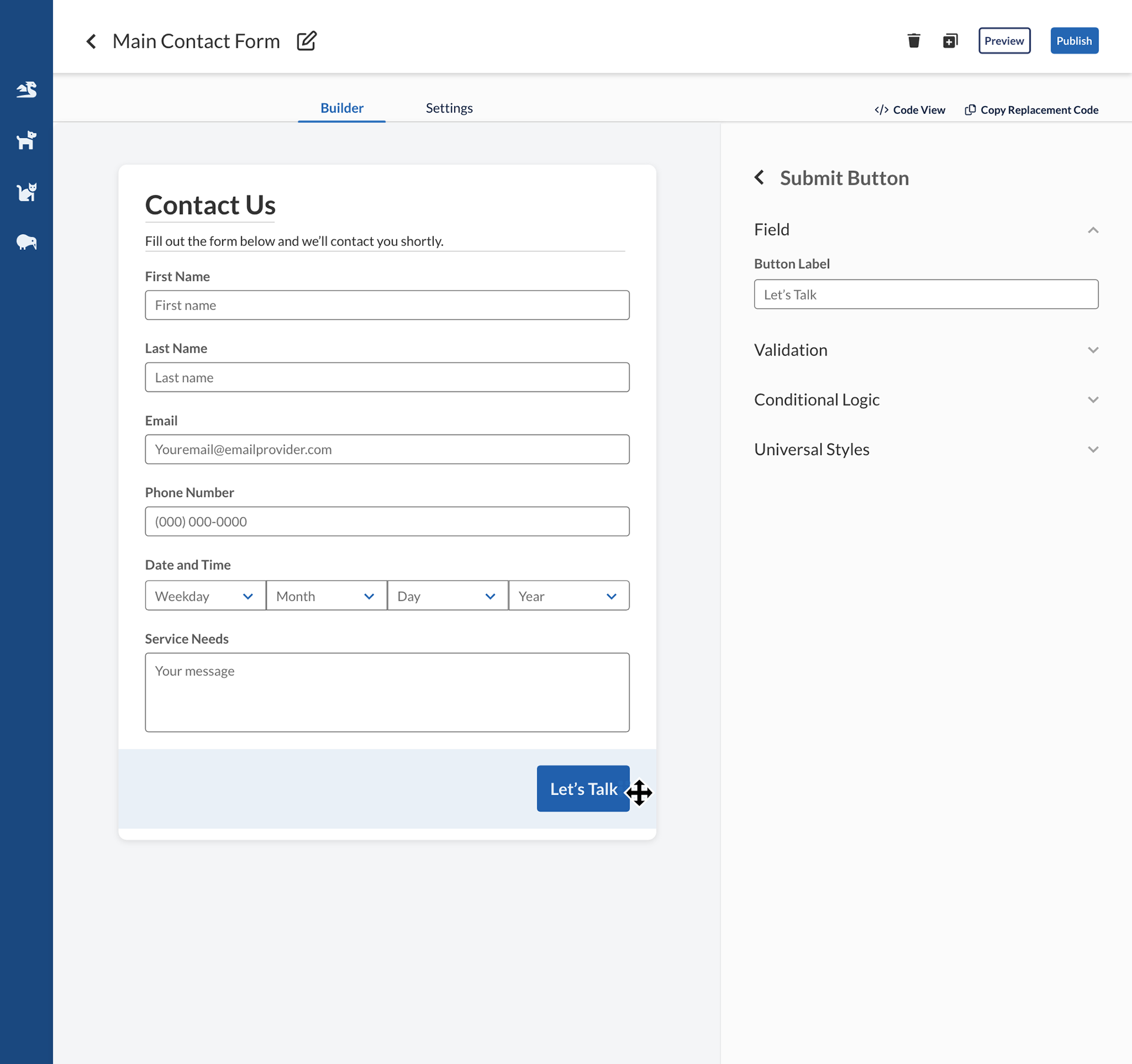
Submit button behavior
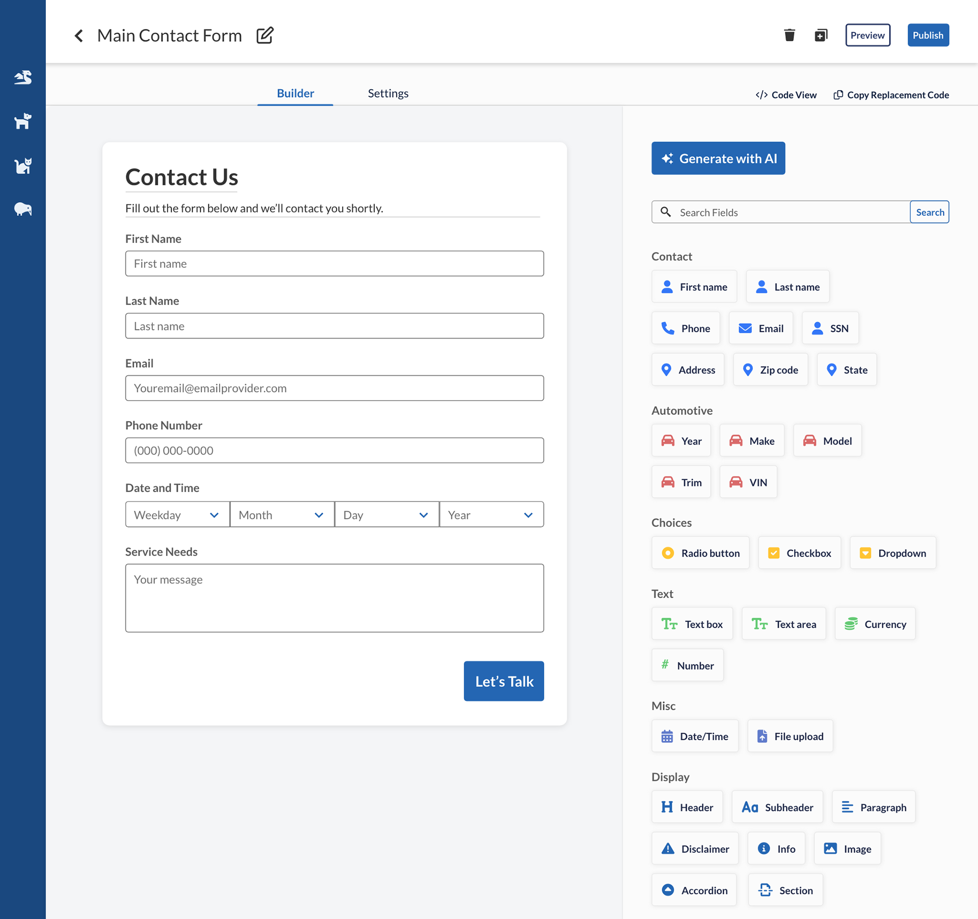
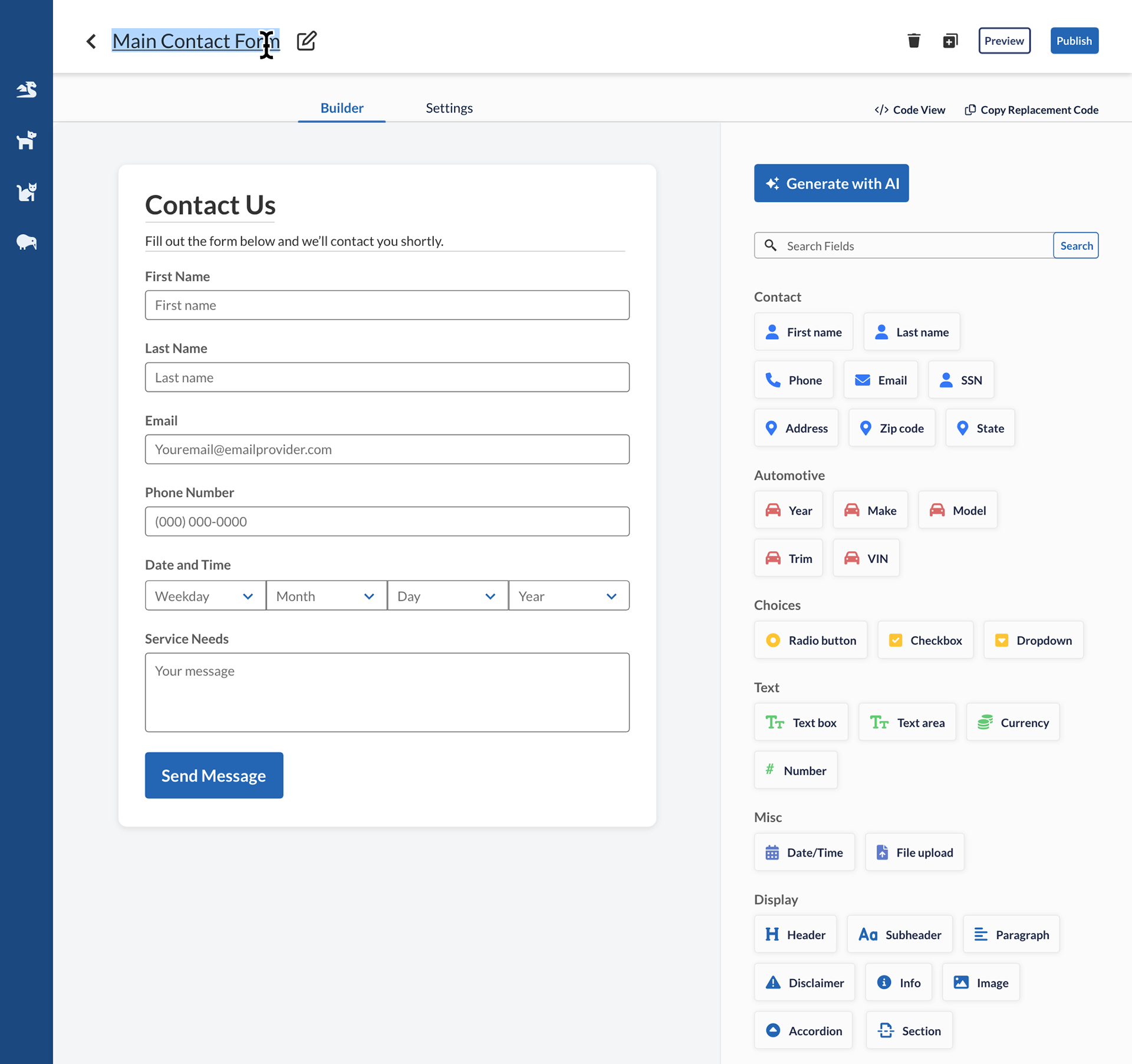
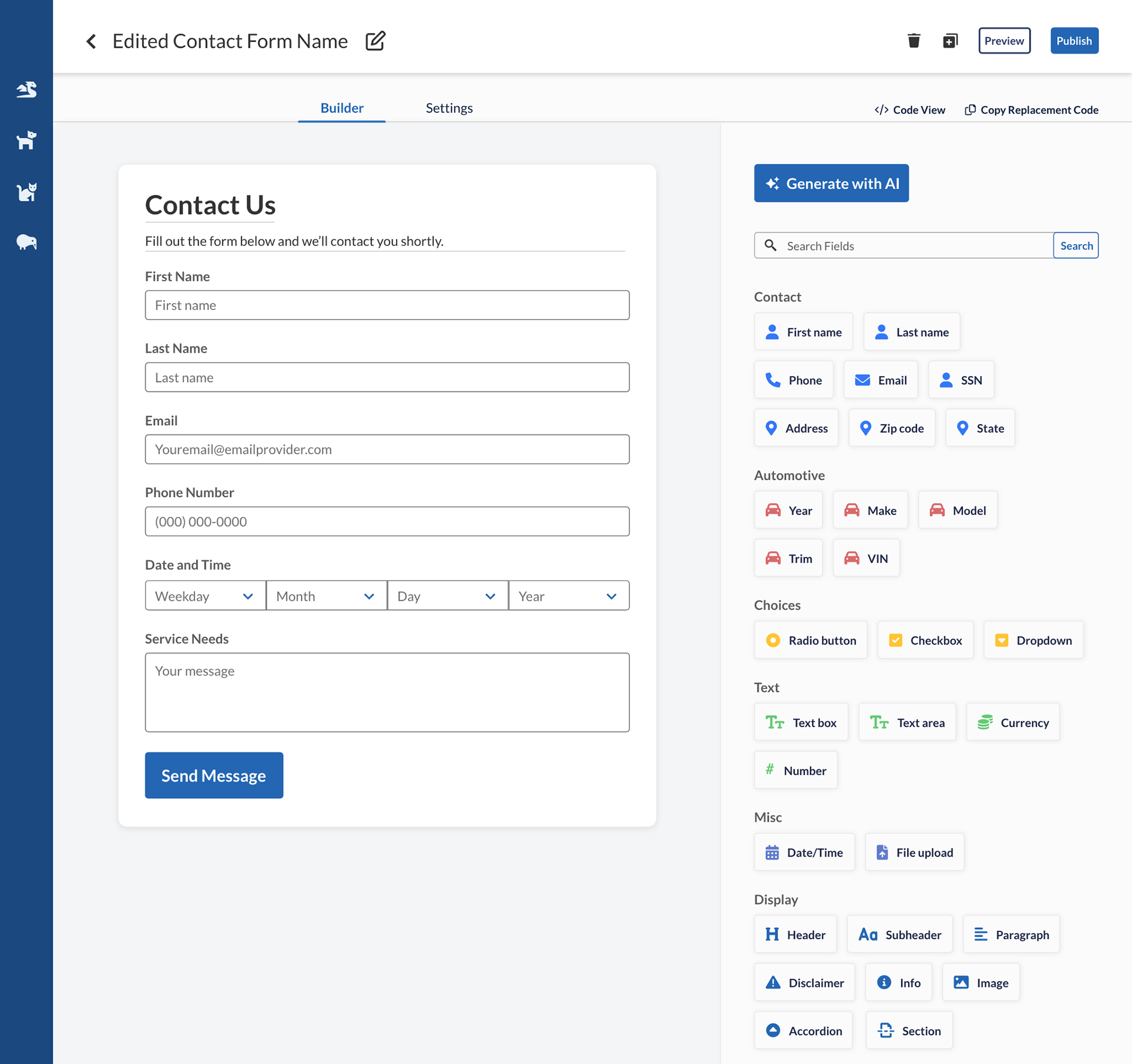
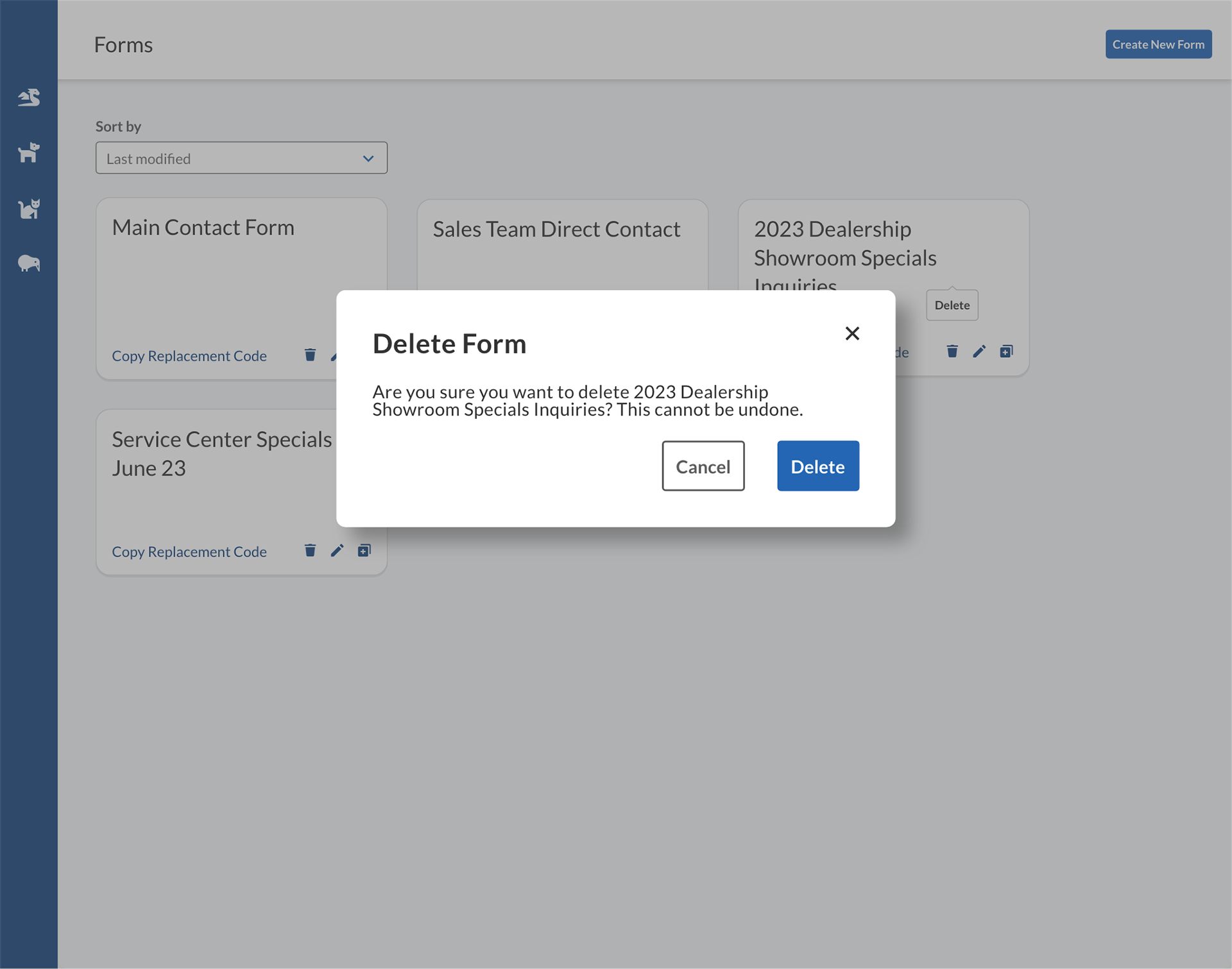
Rename form


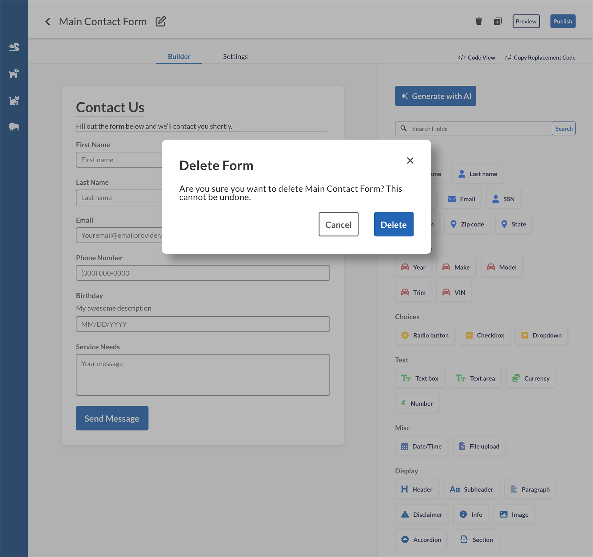
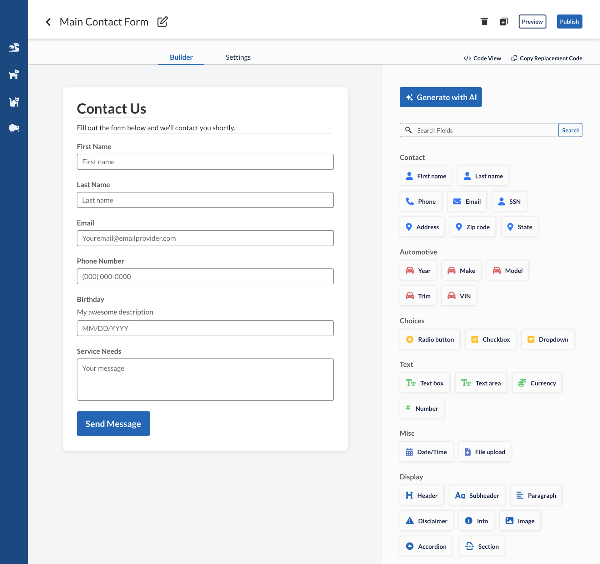
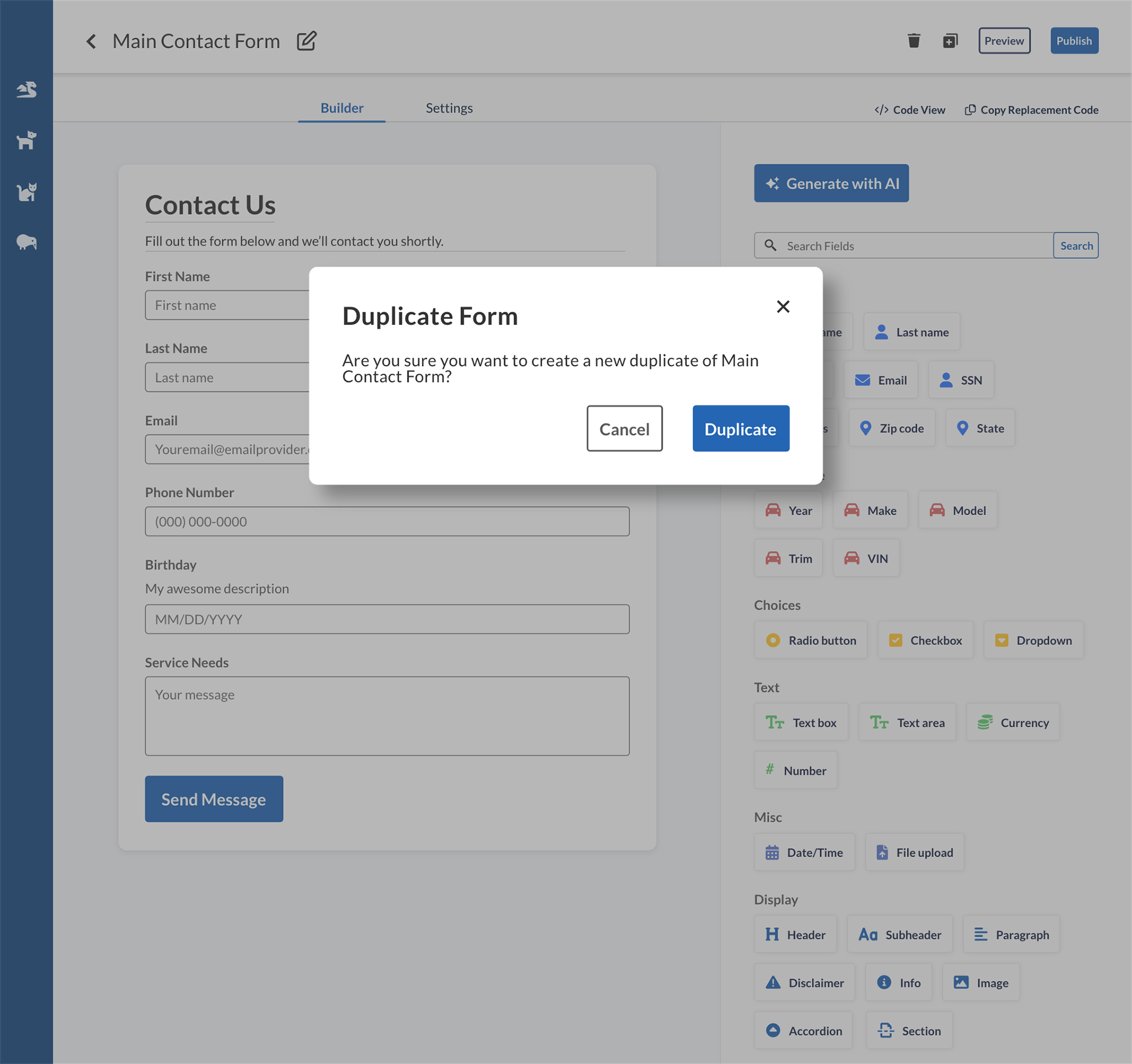
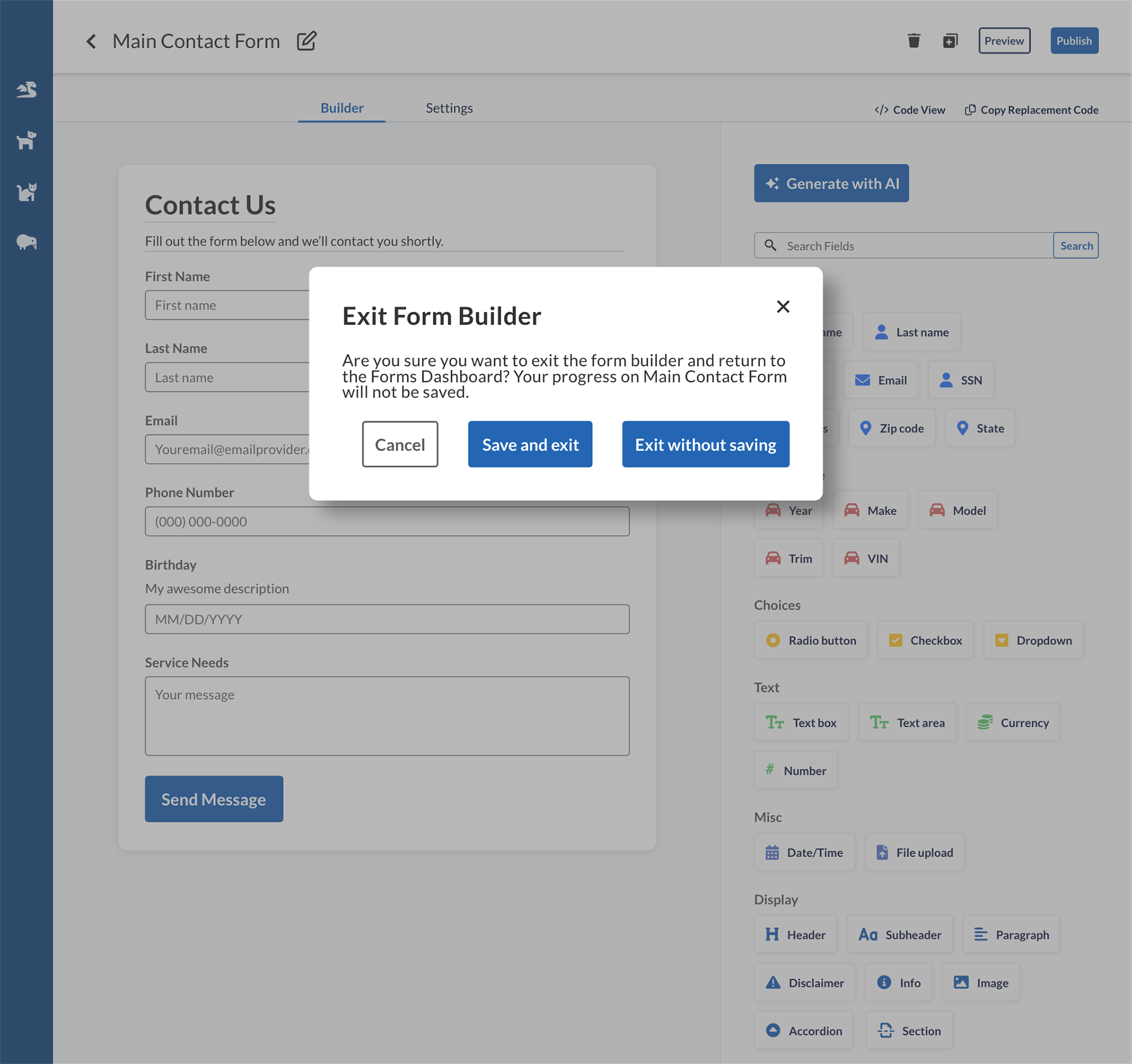
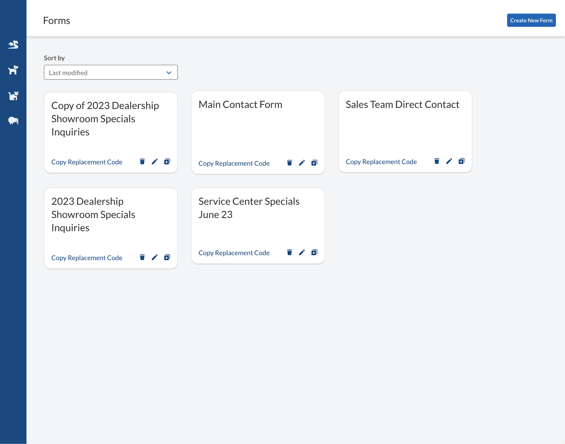
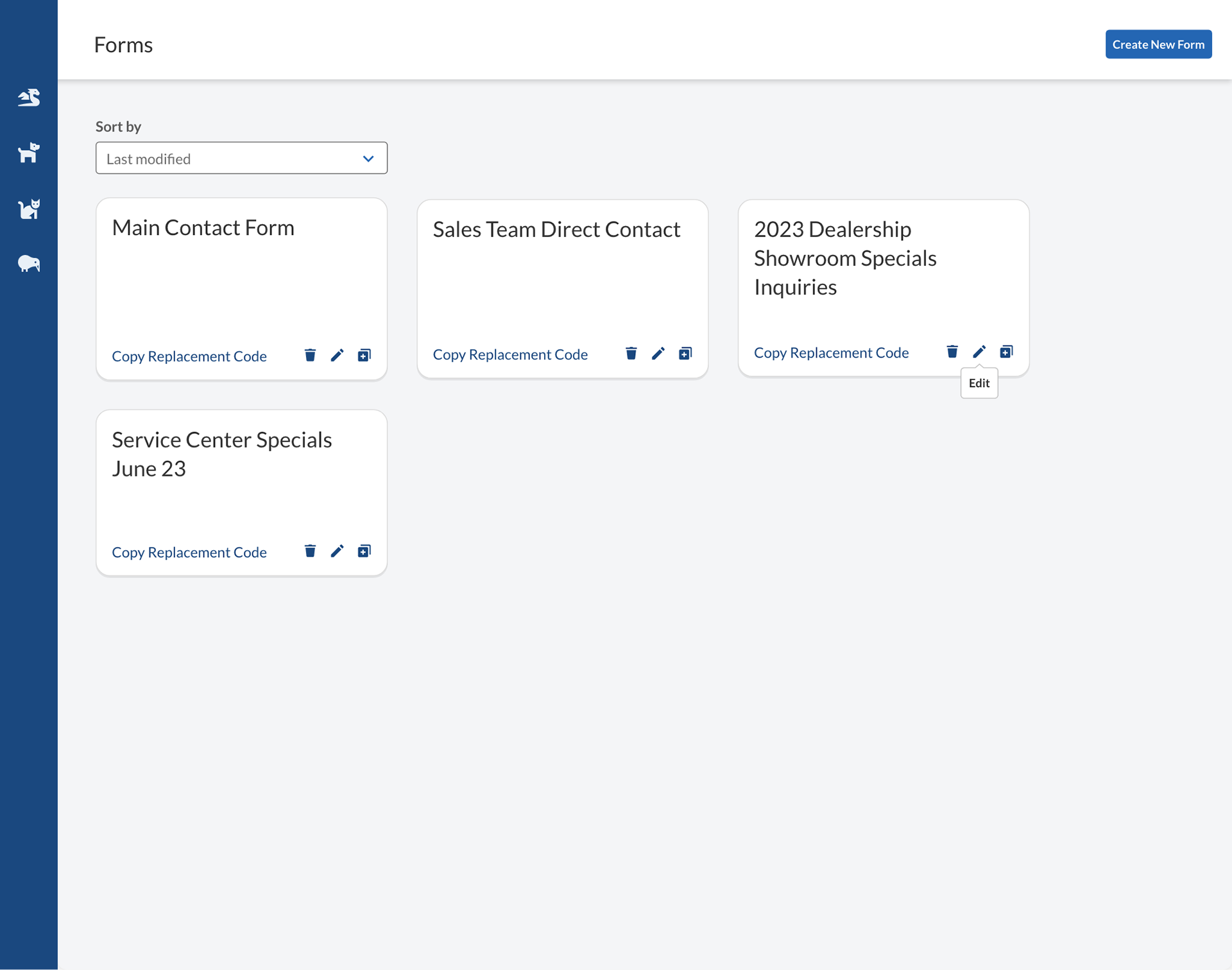
Delete, duplicate, and exit form


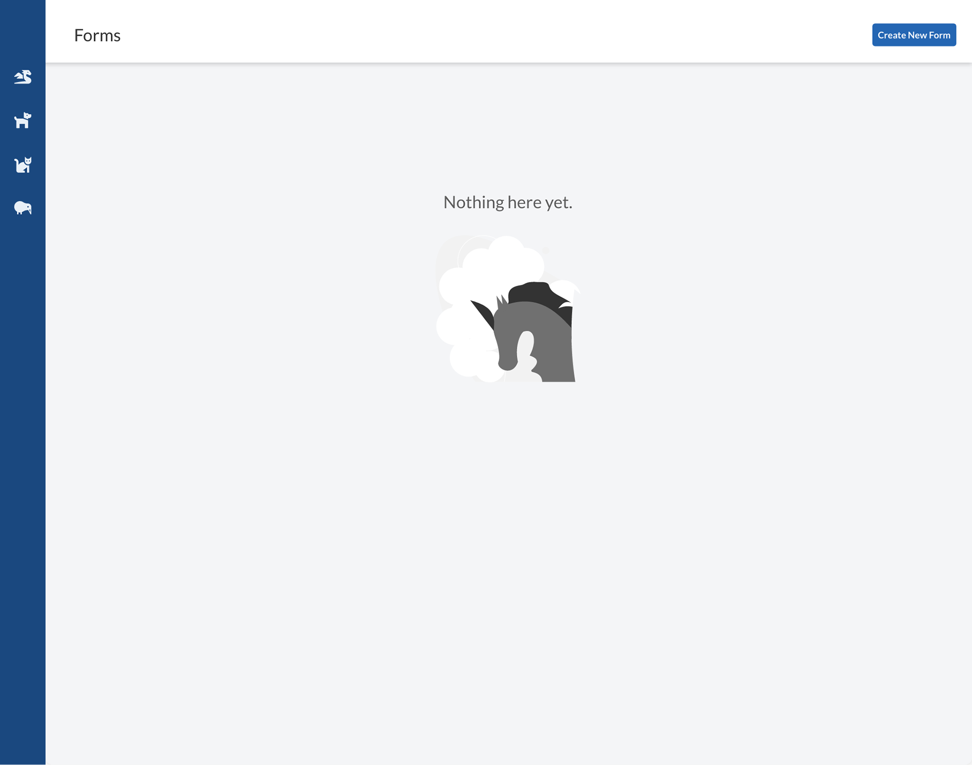
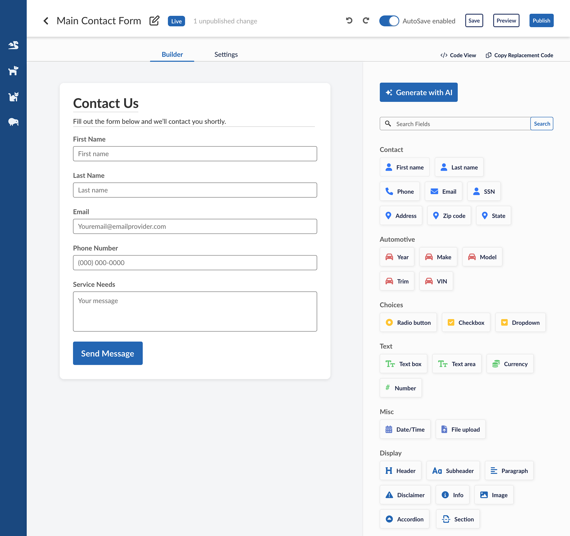
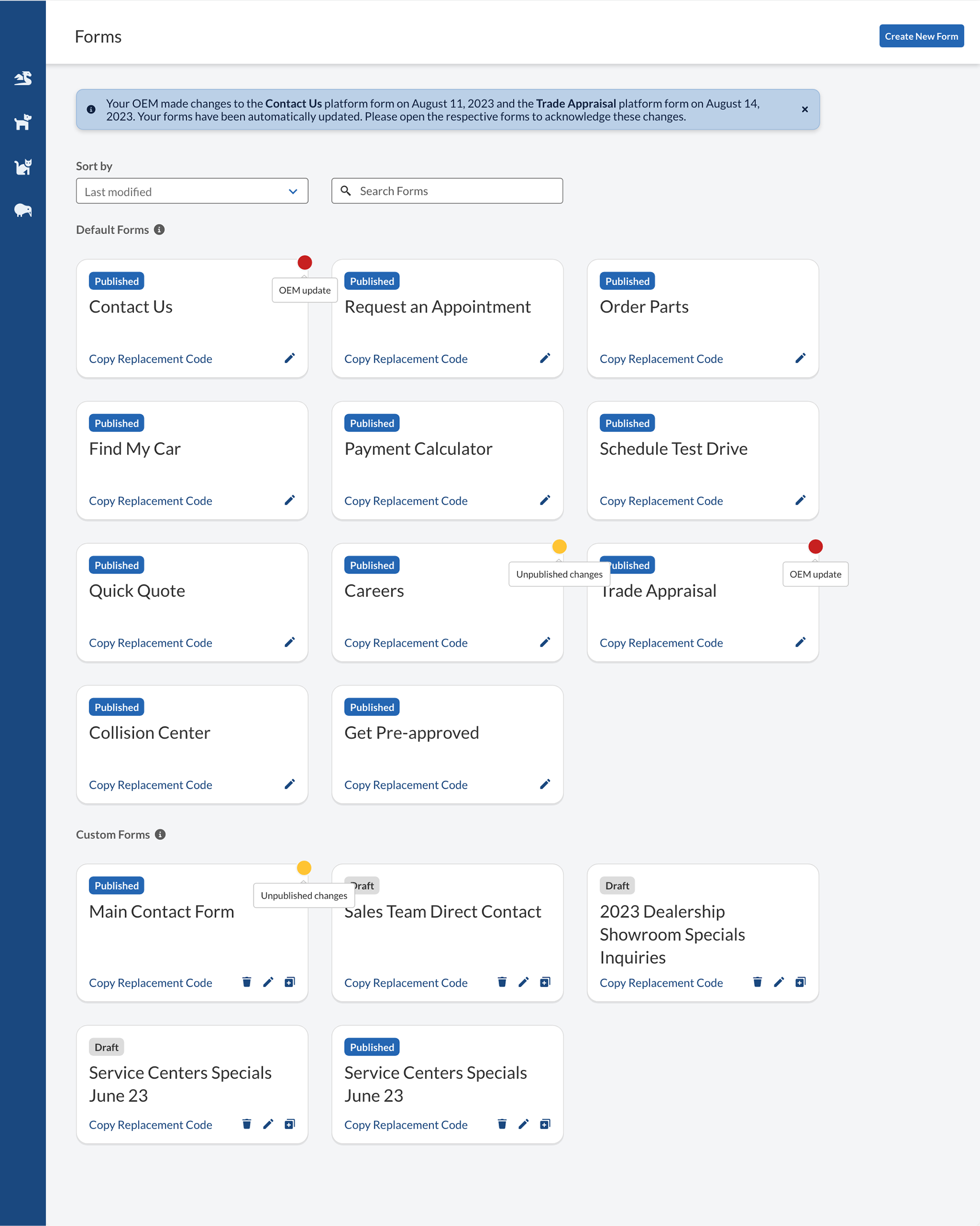
Dashboard


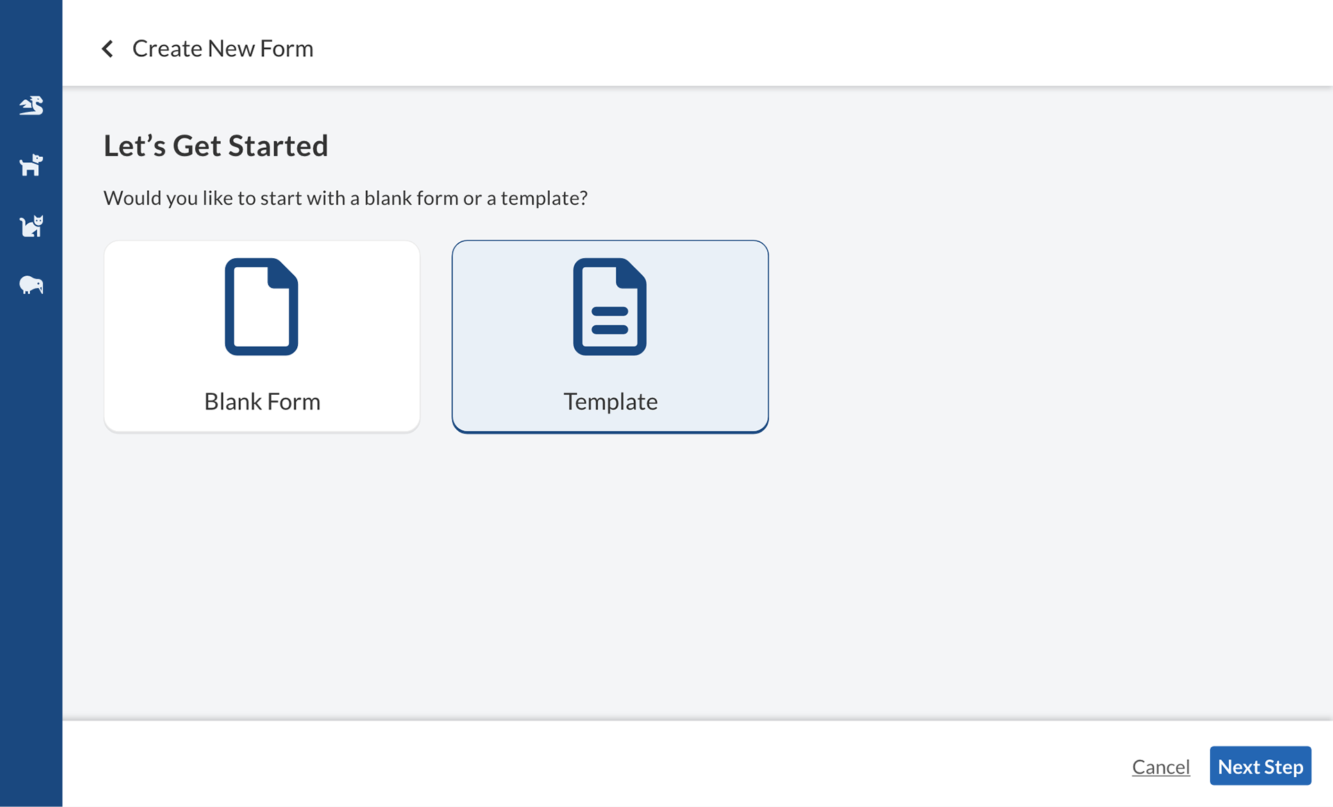
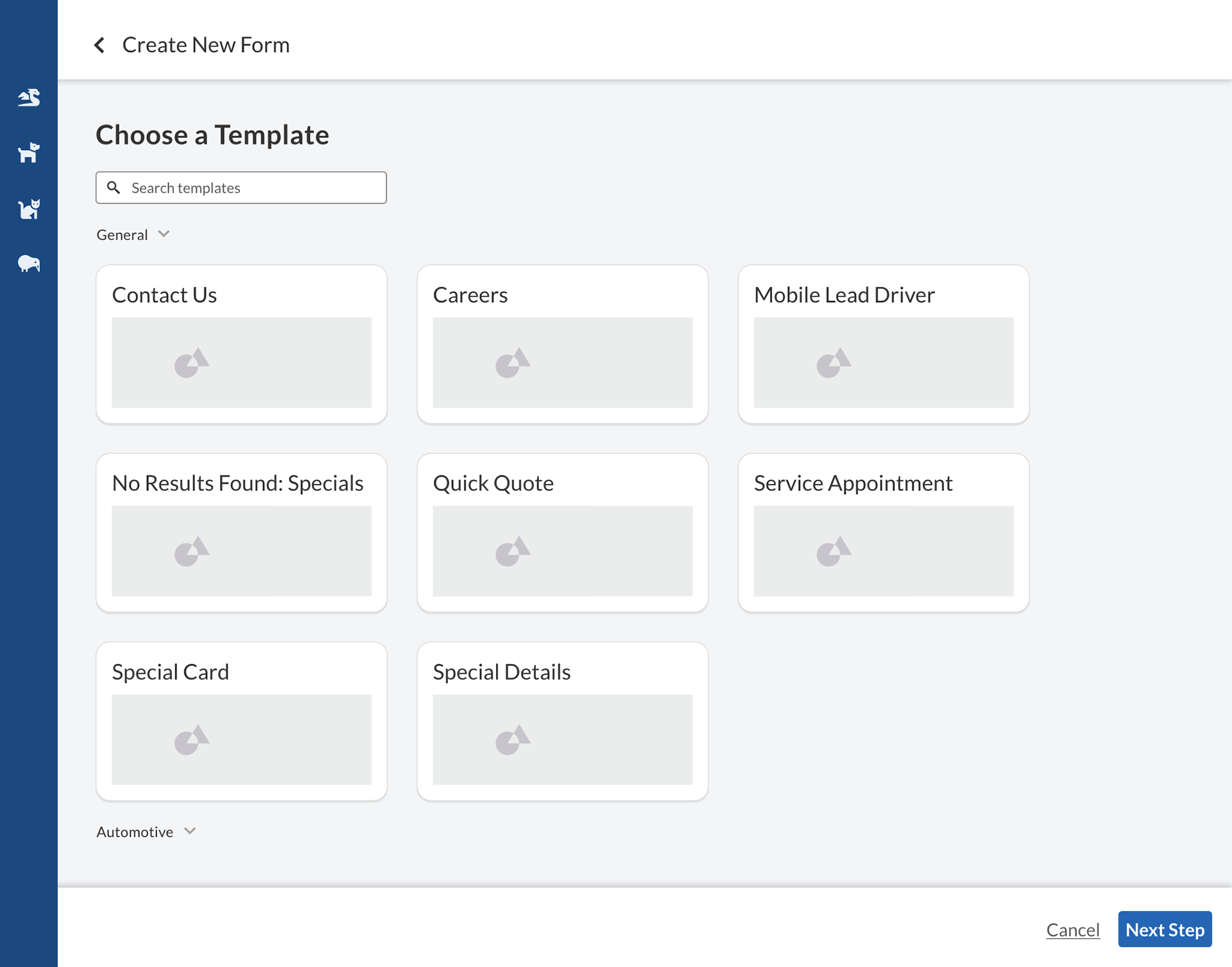
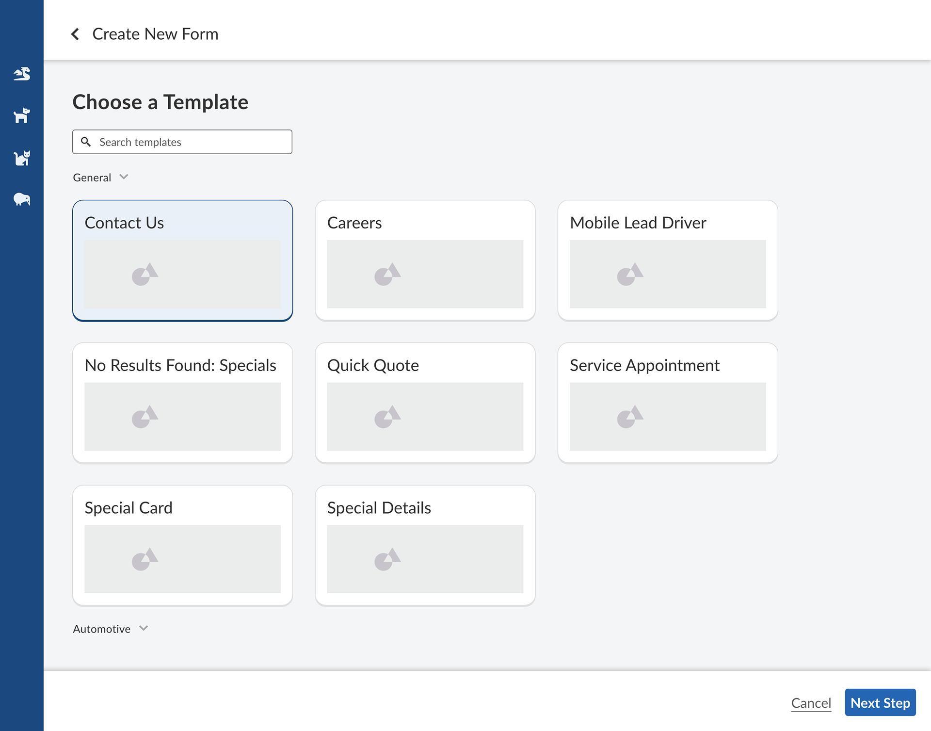
Create from template

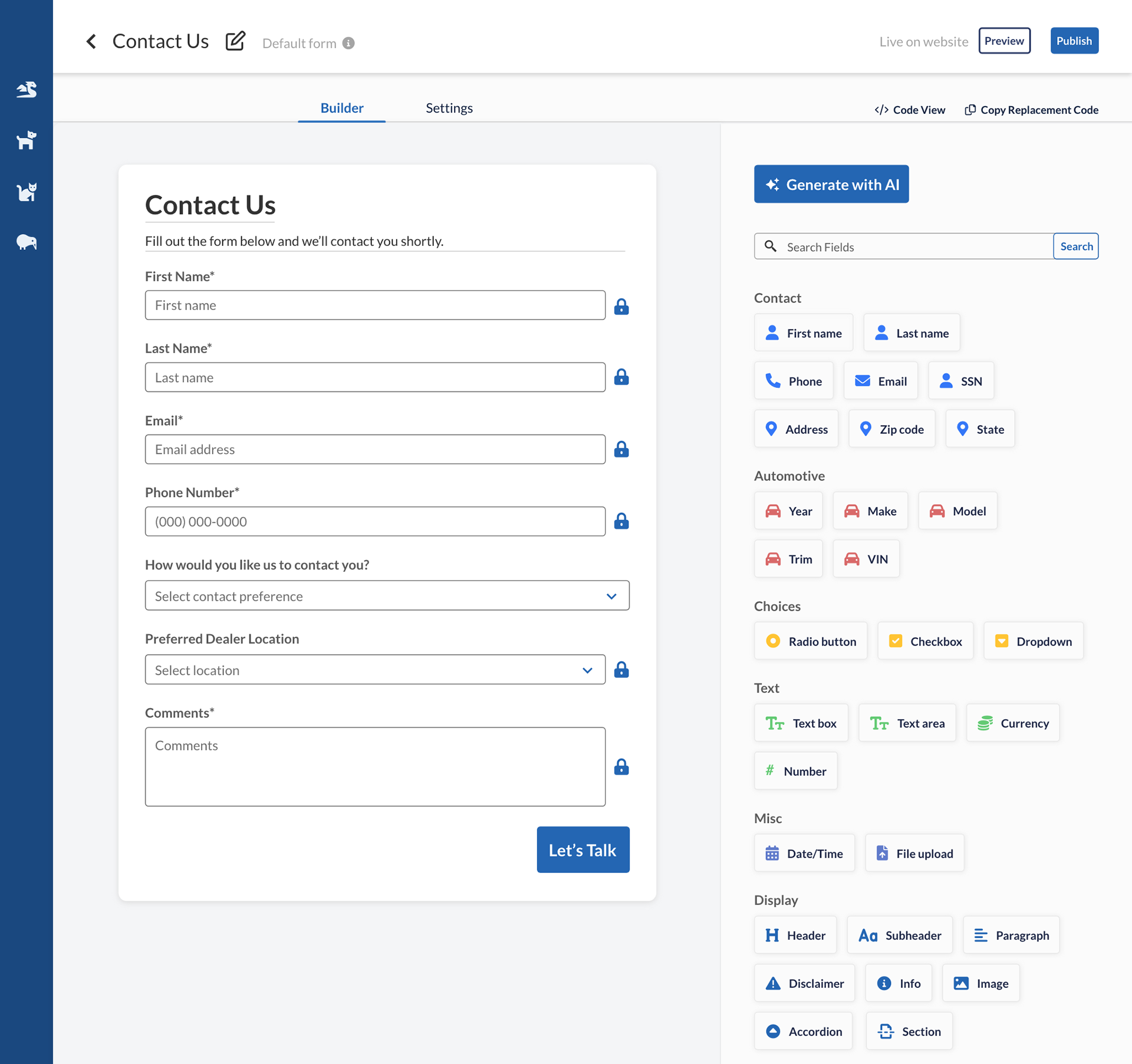
Automatic updates from OEM (original equipment manufacturer, like Ford, GM, etc)
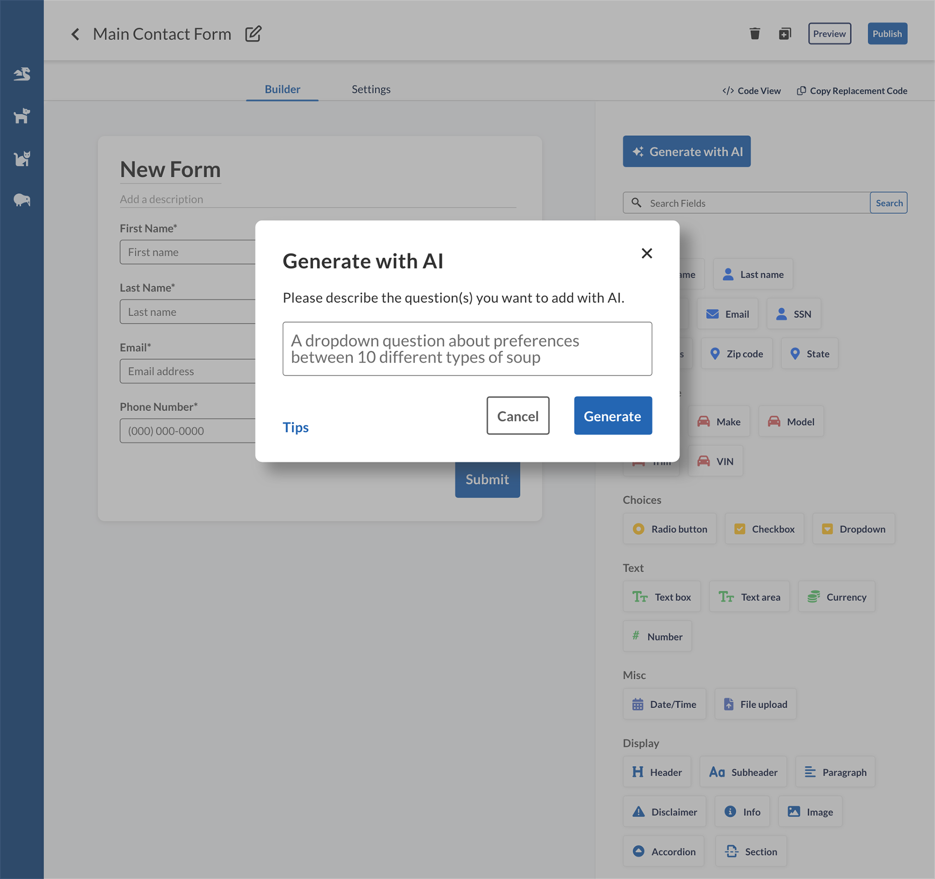
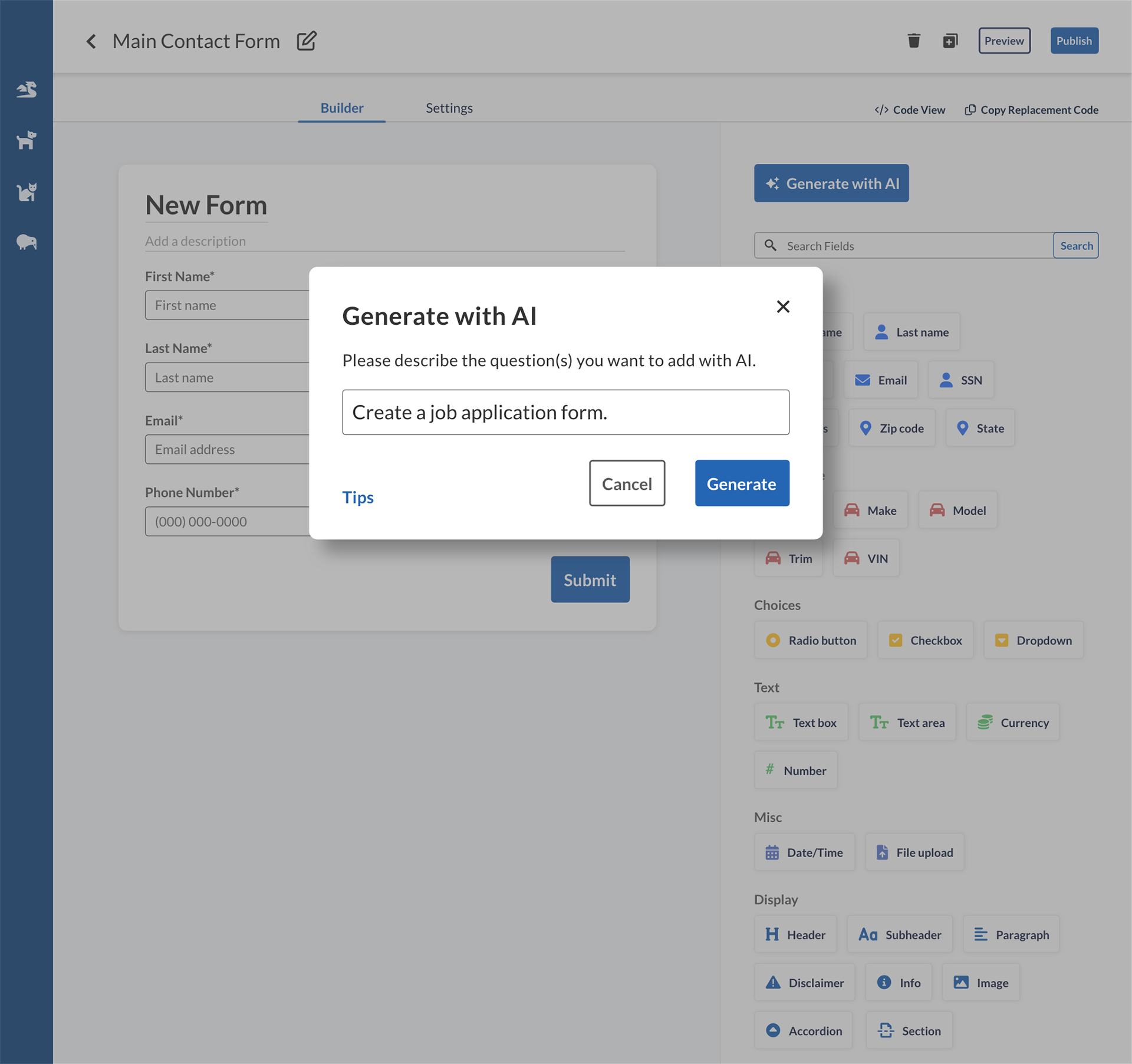
Generate with AI
Please note that this is an initial concept. Further research suggested that it would be more helpful to our CSMs if they could generate forms from support ticket asks or PDF forms.
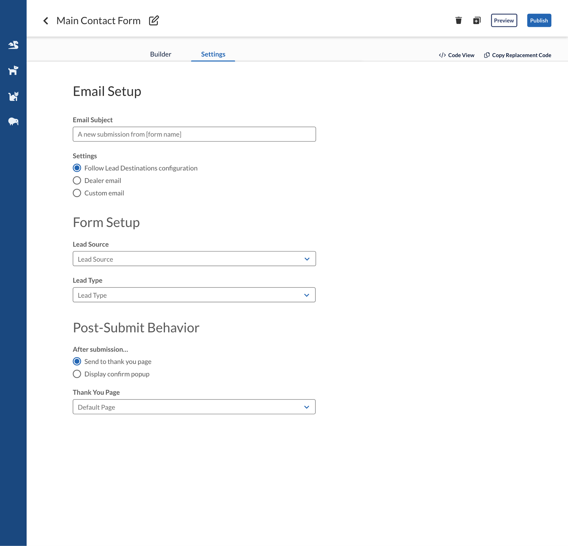
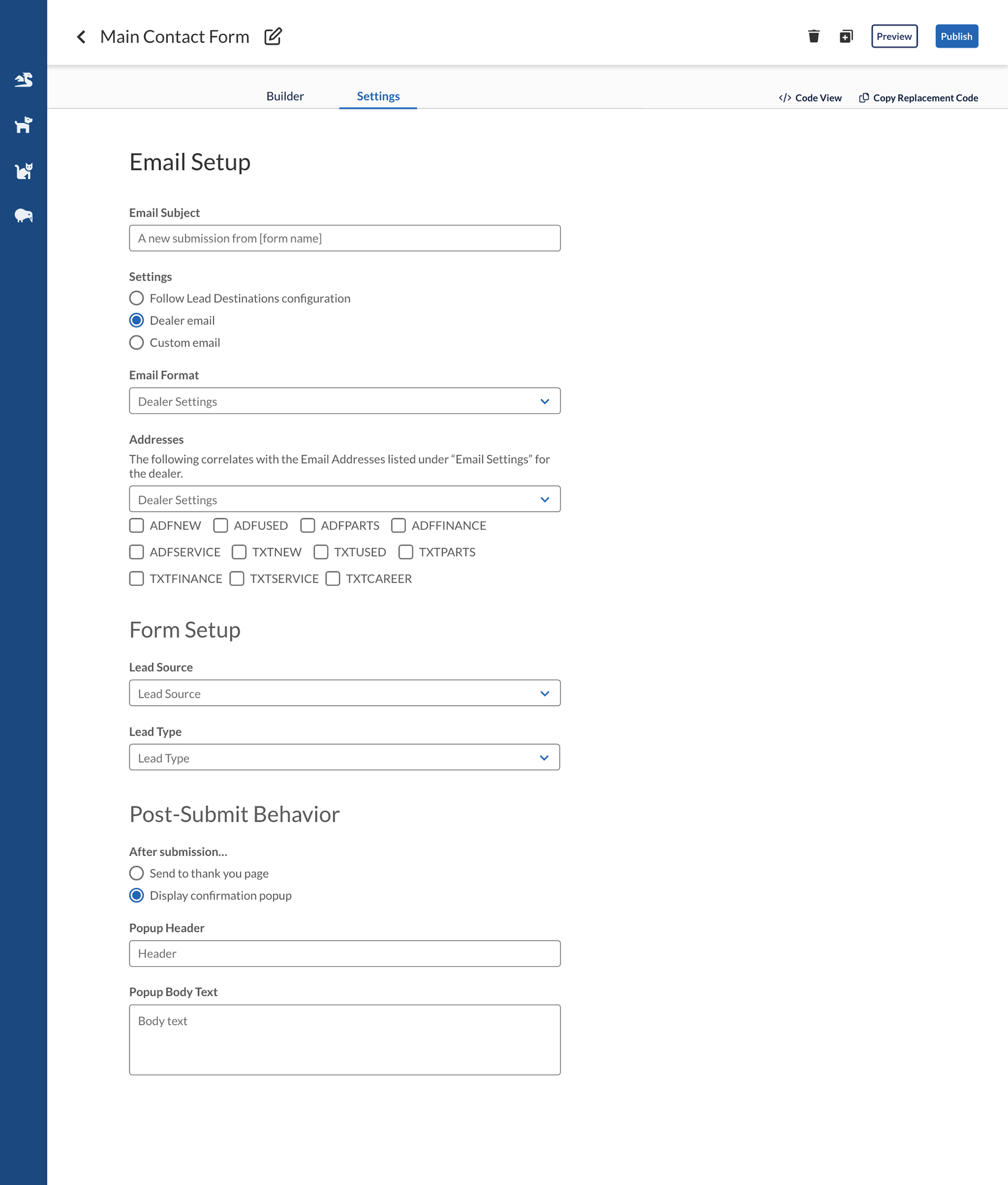
Settings

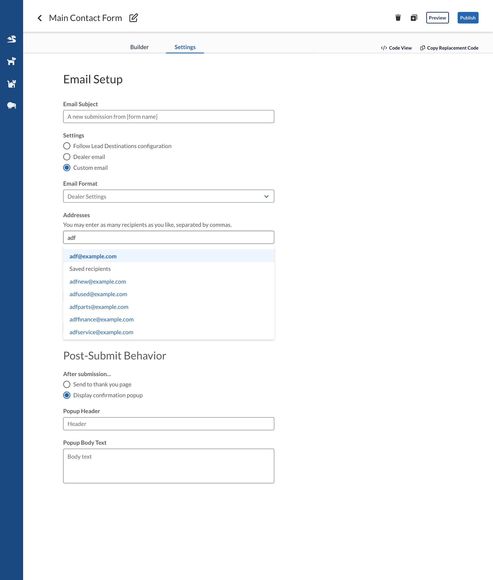
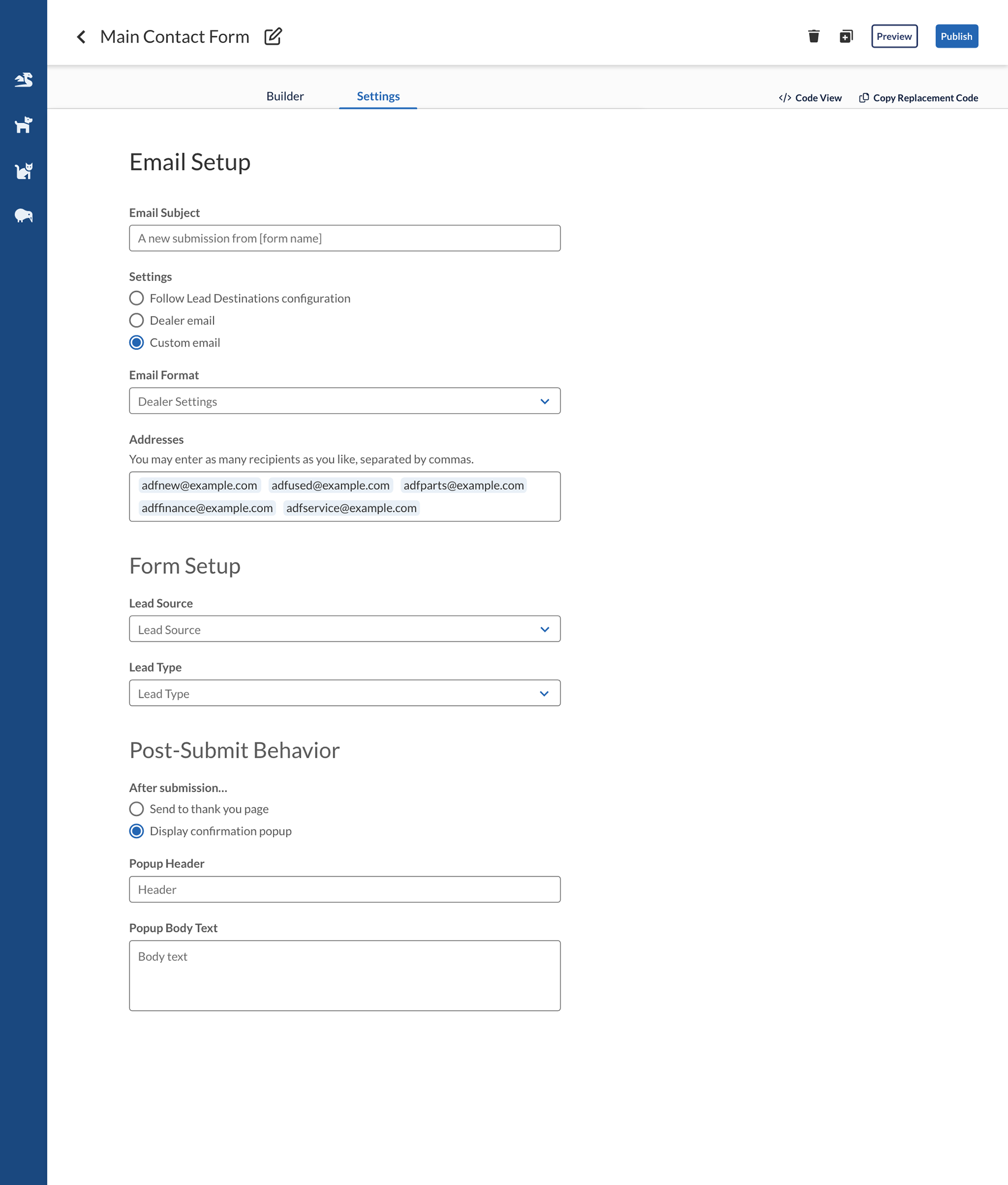
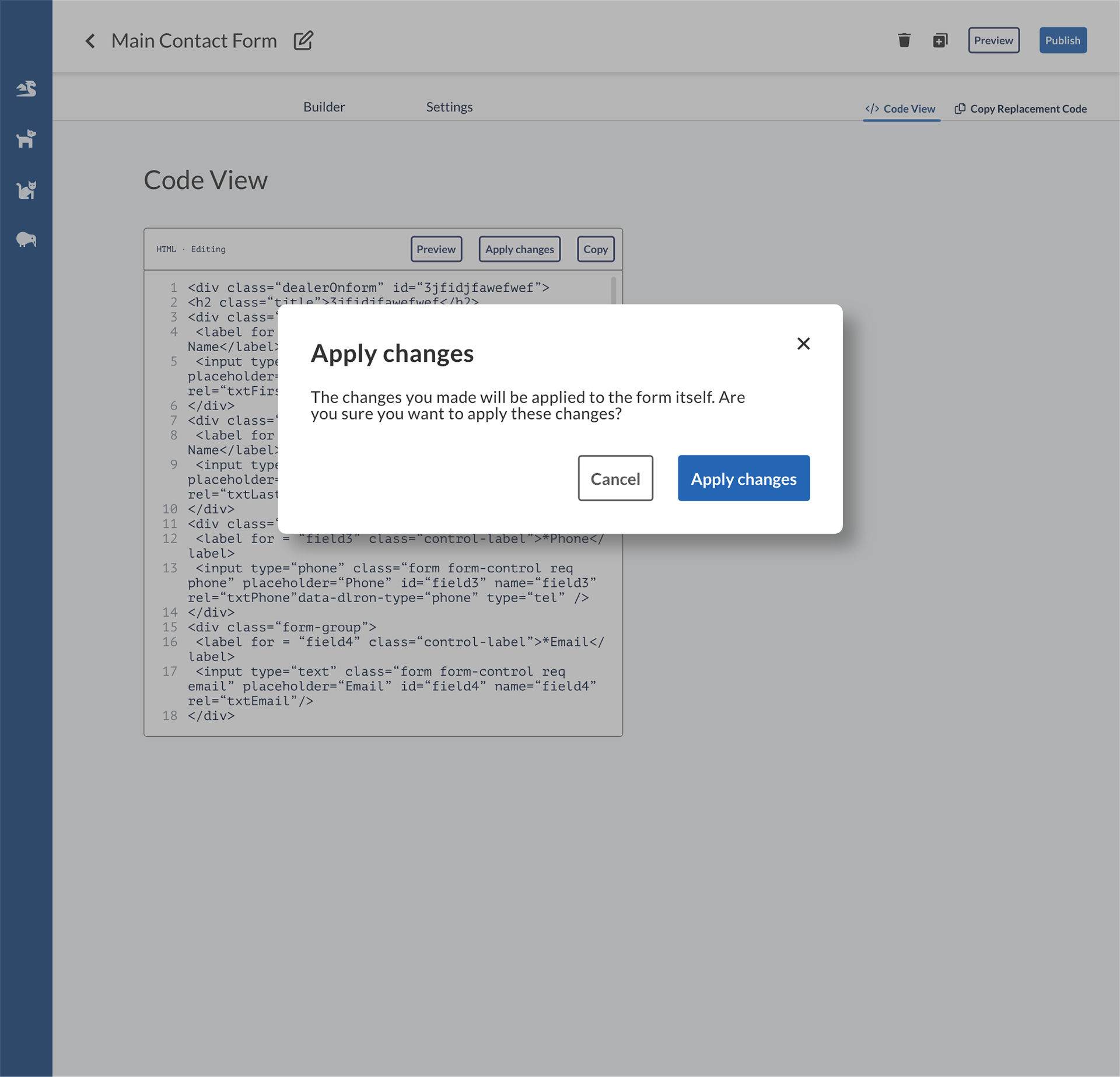
Code view
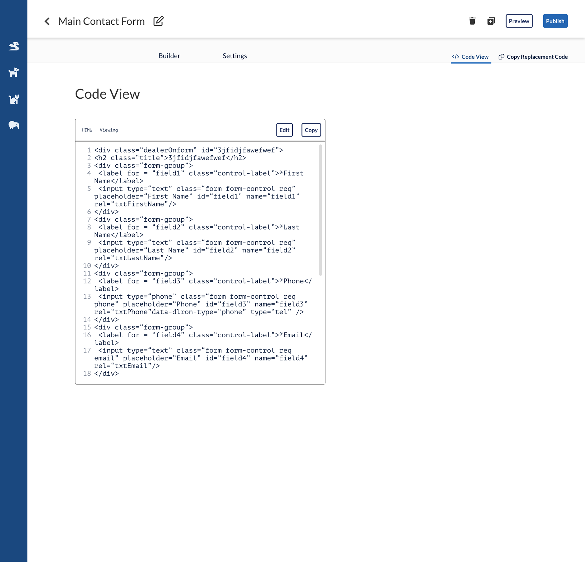
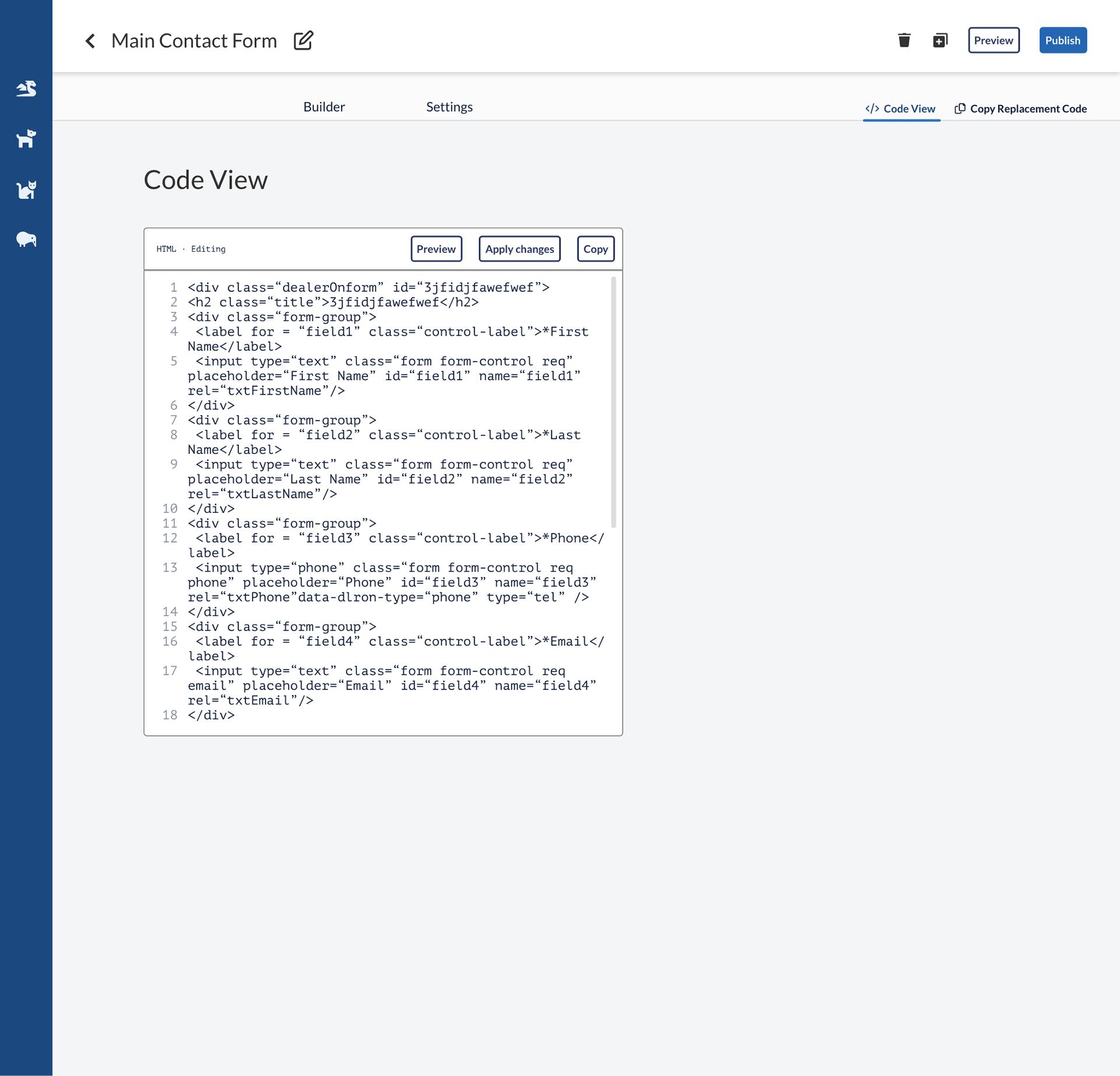
Miscellaneous
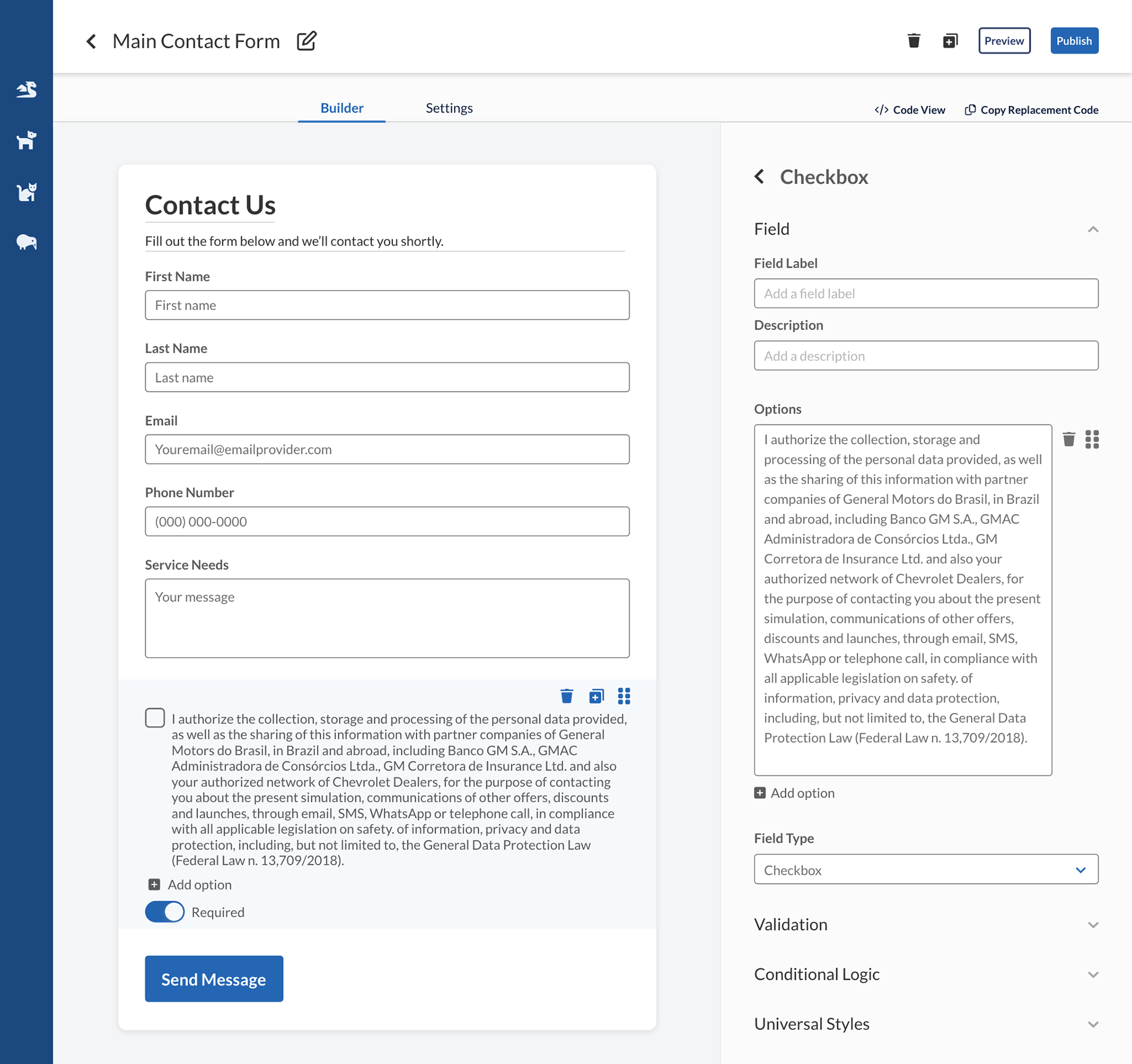
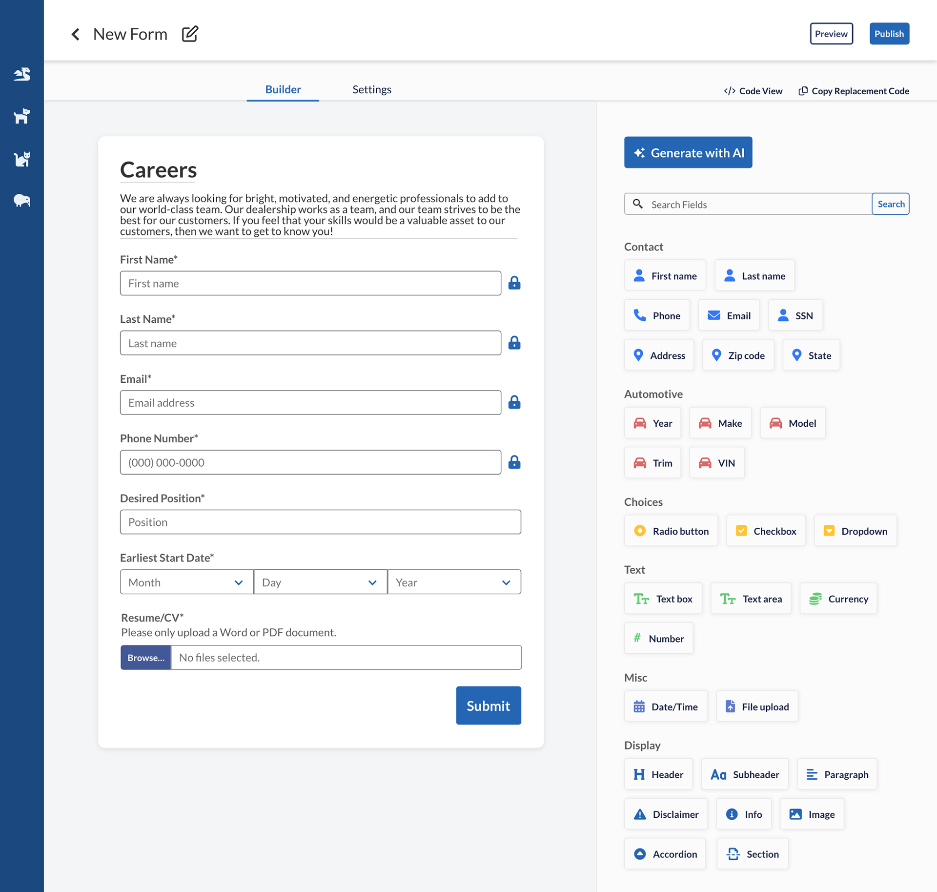
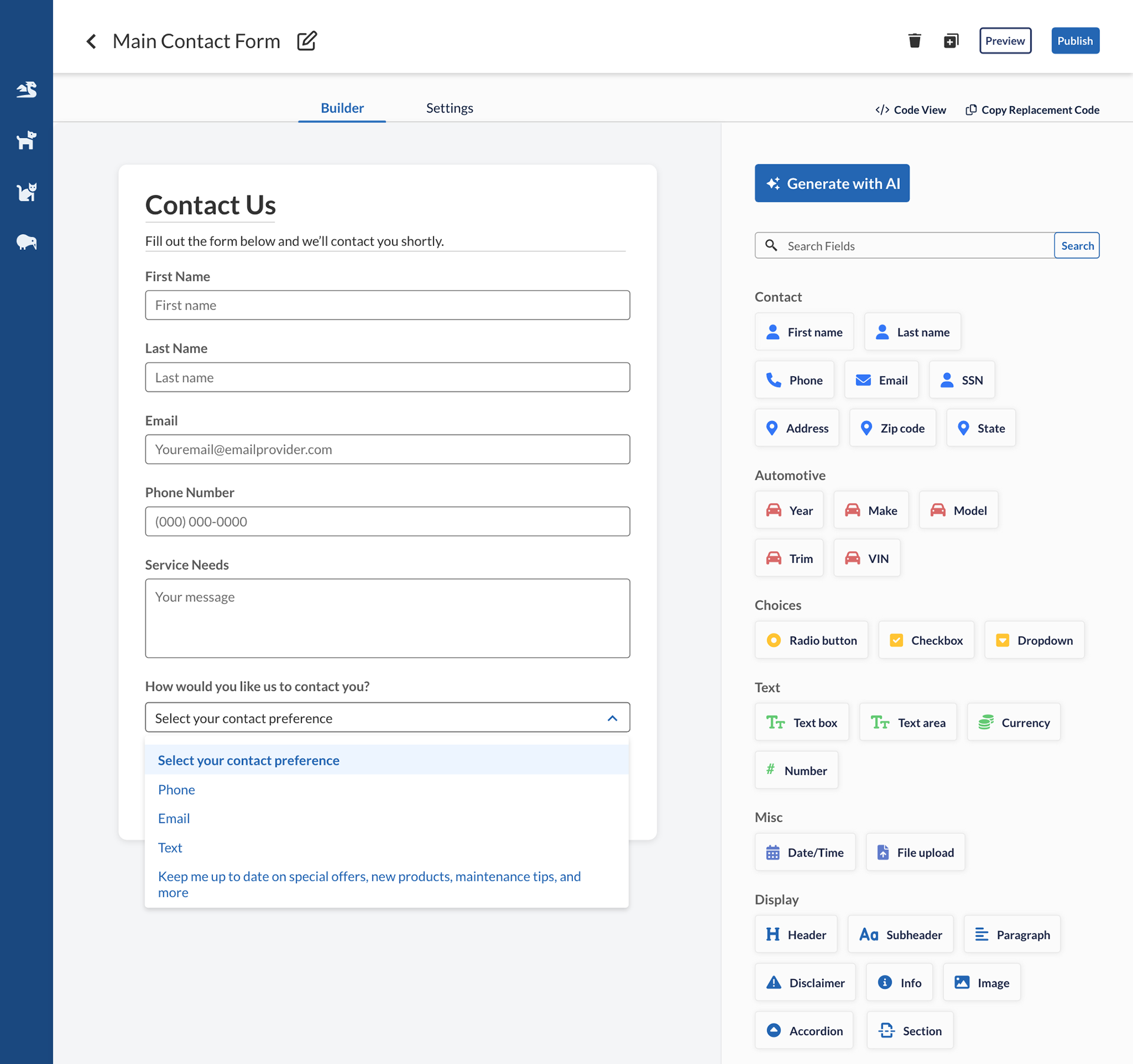
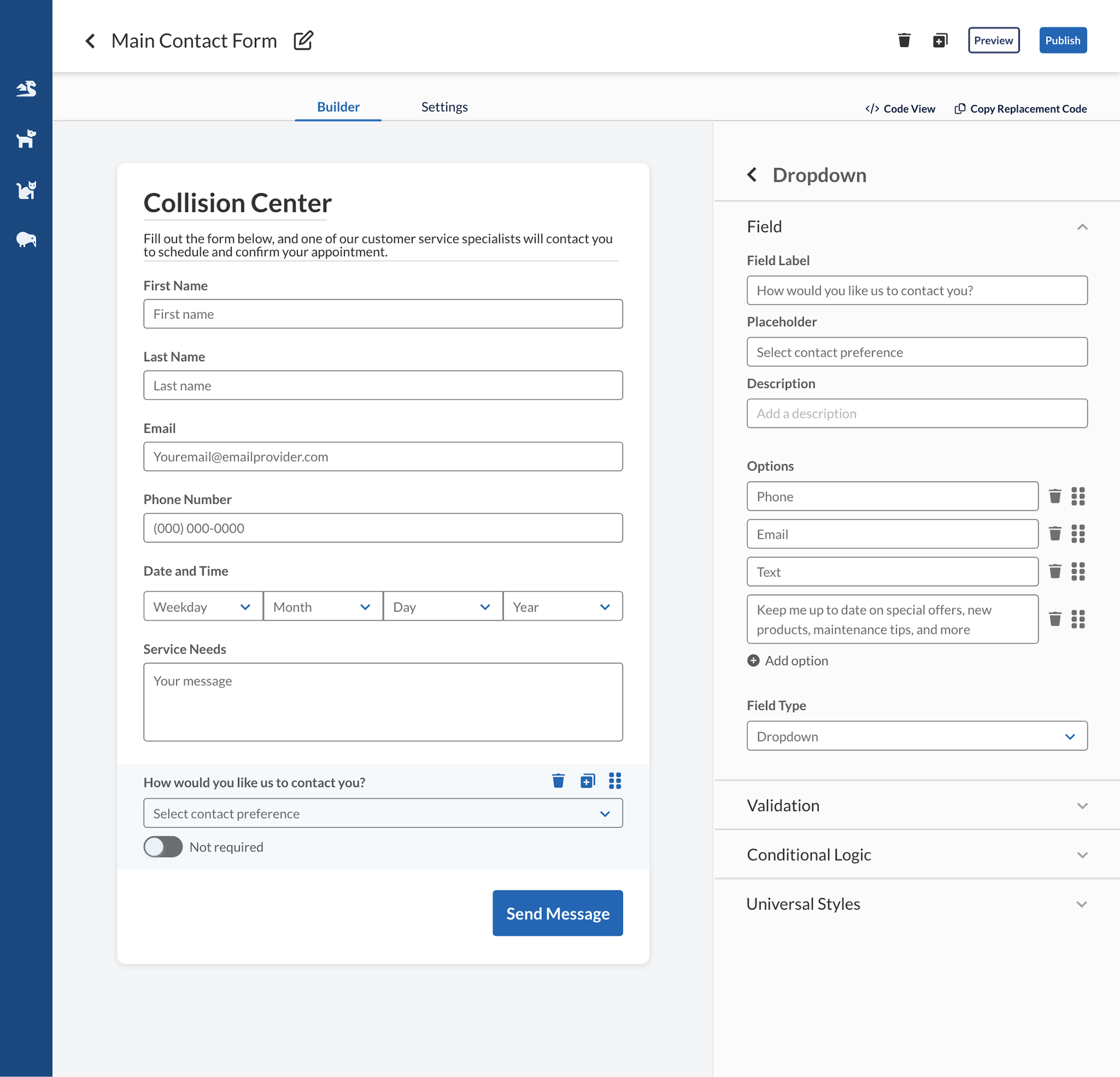
In progress! Check back here for more information!
Feedback
“Everything I’m seeing here is definitely in the right direction” —Jon Rothbard, Senior VP of Operations and skeptical stakeholder
“I wanted to thank you for all the work you’re putting into this. I spoke to [Director of Product Management] yesterday and showed these mocks and she was very pleased to see progress being made and where we’re heading with this, and I made sure to give the credit to you. I provide feedback, but this moves as fast as the work you put in, and I really appreciate that you’re staying on top of this, and getting mocks set up, and following up with me. I really enjoyed this process. It’s great to see how this product is shaping up and will be something I’m really proud to show to execs on Monday.” —Javier Urbina, PM
“Really well done so far. Level of detail is good, everything is well aligned. I’m really glad you’re with us on this. Would like to see your advancement each time you complete something. We will try to build something very similar. Really well done mockups. Clean, simple, intuitive. I really love it, it’s really nice. I love that you’re very detailed, putting everything pixel aligned.” —Helene Goyat, Frontend Software Engineer, on my mockups
“Super slick interface, so cool that the drag-and-drop is all in-house code!” —Deborah Firestone, Frontend Software Engineer
“this is great, custom forms has been a project since even before i was at dealeron” —Nick Rogers, Software Architect
“Nice application and Nice Demo. Thanks!!” —Timothy Mannino, Manager of Development
Takeaways
Keep surveys short and/or focused. If you want to know what people think about the current state of a tool and you also want to test your revamp of that tool, make two separate surveys. Otherwise, people will be less likely to finish your survey.
Certain (not all) core users and stakeholders will strongly prefer a slower, well-made revamp to a faster revamp that doesn’t solve everything wrong with the current product.
Feedback from those core users and stakeholders is worth its weight in gold. It will help you maintain a clearer path.
Check in with your engineers! They have amazing ideas too.


