“This is a show about individual experience and personal identity. There may be times when folks use identifying words or phrases that don’t feel right to you. That’s part of what we’re exploring here. Please listen with an open heart, and as always, I welcome your polite, engaged feedback, and I encourage you to continue the conversation in your own life, and with your own community. Welcome to QUEERY.”
–Cameron Esposito, host of QUEERY
In Fall 2020, I was lucky to take Audra Hubbell’s Visual Voice class whose personal and open-ended assignments are geared towards helping students discover their visual voices. We started the semester by creating visual moodboards, which I interpreted as a board for my some of my inspirations (32 of them) that share themes of storytelling, design ethos, building LGBTQ+ community, and humor.
What followed were three projects focused on the past (what influences you?), the present (what can you not stop thinking about?), and the future (what do you want to change?).
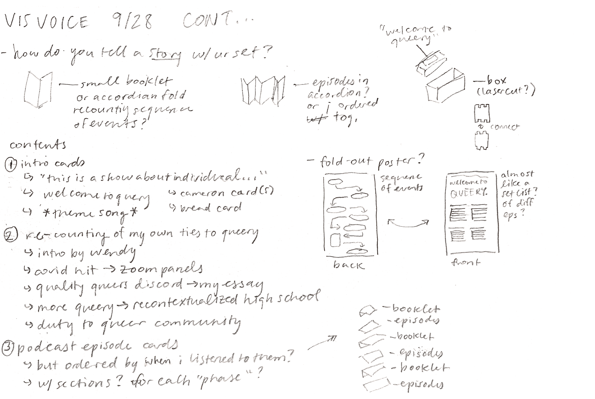
“Welcome to QUEERY” is a response to the question “what influences you?” Developed in one month, It is a (proposed) boxed set of cards, booklets, and a poster navigating through my journey of listening to the podcast QUEERY hosted by Cameron Esposito.
(Please note that the podcast’s branding changed not long after I finished this project.)
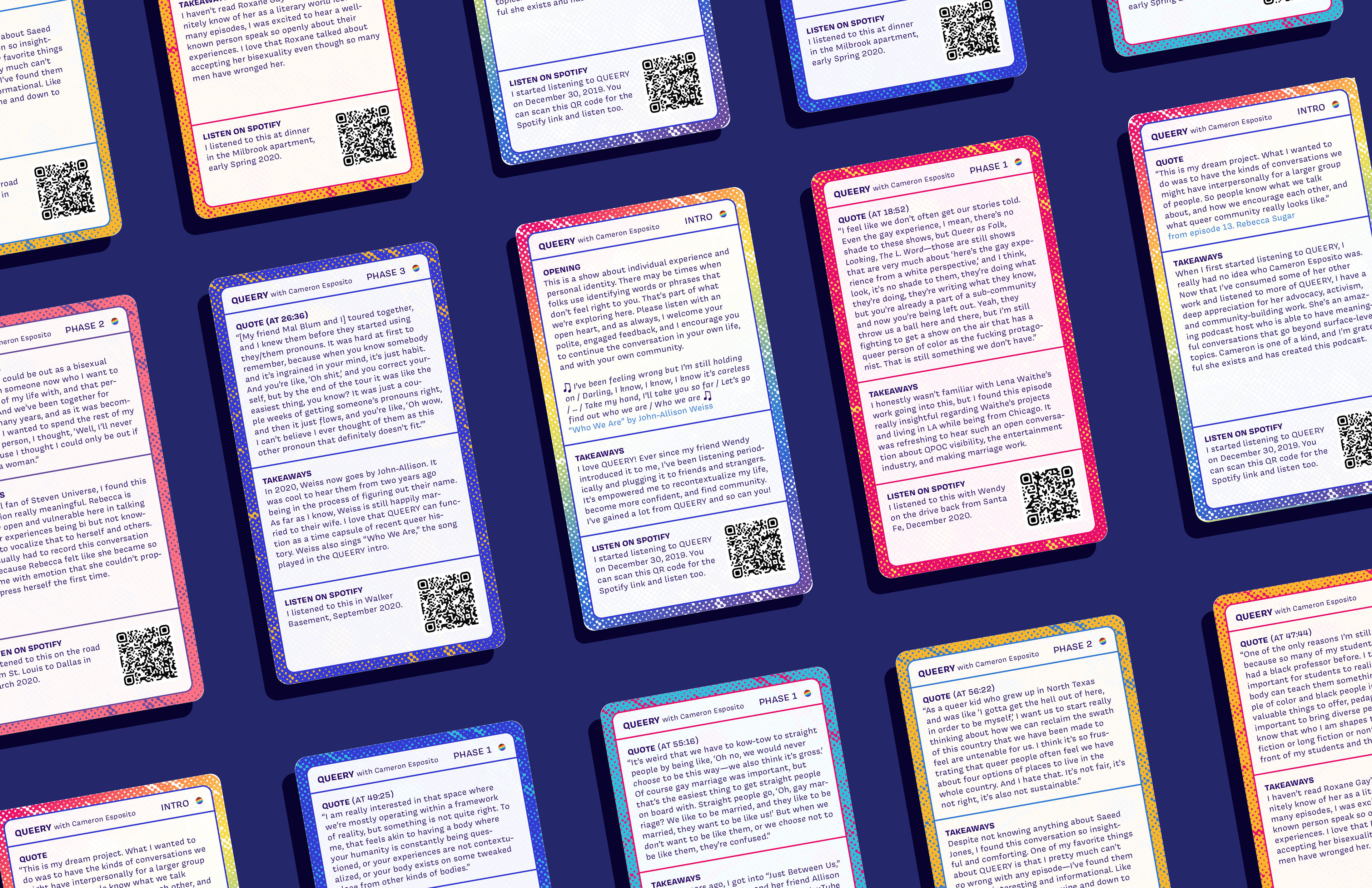
QUEERY is a podcast hosted by lesbian standup comic Cameron Esposito in which she has hour-long conversations with members of the LGBTQ+ community, many of whom are well-known figures. It empowered me to re-contextualize my past, become more confident, and find community.
This card set is an evolved form of me trying to recommend the podcast QUEERY to strangers and friends. Anyone can open this box to get an overview of the podcast and some of my favorite episodes. This is meant to be a layered experience that mimics how I got into QUEERY by providing context into my personal life and the order of episodes I listened to.
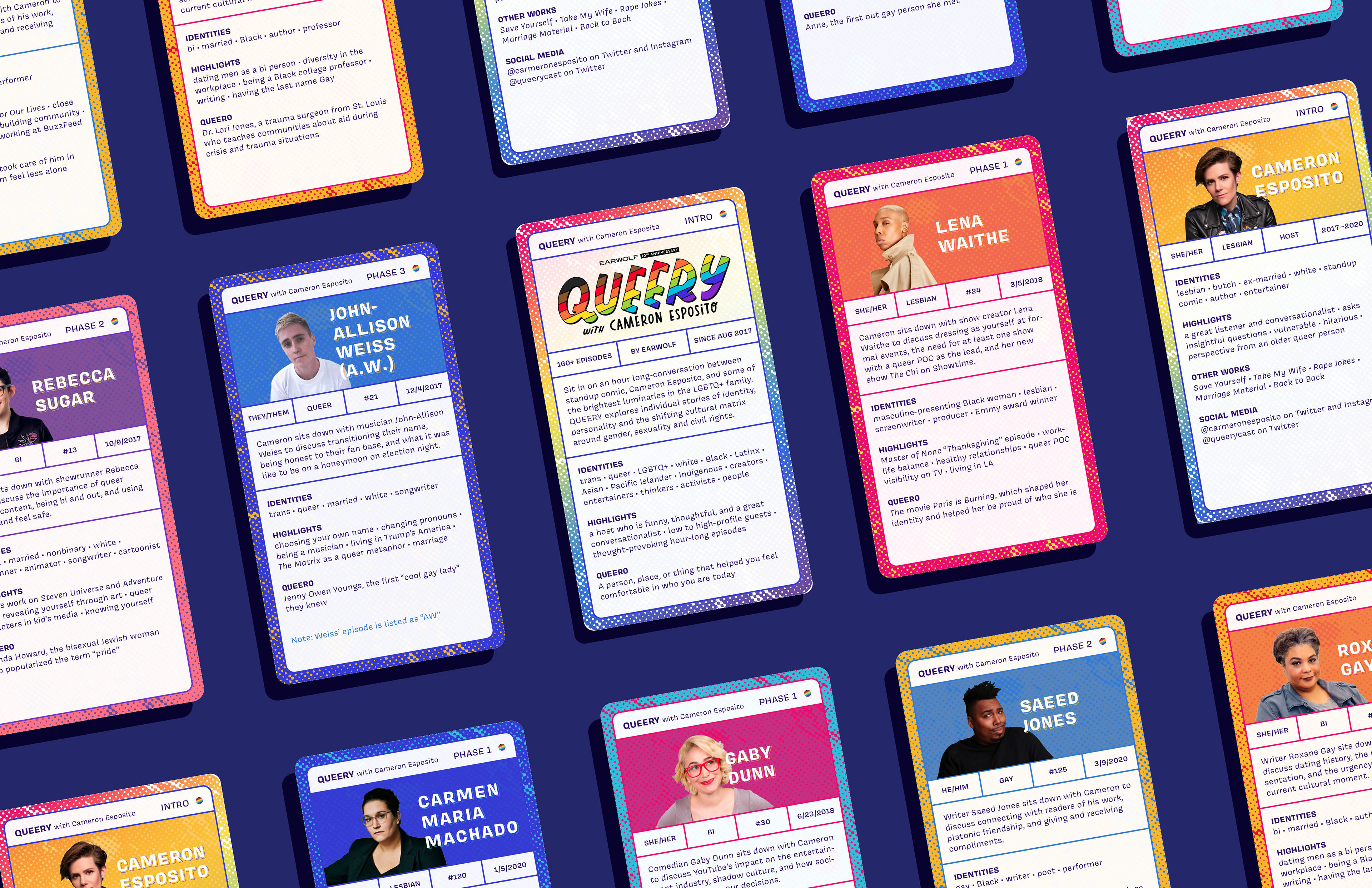
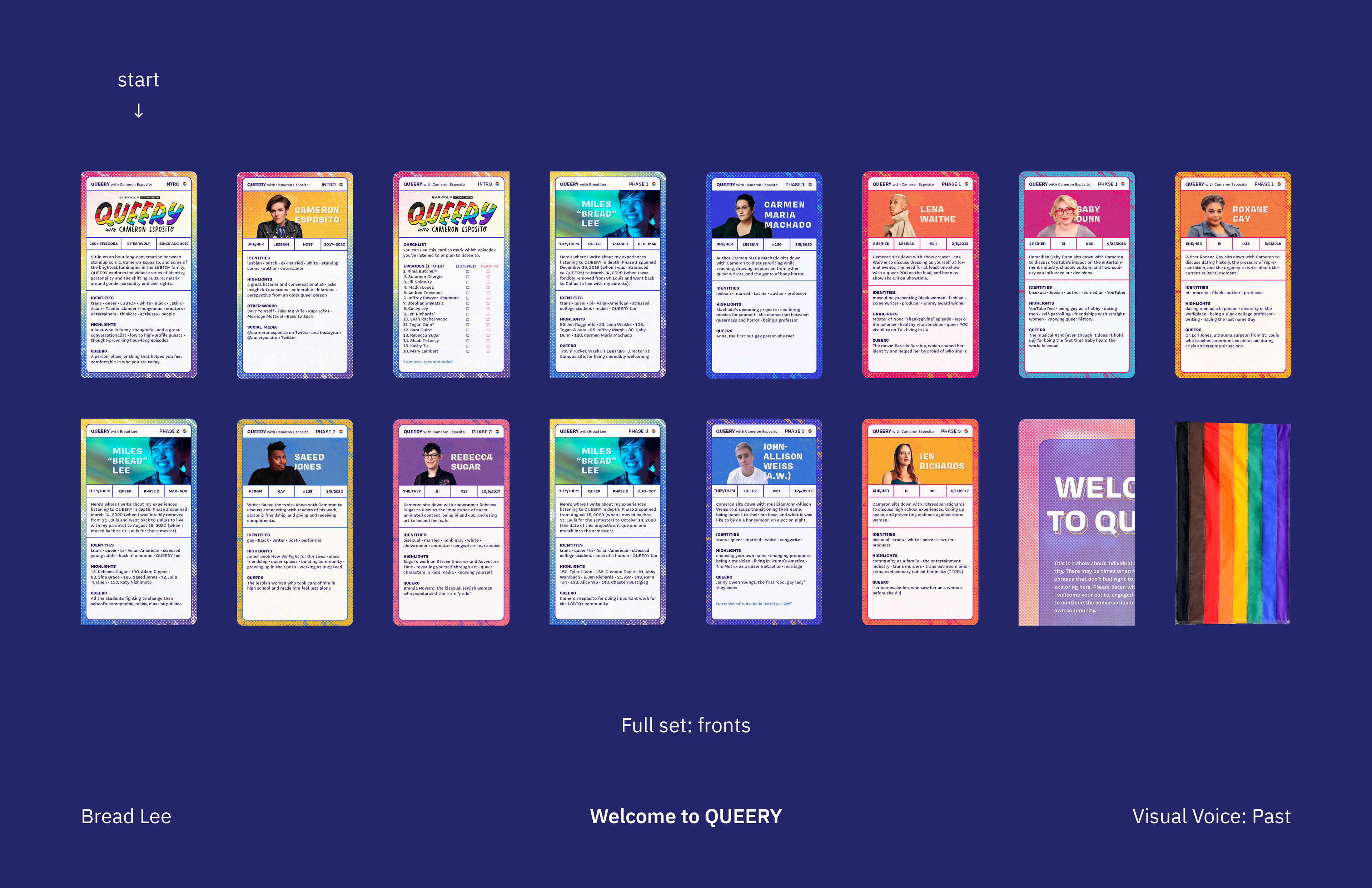
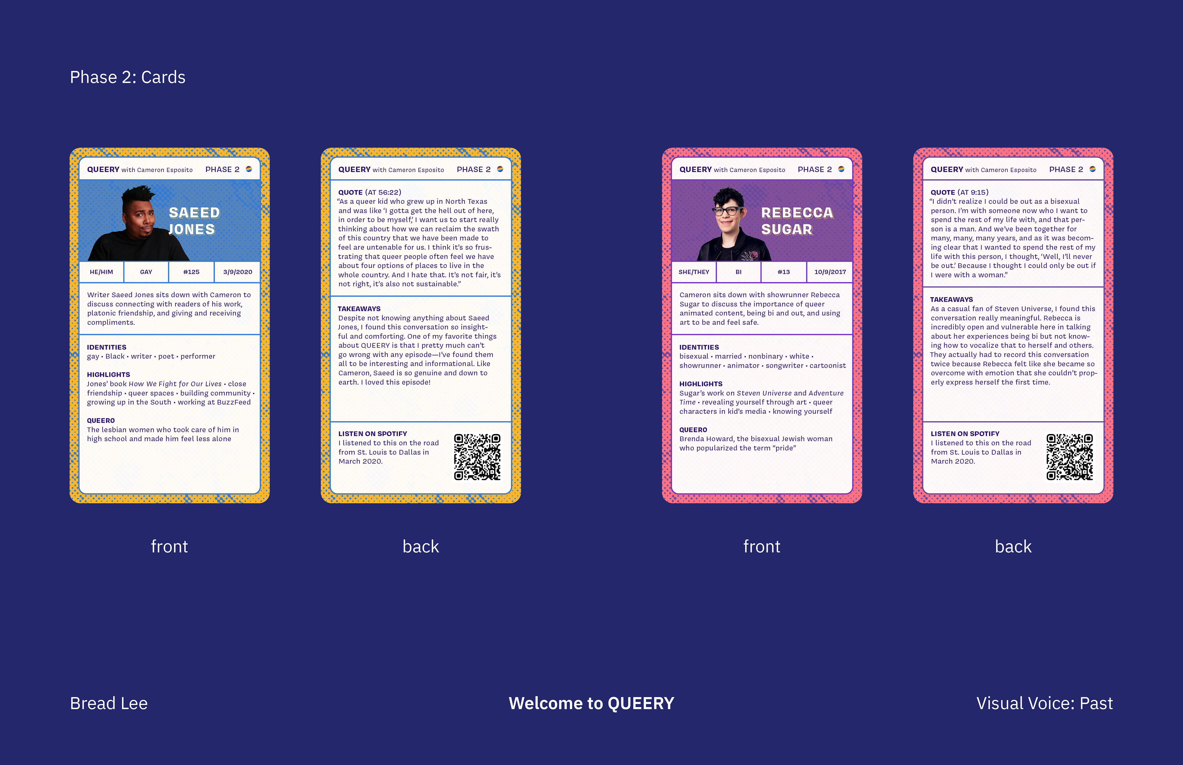
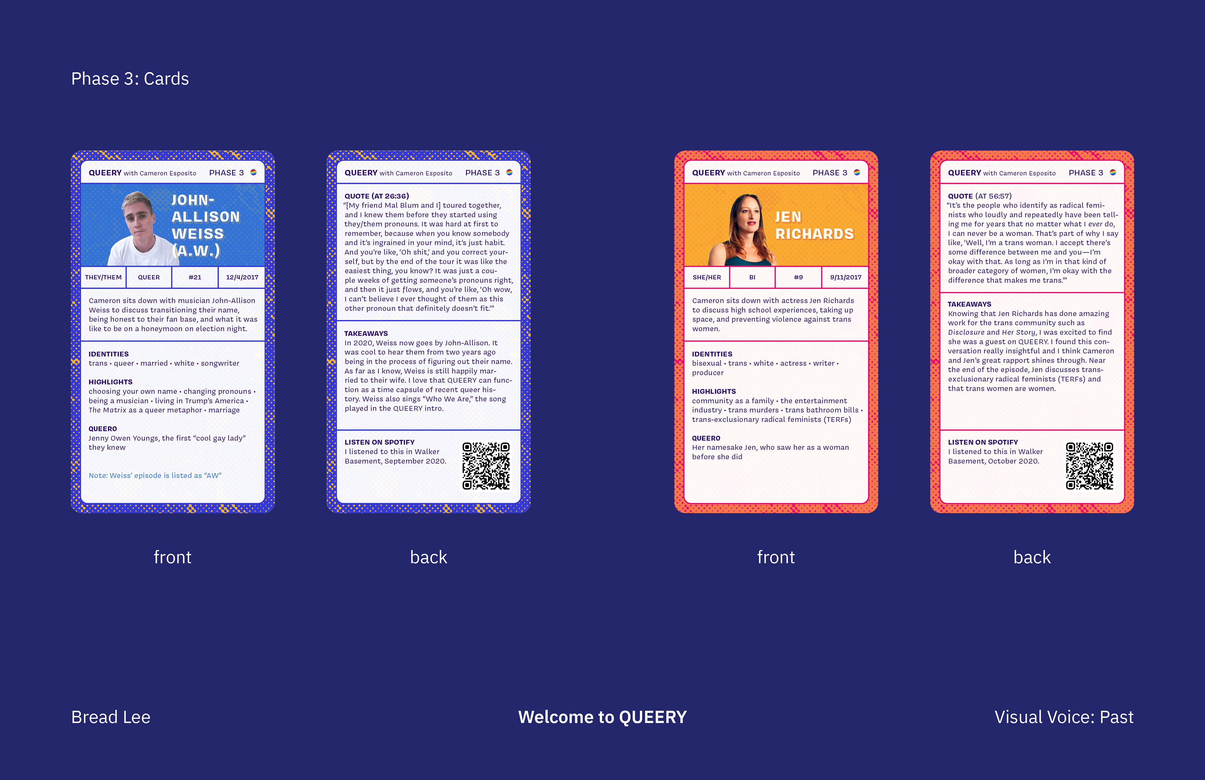
Each episode card’s front side contains the guest’s name, pronouns, notable identities, and Queero (queer hero: a person, place or thing that made you more confident in who you are today) and the episode’s number, air date, and highlights (in my opinion). Each back side contains a memorable quote, my own takeaways, and a QR code to listen to that episode on Spotify.
The title “Welcome to QUEERY” is a reference to Cameron Esposito’s disclaimer in the opening of every episode.
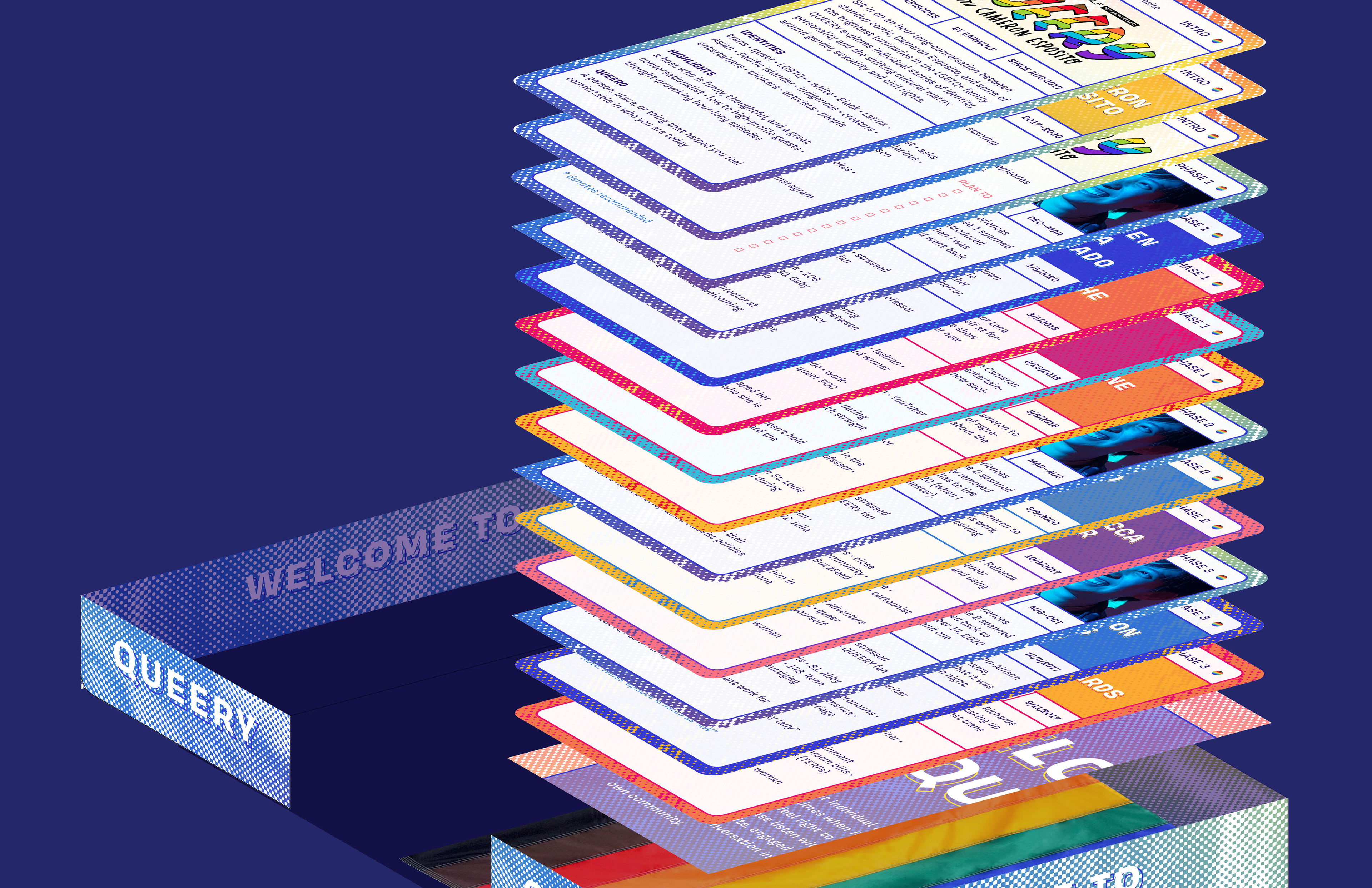
The box’s form is inspired by TON product catalogs. I felt like this one-piece structure would emphasize the relationship between interior/exterior and feel like one singular unit. It’s compact and there’s no chance for the top and bottom box to be separated.
When they open the box, the viewer will find cards introducing the podcast, an episode checklist, a bit of my personal experience, cards for certain episodes (curated), a fold-out double-sided poster, and a mini pride flag. These are chronologically ordered in the sequence I listened to them. The viewer can go along with this or reshuffle the cards however they like: in order of when they themself listened, in order of release date, etc.
After the cards, the viewer will find a fold-out double-sided poster (an episode checklist on the front and the opening song on the back) and a mini pride flag (ideally in QUEERY colors), as souvenirs.
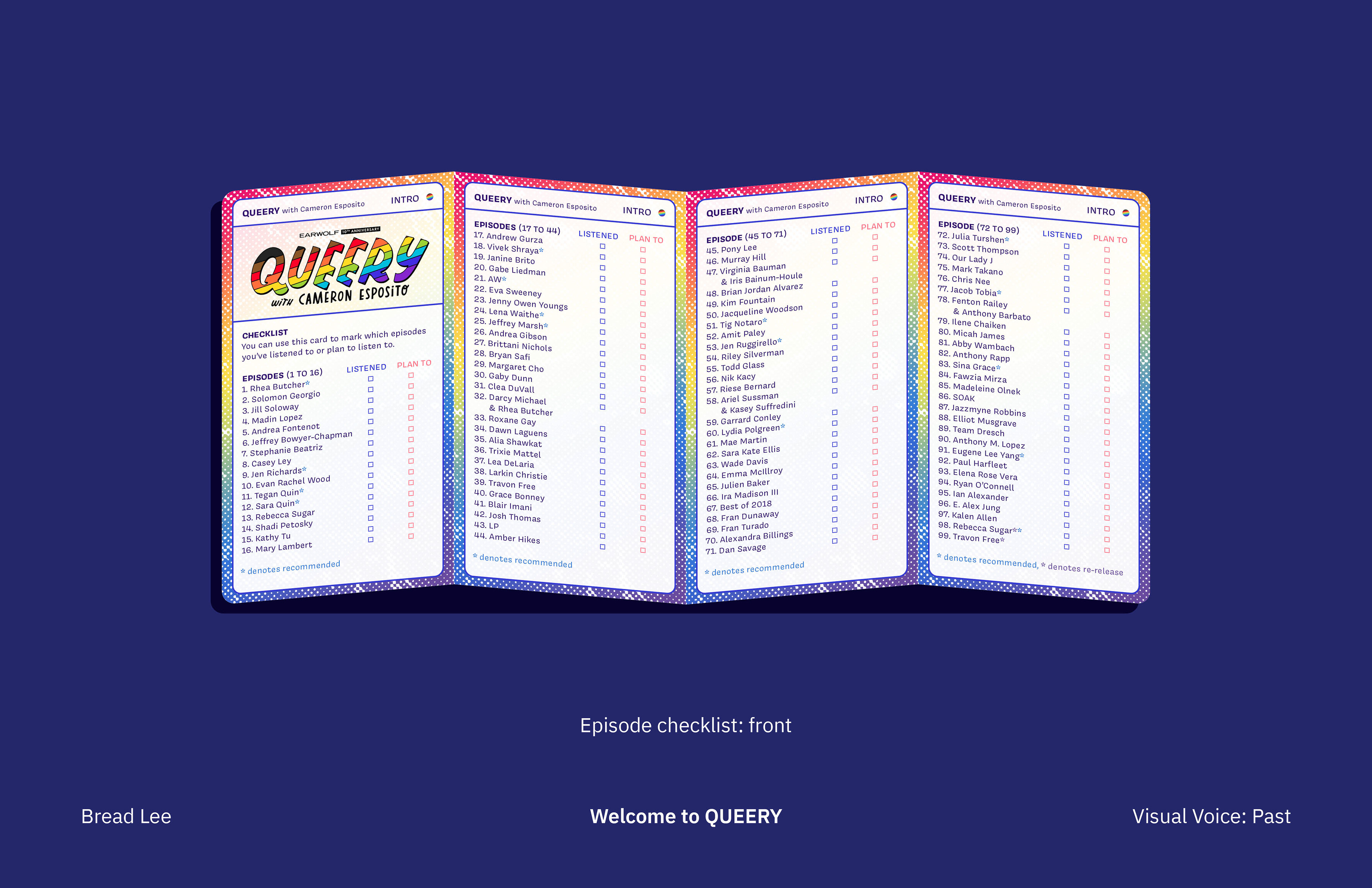
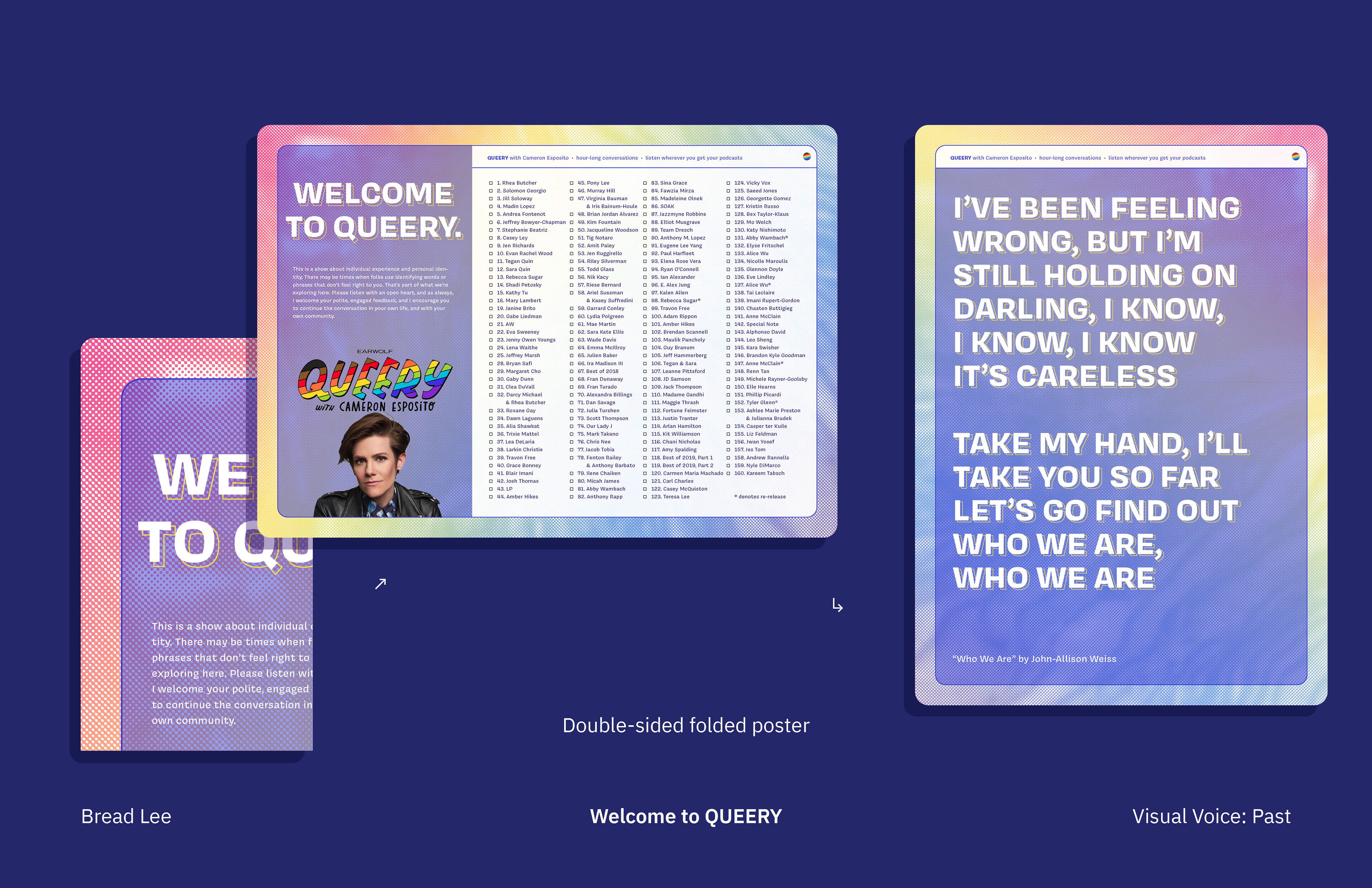
Each card is 2.875 x 5.1 inches (when folded), which is the same ratio of an iPhone 8. I wanted to subtly reference the experience of listening to podcasts on my iPhone (not an iPhone 8 specifically). The box’s contents are split into 4 sections: Intro, Phase 1, Phase 2, and Phase 3. Intro cards provide an overview of QUEERY, including the host and episodes. The checklists (one as an accordion card, the other as a fold-out poster) allow the user to mark episodes they listened to and document their own experience like I have. Each Phase consists of a folded signature of my personal experiences and cards of episodes I listened to. Episode cards provide an overview of the episode on the front (including highlights and the guest’s identities) and details on the back (a pull quote, my takeaways, and a QR code to that episode on Spotify).
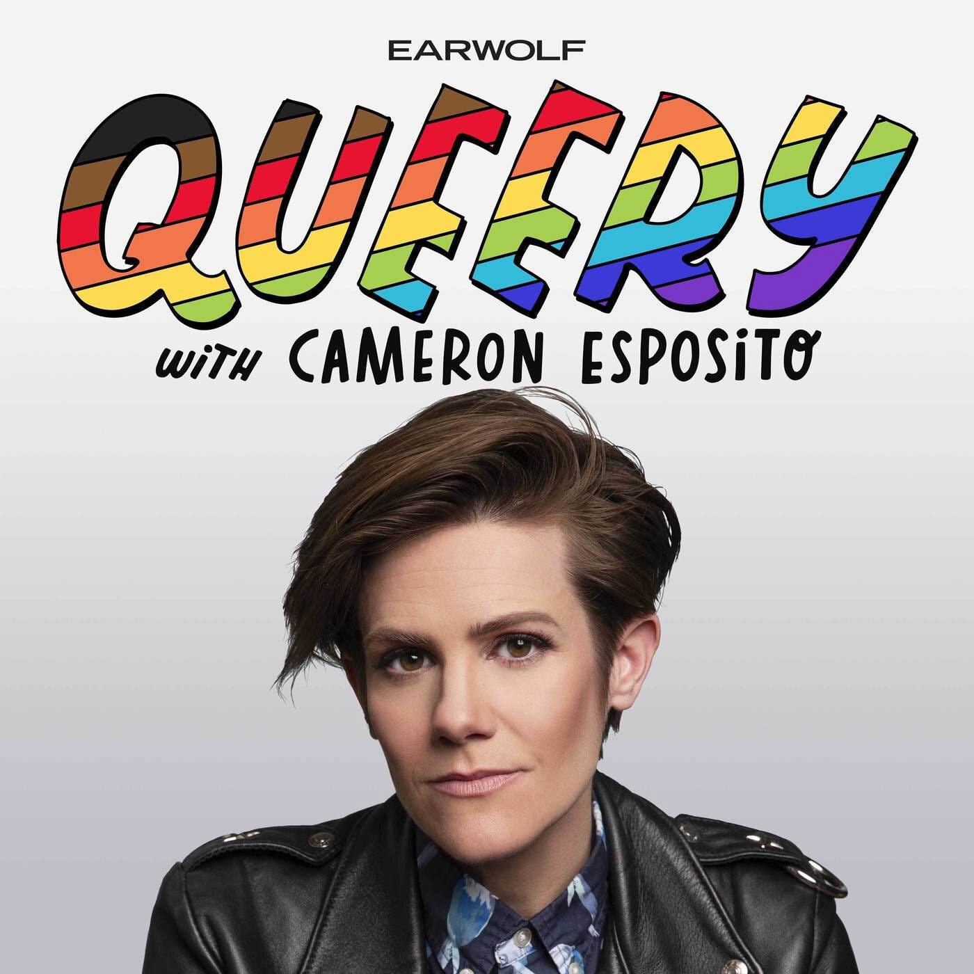
In terms of color, typography, and imagery, I wanted to develop the set’s own visual style apart from QUEERY’s existing style. I took the colors from the rainbow lettering to use as a recurring visual on all elements of the set. However, I chose different typography as a way to make the set feel sophisticated yet welcoming, playful, and unique. Covik Sans and Covik Sans Mono fit those descriptions.
I felt strongly that each episode card should include a full-color photo of the guest’s face, instead of a more abstracted image. Visibility is such a huge issue for many LGBTQ+ people. Part of the reason why I love QUEERY is that it gives contemporary, real, living LGBTQ+ people a place to speak about their lived experiences. I know that when I was younger I would have loved a podcast like this where I could listen to other experiences and know that I could reach adulthood.
I obviously haven’t listened to every single episode, so this is not an objective overview into QUEERY. My goal for this boxed set is to introduce people to QUEERY, and more specifically, my experience listening to it. For those who already love QUEERY, this set has the potential to serve as a collector’s item, or at the very least, a physical manifestation of an auditory experience. Podcasts like QUEERY can feel very personal because the listener hears two people having an intimate and vulnerable conversation. I wanted “Welcome to QUEERY” to feel personal as well. If I were to continue working on this project, I would develop cards for each and every episode and finally make the test prints I wasn’t able to in Fall 2020 (not to mention update the design system to reflect QUEERY’s rebrand).
Take my hand, I'll take you so far
Let's go find out who we are
Who we are
Let's go find out who we are
Who we are
—John-Allison Weiss, “Who We Are”
This class, especially during a difficult semester, forced me to consider what really matters to me. I almost wish that I made postcards about birds of North Texas (I’m an amateur, casual birdwatcher) for the Past project, but I’m glad I got to pay tribute to a thought-provoking podcast that has brought me so much comfort. You could almost say that Cameron Esposito and everyone else who makes QUEERY happen is my queero, or queer hero!
Attribution
Audra Hubbell for her incredible mentorship and flexibility
Cydney Cherepak for her mentorship, calming energy, and button maker!
QUEERY hosted by the wonderful lesbian standup comic Cameron Esposito whose hilarity and lifelong devotion to advocacy inspire me.
Covik Sans and Covik Sans Mono designed by James Edmondson for Oh No Type. When I saw my classmate use Covik in a project in 2019, I immediately asked her what typeface it was and have been wanting to use it ever since. I was really happy that I was finally able to use it for a project!
IBM Plex Sans designed by Mike Abbink, IBM BX&D, in collaboration with Bold Monday.
